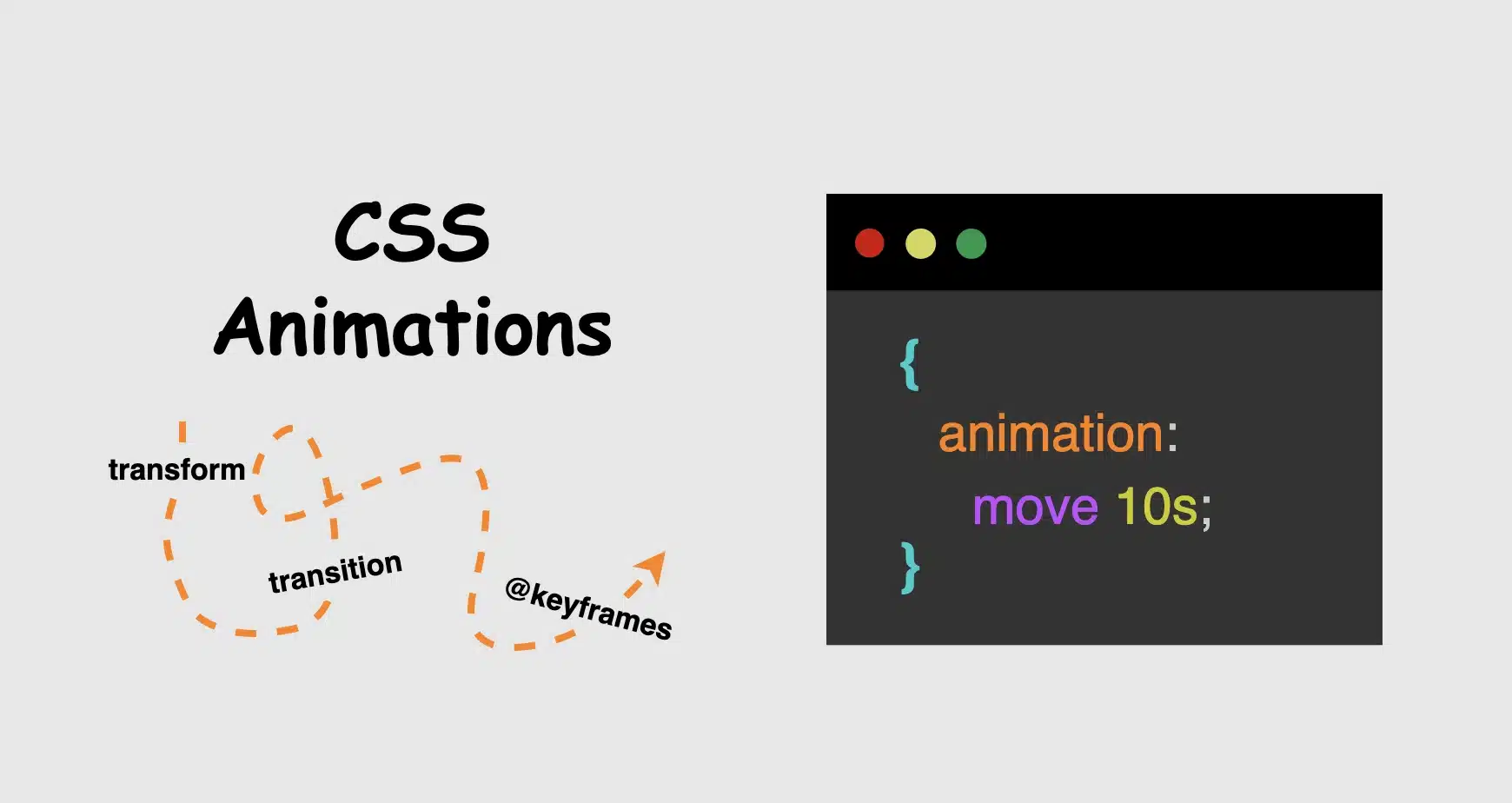
Hi there! You’re aware that the web 🕸 wasn’t always like it is today? Websites were like digital 📰 posters – just text and images. A page loads, and no changes occur. Static design had the reins. No movement, no glow! 🤹♀️ ✨ Everything remained visually frozen. 🧊 🥶 CSS was only a tool to decorate that static content and make some improvements, such as selecting a font, changing colors, adding a border or a margin.
As time went on, browsers improved, and users began to expect more. That’s when CSS started to shine and show the way from static pages to fluid experiences! With features like transition, transform, animation, and keyframes, the focus shifted from how things looked to how they can pulse and move in time. Dynamic design is finally here! CSS became a language capable of transforming static HTML elements into dynamic 🧨 ones.
Motion matters. It allows users to feel when something changes and witness how elements react. It’s a way of communication, 🔊 not just decoration. With only CSS, designers can craft these interactions. Creating animations that ‘rotate‘, ‘skew‘, scale‘ or ‘shift‘ position suggests ongoing system activity. A sliding menu, like a ‘hamburger icon‘, reveals categories, indicating that navigation continues beyond the current view. A spinning icon, after a user clicks ‘Submit’ or ‘Save’ on a button, signals that a process is loading. A button that gently fades in and out on hover – labeled ‘Sign Up‘ – asks for interaction. A fading alert, such as ‘Connection lost‘ or ‘Download has failed, retrying‘, quietly suggests that the message is temporary. Even a ‘scale-up‘ focusing on an image can reveal that it is active. CSS became a must to represent progress and maintain users’ attention.
Of course, as with everything, setting boundaries is essential. Many times action can cause confusion and make users feel distracted or, even worse, rushed. Not every interface needs to include movement. Sometimes, picking stillness is the best choice. Valuable designs recognise when to pause!
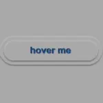
Hey there! 😃 In today’s technology-obsessed world, it’s absolutely crucial to master the art of creating an amazing circular clickable button. A well-crafted button not only enhances the presentation but also elevates the user experience. Maximizing user attention is vital, and buttons are, most of the time, the key to achieving this goal. By utilizing the right tools and techniques, we can create a visually stunning and functionally efficient button that not only looks great but also delivers an unforgettable user experience. 🆙
Let’s collaborate to create a standout button that supports user-friendliness.
HTML Basic Structure
To start building our button, we need to organize our HTML code snippet. The first step is to create a parent element that will act as the base of our button. We give this element the class name .button-base. Next, we need to add a child element within this parent element to serve as the clickable part of the button. We give this child element the class name .clicable-part. It’s important to nest these two elements within a button HTML element as it’s more semantic, better for accessibility, and behaves correctly in forms and interactive contexts by default. Additionally, we need to create the shadow effect for our button, so we add one more HTML element with the class name .button-shadow.
We move forward with CSS and make our button fresh and stylish! For this post, I am writing CSS using Sass syntax. If you would like to convert it to vanilla CSS and don’t already know how, I’d suggest you use an online Sass — CSS converter.
Prepare the body for the clickable button
Firstly, we apply a color (#f5f5f5 – dark gray) to the body by setting the background-color. Additionally, we want to center our button. For that reason, we are using the flex method.
body {background-color: #f5f5f5;display: flex;align-items: center;justify-content: center;}
SCSS
Create the base of the clickable button
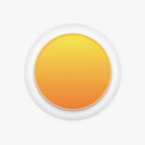
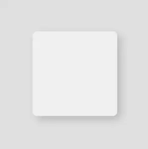
To create the base of our button, we start by making a square with a width and height of 200 pixels. Then, we make it rounded by adding a border-radius of 50%. We use a pale white color (#f9f9f9) for the button’s background-color. To give it a more stylish look, we add some shadows using the box-shadow property.
Finally, we add the flex method to prepare the space to position the clickable part of the button in the center of the base.
📍 As seen in the code snippet below, we need to include border: none and background-color: transparent properties in the button element to ensure it will display only the styles we define. These properties remove the browser’s default styles that typically come with. As a result, it provides us with a clean starting point, so the button appears exactly as we’ve styled it, with no unexpected borders or colors.
In the image below, you can see the base of the button we just created.
Create the clickable part of the button
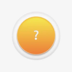
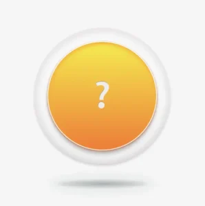
To create the clickable part of our button, we first set the height and width to 80%. Then, we apply a border-radius: inherit to make it appear rounded and follow the shape of the base. For the background of the button, we use a linear-gradient that adds depth as it gives a bright orange color at the top that gradually becomes darker as it goes down. To add a more stylish look, we include shadows using the box-shadow property.
To add content at the top of the clickable part of a button, we can use a :before pseudoelement. Inside the pseudoelement, we can insert the desired symbol or text using the content property. For instance, in our case, a question mark emoticon (?) has been used, but you can use any symbol or text you prefer. It’s important to note that the flex method in the .clickable-part class is essential, as it centers the mark correctly.
The image below displays the content we added on the top of the clickable part of the button.
Add the hover effect on the top of the clickable button
To add a hover effect, we set the :hover CSS property. For the cursor, I prefer using the value pointer (👆), but feel free to choose any other style from the plethora of options available here. Finally, I apply the filter: brightness and increase it to 110%. This makes our button appear brighter whenever the mouse hovers over it. ✨
The gif below demonstrates how the hover effect (👆) appears.
Activate the clickable part of the button
To make your button fully functional, you need to activate its clickable part. We can achieve this by adding the :active property. Next, we give it a background with a linear-gradient that creates a sense of depth by providing a bright magenta color at the top that gradually becomes darker as it goes down. To make it more visually appealing, we include shadows using the box-shadow property.
The following gif displays the activated clickable area.
Update the button’s content when it is activated
To enhance the user experience, we can dynamically update the content displayed on the button when it’s clicked. This may be accomplished by adding a :before pseudoelement and inserting the desired content into the content property. In our case, we will display a white heart (🤍) when the button is clicked.
With just a single click, this button comes to life and reveals its beautiful new content in the following gif (🤍) – it’s an absolute must-see!! 😎
Add the shadow effect to the clickable button
The last thing we have to do is add the shadow effect. We create a rectangle with 140 pixels width and 15 pixels height. Next, we give it a rounded shape by setting the border-radius property to 50%. To create a background that looks like it becomes lighter as it goes toward outer space, we use the radial-gradient technique and make the center darker. To make the whole thing look smoother, we add shadows with the box-shadow property.
Finally, we utilize the position: absolute combined with the top, left, and transform properties to move it below the button and center it.
.shadow {width: 140px;height: 15px;border-radius: 50%;background: radial-gradient(#a7aaaa, #b2b7b710%, #eaeded);box-shadow: -5px0px10px5px#eaeded, /* shadow right side */5px0px10px5px#eaeded, /* shadow left side */inset-5px0px5px#eaeded, /* inset shadow right side */inset5px0px5px#eaeded; /* inset shadow left side */position: absolute;top: 520px;left: 50%;transform: translate(-50%);}
SCSS
The button’s captivating shadow effect is truly impressive and adds to the overall appeal. Hope you find it enjoyable and engaging. Thank you for your attention. 🥳
Below is the full code referenced in this blog post. Feel free to copy and use it in your own projects. If you have any questions or encounter any issues, don’t hesitate to reach out for assistance. You can easily copy the desired code snippet by clicking on the copy icon, located in the top-right corner of each snippet.
Shadows are a simple yet powerful way to add depth and dimension. In programming, the box shadow CSS property creates a sense of layering by simulating light or darkness on HTML elements. The inset box-shadow, which we will analyze in this post, creates a shadow inside the element, giving it a “pressed” or “embossed” effect that adds even more visual interest to your design.
📌 Always remember that inset shadows are drawn inside the box, hence they can reduce the space inside the element.
For better clarity, let’s begin by breaking down the box-shadow property as each value controls and affects a specific part of how the shadow appears.
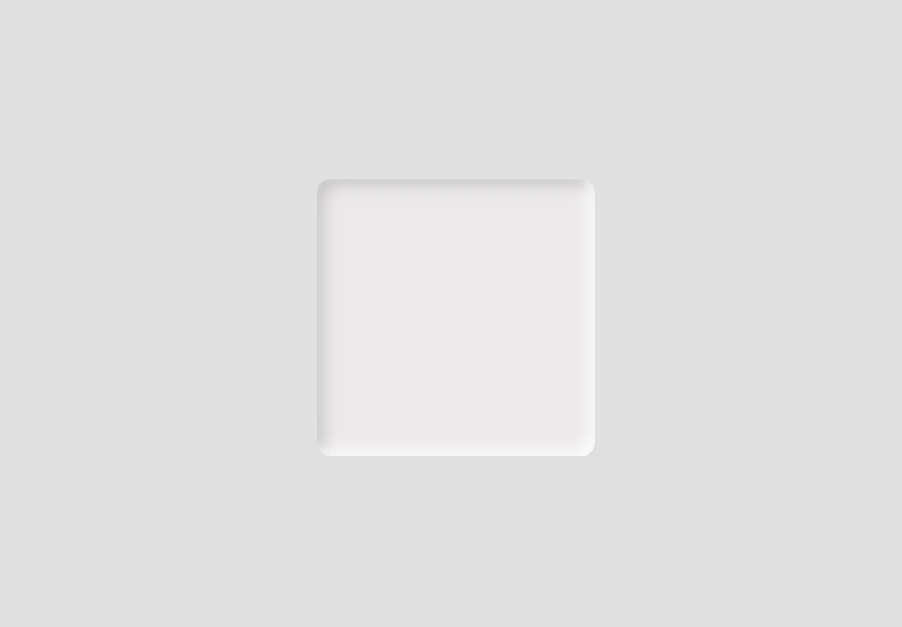
We begin by establishing the basic HTML and CSS structure. Our shadow will be housed within a gray ⬜ box, but for now, we need to adjust the body element so it can properly center and display our box.
Now it’s time to create a rounded box with a light gray background color to gently contrast with the body. This subtle color difference helps us clearly see the shadow effect in action.
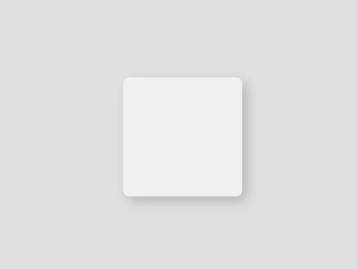
We finalize our work with the shadow effect. Let’s break down our code to make it clear:
inset -5px -5px 10px rgba(255, 255, 255, 0.8) ➤ It positions the shadow at the bottom-right, with a softly blurred, which makes the edges smooth rather than sharp. Also, the shadow is white and mostly visible.
inset 5px 5px 10px rgba(50, 50, 50, 0.2) ➤ It positions the shadow at the top-left, we have again a softly blurred effect, and the shadow now is dark gray and very soft.
If you use spread-radius with inset shadows, it can make the shadow spread too much, making it look too big or messy. By leaving it out, the shadow stays close to the edges, keeping the effect clean and focused.
Working with different shades of gray adds a touch of elegance and also elevates your work. Additionally, it maintains a clean and modern design. 🚀 ✨ So, what’s your take? Do you agree with me, or do you see it in a whole different way? 😄
Hello there! Want to make your HTML elements stand out a bit more? The box-shadow property in CSS lets you add depth by creating a shadow around elements — almost like they’re floating off the page.
To get a better idea of how box-shadow works, let’s look at the different values it takes. Each one controls a part of how the shadow shows up on the page:
🔸 position • offset-X: moves the shadow horizontally • offset-Y: moves the shadow vertically
🔸 blur-radius • Makes the shadow’s edges smoother
🔸 spread-radius • Expands the size of the shadow
🔸 color • Sets the color and transparency using rgba()
Setting spread-radius to 0 keeps the shadow tightly within the blur area. This helps control how far the shadow extends, making it feel like it’s coming from a specific direction — useful when you want the shadow to appear only on certain sides.
We begin by creating the basic HTML and CSS structure. We will work with a light gray ⬜ box and adjust the layout to perfectly center it within the body element.
We create a simple, rounded box that will hold our shadow effect. It has a very light gray background color to contrast with the body, and helps us visualize the effect.
We finalize our work with the shadow effect. First, we shift the shadow bottom and to the right (8px 8px), then we give a nice soft blur of 20px and a semi-transparent gray (rgba(120, 120, 120, 0.4)). And just like that, this simple line of code makes our box look 3D. How amazing! 😃
Now your box stands out! ✨ Try it yourself or try something different! Want the shadow above the box and to the left? Use negative values. Want it sharper? Decrease the blur. Maybe with a little bit of color? 🎨 Play with the rgba() values.
/* Alternative shadow example */.box { .../* offset-X | offset-Y | blur-radius | spread-radius | color */box-shadow: -5px-5px5px0rgba(220, 100, 180, 0.3);}
CSS
Box shadows do more than just enhance appearance — they help direct attention and add gentle emphasis where it counts. Utilizing this small detail intentionally can have a significant impact on your overall design. ✨ 😃
😃 In this post, we are beyond excited to show you how to create a breathtaking water drop effect that stands on top of a text using only the power of CSS.
We will confidently guide you through every single step of the process, from the initial design phase to the final finishing touches.
In addition, we will share expert tips on how to masterfully experiment with CSS properties to achieve the perfect shape and reflection effects. So, let’s jump right in and create something fantastic together!
Setting up the HTML structure for the water drop effect
We begin with the HTML structure. We need to create an element with the class name .wrapper. This element will have two child elements. The first child element will be dedicated to the text, so we give a suitable class name, such as .text. Similarly, we should name the second child element with a class name that reflects its purpose, such as .drop.
Our top priority right now is to work on the second child element, which is our amazing drop. 💦 🤓 Once we’re done with that, we’ll move on to the text.
Styling the water drop effect with CSS
We move forward with the CSS structure. To create a flexible layout for our project, we set the flex property on the element with the class .wrapper. This will allow us to easily adjust the size and position of its child elements.
Additionally, we added the position: relative property to the wrapper to establish a reference point for any absolutely positioned child elements later on in the project. By doing this, we have prepared the necessary space and layout for easier and more precise positioning of elements.
How to create a realistic water drop effect in CSS
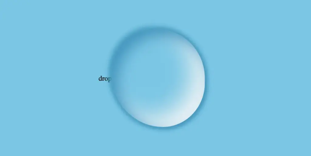
Firstly, we must select a color for the body, setting the background-color. Keep in mind that the same color must be used for the drop. Therefore, it is crucial to choose the color carefully. 🌈
Then, we need to establish the dimensions and borders. Thus, we will set the width and height and then adjust the border-radius property to create a slightly rounded shape.
Next, we maintain the body’s background-color by adjusting the transparency of the drop. In that way, our drop inherits the color of the body.
Additionally, we add the box-shadow property which is the most crucial part as it is responsible for creating a realistic-looking drop that appears three-dimensional. Without it, the element may appear flat and lacking in depth. 😉 So, don’t be afraid to experiment with different shadow settings until you find the right combination that works for you. It’s truly amazing how much of a difference a small tweak-change can make!
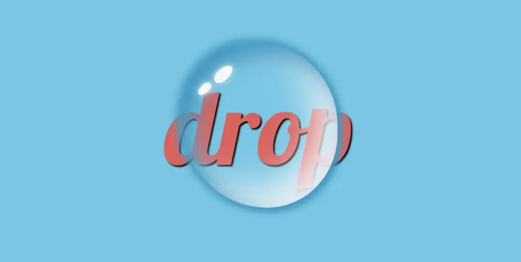
body {background-color: #5fc8e8; /* a light shade of blue */}.wrapper { ...}.drop {width: 210px;height: 220px;background-color: transparent;border-radius: 45%50%45%55%;box-shadow: -2px-2px10px5px#0f9dc4, /* all around */5px5px10px#0796c1, /* top & right */inset15px15px30px#0796c1, /* inset top & right */inset-29px-20px50px#f2f4f7; /* inset left & bottom */}
CSS
This is what is rendered on the screen. For now, we continue to ignore the text and focus on our almost-ready 🙃 amazing drop!
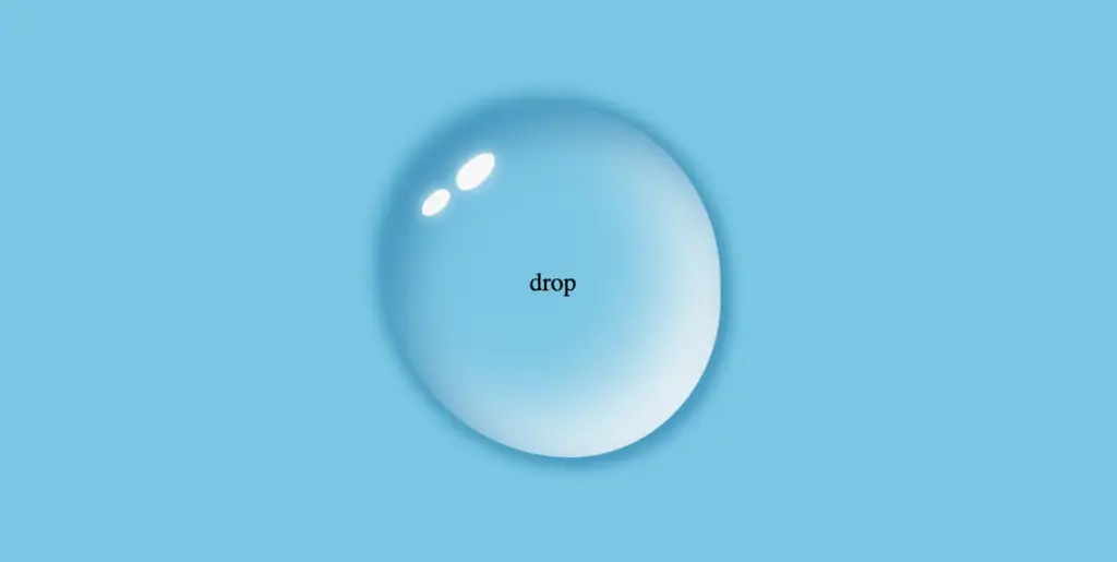
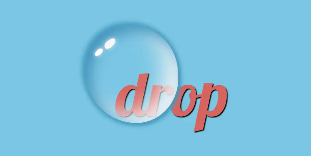
By utilizing the CSS properties :before and :after, we can create two new pseudo-elements without the need for additional HTML markup. This technique can be used to create a glancing effect. Both pseudo-elements have the same properties but with different values, which helps to differentiate them from each other and create a unique look.
We can effortlessly position those glances within the drop element by using the CSS property position: absolute.
Then, we specify their dimensions and the color by setting the width, height and background-color.
Next, we modify the shadows and their shape by setting the box-shadow and border-radius .
After that, we use the top and left properties to position them. Finally, to make them look even more realistic, we can add some rotation by using the transform: rotate() property.
After adding these glances, we can see our final drop. 💦 ✨ It’s pretty cool, isn’t it?
Adjusting text appearance beneath the water drop effect
We are moving forward by adjusting our text and making it more visually appealing. I have selected the “Lobster” font-family with a font size of 140 pixels, a warm dark orange, and a black 2pxtext-shadow.
In case we wish to use another font-family than the usual ones, we need to insert it into our CSS. We do so by setting the @import url(...). Ensure this statement is placed at the beginning of your CSS code snippet, just like I did. Check below. 👇
@importurl('https://fonts.googleapis.com/css?family=Lobster');.text {font-family: "Lobster", sans-serif;font-size: 140px;color: #e85a5a; /* a shade of warm dark orange */text-shadow: 2px2px2pxblack;}
CSS
Take a closer look now. The text appears so different behind the water drop. It’s quite impressive, don’t you think? 😎
One last step, and we are ready! We are free to place our text wherever we want by setting the position: absolute , top and leftCSS properties in order to move it.
We also have full control over the placement of our text. This can be achieved by confidently adjusting the CSS properties position: absolute , top and left.
The final step is complete! Congratulations! 🥳 You have the option to either keep the original design or create your own. Please remember that the most important thing is to combine the appropriate colors 🌈 and shadows; this is necessary for our drop to look realistic.
Full CSS water drop effect code (copy & paste ready)
Below is the full code referenced in this blog post. Feel free to copy and use it in your own projects. If you have any questions or encounter any issues, don’t hesitate to reach out for assistance. You can easily copy the desired code snippet by clicking on the copy icon, located in the top-right corner of each snippet.
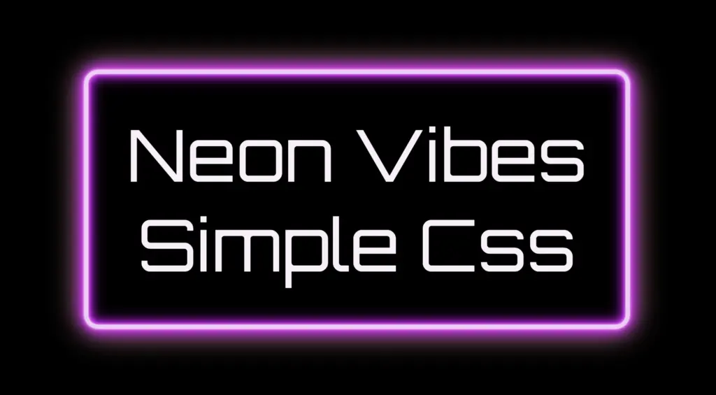
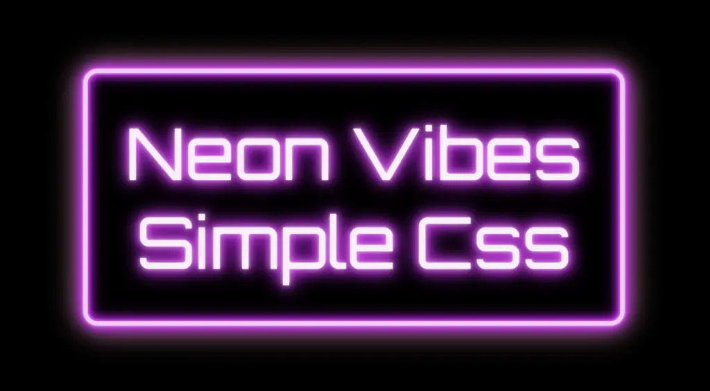
The neon effect in web design brings that bold, electric vibe that grabs attention right away. ⚡🌈 Inspired by real-life neon signs, which I’m sure you have seen outside bars, arcades, or glowing up city streets, it mixes retro charm with a modern twist. It adds personality and mood, turning plain text or shapes into glowing, eye-catching pieces. That soft glow, the depth, those bright color fades — they take a simple design and make it feel alive, as if you have just travelled back in time. 🌟 And the best part? You can pull it off with just HTML and CSS. No images, no JavaScript. 🥳
Setting the stage: Basic HTML structure
To begin creating this effect, we’ll start with a basic HTML structure and add custom CSS later. Think of the HTML <div> we are using, as the frame for a neon sign, and the text as the glowing message inside it.
From there, we move to CSS structure. We import a Google font named “Orbitron”, a futuristic style text, that fits perfectly for our neon effect.
Then we lay the foundation: we structure the page by setting the body to fill the entire viewport and using display: flexto center our neon box both vertically and horizontally. Finally, we add a solid black background — it doesn’t look like much yet, but it sets the perfect stage for the neon glow we’ll add soon, creating strong contrast just like a real sign glowing in the dark.
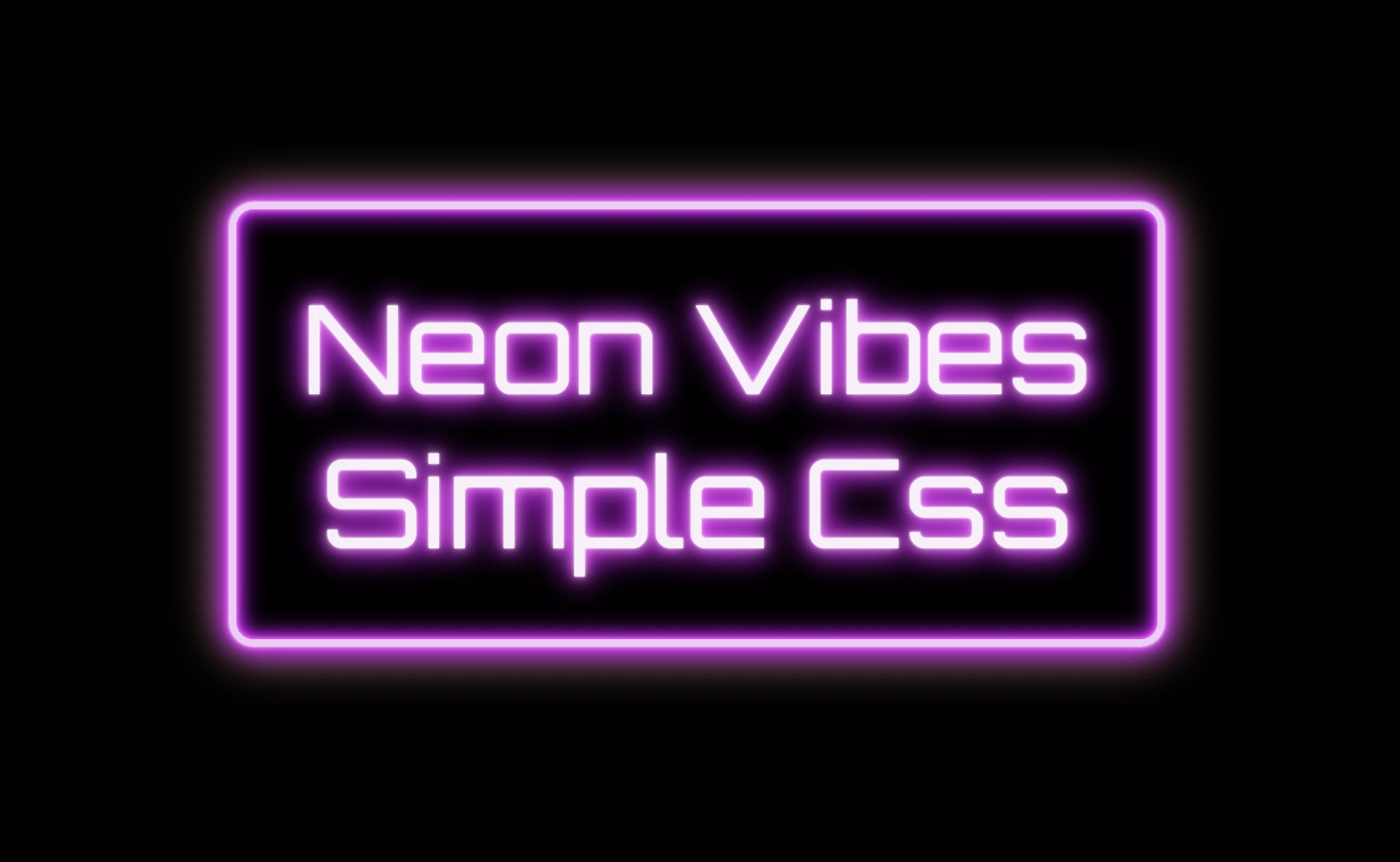
The .neon-effect class is used to create the main structure of the glowing sign. It defines a rectangular box with a width of 700px and a height of 300px, along with a soft, rounded border in light violet (#f4cbf8).
The box uses display: flex to perfectly center the text both vertically and horizontally. The font is set to Orbitron, giving the text a bold, futuristic style, and its size is large (80px) to make it stand out.
The text color is a very light pink (#faf0fb), which will work beautifully once we add glowing shadow effects around it. For now, this creates a clean and centered base — the canvas for our neon sign.
Glowing borders: Neon frame with box-shadow
To create the glowing neon frame around the box, we use layered box-shadow effects. The outer shadows softly expand in multiple directions, starting with white and transitioning through vivid shades of pink, magenta, and purple. This gives the impression of light softly spreading from the edges.
We also include a subtle touch of yellow-gold hue, blending into the glow. This not only adds visual warmth but also gives a nostalgic nod to vintage neon signs, bringing up the charm of the old days while keeping the overall look fresh and vibrant.
Equally important is the second group, which uses the inset keyword and adds an inner glow that shines inside the box. These inset shadows create depth and give the illusion that the light is not only around the sign, but also glowing from within. The combination of outer and inset shadows is essential for achieving a rich, realistic neon effect.
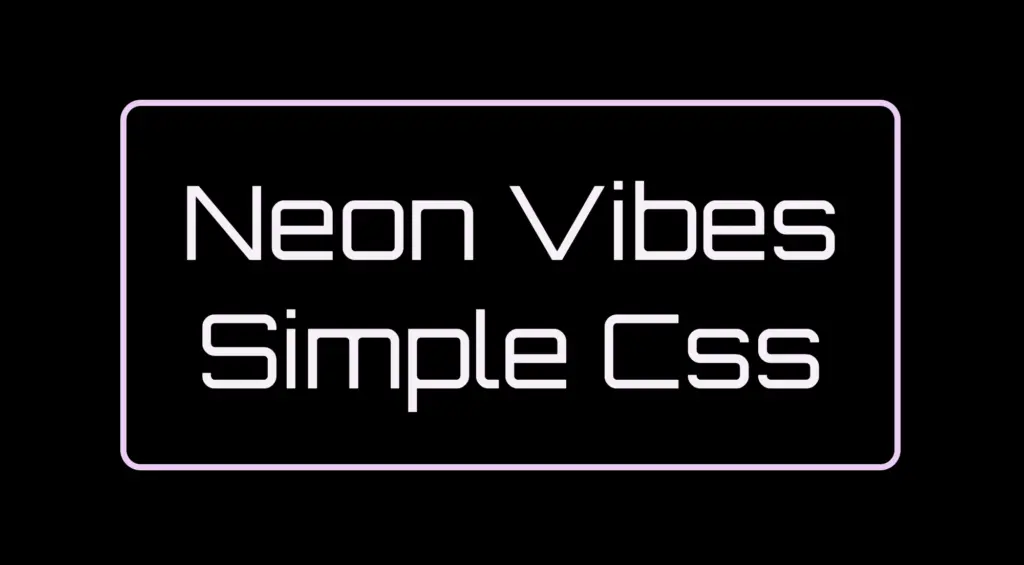
Illuminated Text: Neon Glow with Text-Shadow
To create the glowing effect around the text, we use the same method, multiple layers of text-shadow. Each shadow in your code adds a soft light in a different shade: from white and light pink to vibrant magenta, deep purple.
.neon-effect { ...text-shadow:002px#fff, /* white */0010px#ff99ff, /* light pink */0020px#ff33ff, /* magenta */0026px#cc00ff, /* violet */0024px#9900cc, /* deep purple */0032px#660066; /* dark purple *}
CSS
These layered shadows build a rich glow around each letter, giving it a strong, radiant presence against the dark background. The variation in color and blur size creates depth, making the text appear as if it’s lit from within, just like real neon tubing.
Neon effects in web design are a powerful way to grab attention. ✨ They combine vivid colors, glowing shadows, and sharp contrast to mimic the iconic look of neon signs. Whether you’re aiming for a modern tech vibe or a nostalgic retro feel, neon brings style and energy. Using CSS alone, we can recreate this classic visual with precision and creativity — no electricity needed! 💡😎
Hello everybody! 😃 In the vibrant world of web design, the CSS grayscale filter stands as a powerful tool for transforming the visual appearance of images and elements on a webpage. The CSS filter: grayscale(%) works like a magic wand. 🪄 It takes colorful images or elements and converts them into grayscale shades. This effect is great for creating different aesthetics, whether you’re aiming for a vintage charm or a sleek, modern look. The CSS grayscale filter can be applied to various elements, including images, SVGs, emojis, font icons, and even HTML elements.
Let’s explore what makes this filter so enchanting! 🧙♀️
Grayscale on HTML elements
First of all, it’s important to note that the CSS grayscale filter may not be noticeable on black and white elements. Since grayscale shifts colors toward shades of gray, and black is already the darkest shade, while white stays the lightest one. Secondly, always keep in mind that the filter: grayscale(100%) can make text completely dark, which may not be ideal when placed on black or very dark backgrounds.
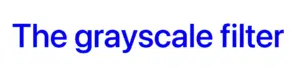
Using the CSS grayscale filter on fonts
We will begin by applying grayscale to fonts. In the following example, I used blue text, instead of the default black to emphasize the contrast and make the transition to shades of gray more noticeable.
This reinforces an important point we discussed earlier—this effect stands out most when applied to bright, colored elements rather than dark, black, or near-black ones. 😉
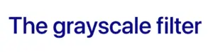
<h1>The grayscale filter</h1>
HTML
h1 {color: blue;filter: grayscale(50%);}
CSS
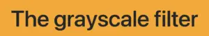
With the HTML code, we define an <h1> heading element, then CSS sets its text color to blue and applies a grayscale filter to it. Initially, we use 50% intensity, creating a visual effect where the blue text is converted to grayscale while still retaining a subtle hint of its original blue color.
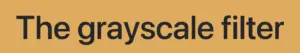
To clarify, there is another example where we use the filter at 90%, resulting in the title appearing in different shades of gray. This time, it’s very close to being completely dark gray—almost black, we could say.
without grayscale(%)
with grayscale(50%)
with grayscale(90%)
Grayscale on background color
In this case, instead of setting the text color, we will set the background-color. Now, take a look at the orange. In the first image, we see a bright orange, while in the second, the color appears slightly darker (grayish) due to the filter: grayscale(40%) property.
We can also apply the grayscale filter to various HTML elements, such as <span>, <li>, and more. Below, I’ve provided two examples for clarity: the first applies the filter to the content of two <span> elements, while the second applies it to the bullets of an <li>.
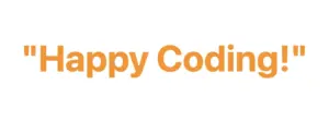
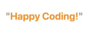
In the HTML snippet, we create a <div> element with the class .grayscale-elements. Inside this <div>, we add two <span> elements, each containing a double quote to frame the text “Happy Coding!” These <span> elements allow us to style the quotes differently from the rest of the text.
In the associated CSS code, .grayscale-elements is targeting elements with this class. The text color of the elements with this class is set to orange. Additionally, the CSS rules target the <span> elements inside and apply an 80% grayscale filter to them, rendering the quotes in shades of gray while retaining the orange color for the rest of the content.
ul {list-style: none; /* remove the default bullets */}li {color: magenta; /* change lists default (black) color */}li:before {content: "•"; /* add new bullets and now can be manipulatated */margin-right: 10px; /* add distance between the bullet and the text */filter: grayscale(50%); /* one of our examples */}
CSS
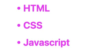
In the HTML snippet, we create an unordered list (<ul>) containing three list items (<li>).
In the associated CSS, we target the <ul> element and remove the default bullets using list-style: none. Then, we style the list items (<li>), setting their text color to magenta.
The :beforepseudo-element is used to add custom bullets before each list item. In this case, the bullet is a solid circle (•) created using the content property. The margin-right property adds spacing between the bullet and the text.
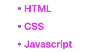
Additionally, a grayscale effect is applied to the bullets using filter: grayscale(50%), reducing their original color intensity by 50%. This results in bullets appearing in varying shades of gray while still retaining some color.
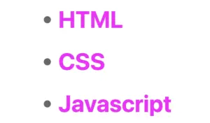
For an even more pronounced effect, I also applied a 90% grayscale filter (filter: grayscale(90%)), making the bullets appear even closer to a true gray. 😃
without grayscale(%)
with grayscale(50%)
with grayscale(90%)
CSS Grayscale on images
Another way to take advantage of this CSS property is by applying the filter: grayscale to images, transforming their colors into shades of gray. This is particularly useful for making pictures look old-fashioned or monochromatic when they create a black and white effect.
The given code creates an HTML div element with the class .grayscale-image.
This class is styled using CSS to display a grayscale image. The background of the div is set to an image from the provided URL using the background-image property. The image is styled to not repeat (background-repeat: no-repeat) and to cover the entire area (background-size: cover). Its dimensions are set to width of 300 pixels and height of 400 pixels. Finally, a grayscale filter is applied to the image using the filter property, with a 70% level of grayscale.
I did something similar for the following image but set the grayscale to 100%, which transformed the image entirely into shades of gray. Impressive, isn’t it? 🙃
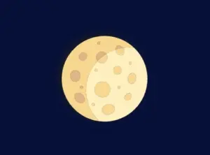
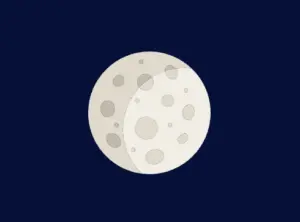
The grayscale filter can be applied to SVG elements too, making them appear in varying shades of gray. This is often used to achieve a specific artistic or design effect. For instance, we applied this filter to an SVG of a moon, which was originally yellow, transforming it into a soft gray and adding a unique visual dimension. Awesome, right?
svg {filter: grayscale(80%);}
CSS
In our CSS code, we apply a filter with a specified grayscale percentage of 80%. This effect transforms the originally yellow image into varying shades of gray while preserving a subtle hint of its original color.
🔖 Remember that directly targeting the <svg> element may cause conflicts 🌩 ⚡ if multiple SVGs exist in the document.
without grayscale(%)
with grayscale(80%)
CSS Grayscale in Font Awesome
Another way to use this CSS trick is with Font Awesome icons. In the example below, we will see how to do it the correct way. Since Font Awesome icons start off as black, it’s important to apply color before adding the grayscale effect.
<iclass="fa-solid fa-camera-retro"></i>
HTML
.fa-camera-retro {color: red;filter: grayscale(70%);}/* OR - if you want a more generic rule */i {color: red;filter: grayscale(70%);}
CSS
In this HTM snippet, we have an <i> element with the class .fa-solid .fa-camera-retro from the Font Awesome library.
The corresponding CSS styles .fa-camera-retro, setting the icon’s color to red and applying a 70% grayscale effect. Additionally, we can also target the <i> element directly for a more generic customization.
🔖 Remember, if you use the Font Awesome.fa-solid class for multiple icons or style them via <i>, all instances will inherit the same appearance, affecting every <i> element in the document.
without grayscale
with grayscale(70%)
CSS Grayscale on emoticons using pseudo-elements
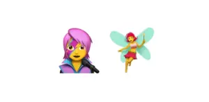
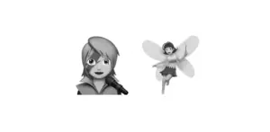
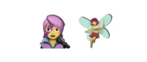
Next, we move on to the beloved emoticons (like 🤗, 😇, etc.). It’s a cool way to make them look a bit different! Below I crafted an example to give a clearer explanation. I chose two of my favorite emoticons 👩🎤 🧚♀️. Feel free to choose your personal favorite and enjoy the experience!! Always remember that the more vivid the colors, the stronger and more noticeable the effect will be! Good luck! 🌟 🥳
The HTML snippet creates a div element with the class .grayscale-emoticons.
The linked CSS code, .grayscale-emoticons uses the :before pseudo-element to insert content. The inserted content consists of two emojis: “👩🎤” and “🧚♀️.” Additionally, a grayscale filter of 40% is applied, giving the emojis a subtle grayscale effect, displaying them in varying shades of gray while retaining some of their original colors.
I also included another example with a 100% grayscale filter, which completely removes all colors, rendering the emojis entirely in grayscale.
without grayscale
with grayscale(40%)
with grayscale(100%)
Using shades of gray adds a nice touch, but if you want to go the extra mile 🏃♀️, try adding shadows to elements for a more realistic look. Building on our previous example, I’ve incorporated the fantastic drop-shadow CSS property to achieve this. Pretty cool, right! 😃
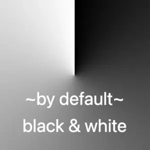
Hello! 😃 CSS conic gradient techniques are a fantastic way to add colorful, creative flair to your designs. Today, we’re diving into the enchanting world of conic-gradient in CSS — a type of gradient where colors transition in a circular or conical pattern around a central point (either the default center or one you define within the element).
This powerful technique allows you to blend and combine colors in unique ways, creating artistic and visually striking effects. Plus, it’s perfect for building things like pie charts for presentations — no extra libraries needed!
In addition to conic-gradient CSS also offers linear-gradient and radial-gradient techniques. 🌈✨ They all have a starting and an ending point, giving us the flexibility to control the direction and flow of the gradient. It is essential to blend at least two colors, but we can blend even more, creating smooth transitions or distinct shifts between them based on our needs.
Ready to unlock 🗝 the art and practical uses of conical gradients? Let’s jump into this creative adventure! 💻
What is a conic gradient?
A CSS conic gradient is a styling technique used in CSS to create a color transition that radiates from a central point in a circular or conical pattern. It allows you to specify different color stops and angles, leading to a visually pleasing gradient effect for backgrounds or other elements on a webpage.
There are many variations and creative ways to use conic gradients — and we’ll be exploring them in the next sections!
Understanding the default direction of a CSS conic gradient
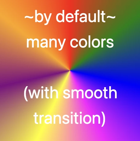
So, let’s begin with the default direction, which is clockwise. To create a conic gradient, we need at least two colors. Below, I’ve prepared some examples to show exactly what I mean.
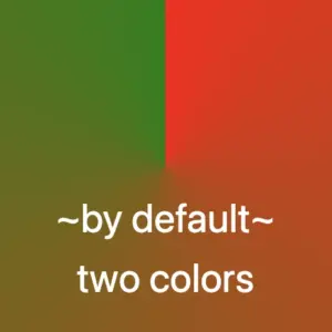
/* blend two colors */.conic-two-colors {background-image: conic-gradient(red, green);}
/* blend black and white */.conic-black-white {background-image: conic-gradient(black, white);}
CSS
🔖 Keep in mind that if we want to achieve a seamless transition between the last and first color, we have two ways to achieve this:
First, we can choose intermediate colors between the starting and ending colors. For example, in our case, we can pick colors from #FF4C00 (orange) to #FF6E00 (a reddish shade), creating a smooth blend from orange to red.
The second option, which is simpler, involves repeating the same color at both ends. In this example, we’ll use red as the repeated color.
Here’s a simple code snippet to help illustrate this.
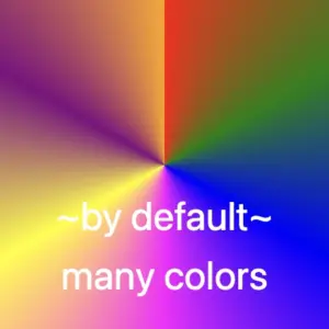
/* using specific colors when blending */.conic-smooth-option-a {background-image: conic-gradient(red, green, blue, magenta, yellow, purple, orange, #FF4C00, #FF6E00);}/* using the same color at both ends */.conic-smooth-option-b {background-image: conic-gradient(red, green, blue, magenta, yellow, purple, orange, red);}
CSS
Positioning the center of a CSS conic gradient
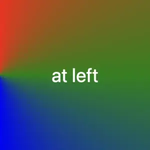
Move the center to the sides
In CSS, conic gradients provide the flexibility to reposition the gradient’s center anywhere within the container. This enables precise alignment with a specific side, whether or not you use percentage values (%) or define specific color stops.
In the following examples, we’ll focus on positioning the gradient center along different sides of the container.
/* Gradient starting from the left */.conic-left-point {background-image: conic-gradient(at left, red, green, blue, purple, orange);}
CSS
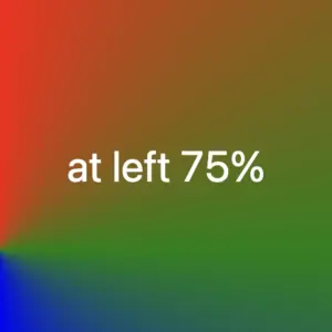
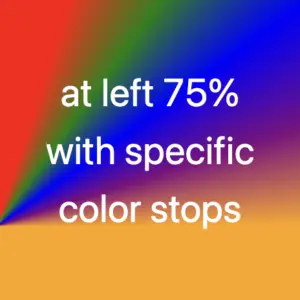
/* Starting point at 75% from the left */.conic-using-percentage {background-image: conic-gradient(at left75%, red, green, blue, purple, orange);}
CSS
/* Gradient starting at 75% left with defined color stops */.conic-specific-stops {background-image: conic-gradient(at left75%, red5%, green10%, blue15%, purple20%, orange25%);}
CSS
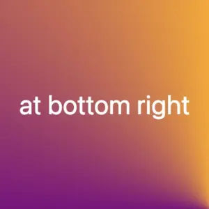
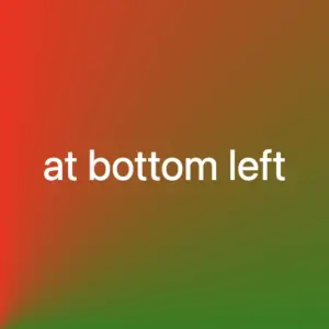
Move the center to the corners
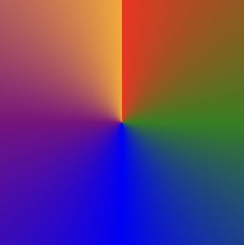
Building on the previous section, we can also move the gradient’s center to the corners of the container. Conic gradients in CSS allow this kind of precise positioning, with or without using color stops, giving you even more layout control.
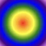
Without color stops
The following code snippet shows a gradient that starts from the center point of our element with red color, transitions to green, then blue, followed by purple, ending with orange, creating a smooth, circular gradient effect.
Below we can see how the previous gradient can break into different pieces the position we choose for the gradient’s center.
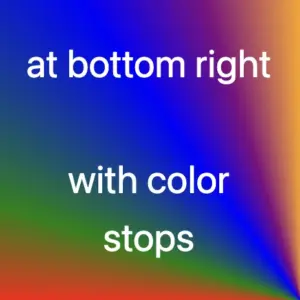
The CSS code snippet .conic-corner-bottom-rightstarts at the bottom right corner of our element and smoothly transitions through red, green, blue, purple, and orange creating a visually appealing color blend.
The reason you’re only seeing the purple and orange colors is due to the angle of the gradient in relation to the element.
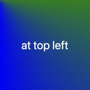
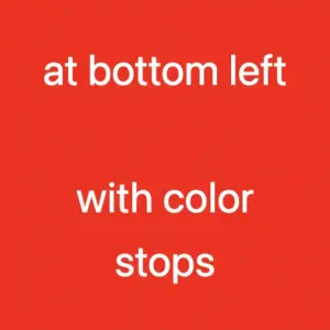
I followed the same steps with .conic-bottom-left-corner, and as the angle changes, the red and green colors become visible. The same goes for .conic-top-right-corner, where we can now see shades of blue and purple. Finally, by setting the center to the top left using .conic-top-left-corner, green and blue come into view. How cool is that! 🥳
Imagine that changing the center position and adjusting the angle is like zooming in on the gradient — revealing each quarter of the circle more closely, one at a time. 🔍 It’s like examining the gradient through a magnifying glass as you explore each corner!
With color stops
Let’s take a look at the following example, where color stops are used to better control how and where each color appears within the conic gradient.
Color stops let you define specific points along the gradient circle where a color should begin or end. This gives you greater precision over the flow of colors, rather than relying on an even, automatic blend. For example:
In this case, red takes up the majority of the gradient — up to 75% — and the remaining colors (green, blue, purple, and orange) appear in quicker succession toward the end.
We can also combine color stops with center positioning to control not only when colors appear but also where they start. For instance:
These examples show how positioning the gradient center at different corners—while using color stops—can dramatically affect which parts of the gradient are visible. You’ll notice that the dominant red still takes the lead, but the visibility of the other colors shifts depending on the corner you choose.
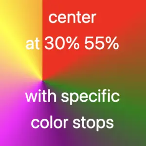
Moving the center inside the element
We continue with a really powerful feature of conic gradients: the ability to position the center anywhere inside the element. This opens up even more creative possibilities — and of course, you’re free to use color stops with these custom center positions as well.
Below, I’ve prepared two examples.
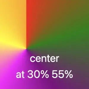
In the first one, the gradient starts from a point located 30% across and 55% down the element. It then smoothly transitions through different colors: red, green, purple, magenta, yellow, and orange. Imagine a color wheel starting from red and going around in order, stopping at each of these colors along the way.
In the second one, the gradient starts from a point 30% across and 55% down the element — but this time, it uses color stops to control exactly where each color appears.
Then it transitions through different color stops: red 15%, green 30%, purple 45%, magenta 60%, yellow 90%, and finally orange at 100%. You can use my example or you are free to create your own. I chose these values based on what felt right to me—but feel free to experiment and create your own version. It’s totally up to you
Changing the starting angle of a CSS conic gradient
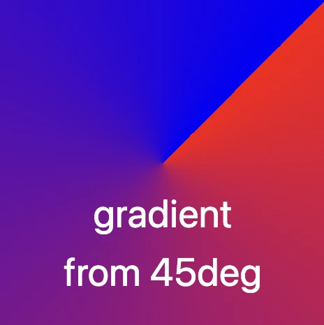
Let’s move forward and explore another option we have another option available with conic gradients, as we are free to start the gradient from different points.
In our example the gradient starts at 45 degrees to the right, moving from red to blue. This means the colors change smoothly in a circular motion, like a slice of pie with red at the starting edge and blue at the finishing point.
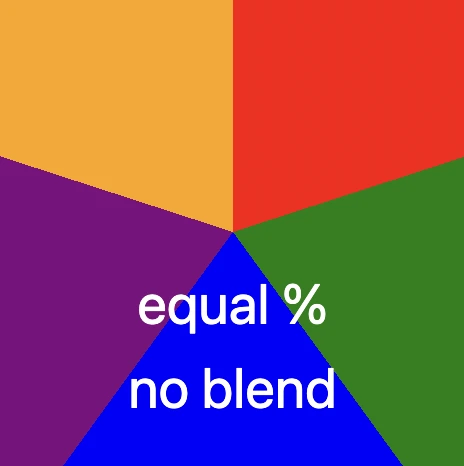
Another option is to use a non-blend gradient technique. In the following code snippet, the gradient starts with the color red at the top of the circle and makes sharp, sudden transitions to the next colors — green, blue, purple, and finally orange. Each color occupies a distinct 20% slice of the circle, creating a step-like, segmented pattern with no smooth blending between sections. It’s like a colorful pie chart made of equal parts..
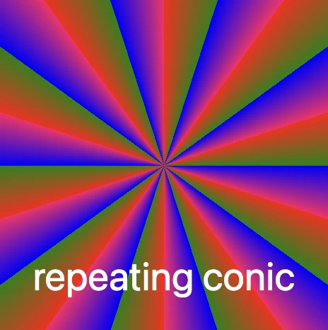
The repeating-conic-gradient is a function that is used to repeat the conic gradient. Below are two examples that show just how flexible and creative conic gradients can be.
1. Repeating every 10%: The gradient originates from the center of the element. It begins with red at the center, then transitions to green at 5%, and to blue shortly after. At 10%, it shifts to a specific pinkish-red color defined by the hex code #ff1064. These color transitions repeat every 10% of the circle, creating a series of concentric slices that cycle outward in a continuous, colorful loop.
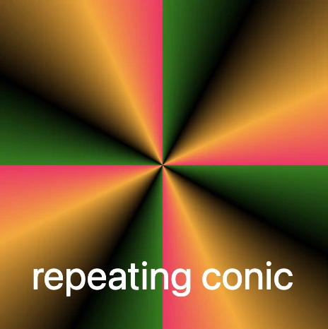
2. Repeating every 25%: In this example, the gradient is centered within the element and begins with green at the starting point. As it radiates outward, it shifts to black at 8%, then to orange at 18%, and finally to a vibrant pinkish-red at 25% (using the hex code #ff1064). These defined color stops repeat every 25% of the circle, creating a looping, segmented pattern that spirals out from the center in consistent, colorful sections.
Always bear in mind that, to create a harmonious and uniform repeating conic gradient, it’s important to maintain consistent spacing and carefully planned distances between color stops.
In the image below, we can observe that green, black, and orange are each repeated three times, while the color #ff1064 (a shade of pinkish-red) appears only twice. This happens because the total space occupied by all the defined color stops—green, black, orange, and #ff1064—adds up to 40% of the conic gradient.
This setup ensures that the entire pattern repeats in a balanced way: the specified colors take up 40% of the gradient, and the remaining 60% of the circle is evenly distributed across the repeated pattern. The result is a visually pleasing and consistent circular repetition.
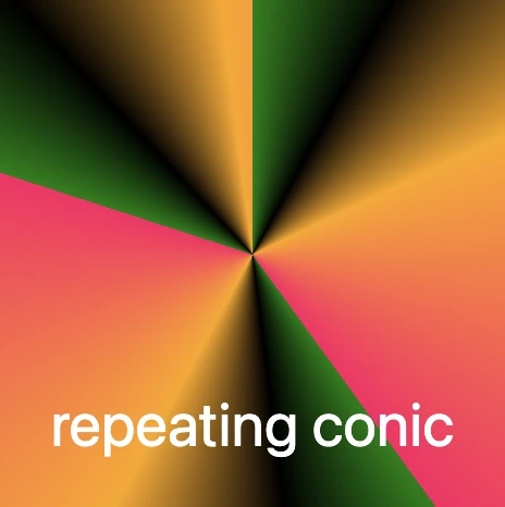
The following code snippet defines the color stops and their positions for this repeating conic gradient:
green: This is the starting color of the gradient. It begins right at the 0% mark.
black 8%: The next color in the gradient is black, and it starts at 8%.
orange 18%: Orange follows next, starting at 18% of the circle.
#ff1064 40%: Finally, the last color in the gradient is a shade of pinkish-red specified by the hexadecimal color code #ff1064, and it starts at 40% of the circle’s circumference.
After that, the pattern repeats, starting again from green and continuing through the same sequence.
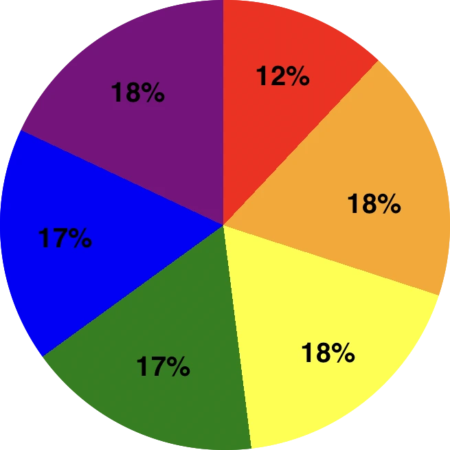
Creating amazing pie charts with CSS conic gradient
The CSS conic function is used to create conic gradient backgrounds. A conic gradient creates a circular gradient, much like a pie chart, with or without different color stops defining different sections of the circle.
And here’s the fun part: we’re completely free to shape our gradients into perfect circles using CSS! Just apply a border-radius of 50%, and you can create stunning pie-style visuals. 😃
red 0%, red 12% This pair defines a red segment that starts at 0% and ends at 12% of the circle. This represents the first segment of the conic gradient.
orange 12%, orange 30%: Starts right after red and continues to 30%, forming the orange slice.
yellow 30%, yellow 48%, green 48%, green 65%, and blue 65%, blue 82% each define their own slices.
The last segment, purple 82%, purple 100%, defines the purple segment that starts at 82% and goes all the way to 100% of the circle. This represents the last segment of the conic gradient.
Each pair of color stops defines a slice of the CSS conic gradient, making it easy to visualize proportions — just like a pie chart!
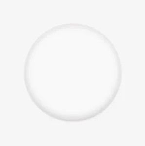
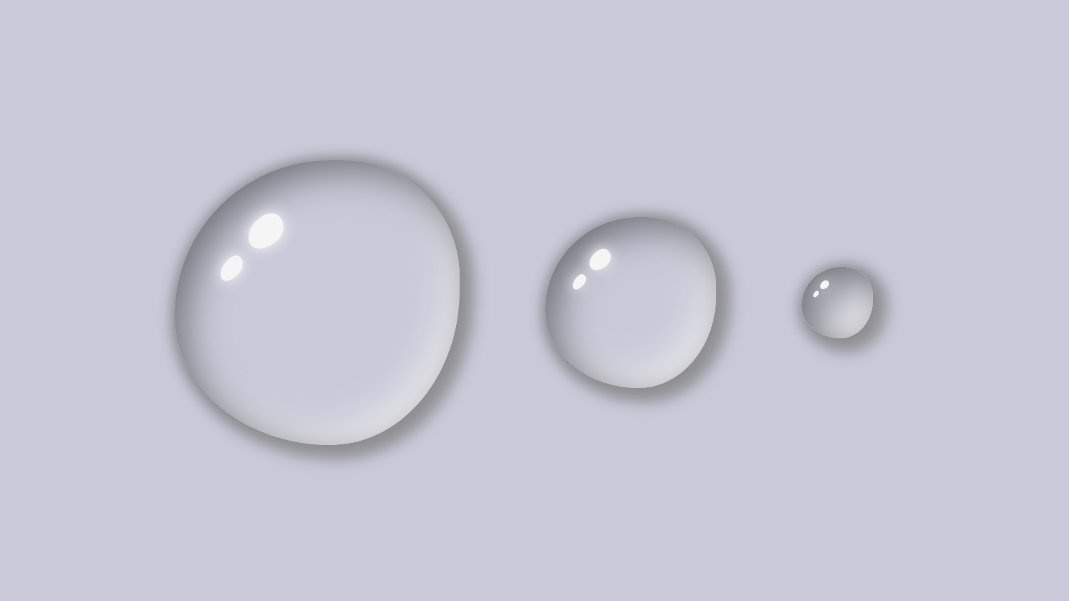
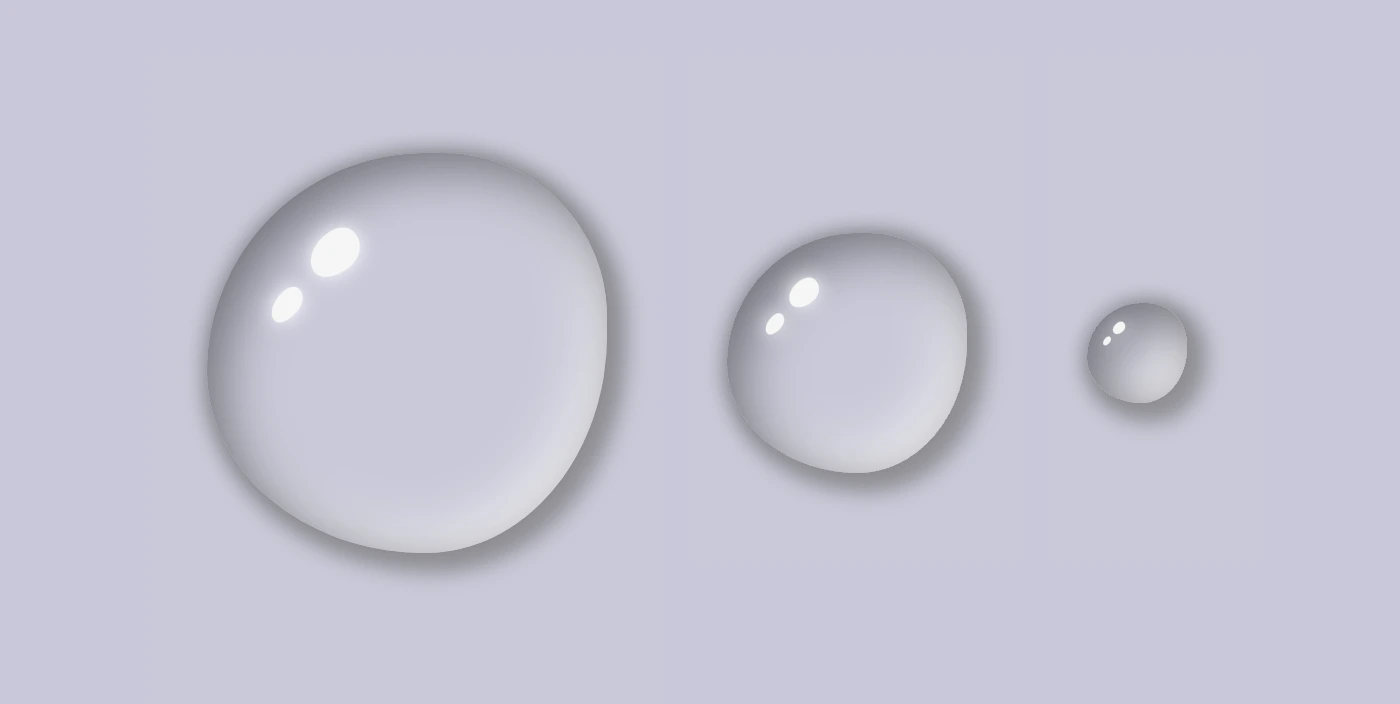
Hello there! 😃 In this post, we will guide you drop-by-drop ☔ on how to make a beautiful gray CSS water drop using only CSS. We will take you through the entire process, from the initial design to the final touches, and provide useful tips on how to adjust CSS properties to achieve the perfect shape and reflection effects. By the end, you will have created stunning water drops that will capture everyone’s attention.
So, let’s begin this adventure and dive in! 🤿
HTML Structure for water drop
First, we create an HTML element with a class name that reflects the intended purpose and makes it easily identifiable. In our example, we will use the class name .drop 💦✨.
<divclass="drop"></div>
HTML
CSS Structure for a water drop
We continue working on our CSS code. First, we have to create our drop, then we will add some shine as a way to look more natural, and finally, we will add two more drops with different sizes. Let the game begin! ⏳
Create the water drop
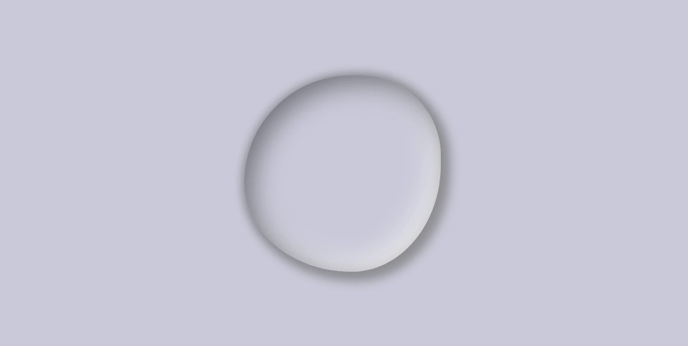
We begin by setting the background-color for our body, giving it a light shade of grayish blue (#c9c9db). As drops are transparent, picking the appropriate color as their background is essential.
Then we define the dimensions and borders of our drop, setting the width and height and adjusting the border-radius property to create a slightly rounded shape. (It’s important to note that nothing will be rendered on the screen at this stage as our drop does not have any color yet. 💬 )
Next, we work on creating the drop effect using only shadows, which can be quite challenging. To achieve this, we have to make sure that the drop’s background-color is set to transparent.
body {background-color: #c9c9db; /* a light shade of grayish blue */}.drop {width: 200px;height: 200px;border-radius: 60%45%50%60%/60%45%60%50%;background-color: transparent;}
CSS
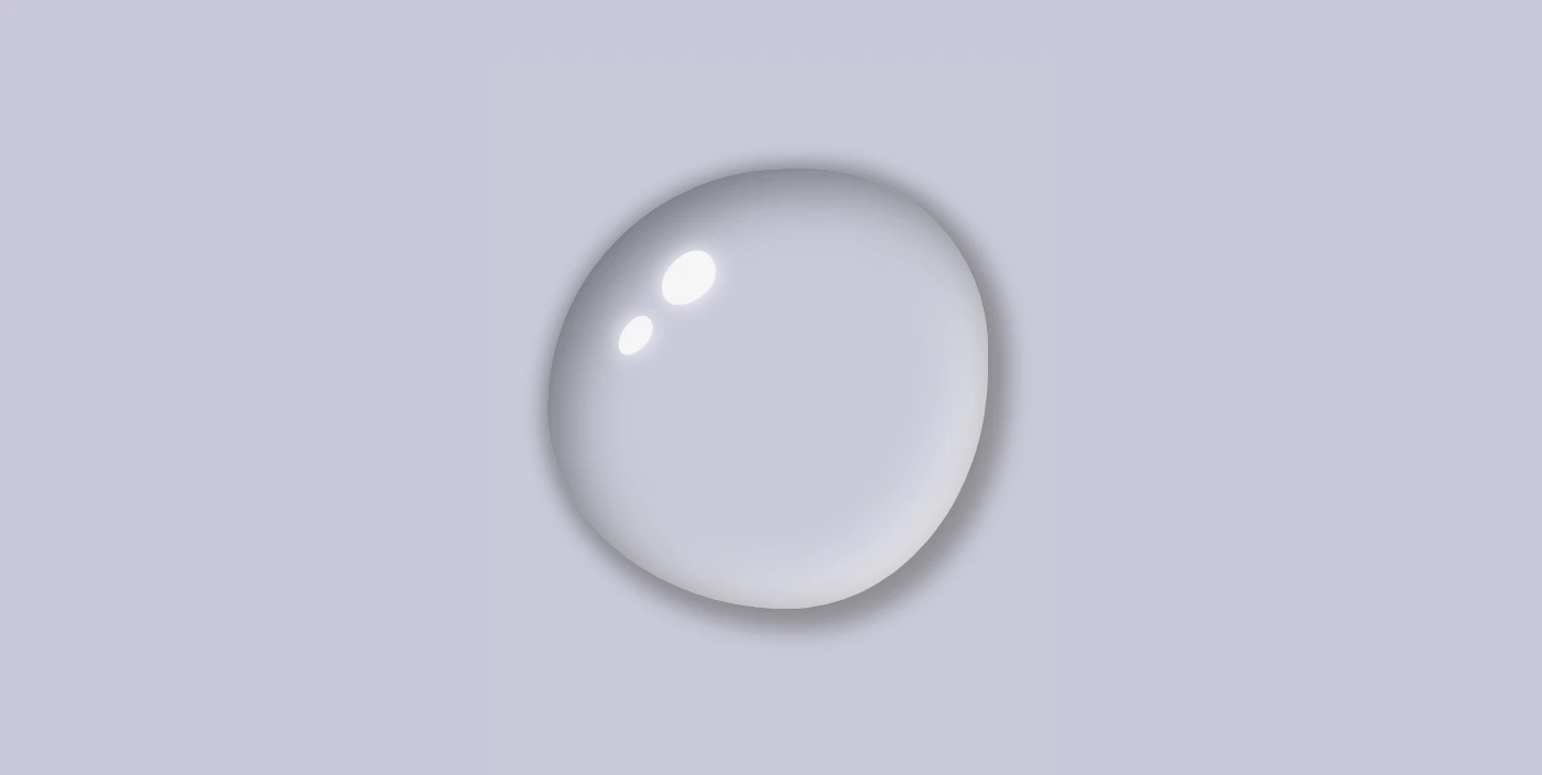
We finalize by adding the box-shadow property to create the CSS water drop effect. We have to play somehow 🎨 🖌 with our color shades till we manage 🤯 to create the perfect result. 💪
body {background-color: #c9c9db; /* a light shade of grayish blue */}.drop { ...box-shadow: 0010px#8a8a8e, /* top-right-left-bottom */5px5px10px5px#929297, /* left & bottom */inset8px8px25px#71717a, /* inset top & right */inset-8px-8px25px#f2f2f2; /* inset left & bottom */}
CSS
Below, we can see what has been displayed on the screen up to this point.
Adding shine to the CSS water drop
With the power of CSS, we can bring to life unique and captivating shine ✨ effects using the :before and : after pseudo-elements. By setting different values for the same properties, we can create a distinctive and inspiring look that will leave a lasting impression on our audience.
To position the shine inside the drop element, we utilize the position: relative to our class and then the position: absolute to our pseudoelements.
Then, we specify the dimensions and colors for the shine by setting the width, height and background-color.
Next, we add the box-shadow and border-radius properties that allow us to create smooth and rounded corners on the shiny elements. This can give the design a softer look.
After that, we use the top and left properties to position them.
Finally, to make them look even more realistic, we can add some rotation by using the transform: rotate() property.
In the following image, you can see the changes applied: a shiny, grey water drop!
Here we are! Our stunning water drops are displayed on the screen! Nice, isn’t it? 😎 (We added some extra styling, not included in our code snippets, to center our drops, in case you are wondering about the last screenshot)
Hope you found it useful. Utilize these techniques to create stunning water drops that will impress your audience. Have fun experimenting with different colors, shades, and shapes to produce your own unique designs! 💦 ✨ Happy coding!
Below is the full code referenced in this blog post, along with some extra stylings to enhance our final result. Feel free to copy and use it in your own projects. If you have any questions or encounter any issues, don’t hesitate to reach out for assistance in the comments section. You can easily copy the desired code snippet by clicking on the copy icon located in the top-right corner of each snippet.
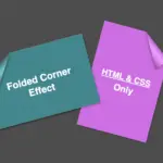
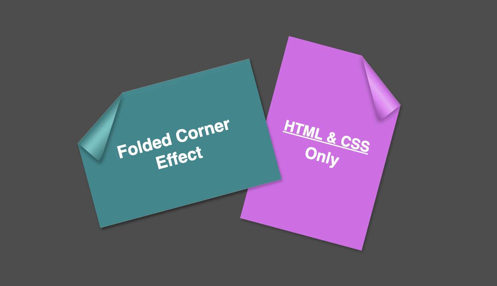
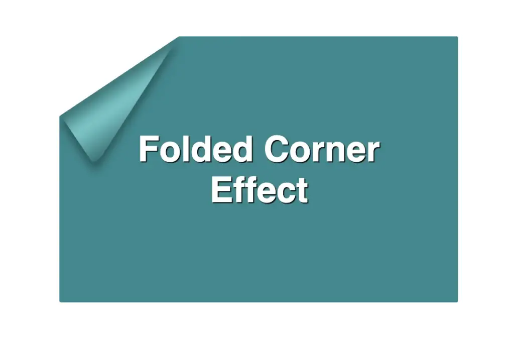
Hello everybody! I’m excited to share a cool folded corner effect I created using just HTML and CSS. This eye-catching design adds a dynamic flair, creating a realistic illusion that enhances your webpage’s visual appeal —no images, extra scripts, or complex code required. How awesome is that? 😎
Elements with clip-path do not take shadows directly. Instead, they must be nested within a container to inherit its shadows.
Creating the folded corner effect using pseudo-element
We’ll start by using the :before pseudo-element combined with the clip-path property to create the folded corner effect. The main element, which contains the pseudo-element, is styled with a filter property to apply a shadow. This shadow is then inherited by the pseudo-element, allowing the folded corner to display a subtle, realistic shadow as well. This technique keeps the design lightweight and visually appealing.
Basic HTML structure for the folded corner effect
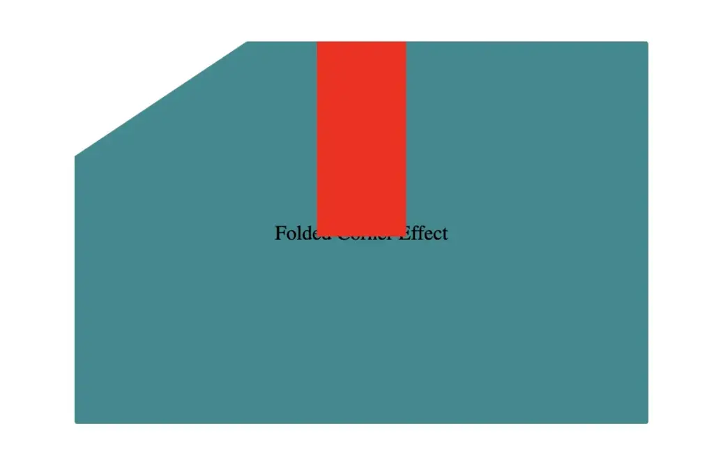
The HTML code snippet creates a card layout. We have a parent element with the class .card, housing two child elements: the first with the class .title for the card’s title, and the second with the class .folded-corner to apply the folded corner effect via CSS.
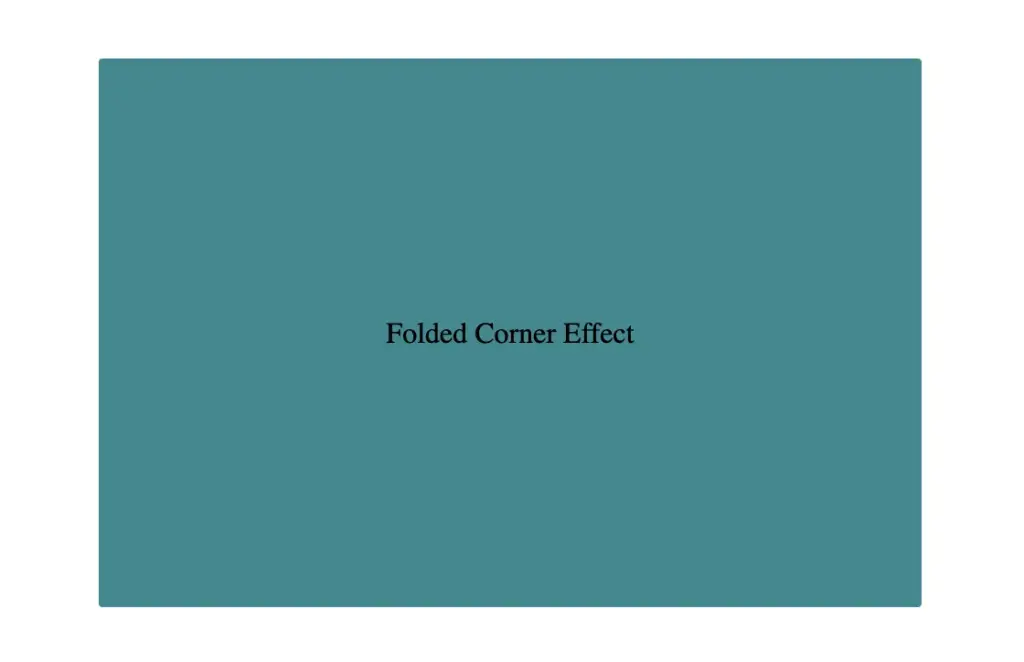
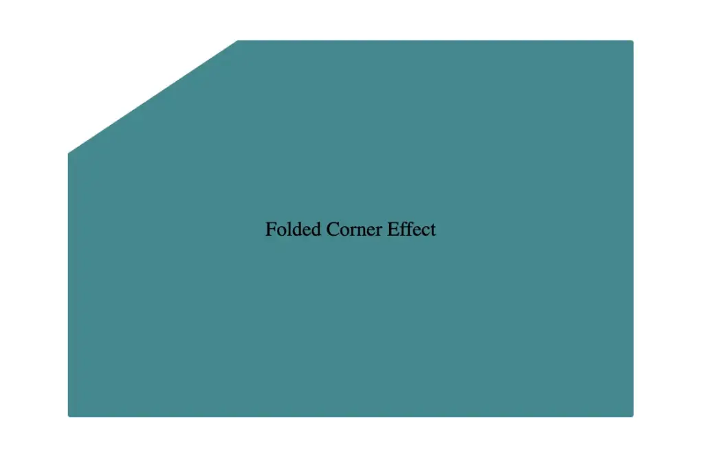
Starting with the CSS, we define a horizontal rectangle by setting the width to 450px and the height to 300px, along with a subtle 2px border-radius for slightly rounded corners. The background color is set to #228a90, a rich teal with greenish-blue tones that gives the card a fresh, modern look.
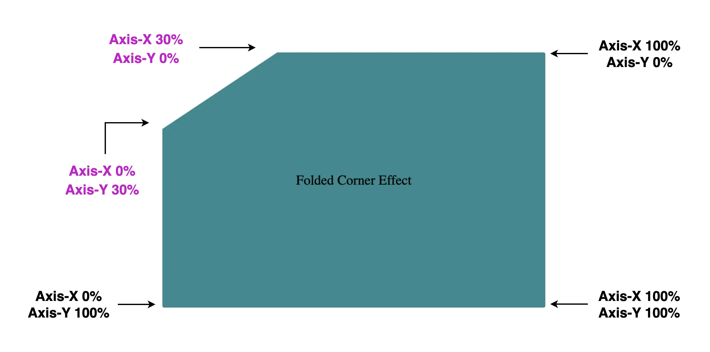
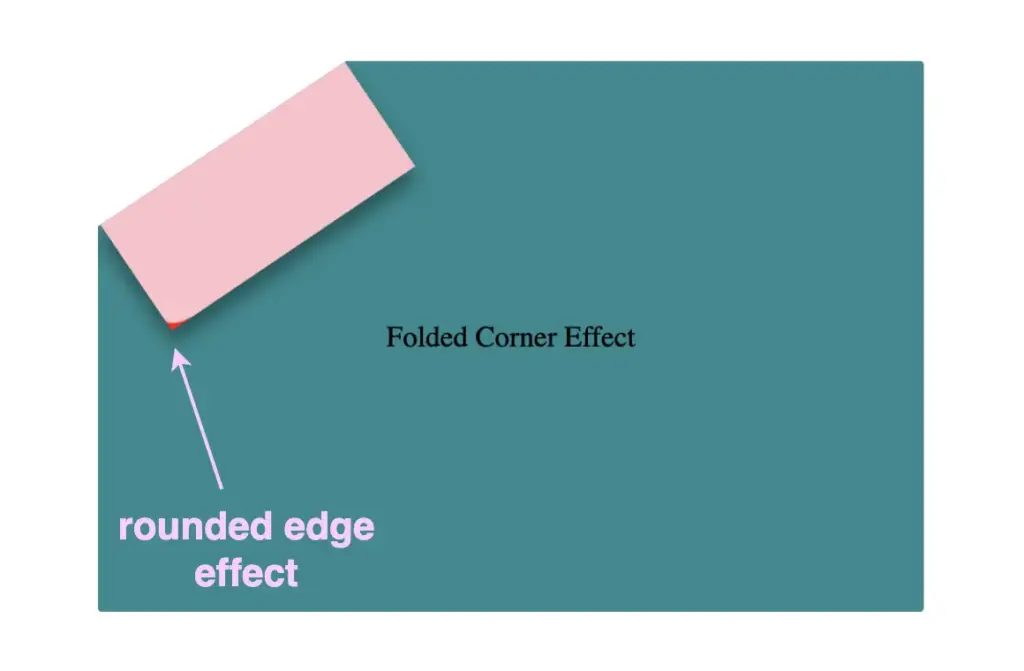
Then we use the clip-path property to shape the desired paper corner for the folded effect. I chose the top-left corner, but you can select any one you prefer by adjusting the corresponding points in the clip-path: polygon() function.
Think of the corners in this order: top-left, top-right, bottom-right, bottom-left (clockwise).
Remember to split each selected corner into two coordinates to get the right look (watch those 👇 magenta measurements! 😉) Take into account that the top-left corner has both Axis-X and Axis-Y on 0%.
Finally, adding position:relative does not change something in our effect but prepares us for future positioning adjustments. As for centering our elements using flexbox—it’s purely for aesthetic purposes, helping keep everything visually balanced and neat. Below, we can see what is rendered on the screen for now. Pretty cool, right!? 😃
CSS structure: how to create the folded corner effect
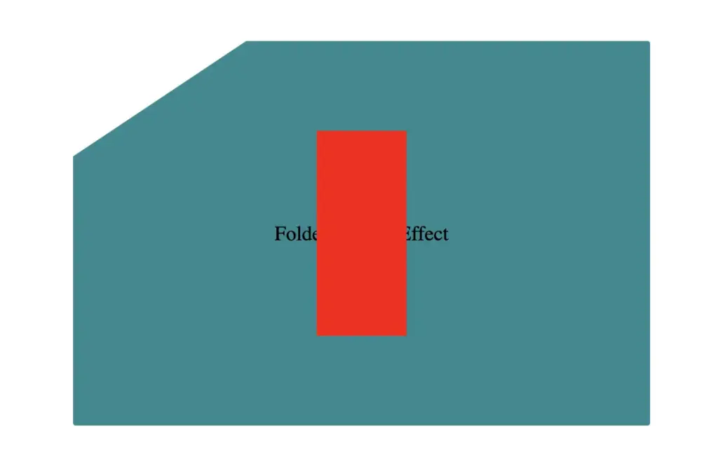
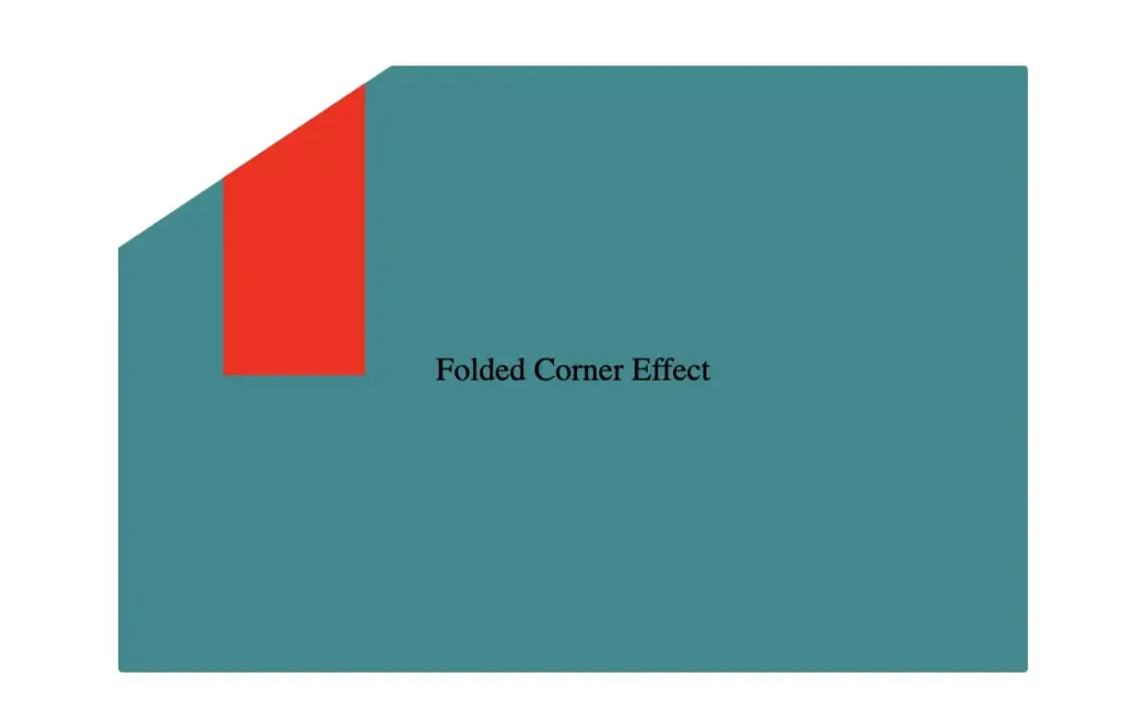
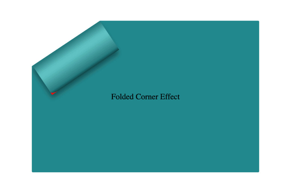
To continue building our effect, we’ll use the folder-corner child element to create a second rectangle within the parent card element. This element will act as the folded piece of paper. We’ll give it a width of 70px and a height of 160px.
For now, we’ll use a red background color to help us visualize its position and behavior more clearly—this will be updated to its final color later. We’ll also apply position: absolute to enable precise positioning.
Next, we continue with positioning. We use the top and left properties to move the .folded-corner element closer to the clipped corner, then apply the transform property to rotate it into place.
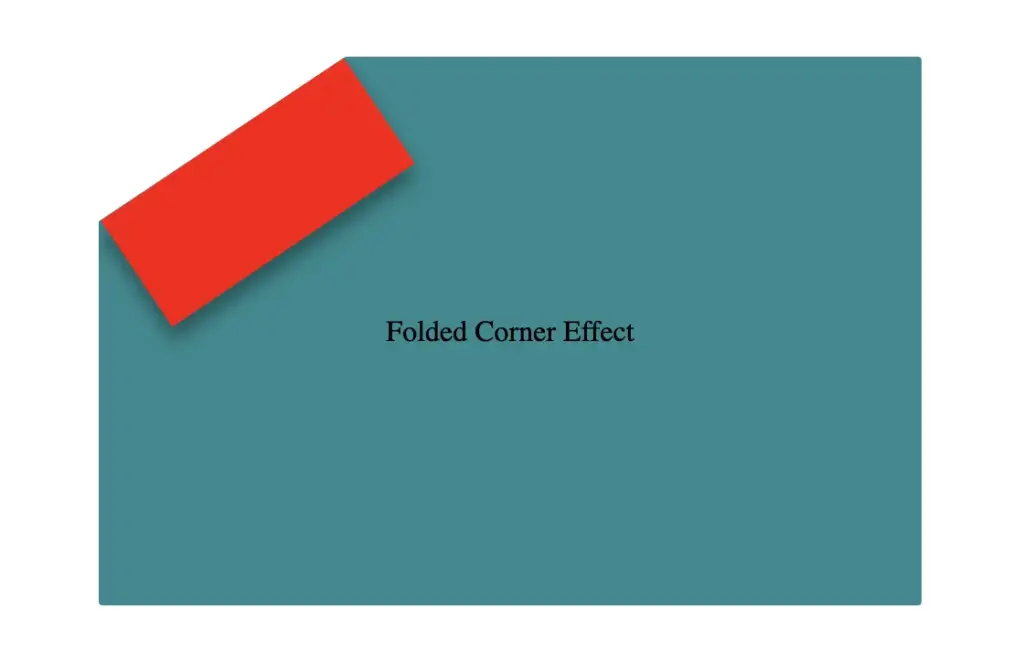
Finally, adding the filter property is essential for completing our effect. As mentioned earlier, applying a shadow directly to an element with a clip-path isn’t possible — so the solution is to create an additional element that can hold the shadow.
To do this, we’ll add a :before pseudo-element with the same dimensions as our folded corner. This allows us to recreate the folded shape and apply the shadow to it — adding depth and realism to the folded corner effect. 😎
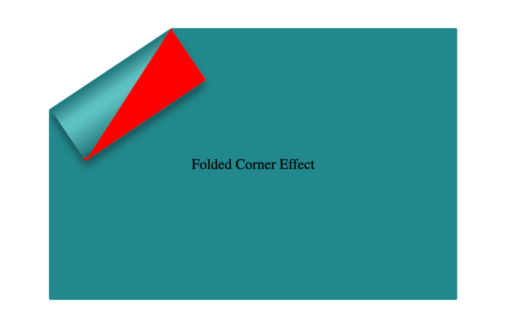
Next, we move forward by using the beforepseudo-element with the content property and set its position to absolute for precise placement within the parent. We want this pseudo-element to have the exact dimensions as the parent, so we set both its width and height to 100%, something that allows it to inherit the parent’s size.
For now, we apply a pink background to help visualize the structure. Finally, we add a border-radius of 10% to the bottom corner, which softens the edge and creates a smoother, more realistic folded appearance.
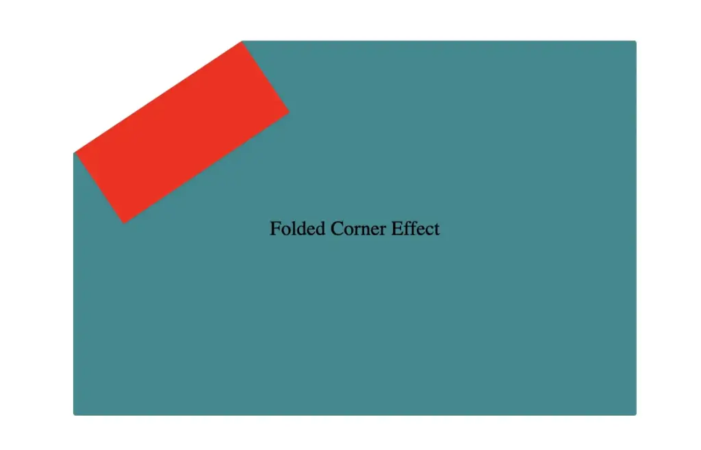
Next, we replace the pink background with a smooth linear gradient. We choose colors similar to the main hue but make them darker towards the edges and lighter in the center. This gradient effect enhances the appearance by making the center appear brighter and polish. ✨
To complete the shape, we apply the clip-path: polygon(0% -2%, 0% 100%, 100% 100%) property. This is essential for transforming the before pseudo-element —which starts as a rectangle, just like its parent—into a triangle.
In simple words, this clipping path reshapes the element into the desired triangular form. 🥳
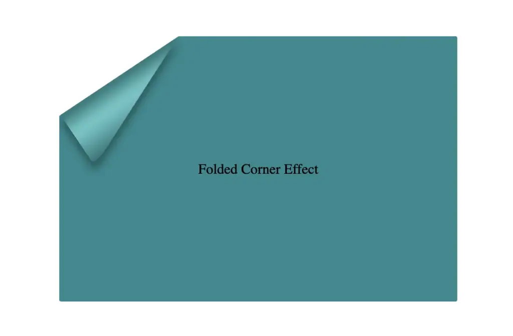
The last step is to turn back to the parent element with the class .folded-corner and “remove” the red rectangle from view by simply replacing the red background-color with a transparent value. As we can see, the :before pseudoelement inherits its parent shadow effect while the parent becomes invisible.
We can enhance the title to have a more eye-cathing result. Applying a white background-color, increasing the font-size, and adding a subtle black text-shadow will make the title stand out beautifully, elevating the overall design. 📄 ✨
If you have any questions or run into any issues, don’t hesitate to reach out in the comments below — I’m happy to help. You can easily copy any code snippet by clicking the copy icon in the top-right corner of each block.
Summary
We started by creating the paper and cutting its corner. Then, we set the clip-path property to define the shape and positioned the folded-corner element precisely over the clipped area. After that, we enhanced the styling with background gradients that match the paper’s tone, and wrapped up by polishing the effect for a clean, realistic look. 📄 ✨
Wishing you the best of luck in all your creative endeavors! 😃
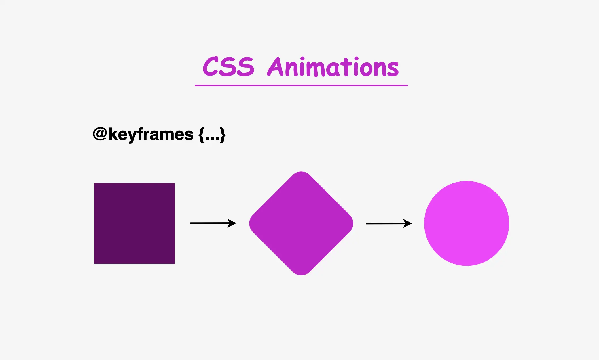
Hi there! 😃 In today’s post, we will analyze the amazing CSS @keyframes rule, an incredibly powerful tool for creating complex and visually stunning animations on web pages.
Understanding keyframes in CSS
In simple terms, keyframes define the animation’s behavior through a series of @keyframes which describes how the animation should change over time. Each keyframe represents a specific point in time, and CSS smoothly transitions between these keyframes to create fluid motion.
With CSS keyframes, you can create various animations, from simple color changes to complex effects like movements and transformations. By combining keyframes with other CSS properties, we can control timing and duration and create dynamic and visually engaging websites.
I will provide you with an example that will make this at-rule crystal clear. 🧐 Let’s grab a ☕ and move forward. 🚀 We’ve got this!
Example of keyframes in CSS: The theory behind it
The details of the animation will depend on the specific effect we want to achieve. Let’s say we want to create an animation where a square ⬛ transforms into a circle ⚫ and then back into a square ⬛ again. Additionally, the color 🌈 of the shape changes during the animation, and there are some movements and transitions involved. It might seem massive and confusing, 😰 but we can deal with it step by step together! 🛠
For our animation to be smooth and realistic, we need to define the @keyframes. The first keyframe serves as the starting point (0%), followed by intermediate points and the final keyframe (100%) that marks the end of the animation and returns to the starting point.
😃The following code snippet provides a quick example of a keyframes structure in action.
@keyframesname-of-keyframe { 0% { ... /* this is the starting point */ } 50% { ... /* this is one intermediate point */ } 100% { ... /* this is the ending point */ }}
CSS
To create these keyframes, you’ll need to use CSS animation properties, such as animation-name, animation-duration, animation-iteration-count and animation-delay. Theanimation-nameproperty connects the animation to its keyframes, while the other properties control how long it should last, how it should behave over time, and whether it has a delay before starting..
Once you’ve defined your keyframes and animation properties, CSS will automatically insert transitions between the keyframes to create smooth changes. This means you don’t need to worry about manual calculations. CSS takes care of it for you. Cool huh!? 😎 ✨
Example of keyframes in CSS: Practical implementation
As we already mentioned, we will work with a box. We need to start with the HTML code and create a <div> element that has the class name .box.
<divclass="box"></div>
HTML
Then, in our CSS code, we define the basic properties. It should be a square with a width and height of 200 pixels, and we’ll keep the background-color simple by using black for now.
This is what is rendered on the screen for now. A simple black box.
Applying animation effects to the elements
To add animation effects to our <div> element, we need to define the animation properties of our class .box. We set the animation-name, which is the animation’s name, then the animation-duration, which is the time the animation takes to complete, and finally, the animation-iteration-count which declares how many times the animation should repeat.
Then, we create our animation using the @keyframes rule, where we can specify the values of the CSS properties at different points during the animation. The most crucial step is to link the animation to our element. We do this by using the animation-name property and assigning it to the same name we defined earlier. In our case my-animation.
Transforming colors and shapes with animation
We will start our transformations by working with colors and shapes using the background-color and border-radius properties.
As we can see, it begins with a pink square at starting point: 0%. Then, it transitions to purple (25%) where it starts becoming cyclic. After that, it turns to black (50%) and remains a full circle. Then (75%) shifts to purple again, where it starts transitioning back to a square. Finally (ending point: 100%) turns to a pink square.
Animating Element Position
The next step is adjusting the position of our box. To do this, we need to adjust the positioning of the HTML element associated with our .box class and set it to position: relative, allowing it to move within its container.
Now, let’s animate its movement:
The animation starts at the top-left corner 0%.
At 25%, it moves diagonally by changing both the top and left values.
At 50%, it continues moving horizontally to the left.
At 75%, it moves diagonally back by adjusting top and left again.
Finally, at 100%, it returns to its original position at the top-left corner.
We can also add any content we want (text, image, emoticon, etc.) inside our HTML element. For our example, I use an emoticon and set its font-size to 100px.
We can add a delay to our animation by setting the animation-delay CSS property. This delay momentarily pauses the animation before it begins, creating a smoother and more controlled start.
For instance, if we set the delay to 2s, the animation will start after 2 seconds. However, please note that this delay occurs only once when we first see the animation. To observe the effect again, we may need to refresh the page.
.box { ...animation-delay: 2s;}
CSS
You can see the animation with the delay effect below. It starts with its initial black background-color and after the 2s it starts the transitions we created with the @keyframes. 😉
Using the @keyframes shorthand for animations
By using shorthand, you can save space and time while improving your code’s readability. Instead of writing multiple properties separately, you can define them all using just the animation shorthand.
.box {animation-name: my-animation;animation-duration: 10s;animation-iteration-count: infinite;animation-delay: 2s;/* Here’s the shorthand version */animation: my-animation 10s2sinfinite;}
Below is the full code referenced in this blog post. Feel free to copy and use it in your own projects.
If you have any questions or encounter any issues, don’t hesitate to ask for help. You can easily copy the desired code snippet by clicking on the copy icon, located in the top-right corner of each snippet.
We’d love to hear your thoughts! If you have feedback or questions, drop a comment below.
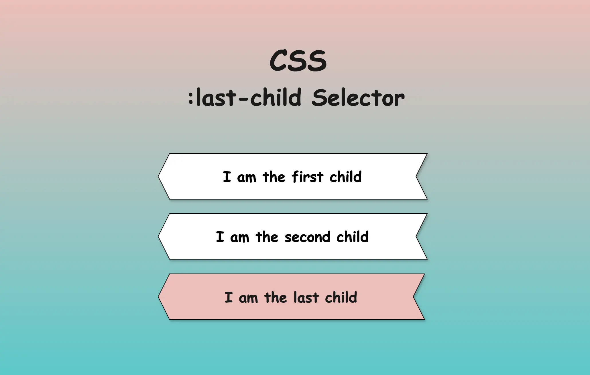
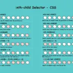
Hello everyone! In this post, we will explore the CSS last child selector, one of the most useful selectors in CSS. We use the CSS last-child selector when we want to target and modify only the last element of the same type. By types of elements, we mean HTML tags like paragraphs (<p>), headings (<h1>, <h2> …), lists (<li>) and others.
Typically, we use the CSS last-child selector with list items <li>, but it can be applied to any type of element. I have prepared some examples to help you understand how to use the selector based on your needs.
How to use the CSS last child selector for list elements
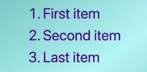
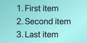
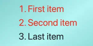
In the example below, the HTML structure includes an ordered list (<ol>) with three list items (<li>), all colored indigo.
We continue by adding the CSS rule, which selects only the last item and applies a red color to it.
/* Applies indigo color to all list items */li {color: indigo; }/* Applies red color only to the last list item */li:last-child {color: red; }/* OR */li:nth-last-child(1) {color: red;}
CSS
When using the :last-child selector in CSS, it targets the last element within its parent. When we add a new item to the end of the list, this new item becomes the last child of the list, and the previous first item now becomes the second one from the end. This change causes the :last-child selector to now targetthenewlyaddeditem instead.
Applying the CSS last child selector to non-list elements
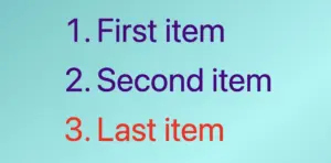
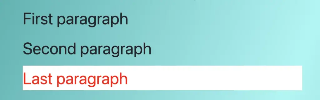
In the following example, we will use the last child selector for paragraphs. The HTML structure contains a <div> which enclose three paragraph (<p>) elements. By default, all HTML elements have black text color, so paragraphs will appear in black.
By setting the CSS last child selector, it selects the last <p> element and applies the text color red to a white background. As a result, the last paragraph appears in red with a white background, while the subsequent paragraphs keep their default styling.
/* Applies red color and background white to the last paragraph*/p:last-child {color: red;background-color: white;}/* OR */p:nth-last-child(1) {color: red;background: white;}
Using the last child selector across multiple parent containers
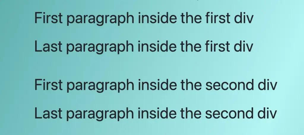
In this example, we will examine another case, as many times, we have multiple HTML elements to work with within a document. Here, we have two div elements, each containing two paragraph (<p>) elements colored black.
<div><p>First paragraph inside the first div</p><p>Last paragraph inside the first div</p></div><div><p>First paragraph inside the second div</p><p>Last paragraph inside the second div</p></div>
HTML
The CSS rule div p:last-child selects the last <p> element within any <div> and applies the specified styles to it.
/* Applies red color and white background to the last paragraph inside each div*/divp:last-child {color: red;background-color: white;}/* OR */divp:nth-last-child(1) {color: red;background-color: white;}
CSS
As a result, the last paragraph of each <div> will display in red with a white background.
Meanwhile, the remaining paragraphs will keep their default styles. This demonstrates how the :last-child selector can be used to style the last element within several parent containers. 😉
Selecting the last child inside the first parent element
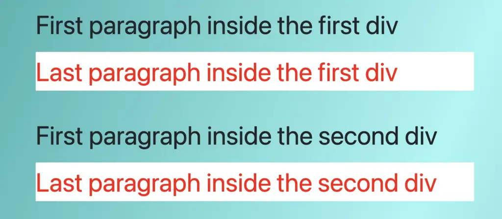
In this example, we have two <div> elements, each containing two paragraph <p> elements colored black as in the previous one, but this time, we will examine how we can select only thelast paragraph inside the first div.
<div><p>First paragraph in the first div</p><p>Second paragraph in the first div</p></div><div><p>First paragraph in the second div</p><p>Second paragraph in the second div</p></div>
HTML
The CSS rule div:first-child p:last-childselects only the first paragraph <p> within the firstdiv and applies the specified styles to it.
/* Applies red color and white background to the last paragraph of the first div*/div:first-childp:last-child {color: red;background-color: white;}/* OR */div:nth-child(1) p:nth-last-child(1) {color: red;background-color: white;}
CSS
Therefore, the last paragraph in the first div will be shown in red with a white background, while the second paragraph will remain in its default black color.
The second div, is not influenced at all by the styles applied to the first div, demonstrating selective styling implementation. 😉 This method is particularly useful for assigning specific styles to elements in complex layouts.
Avoiding the last child with the :not(:last-child) selector
Finally, we will examine the opposite case and how to avoid selecting the last childelement. In this example, the HTML structure consists of an ordered list <ol> housing three list <li> elements.
The <span> tag is a powerful yet often overlooked element in HTML. It’s commonly used for adding style and interactivity, but what does span do in HTML exactly? In this guide, we’ll explore its full potential and show you how to use it effectively on your web pages.
What is a span tag?
We use HTML <span> tag to target and manipulate specific 🍰 parts within an HTML 🎂 element without affecting the layout of surrounding elements. In simple terms, it acts as an inline container for styling small portions 🍰🍰 of text.
<span>....</span>
HTML
Why and when to use span in HTML?
Since <span> does not introduce additional structure or spacing, it is ideal for precise, targeted styling such as:
Highlighting text, changing colors, or formatting specific letters, words, or even a small paragraph.
Wrapping text for CSS animations or visual effects.
The difference between span and div
While both <div> and <span> are used for grouping and styling elements, they behave differently in terms of layout and structure. The table below highlights their key differences:
span
div
inline element
block element
stays within same line
starts new line and takes full width
does not affect layout
breaks the normal text flow
HTML span using inline styling
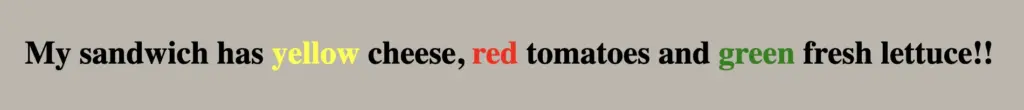
Below, I’ve prepared an example to illustrate how we use <span>, along with an image to help you visualize it better. 🤓 In this example, we use <span> to change the style of multiple parts of the text within a <p> element. The <span> tag wraps around specific words we want to highlight or style differently without affecting the entire line.
<p> My sandwich has <spanstyle="color:yellow">yellow</span> cheese,<spanstyle="color:red">red</span> tomatoes and<spanstyle="color:green">green</span> fresh lettuce!!</p>
HTML
Styling span in CSS: Best practices
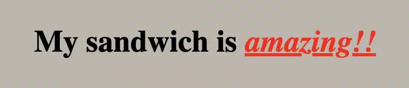
We can also style <span> elements beyond CSS inline styling. Below, I include an example and an image to picture it. In this example, we place the <span> element within a <div> element. The CSS code applies specific styling (color, font style, and text-decoration) only to the text inside the <span> tag, allowing us to highlight or change the look of a selected part without affecting the rest of the text.
<div> My sandwich is <span>amazing!!</span></div>
HTML
div > span {color: red;font-style: italic;text-decoration: underline;}
CSS
🔖 Here’s a trick: With div > span, we’re styling only <span> elements that are direct children of a <div>. This way, we target only this specific span, without affecting other <span> elements in the code! 🔴
Curious to learn more about how to focus on the exact elements you want? Look at my CSS selectors post — it’s all about precision! 🎯
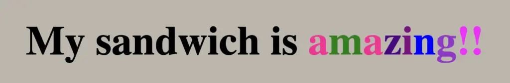
Targeting letters one by one using span in CSS
Want to take it a step further? We can make it even more impressive by styling each letter of one word individually!! 🧨 ✨
<h1> My sandwich is <spanclass="letter-a">a</span><spanclass="letter-m">m</span><spanclass="letter-a">a</span><spanclass="letter-z">z</span><spanclass="letter-i">i</span><spanclass="letter-n">n</span><spanclass="letter-g">g</span><spanclass="exclamation-mark">!!</span></h1>
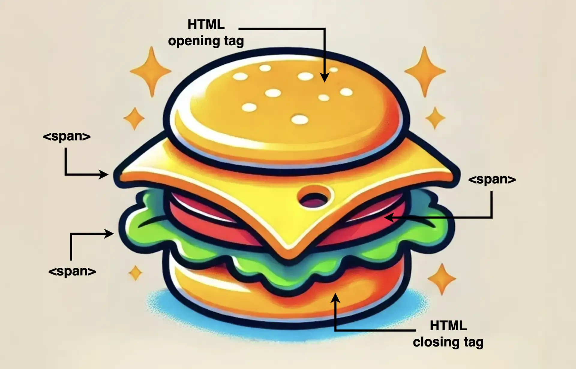
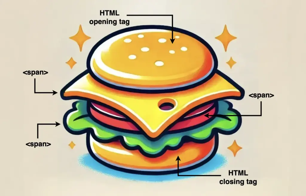
What about making our learning more fun and using the metaphor of a sandwich to represent how the <span> elements are surrounded by their container element (HTML opening and closing tags)!
Here’s the idea 💡
Sandwich with span as the filling 🍔
Imagine an illustration where a slice of text is styled like a sandwich with:
Bread Slices: Representing HTML tags surrounding the <span> element.
Fillings (cheese, tomato, lettuce): Representing the words or phrases wrapped in the <span> elements, styled differently to stand out, just like all these fillings inside a sandwich.
This metaphor will show the positioning of <span> clearly! 🥳
Is CSS a programming language? If you’ve ever wondered, read the following post and discover 🔎 why you might reconsider asking that question!
A programming language is a tool 🛠 that enables developers to instruct computers to perform tasks or calculations. Developers achieve this by writing code that tells the computer what to do step-by-step, much like giving commands to execute specific outcomes. It consists of rules that a computer can understand and execute. 😎
CSS (Cascading Style Sheets) is not considered a programming language. It is a style sheet language that defines how HTML elements should be displayed on a webpage and controls their layout, colors, fonts, and spacing.
Below, I have prepared an example to help you better understand what CSS does. Also, you’ll see an image displaying the HTML and CSS code snippet used in the example.
As we already said, CSS contains rules. Each rule typically includes a selector (which identifies the HTML element to style) and the declaration block {...} (which specifies the styling properties and their values). In our example, h1 is the selector, and background-color: pink; , color: indigo; and font-size: 25px; are declarations.
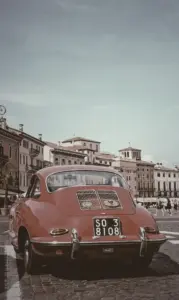
Welcome to a practical guide on using the CSS filter to modify how your images 📸 look. In this post, we’ll work on how to adjust the opacity and saturate (color intensity) CSS filters. These two methods will help us handle how images are rendered on our website, particularly concerning their colors and transparency.
Let’s get into the world of CSS 👩💻 and customize the images to suit our needs.
CSS filter: opacity
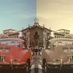
The CSS property filter: opacity() helps you control how colorful an image appears against its background. You can set it anywhere between 0% and 100%. At 0%, the image turns grayscale, losing all its colors and showing only the background color. If you set it to 100%, the image displays its true, unaltered colors. Values in between change how colorful the image appears.
🔖 For setting CSS opacity, you can use either a percentage of 0% and 100% or a decimal value between 0 and 1, both options ending up in the same outcome. 🫧😃
Example
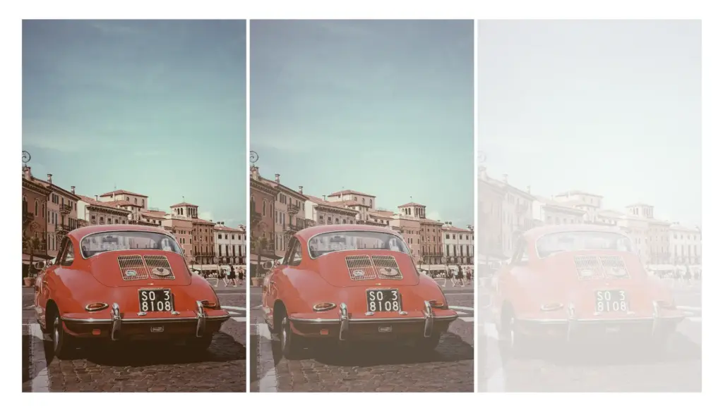
Starting with the HTML code which includes three <img> elements. All images share the same .image class. Additionally, the second image includes one more class the .opacity-image2 while the third image includes the .opacity-image3 class.
In the CSS code the .image class introduces a non-repeated image that covers the entire background area of the element. Its dimensions are 300 pixels in width and 500 pixels in height.
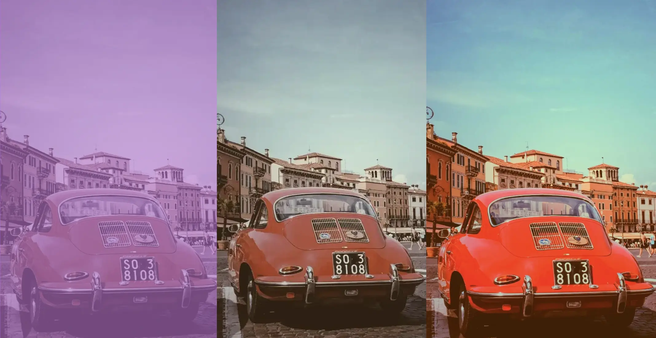
We move forward with the other two classes. The .opacity-image2 class targets the second image and applies a visual effect controlling transparency. An opacity of 80% means the element will be slightly transparent, allowing some background to show through.
The .opacity-image3 class is meant for the third image, ensuring the same visual change happens there too. In this case, an opacity of 20% means the element will be mostly transparent, allowing more background to show through.
* In this case, the background is purple (a random color for this specific example, as you can pick any color you prefer), so our effect will blend the original element’s colors and the purple background color, influenced by the 80% opacity.
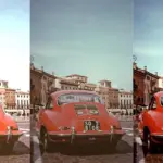
Saturation is about how bright and vivid colors are in a picture. The CSS property filter: saturate() helps you adjust this. The values vary from 0% to 100%. If you choose 0%, the colors disappear and become black and white (grayscale). With a value of 100%, it stays as colorful as it was.
Keep in mind that going over 100% makes colors appear highly vibrant. Specifying a saturation of 200% is technically allowed, but that’s not the usual way.
🔖 To specify a percentage for saturation, you can use values like 10% or 0.1, they mean the same thing. It’s up to you. 🫧😃
Example
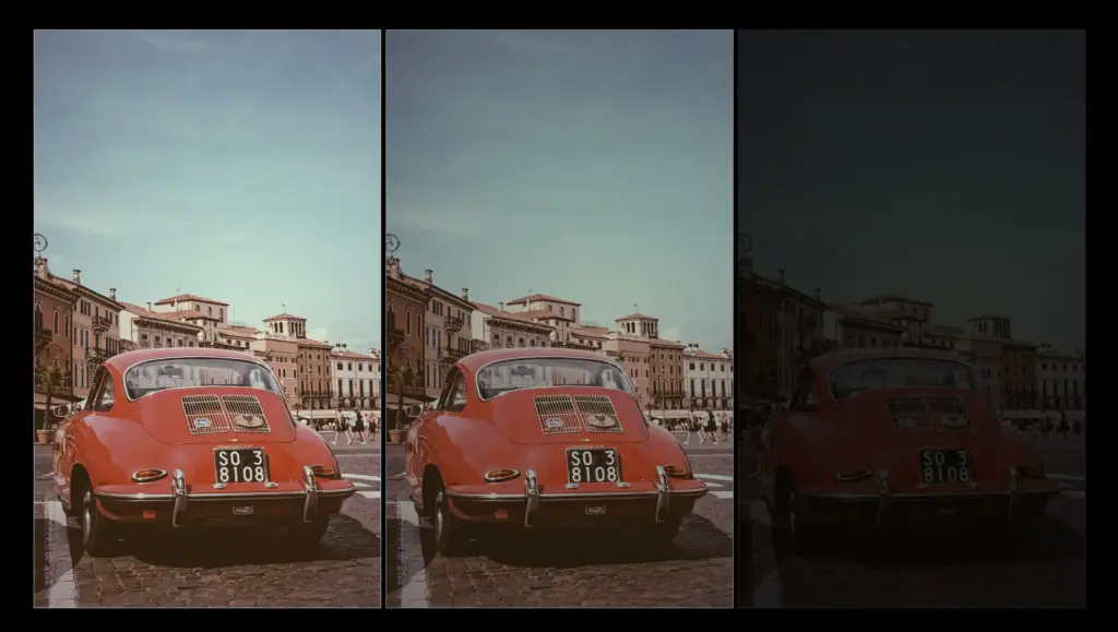
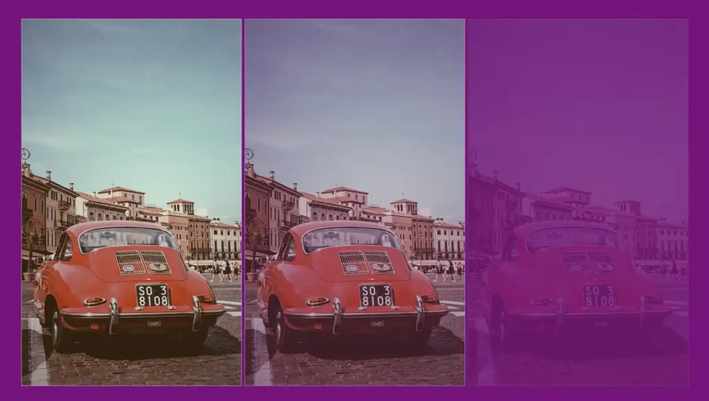
Starting with the HTML code which includes three <img> elements. All images share the same .image class. Additionally, the second image includes one more class the .saturate-image2 while the third image includes the .saturate-image3 class.
In the CSS code, the .image class introduces a non-repeated image that covers the entire background area of the element. Its dimensions are 300 pixels in width and 500 pixels in height.
We continue with the other two classes. The .saturate-image2 class targets the second image and applies a visual effect controlling saturation. A saturation of 200% will be doubled compared to the original colors of the image, resulting in a sharp visual effect.
The .saturate-image3 class focuses on the third image and applies the same visual effect. In this case, a saturation of 20% means the image will have its colors slightly desaturated, resulting in a toned-down appearance compared to the original colors. The saturation level will be reduced to one-fifth of the original, giving a less intense color effect.