Welcome to a practical guide on using CSS filter to modify the appearance of your 📸 images. In this post, we’ll focus on adjusting the contrast and brightness CSS filters. These techniques will allow us to control how images are displayed, specifically regarding their levels of light and darkness.
Let’s dive into the world of CSS 👩💻 and customize the images to suit our preferences.
CSS property filter: contrast
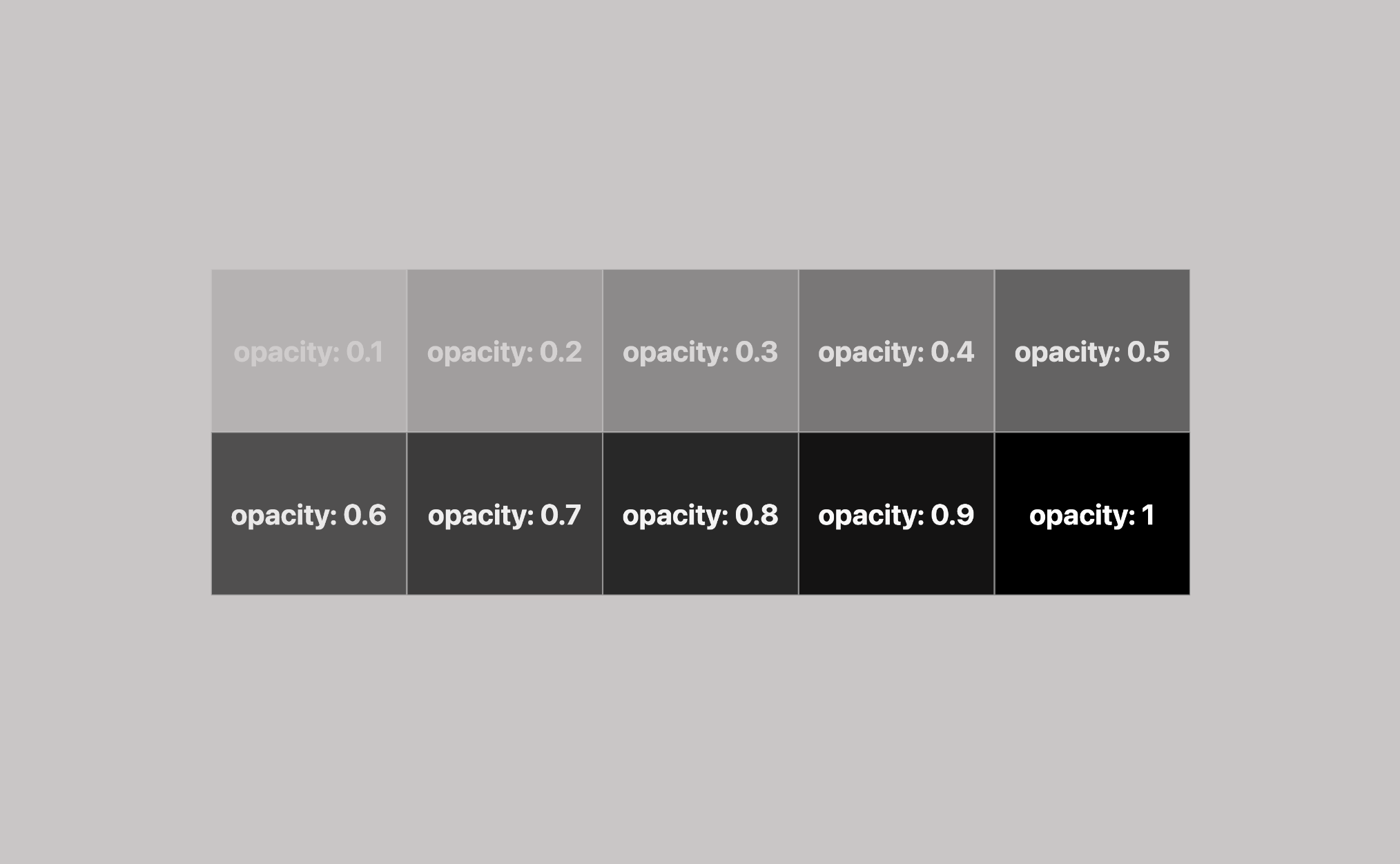
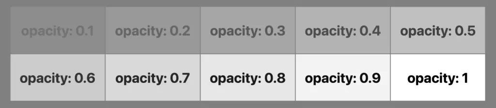
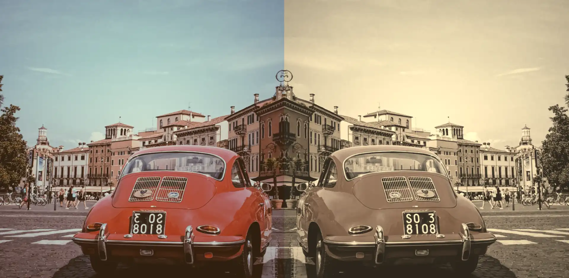
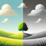
The CSS property filter: contrast() is used to control the difference between the light and dark parts of an image. The contrast property accepts values from 0% to infinity. A value of 100% (or 1) is normal contrast. A higher value, increases the difference between light and dark areas, making the image appear more vivid and clearer. On the contrary, a lower value decreases the distinction, resulting in a softer and more blended appearance.
Always remember, if you want your picture to be clear and detailed, you can try using higher contrast values. This way, you find the right mix between making the picture softer and keeping it sharp and clear. But if you set the contrast too low, the picture might not show the different parts or details well. It might look a bit boring or like it has a gray layer on top. 🙁
🔖 You can express contrast either as a percentage (10%) or in decimal form (0.1) – both methods produce identical results. The choice between the two is entirely based on your personal liking. 🫧😃
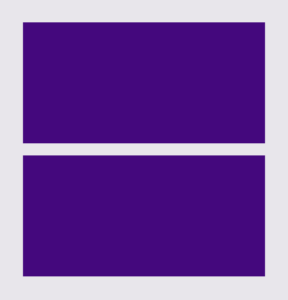
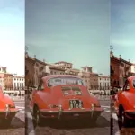
CSS Contrast filter example
I crafted an example for you.
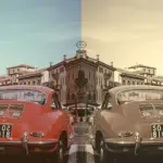
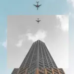
Starting with the HTML code which includes three <img> elements. All images share the same .image class. Additionally, the second image includes one more class the .contrast-image2 while the third image includes the .contrast-image3 class.
<img class="image"/>
<img class="image contrast-image2"/>
<img class="image contrast-image3"/>In the CSS code the .image class introduces a non-repeated image that covers the entire background area of the element. Its dimensions are 300 pixels in width and 500 pixels in height.
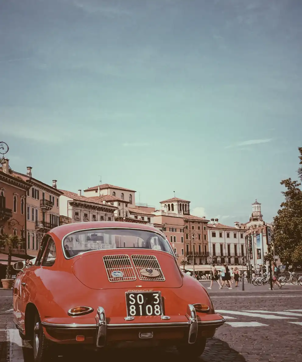
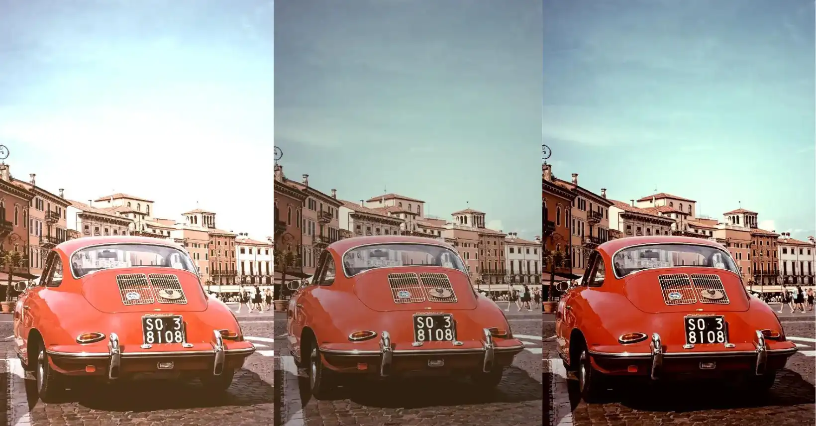
We move forward with the other two classes. The .contrast-image2 class targets the second image and applies a visual effect that controls the contrast. A value of 150% would make the differences between light and dark elements in the image more pronounced, resulting in a sharper and more defined visual appearance.
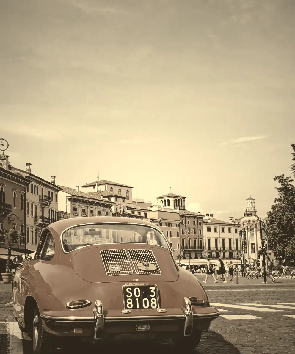
The .contrast-image3 class targets the third image and applies the same visual effect. In this case, a value of 20% reduces the contrast, making it less distinct and blending the light and dark areas.
.image {
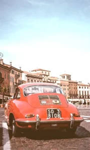
background-image: url(https://images.unsplash.com/photo-1501829385782-9841539fa6bf?ixlib=rb-4.0.3&ixid=M3wxMjA3fDB8MHxwaG90by1wYWdlfHx8fGVufDB8fHx8fA%3D%3D&auto=format&fit=crop&w=3024&q=80);
background-repeat: no-repeat;
background-size: cover;
width: 300px;
height: 500px;
}
.contrast-image2 {
filter: contrast(150%);
}
.contrast-image3 {
filter: contrast(20%);
}In the images below we can see the results.


CSS property filter: brightness
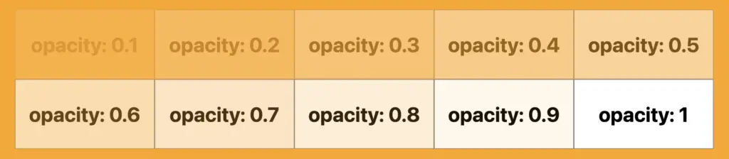
The CSS filter: brightness is a property that adjusts the intensity of light in an image. It influences how bright or dark the visual element appears to the viewer. A value of 100% (or 1) represents the origin brightness. Values less than 100% darken the element, while values greater than 100% brighten it. For example, 50% would make the element half as bright, and 200% would make it twice as bright while a brightness of 0% gives only a black color.
🔖 You have the choice to indicate brightness using percentages, such as 10%, or in decimal form like 0.1, both have the same results. It’s completely up to your preference. 🫧😃
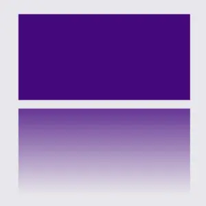
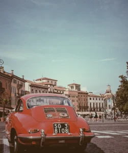
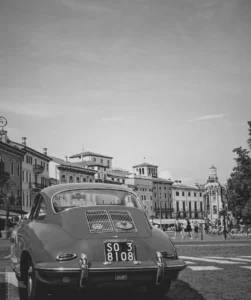
CSS Brightness filter example
Here is an example for you.
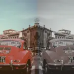
Starting with the HTML code which includes three <img> elements. All images share the same .image class. Additionally, the second image includes one more class the .brightness-image2 while the third image includes the .brightness-image3 class.
<img class="image"/>
<img class="image brightness-image2"/>
<img class="image brightness-image3"/>In the CSS code the .image class introduces a non-repeated image that covers the entire background area of the element. Its dimensions are 300 pixels in width and 500 pixels in height.
We proceed with the other two classes. The .brightness-image2 class targets the second image and applies a visual effect that controls the brightness making the element 1.5 times brighter than its normal appearance.
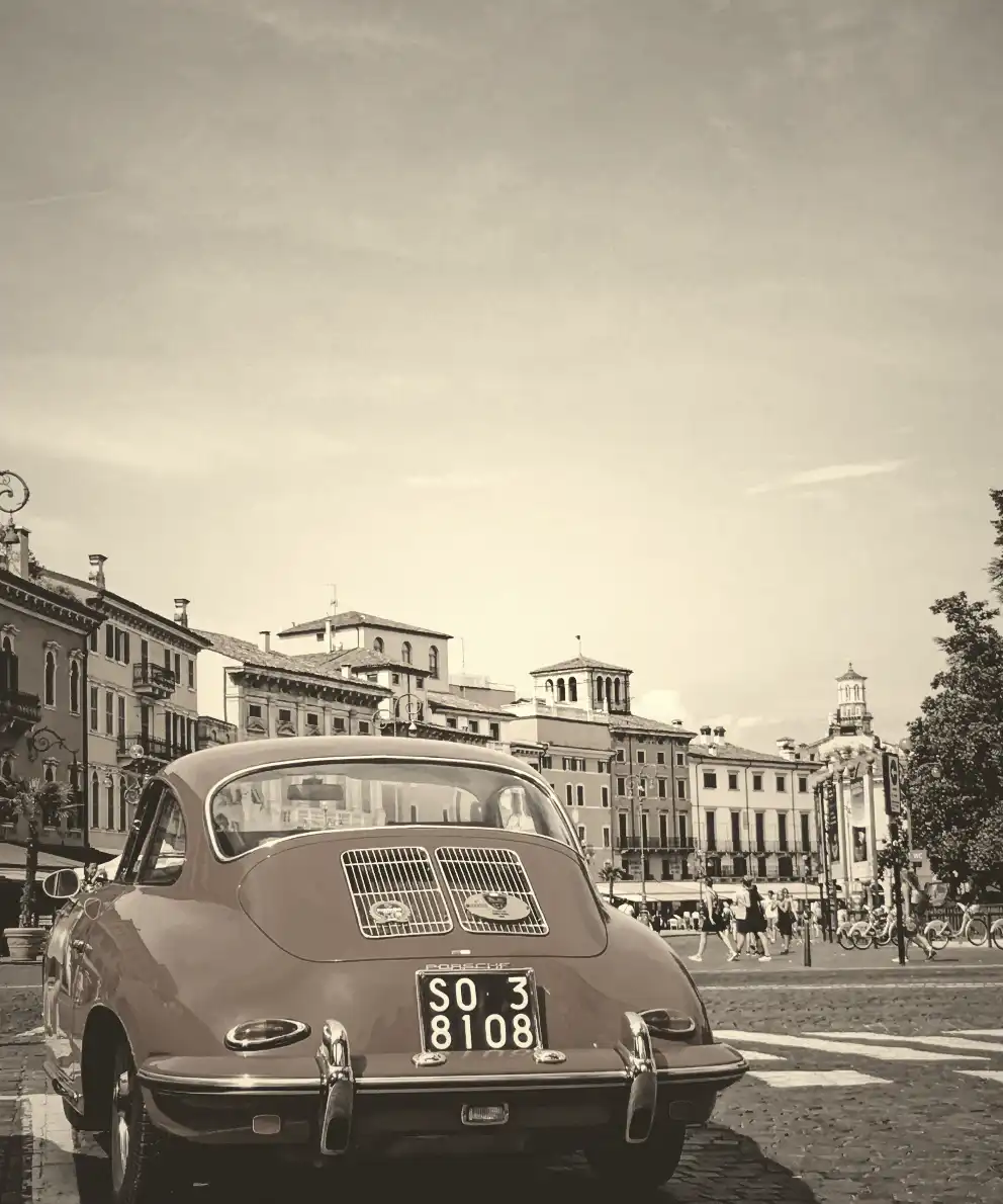
The .brightness-image3 class targets the third image and applies the same visual effect. In this case, a brightness of 20% means the element will be darkened, making it one-fifth as bright as its original state.
.image {
  background-image: url(https://images.unsplash.com/photo-1501829385782-9841539fa6bf?ixlib=rb-4.0.3&ixid=M3wxMjA3fDB8MHxwaG90by1wYWdlfHx8fGVufDB8fHx8fA%3D%3D&auto=format&fit=crop&w=3024&q=80);
  background-repeat: no-repeat;
  background-size: cover;
  width: 300px;
  height: 500px;
}

.brightness-image2 {
  filter: brightness(150%);
}

.brightness-image3 {
  filter: brightness(20%);
}In the images below we can see the results.