Hello everybody 😃 Today, we will discover the art of the powerful CSS blur effect. Get ready to meet the amazing backdrop-filter CSS property. We’ll dive 🤿 into the world of adding visual elegance and depth to our web design, and we will learn to create captivating and stunning web elements. Let’s get started!
Adding basic HTML structure
Let’s get started with the HTML setup. We create a parent div named custom-container for the background and a child div named blurry-container where we will apply the CSS blur effect. Follow along for the step-by-step process.
<div class="custom-container">
  <div class="blurry-container"></div>
</div>Adding the background image
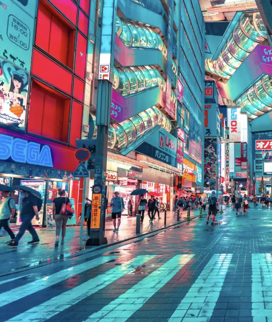
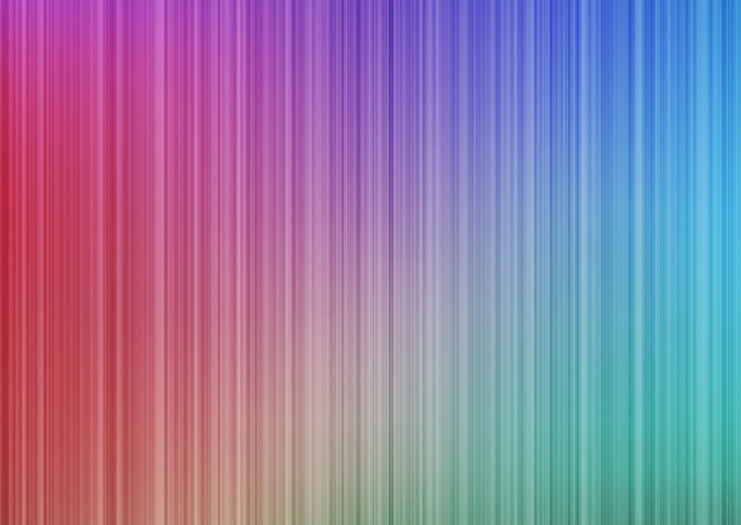
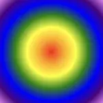
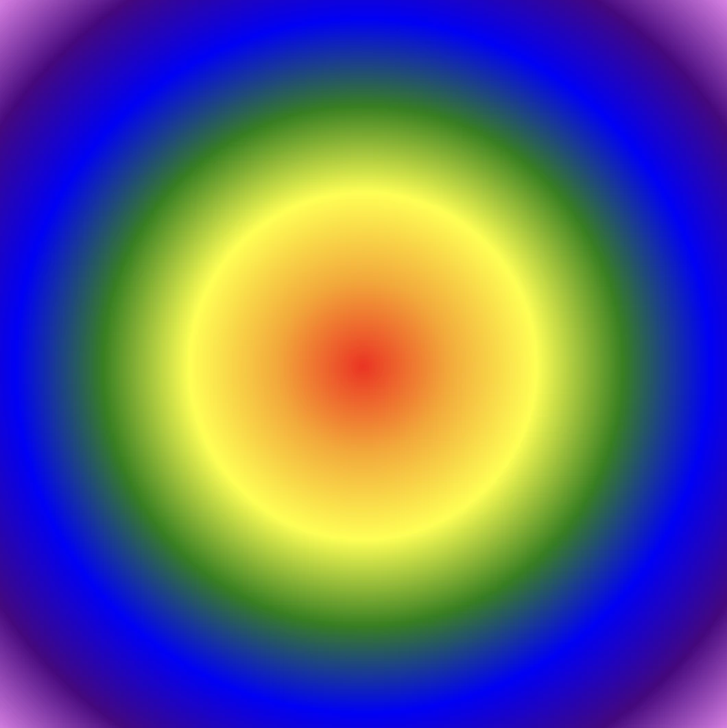
We move forward with the CSS structure by preparing the background. I opted for a striking and colorful background image as it is more impressive and gives prominence to our effect, setting background-image. I also add background-repeat which determines how the background image is shown, and background-size which sets the size of the image, in our case we want to fill the entire display. Completing it with height: 100vh for full-screen coverage.
.custom-container {
  background-image: url(https://images.unsplash.com/photo-1540959733332-eab4deabeeaf?ixlib=rb-1.2.1&ixid=MnwxMjA3fDB8MHxwaG90by1wYWdlfHx8fGVufDB8fHx8&auto=format&fit=crop&w=1194&q=80);
  background-repeat: no-repeat;
  background-size: cover;
  height: 100vh;
}
The next step is to create a “place” where we can accommodate our blur, I believe a box would serve this need. To begin, I create one by setting the appropriate width and height along with its border and border-radius. I utilized borders to ensure my box remains visible. Whether to keep them or not is entirely up to you. The design can still look great in both cases. Feel free to choose whichever option suits your preference or the project’s requirements. 😃
.blurry-container {
  border: 2px solid white;
  border-radius: 5px;
  width: 400px;
  height: 500px;
}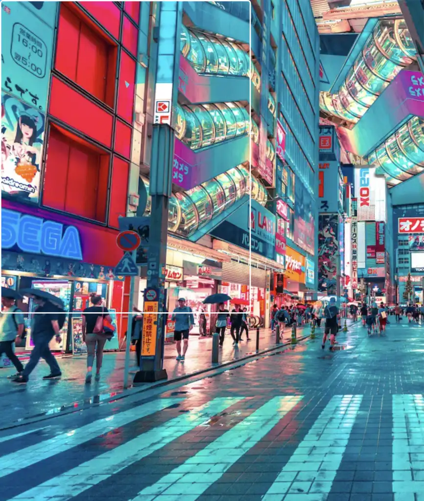
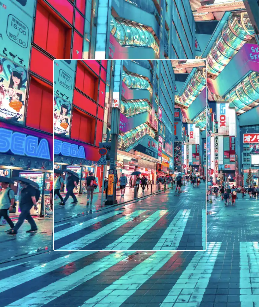
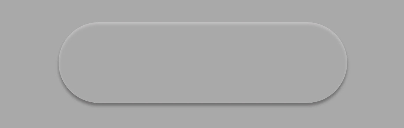
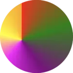
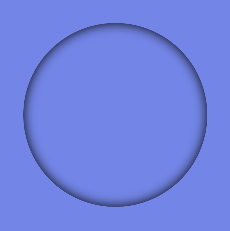
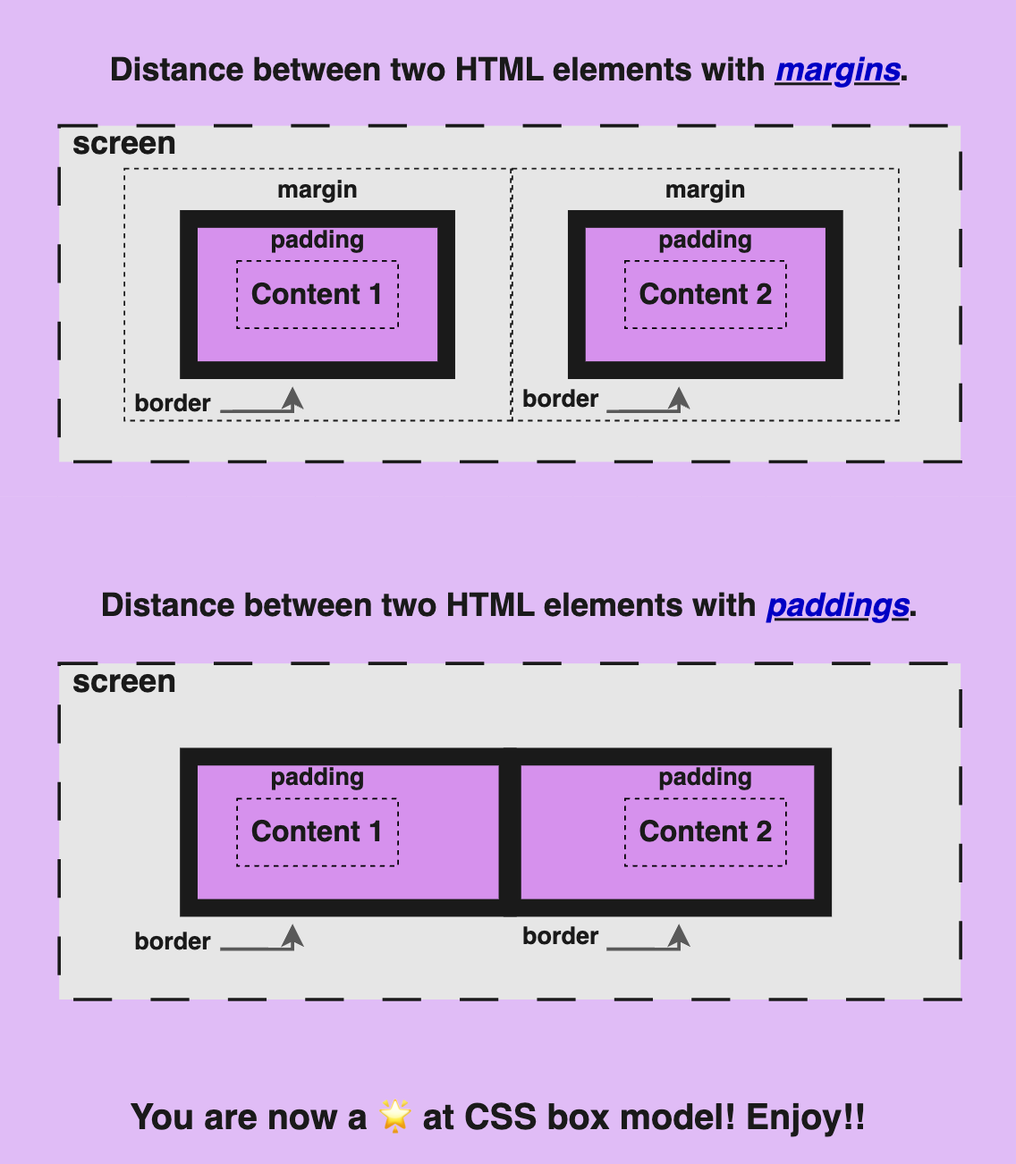
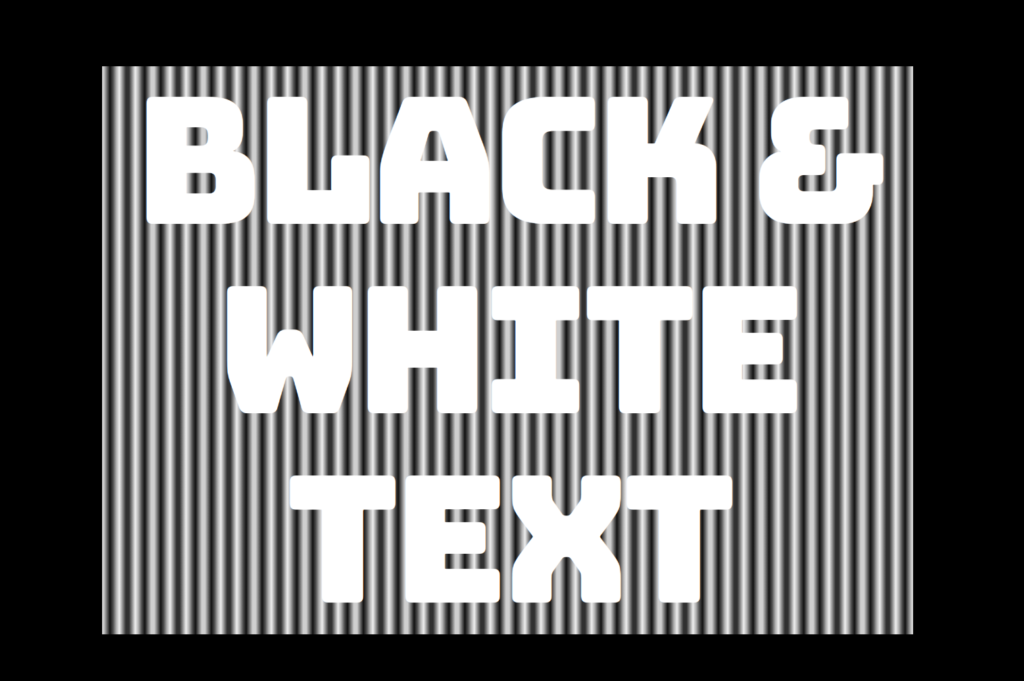
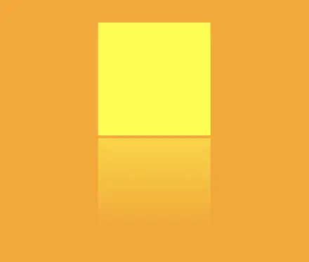
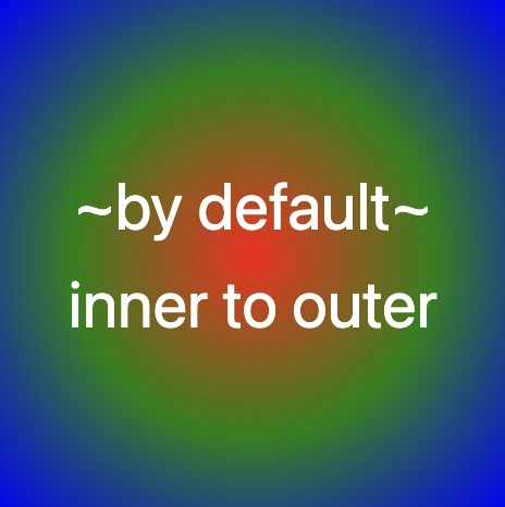
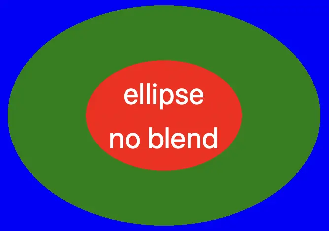
If we want our box to share the same image as its background, and not just be transparent, it is crucial to add the background: inherit CSS property.
In the following image, we can see clearly that our box now has the exact same image as its background.
.blurry-container {
  ...
  background: inherit;
}
Now it’s time to center our box. We do so by applying the flex CSS property to the parent HTML element which is the custom-container.
.custom-container {
  ...
  display: flex;
  align-items: center;
  justify-content: center;
}
Adding the blur effect (backdrop-filter)
We create the blur effect using the pseudo-element :before. To manage this, we have to set position:relative to the parent element and position: absolute to the child. The child element needs the content CSS property to be assigned an empty string value in order to be displayed. Despite the recent code adjustments, you won’t notice any visible changes on the screen just yet. 😭
.custom-container {
  ...
  position: relative;
  .blurry-container {
    ...
    &:before {
      position: absolute;
      content: "";
    } /* end of before */
  } /* end of blurry-container */
} /* end of custom-container */Let’s proceed with our effect. 🥁 We do so by adding the backdrop-filter CSS property to :before pseudoelement. Increasing the pixel value intensifies the blur effect by creating a stronger visual impact. I’ve applied a 12px blur effect, but you have the flexibility to adjust it according to your preferences. If you desire a clearer look, feel free to reduce ⬇ the pixels. Alternatively, for a stronger fade effect, you can increase ⬆ the pixel value.
&:before {
  ...
  backdrop-filter: blur(12px);
}


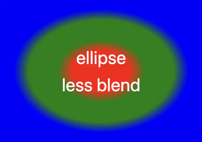
🔖 What to avoid when applying the blur effect
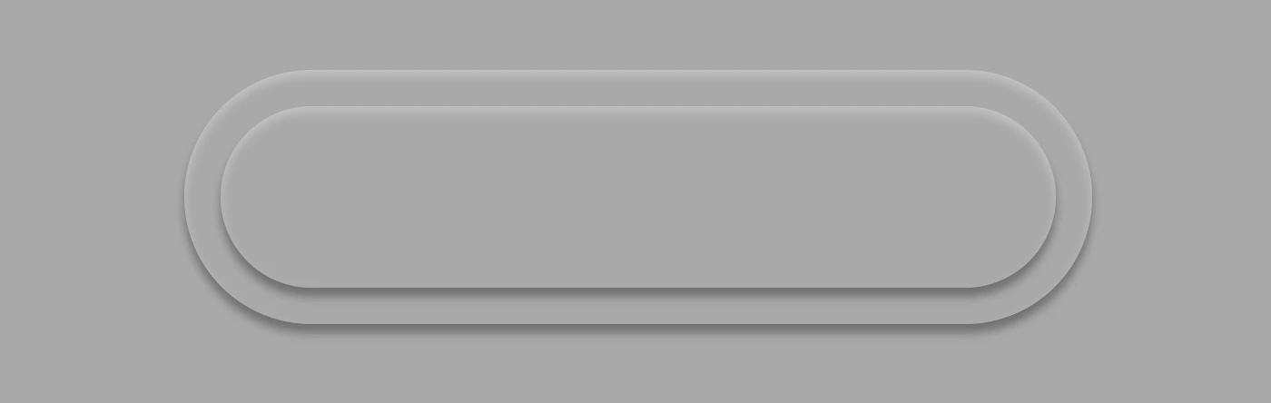
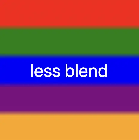
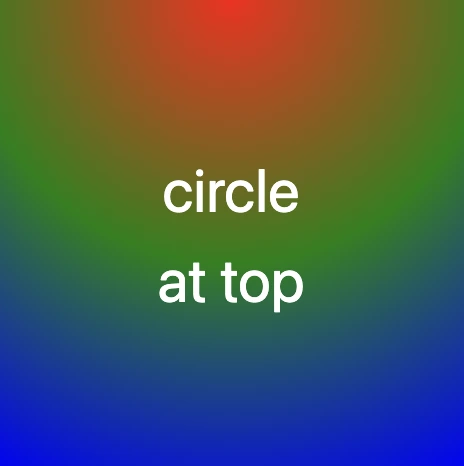
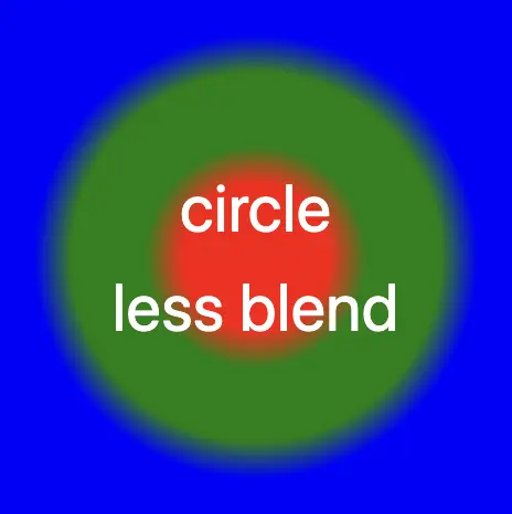
Remember that the blur effect can sometimes get out of control on a web page because of how it’s applied to an element. When you use the blur effect, it makes the element bigger, like it’s expanded, depending on how much blur you want. So, the more blur you add, the larger the element becomes. Because of that, the element might grow so big that it spills out of its box or crashes into nearby elements. 😟
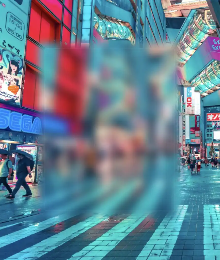
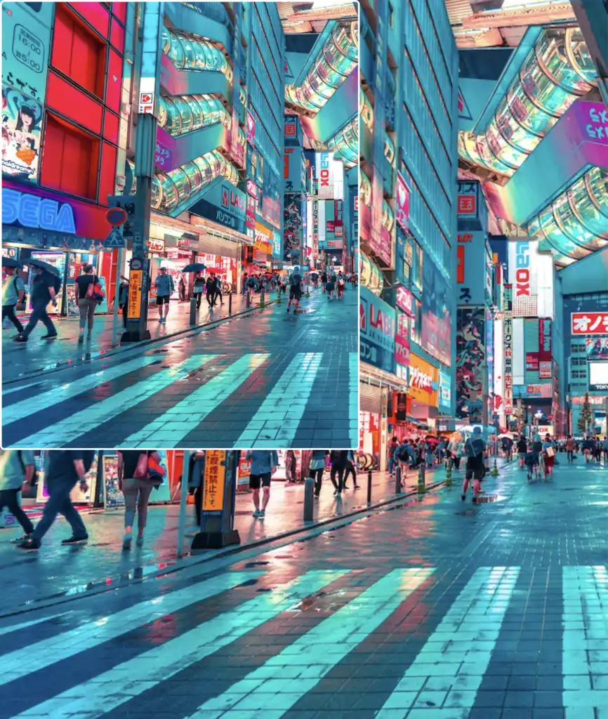
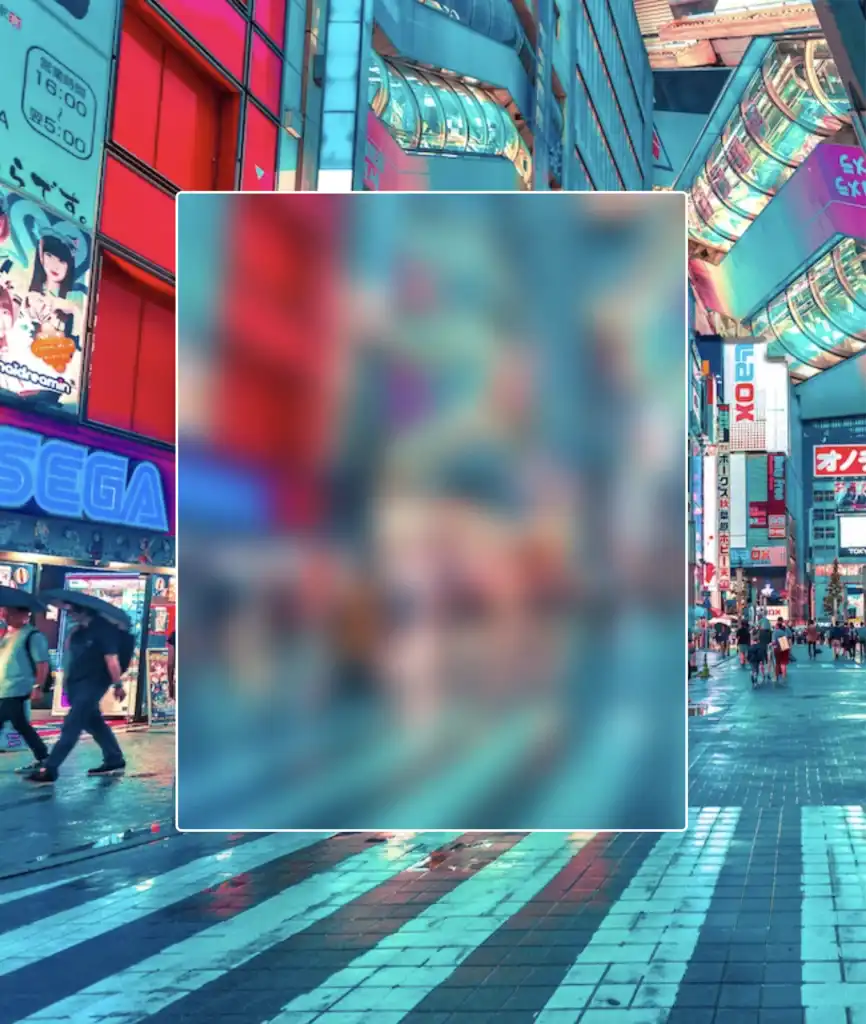
Observe how the blur CSS property overflows in the current setup above. To correct that, apply the overflow: hidden CSS property to the PARENT element custom-container. With this modification, you can control the blur effect and prevent it from causing a mess on your web page.
.custom-container {
...
overflow: hidden;
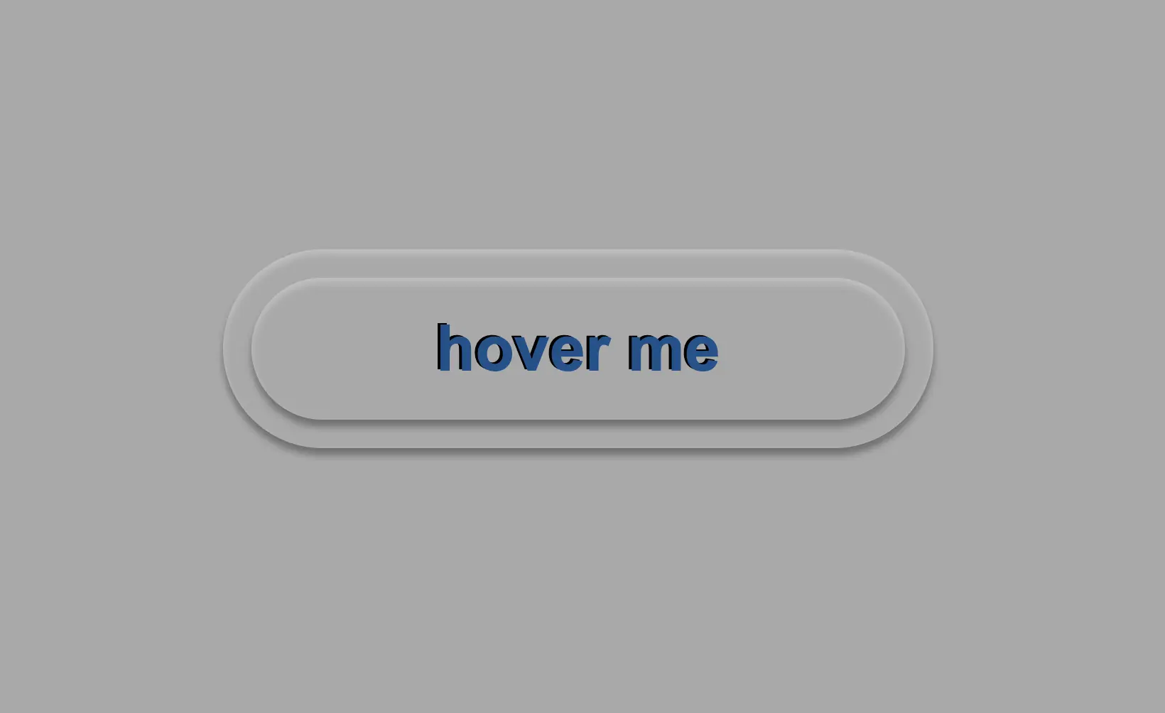
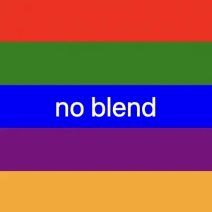
}… and boom 🥳 here it is! Our blur effect displayed flawlessly, as intended!
Complete code solution
Below is the full code referenced in this blog post. Feel free to copy and use it in your own projects. If you have any questions or encounter any issues, don’t hesitate to reach out for assistance. You can easily copy the desired code snippet by clicking on the copy icon, located in the top-right corner of each snippet.
<section class="custom-container">
  <div class="blurry-container">
    <div class="title">Hello World</div>
  </div> <!-- end of blurry-container -->
</section> <!-- end of customer-container -->* {
box-sizing: border-box;
padding: 0;
margin: 0;
}
.custom-container {
height: 100vh;
display: flex;
align-items: center;
justify-content: center;
background-image: url(https://images.unsplash.com/photo-1540959733332-eab4deabeeaf?ixlib=rb-1.2.1&ixid=MnwxMjA3fDB8MHxwaG90by1wYWdlfHx8fGVufDB8fHx8&auto=format&fit=crop&w=1194&q=80);
background-repeat: no-repeat;
background-size: cover;
.blurry-container {
position: relative;
border: 2px solid white;
border-radius: 5px;
width: 400px;
height: 500px;
padding: 100px 50px;
display: flex;
align-items: center;
justify-content: center;
background: inherit;
overflow: hidden;
&:before {
content: "";
position: absolute;
top: -20px;
left: -20px;
bottom: -20px;
right: -20px;
box-shadow: inset 0 0 300px rgba(25, 100, 128, 0.5);
backdrop-filter: blur(12px);
}
.title {
font-size: 50px;
color: #132216;
font-weight: bold;
padding: 5px 20px;
border: 2px solid #364739;
border-radius: 50px;
backdrop-filter: blur(8px);
}
} /* end of blurry-container */
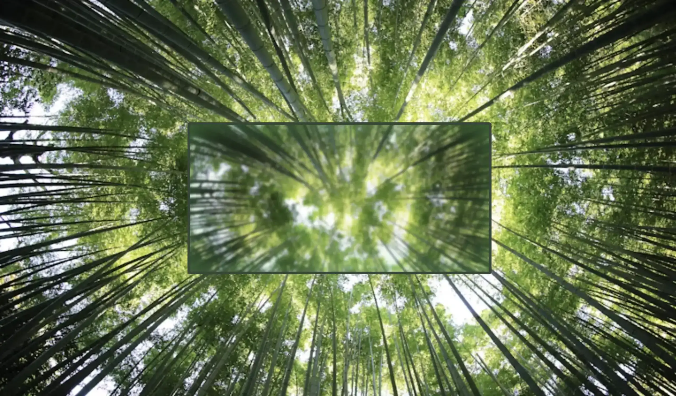
} /* end of customer-container */Complete code solution for post’s cover
Below, I include the code for my post’s cover. I also added a title to see how we add text over the blur effect. 😎
<section class="custom-container">
  <div class="blurry-container">
    <div class="title">Hello World</div>
  </div> <!-- end of blurry-container -->
</section> <!-- end of customer-container -->* {
box-sizing: border-box;
padding: 0;
margin: 0;
}
.custom-container {
height: 100vh;
display: flex;
align-items: center;
justify-content: center;
background-image: url(https://images.unsplash.com/photo-1440342359743-84fcb8c21f21?w=800&auto=format&fit=crop&q=60&ixlib=rb-4.0.3&ixid=M3wxMjA3fDB8MHxzZWFyY2h8MTJ8fGZvcmVzdHxlbnwwfDB8MHx8fDA%3D);
background-repeat: no-repeat;
background-size: cover;
.blurry-container {
position: relative;
border: 2px solid #364739;
border-radius: 20px;
width: 500px;
height: 300px;
padding: 100px 50px;
display: flex;
align-items: center;
justify-content: center;
background: inherit;
overflow: hidden;
&:before {
content: "";
position: absolute;
top: -20px;
left: -20px;
bottom: -20px;
right: -20px;
box-shadow: inset 0 0 100px rgba(100, 200, 100, 0.8);
backdrop-filter: blur(2px);
}
} /* end of blurry-container */
.title {
font-size: 50px;
color: #132216;
font-weight: bold;
padding: 5px 20px;
border: 2px solid #364739;
border-radius: 50px;
backdrop-filter: blur(8px);
}
} /* end of customer-container */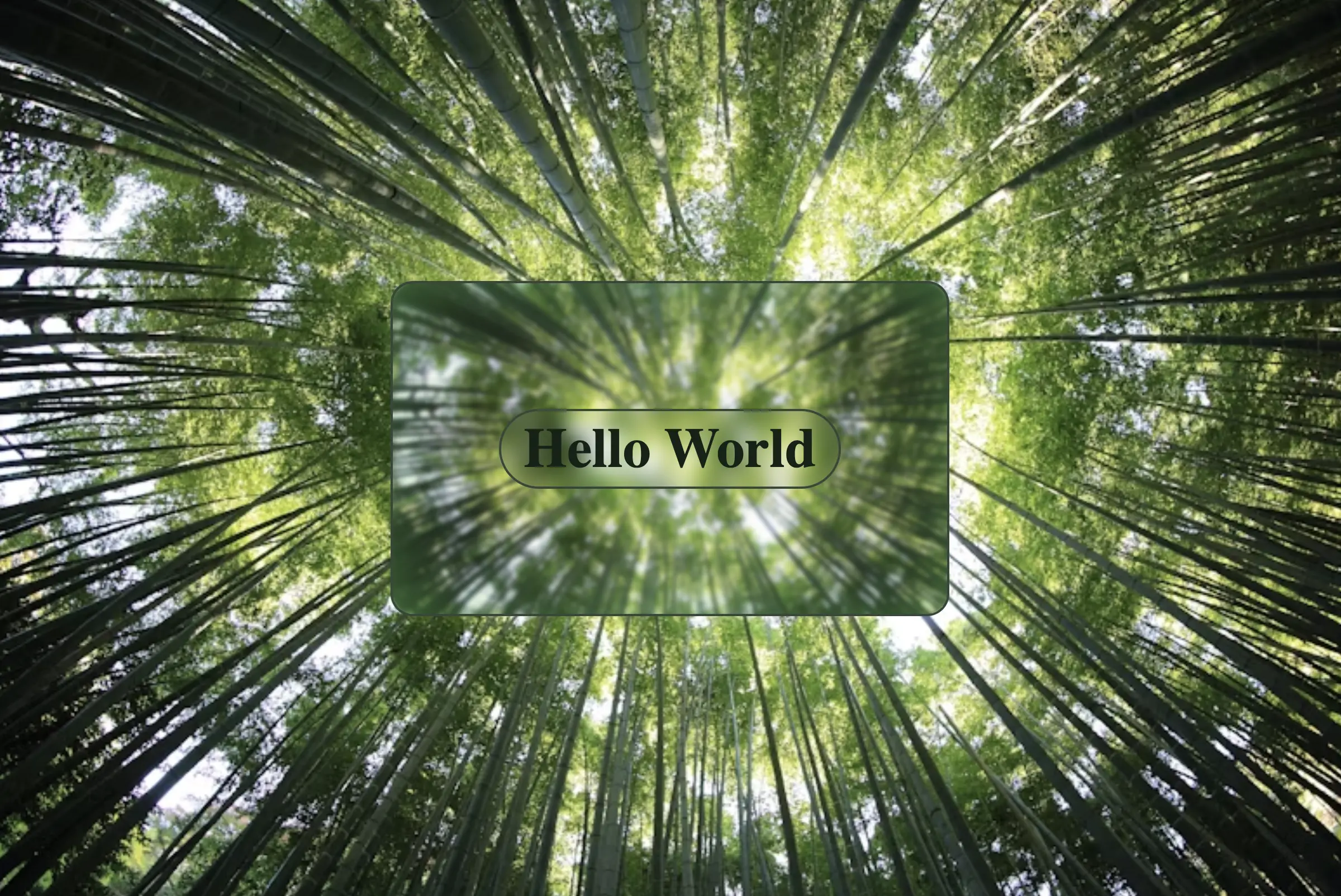


