CSS, HTML, animations, and UI techniques that shape the web experience. Learn how to build beautiful, responsive, and interactive interfaces right in the browser.
Hello, everybody 😃 Get ready to add a vibrant twist to your web designs with my latest post on fonts. In this post, we’ll explore the fascinating world of typography, sharing clever ways to add a burst of colors, outlines, shadows, and CSS colorful text. Whether we are looking to level up designs or experiment with CSS, this post provides the inspiration and know-how to make texts truly stand out on your screen. Stay tuned for an amazing journey into the art of CSS typography! 🌈✨
We already know the color CSS property. When setting the text color, we’re setting the color of the text itself. In contrast, setting the background-color sets the background color behind the text. But what if we want a more challenging font? Can we do that? Absolutely!
Below, I prepared an example as a way to make it more understandable. Enjoy! 💻
Preparing our HTML and CSS structure
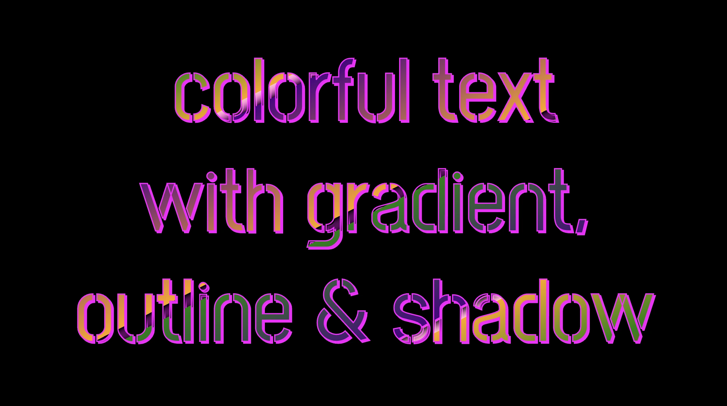
The following code creates a colorful text with gradient, outline, and shadow. We will start with our HTML structure. Our body has background-color: black. Inside, we make an HTML div element that serves as a container for our text and has a class attribute named font-effects.
<body><divclass="font-effects"> colorful text with gradient, outline & shadow is so impressive</div></body>
HTML
Next, let’s proceed with our CSS structure. The font-effects class contains the rules applied to the HTML element mentioned earlier. We’ll provide a thorough examination of these rules as we progress through this post. For now, it’s important to note that our text has color white, our body has background-color black, and we’ve also integrated (@import url(...)) a font-family of Google Fonts.
Ensure this statement is placed at the beginning of your CSS code snippet, just like I did (check line 2).
/* insert google fonts */@importurl('https://fonts.googleapis.com/css2?family=Stick No Bills');body {background-color: black;}.font-combinations {width: 1100px;font-size: 150px;color: white;font-family: 'Stick No Bills', sans-serif;text-align: center;}
CSS
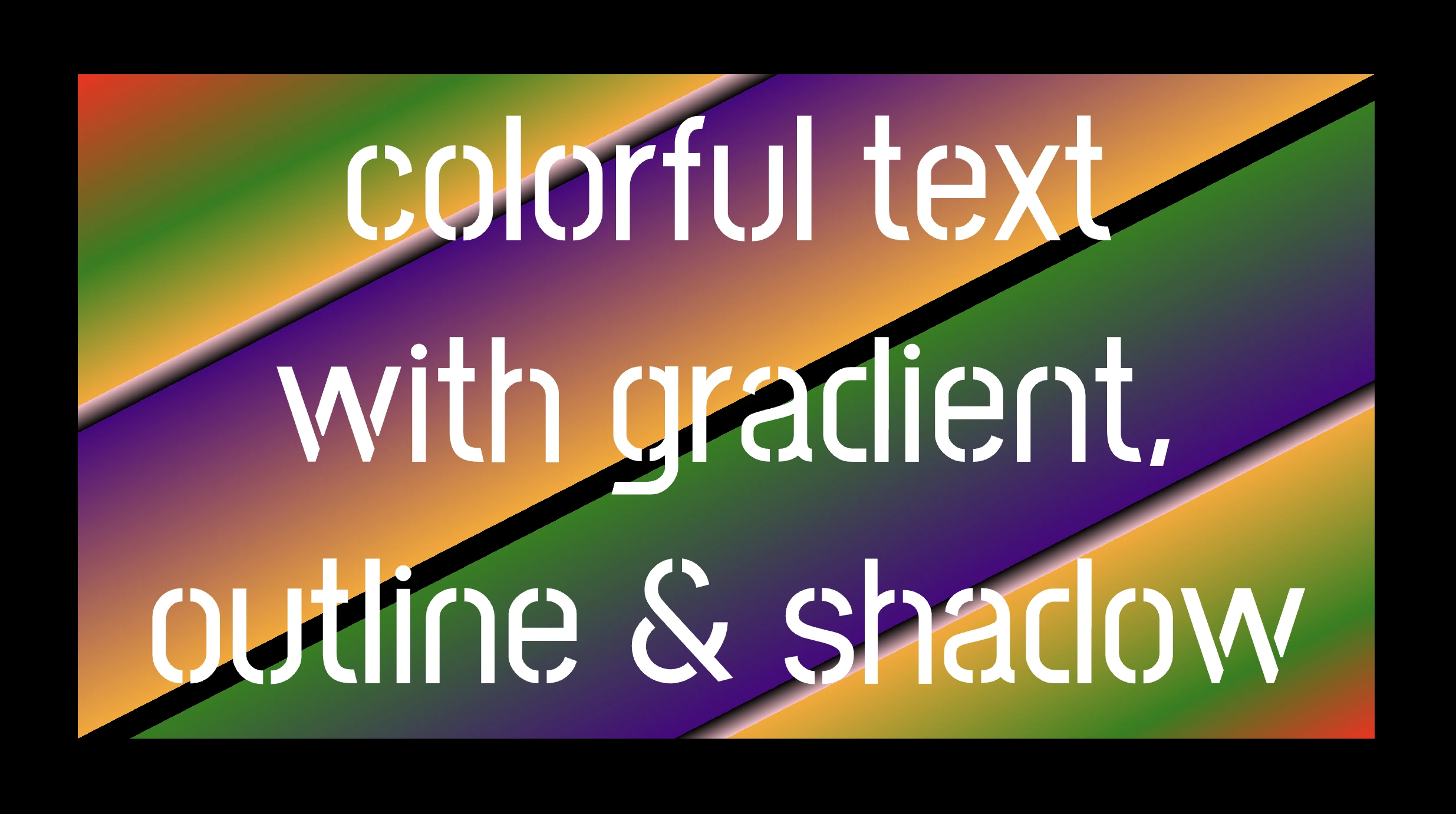
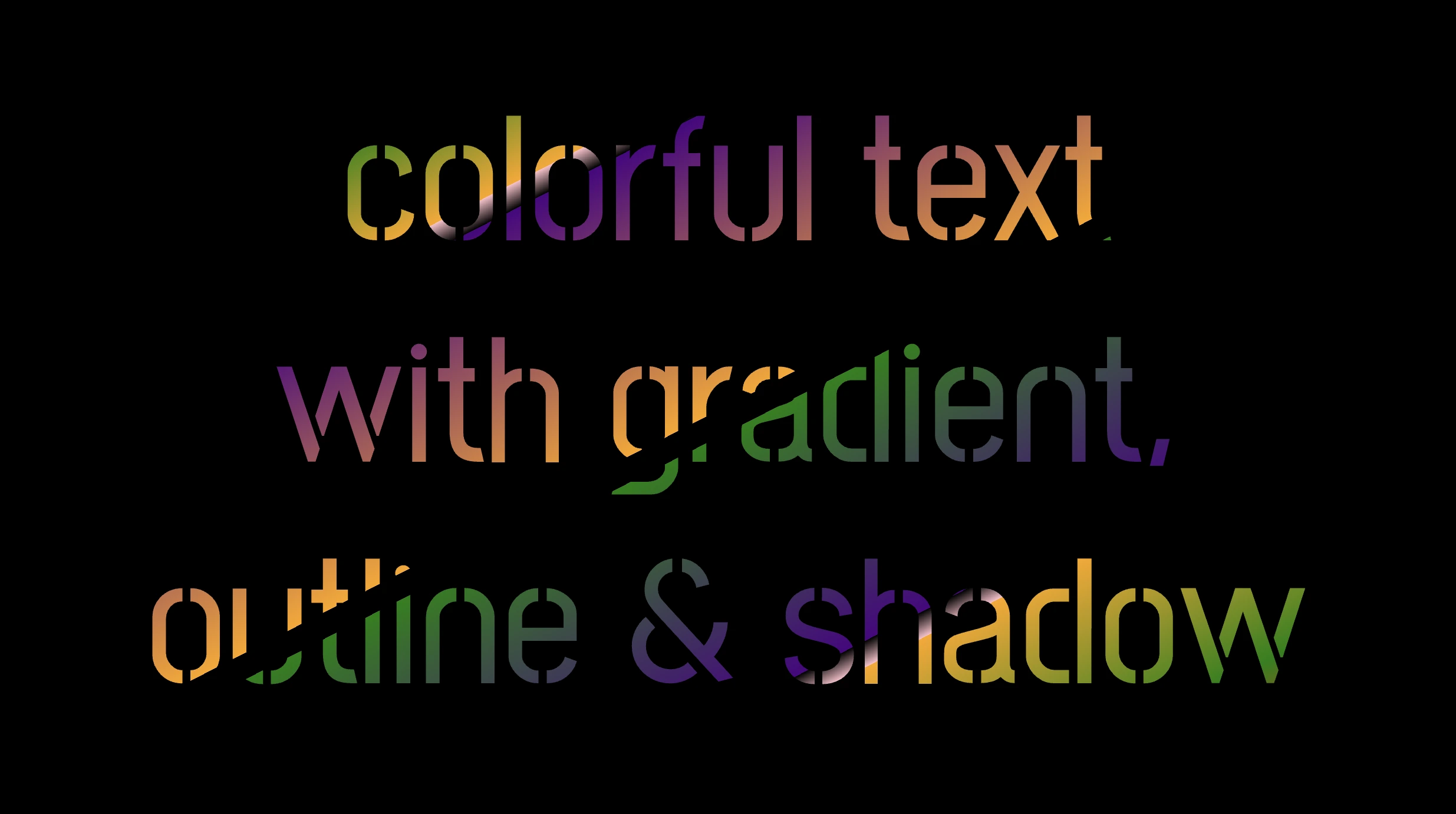
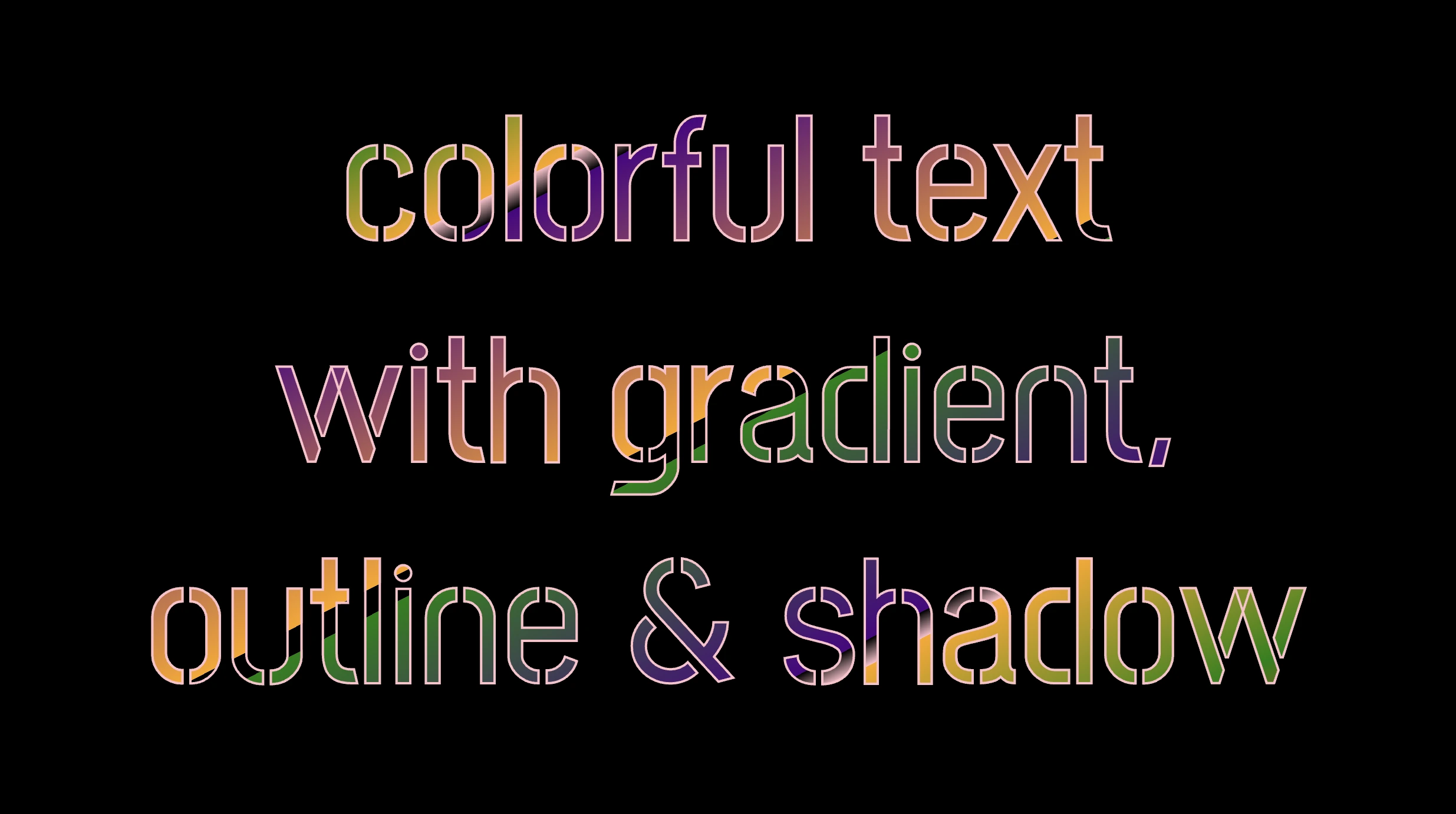
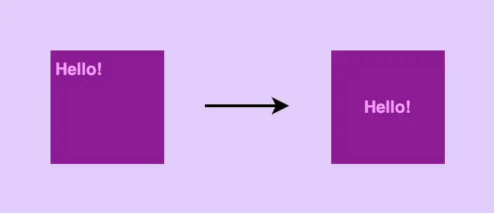
The following image shows what is rendered on the screen now.
Inside the .font-effects style rules, we include the following instructions to create these amazing fonts:
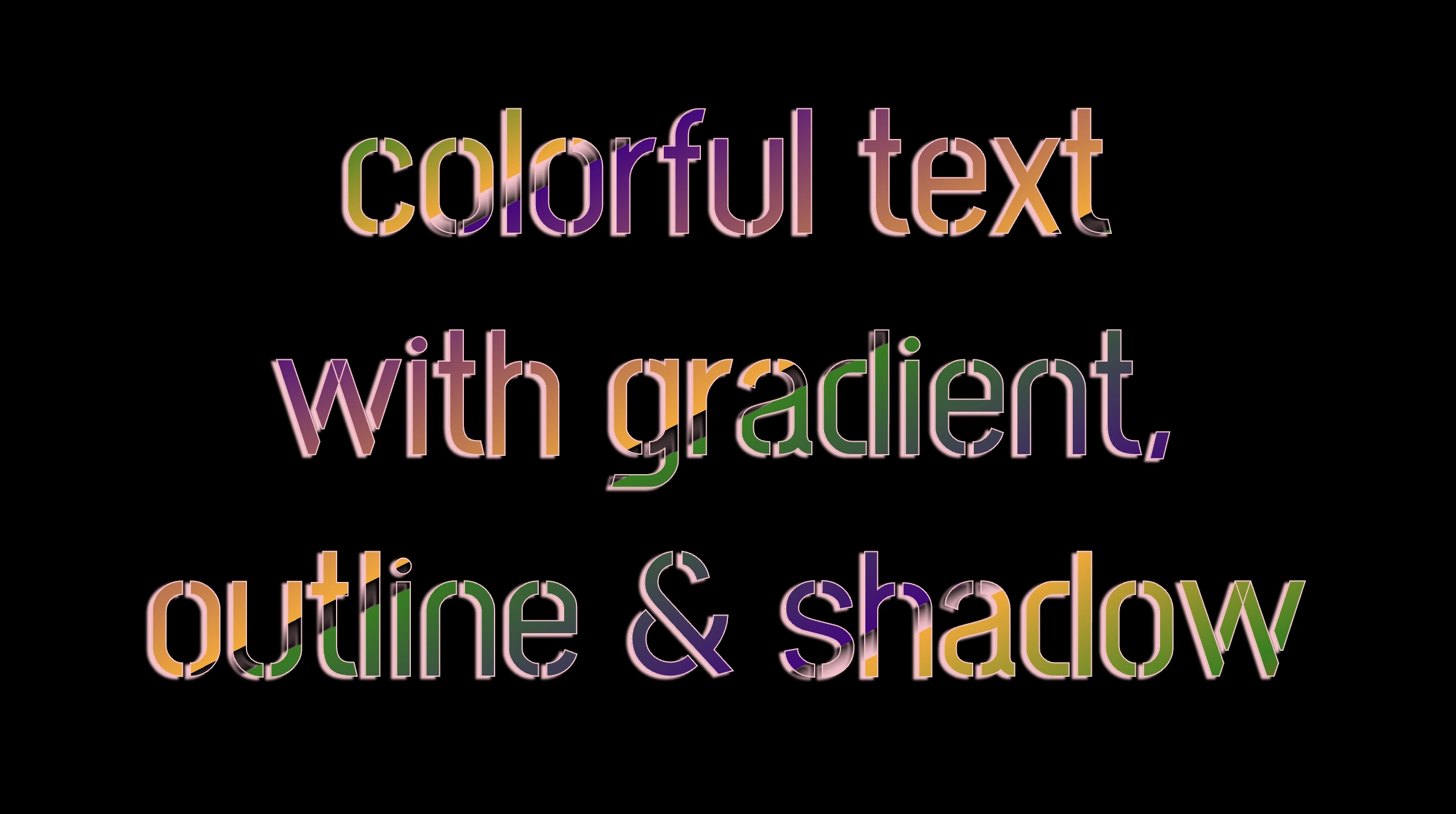
.font-combinations { .../* adding colors */background-image: linear-gradient( to rightbottom, red0, green15%, orange25%, pink25%,transparent27%, indigo27%, orange50%, black50%,transparent52%, green52%, indigo73%,transparent73%, pink75%, orange75%, green90%,red100% );/* Makes the text shape match the background */-webkit-background-clip: text;color: transparent;/* adding outline to text */-webkit-text-stroke-width: 1px;-webkit-text-stroke-color: pink;/* adding shadow to text */filter: drop-shadow(-2px2px2pxrgba(250, 190, 210, 0.8));}
CSS
Adding the linear gradient effect
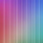
background-image: linear-gradient(...) ➡ This CSS rule creates a background gradient using the linear-gradient function. The gradient begins with red, transitions to green, and then shifts to orange. It then transitions to pink, becomes transparent, then indigo, returns orange becomes transparent once more, shifts to green, then indigo, then transparent again, returns to pink, then orange for the third time, then green, and finally returns red again.
Remember that this gradient will be used as the background for our text. Isn’t this awesome? 😎
-webkit-background-clip: text ➡ We continue with this CSS rule that tells the browser to clip the background gradient to the shape of the text. We are not ready yet to see the colorful background as text. 😕 We just prepared the space (fonts). Don’t worry we will proceed with our work and see the amazing result! 😉
color: transparent ➡ This CSS rule makes the actual text content transparent. This allows the colorful gradient to show through the text 🥳, and there it 🥁 is!
Adding the outline effect
-webkit-text-stroke: 2px red ➡ Then we add a pink outline or stroke with a width of 2 pixels. This makes the text more visible against the background gradient.
🔖 We are free to write it more analytically setting the following two CSS properties -webkit-text-stroke-width and -webkit-text-stroke-color. It’s up to you!
Applying the shadow effect
filter: drop-shadow(-2px 2px 2px rgb(250, 190, 210, 0.8)) ➡ To finalize our work we add a shadow to the entire section, with an offset of -2 pixels to the left, 2 pixels down, a blur radius of 2 pixels, and a subtle pink shadow rgba(10, 10, 10, 0.8). This deep shadow adds a subtle but noticeable darkening effect to our text.
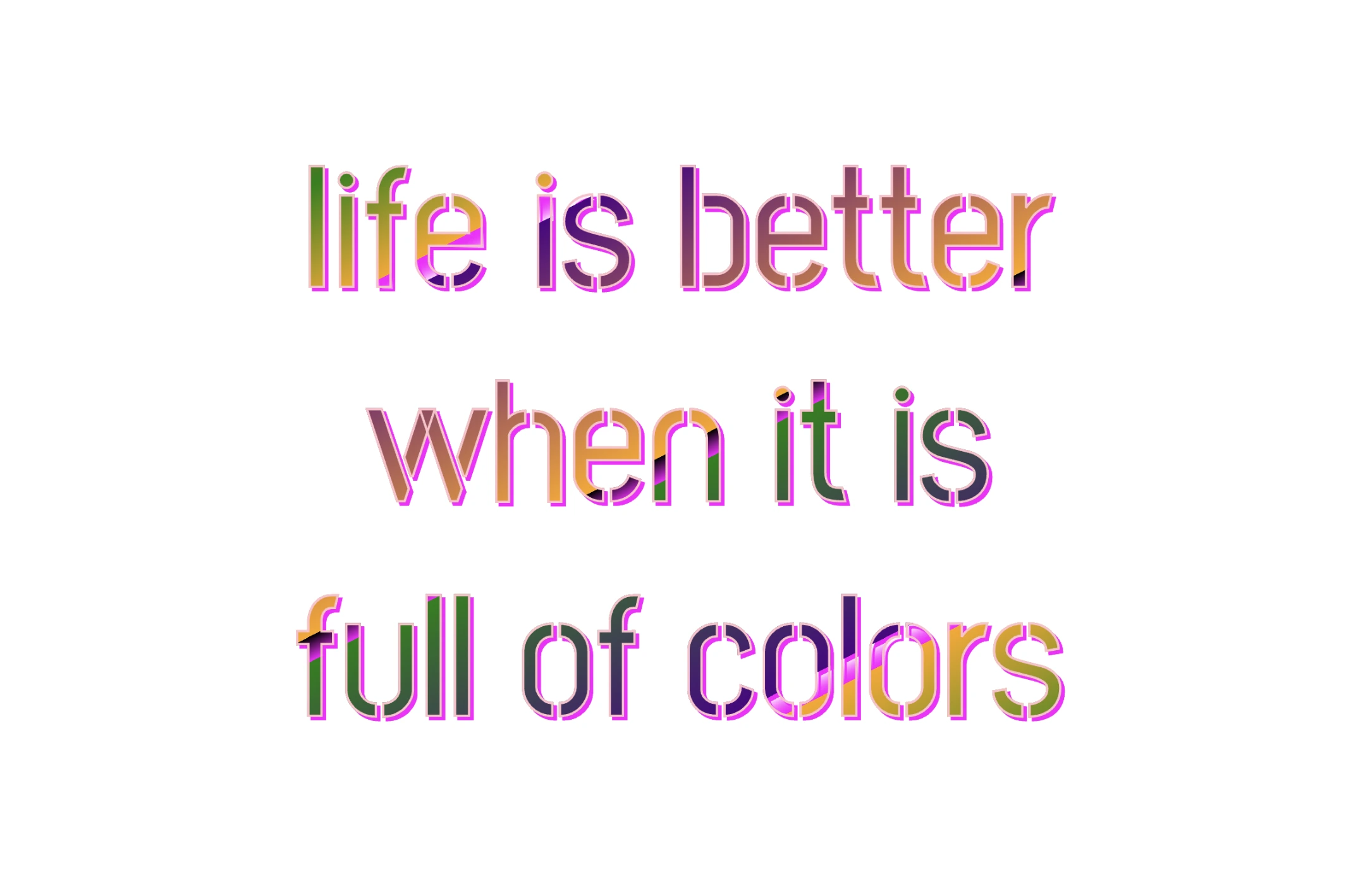
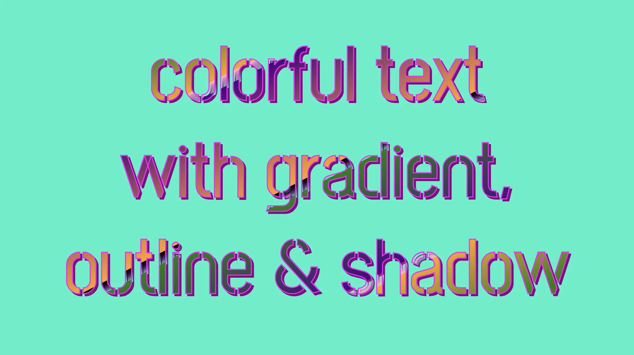
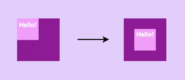
To infuse our text with a touch of fantasy and vibrance 🎉 ✨, we can use a brighter color for the outline and change the shadow to match. For example, we could create a vivid or dark background as a way to create contrast and then swap out the pink outline and shadow for a more vibrant magenta. In the picture below, you can see how these small changes make a big difference, giving a more colorful and bright result.
Hello, there 😃 Let’s step into a digital world where CSS brings forth the captivating CSS text outline effect. It’s a simple yet powerful technique that adds structure and clarity to texts and elements.
Let’s dive into how CSS outlines 🖋 can make a significant difference in the visual appeal of your website. 💻 🫧
Create basic HTML and CSS structure
As a first step, we need some basic HTML structure to apply our CSS stylings.
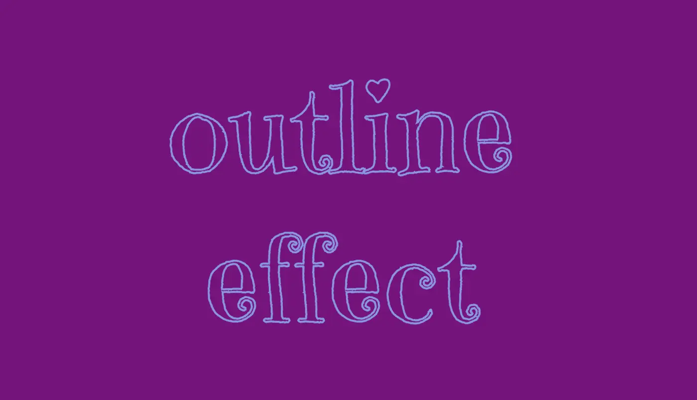
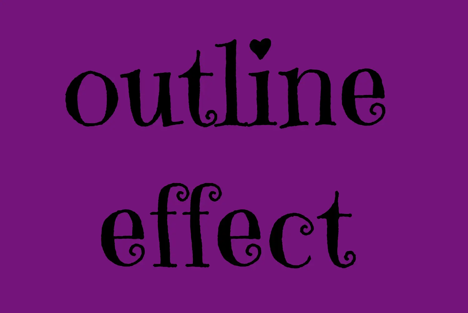
Let’s see what we have done so far. I have chosen a vibrant purple color for our background while keeping the text in the default black color. Our text is set to 180px, perfectly aligned to the center.
To give a playful and lively vibe to our design, I’ve chosen the “Emily Candy” font-family which adds a delightful touch. If you also intend to use this font family, importing it into your CSS file is essential. Ensure the @import statement is placed at the beginning of your CSS code snippet, just like I did (check above lines 2-4).
In the image below, you can see the current rendering on the screen up to this point.
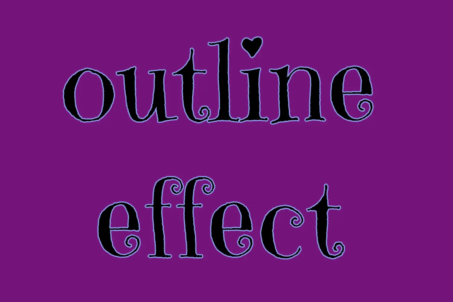
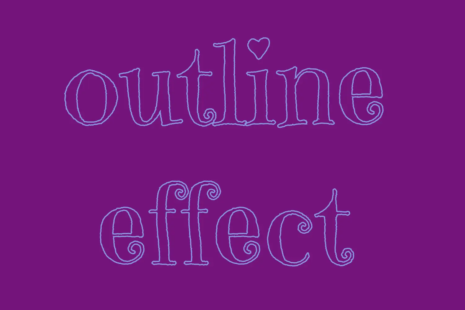
Apply the CSS text outline effect
.outline-effect { ... text-stroke: 2px#8695e9; // medium blue shadecolor: transparent;}
CSS
The first thing we have to do is set the text-stoke property which represents a specific style line. Here, in our example, the text should have a light to medium blue color (#8695e9) outline with 2 pixels wide. Remember that as we increase the pixels, the outline becomes wider.
🔖 It’s useful to know that we can split the text-stroke property in two: text-stroke-width and text-stroke-color.
Hello everybody! 😀 In this post, we’ll work with the amazing CSS border property, which is basically the line that surrounds our objects. Borders are an independent property and do not affect the content within. You can think of borders as beautiful frames that enclose HTML elements. ✨ 🖼 Let’ dive into the details of CSS border styles.
When working with borders in CSS, we have four key properties to consider:
border-width
border-style
border-color
border-radius
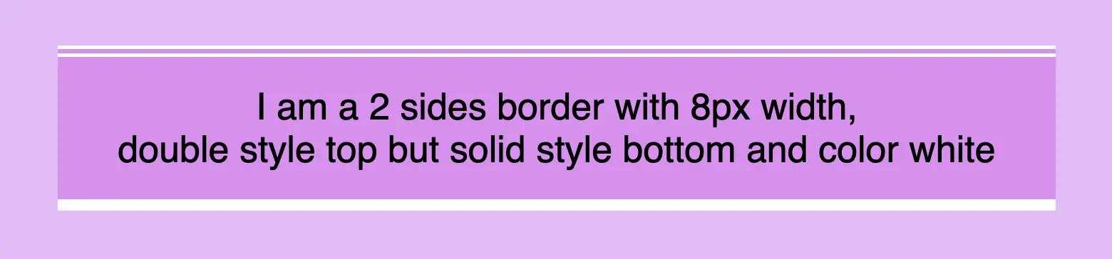
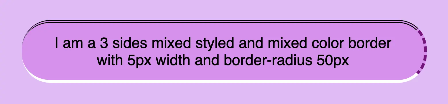
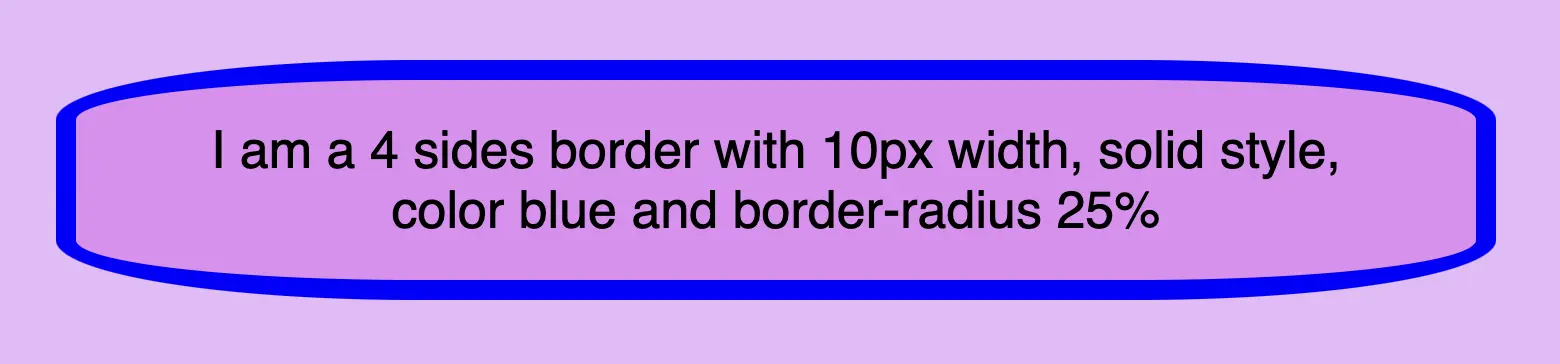
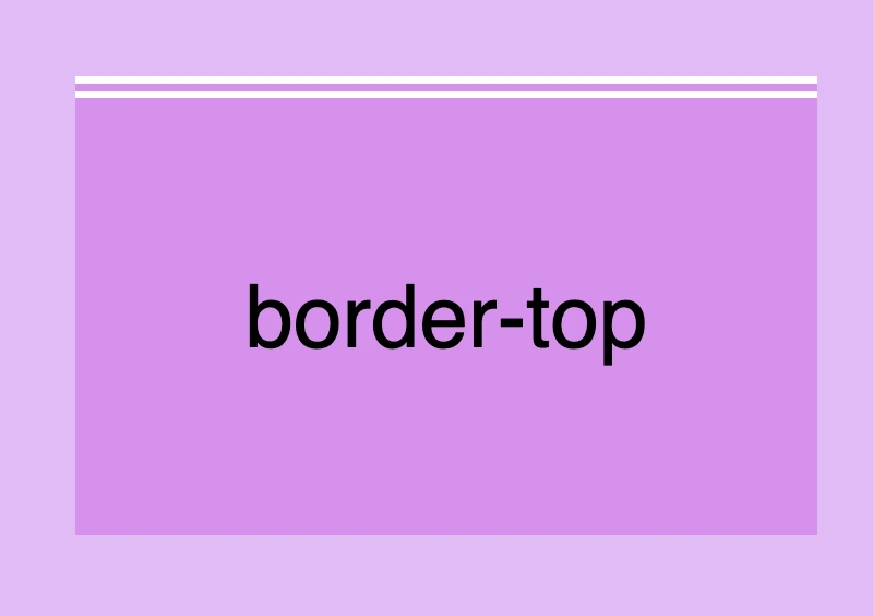
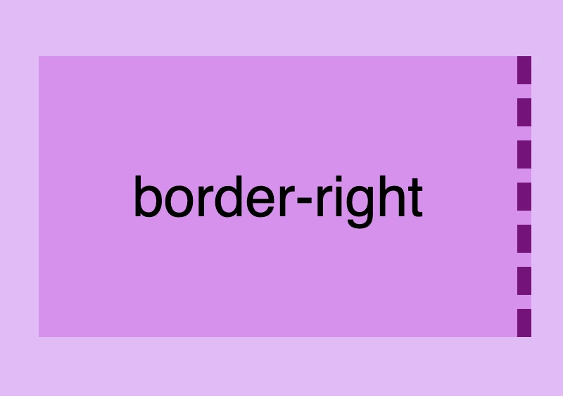
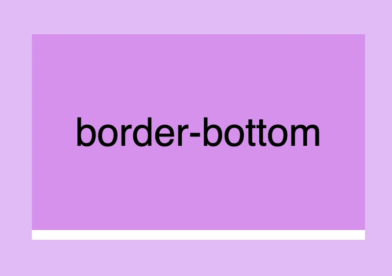
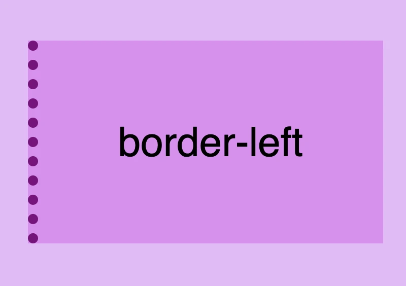
Furthermore, we have the option to handle each side individually by using properties like border-top, border-right, border-bottom and border-left. We can either modify all four sides at once or selectively apply changes to different sides.
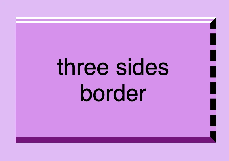
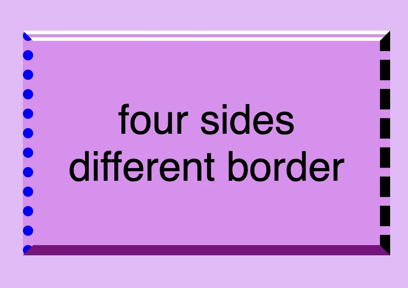
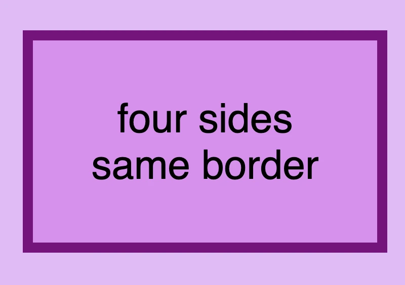
Below, there are some basic examples of borders so that you can have a quick glimpse of the possibilities offered by this CSS property. Afterward, we will go deeper and explore every case more analytically.
CSS border style – The playful property
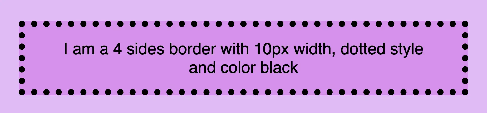
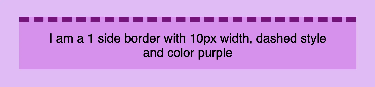
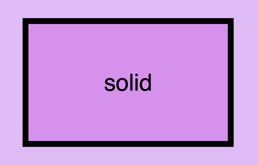
We can now move forward and focus on the first thing we need to know about borders is the border-style CSS property. There are many styles available, but for today, we will concentrate on the most common ones.
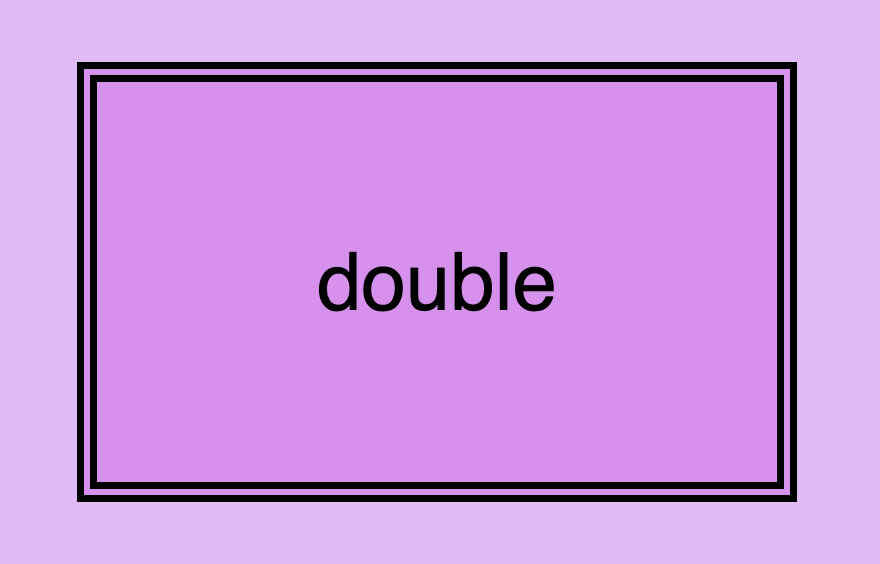
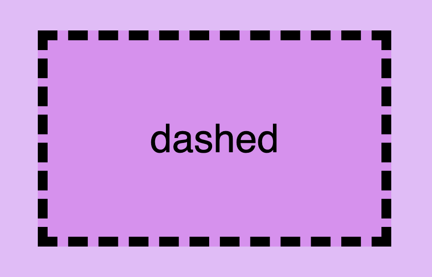
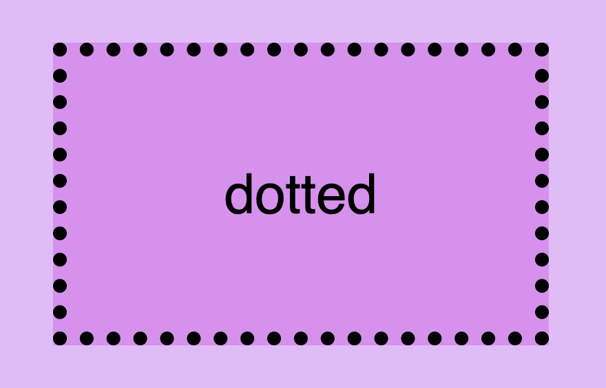
The first and most usual is the solid type which is just a simple line. Then we have the double which is as you’d expect a double line border. Another style is the dashed one in which, the line is made up of dashes. It’s nice to have clear and descriptive names right? Finally, the dotted style is the one in which the border line consists of dots.
Below, you will find examples showcasing the styles we’ve just mentioned alongside their respective CSS code:
Now that you’ve seen the basic border stylings, it’s time to check out the border’s width property. By default, borders have 1px width. To change that, we must modify the border-width property according to our needs.
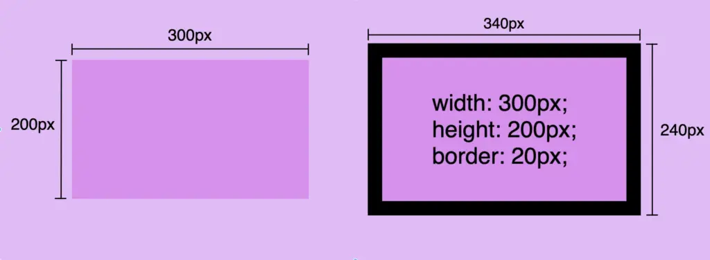
Before we continue, it’s important to give you some insights on an important property that directly affects border behaviors and is called box-sizing. Box sizing’s value is set, by default, to content-box . Because of that borders occupy additional space around the objectsthey surround.
In simple words, if I have a box with 300px width and 200px height and I want to add a 20px border to all sides, then I will end up having a bordered box with 340px width and 240px height. Let’s see how I came up with this result:
🕵️♀️ By exploring the box-sizing CSS property, we can include borders within the box’s dimensions. If you’re interested in learning more about it check out my post. You will find detailed instructions and explanations on each box sizing method.
CSS border color – For vivid results
The next step is to understand how border color works. By default, borders are always rendered in black. This means that if we don’t specify a color our borders will automatically display in black.
By default, borders are always rendered in black
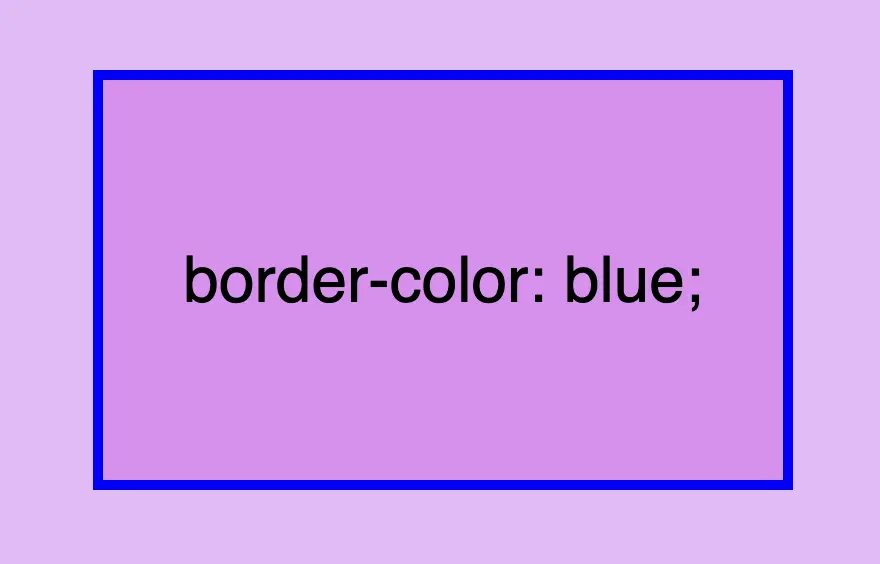
However, if we want a different color we have the freedom to choose any color we desire and simply assign it to the border-color property. Let’s see that in action:
border-color: blue;
CSS
Border colors can be described using various different value types. For instance, you can specify the color blue by using :
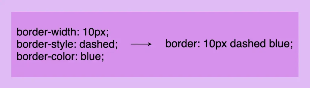
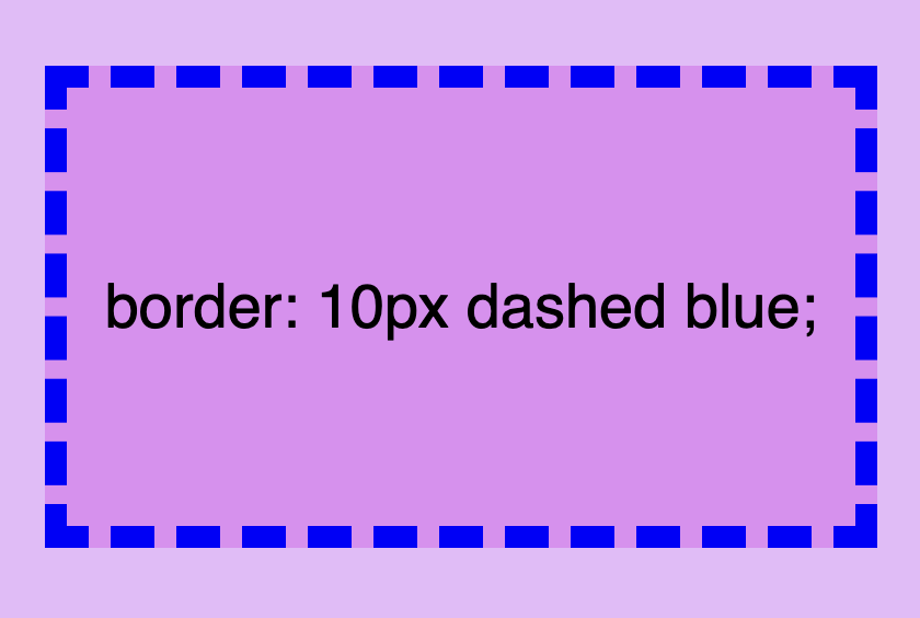
There is a cool method for writing all the above border properties that prove to be highly useful. By choosing this approach, you can set multiple values simultaneously. This technique is a super efficient way to define all border properties in a quick and easy manner. It’s a total time and space saver! 😃
Instead of listing each property separately, you just add each property side by side in a single line:
border: 10px dashed blue;
CSS
Cool right? 😎 ✨ Keep in mind that the order of the property doesn’t matter! We usually start with pixels and then add style and color, but it’s up to you the final decision!
CSS Border Styles for unique results
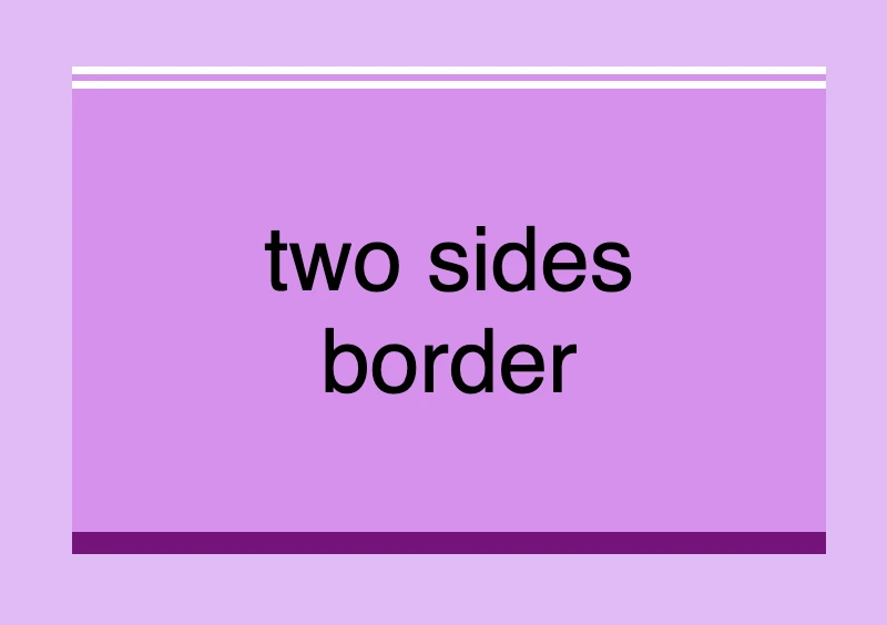
Additionally, we have the flexibility to selectively choose specific sides when defining our border styles. This allows us to create borders combined with different styling. In the following example, you can check out some of these combinations. But still, you are free to make your own! 😀
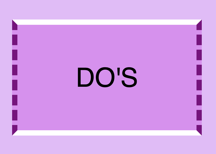
🔖 Keep in mind when working with the CSS border property that it is considered a good practice to set equal border widths for all sides. Being consistent helps by bringing a sense of balance and distraction-free results. Furthermore, try to avoid mismatched styles and colors. Matching styles and colors lead to a smooth and cohesive look that’s easy on the eyes. Not to mention, it keeps your code cleaner 🎉 and easier to manage. 😀
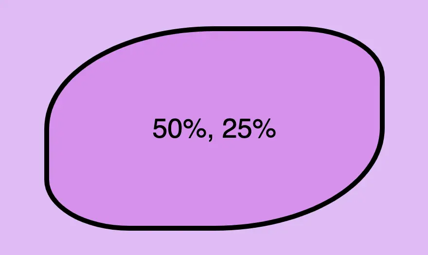
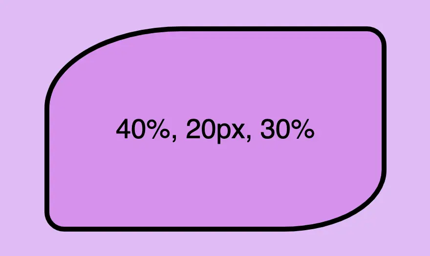
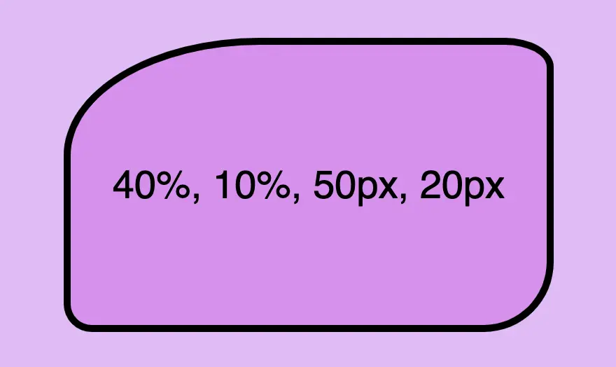
Last but not least we have the border-radius CSS property, which enables us to give our elements rounded corners. We can opt for uniform rounding or we can apply different degrees of rounding to each corner. In addition to that, it’s useful to know that when we are working with different radius per corner, we can also combine px with %.
When we are setting different border-radius per corner, we are free to combine px with %.
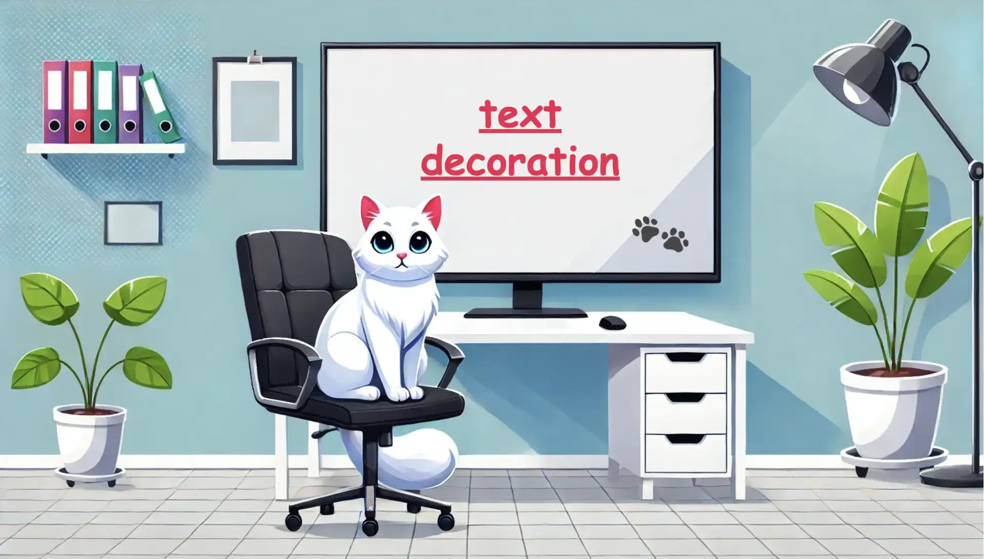
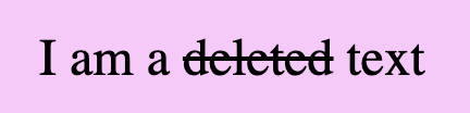
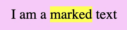
Hi to everyone 😃 Today, we will analyze the CSS text decoration property, which is a valuable tool for improving the presentation of text on your website. It allows us to add visual enhancements such as underlines for hyperlinks, strikethroughs for completed tasks, or the removal of decoration for a clean and professional appearance.
With minor code adjustments to our CSS code, we can enhance the visual appeal of our text content. Consider integrating it to elevate the aesthetics of our website. Below, I’ve prepared a detailed guide.
Wishing you bug-free reading 👩💻, I mean coding! 💻 ✨
Text-decoration line
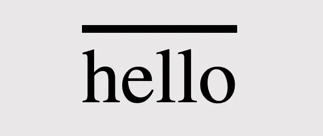
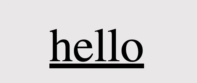
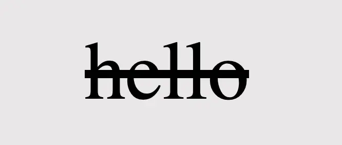
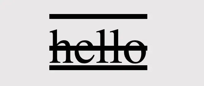
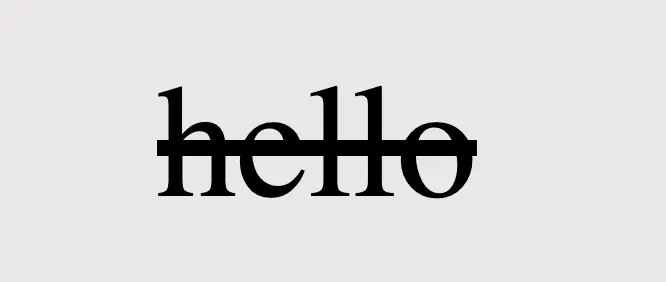
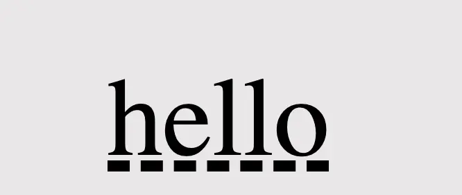
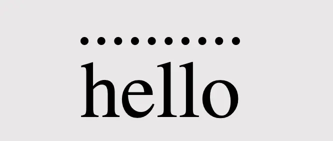
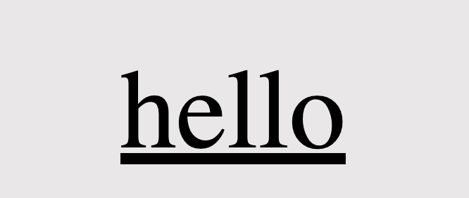
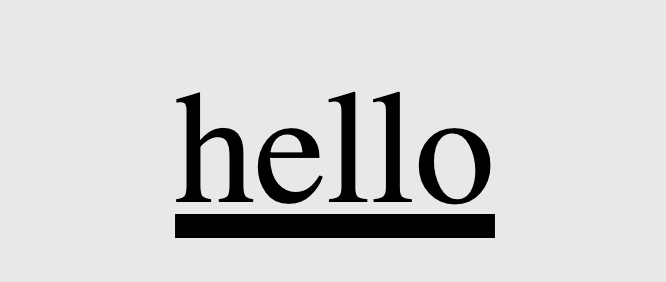
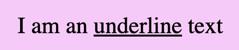
First of all, we define the position of the line we desire by setting text-decoration-line. Those are: underline, overline, and line-through.
text-decoration-line: overline;
CSS
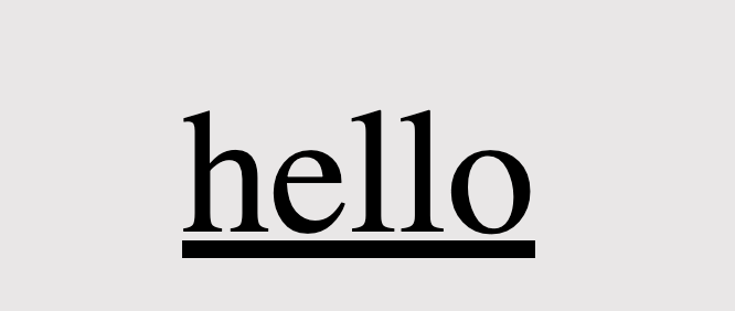
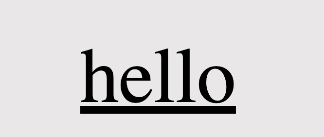
text-decoration-line: underline;
CSS
/* text-decoration: line-through is also a way to write it */text-decoration-line: through;
CSS
/* we are also able to make line combinations */text-decoration-line: overline through underline;
CSS
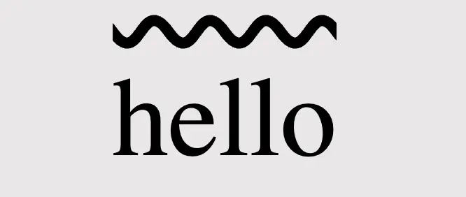
Text-decoration style
Next, we proceed by configuring text-decoration-style to specify the desired line style, such as solid, dashed, dotted, double, or wavy.
🔖 Each example set a different position (text-decoration-line) for the lines as an opportunity to see more combinations. 😎
Using colors is a timeless strategy for enhancing aesthetics. Embracing the use of colors is equally effective in our case, accomplished through the addition of text-decoration-color.
/* default color value */text-decoration-color: black;/* or */text-decoration-color: initial;
CSS
text-decoration-color: orange;
CSS
.text-color {color: green;}/* inherits text's color */text-decoration-color: current-color;/* or */text-decoration-color: inherit;
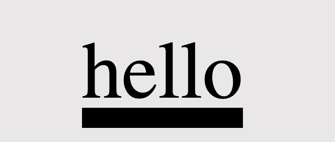
Lastly, adjusting the text-decoration-thickness allows us to precisely manage the thickness and also offers us the flexibility to choose between pixels (px) or percentages (%) based on our preferences.
/* the browser pick the thickness of the text decoration line */text-decoration-thickness: auto;
CSS
/* means "use the default thickness for underlines as determined * by the browser". */text-decoration-thickness: initial;
CSS
/* The percentage value is relative to the font size of the text * to which the decoration is applied. * Example: * In our case the font size is set to 40 pixels, * so the underline will be 6 pixels thick, * which is 15% of its font size (15% of 40 pixels) */text-decoration-thickness: 15%;
CSS
/* override the applied default thickness */text-decoration-thickness: 10px;
CSS
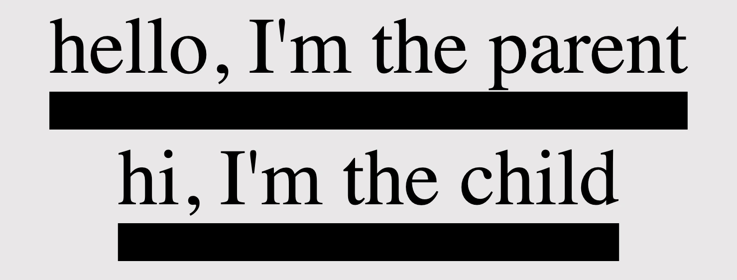
<divclass="parent"> hello, I'm the parent<divclass="child">hi, I'm the child</div></div>
HTML
/* Thickness for the parent element */.parent {text-decoration: underline;text-decoration-style: solid;text-decoration-thickness: 20px;}/* Inherits thickness from the parent */.child {text-decoration-thickness: inherit;}
CSS
Be distinctive by mixing text-decoration
We can always create mixings and make our texts more strong and more stylish. Below I prepared two examples for you in order to make it clearer. 😃
Underline mixings
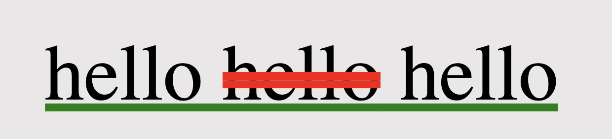
We combined the following HTML and CSS code snippets to create a styled text element. The HTML part consists of a <div> element with the class underline-mixings containing the text hello and a nested <span> element with the class extra-underline, also containing the text hello.
The CSS styles are applied to these elements using their respective class selectors. The underline-mixingsins class applies an underline with a double style and green color to the text within the <div>.
On the other hand, the extra-underline class applies a red dashed underline to the text within the <span>, along with a 12-pixel thickness for the underline.
When combined, this code creates a styled text element where the text inside the <div> is underlined with a green double line, while the text inside the <span> has a red dashed underline with increased thickness. We can use it if we want to emphasize a specific part of a text.
Strike through mixings
Within the HTML code, there is a <div> element with the class strike-through-mixings, encompassing the text hello and containing a nested <span> element with the class extra-underline, which also contains the text hello.
The CSS styles are assigned to these elements through their corresponding class selectors. The strike-through-mixings class gives the text within the <div> an underline with a solid style and a green color. Meanwhile, the extra-underline class applies a red double line-through decoration to the text inside the <span>, with an 8-pixel thickness.
When we put together this code, generates a styled text element where the text within the <div> has a green solid underline, and the text within the <span> is displayed with a red double line-through decoration of increased thickness. It is really useful if we want to erase a part of a text.
Text-decoration shorthand
The CSS text-decoration shorthand property lets you apply decorations like underline, overline, and line-through in a single statement. It simplifies things by merging multiple properties into one. Settling the shorthand makes your code shorter and easier to understand. You can set all of these properties at once, making it more efficient or you can pick some of them based on your requirements.
The CSS text-decoration shorthand property lets you apply decorations like underline, overline, and line-through in a single statement
🔖 Note that the order of these values doesn’t matter; you can change the order and still achieve the same results. However, it is essential to specify the type of the line, as setting the text-decoration-line is a necessary step for your code to work properly.
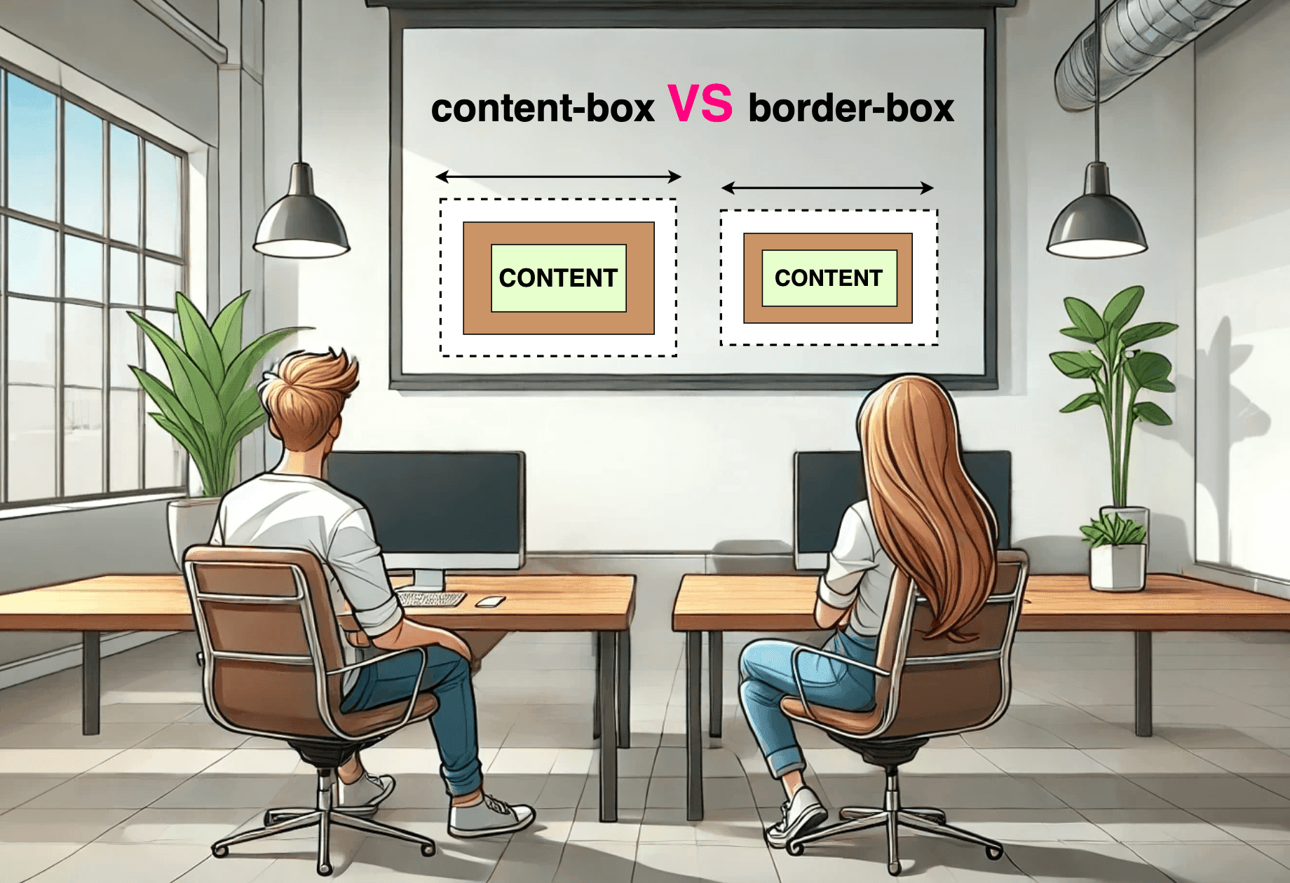
Hello there! 😃 In this post, we’ll explore the unique CSS box sizing property, which is a part of the box model. We’ll explore how this property affects the size of an element on a webpage and take a closer look at the details of the content-box and border-box CSS properties.
So, let’s move forward and delve into 🕵️♀️ the powerful box-sizing CSS property!
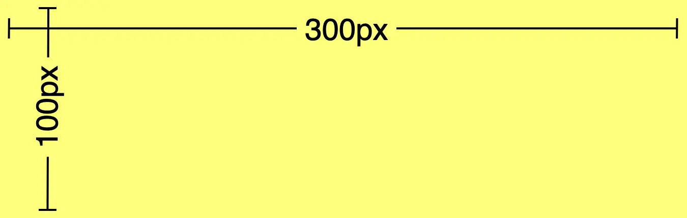
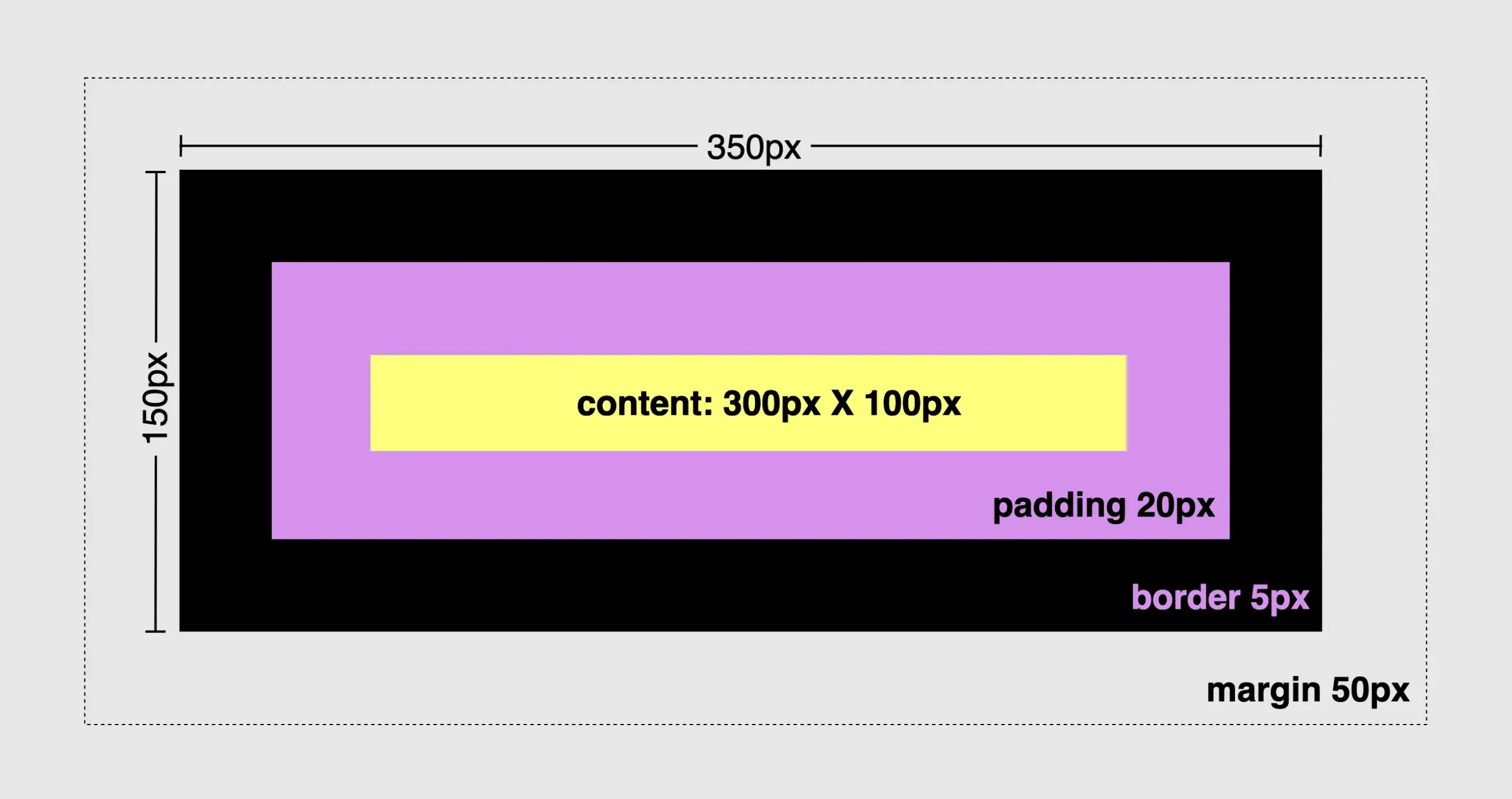
First of all, we have to create a simple box with specific dimensions for its width and height. Also, assigning a color for our box would be essential, hence, we also need to set a background-color. I like the idea of giving our box a vibrant and cheerful yellow 🟨 as it is super appealing! 😃
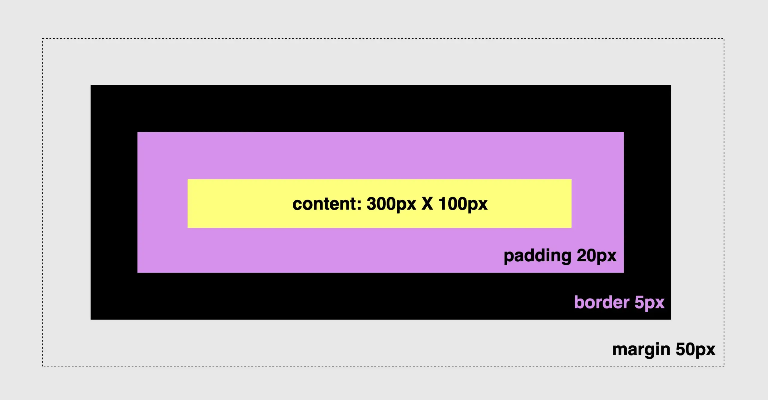
Since our box is now prepared, 🥁 we can proceed further by adding padding, border and margin and observe the changes in the dimensions surrounding our box.
Paddings & margins are both transparent. Paddings use the same background as the one used by the main content, while margins inherit their background from the parent element to which they belong.
🔖 For today, and only in order to make our example more explicit and easily understandable, we have chosen to apply a purple 🟪 color to the padding. In the image below we can see what is rendered to our screen based on the code snippet.
.box { ...padding: 20px; /* to all 4 sides */border: 5pxsolidblack; /* to all 4 sides */margin: 50px; /* to all 4 sides */}
CSS
Understanding CSS content-box
First and foremost, we need to know that all elements have, by default, box-sizing: content-box. That means when we add border and padding to an element, it automatically grows bigger and occupies more place.
(The provided code snippet serves as an illustration of the configuration. It should be emphasized that this snippet is specifically designed for the purpose of this example, and represents the default setting, as we previously mentioned).
The box-sizing property does not have any effect on margins as they are already positioned outside of the element’s space and are not considered part of it.
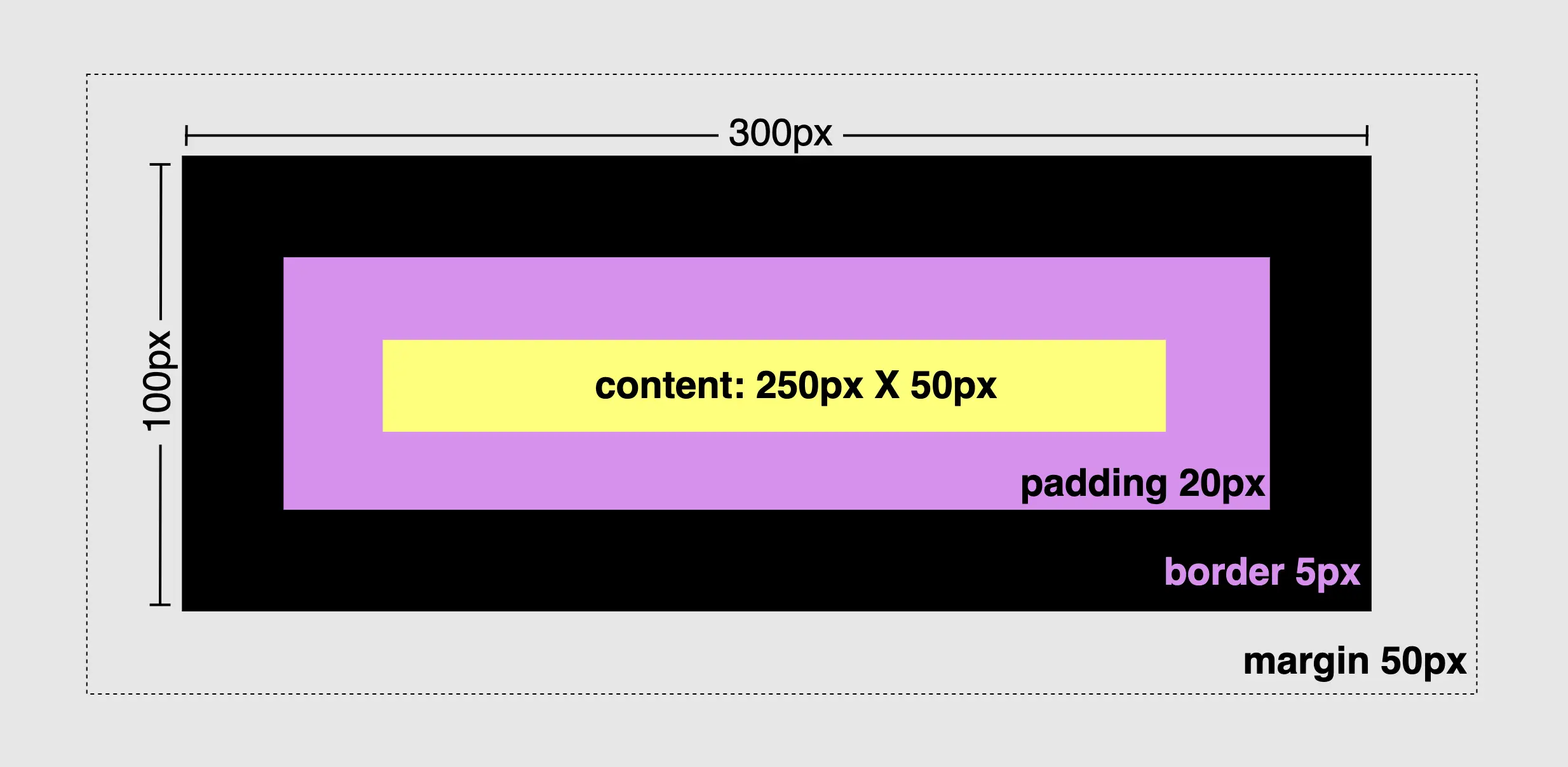
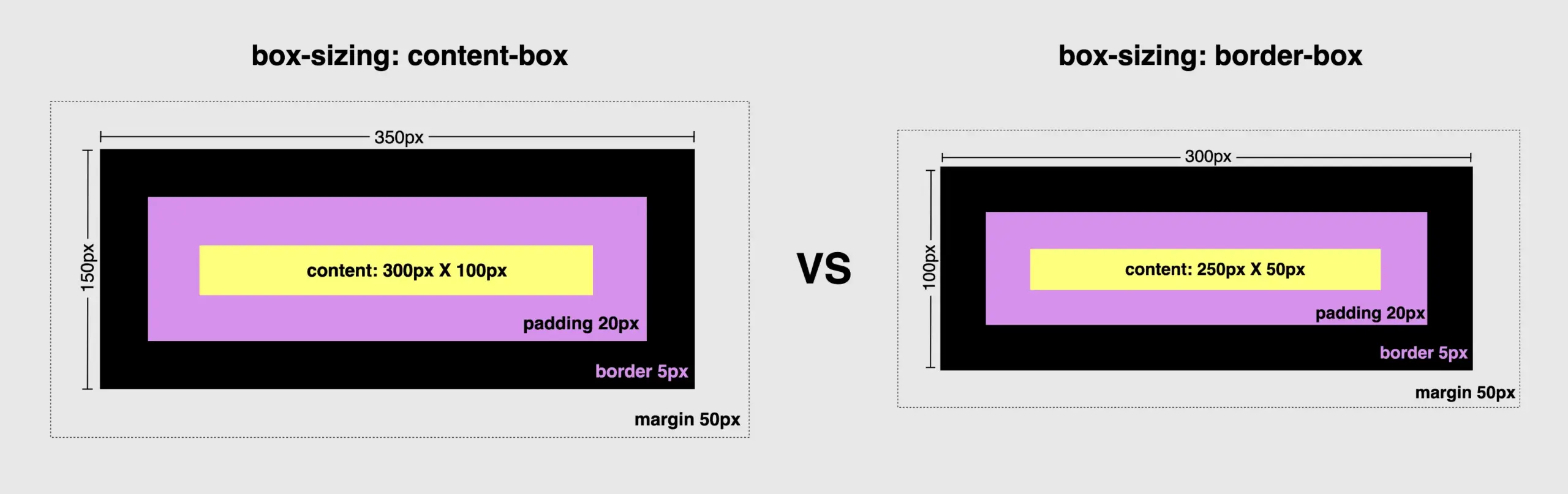
To modify the default configuration and include the borders and paddings of an element within its initial size, it is necessary to apply the CSS property box-sizing: border-box. This property ensures that the specified width and height of the element is now adjustable and the content box can reduce its dimensions in order to include/accommodate paddings and borders.
To summarize in a nutshell, 😌 content-box calculates the width and height based only on the content while border-box includes the paddings and borders in the calculation.
Let’s examine both images side by side to simplify the contrast of their different sizes.
Tech tips
* {box-sizing: border-box;}
CSS
🔖 We usually choose the border-box method due to its simplicity in achieving consistent layouts. We include the corresponding code in our CSS files by setting the asterisk (*) from the CSS selectors. By doing so, we apply it to all HTML elements, hence, we no longer need to include it repeatedly in each HTML 👌 element.
In this post, we will explore how to center elements in CSS using various methods and make our lives, as developers, much easier. Are you ready to dive deeper? Take your snorkel 🤿 and follow me!
As in life, so in programming, placing items in a way that will be helpful or more beautiful, is one of the most important things you can achieve. There are plenty of ways to place or position (in programming terms) items, although it still remains quite a challenge.
We will start by adding our basic HTML & CSS structure:
Now, we can move forward. 😕 Don’t worry — everything is going to be okay! We‘ll go step by step together and continue working only on CSS.
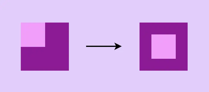
Below are two images. The left one shows what was rendered through our code above, and the right one shows what we want to achieve. Let’s get started! 💪
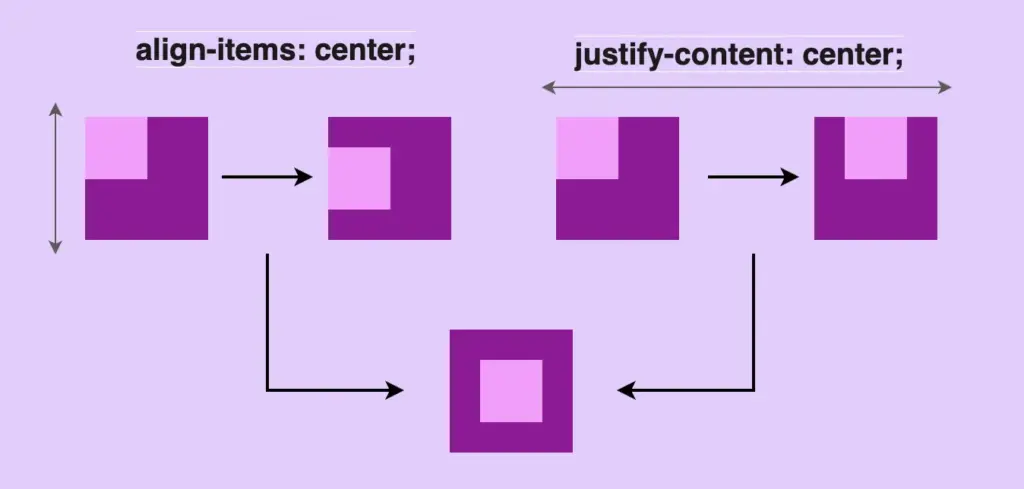
Center in CSS using flexbox
First, a few words about flexbox. 😇 Flexbox is a modern layout model, in simpler words, a way to easily position our HTML elements in rows or columns. It provides multiple ways, through CSS, to organize our layout and at the same time be flexible and responsive on different devices.
Basic steps for centering HTML elements using flexbox
The basic property for flexbox is the display property. Using display: flex is not gonna give us something but it is necessary if we want to work with the other flexbox properties.
To center HTML elements we have to use align-items & justify-content properties. align-items: center centers child elements vertically &justify-content: center centers child-elements horizontally.
All these three properties combined give us the desired outcome, as seen in the code snippet below:
There is a small prologue for the grid here. 😇 The grid is a layout system. There is a basic difference between flexbox and grid. Flexbox is one-dimensional (best suited for small-scale layouts) while grid is two-dimensional (best suited for large-scale layouts).
In simple words, with flexbox we work in rows or columns while with grid, we work on both at the same time. Grid layout makes it easier to create complex, responsive designs that adapt to different screen sizes and orientations.
Flexbox & grid can work together and complement each other
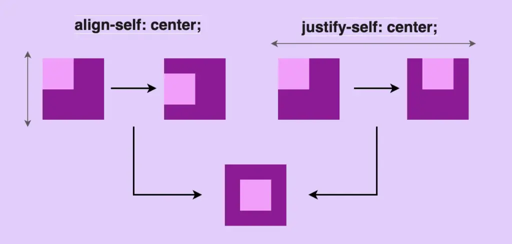
Using grid-template-areas
As in flexbox, the basic property for the grid is the display property. Using display: grid is not gonna give us something but it is necessary if we want to work with the other properties. By setting the display property of an element to a grid, the element becomes a container for grid elements, which can be positioned using the grid layout.
To center HTML elements we have to use align-self & justify-self properties. align-self: center centers child-elements vertically andjustify-self: center centers child-elements horizontally. All these three properties combined give us the desired outcome, as seen in the code snippet below:
Another way to center HTML elements through a grid is with place-items property. place-items: center centers child elements vertically & horizontally at the same time.
.parent { ...display: grid;place-items: center; /* centers vertically & horizontally at the same time */}
At this point, a few words about positioning property would be helpful, I suppose. 😇 CSS position property defines the position of an HTML element in a document. There are five types of positioning:
static
relative
absolute
fixed
and sticky
In this post, we will use position: relative & position: absolute . By default the position property of HTML elements is static. That means that our flow (direction of HTML elements) follows HTML order and goes from top to bottom. If we want to change this flow we have to change the position property.
Position: relative works exactly as position static but allows you to change the position of an HTML element. In simple words, you can now move your HTML element, for example, 20px left.
.examRel {position: relative;left: 20px;}
CSS
Position: absolute takes the document out of its flow and places an element relative to the closest parent element.
.examAbs {position: absolute;top: 40px;}
CSS
🤔 So if we have two HTML elements and we want to put one (which we used to call child-element) inside the other (which we used to call parent-element) all we have to do is put position relative to the parent and position absolute to the child.
.examParent {position: relative; /* parent element */}.examChild {position: absolute; /* child element */}
CSS
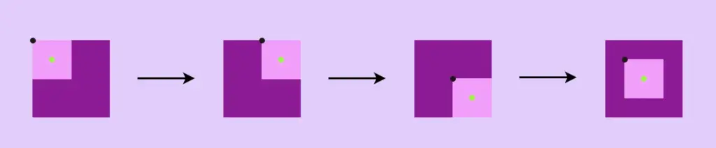
Using transform and translate
First of all, we set position: relative to our parent element. Secondly, we set position: absolute to our child element. Then we set left: 50% and top: 50% to move the child-element from the parent, using as a reference the child’s top-left edge (see black dot).
To finalize our centering, we use transform: translate(-50%, -50%) to align the middle of the child element (green dot) to the middle of the parent element.
First of all, we set position: relative to our parent element. Secondly, we set position: absolute to our child element. Then we set left: 0top: 0right: 0bottom: 0 . By doing so, the child element will fill all available space of the parent container.
Finally, we use margin: auto. Using the margin property lets the browser calculate the appropriate margin for the child element and divide the space evenly. It centers our element horizontally & vertically at the same time.
.parent { ...position: relative;}.child { ...position: absolute;left: 0;top: 0;right: 0;bottom: 0;margin: auto; /* centers vertically & horizontally at the same time */}
CSS
📢 Warning: you need to set a fixed width to the HTML element you are trying to center (in our case the child element). Otherwise, it won’t work!
Dos for CSS centering
If instead of a box, you have to center a div or even a whole paragraph you can use all these methods described above! To do so, remember NOT to add width and height to the child and just let the child get its dimensions based on the included text. This way when centering the child it will be the same as centering the text, check the image below:
If you decide, though, to add bigger dimensions, bigger than your text, I mean, you need to be careful. By doing so you might end up centering the child element but not its content, the text.
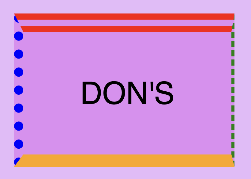
Don’ts for CSS centering
🥵 DO NOT center elements using huge paddings. It may seem easy at first but it is considered to be extremely risky and error-prone. Especially now that we have to deal with all these different screen sizes. You will be forced to change paddings again and again with media queries. (@media only screen and(screen’s width) { }).
Welcome to the vibrant 🎡 world of colors! The CSS color property is one of the most creative building blocks of web design. Whether you want to create a visually stunning user interface or simply add a touch of flair to your project, understanding the variation of colors will empower you to paint your digital canvas with endless possibilities. In this post, we’ll dive into CSS color methods and explore their syntax and formats. Let’s embark on this chromatic journey together! 🌈✨
Exploring CSS color methods
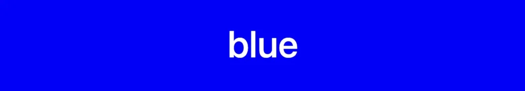
Most colors have a predefined name, allowing us to easily declare them by referencing their designated names. For instance, if we desire a blue color, we can do so by setting background-color: blue.
Apart from names, we can declare colors by setting the values HEX , RGB , and HSL.
HEX color method
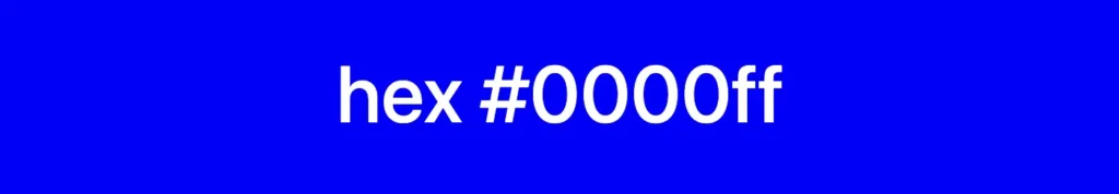
A hexadecimal (HEX) color is stated with #RRGGBB where RR represents the red color, GG stands for the green color, and BB acts for the blue color. In the example below, we can see that the HEX value for pure blue is #0000FF , where the first two ’00’ represent no red and the second two ’00’ represent no green, while ‘FF’ indicates the maximum intensity of blue color. So, at this point, is the right time to say that ’00’ stands for zero and represents the absence or off state, while ‘FF’ stands for the highest value and represents full intensity or the presence of all components.
Hexadecimal syntax supports using from 3 to 6 letters in order to denote RGB color combinations. As you may have already guessed, using less letter syntax reduces our color combinations, that’s why it’s mostly common to see 6-digit hexadecimal system when working on projects. In our example, we could write #00F instead of #0000FF.
🔖 It is essential to note that hexadecimal color works only if we add the # in front of it.
🔖 This 6-digit format for RGB colors (#rrggbb), can be extended to 8 digits to include an alpha channel, where the last two digits (00 to ff) represent the alpha value, with 00 being fully transparent and ff being fully opaque. Hexadecimal numbers use digits 0-9 and letters a-f. They represent numbers in a base-16 system. 🔹 Higher aa values (closer to ff or ee, etc.) mean less see-through colors. 🔹 Lower aa values (closer to 00 or 11, etc.) mean more see-through colors.
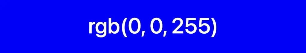
The RGB color model is a way of defining colors using red (R), green (G), and blue (B) values. These values go from 0 to 255, or you can use percentages from 0% to 100%. This gives us loads of different shades to play with!
Each value determines how strong that color should be. When the values are at ‘0’ or ‘0%’, it means the color is completely off, like it’s not there at all. But when they’re set to ‘255’ or ‘100%’, the color is at its maximum power or indicates the highest achievable intensity level. Cool, right? 😎
By skillfully combining them, we open up a plethora of possibilities, allowing us to create captivating color combinations.
Below, we see an example of the RGB color model for the color blue. The intensity of red and green is set to 0, and the intensity of blue is set to its maximum value of 255, resulting in pure blue color. In terms of percentages, it would be rgb(0%, 0%, 100%).
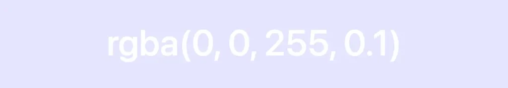
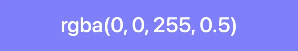
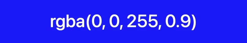
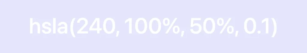
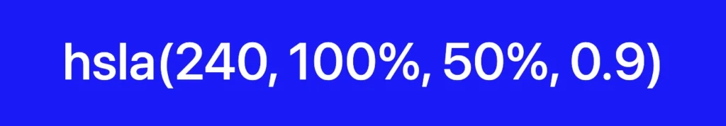
🔖 This function also allows us to add the alpha value (a) responsible for our color’s opacity (transparency), but this time written in a different way. It ranges from 0.0, which is fully transparent, to 1.0, which represents full color.
HSL color method
The HSL is another cool way to define colors. It consists of three parts that work together. So, let’s break it down!
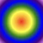
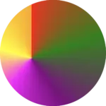
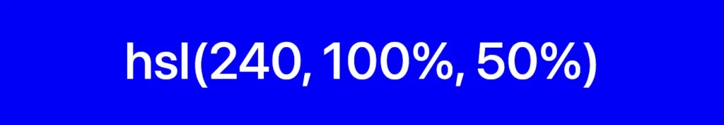
The first part is hue (H), which is a number on a color 🎨 wheel. It goes from 0 to 360, where red is 360, green is 120, and blue is 240. So, you can pick any hue you want, and it’ll give you a different color.
The second part is saturation (S). This one controls how vibrant the color is. When it’s at 0%, the color becomes grayish, but when it’s turned on at 100%, you get the boldest, brightest color!
And finally, we’ve got lightness (L). This guy decides how light or dark the color should be. At 0%, it’s dark as black; 50% is the regular normal color, and at 100%, it’s bright as white.
Combining all the parts we can effortlessly create a myriad of captivating color 🍭 combinations.
Above is an example of the HSL color model for the color blue. We begin with the hue value of 240 degrees, which corresponds to the blue color on the HSL color wheel. The saturation is set to 100%, meaning it is fully saturated and vivid. The lightness is set to 50%, which represents a mid-level brightness for the blue color.
🔖 This function also includes the alpha (a) component which controls opacity (transparency) and is written in the same way as rgb(), a number between 0.0, fully transparent, and 1.0, which gives a clear color.
In CSS, colors can be defined in three primary ways, each serving a specific purpose.
The first way is used to change the color of the text. This is achieved through the color property.
We continue with the second one, which focuses on adding color to the background by utilizing the background-color property.
Finally, the third way revolves around defining colors for element borders, providing them with a distinct and visually appealing appearance. This is accomplished by setting the border-color property. If you’d like to learn more, check out my post on creative ways to style CSS borders.
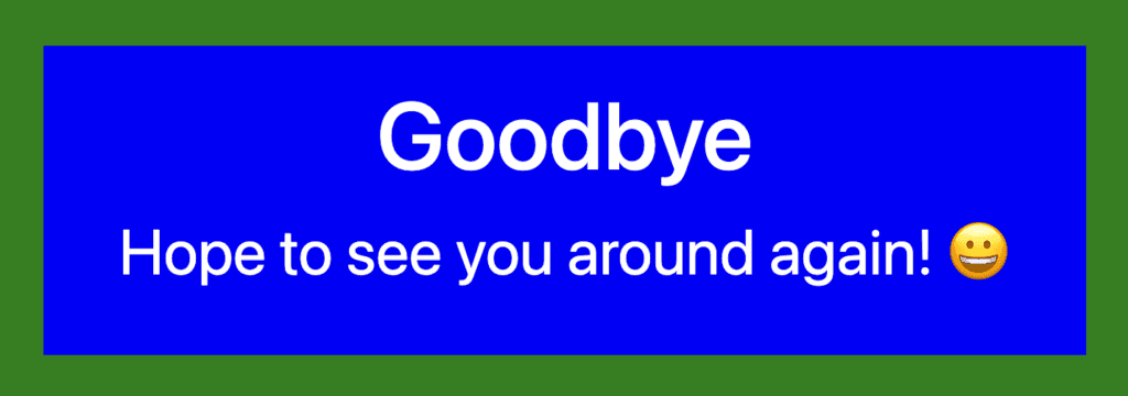
Explore different color combinations and properties to create a user experience that matches your design vision. For now, check out a simple example that follows:
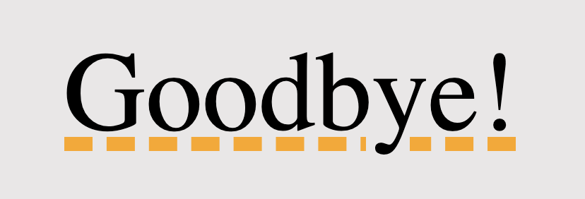
<divclass="container"><h1>Goodbye</h1><p>Hope to see you around again! 😀</p></div>
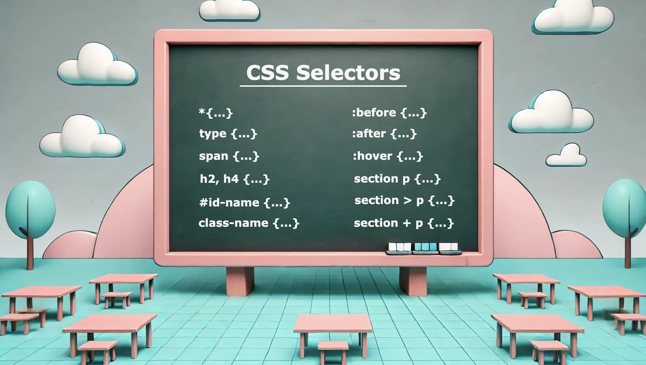
Greetings everyone! 😃 Today, our focus will be on addressing CSS selectors. These unique tools 🛠 are essential for targetting 🎯 specific HTML elements and controlling their appearance using CSS. Utilizing CSS selectors enables us to apply styles to those chosen elements which simplify and organize our code as well as improve the presentation and display of our websites.
CSS selectors offer a wide range of options, from a basic element selection class, id, type, * to more advanced techniques when combining them. In addition, we have the pseudo-selectors :before, and :after which also apply styles but only to specific elements and then it is the :hover pseudo-selector which adds the hover effect. So, let’s continue and analyze them one by one!
Universal CSS Selector
We are able to select ALL elements by setting the asterisk * selector. We utilize the asterisk to seamlessly/harmoniously apply uniform styles across all elements on our page. Below we can see an example where the CSS selector * applies a padding of 10 pixels to all HTML elements on the page. This means that every element, such as headings, paragraphs, images, buttons, and more, will have a padding of 10 pixels on all sides, creating consistent spacing around each element.
* {padding: 10px;}
CSS
Basic CSS Selectors
Now, it’s time to continue with the basic CSS selectors.
class selector
The first one is when we select elements based on their class. In the following example, we set all elements with classname="custom-class" to have background-color: yellow.
.custom-class {background-color: yellow;}
CSS
id selector
We continue with the second selector where we pick out elements based on their id. In the example below, we set all elements with id="custom-id" to have background-color: yellow.
#custom-id {background-color: yellow;}
CSS
type selector
Finally, the third selector is when we target elements based on their type (e.g.: p, h3, div, etc…). The code to the coming example selects all p elements from our document. The rules background-color: yellow and font-size: 14px means that all paragraphs on our document will be displayed with this specified background color and font size.
We can further enhance CSS selectors by creating powerful combinations. Mixing and matching elements, make our selectors stronger and maintain our code super clean. 😄✨ The examples provided above show how adeptly combining CSS selectors can lead to remarkable outcomes.
Multiple selectors
We can begin with the power of CSS selectors in tailoring styles to a variety of HTML elements. Using the above code snippet we set the text color for h1 and h3 to magenta, while the text color for h2, h4 and p will be pink. All other elements (e.g.: h5, h6, div, a, etc…) will not be affected by these rules and will retain their default styling.
h1, h3 {color: magenta;}h2, h4, p {color: pink;}
CSS
Adjacent Sibling Selector (+)
We move forward with a slightly different example. Here, our code selects only the first p element that stands after every section element. So, here we will give a purple background-color to paragraphs that come immediately after sections. If there are paragraphs that follow other sections but are not direct siblings, they will not be affected by this specific rule.
section + p {background-color: purple;}
CSS
<section><p>This paragraph will NOT have a purple background.</p></section><p>This paragraph will have a purple background because it is immediately preceded by a section element.</p><section><p>This paragraph will NOT have a purple background.</p></section><p>This paragraph will have a purple background because it is immediately preceded by a section element.</p><p>This is an additional paragraph after the last 'p' element, and it will NOT have a purple background.</p>
HTML
Direct children selector (>)
We continue by setting the following code which selects all the p elements but only when they are nested inside a section and only the direct children. So, here will give a purple background-color to all paragraphs p that are direct children of all section elements. Any other paragraphs inside nested elements or outside the section elements will not be affected by this specific rule.
section > p {background-color: purple;}
CSS
<section><p>This paragraph will be selected.</p><p>This paragraph will be selected.</p><div><p>This paragraph will NOT be selected.</p></div></section><p>This paragraph will NOT be selected</p>
HTML
All descendants selector
Our last example selects all p elements insidesection elements. So, here will give a purple background-color to all paragraphs p that are nested to section elements. Any other paragraphs outside the section elements will not be affected by this specific rule.
sectionp {background-color: purple;}
CSS
<section><p>This paragraph will be selected.</p><div><p>This paragraph will ALSO be selected.</p></div></section><p>This paragraph will NOT be selected</p><p>This paragraph will NOT be selected</p>
HTML
🔎 🕵️♀️ 🔍 The main difference between 3 and 4 is that section > p selects all p elements that are direct children, of the section, while section p selects all p elements that are descendants of the section, no matter how deeply nested.
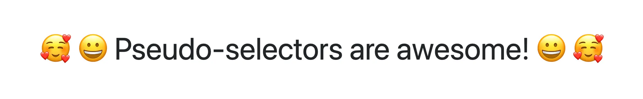
The :before and :after are not standalone selectors in CSS. They are pseudo-elements that can be used with regular CSS selectors to apply styles to specific parts of an element’s content. They are used in conjunction with regular selectors to add content before or/and after the selected elements and apply specific styles to that generated content.
Here we have an example using an h1 selector with :before and :after pseudo-selectors. Styles defined within h1:before will be applied to the content that appears before(left) the h1 element while styles defined within h1:after will be applied to the content that appears after(right) the h1 element.
h1:before {content: "🥰 😀"; /* the two faces will be placed before my heading(h1) */padding-right: 10px;}h1:after {content: "😀 🥰"; /* the two faces will be placed after my heading(h1) */padding-left: 10px;}
CSS
OR (using Sass)
h1 {&:before {content: "🥰 😀";padding-right: 10px; }&:after {content: "😀 🥰";padding-left: 10px; }} /* end of h1 */
SCSS
🔖 We need to add padding-right and padding-left in order to give our pseudo-selectors a small space, in our case 10px, from our heading.
<h1>Pseudo-selectors are awesome!</h1>
HTML
Ta-da 🥁 ! Below, we are able to view the current visual output displayed on the screen. Awesome! Isn’t it? ✨ 🎉
Hover
We use the :hover selector to change the style of an element when we hover over it. While it is commonly used with links it can also be applied to all elements. To implement this effect, first, select the element you want to target, in our case the <button>, and then apply the :hover pseudo-selector to it. After that, when we hover over the button, its color will change from pink to green.
The CSS selectors play a fundamental role in web development, enabling us to target and style specific elements efficiently. They provide great flexibility and precision in styling web pages. Use them in the right way 🧐 and you will be able to do amazing things! Sending good vibes for your CSS explorations! Happy coding!!
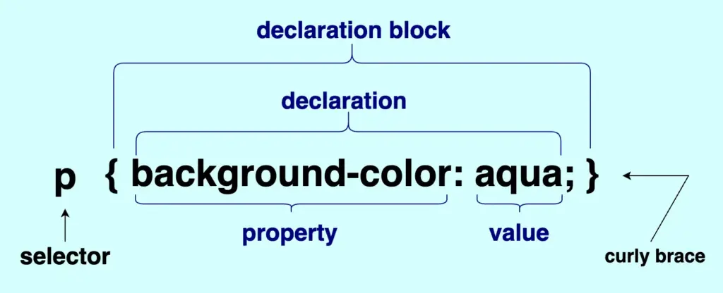
Hey there! 😄 Welcome to my post about CSS syntax. The Cascading Style Sheet (CSS) is a language we use to style and design ✨ 🎨 our HTML documents. It is NOT a programming 💻 language, and it is not stand-alone; hence, you should only use CSS to accompany and enrich HTML.
Below we can see an outline as a way to analyze and understand the CSS syntax better. You have to configure all the essential parts that compose CSS to make it work effectively.
The first thing we have to do is target the part of the HTML document we want to style, and we do so by setting the selector .
We continue with the declaration we want to make. The declaration block is the area that contains the styles we want to apply. Each block can contain one or more declarations depending on our needs, and it is necessary to be nested; that’s why we put it inside {} curly braces.
Each declaration includes a CSS property name and a value. The property represents the characteristics we want to apply to an element and is always followed by a : colon, while the value is the assigned setting for the property and is always followed by a ; semicolon.
🔖 In CSS, when we have more than one declarations we traditionally write them vertically to enhance readability. You can see that in the following example:
<p> Wishing you smooth sailing through your CSS adventures!</p>
HTML
p {font-size: 14px;color: magenta;background-color: navy;}
We often format HTML elements using CSS but can achieve basic text formatting using only HTML. Below are some of the most common HTML formatting elements for text and layout. I also prepared some examples for better understanding.
HTML Elements – Text Formatting
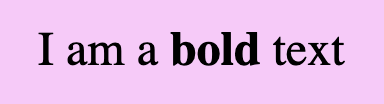
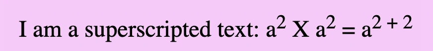
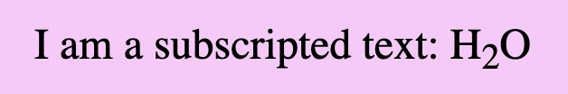
bold
<b>...</b>
<div>I am a <b>bold</b> text</div>
HTML
strong
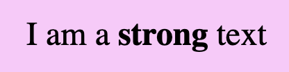
<strong>...</strong>
<div>I am a <strong>strong</strong> text</div>
HTML
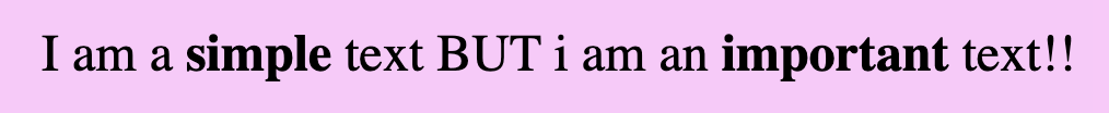
📢 Bold VS Strong
As we can see below <bold> and <strong> look exactly the same. The difference is that we use strong when we have to show an important text and bold when we want just to pay attention to the text, something like highlighting.
<div>I am a <b>simple</b> text BUT i am an <strong>important</strong> text!!</div>
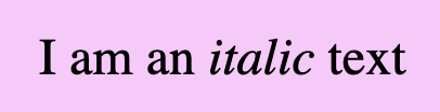
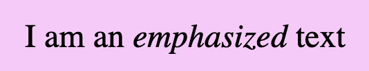
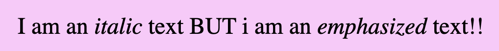
Formatting italic <i> and emphasized <em> appear in the exact same way. We use emphasized when we want to give emphasis to the text and italic when we want to present different our text.
<div>I am an <i>italic</i> text BUT i am an <em>emphasized</em> text!!</div>
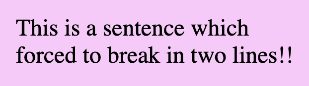
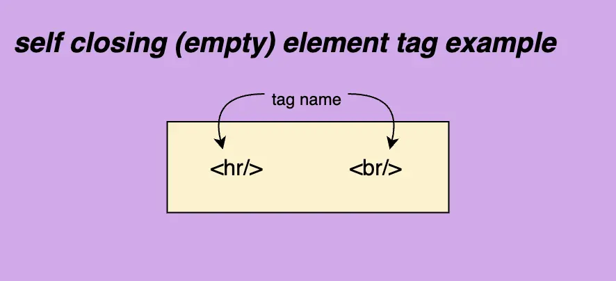
We can use two tags in HTML to manipulate our document’s layout. Break Line tag <br/> which inserts a new line by adding the tag wherever we want to force the text to break and the Horizontal row tag<hr/> which is used if we want to add space between HTML elements. There are both self-closing tags as they are empty elements.
break line
<br>
<div>This is a sentence which <br>forced to break in two lines!!</div>
HTML
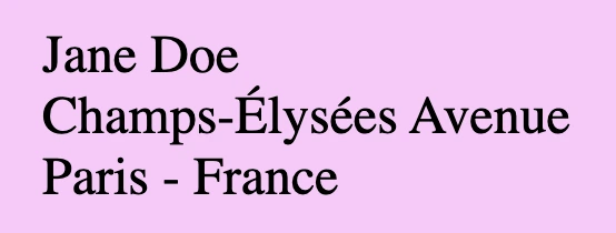
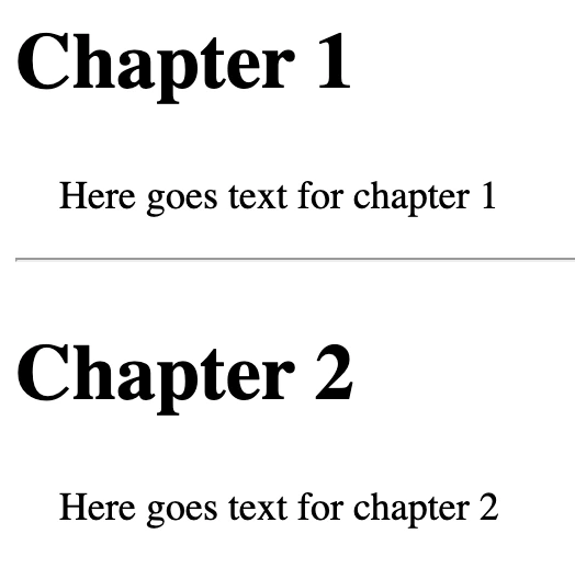
💡 A common practice for adding a new line is using the break line tag, which is helpful If we want to write an address.
<h2>Chapter 1</h2><p>Here goes text for chapter 1</p><hr/><h2>Chapter 2</h2><p>Here goes text for chapter 2</p>
HTML
💡 Remember, If you want to apply extra styling, you have to use 🔓 CSS instead! HTML is used as a markup language, whereas CSS is the one responsible for making something more beautiful 😄).
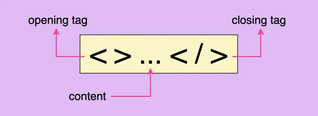
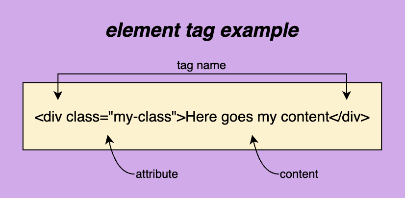
In order to create a web page, it is necessary to use HTML elements. These tags, also known as components represent the fundamental building blocks of a webpage. Each tag consists of:
the opening tag < > declare the beginning of an element and contains its characteristics, which are called attributes.
the closing tag </ > declare the end of an element.
it’s content <>...</> element’s content is accommodated within this space.
Here are some examples of how to construct HTML elements.
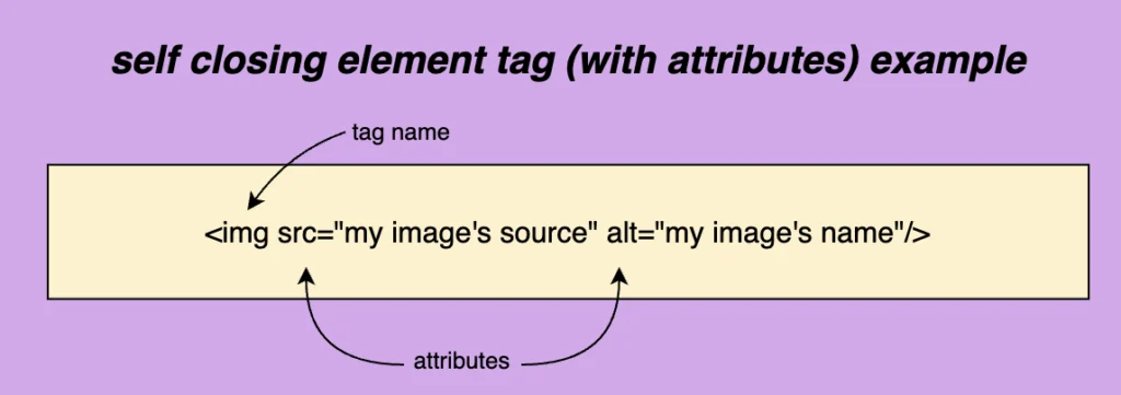
There are also some self-closing tags <.../> which means they have only one tag and no content. Some self-closing tags e.g <img/> have attributes and some don’t, like <hr/> and <br/>.
📝 Regarding closing tags, you may see them closing in the following ways:
<br>
<br/>
<br />
All three types are valid and you are free to use whichever you prefer. In our case, I’ll be using the closure slash without a space.
HTML elements
The <html> tag is required and is the container of all tags. It defines how the browser will present the document. In order to be functional we have to add the <head> tag and the <body> tag with their content.
<!DOCTYPEhtml><head><!-- head elements here --></head><body><!-- body elements here --></body></html>
The head tag has a crucial role in our HTML document. It is the container for adding all required information, in order to upload the document on the browser. Anything included in the head element, though, is not displayed on the browser. Each document can have only a single head element. A list, of head tags and their usage, is shown below:
The base tag is the one we use when specifying the base URL for our document/site. It is the one used when creating relative URLs. For example, if we would like to add as a base URL for our site we would do something like:
<basehref="https://littlecodingthings.com/"/>
HTML
link
<link/>
It’s the tag that specifies a connection between our document and another source. Some of the most commonly used attributes are, the rel , the type and the href attribute.
rel shows the relationship between the two parts, type shows the type of resource linked to the document, and last (but not least) href gives the path to the resource, in simple words it is the resource’s address. type is an optional attribute and therefore can be omitted. The resource we are connecting our document to could be internal (inside our project’s folder) or external e.g another website.
In the example below you can see that I connect my HTML page with a CSS stylesheet (internal file) and a font awesome icons resource (external file).
It provides information about the document’s data, it’s data about data!
For example, if you want to provide information about the author who wrote the page or the keywords which are responsible for the search engine optimization you can use the code below.
Is a special HTML element, you can use to add styles (CSS) to your web page. It helps you to modify the presentation and layout of your web page. In simple words, it allows you to customize characteristics like fonts, sizes, and colors so that your web page looks the way you prefer. Additionally, it is important to know that when you implement elements using <style> they may override other stylings you have probably added to your CSS (depending on your CSS rules specificity).
For example, if you want to apply green font-color to all h1 (headings) and font-size 12px to all paragraphs on your web page you can use a style tag as seen below. This code will apply green color to all h1 tags and a 12px font size to all paragraphs.
The title tag is an HTML element used to define the title of a web page. It is placed within the <head> section of an HTML document and is not visible on the actual page but is displayed on the browser’s title bar or tab
<title>Little Coding Things</title>
HTML
Body elements
<body>...</body>
This required element is the container of all tags we use to create the structure — the appearance — of the document. Only one body element can be in each document. Anything contained in the body tag is displayed on the browser.
<body><h1>Hellow there</h1><p>How are you today? Would you like to fill the form below and be a member?</p><form>...</form><button>Submit</button><div>Little Coding Things Family Welcomes You!</div> ...</body>
HTML
navbar
<nav>...</nav>
This tag defines a section of navigation links, such as all those in a navigation bar. It emphasizes the semantic structure of a web page, making navigation links more accessible and easier to identify for both users and search engines.
The provided code snippet shows how to create a simple navigation bar using the <nav> element. Inside the <nav> tag, an unordered list (<ul>) is used to organize navigation links as list items (<li>). Each list item contains an <a> tag, which represents a hyperlink. This structure is visually organized and semantically meaningful, as the <nav> element displays a block of navigational content, improving accessibility for screen readers and helping search engines understand the site’s structure. This layout is a basis for building user-friendly and responsive navigation menus.
🔖 By default, the list has a vertical orientation as HTML documents naturally have a vertical flow of content. To style the navigation bar into a horizontal layout or add other design elements like spacing, colors, and hover effects, CSS must be applied. 🤔 ✨
anchor
<a>...</a>
We will use this tag If we want to create a hyperlink. It is necessary to include the href="" value where we set the address of the link we want to visit which can be an internal URL href="./..." or an external one href="https://littlecodingthings.com/about-us/".
It is optional but really helpful to include target="_blank" value if we want our link to open in a different tab. Its default value is target="_self" and it opens the link to the current browsing context, the same page.
<ahref="./..."target="_blank">Check our new post</a><ahref="https://littlecodingthings.com/"target="_blank">Little Coding Things</a>
HTML
address
<address>...</address>
This HTML tag provides contact information about a person or an organization.
The article tag is used for specifying content independence, its content should be self-contained and have its own meaning. Examples of such usage could be a newspaper article, a forum or a blog post.
<article><h1>Explore India</h1><img/><!-- An image that shows India --><h2>India's Top Ten Attractions</h2><p>Here goes text about India's attractions</p><h2>India's Food</h2><p>Here goes text about India's cusine</p></article><article><h1>Explore Tanzania</h1><img/><!-- An image that shows Tanzania --><h2>Tanzania's Top Ten Attractions</h2><p>Here goes text about Tanzania's attractions</p><h2>Tanzania's Food</h2><p>Here goes text about Tanzania's cusine</p></article>
HTML
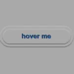
button
<button>...</button>
Defines a button we want to introduce to our document. It is interactive by the user and represents an action. It may contain text, icons, or even images. Including the type="button" attribute is crucial for declaring and rendering it properly within the browser.
Below, you can see a button I create for you to understand it better. It would be nice to add CSS to make it prettier! 😉
The division tag is the most common tag and defines a section in the document. HTML5 introduced some new tags, like section and footer, to provide a more descriptive way of splitting a document’s contents. Before that, the div tag was the primary choice, and often resulted in a situation referred to as “div hell”.
<div> Lorem ipsum dolor sit amet consectetur adipisicing elit. Maxime mollitia, molestiae quas vel sint commodi repudiandae consequuntur voluptatum laborum numquam blanditiis harum quisquam eius sed odit fugiat iusto fuga praesentium optio, eaque rerum! Provident similique accusantium nemo autem.</div>
HTML
footer
<footer>...</footer>
It represents the content that appears at the bottom of a webpage and usually includes additional information such as contact details, navigation links, sitemaps, and copyright information.
<footer>...</footer>
HTML
image
<img/>
This tag helps us to insert an image into our document. It is necessary to include the src attribute that sets the path of the image we want to display on the browser. Additionally, the alt attribute plays a crucial role by providing information about the image. The information is utilized by screen readers, benefiting individuals with reading disabilities. It is also recommended by SEO guidelines and appears when the image fails to load correctly (e.g. broken image link cases). Further attributes that can be added include width and height allowing us to define the dimensions of our image. By using images we can beautify our content and make it more attractive and explanatory.
We have six heading tags. From <h1> which is the biggest to <h6> which is the smallest based on their font-size. All headings have a default size, which can be modified using CSS. Headings are extremely important as they give emphasis and they provide brief information about our document.
<h1>...</h1><!-- largest heading --><h2>...</h2><h3>...</h3><h4>...</h4><h5>...</h5><h6>...</h6><!-- smallest heading -->
HTML
list
<li>...</li>
We have ordered <ol> list that can be either numerical or alphabetical and the unordered <ul> list that utilizes bullet points.
Additionally, there is a description <dl> list that is used when we want to display terms along with their corresponding descriptions. It consists of the <dl> tag (a description list) which requires two elements. The first one is a <dt> tag, the description term element, and the second one is the <dd> tag, representing the description itself. Keep in mind, that the <dd> element has somemargin-left set by default.
📝 Pay attention to the correct order, as <dt> tag always comes before <dd> tag.
<li><ol>First item</ol><ol>Second item</ol></li><li><ul>First item</ul><ul>Second item</ul></li><dl><dt>HTML</dt><dd> The HyperText Markup Language or HTML is the standard markup language for documents designed to be displayed in a web browser.</dd><dt>CSS</dt><dd> Cascading Style Sheets is a style sheet language used for describing the presentation of a document written in a markup language such as HTML or XML.</dd></dl>
It specifies the most significant content that is unique in the whole document and should not be repeated across multiple pages. It must also not contain repeated content such as headers, logos, forms, or links and it can’t be the child of other sections like headers, navbars, footers, or sidebar elements.
<main><h1>I am the main content</h1><p>I am the first paragraph of the text</p><p>I am the second paragraph of the text</p></main>
HTML
paragraph
<p>...</p>
We set it when we add a new paragraph to the document. It is commonly used to separate blocks of text into individual paragraphs, making it easier to organize, read, and understand.
<p> I am the first paragraph for your content.</p><p> I am the second paragraph for your content.</p>
HTML
section
<section>...</section>
This tag is used for separating an HTML document into distinct categories.
<h1>Making cake</h1><section><h2>Ingredients</h2><p>In order to make a cake we will need butter, flour, milk, cocoa and lemmons.</p></section><section><h2>Baking</h2><p>We bake the cake in a preheated oven for 50 min at 160 degrees.</p></section>
HTML
span
<span>...</span>
Is an inline container. We use span when we want to manipulate a specific part inside another HTML element.
<p> My garden has beautiful<spanstyle="color:green">green</span> trees and<spanstyle="color:yellow">yellow</span> flowers.</p>
When we want to insert a table into our document we can use the <table> tag. To add any essential components of a table we can use <tr> for rows,<th> for headings and <td> for cells.
The HTML comment tag is really helpful as we use it to keep notes, which are not displayed on the browser when loaded. However, you have to be careful not to add any sensitive data inside a comment because even though it is not rendered in the browser’s view, it will show up to anyone who knows how to use the browser developer tools and check the HTML document elements.
<!-- Here goes my comment --><!-- Here goes my comment when it is more than one line-->
HTML
script
<script>...</script>
The script tag is commonly known as a special container. It is basically a playground where we can include a set of instructions — a script — that the browser can understand and follow. We can add the instructions inside the tag or link them to an external file that contains our code. In both cases, when the browser reads the HTML document and reaches the script tag, it will try to read and execute what’s included.
<script>console.log('Hey! Welcome to Little Coding Things squad!');</script><scriptsrc="our-script-file.js"></script><scriptsrc="https://littlecodingthings.com/non-existent-script-file.js"></script>