Hello there! Want to make your HTML elements stand out a bit more? The box-shadow property in CSS lets you add depth by creating a shadow around elements — almost like they’re floating off the page.
To get a better idea of how box-shadow works, let’s look at the different values it takes. Each one controls a part of how the shadow shows up on the page:
box-shadow: /* offset-X, offset-Y, blur-radius, spread-radius, color; */🔸 position
• offset-X: moves the shadow horizontally
• offset-Y: moves the shadow vertically
🔸 blur-radius
• Makes the shadow’s edges smoother
🔸 spread-radius
• Expands the size of the shadow
🔸 color
• Sets the color and transparency using rgba()
Setting spread-radius to 0 keeps the shadow tightly within the blur area. This helps control how far the shadow extends, making it feel like it’s coming from a specific direction — useful when you want the shadow to appear only on certain sides.

Setting up the layout
We begin by creating the basic HTML and CSS structure. We will work with a light gray ⬜ box and adjust the layout to perfectly center it within the body element.
<div class="box"></div>body {
background-color: #e0e0e0; /* Light gray */
display: flex;
align-items: center;
justify-content: center;
margin: 0;
}Creating the box
We create a simple, rounded box that will hold our shadow effect. It has a very light gray background color to contrast with the body, and helps us visualize the effect.
.box {
  width: 200px;
  height: 200px;
  border-radius: 10px;
  background-color: #f0f0f0; /* Very Light Gray */
}
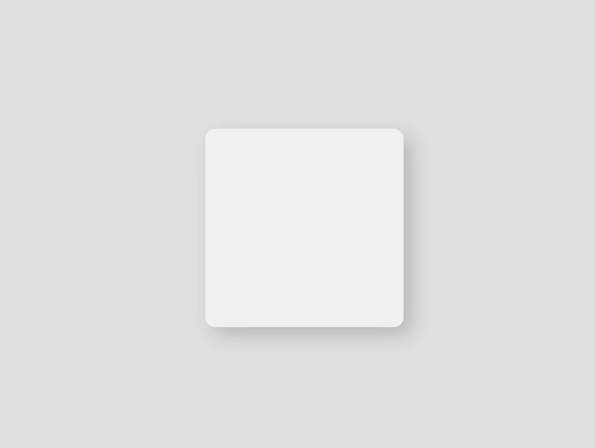
Adding the box-shadow effect
We finalize our work with the shadow effect. First, we shift the shadow bottom and to the right (8px 8px), then we give a nice soft blur of 20px and a semi-transparent gray (rgba(120, 120, 120, 0.4)). And just like that, this simple line of code makes our box look 3D. How amazing! 😃
.box {
  ...
  /* offset-X | offset-Y | blur-radius | spread-radius | color */
  box-shadow: 8px 8px 20px 0 rgba(120, 120, 120, 0.4);
}
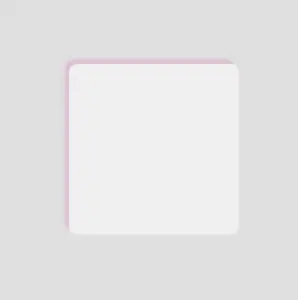
Now your box stands out! ✨ Try it yourself or try something different! Want the shadow above the box and to the left? Use negative values. Want it sharper? Decrease the blur. Maybe with a little bit of color? 🎨 Play with the rgba() values.
/* Alternative shadow example */

.box {
  ...
  /* offset-X | offset-Y | blur-radius | spread-radius | color */
  box-shadow: -5px -5px 5px 0 rgba(220, 100, 180, 0.3);
}
Box shadows do more than just enhance appearance — they help direct attention and add gentle emphasis where it counts. Utilizing this small detail intentionally can have a significant impact on your overall design. ✨ 😃