Have you come across the clip-path CSS property before? It’s a unique tool that helps us to create a variety of shapes from scratch without the need for complex code. A trully captivating addition in web design.
The clip-path accepts several values: circle(), ellipse(), polygon(), and inset(). These values define the shape of the clipping path applied to an element and we utilize them depending on the shape we want to create each time.
Specifically, in today’s post, we will learn how to clip an element into a triangle shape by setting the clip-path: polygon().
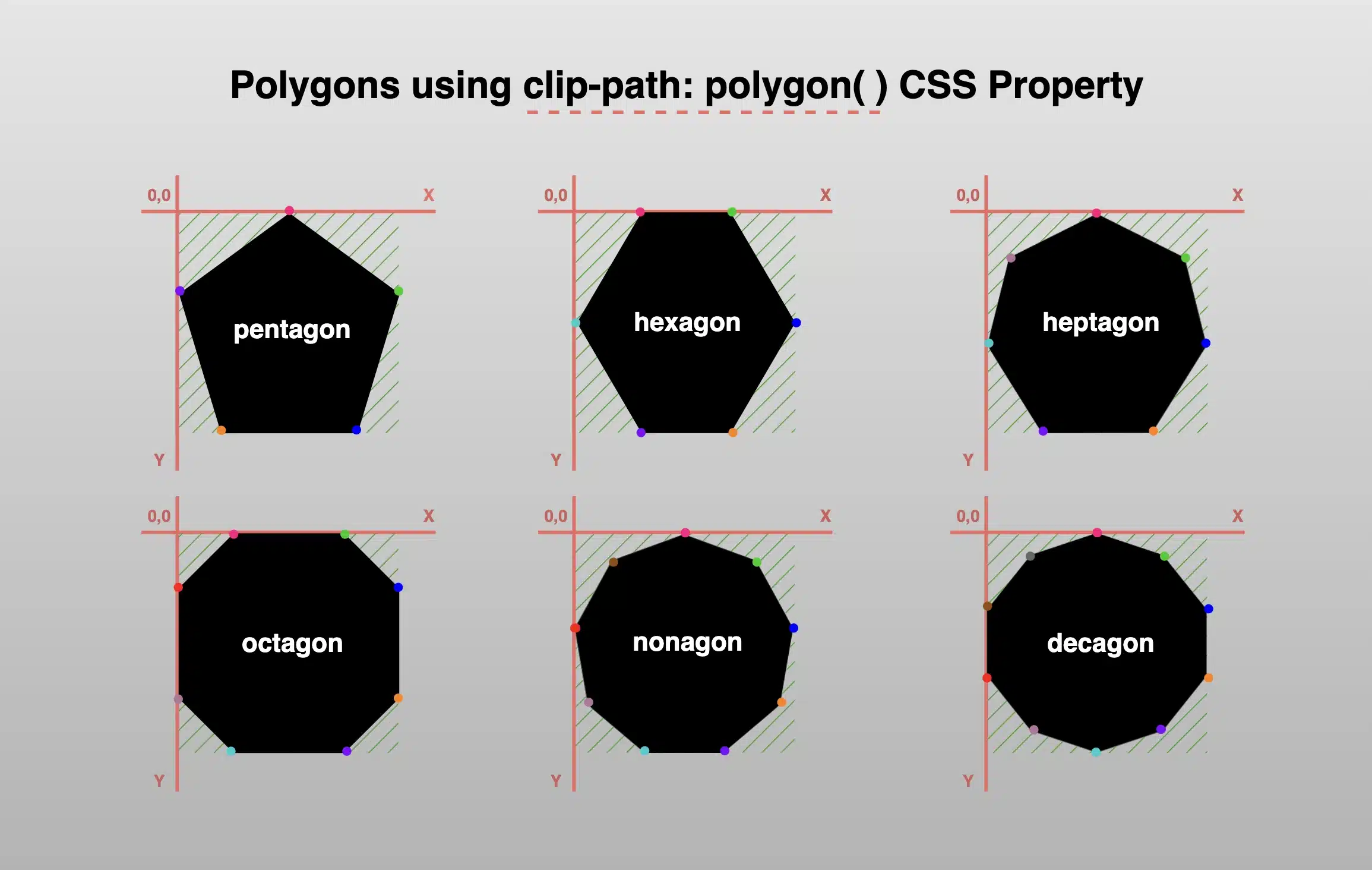
Clip-path polygon() function explained
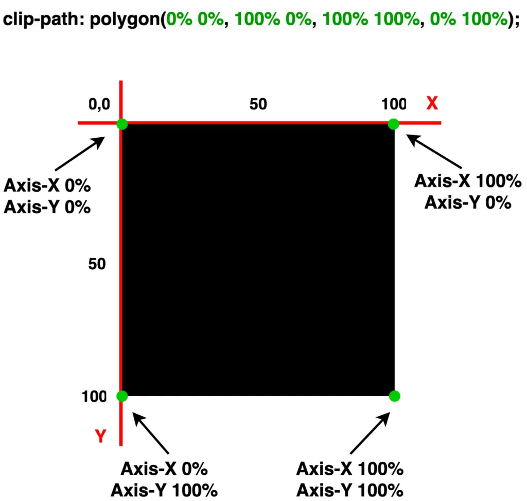
It’s time to continue and focus on our triangles. Let’s proceed with the example I prepared and see how this special tool works. 🪄 Below we have a black square. We used to create squares by setting the width and height CSS properties, but for today, let’s see how we can replace them with the clip-path property.
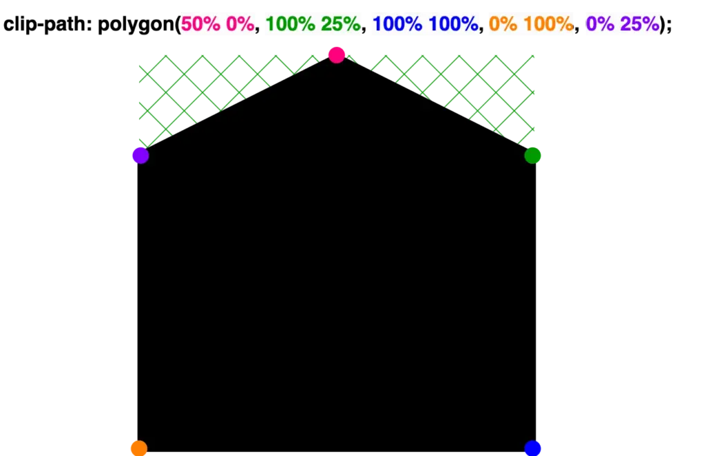
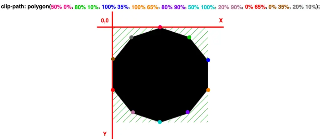
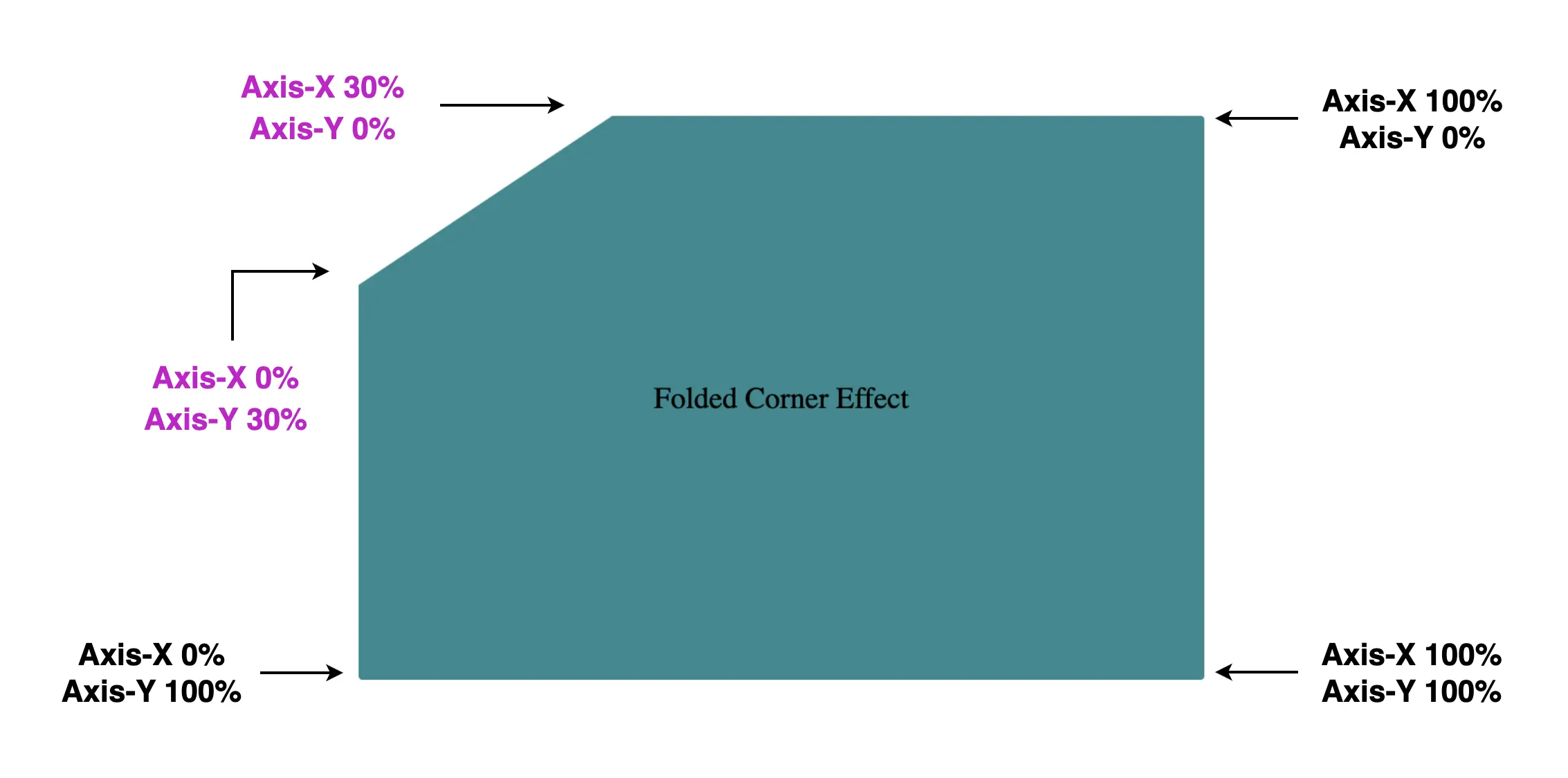
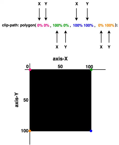
Take a look below. I begin with a ⬛ square, making it easier to understand our function as squares (boxes) are the most familiar shapes in CSS. Then I will transform this square into a 📐 triangle. The color code shows how we position the square along both the X-axis and Y-axis. The colored points on the corners represent the clipping region.
🖇 Despite having three magenta points and one green point, for now, all points behave the same. The differentiation of the green point will be meaningful later and hold significance for the following stages in our work.
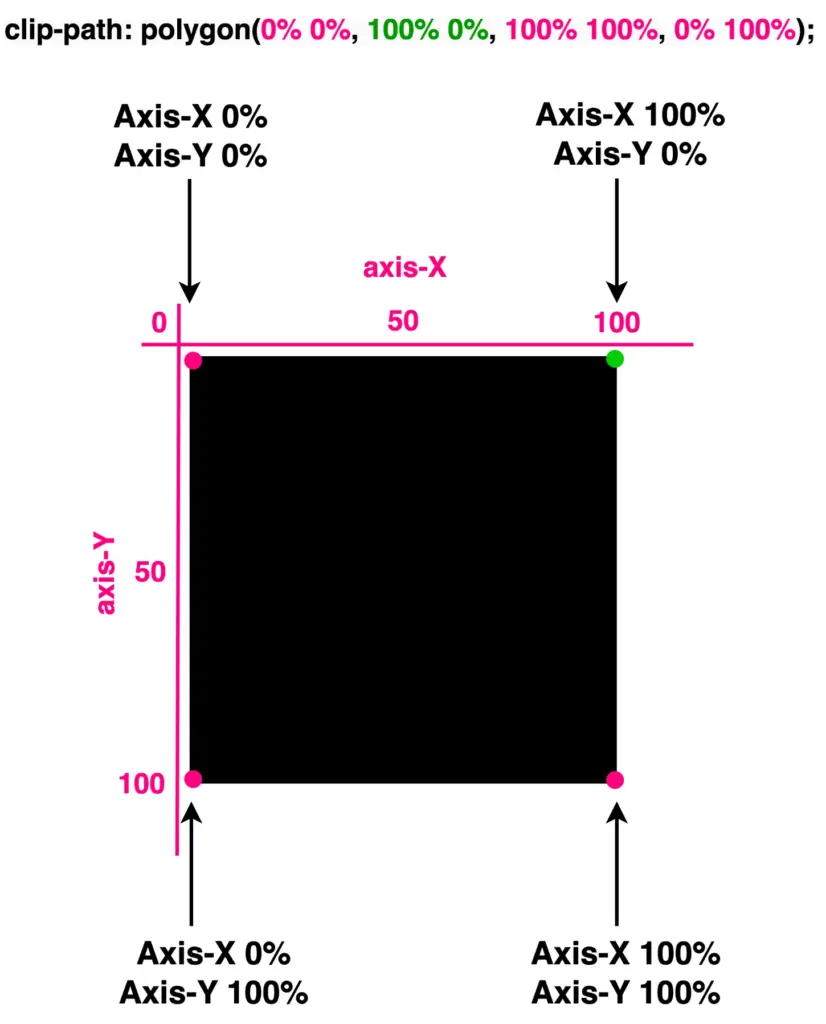
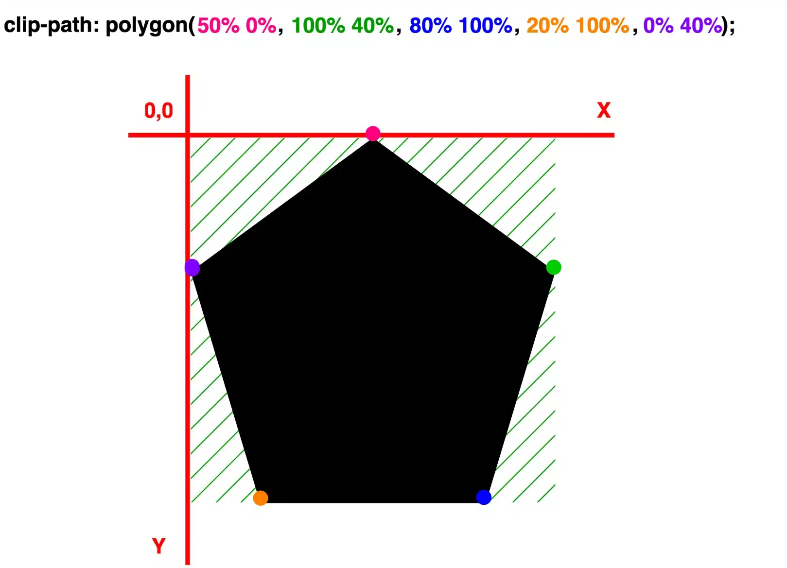
Each pair of values inside the clip-path: polygon() function represents a point, and all these points together define a clipping region.


Create orthogonal triangles
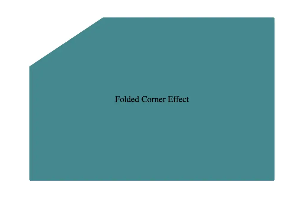
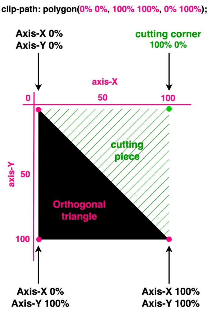
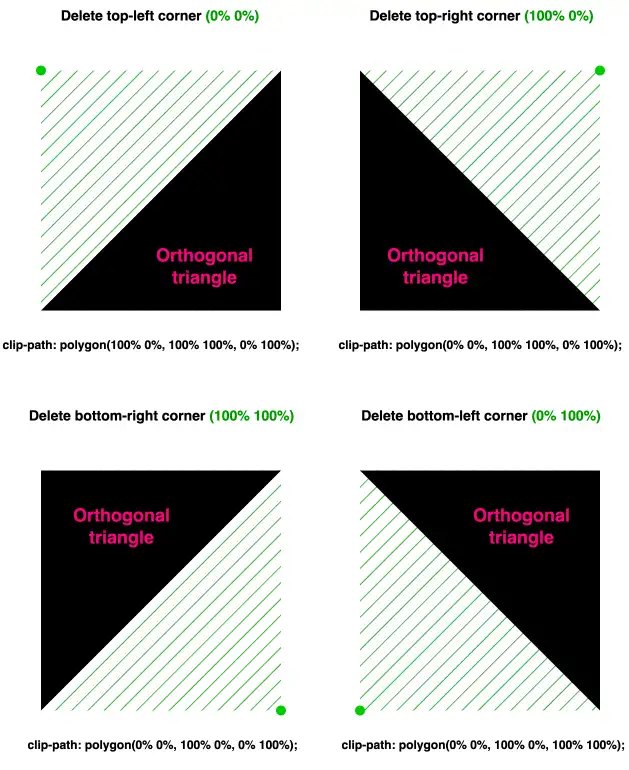
Now, let’s see how we can transform it into a triangle. The square has four corners (points) while the triangle has three corners. Depending on the type of triangle we want to create, we need to cut the corresponding corner.
In my example, I create an orthogonal triangle. I cut the top-right corner (100% 0%). As you can see in the following image, cutting this corner, we have the triangle we need.
What do you think? It looks good! Isn’t it? 😎 With just a simple line of code!
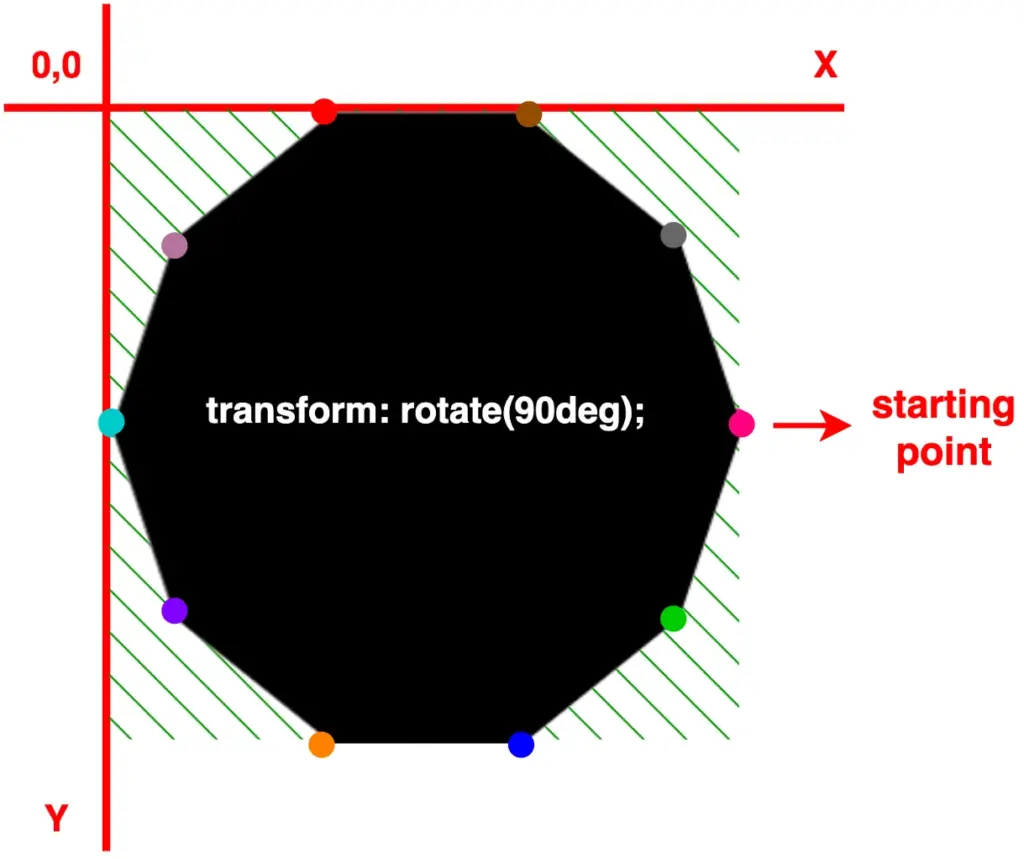
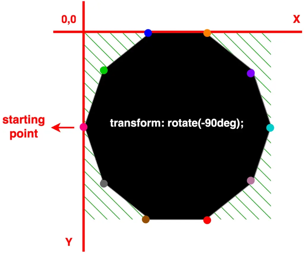
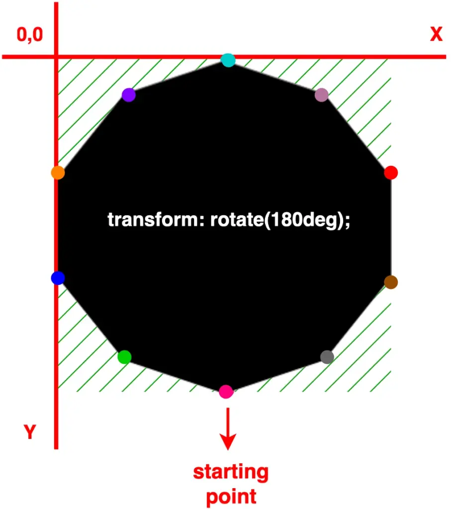
🔖 I opted to clip the top-right corner (100% 0%). Alternatively, it would also be correct to clip the top-left corner (0% 0%), the bottom-right corner (100% 100%), or the bottom-left corner (0% 100%). All these clippings yield the same result, so you can choose the one that best fits your preferences. Additionally, you can use transform: rotate to adjust the orientation as needed.
With our triangles now in place, let’s explore how we can move them along both axes and discover the variety of triangles we can create.
Create equilateral triangles
We move forward by keeping the initial design where we cut the top-right corner (100% 0%). We will work with this triangle.
To start, I’ve chosen to create equilateral triangles. This involves first focusing on the remaining top-left corner and then on the remaining bottom-right corner. Don’t worry and don’t feel confused, we’ll clear everything up. As mentioned above, the code and diagrams for clarity are ready!
As you can see below, we maintain the bottom corners as they are, and we change the remaining top-right corner, where we move it left to 50% along the X-axis. By doing so, we transform our orthogonal triangle into an equilateral triangle.
clip-path: polygon(
           50% 0%,
           100% 100%,
           0% 100%);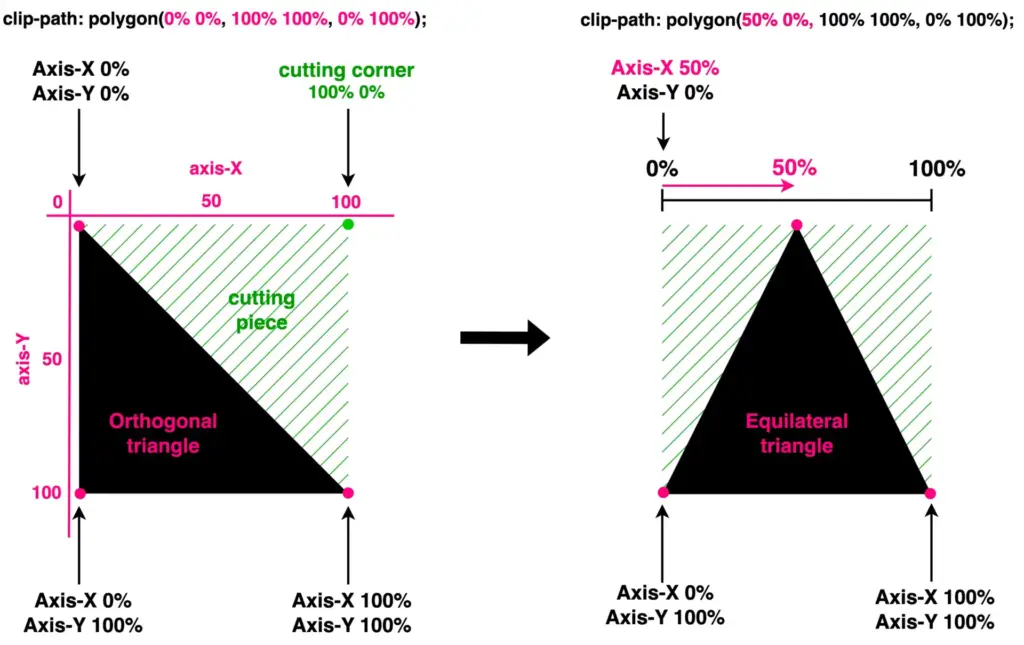
This orthogonal triangle can give us one more equilateral triangle. We maintain the top-left and bottom-left corners, and we change the bottom-right corner by moving it up to 50%on the Y-axis.
clip-path: polygon(
           0% 0%,
           100% 50%,
           0% 100%);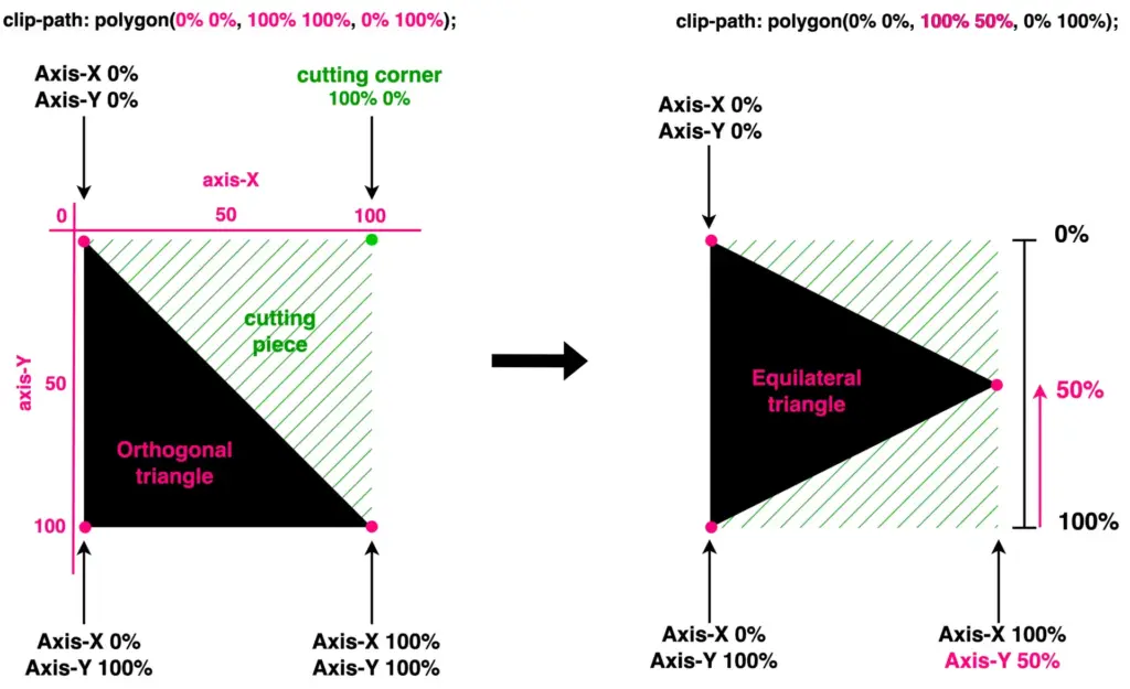
Create acute triangles
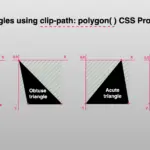
We continue with the acute triangles. Once again, we maintain the bottom corners as they are, and we change the remaining top-right corner. Here, we have two cases. First, we move it left to 15% along the X-axis, while in the second case, we move it left to 85%. By doing so, we transform our orthogonal triangle into acute triangles. Depending on our preferences.
clip-path: polygon(
           15% 0%,
           100% 100%,
           0% 100%);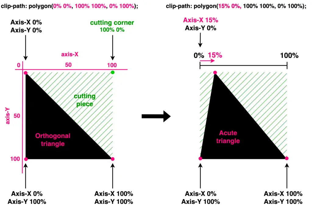
clip-path: polygon(
           85% 0%,
           100% 100%,
           0% 100%);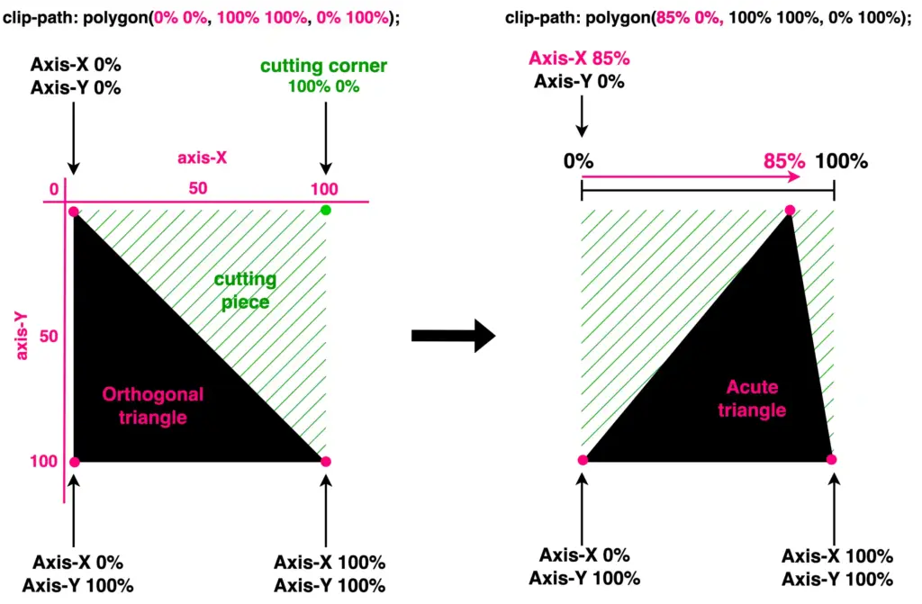
Another approach is to work with the bottom-right corner and adjust the values on the Y-axis. Let’s see how our triangle will become then. I move the bottom-right corner first up to 35% and then up to 65%.
clip-path: polygon(
           0% 0%,
           100% 35%,
           0% 100%);
           /* OR */
clip-path: polygon(
           0% 0%,
           100% 65%,
           0% 100%);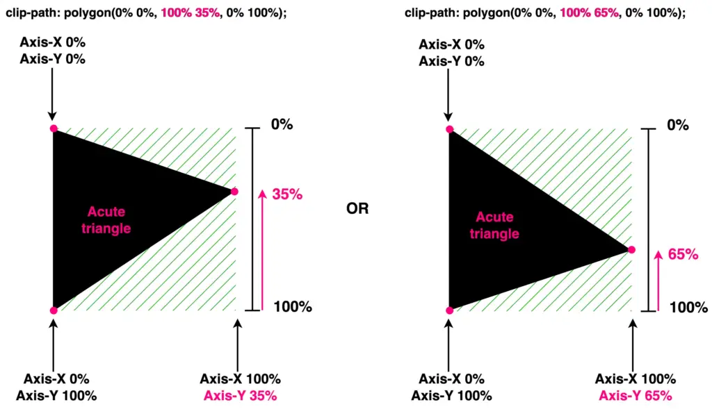
🔖 The values I use to create the triangles are indicative. Feel free to choose any value that suits your preferences and requirements. 😃
Create obtuse triangles
Finally, it’s time to work with the bottom-left corner. We leave the top-left and bottom-right corners unchanged while modifying the values of the bottom-left corner. Initially, I adjust the X-axis value, shifting the corner left to 20%. Next, I adjust the Y-axis value, moving the corner up to 80%.
clip-path: polygon(
           0% 0%,
           100% 100%,
           20% 100%);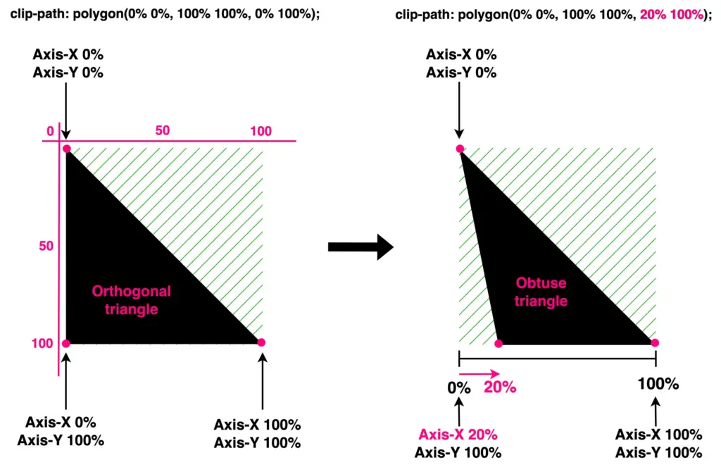
clip-path: polygon(
           0% 0%,
           100% 100%,
           0% 80%);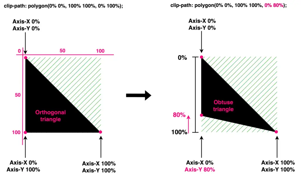