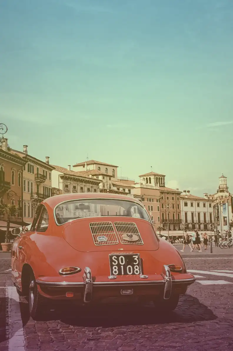
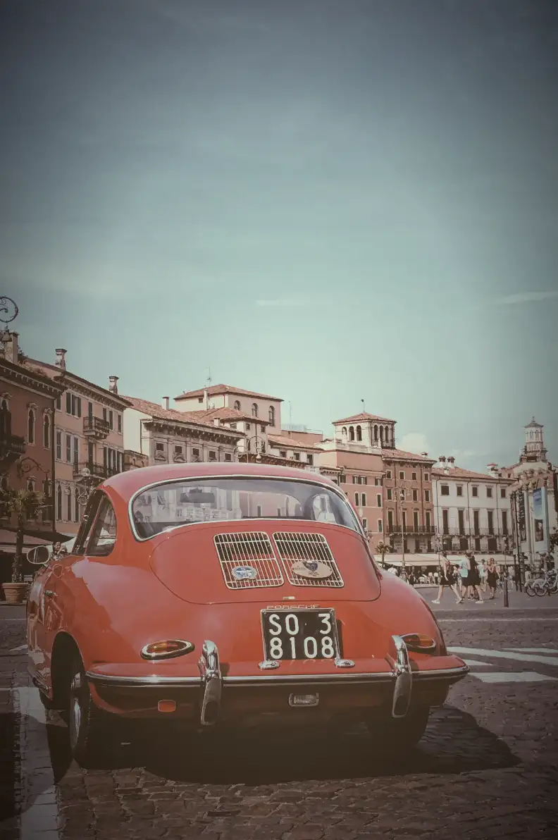
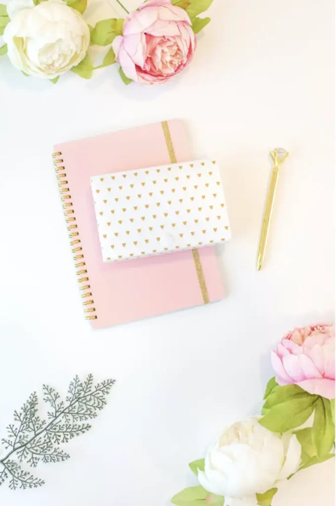
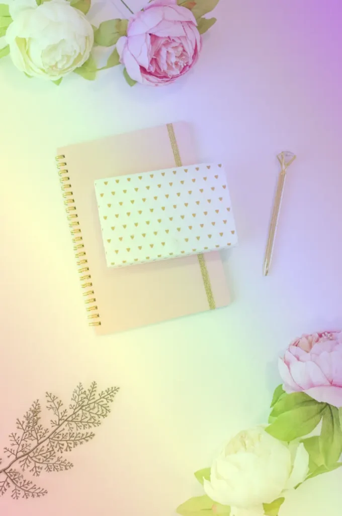
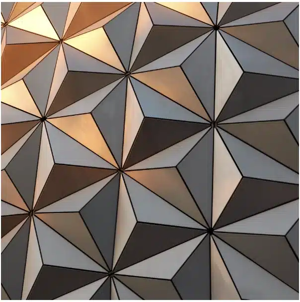
Have you ever wanted to add cool effects to your website? With the CSS overlay effect, you can easily create stylish overlays to make your content stand out! Let’s see how it works!
What are overlay effects?
A CSS overlay effect is a powerful technique for placing an extra layer on top of your web content, typically an image or a background, to enhance its appearance or improve readability.
This effect allows you to create various visual enhancements, such as darkening an image or adding a color tint.
You can achieve overlays using the CSS background-color and background-image properties, enabling you to apply stunning visual effects to images. With these properties, you can easily modify the look and feel of your content, making it more engaging and visually appealing.
Let’s dive into an example to see how the CSS overlay effect works.
Basic HTML and CSS setup for a CSS overlay effect
First, we need to create an HTML element to hold our image and assign it a class. This class will contain all the necessary CSS rules to achieve the desired overlay effect.
<divclass="overlay-container"></div>
HTML
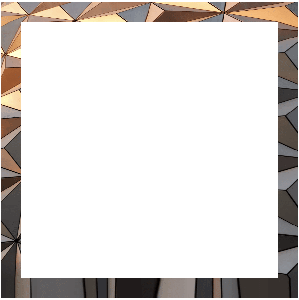
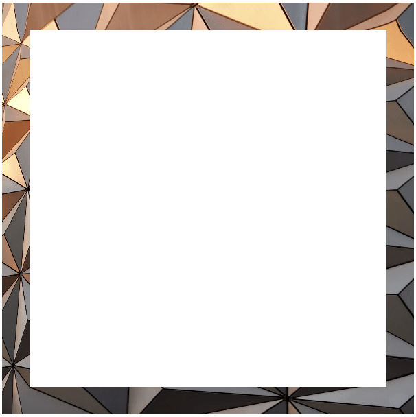
Next, we write the CSS for our class, setting a background image without repetition. This ensures the image fits nicely within a 400x600px box. With this setup, we can easily apply overlay effects or make further adjustments as needed.
A common technique for creating overlay effects is pseudoelements (:before and :after). To get this effect working, we have to prepare our class by setting position: relative. Then, we apply position: absolute to the :before pseudo-element. This ensures that :before is positioned relative to its parent — the overlay container.
We also use the content: "" declaration to make sure the pseudo-element is generated. In this case, the content remains empty since we want the image to be visible underneath.
Additionally, we set width: 100%; and height: 100%; to ensure the :before pseudo-element covers the entire area of its parent container, completely overlaying the image.
Overlay effects come in various types, each adding a unique touch to our images. The CSS property that helps us to create this effect is background-image.
Below, I’ve created different variations for you to explore. 👩💻 Enjoy!
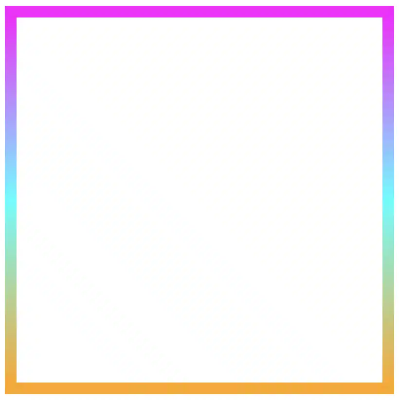
Using a linear gradient for the overlay effect
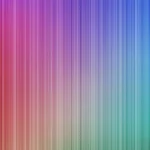
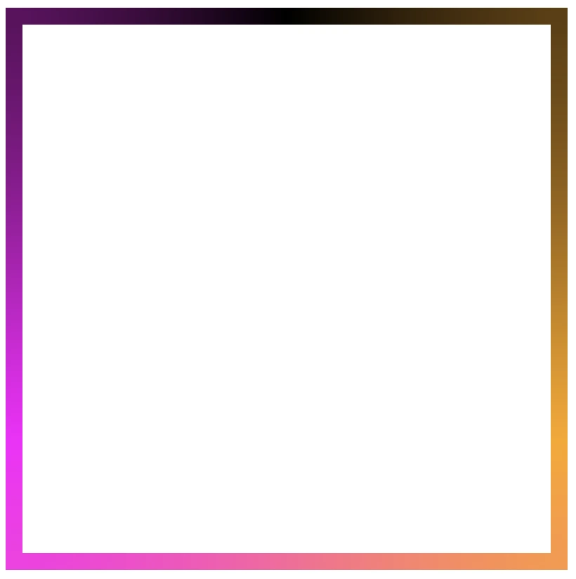
In the following CSS code snippet, you can see that the background-image property is set to linear gradient(...), creating a multi-color overlay effect with different transparency levels. This produces a smooth gradient overlay from top to bottom with shades of teal, yellow, and purple that make the perfect match for our image.
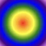
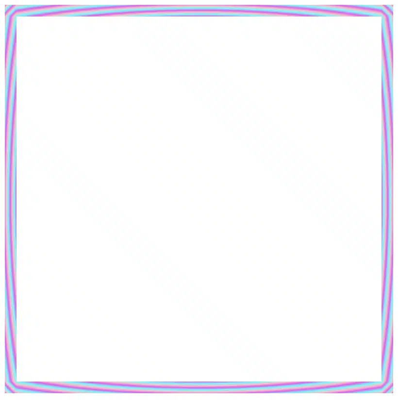
We continue with a more creative approach. Here, radial gradient(...) creates a unique overlay effect using a circular pattern. It transitions from shades of light gray to dark gray, adding a subtle yet eye-catching touch to the image.
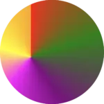
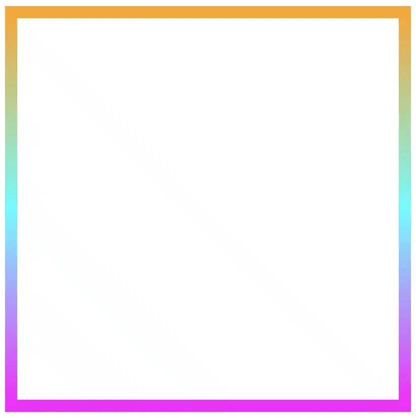
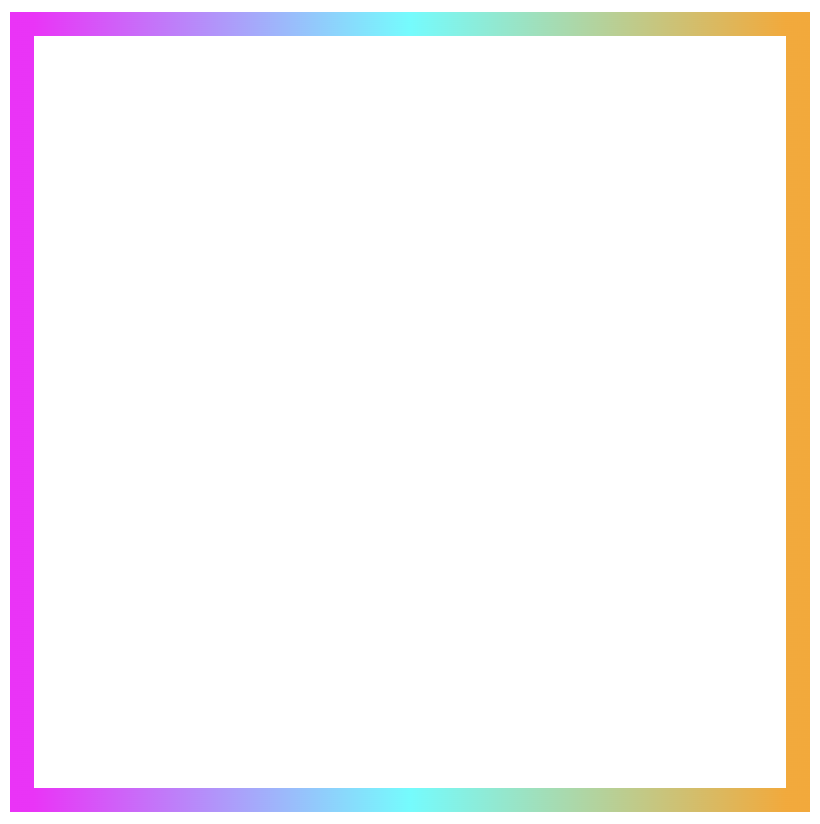
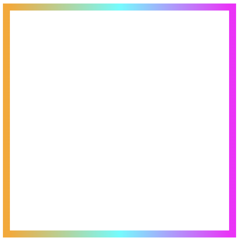
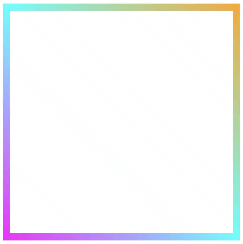
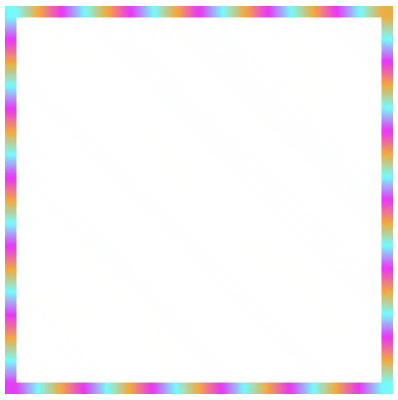
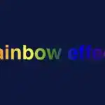
Another vibrant and playful effect is the rainbow gradient. Often used for decorative purposes, this effect adds bright, joyful colors to the image, creating a fun and lively vibe. 🌈✨
When you apply this gradient as a background, it creates a smooth transition of colors from purple to red, mimicking the colors of a rainbow (ROYGBIV). The use of semi-transparent alpha values gives a soft blending effect between the colors, creating a visually appealing and harmonious overlay.
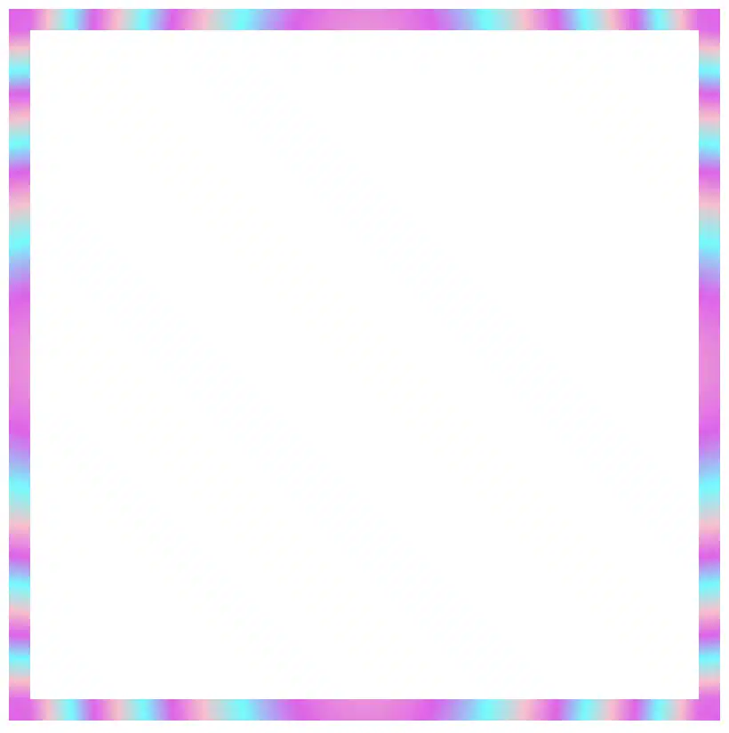
In this example, I kept the second image to make the outcome clearer. I’ve given it a softer, more romantic feel, where the pale pink color with the slight see-through effect adds a charming and gentle mood.
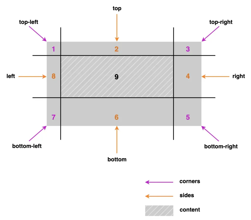
The border-image-slice CSS property allows us to be extremely creative with our borders. We can cut (slice) a source, such as an image with a nice pattern or a gradient, into pieces so it can stretch or repeat those slices around an element’s border. We specify how far in from each edge the slicing occurs and those slices are sketched to be the border areas (edges and corners).
Outline of the border-image-slice CSS property
Let’s see our property more analytically. First, you pick a visual source and then decide where to “slice” it. After that, CSS uses those pieces to sketch the border. Kind of like cutting a picture into a nine-patch grid and placing it around a box. We have 4 corners, 4 sides, and the main content. Only 8 of them actually showed up and used for borders, the corners and the sides. The 9th slice, which is the main part of the element, is optional and it usually carries our content.
A few critical points about those pieces:
Corners: Depending on the value, they may not stretch (value 1), they just sit there like little anchors, or they may stretch (higher or more values).
Sides: Stretch or repeat, depending on your border settings. They control most of the visual essence.
Center: The middle part usually isn’t drawn as part of the border at all—it’s ignored unless you explicitly choose to fill it.
Practical examples: How border-image-slice works
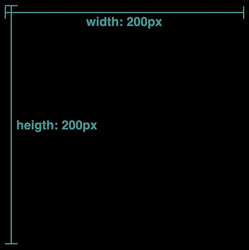
To better understand how this property works, we first need to insert an image with a width and height of 400px. Next, we’ll apply properties like object-fit: cover, background-size: cover, and background-position: center to keep the image centered and fully visible without distortion. 🔖 These properties are only here so we can clearly see the image at this stage — they aren’t required for the next steps. Finally, we add the source of our image.
With our image set up, we can continue and see how border-image-slice handles different inputs.
This CSS property can take one to four values. – One value: uses the same slice for every side. – Two values: set the first for top and bottom, and the second for left and right. – Three values: apply the first for the top, the second for both left and right and the third for the bottom. – Four values: follow the standard CSS direction: top, left, bottom, right. With so many options, there is plenty of room to create some trully great-looking border effects.
Setting the value: 1
Let’s start with value 1. First, we need to add a 20px border but transparent. This gives us the space the image-based border will later occupy, without showing the standard solid border.
Then, we set border-image-slice to 1. In this way, the browser takes a very thin section, just one pixel wide, from each edge of the image and stretches it along the borders. As a result, we have only stripes.
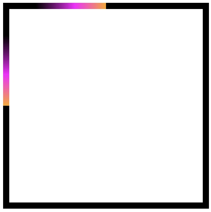
We continue following the same tactic, but this time instead of 1 we use a value of 100. By doing this, the browser cuts a 100-pixel-wide section from each edge of the image and uses those slices to form the new borders. In that way, we are closer to our initial image as we use a wider section of it.
Next, we will use two values, 1 100, to see how different slice sizes affect the borders. The first value (1) applies to both the top and bottom, creating thick slices, close to line-like borders. The second value (100) applies to both the left and right, creating wider slices that maintain more of the image’s details.
Moving forward, it’s time to see the results when using three values. The first value (150) applies to the top, the second value (80) to the left and right and finally the third value (5) to the bottom. As we can observe again, the higher the value, the closer to the image’s characteristics.
Our final option is to use four different values, one for each side of our element. The values apply in a clockwise direction – top, right, bottom, left. That creates an uneven but interesting border effect.
Playing with border-image-slice feels a bit like trimming a photo into fancy frames — every small tweak shifts the mood of the border in surprising ways. What do you think? Are you ready to try it out yourself? Be my guest and have fun! 😃
Borders have long been one of the simplest tools in web design. Yet, that’s no reason to look boring. Combining the border-image-slice property with the power of CSS gradients, we can turn simple static lines into 🎨 colorful, eye-catching details that make your designs stand out. Besides, a playful border effect adds fun and energy to a page, helping shapes and sections feel more alive. No images needed, just blending colors with clean CSS. In other words, it’s a small touch that can make your design feel fresh and creative, adding personality and vibrance. 🌈 ✨
Border effect explanation setting linear-gradient
We’ll begin by creating a box with a 150px width and height that temporarily has a solid 5px black border. This is the box we’ll use to experiment with different gradient border effects and make it pop! 🥳
With our box in place, we can make things more interesting by replacing the simple black border with a color 🍭 splash of CSS gradients.
First, we need to add the transparent value to the border.
Next, we continue with the gradient. I decided to start with the linear-gradient and use three colors (magenta, cyan, orange). Feel free to use as many colors as you want.
In the final step, we set border-image-slice to 1. In that way, the browser uses the whole gradient evenly on all sides of the border.
The browser doesn’t know how to spread the gradient across the border area. Without the border-image-slice property, the gradient won’t appear at all. It is essential to add it as it will activate and display the gradient border.
It’s good to know that the border-image-slice property can take up to four values, each one responsible for how to cut (slice) the gradient we use as a border.
More analytically:
border-image-slice: 1; simply put the whole gradient eventually on all sides
border-image-slice: 20; it cuts 20 (px or percentages, depending on what you use) from each edge to make the border
border-image-slice: 20 30; the same as above but the first value is for top and bottom, the second for left and right
border-image-slice: 20 30 10; the first value is for top, the second for left and right and the third for bottom
border-image-slice: 20 30 10 5; finally, the first value is for top, the second for right, the third for bottom and the fourth for left
🔖 When we use a gradient, we usually just write 1 because a gradient isn’t a picture with pixels or edges to slice. It smoothly fills the space, so there’s nothing to “cut”. The value 1 simply tells the browser to use the whole gradient for the border.
More border effect ideas with linear-gradient technique and border-image-slice: 1
Below, I included a few more examples to help you see how changing the gradient can completely transform the look of a border, making the concept clearer and easier to follow. 😃
Flipping the colors: The reverse linear-gradient
Colorful linear gradients that flow from top to bottom or the reverse way are like creating amazing color bands that wrap around the box.
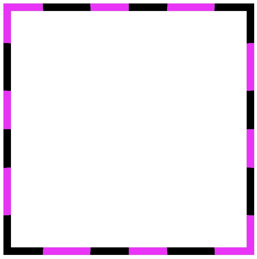
Color loops: The repeating linear-gradient technique
With repeating gradients, you can build patterns that literally look like an impressive dancing effect or all these amazing neon light effects. How cool is that!? 😎
Moreover, we are free to experiment with the other two (radial-gradient and conic-gradient) CSS gradients as well. So, let’s dive into some more examples and discover how different gradient ideas come to life.
Border effects with different border-image-slice values
Radial gradient for spinning border effects
Now, let’s see what would happen if we use the same gradient, in this case, the radial-gradient, with many different values on border-image-slice. For these examples, I used cyan, pink and violet. 🎨 ✨
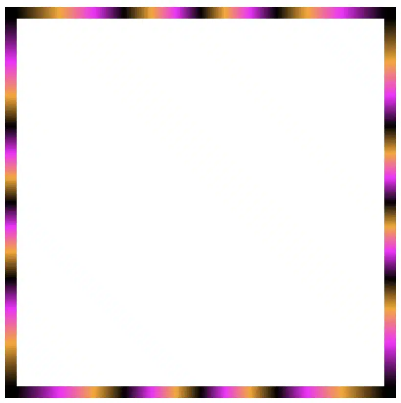
In the first example, we maintain the value 1 while in the second, we replace it with a value of 50. The border-image-slice: 1; applies the entire gradient, spreading the colors smoothly around the border. With this transition, the gradient stays wide and soft.
The border-image-slice: 50; applies a small piece of the gradient. Since it’s using only a part of the gradient’s color range, the colors repeat more often and look like stripes that are spinning around.
To sum up, increasing the slice value tells the browser to take a smaller “slice” of the gradient and reuse it around the border. As a result, with a smaller slice, we have more repetition and eventually stronger striping.
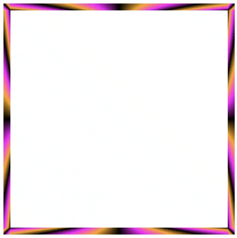
Conic gradient for more complex border effect
Next, let’s see what would happen if we use the same gradient, in this case, the conic-gradient, but different values on border-image-slice. For these examples, I changed the colors and used black, orange, magenta, and black again. 🎨 ✨
🔖 A small detail to keep in mind is that starting and ending with the same color (in this case, black) helps to keep the transitions soft and seamless.
In this case, with a 1 value it uses almost the entire conic gradient around the border. The colors flow smoothly and evenly, creating a soft circular blend with gentle transitions.
On the other hand, with a value 30 it takes a smaller portion of the gradient and stretches it around the border. The border starts showing clearer color sections with mild curves and slight breaks at the corners.
Finally, with a value of 60 it uses a very small wedge of the conic gradient and repeats it. As a result, the border shows strong, repeating color bands or striped details, especially near the corners.
In this case, we use two values: 1 60. The result is a creative mix of two effects. The first value (1) applies to the top and bottom borders. Due to this we have a smooth and gentle look with wide color transitions. The second value (60) applies to both the left and right borders. Because of that, the effect is a tighter and more striped pattern as the gradient slice we use is smaller and repeated more often.
Our final example takes four values: 1 60 60 1. This setup makes our border appear acymatric, calm, and energetic at the same time. More analytically, the first value (1) is for the top border and uses almost the entire gradient. The second and the third values (60 60) are for the right and bottom borders and use a smaller slice (tighter pattern). While the last value (1) is for the left border and uses almost the entire gradient again. Due to these values, we have smooth and continuous top and right borders, while the bottom and left are striped.
The results we observe when utilizing these all these specific values above on the border-image-slice CSS property concerns only a box of 150 pixels in width and height. It is critical to adjust the values if you have different dimensions.
Take into consideration that gradients with the 1 value look better in square shapes, as the color flow fits perfectly within equal sides.
Experimenting with gradient borders opens the door to an endless palette of styles — from soft pastel outlines that frame content elegantly to bold, vibrant strokes that command attention. The key lies in balance: using color transitions and subtle motion to enhance, not overpower, the user experience. Whether you’re styling buttons, containers, or entire sections, CSS gradient borders are a reminder that even the smallest design detail can carry a playful spark — proof that borders don’t just separate elements, they can also bring them to life.
Another efficient and user-friendly CSS method to cut down ✂ and “play” 🤹♀️ with existing HTML elements. In contrast to most clip-path methods that use coordinate pairs(X, Y) to define points (that act as the corners of the shape) inset()manipulate the sides of the element. How so? Let’s discover it together!
The clip-path: inset() is a way to restrict the visible area of an element by “pushing in” its sides from the element’s bounding box. This function doesn’t create a new shape as every element’s box is rectangular (and it can be a square if the width and height match), it just “trims” the existing one. The result is always a four-sided shape with right angles, which can be either a rectangle or, in special cases, a square.
Now, let’s proceed with a more detailed analysis and try out this amazing tool. For better understanding, I have prepared some practical examples for you. This is our “working area” for today! 👷♀️ 🏗 👷♂️
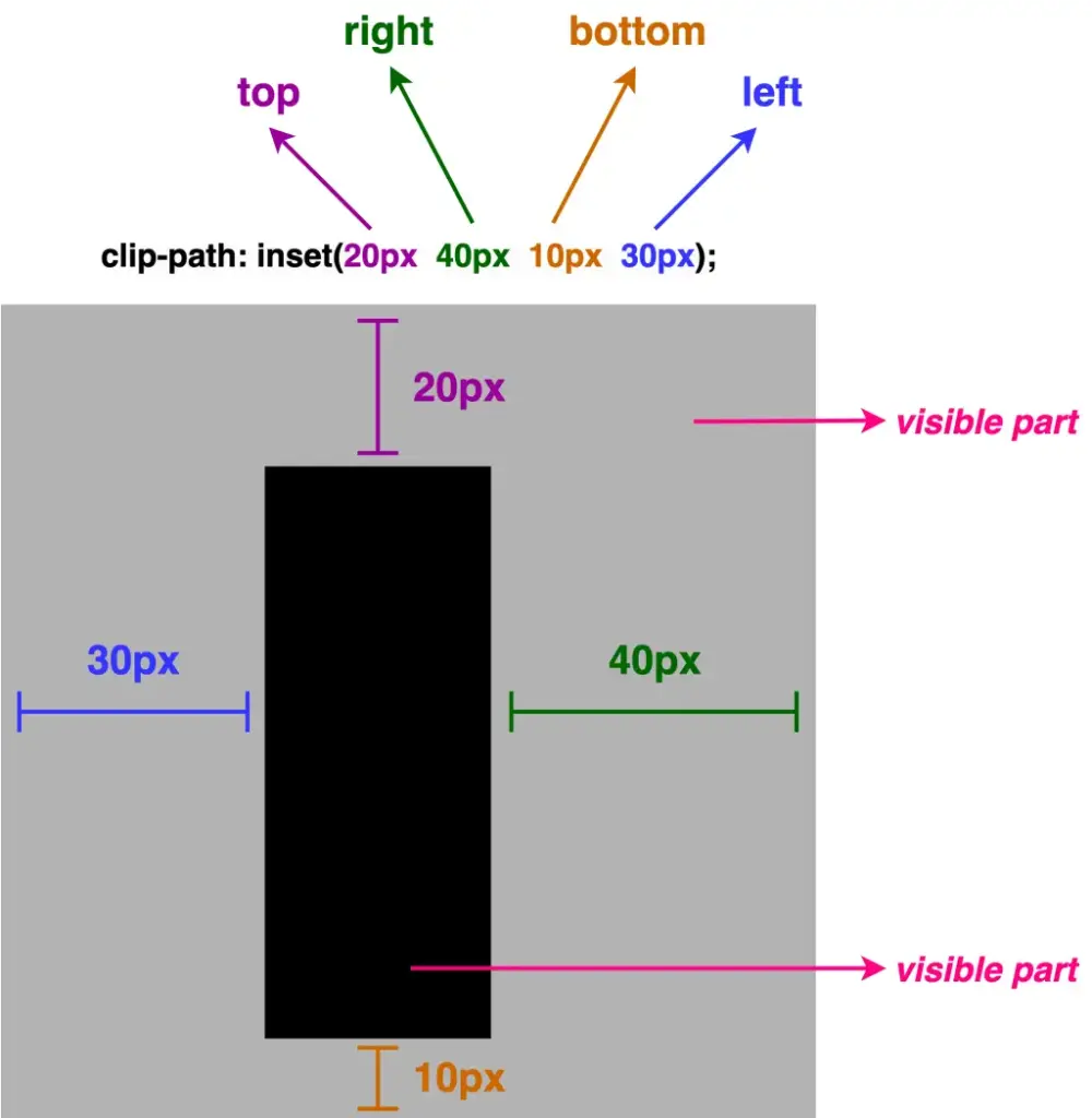
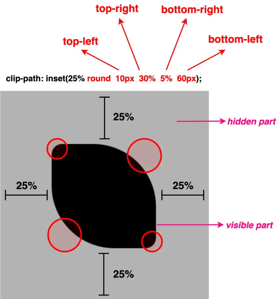
Inset accepts up to four values, each controlling how far the sides are pushed inward.
So, how about analyzing the different cases based on these values, and then proceeding with examples?
One value: it applies to all four sides
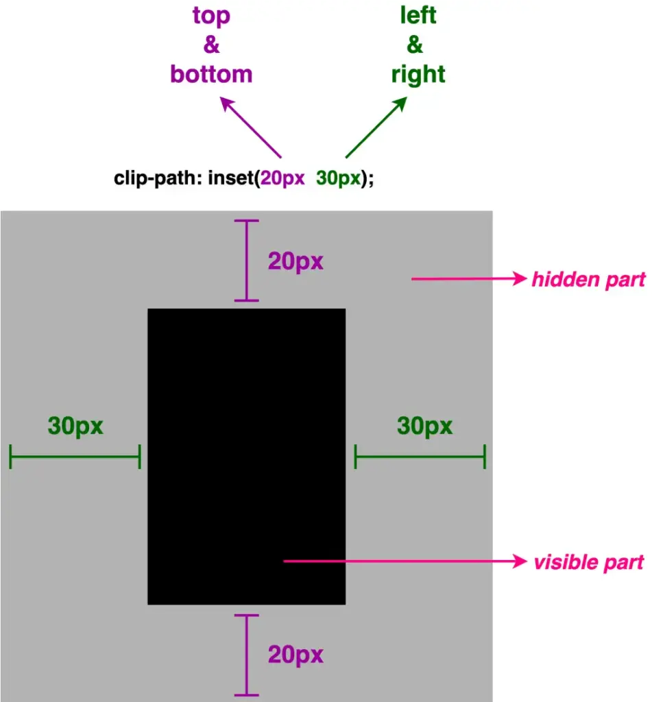
Two values: the first one is for top & bottom, while the second is for left & right
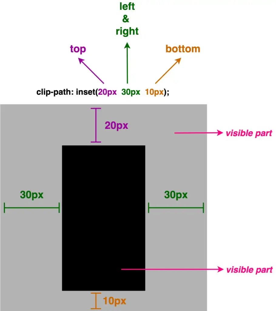
Three values: the first one is for top, the second for left & right and the third for bottom
Four values: the first one is for top, the second for left, the third for bottom and finally the fourth value is for the right side (clockwise).
We can now proceed with our examples. The code snippets and images that follow display these four cases.
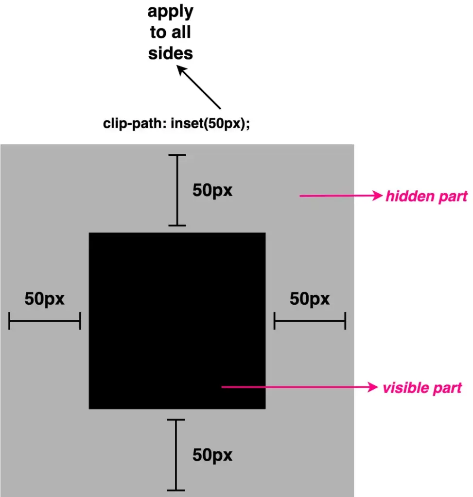
First case – One value
.square-shape { ...clip-path: inset(50px); }
CSS
NOTE: ⬜ The gray color is used only for clarity, to distinguish the initial square from the clipped one. In practice, this part would be cut out (hidden).
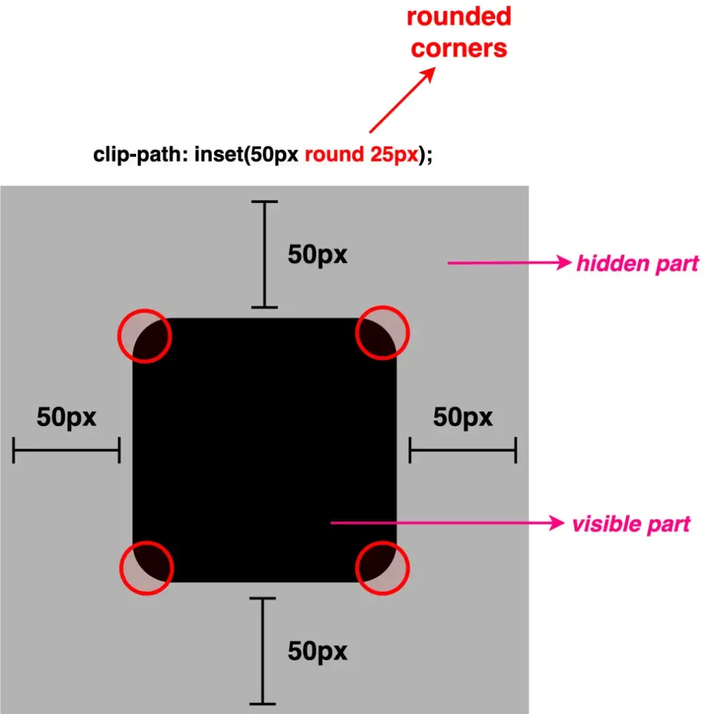
Apart from cropping, inset()allows you to round the corners of the clipped shape as well. This is achieved by adding the optional round keyword, followed by a radius value, which functions similarly to the border-radius CSS property. By utilizing it, we can transform the sharp corners into rounded ones.
As previously with the inset(), round takes up to four values, too.
One value: it applies to all corners the same value
Two values: they applied diagonal, the first one is for top-left & bottom-right corners, while the second is for top-right & bottom-left corners
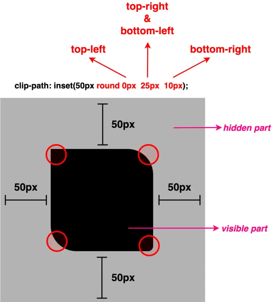
Three values: the first one is for the top-left corner, the second goes diagonally and is applied to both the top-right & bottom-left corners, and the third for the bottom-right corner
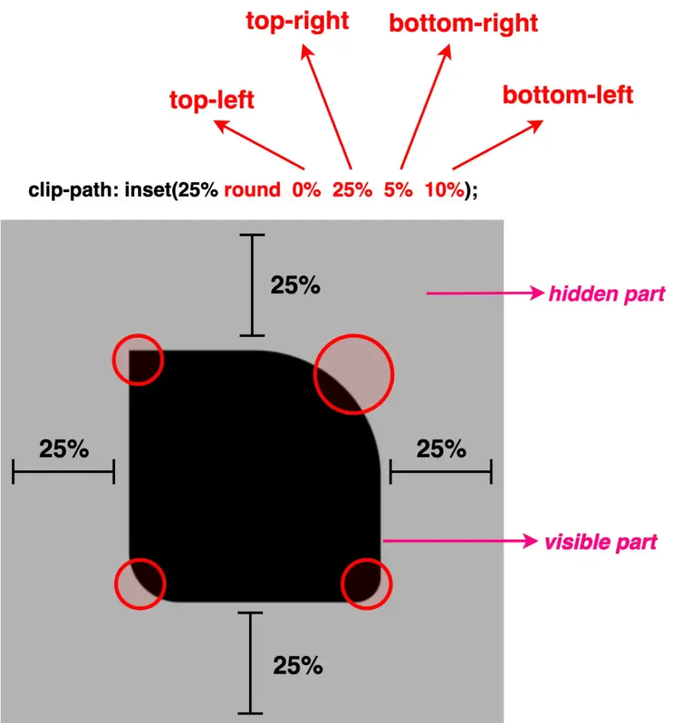
Four values: the first one is for the top-left corner, the second for the top-right, the third for the bottom-right, and finally the fourth value is for the bottom-left corner (clockwise).
We move forward with our examples. The following code snippets and images display these four cases.
Well, something like a 🍋 lemon is here!! Cool, hug!?
Clip-path inset function – manipulating images
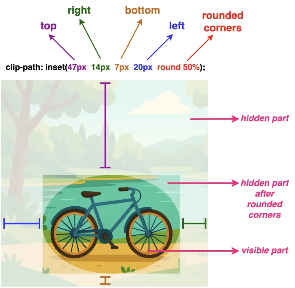
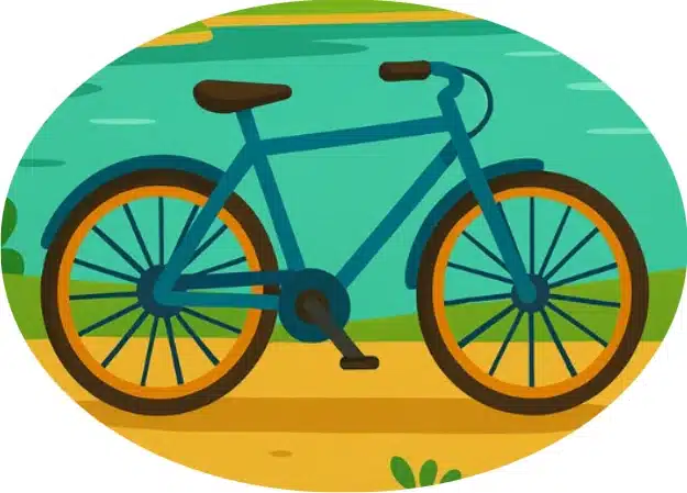
Images can also be clipped, revealing only part of them, by simply utilizing the clip-path: inset() CSS property.
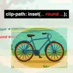
Below, we have an image of a bicycle 🚴♀️ out in nature. 🏞 Let’s say that we want to isolate the bicycle and display it within a rounded shape, pretty much like a frame. ✨
Depending on our prefrences, we cut away the unnecessary parts. First, our initial square image turns into a rectangle. After that, we add the round with a value of 50% which gives the remaining part a smooth, nicely rounded shape.
NOTE: To make things more straightforward, I’ve prepared an image with colored code and overlays 🎨 ✂ showing which values correspond to the parts we cut away.
Have you come across the clip-path CSS property before? It’s a unique tool that helps us to create a variety of shapes from scratch without the need for complex code. A trully captivating addition in web design.
The clip-path accepts several values: circle(), ellipse(), polygon(), and inset(). These values define the shape of the clipping path applied to an element and we utilize them depending on the shape we want to create each time. Specifically, in today’s post, we will learn how to clip an element into a triangle shape by setting the clip-path: polygon().
Clip-path polygon() function explained
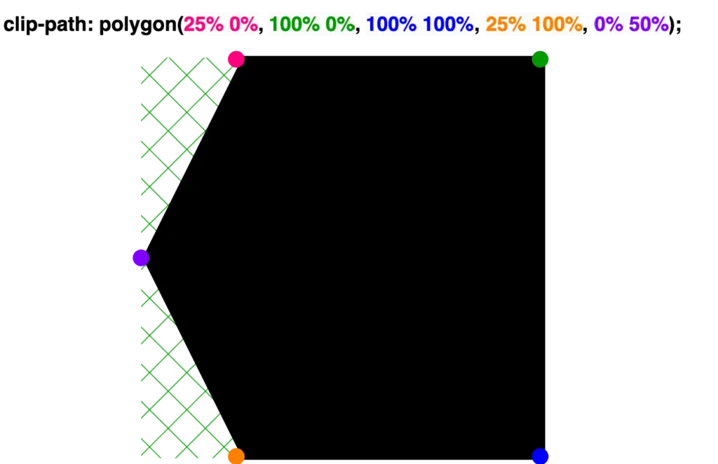
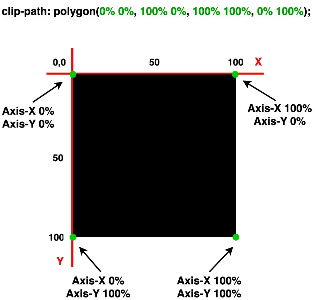
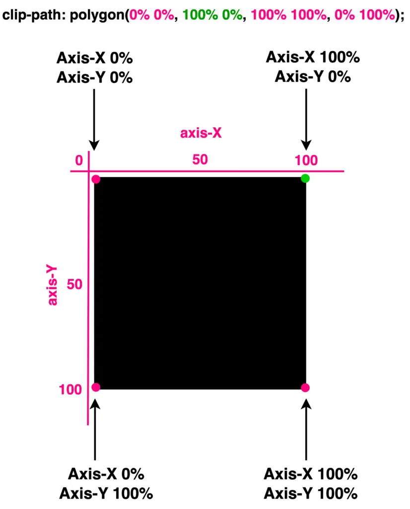
It’s time to continue and focus on our triangles. Let’s proceed with the example I prepared and see how this special tool works. 🪄 Below we have a black square. We used to create squares by setting the width and height CSS properties, but for today, let’s see how we can replace them with the clip-path property.
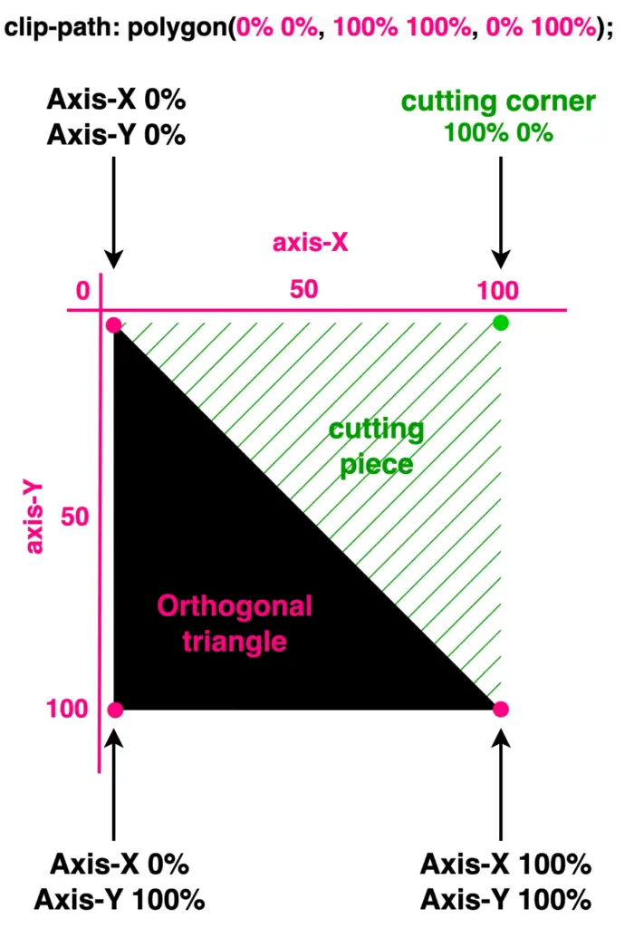
Take a look below. I begin with a ⬛ square, making it easier to understand our function as squares (boxes) are the most familiar shapes in CSS. Then I will transform this square into a 📐 triangle. The color code shows how we position the square along both the X-axis and Y-axis. The colored points on the corners represent the clipping region.
🖇 Despite having three magenta points and one green point, for now, all points behave the same. The differentiation of the green point will be meaningful later and hold significance for the following stages in our work.
Each pair of values inside the clip-path: polygon() function represents a point, and all these points together define a clipping region.
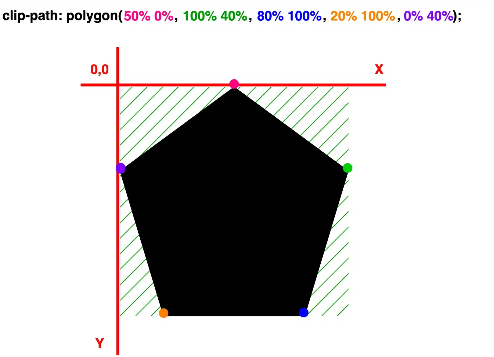
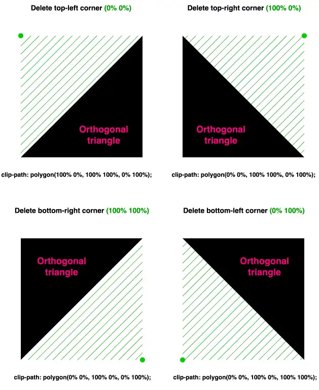
Now, let’s see how we can transform it into a triangle. The square has four corners (points) while the triangle has three corners. Depending on the type of triangle we want to create, we need to cut the corresponding corner. In my example, I create an orthogonal triangle. I cut the top-right corner (100% 0%). As you can see in the following image, cutting this corner, we have the triangle we need.
What do you think? It looks good! Isn’t it? 😎 With just a simple line of code!
🔖 I opted to clip the top-right corner (100% 0%). Alternatively, it would also be correct to clip the top-left corner (0% 0%), the bottom-right corner (100% 100%), or the bottom-left corner (0% 100%). All these clippings yield the same result, so you can choose the one that best fits your preferences. Additionally, you can use transform: rotate to adjust the orientation as needed.
With our triangles now in place, let’s explore how we can move them along both axes and discover the variety of triangles we can create.
Create equilateral triangles
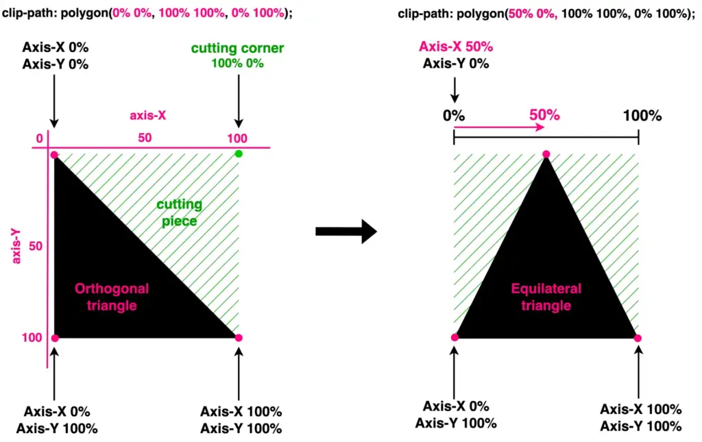
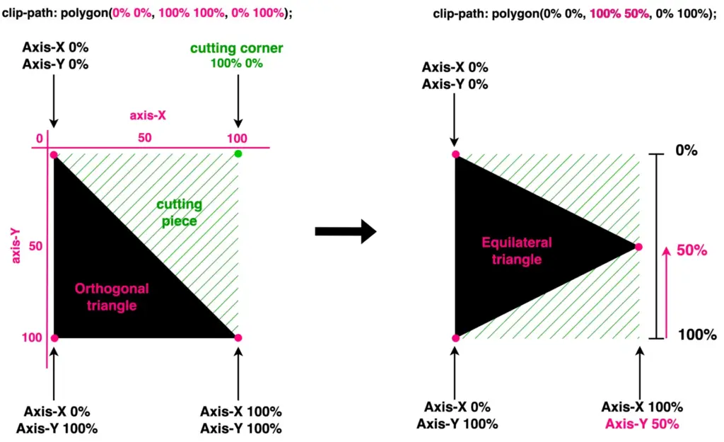
We move forward by keeping the initial design where we cut the top-right corner (100% 0%). We will work with this triangle.
To start, I’ve chosen to create equilateral triangles. This involves first focusing on the remaining top-left corner and then on the remaining bottom-right corner. Don’t worry and don’t feel confused, we’ll clear everything up. As mentioned above, the code and diagrams for clarity are ready!
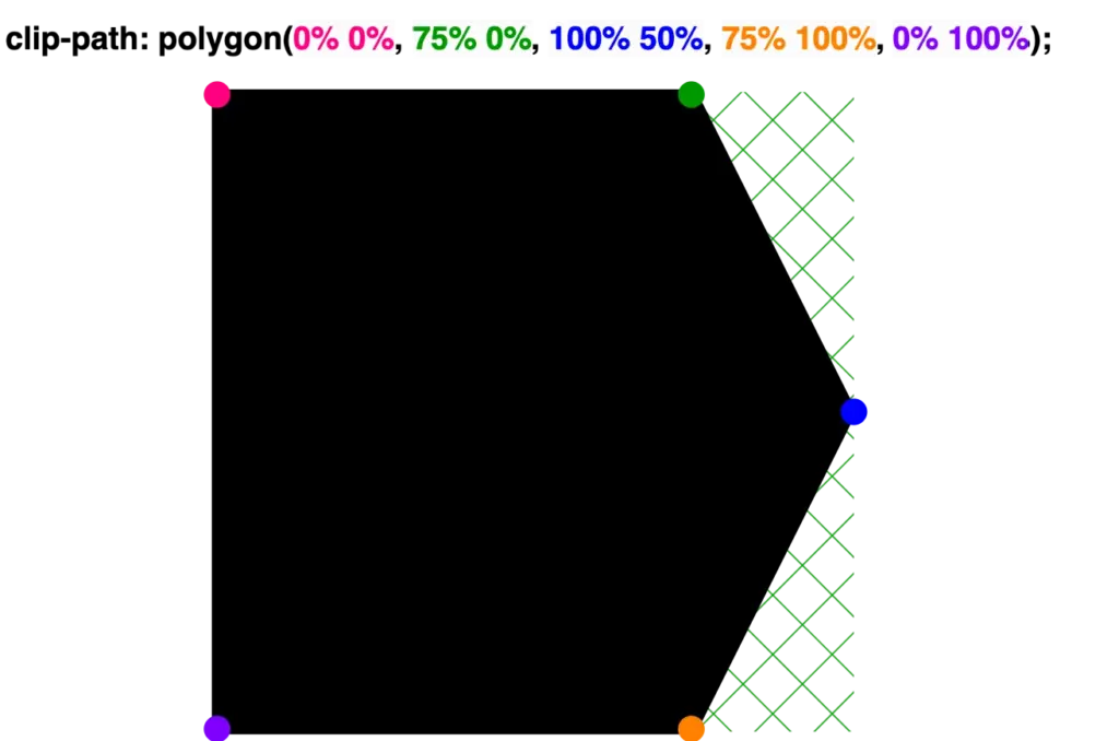
As you can see below, we maintain the bottom corners as they are, and we change the remaining top-right corner, where we move it left to 50% along the X-axis. By doing so, we transform our orthogonal triangle into an equilateral triangle.
clip-path: polygon(
           50% 0%,
           100% 100%,
           0% 100%);
This orthogonal triangle can give us one more equilateral triangle. We maintain the top-left and bottom-left corners, and we change the bottom-right corner by moving it up to 50%on the Y-axis.
clip-path: polygon(
           0% 0%,
           100% 50%,
           0% 100%);
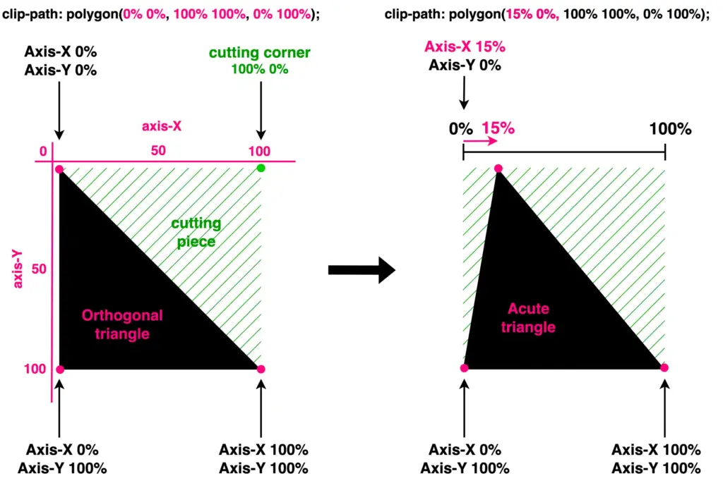
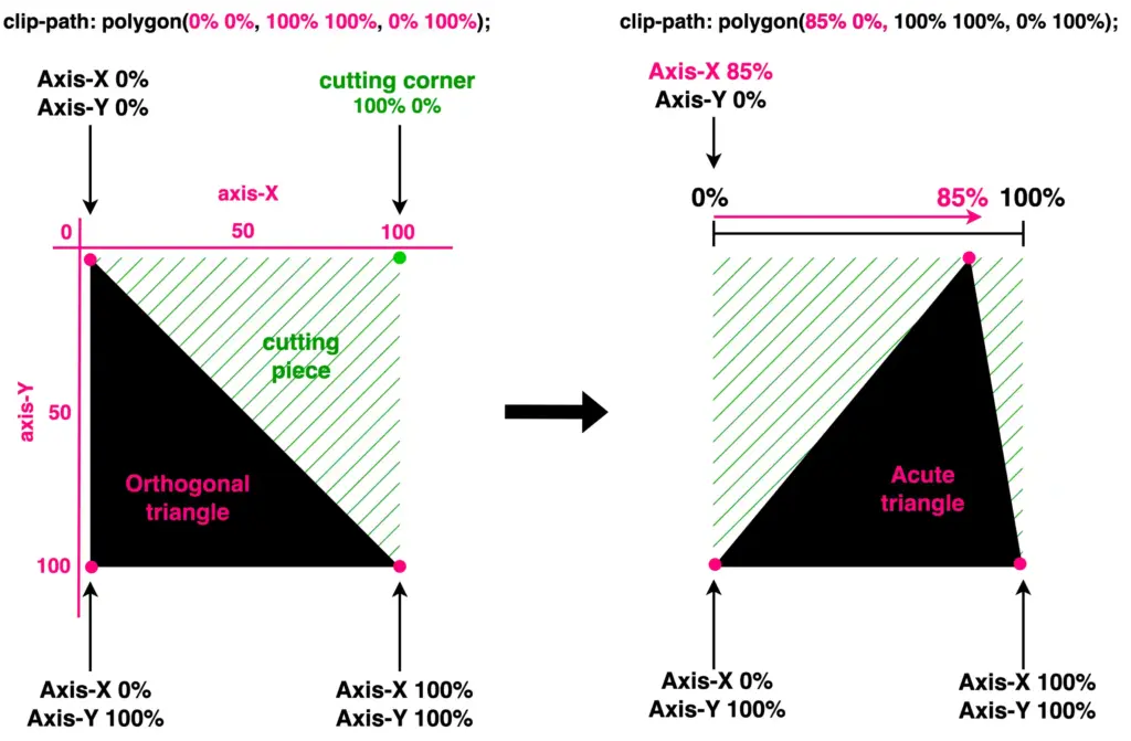
Create acute triangles
We continue with the acute triangles. Once again, we maintain the bottom corners as they are, and we change the remaining top-right corner. Here, we have two cases. First, we move it left to 15% along the X-axis, while in the second case, we move it left to 85%. By doing so, we transform our orthogonal triangle into acute triangles. Depending on our preferences.
clip-path: polygon(
           15% 0%,
           100% 100%,
           0% 100%);
clip-path: polygon(
           85% 0%,
           100% 100%,
           0% 100%);
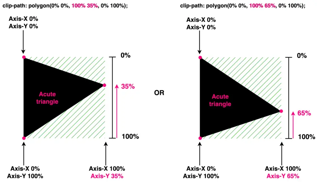
Another approach is to work with the bottom-right corner and adjust the values on the Y-axis. Let’s see how our triangle will become then. I move the bottom-right corner first up to 35% and then up to 65%.
🔖 The values I use to create the triangles are indicative. Feel free to choose any value that suits your preferences and requirements. 😃
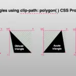
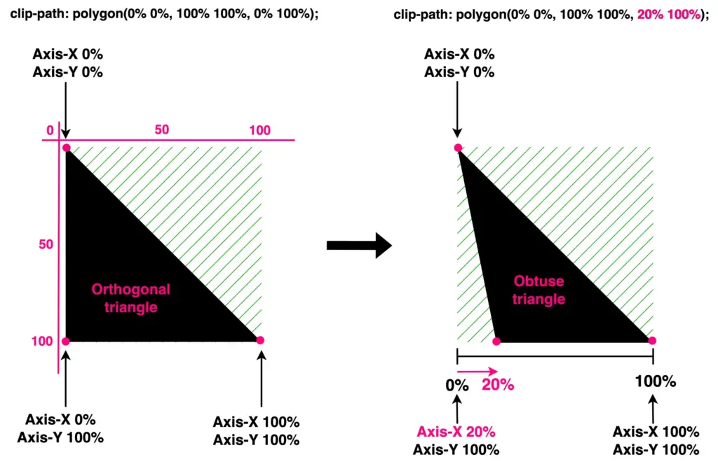
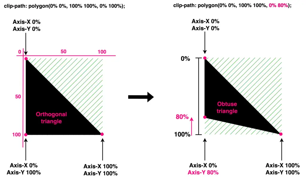
Create obtuse triangles
Finally, it’s time to work with the bottom-left corner. We leave the top-left and bottom-right corners unchanged while modifying the values of the bottom-left corner. Initially, I adjust the X-axis value, shifting the corner left to 20%. Next, I adjust the Y-axis value, moving the corner up to 80%.
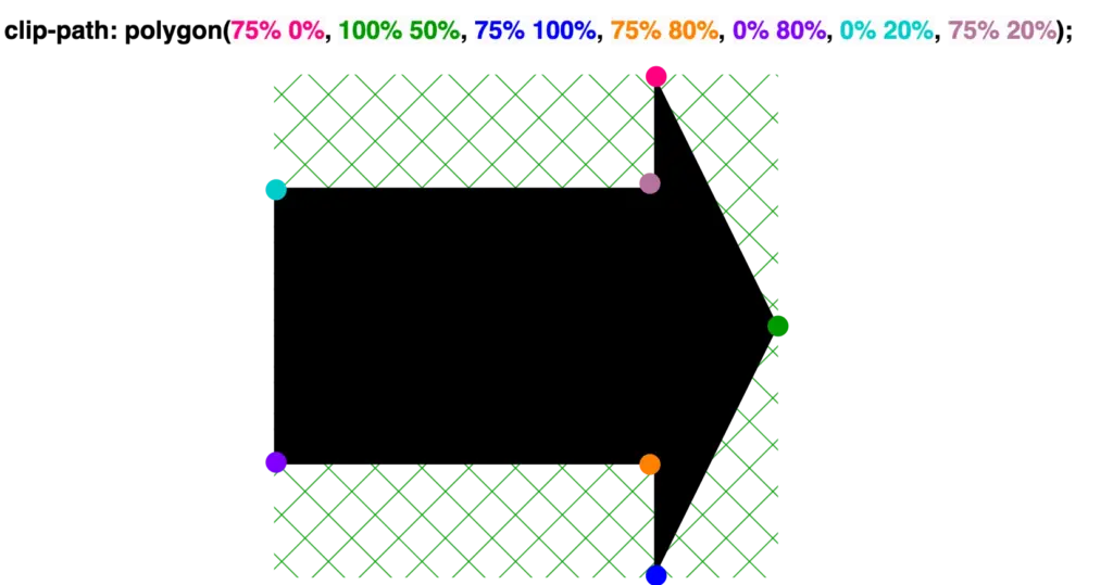
Have you ever wondered if you can create all these directional signs (⬆,↙, etc.), you see everywhere around, using only CSS? I have the solution for you! What about exploring the unique clip-path CSS property, where you can create complex shapes following specific movements!
The clip-path property allows us to cut ✂ an element to a shape of our choice by specifying a series of points. It takes many values, but in our case, we will use the clip-path: polygon() function. I’ll briefly note circle(), ellipse(), and inset() which are the rest of the functions. In this post, we will analyze how we can create navigation signs only.
Clip-path: polygon() function explained
It would be an excellent start to examine the syntax of this amazing tool. Below I’ve illustrated the code along with explanatory diagrams. The first one shows how we can make a square setting the clip-path: polygon() function. We used to create square shapes ⬛ by simply setting the width and height CSS properties. However, I opted to use the clip-path to utilize its familiarity and improve clarity. 😎 I used colored code to show you how we measured on both the axis-X and axis-Y. Each pair of values represents a point, with the first value indicating the horizontal position and the second value indicating the vertical position. Then an image accompanied the code and display a series of colored points illustrate how we form our visual element.
“Clip-path is extremely flexible. We can create any shape we desire from scratch, but we can also apply it to existing shapes and create transformations of our choice”.
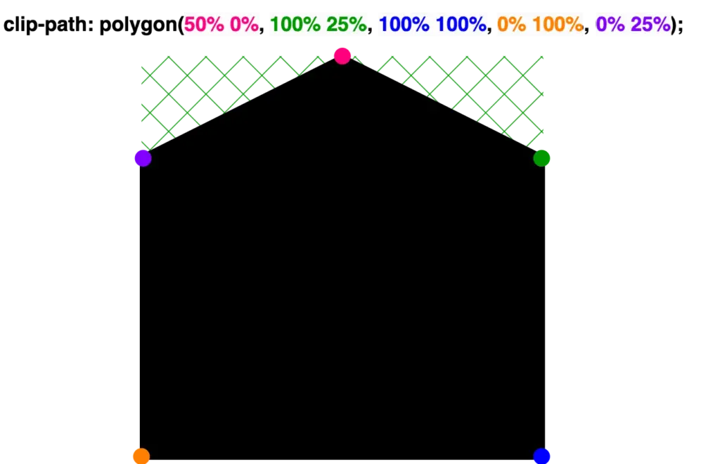
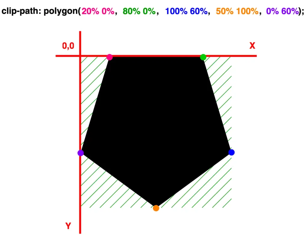
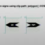
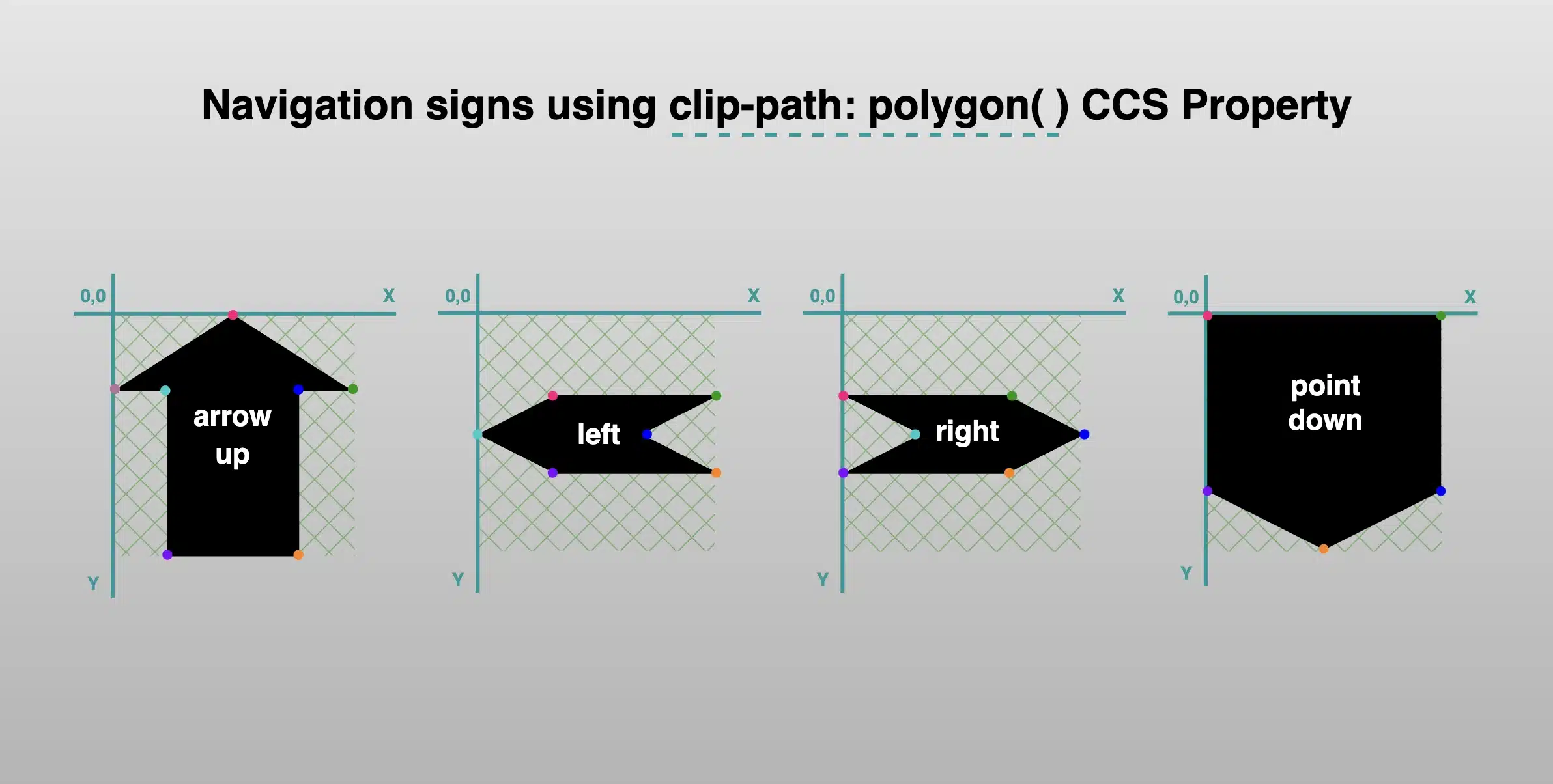
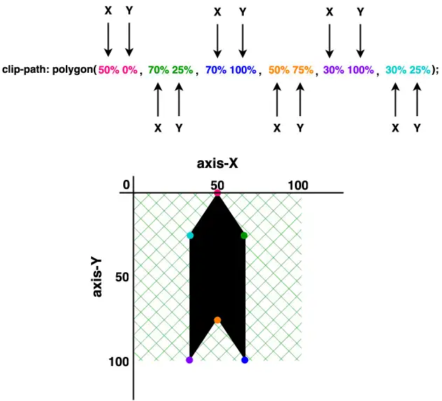
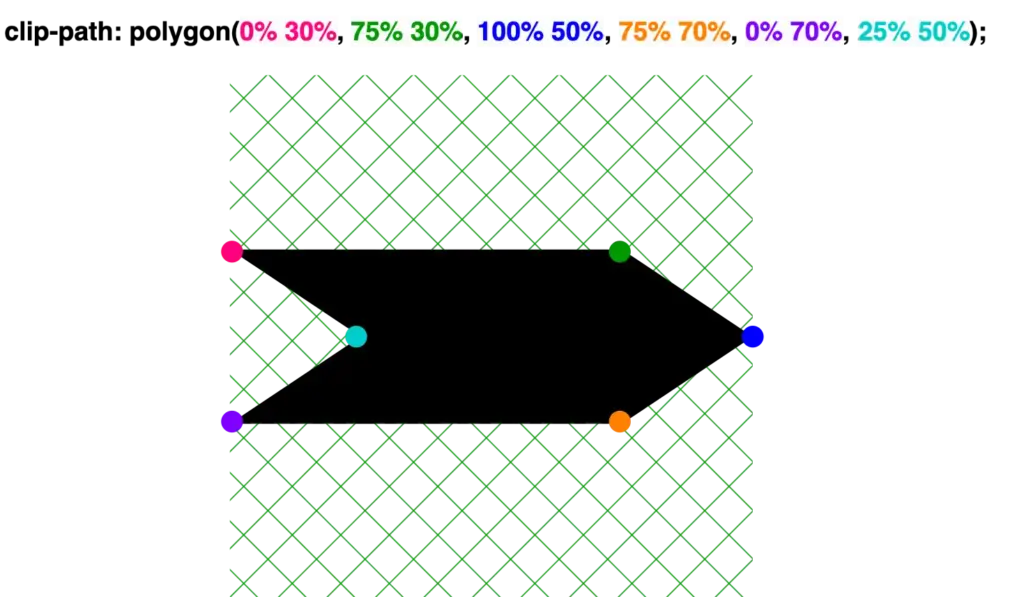
The second case shows how we can transform the square into a directional sign that points to the top. Again, the clip-path: polygon function is defined by coordinates relative to the element’s bounding box, but this time it is a bit harder. 🤯 Don’t worry, I am here to clarify for you! 🤓
It starts at the top-middle (50% 0%).
Then it moves diagonally down and right (70% 25%).
From there, it continues straight down (70% 100%) where it turns diagonally again for two times in a row.
First up and left (50% 75%), then down and left (30% 100%).
Finally, it moves straight up (30% 25%) where it completes its movements.
These one-direction moves enable you to create complicated shapes by strategically placing each point to outline the desired polygonal form. This method allows for precise control over the path of the shape, facilitating the design of visually appealing and geometrically complex elements on web pages.
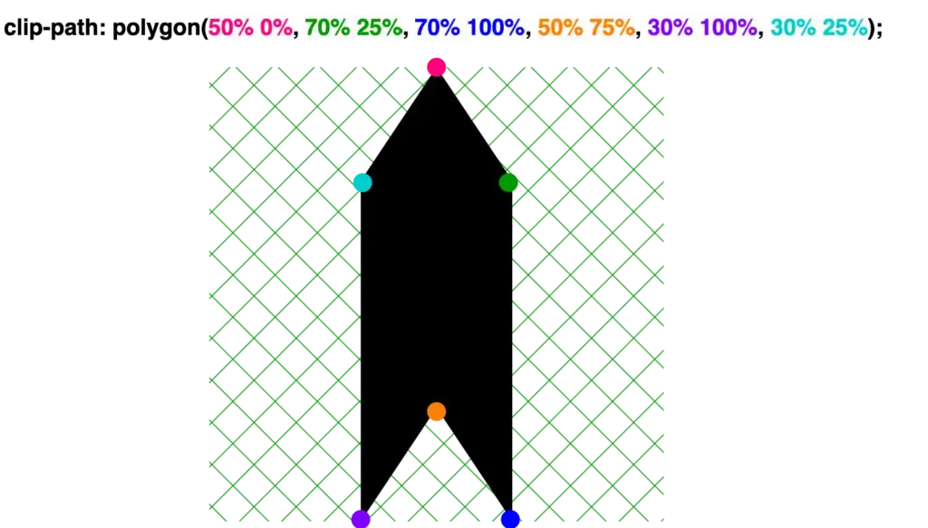
🔖 We are always free to skip all these signs and create just one, 😇 to show only one direction, then we can rotate it until it aligns with our preferences.
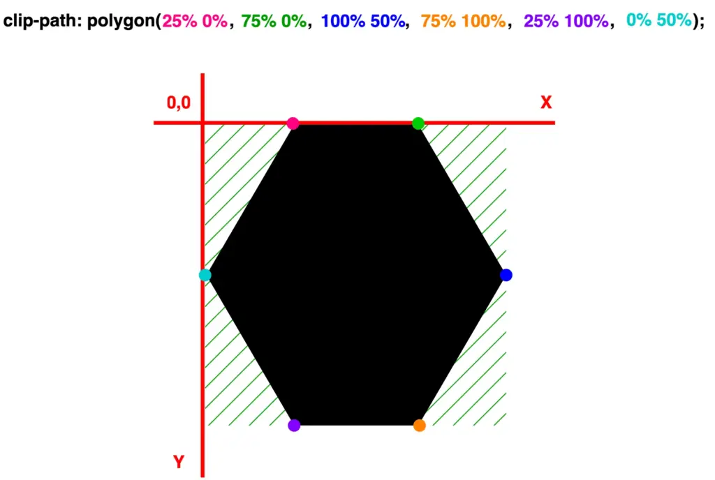
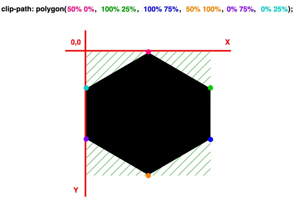
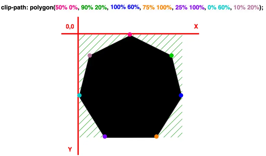
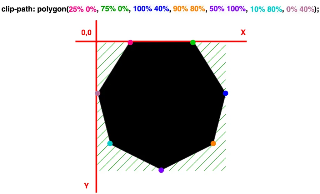
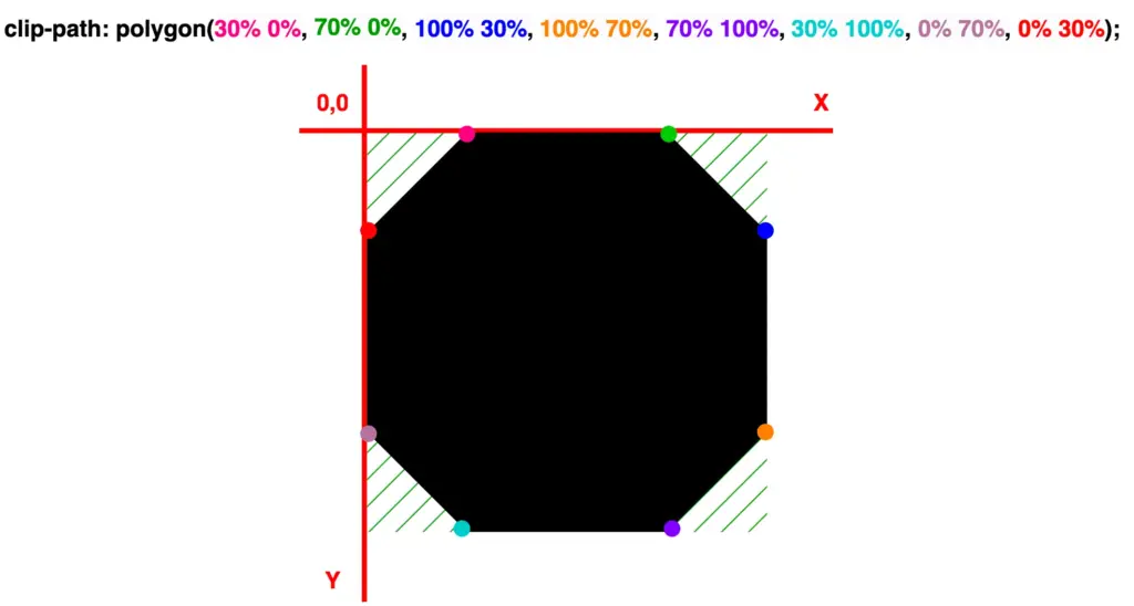
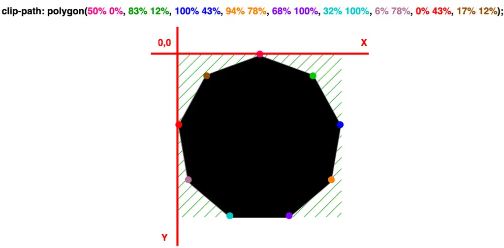
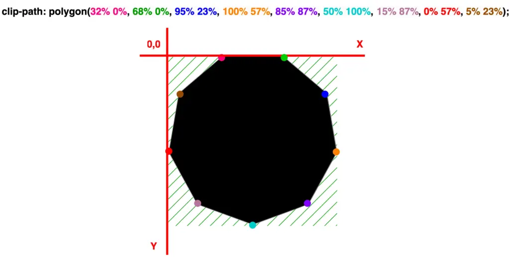
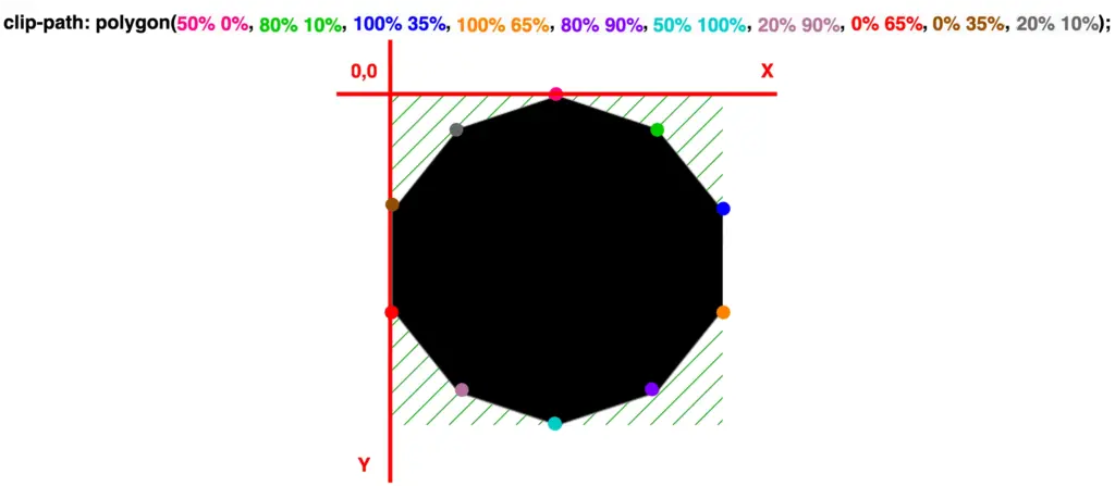
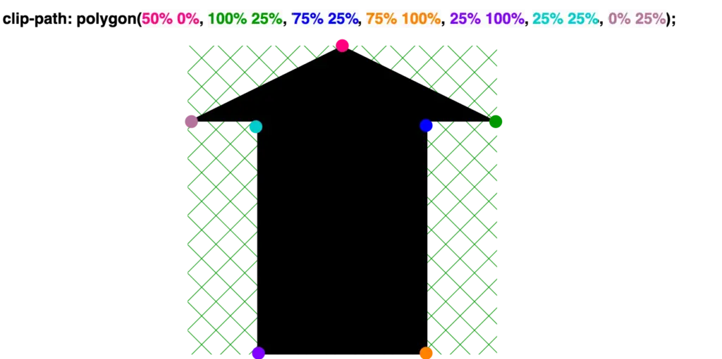
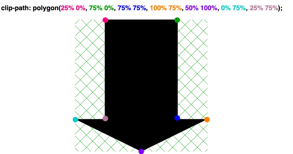
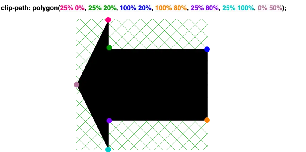
Welcome! Today we’ll dig ⛏ deep and dive into geometric layouts exploring the fascinating clip-path CSS property. This amazing tool helps us to define specific regions within an element, allowing creative shape manipulation. We declare specific points based on the shape we intend to create, offering precise control over our work preferences and needs.
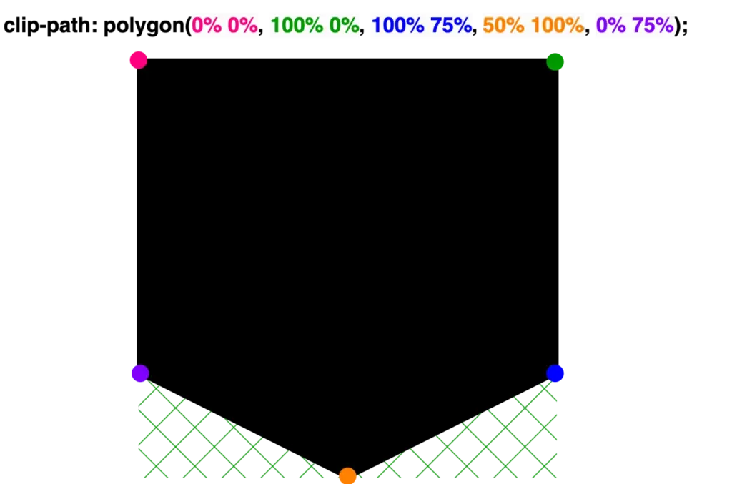
Clip-path CSS property supports several shapes. Depending on the shape we want to create we have the following options: circle(), ellipse(), inset(), and polygon(). In today’s post we’ll spend time on clip-path: polygon() as this anables us to clip an element into a polygon shape.
Clip-path polygon() function explained
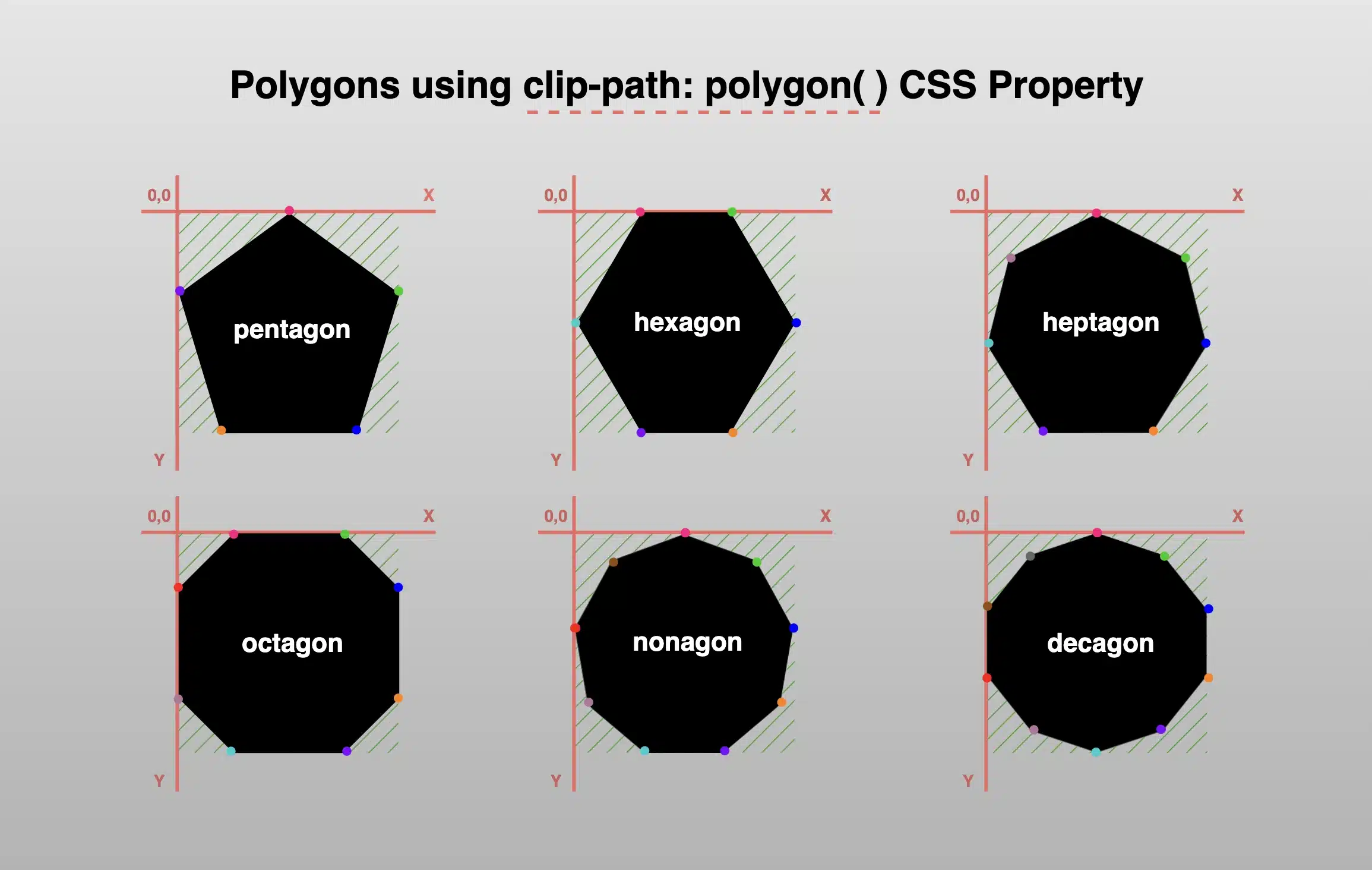
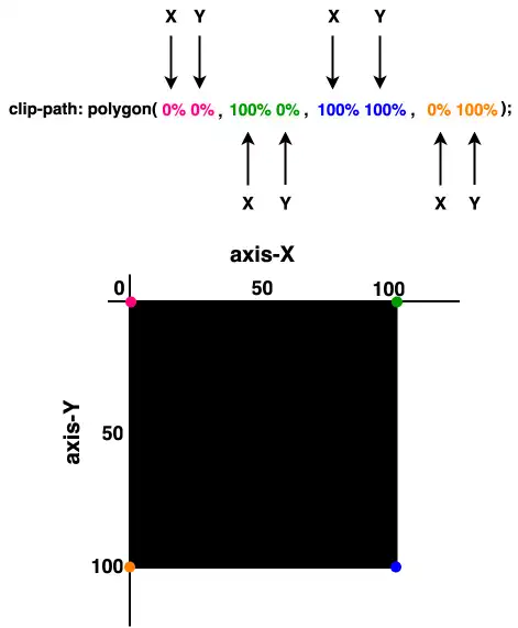
To illustrate the clip-path: polygon() CSS property I chose to start with a square, as it is the most common type of polygon. Below, we can see the code marked with colors. Each pair of values, inside the parentheses, symbolizes a point. In our case, we have four pairs of values, hence we have a shape with four points (square). The four color points represent the clipping area and display how we position the square on both axes X and Y.
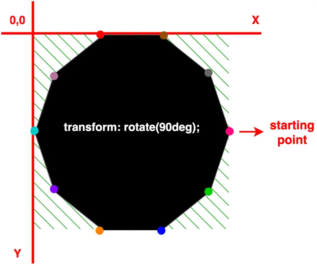
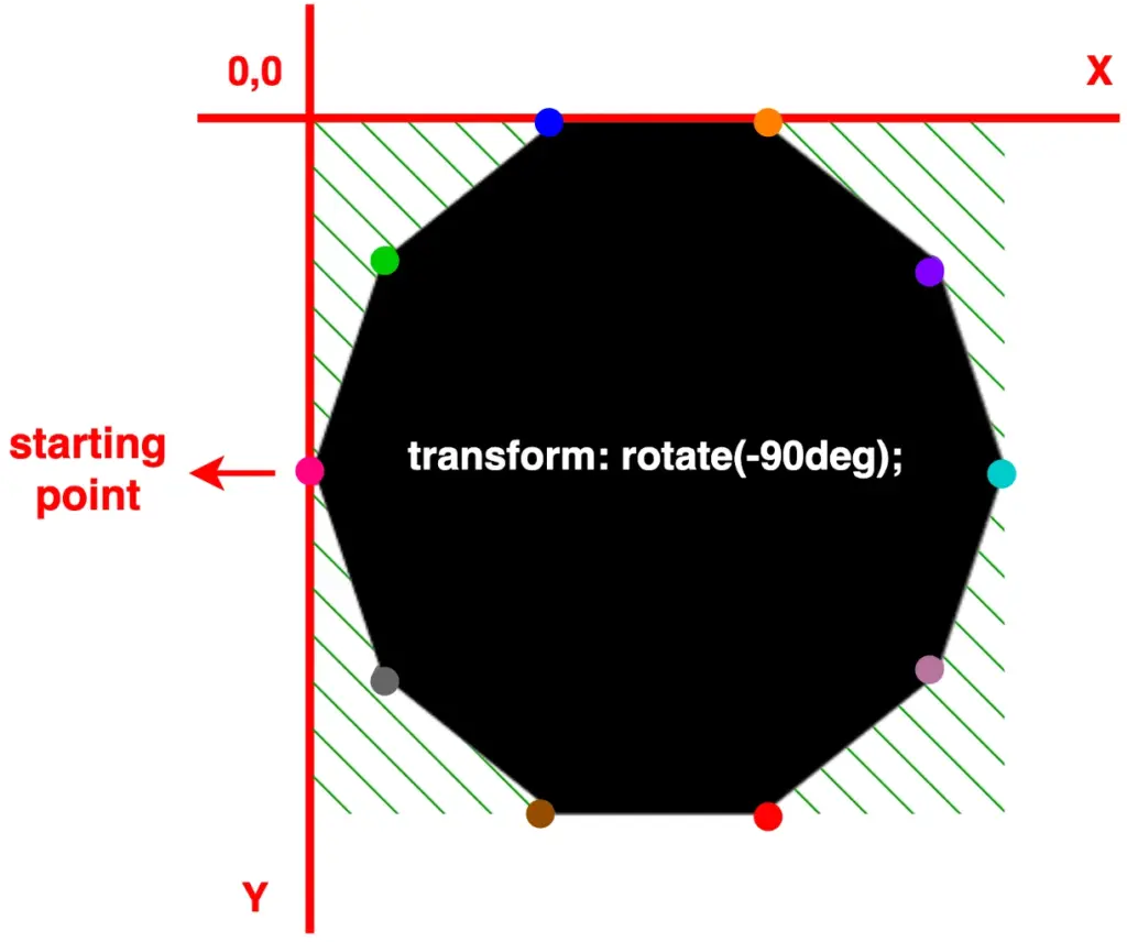
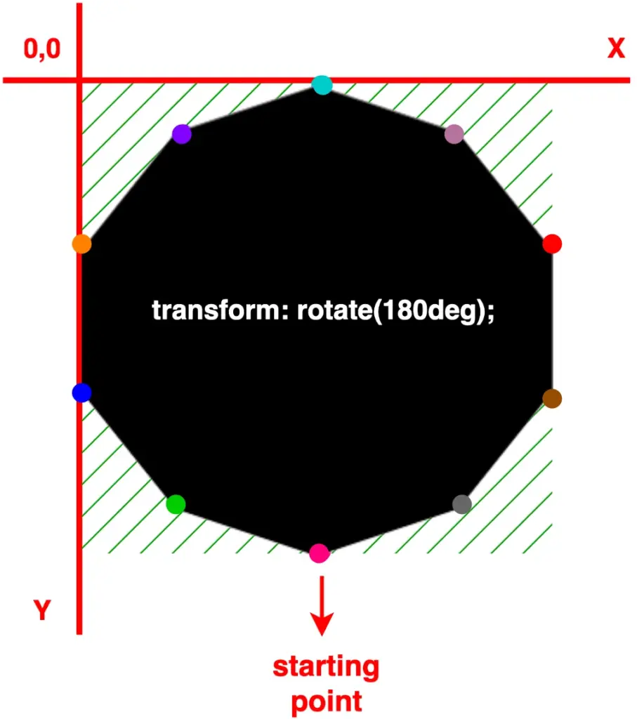
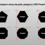
To make things easier, we are free to create only one type of shape at a time and adjust its direction by customizing its orientation. For instance, as demonstrated below, we can use a decagon shape, which is the last shape we created above, and modify its degrees through the transform: rotate() CSS property. In that way, we set the orientation according to our preferences.
More specifically:
In case 1, we notice our decagon rotating 90 degrees to the right
In case 2, with the use of a negative value, our decagon moves anticlockwise and rotates 90 degrees to the left
In case 3, it rotates 180 degrees to the right, resembling a downward orientation
🔖 Pay attention to how the colorful dots shift from one place to another, updating their positions each time we change the rotating value. 🥳
/* case 1 */transform: rotate(90deg);/* case 2 */transform: rotate(-90deg);/* case 3 */transform: rotate(180deg);
The clip-path property in CSS lets you control which part of an element is visible by defining a specific shape, no matter what the element’s shape is. It’s like placing a mask over an element—only the area inside the shape will be shown. Everything outside will be hidden. This provides a clever way to “cut out” parts of an element without needing extra images or complex code.
A great tool for creating unique layouts, applying image effects, and designing custom shapes. CSS supports several shapes for clip-path, including circle(), ellipse(), inset(), and polygon()—each giving you different ways to shape your content and hide any parts you don’t need. 🪄
In today’s post, we’ll focus on the circle() ⚫ function and explore how it works. 🧐 Let’s dive in!
The circle() function
The circle() function is one of the simpler ways to create circles by clipping an element into a rounded shape with a radius of our preference based on the element’s smaller dimension (width or height, selecting the smaller one, ensuring the circle fits within the element). Traditionally, we can use pixels px and percentages % to define the dimensions and the position of the circle. Otherwise, we can just utilize the handy center keyword, which is responsible for positioning our circle.
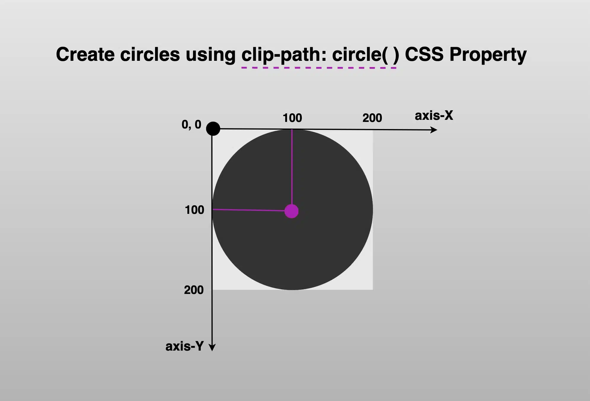
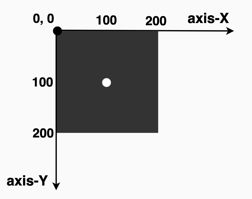
Below, we see the starting setup we’ll use to explore this awesome CSS property. It shows a dark grey square, with a width and height of 200px. Also, a small white dot marks its center. This allows us to visualize exactly how the circle is positioned. The square is placed on an axis to make things even clearer. This helps explain both positioning and how the circle will be clipped inside it (inside the square element). 📐 😃
The circle(radius at axis-X axis-Y) function using pixels and percentages
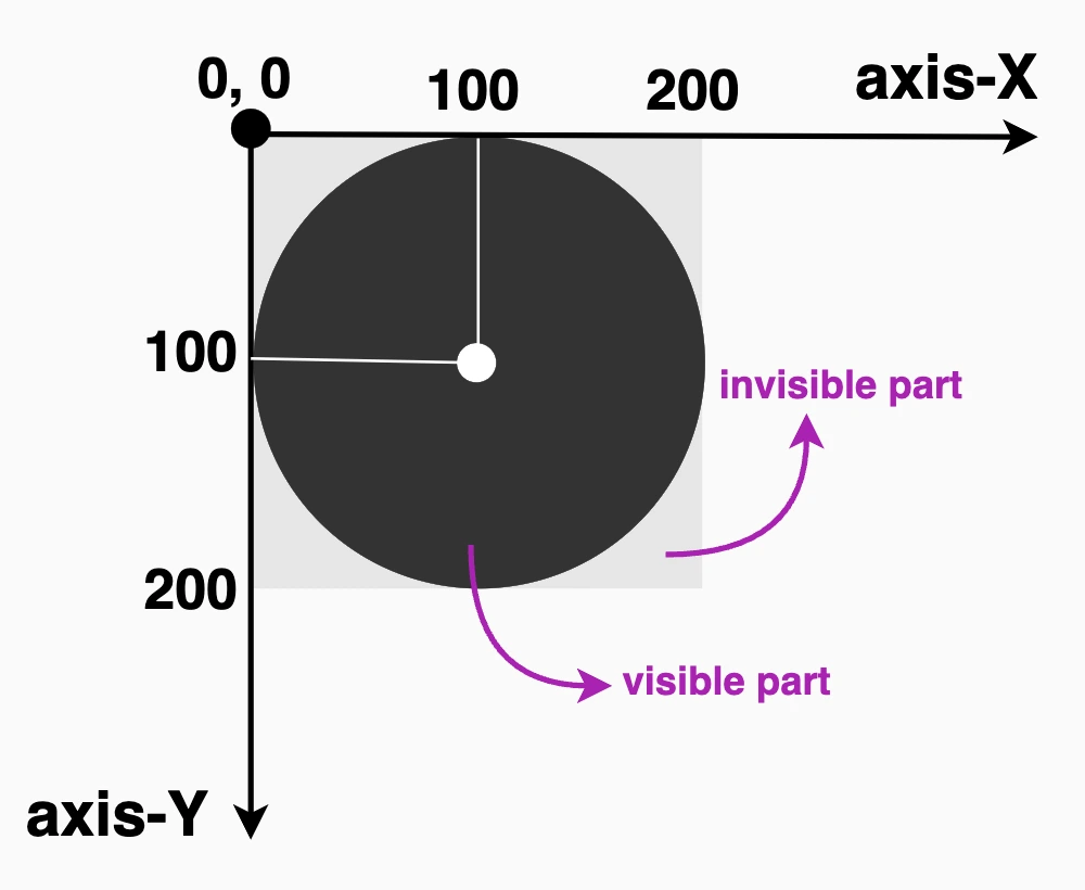
It defines a circular clipping area using two values: the radius of the circle and its center point. We set the radius to 100px wide or 50% of the element’s width, and we positioned it 100px from the left and 100px from the top of the element or 50% 50%, which places the circle right in the element’s center. Everything outside the circle will be invisible. This creates a circle that is perfectly centered within the square.
.circle { // circle(radius at axis-X axis-Y) //clip-path: circle(100px at 100px100px);} // OR //.circle { // circle(radius at axis-X axis-Y) //clip-path: circle(50% at 50%50%);}
CSS
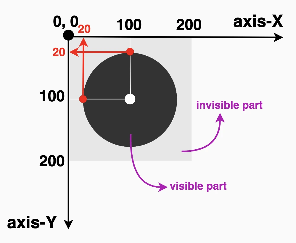
Now, let’s try to cut ✂ a smaller circle. Maybe with a radius of 80px. How would our code and circle look now? Check out the updated code snippet below.
We’re still cutting out a specific shape, a circle, from the element, but this time the circle is smaller (radius of 80px or 40% of the element’s width), though it is centered at the same spot as before (100px from the left and 100px from the top or 50% 50%). That means the circle stays perfectly centered within the square.
.circle {clip-path: circle(80px at 100px100px);} // OR //.circle {clip-path: circle(40% at 50%50%);}
CSS
🔖 Bear in mind that we can combine pixels with percentages, too. E.g. clip-path: circle(80px at 50% 50%);
Using % instead of pixels, it makes our shapes responsive and adjusts to the size of our elements each time. In that way, our designs are more flexible and adaptable to different screen sizes.
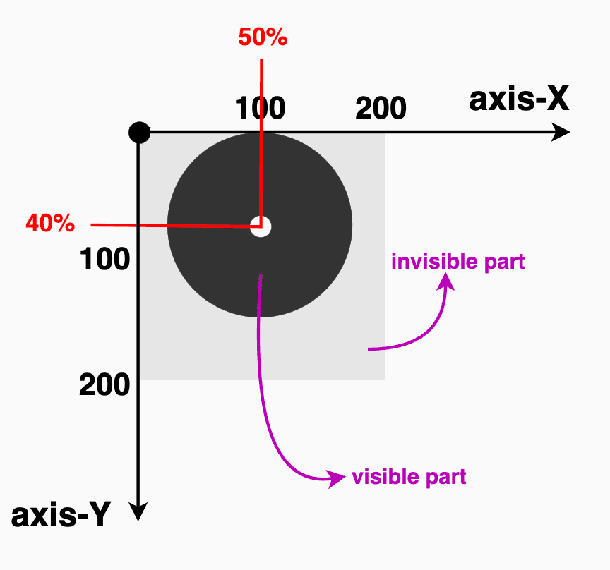
The circle(radius) function
Another way to create circles using clip-path is the circle(%). It clips the element into a perfect circle with a radius of our preference. Additionally, since you do not specify a position, it centers by default at 50% 50% (50% horizontally and 50% vertically).
Below, we have two examples. The first one has a radius of 50%, while the second has a radius of 40%, allowing for easy comparison with the previous examples.
.circle {clip-path: circle(50%);} // OR //.circle {clip-path: circle(40%);}
CSS
The circle(radius at center) function using the ‘center’ keyword
It defines a circular clipping area using the radius and the keyword center. Using this method, we create a circle with a 100px radius perfectly 🎯 centered inside the element. Anything outside that circle will be hidden.
🔖 Note that setting the center it is the same as writing 50% 50%, maintain a cleaner and clearer code. ✨
.circle {clip-path: circle(100px at center);} // OR //.circle {clip-path: circle(50% at center);}
CSS
Likewise, if we create a smaller circle.
.circle {clip-path: circle(80px at center);} // OR //.circle {clip-path: circle(40% at center);}
CSS
clip-path: circle() VS border-radius
Now, let’s see why we are utilizing the clip-path instead of simply relying on the border-radius CSS property. As we mentioned earlier, when setting the clip-path, we deal with two main values: the radius, similar to what border-radius offers, and the positioning, which is particularly important if we want to create a circle that is not 🎯centered within the element.
Let’s create our circle again, with a radius of 80px or 40% (depending on your preferences – if you use px or %). Next, position it, but not in the center of our element (50% 50%).
🔶 If we want the visible part to be closer to the top side, we keep axis-X at 50%, but we change the axis-Y from 50% to 40%. 🔶 If we want the visible part closer to the right side, we keep the axis-Y at 50%, but we will change the axis-X from 50% to 40%.
.circle { // circle(radius at axis-X axis-Y) //clip-path: circle(80px at 50%40%);} // OR //.circle {clip-path: circle(40% at 50%40%);}CSS
CSS
.circle { // circle(radius at axis-X axis-Y) //clip-path: circle(80px at 40%50%);} // OR //.circle {clip-path: circle(40% at 40%50%);}CSS
CSS
Setting clip-path instead of border-radius gives us the privilege to focus on any part of our element we prefer, not just the center. A really useful method, especially when working with images 📸 and you want to keep a part of the image that is not necessarily at the center.
Let’s examine another case. What do you think? Are we able to vanish 🎩🐇 a whole piece of our circle and keep only a small part if needed? Let’s see the following code snippet. We position the center of the circle at zero (0%) on both axis. This means that the center of our circle will be placed at the top-left corner of the initial element, as that’s the point where both axes X and Y begin.
.circle {clip-path: circle(80px at 0%0%);} // OR //.circle {clip-path: circle(40% at 0%0%);}
CSS
Take a closer look at the image below. Since the circle is positioned at the element’s top-left corner, only the 🕞 quarter of the circle that fits within the element’s bounds will be visible, all the rest, that is extended beyond the element’s boundaries, will not be displayed at all. Cool hug! 😎
Apply clip-path to images
Now it’s the perfect time to analyze how we can utilize clip-path with images. A clever way to control their shape and also ‘cut out’ and leave in view only a specific part of the image.
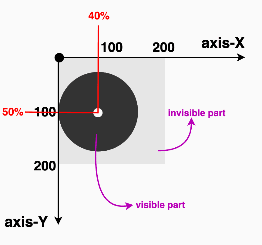
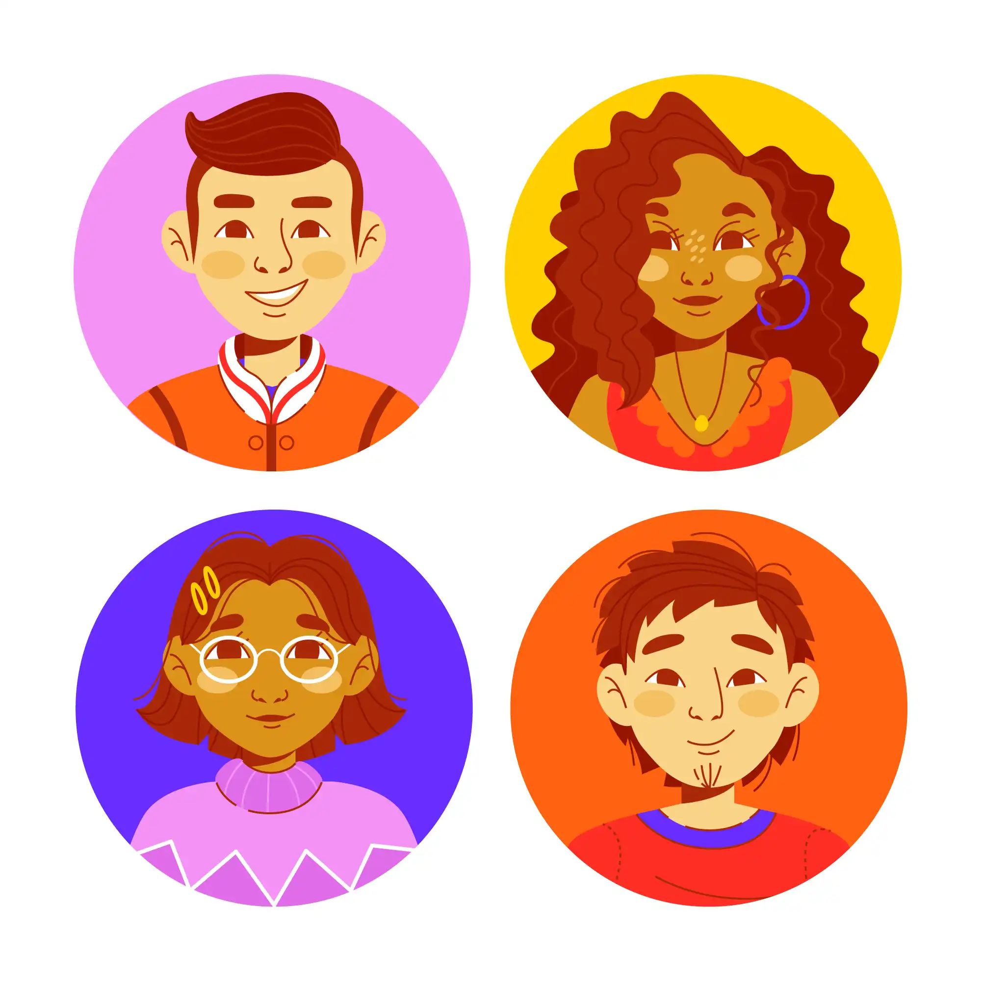
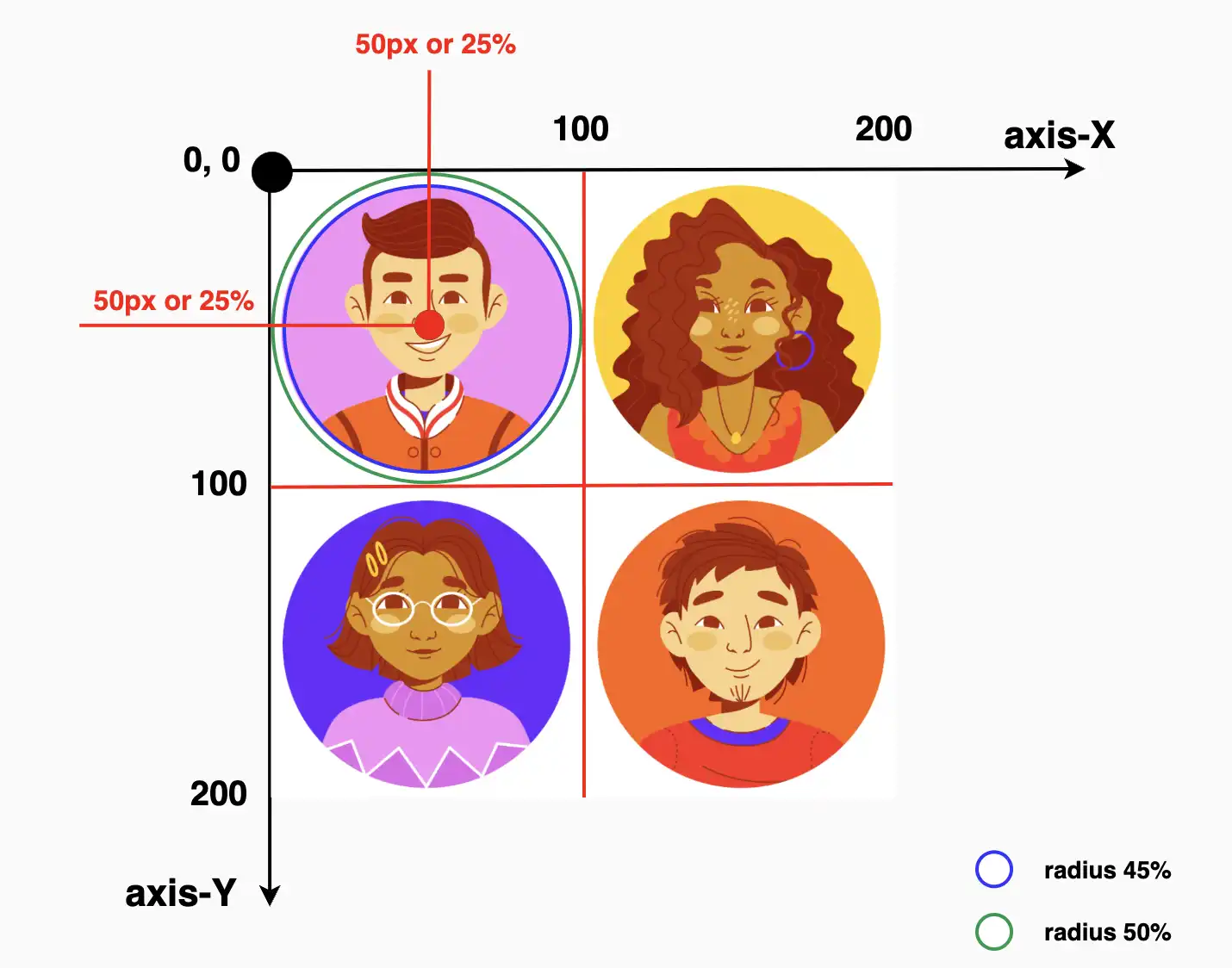
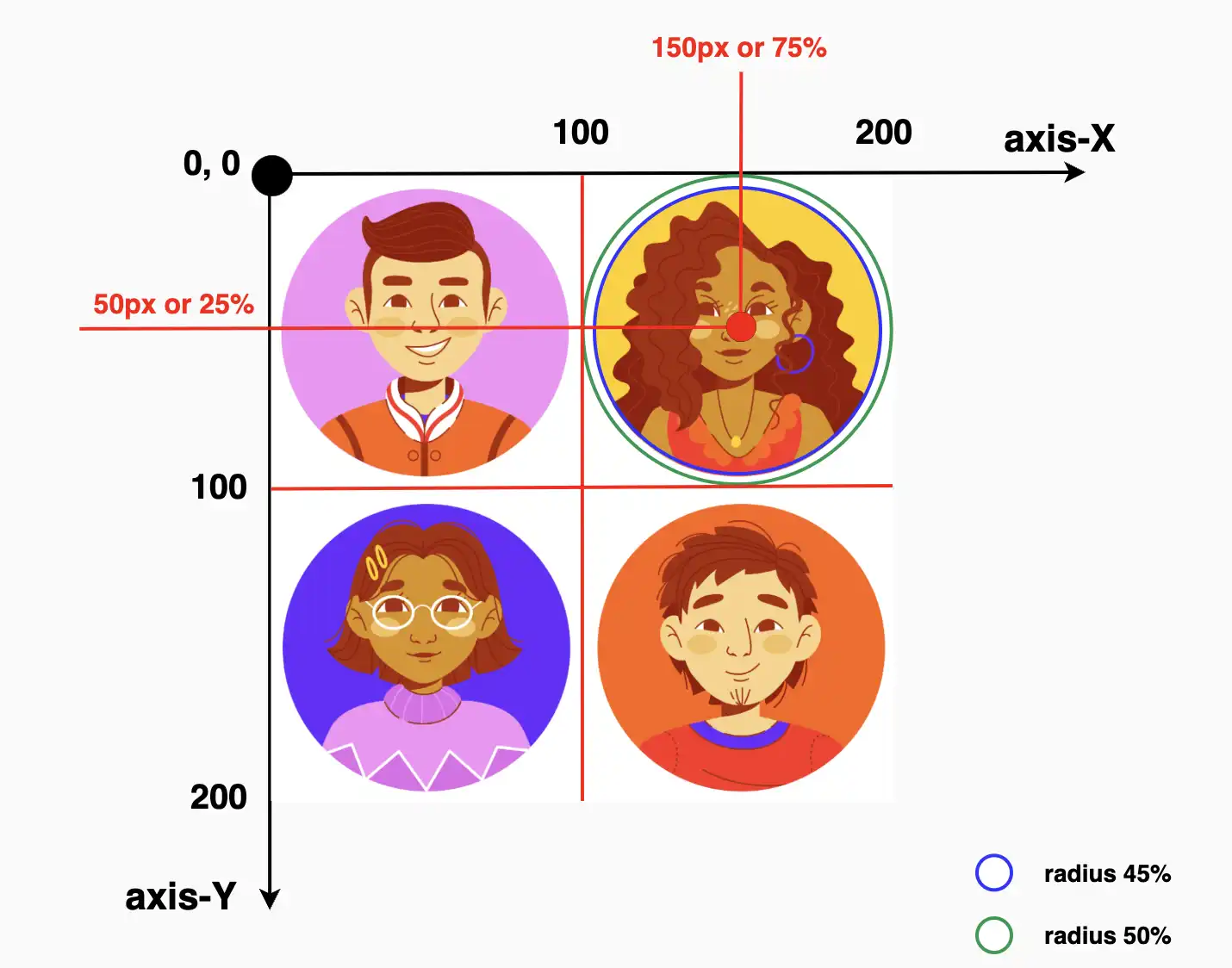
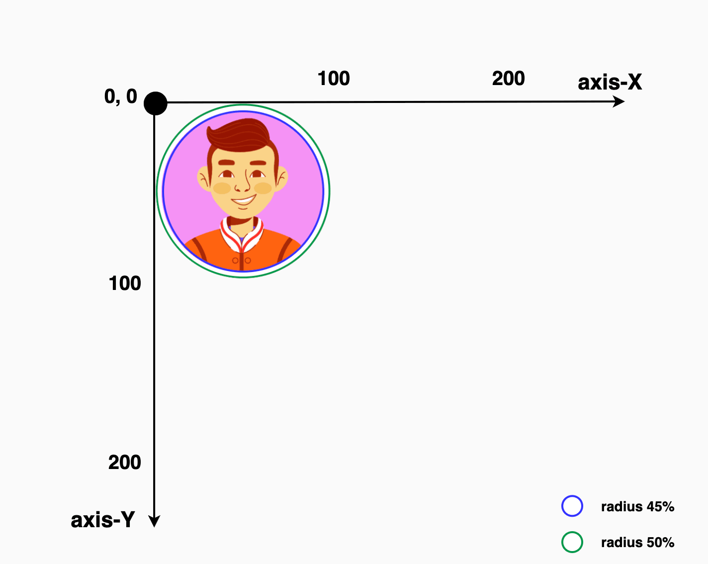
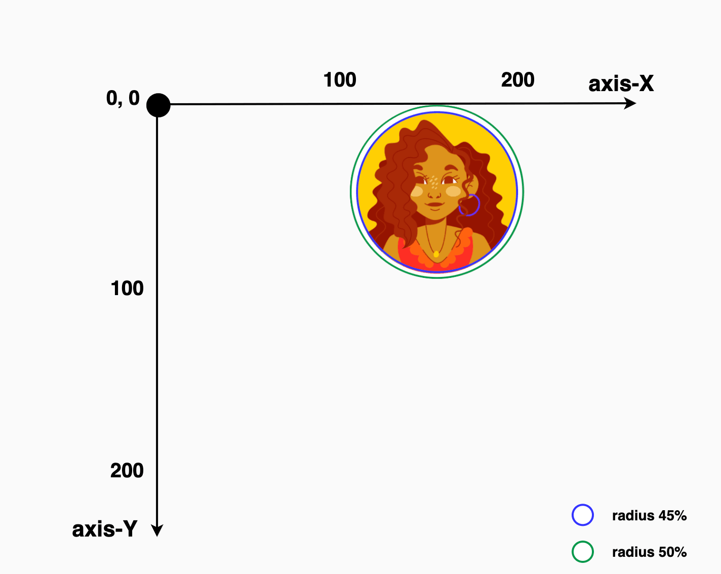
In the following example, we’re working with an image that contains four avatars, each placed in one of the image’s corners: top-left, top-right, bottom-left, and bottom-right. The image is divided into four equal parts, with one avatar in each. By using the clip-path: circle() function, we can focus on just one avatar at a time.
First, we apply clip-path: circle() to cut out the top-right part of the image, revealing only the avatar placed there. Then, we do the same for the top-left corner to show the avatar in that section. We repeat this process for the bottom-left and bottom-right parts as well, effectively isolating each avatar with a circular crop.
Depending on the visual balance and spacing, you can choose 45% (blue 🔵 border) to match the exact size of the avatar or go with 50% (green 🟢 border) to include a bit of extra white space from the image background for a more relaxed look. 🌈 😎
To target and isolate each avatar at the top of the image:
🔶 For the top-right avatar, we place the circle’s center at 25% 25%. This moves the circle’s center closer to the top-right side of the image.
🔶 For the top-left avatar, we set the position at 75% 25%. This turns the focus to the top-right area of the image.
Adjusting these percentages gives you fine control over what part of the image stays visible, allowing you to highlight exactly what you want.
.circle { // circle(radius at axis-X axis-Y) //clip-path: circle(45% at 25%25%);} // OR //.circle {clip-path: circle(50% at 25%25%);}
CSS
.circle { // circle(radius at axis-X axis-Y) //clip-path: circle(45% at 75%25%);} // OR //.circle {clip-path: circle(50% at 75%25%);}
CSS
Below we can see the final results for the two avatars. The first image displays only the first avatar while the second presents only the second one. All the rest of the avatars will be hidden. Pretty cool, right?
This technique allows us to pinpoint and display specific parts of the image. Then, with the necessary positioning, we put this specific part of the image in our desired place. 😃 ✨
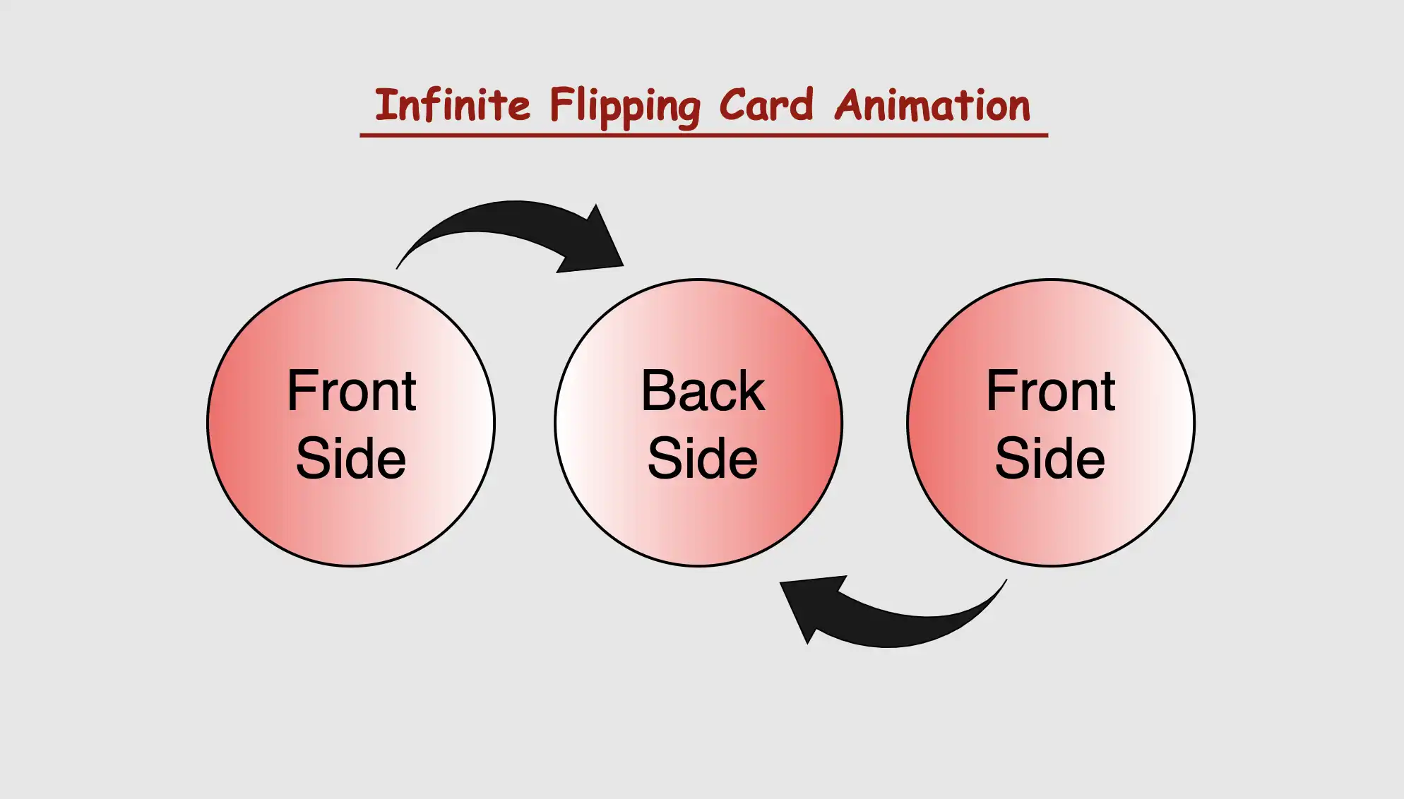
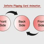
Welcome to this article, where I will guide you through some simple steps of creating a stunning CSS infinite flipping card animation. With my easy-to-follow instructions, you’ll be able to design a beautiful and eye-catching card in no time. Don’t miss this opportunity to elevate your website and impress your audience! 😉
Let’s proceed and direct our attention towards creating this distinctive animation!
CSS Infinite flipping card effect animation
The supplied HTML and SCSS (Sass) code generates a flip card that exhibits movement along both the Y and X axes. The X-axis and Y-axis represent two intersecting lines, defining the coordinates of a point in a two-dimensional space.
Now, let’s analyze the code one step at a time:
HTML structure
Let’s start by examining the HTML structure. We begin by creating a container element with the class flip-wrapper. This container acts as the main hub for our animation. Inside this container, we have a special area with the class flip-card. So, now we have a parent element and a child element. The parent element is where we will build the animation while the child element is the one that determines the appearance of our animation.
In our CSS code example, we start by making the whole page’s background-color a shade of gray (#c3c8c3).
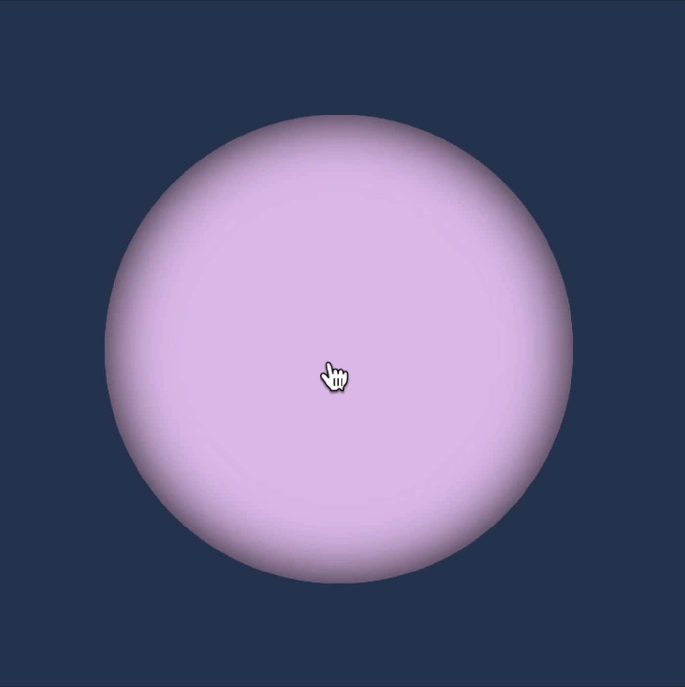
Then, for the container called .flip-wrapper we decide its size by giving it a fixed width and height of 300 pixels. We also make it look circular or rounded by using the border-radius property. It’s important to mention that you can keep it square ⬛ if you prefer, but I went with the rounded look ⚫ because it helps us see clearly the effect.
Moving on to the .flip-card element, we set its width and height to 100% as a way to cover the entire available space. We make it look nicer by giving it a linear-gradient background using white and black colors. A subtle gray shadow effect is also a nice touch, giving a sense of depth. To keep the circular style consistent, we add the inherit value to border-radius property.
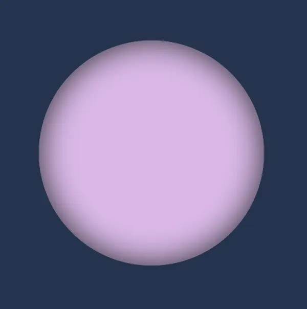
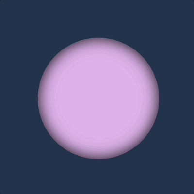
body {background-color: #213450; /* dark blue */}.flip-wrapper {width: 300px;height: 300px;border-radius: 50%;.flip-card {width: 100%;height: 100%;background-color: #e1b6ea; /* lavender */box-shadow: inset0030px;border-radius: inherit; }}
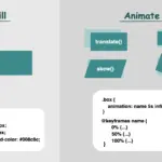
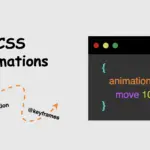
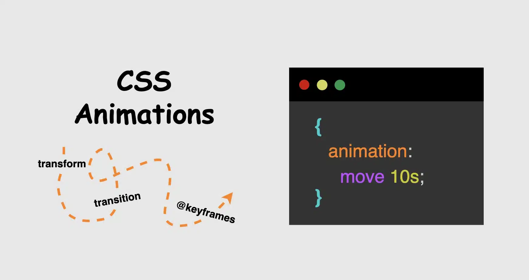
To achieve this captivating effect, we must employ the following two CSS properties: animation and @keyframes. Let’s dive deeper into their analytical exploration.
To create an infinite flipping card animation it is essential to connect the animation and @keyframes CSS properties. Otherwise, it won’t work.
Setting the animation CSS property
In this section of the code, we’re applying the CSS animation property to the element we want to make the animation, in our case to the .flip-wrapper class. The purpose of this property is to associate the animation with the element, as we mentioned above.
First of all, we need a name for our animation. Here the animation is named rotation. This name acts as a reference point, allowing us to reuse and target this specific animation throughout our stylesheet.
Then we have to give it a duration. Our example has a duration of 8 seconds 8s. This duration defines how long the animation takes to complete one cycle, indicating that the entire animation, from start to finish, will span over 8 seconds.
Additionally, it’s set to repeat infinitely. This means that once the animation completes, it restarts immediately and runs continuously without a break. This creates a continuous animation effect (loop 🌪 😂).
In summary, we are using the animation property to apply an animation named ‘rotation’ to the .flip-wrapper class, making it last for 8 seconds and repeat indefinitely, resulting in an uninterrupted, continuous animation for an element.
In the @keyframes rotation section, we define the animation behavior. It specifies a transformation that involves rotating an element around its X-axis and Y-axis. Here’s a breakdown of its key components:
@keyframes: This is the rule used to define the keyframes for the animation. Keyframes specify how the animation should change over time, in this case, from the starting state (from) to the ending state (to).
rotation: This is the name given to the animation, and it will be used to reference the animation when applying it to elements using the animation property.
fromandto: These define the initial and final states of the animation. In the from state, the element has a rotation of 0 degrees around the X-axis, meaning it starts with no rotation. In the to state, the element is rotated 360 degrees, completing one full rotation, around the X-axis and/or Y-axis.
transform: The transform property is used to apply a specific transformation to the element. In rotation animations, (the specific transformation applied can vary, such as rotating, scaling, or skewing the element.) it enables the element to change its orientation.
transform: rotateY()
In the following CSS animation, named rotation , our animation starts from a rotation of 0 degrees (from) and smoothly transitions to a 360-degree rotation (to) around the Y-axis.
This CSS animation, named rotation rotates the element around its X-axis. It starts (from) with no rotation (0 degrees) and smoothly completes (to) a full 360-degree rotation.
We have the capability to create rotations along both the Y and X axis at the same time.
transform: rotateX() rotateY()
In this CSS animation named rotation the element is rotated in both the X and Y axes. It starts (from) with no rotation (0 degrees in both axes) and gradually complete (to) a full 360-degree rotation in both the X and Y axes. This animation can create a complex spinning effect that involves rotations in multiple directions. Cool huh!! 😎
What to avoid when making a CSS flipping card effect animation
As a reminder, it’s important to ensure that our animation transitions smoothly. To achieve a complete rotation, we must rotate (from) 0 degrees (to) 360 degrees. In the provided animation code, the @keyframes specifies a rotation of (160 deg) for both the X and Y axes, resulting in a card flip effect. However, this setup does not create a smooth transition beyond the 180-degree point. The card abruptly returns to its initial position, giving it a characteristic stop-and-return appearance. To achieve a more natural and realistic flipping effect, we need to ensure a complete 360-degree rotation or a half 180-degree rotation.
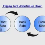
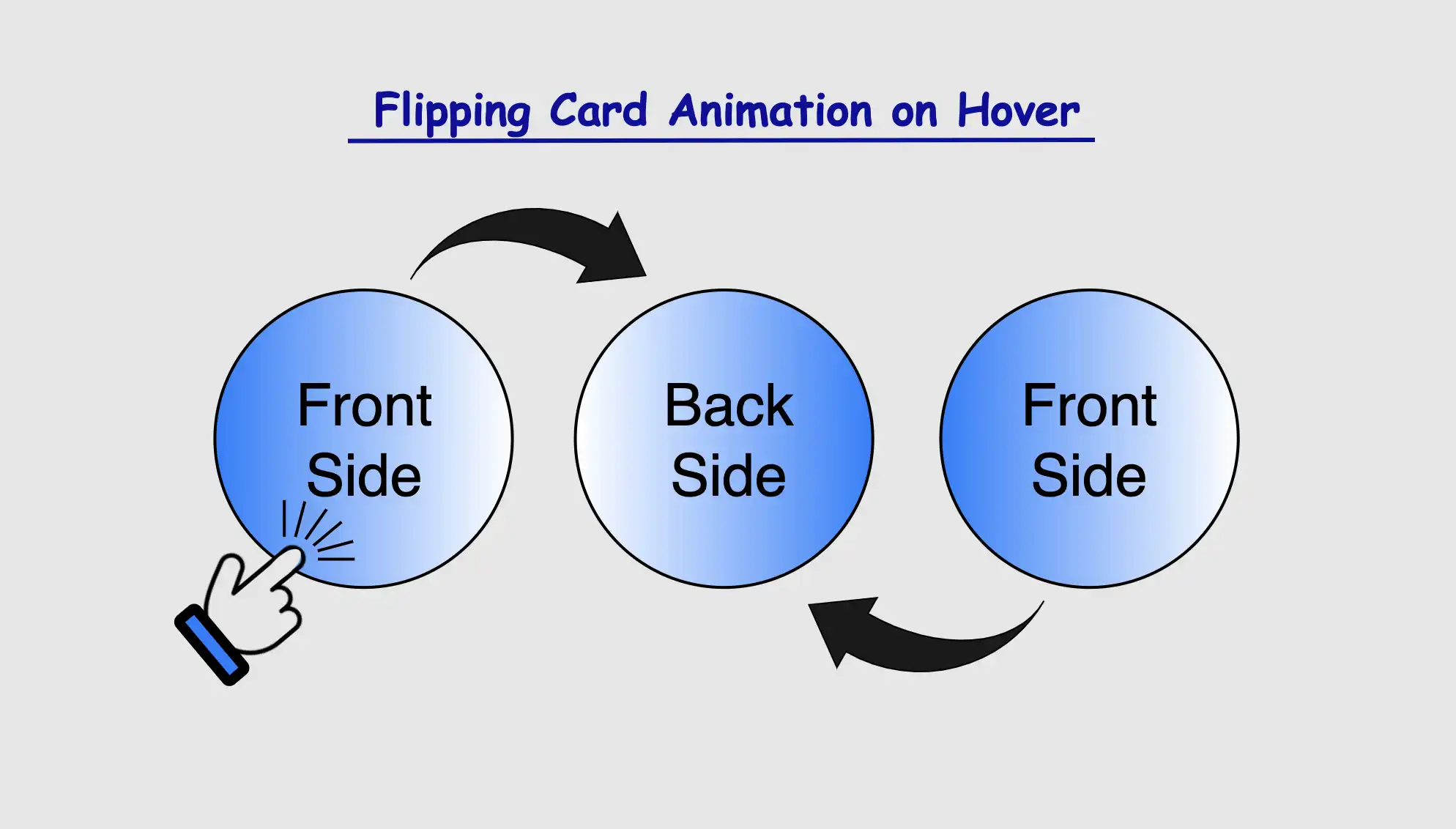
Greetings! Today, I’m excited to walk you through the steps of crafting an amazing CSS flipping card animation that will activate when the user hovers over it. By following my detailed guidance, you’ll learn how to create a stunning animated card that will grab the attention of your viewers and enhance the overall appearance of your website. So, don’t miss out! 😉
Let’s focus on making this unique animation!
CSS Flipping card animation on hover
The provided HTML and SCSS (Sass) code creates a flip card that moves along the Y and X axis. The X-axis and Y-axis are two lines that cross each other. They’re used to define the location of a point in a two-dimensional space.
Let’s break down the code step by step:
HTML structure
To start, let’s focus on the HTML structure. We begin by creating a parent container with the class flip-wrapper. This container serves as the parent for our captivating animation. Inside this wrapper, we have a child element with the .flip-card class. This particular element is where our animation will take place.
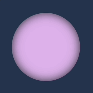
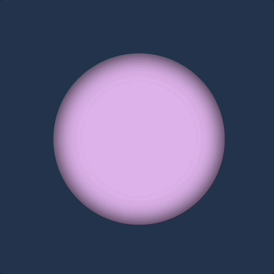
In our CSS code snippet, we start by setting the background-color of the entire page to a deep shade of dark blue (#213450).
Moving on to the .flip-wrapper container, we specify its dimensions, giving it a fixed width and height of 300 pixels. To create a circular or rounded appearance, we apply border-radius. It’s worth noting that, if desired, you can leave the dimensions as is to maintain a square 🟪 shape. I chose this rounded 🟣 design because it makes it easier for us to observe the effect we’re aiming for. 😉
Next, we focus on the .flip-card element. We set its witdh and height to 100% to ensure it covers the entire available space. We also enhance its visual appeal with a soothing pastel purple (lavender) background-color and a subtle gray shadow effect. To maintain the circular theme, we add the inherit value to border-radius property.
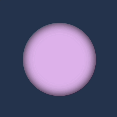
body {background-color: #213450; /* dark blue */}.flip-wrapper {width: 300px;height: 300px;border-radius: 50%;.flip-card {width: 100%;height: 100%;background-color: #e1b6ea; /* lavender */box-shadow: inset0030px;border-radius: inherit; }}
SCSS
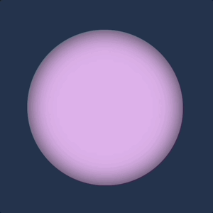
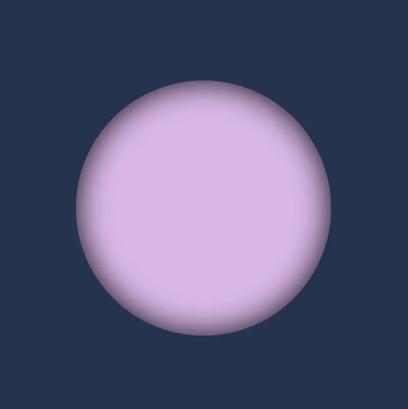
This is what’s visible on our screen at the moment.
For our effect to function as intended we have to work with both the parent and the child element. We begin with the parent element where we apply the :hover effect and change the cursor to a pointer 👆. You can check out all cursor style and pick the one that suits you best. 🤗
.flip-wrapper { ...&:hover {cursor: pointer; }}
SCSS
Next, we’ll move on to our child element. Here, we set the transform CSS property to rotateY and specify the degree (deg) of rotation we desire.
Afterward, we’ll define the transition CSS property. We can use it in two ways. We add it to the :hover or we can add it directly to the .flip-card class. In the first case, the effect works only when you hover in. In the second case, the effect works when you hover in, but when you hover out it turns back to its original position. Then we set the transform value and specify the duration in seconds (s). In our case, I’ve chosen 8 seconds to make the effect slow and easily observable. 😉
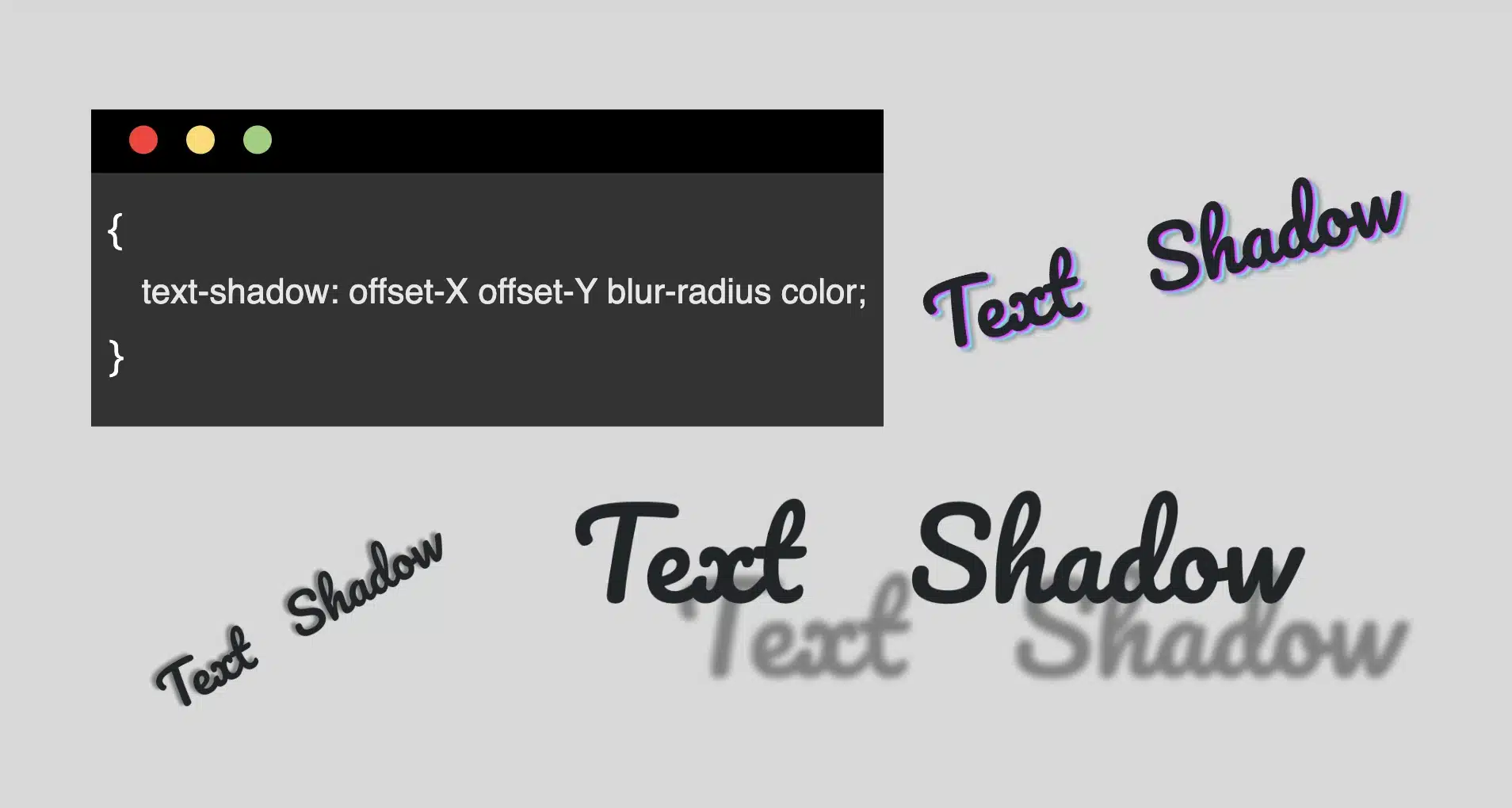
Hello everybody! In the land of web design, the CSS text shadow property is like adding magic to your text. It helps you create elegant headings that command attention and, many times, make text easier to read. The text-shadow empowers designers to pass beyond the limits of ordinary with just a few lines of simple yet powerful code.
However, it’s essential to use it wisely, overdoing it can sometimes cause confusion and reading can end up difficult. Therefore, we must keep in mind that beyond styling, readability is also important. Always aim to strike a balance between appearance and clarity so our text is accessible to everyone.
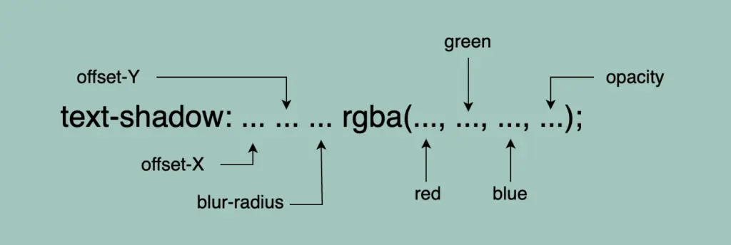
Text shadow structure
First things first! We’ll begin with the structure and break down its components:
Offset-X and Offset-Y: They determine the horizontal and vertical distances of the shadow. When we use positive values, the shadow moves to the down and right. When we use negative values, the shadow moves to the top and left.
Blur-radius: It specifies the extent of blurring for the shadow. A higher value creates a spread, while a lower value sharpens the shadow.
Color: Here, we set the color of the shadow. All color methods are accessible (color names, hexadecimal codes, rgba and hsla values).
If we don’t want to use a specific color, our shadow defaults to black.
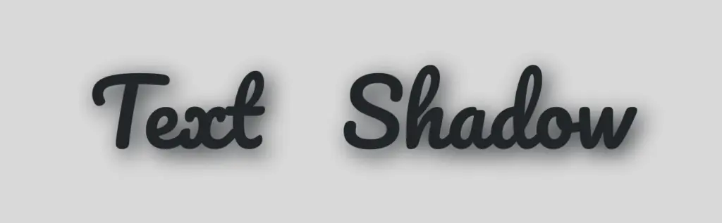
Below, I have prepared some examples to make this amazing tool more understandable. I’ll use the charming “Pacifico” font with the text “Text Shadow” to showcase its capabilities. So, let the game begin!! 😃
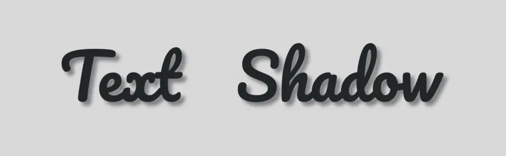
Text shadow with positive values
In our first example, we use positive values and create a gray shadow 5 pixels to the bottom and right of our text. It has a blur radius of 5 pixels, giving it a softened appearance.
.text-shadow {text-shadow: 5px5px5pxgray;}
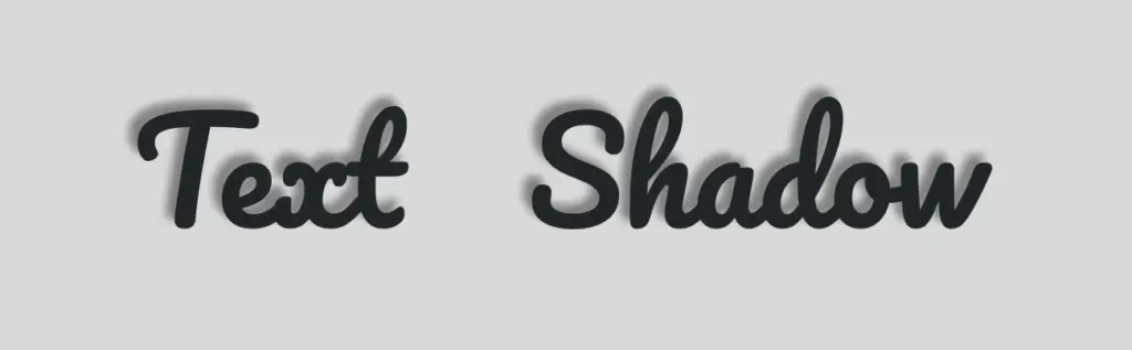
Text shadow with negative values
Next, we create a gray shadow 5 pixels to the top and left of our text, using negative values. It has a blur radius of 5 pixels.
.text-shadow {text-shadow: -5px-5px5pxgray;}
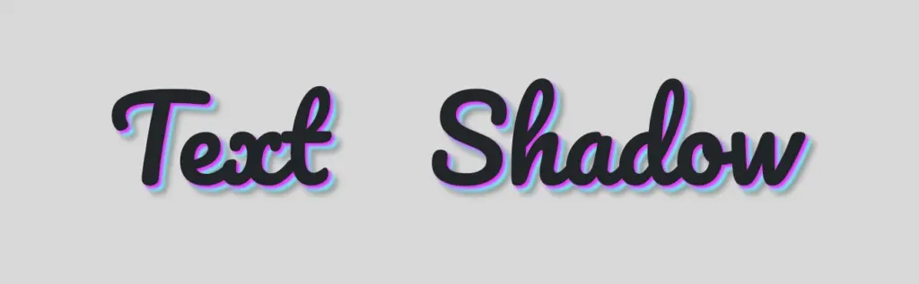
Text shadow with colors
Nothing better than playing with colors!! 🌈 In that case, we add two vibrant colors: magenta and cyan, then finish our shadow with color gray. Cool hug!? 😎 As shown in the following code snippet, to create a repeating shadow with different colors, we must increase the pixels along both the X-axis and the Y-axis each time we add a new color.
⛔ In this example, we increase the blur, and we are able to notice that it is very, very important to keep blur-radius at low values, otherwise, our text appears a bit confusing with poor readability.
.text-shadow4 {text-shadow: 5px5px20pxgray;}
Text shadow with high values
Finally, let’s get creative. By increasing the values at both the X-axis and Y-axis, we can widen the gap between the text and its shadow, achieving a more strongly marked visual effect.
.text-shadow {text-shadow: 70px50px5pxgray;}
Whether a shadow type is “good” depends on your design goals. For bold, eye-catching text that stands on the page, this approach can be very effective. If you’re going for a more subtle or minimalistic design, you might opt for smaller offsets and blurs. It’s all about finding the balance that fits your overall design concept!
Utilizing the text shadow, you are not only creating a stylish effect, but you are also crafting an experience that users will remember. So, get playful when using it. Experiment! Let your creativity shine through! ✨ 🎉
Greetings, all! 😃 I’m excited to share an incredible CSS technique with you today. We’ll learn little by little how to create impressive and rounded text. This technique can give our text a unique and captivating appearance that stands out from the usual. Get ready to take your text to the next level! 🧨 ⚡
Are you interested in learning how to uplevel your typography? Stick around to explore the endless possibilities of CSS and take your website to new heights! Let the game 🌀 begin and happy designing! 😊
HTML structure
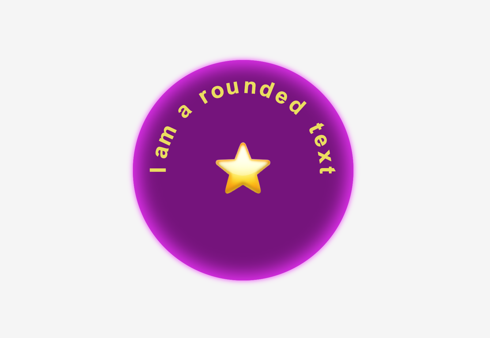
To create a text that appears in a rounded effect we begin with the HTML structure. First, we need an HTML div with a specific class. Let’s call it .wrapper. This div will be the container where the text will be displayed. To achieve the desired effect, we also need to add a span element for each character we want to use. By doing so, it allows us to handle and move each character separately and create the shape we want. 😉
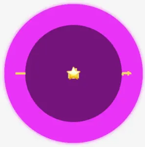
In our example, we will use 15 letters and a star, so we need to add 16 spans. Each span represents a character. You can see the code snippet below for a better understanding.
We move forward with the CSS. We begin by styling the wrapper HTML element with a width and height of 400 pixels. It will also have a purple background-color, an inset magenta shadow (the inset box-shadow is a clever idea 💡 to create a distinctive boundary inside our wrapper, which will help us later with the positioning), and a border-radius of 50%, giving it a completely round shape. Finally, the flex method will perfectly align our text inside the wrapper.
Next, we will apply some styling to the spans within the wrapper. They will have a font-family: Arial (we need a really distinct font), a font-size of 40 pixels, and will be colored in a yellowish shade (#eddc42).
🔖 Note that we won’t add spaces between characters since we will place them one by one. By avoiding spaces, we can achieve precise and accurate positioning, which allows for greater control and flexibility in our design.
Preparation before starting to position the letters
To be able to make the positioning, we set position: relative property to the wrapper and position: absolute property to the span as a way to move them freely. By doing so, all characters take the same place, but we can observe only the last one as it is on the top.
Now, we can see what is currently shown on the screen. While I’m not a looping message so far, 🤪 I will be soon! Let’s proceed. 😃
Creating the rounded shape
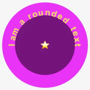
Starting from the two ends and going toward the middle side is a smart tactic to divide the space equally. Remember, we have a star that we will put in the center of the circle, so we do not count it. Thus, we initiate our positioning from the letters “Ι and t”, the first and last letter of our phrase, and place them in the middle of axis-Y by setting top: 50% and transform: translate(-50%) .
Also, we keep the letters 40 pixels away from the left and right sides, with the left and right CSS properties respectively.
Finally, transforming our letters setting the transform: rotate() gives them a vibrant and dynamic perspective, bringing them to life in a truly inspiring way.
Now, take a look at this sequence of characters. Notice how both the first and last letters are in their respective positions on the displayed screen. This is a good time to examine how the box-shadow CSS property helps us to count and place the characters accurately. 🟣 🤩 🟣 🤩 🟣
We move forward with this topic by counting the remaining characters. Ι know! I know! It can be a bit tricky and confusing 🤯 because of the counting, but the result will be amazing!! ✨ 🎉 Therefore, please ensure to maintain the positioning using the same tactic consistently. Finally, I’m including the rest of the code snippet below to complete my work.
As we can see, all letters are in their respective positions on the displayed screen and our text is finally taking a rounded shape. 🟣 🤩 🟣 🤩 🟣
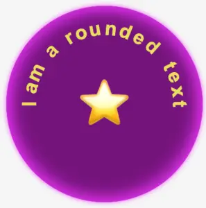
To finalize, it would be better if the star appears bigger so we modify the .character16-emoticon class and adjust the font-size property to 100px. Additionally, the box-shadow property needs to be updated to achieve the desired visual effect. Therefore, we will need to go back and make the necessary changes to ensure it looks exactly as we want it to.
Below is the full code referenced in this blog post. Feel free to copy and use it in your own projects. If you have any questions or encounter any issues, don’t hesitate to reach out for assistance. You can easily copy the desired code snippet by clicking on the copy icon, located in the top-right corner of each snippet.
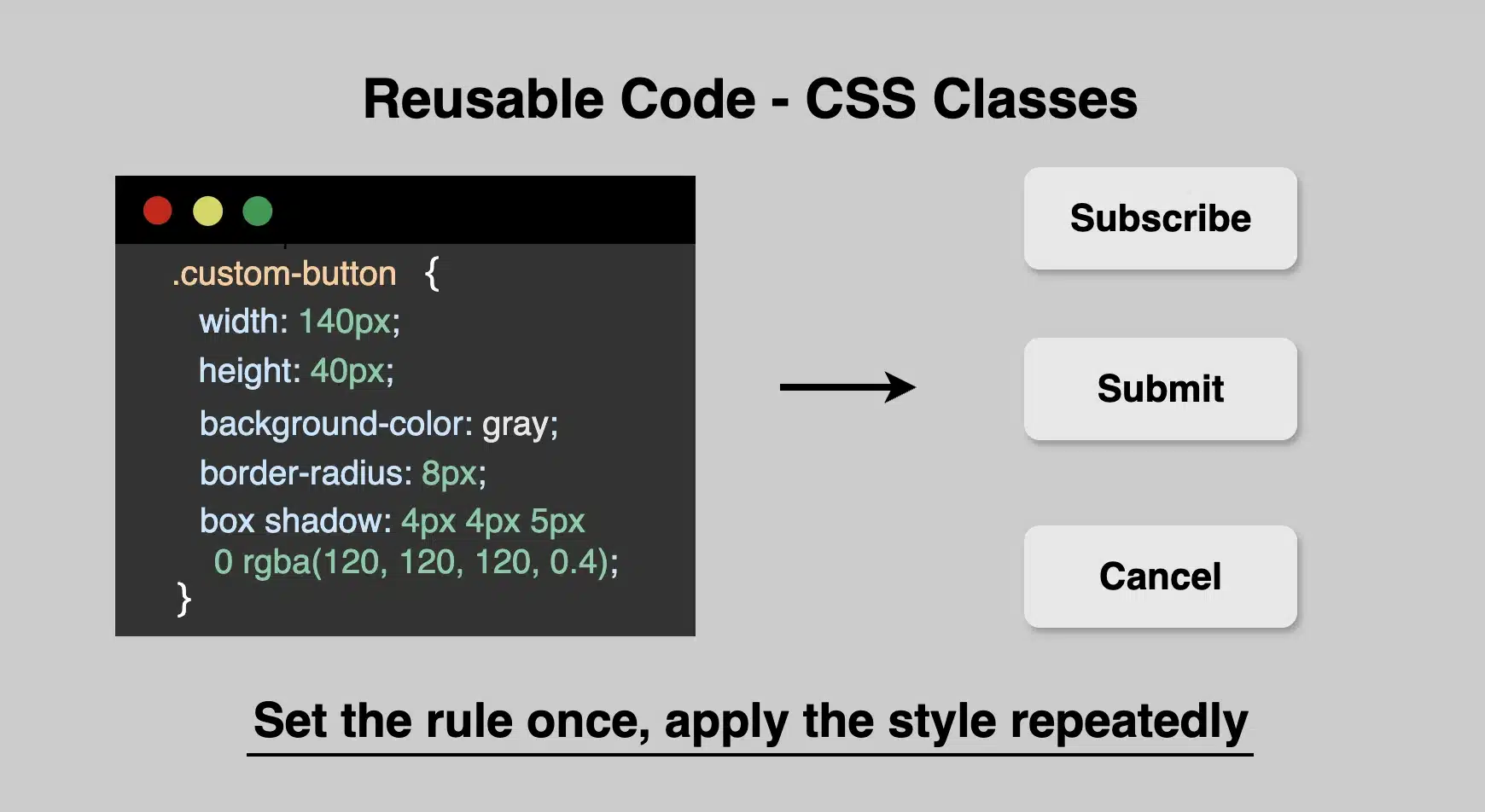
When building 🏗 websites, it’s common to create reusable code. What about you? Have you ever wanted to style multiple elements consistently without repeating yourself? That’s where CSS classes come in handy! They are flexible, well-structured, and designed to style multiple elements at once, giving them a consistent look. They assist you in reusing styles efficiently and also maintain your code organized and clean. 🧹 🧱
Reusing styles with classes
To highlight the value of reusable code with classes, consider the following simple example.
Example Let’s say we want to create several buttons that all match in style and look uniform across the page.
As we can see below, all three buttons share the exact same characteristics by only sharing one class, the .custom-button. Whenever we want to restyle the buttons, we only need to make changes to this class, and the changes will take effect instantly on all buttons. Incredibly impressive but made easy at the same time! 😎
The importance of keeping names precise and descriptive
When creating class names, try to make them short yet meaningful. Do not use unclear and generic names. A name like .custom-button or .card-header gives a clear idea of what the class is for. Pick names that make sense at a glance. Descriptive names help you and others understand your code later, especially in larger projects.
Last but not least, always accompany classes with comments. Comment with precision. Your comments should clearly explain why you are using a particular approach rather than simply describing what the code does. Additionally, update comments as your code evolves. Outdated comments can be more harmful and misleading than having no comments at all. 😉
Below, I have included an example. Remember, the correct way to declare a comment is: /* This is a comment in CSS */.
CSS
/* limit width to improve readability on large screens */.container {max-width: 1200px;}
CSS
Using reusable classes in CSS saves time and keeps your code well-organized and maintainable. So, next time you catch yourself repeating the same styles again and again, try grouping 🧲 them into a class!
Hi there! You’re aware that the web 🕸 wasn’t always like it is today? Websites were like digital 📰 posters – just text and images. A page loads, and no changes occur. Static design had the reins. No movement, no glow! 🤹♀️ ✨ Everything remained visually frozen. 🧊 🥶 CSS was only a tool to decorate that static content and make some improvements, such as selecting a font, changing colors, adding a border or a margin.
As time went on, browsers improved, and users began to expect more. That’s when CSS started to shine and show the way from static pages to fluid experiences! With features like transition, transform, animation, and keyframes, the focus shifted from how things looked to how they can pulse and move in time. Dynamic design is finally here! CSS became a language capable of transforming static HTML elements into dynamic 🧨 ones.
Motion matters. It allows users to feel when something changes and witness how elements react. It’s a way of communication, 🔊 not just decoration. With only CSS, designers can craft these interactions. Creating animations that ‘rotate‘, ‘skew‘, scale‘ or ‘shift‘ position suggests ongoing system activity. A sliding menu, like a ‘hamburger icon‘, reveals categories, indicating that navigation continues beyond the current view. A spinning icon, after a user clicks ‘Submit’ or ‘Save’ on a button, signals that a process is loading. A button that gently fades in and out on hover – labeled ‘Sign Up‘ – asks for interaction. A fading alert, such as ‘Connection lost‘ or ‘Download has failed, retrying‘, quietly suggests that the message is temporary. Even a ‘scale-up‘ focusing on an image can reveal that it is active. CSS became a must to represent progress and maintain users’ attention.
Of course, as with everything, setting boundaries is essential. Many times action can cause confusion and make users feel distracted or, even worse, rushed. Not every interface needs to include movement. Sometimes, picking stillness is the best choice. Valuable designs recognise when to pause!
Hey there! 😃 In today’s technology-obsessed world, it’s absolutely crucial to master the art of creating an amazing circular clickable button. A well-crafted button not only enhances the presentation but also elevates the user experience. Maximizing user attention is vital, and buttons are, most of the time, the key to achieving this goal. By utilizing the right tools and techniques, we can create a visually stunning and functionally efficient button that not only looks great but also delivers an unforgettable user experience. 🆙
Let’s collaborate to create a standout button that supports user-friendliness.
HTML Basic Structure
To start building our button, we need to organize our HTML code snippet. The first step is to create a parent element that will act as the base of our button. We give this element the class name .button-base. Next, we need to add a child element within this parent element to serve as the clickable part of the button. We give this child element the class name .clicable-part. It’s important to nest these two elements within a button HTML element as it’s more semantic, better for accessibility, and behaves correctly in forms and interactive contexts by default. Additionally, we need to create the shadow effect for our button, so we add one more HTML element with the class name .button-shadow.
We move forward with CSS and make our button fresh and stylish! For this post, I am writing CSS using Sass syntax. If you would like to convert it to vanilla CSS and don’t already know how, I’d suggest you use an online Sass — CSS converter.
Prepare the body for the clickable button
Firstly, we apply a color (#f5f5f5 – dark gray) to the body by setting the background-color. Additionally, we want to center our button. For that reason, we are using the flex method.
body {background-color: #f5f5f5;display: flex;align-items: center;justify-content: center;}
SCSS
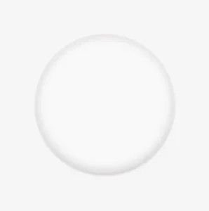
Create the base of the clickable button
To create the base of our button, we start by making a square with a width and height of 200 pixels. Then, we make it rounded by adding a border-radius of 50%. We use a pale white color (#f9f9f9) for the button’s background-color. To give it a more stylish look, we add some shadows using the box-shadow property.
Finally, we add the flex method to prepare the space to position the clickable part of the button in the center of the base.
📍 As seen in the code snippet below, we need to include border: none and background-color: transparent properties in the button element to ensure it will display only the styles we define. These properties remove the browser’s default styles that typically come with. As a result, it provides us with a clean starting point, so the button appears exactly as we’ve styled it, with no unexpected borders or colors.
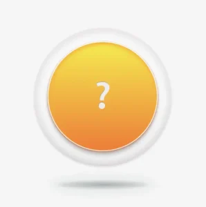
In the image below, you can see the base of the button we just created.
Create the clickable part of the button
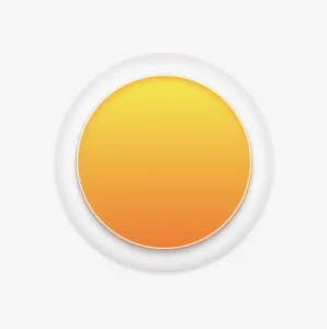
To create the clickable part of our button, we first set the height and width to 80%. Then, we apply a border-radius: inherit to make it appear rounded and follow the shape of the base. For the background of the button, we use a linear-gradient that adds depth as it gives a bright orange color at the top that gradually becomes darker as it goes down. To add a more stylish look, we include shadows using the box-shadow property.
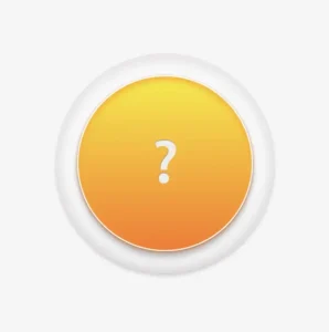
To add content at the top of the clickable part of a button, we can use a :before pseudoelement. Inside the pseudoelement, we can insert the desired symbol or text using the content property. For instance, in our case, a question mark emoticon (?) has been used, but you can use any symbol or text you prefer. It’s important to note that the flex method in the .clickable-part class is essential, as it centers the mark correctly.
The image below displays the content we added on the top of the clickable part of the button.
Add the hover effect on the top of the clickable button
To add a hover effect, we set the :hover CSS property. For the cursor, I prefer using the value pointer (👆), but feel free to choose any other style from the plethora of options available here. Finally, I apply the filter: brightness and increase it to 110%. This makes our button appear brighter whenever the mouse hovers over it. ✨
The gif below demonstrates how the hover effect (👆) appears.
Activate the clickable part of the button
To make your button fully functional, you need to activate its clickable part. We can achieve this by adding the :active property. Next, we give it a background with a linear-gradient that creates a sense of depth by providing a bright magenta color at the top that gradually becomes darker as it goes down. To make it more visually appealing, we include shadows using the box-shadow property.
The following gif displays the activated clickable area.
Update the button’s content when it is activated
To enhance the user experience, we can dynamically update the content displayed on the button when it’s clicked. This may be accomplished by adding a :before pseudoelement and inserting the desired content into the content property. In our case, we will display a white heart (🤍) when the button is clicked.
With just a single click, this button comes to life and reveals its beautiful new content in the following gif (🤍) – it’s an absolute must-see!! 😎
Add the shadow effect to the clickable button
The last thing we have to do is add the shadow effect. We create a rectangle with 140 pixels width and 15 pixels height. Next, we give it a rounded shape by setting the border-radius property to 50%. To create a background that looks like it becomes lighter as it goes toward outer space, we use the radial-gradient technique and make the center darker. To make the whole thing look smoother, we add shadows with the box-shadow property.
Finally, we utilize the position: absolute combined with the top, left, and transform properties to move it below the button and center it.
.shadow {width: 140px;height: 15px;border-radius: 50%;background: radial-gradient(#a7aaaa, #b2b7b710%, #eaeded);box-shadow: -5px0px10px5px#eaeded, /* shadow right side */5px0px10px5px#eaeded, /* shadow left side */inset-5px0px5px#eaeded, /* inset shadow right side */inset5px0px5px#eaeded; /* inset shadow left side */position: absolute;top: 520px;left: 50%;transform: translate(-50%);}
SCSS
The button’s captivating shadow effect is truly impressive and adds to the overall appeal. Hope you find it enjoyable and engaging. Thank you for your attention. 🥳
Below is the full code referenced in this blog post. Feel free to copy and use it in your own projects. If you have any questions or encounter any issues, don’t hesitate to reach out for assistance. You can easily copy the desired code snippet by clicking on the copy icon, located in the top-right corner of each snippet.


