Tag: css border

  • Border-image-slice CSS Property For One-of-a-kind Border Effects

    Border-image-slice CSS Property For One-of-a-kind Border Effects

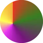
    The border-image-slice CSS property allows us to be extremely creative with our borders. We can cut (slice) a source, such as an image with a nice pattern or a gradient, into pieces so it can stretch or repeat those slices around an element’s border. We specify how far in from each edge the slicing occurs and those slices are sketched to be the border areas (edges and corners).

    Outline of the border-image-slice CSS property

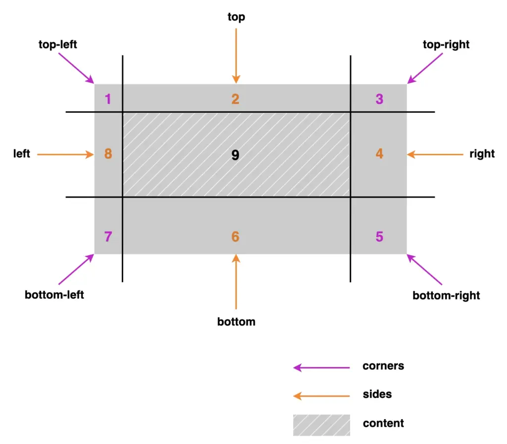
    Let’s see our property more analytically. First, you pick a visual source and then decide where to “slice” it. After that, CSS uses those pieces to sketch the border. Kind of like cutting a picture into a nine-patch grid and placing it around a box.
    We have 4 corners, 4 sides, and the main content. Only 8 of them actually showed up and used for borders, the corners and the sides. The 9th slice, which is the main part of the element, is optional and it usually carries our content.

    A nine-patch grid outline about border-image-slice CSS property

    A few critical points about those pieces:

    • Corners: Depending on the value, they may not stretch (value 1), they just sit there like little anchors, or they may stretch (higher or more values).
    • Sides: Stretch or repeat, depending on your border settings. They control most of the visual essence.
    • Center: The middle part usually isn’t drawn as part of the border at all—it’s ignored unless you explicitly choose to fill it.

    Practical examples: How border-image-slice works

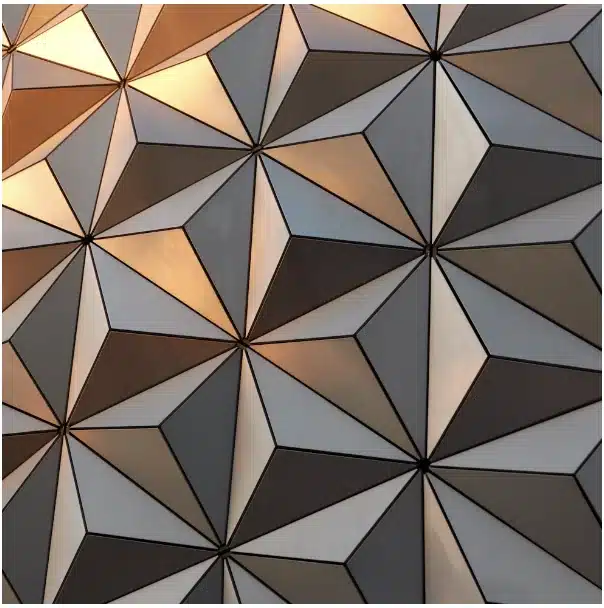
    To better understand how this property works, we first need to insert an image with a width and height of 400px.
    Next, we’ll apply properties like object-fit: cover, background-size: cover, and background-position: center to keep the image centered and fully visible without distortion.
    🔖 These properties are only here so we can clearly see the image at this stage — they aren’t required for the next steps.
    Finally, we add the source of our image.

    <div class="image"></div>
    HTML
    .image {
      width: 300px;
      height: 300px;
      
      object-fit: cover;
      background-position: center;
      background-size: cover;
      
      background-image:  url(https://images.unsplash.com/photo-1553526777-5ffa3b3248d8?ixlib=rb-4.1.0&ixid=M3wxMjA3fDB8MHxwaG90by1wYWdlfHx8fGVufDB8fHx8fA%3D%3D&auto=format&fit=crop&q=80&w=987);
    }
    CSS
    Image with pattern
    Photo by Robert Horvick on Unsplash

    With our image set up, we can continue and see how border-image-slice handles different inputs.

    This CSS property can take one to four values.
    One value: uses the same slice for every side.
    Two values: set the first for top and bottom, and the second for left and right.
    Three values: apply the first for the top, the second for both left and right and the third for the bottom.
    Four values: follow the standard CSS direction: top, left, bottom, right.
    With so many options, there is plenty of room to create some trully great-looking border effects.

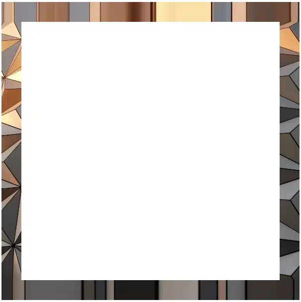
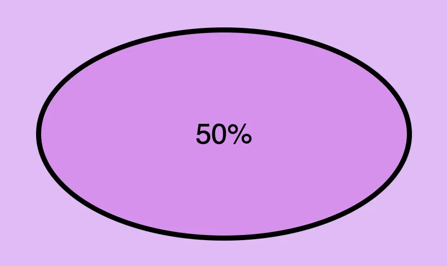
    Setting the value: 1

    Let’s start with value 1.
    First, we need to add a 20px border but transparent. This gives us the space the image-based border will later occupy, without showing the standard solid border.

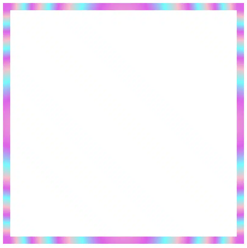
    Then, we set border-image-slice to 1. In this way, the browser takes a very thin section, just one pixel wide, from each edge of the image and stretches it along the borders. As a result, we have only stripes.

    .image {
      ...
      border: 20px solid transparent;
      border-image-slice: 1;
    }
    CSS
    Border effect setting the border-image-slice-value: 1

    Setting one value

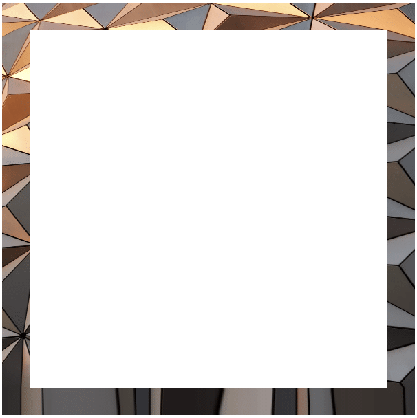
    We continue following the same tactic, but this time instead of 1 we use a value of 100. By doing this, the browser cuts a 100-pixel-wide section from each edge of the image and uses those slices to form the new borders. In that way, we are closer to our initial image as we use a wider section of it.

    .image {
      ...
      border: 20px solid transparent;
      border-image-slice: 100;
    }
    CSS
    Border effect setting the border-image-slice-value: 100

    Setting two values

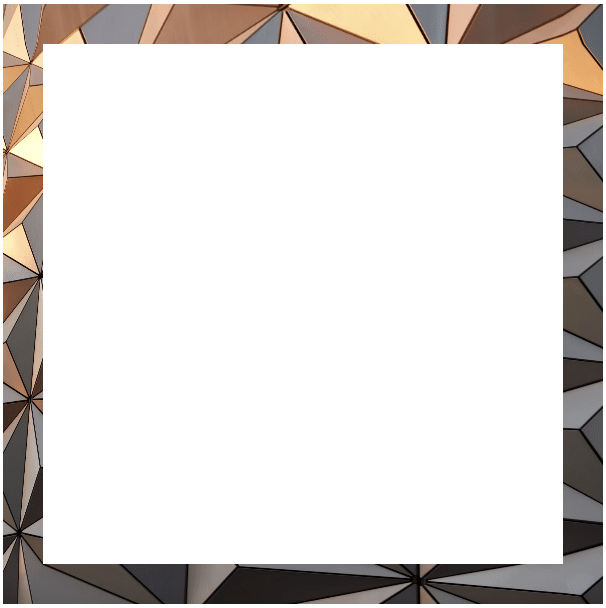
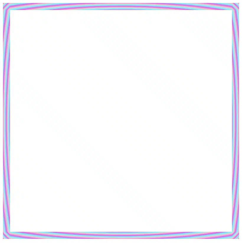
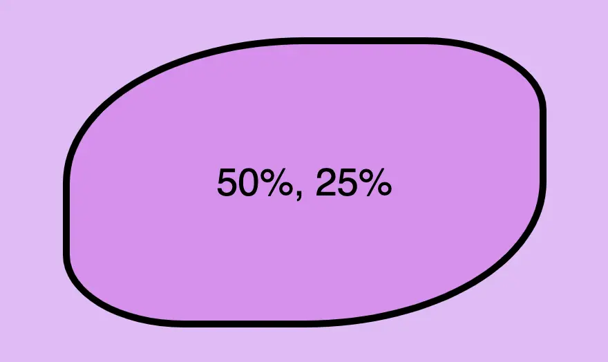
    Next, we will use two values, 1 100, to see how different slice sizes affect the borders. The first value (1) applies to both the top and bottom, creating thick slices, close to line-like borders. The second value (100) applies to both the left and right, creating wider slices that maintain more of the image’s details.

    .image {
      ...
      border: 20px solid transparent;
      border-image-slice: 1 100;
    }
    CSS
    Border effect setting the border-image-slice-value: 1 100

    Setting three values

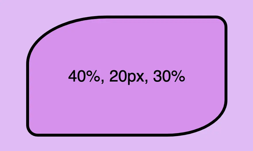
    Moving forward, it’s time to see the results when using three values. The first value (150) applies to the top, the second value (80) to the left and right and finally the third value (5) to the bottom. As we can observe again, the higher the value, the closer to the image’s characteristics.

    .image {
      ...
      border: 20px solid transparent;
      border-image-slice: 150 80 5;
    }
    CSS
    Border effect setting the border-image-slice-value: 150 80 5

    Setting four values

    Our final option is to use four different values, one for each side of our element. The values apply in a clockwise direction – top, right, bottom, left. That creates an uneven but interesting border effect.

    .image {
      ...
      border: 20px solid transparent;
      border-image-slice: 50 80 120 150;
    }
    CSS
    Border effect setting the border-image-slice-value: 50 80 120 150

    Playing with border-image-slice feels a bit like trimming a photo into fancy frames — every small tweak shifts the mood of the border in surprising ways.
    What do you think? Are you ready to try it out yourself? Be my guest and have fun! 😃

  • Create Playful Border Effects Combining CSS Gradients With The Border-image-slice CSS Property

    Create Playful Border Effects Combining CSS Gradients With The Border-image-slice CSS Property

    Borders have long been one of the simplest tools in web design. Yet, that’s no reason to look boring. Combining the border-image-slice property with the power of CSS gradients, we can turn simple static lines into 🎨 colorful, eye-catching details that make your designs stand out. Besides, a playful border effect adds fun and energy to a page, helping shapes and sections feel more alive. No images needed, just blending colors with clean CSS.
    In other words, it’s a small touch that can make your design feel fresh and creative, adding personality and vibrance. 🌈 ✨

    Border effect explanation setting linear-gradient

    We’ll begin by creating a box with a 150px width and height that temporarily has a solid 5px black border. This is the box we’ll use to experiment with different gradient border effects and make it pop! 🥳

    <div class="box"></div>
    HTML
    .box {
      width: 150px;
      height: 150px;
      border: 5px solid;
    }
    CSS
    A white box with 5 pixels solid black border

    With our box in place, we can make things more interesting by replacing the simple black border with a color 🍭 splash of CSS gradients.

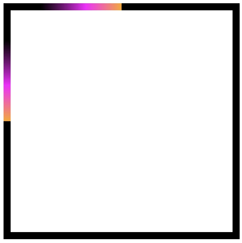
    • First, we need to add the transparent value to the border.
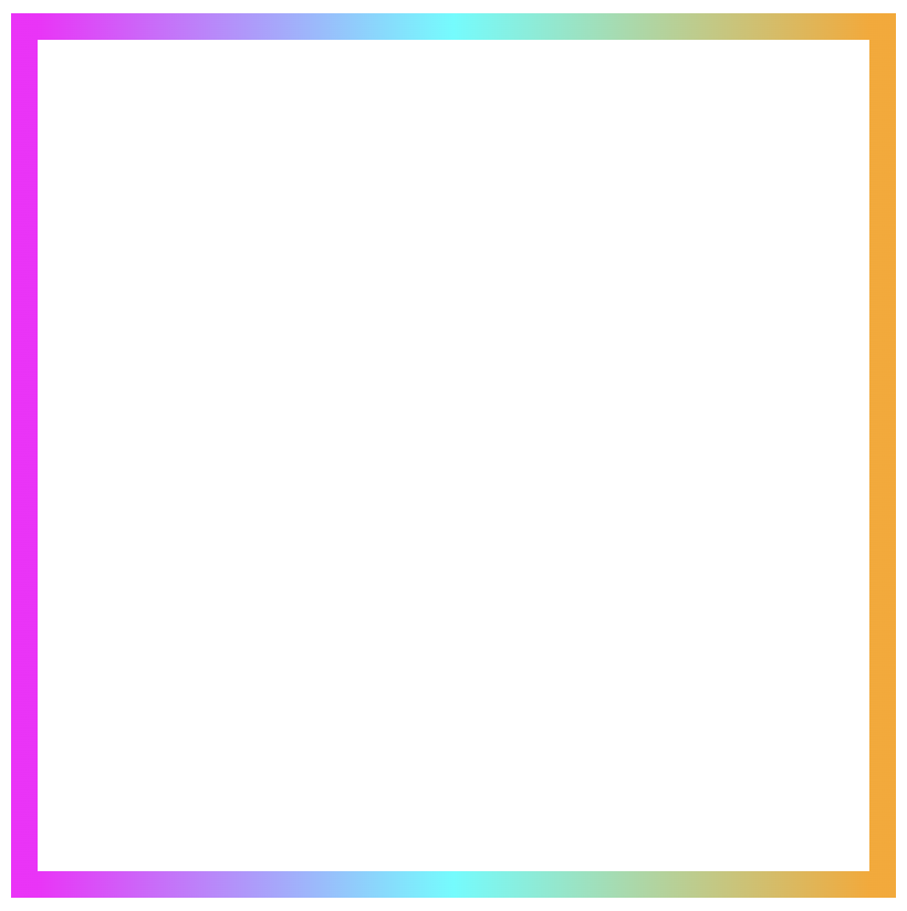
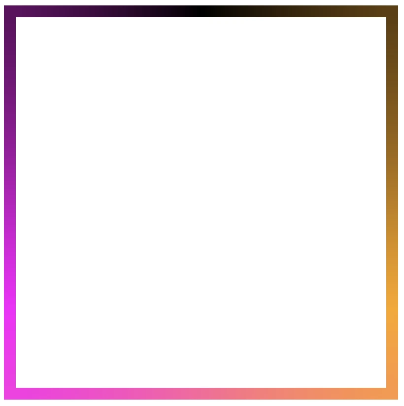
    • Next, we continue with the gradient. I decided to start with the linear-gradient and use three colors (magenta, cyan, orange). Feel free to use as many colors as you want.
    • In the final step, we set border-image-slice to 1. In that way, the browser uses the whole gradient evenly on all sides of the border.

    The browser doesn’t know how to spread the gradient across the border area. Without the border-image-slice property, the gradient won’t appear at all. It is essential to add it as it will activate and display the gradient border.

    .box {
      ...
      border: 5px solid transparent;
      border-image: linear-gradient(magenta, cyan, orange);
      border-image-slice: 1;
    }
    CSS
    Border effect with magenta, cyan and orange made combining the linear-gradient technique and the border-image-slice: 1 CSS property

    It’s good to know that the border-image-slice property can take up to four values, each one responsible for how to cut (slice) the gradient we use as a border.

    More analytically:

    border-image-slice: 1; simply put the whole gradient eventually on all sides

    border-image-slice: 20; it cuts 20 (px or percentages, depending on what you use) from each edge to make the border

    border-image-slice: 20 30; the same as above but the first value is for top and bottom, the second for left and right

    border-image-slice: 20 30 10; the first value is for top, the second for left and right and the third for bottom

    border-image-slice: 20 30 10 5; finally, the first value is for top, the second for right, the third for bottom and the fourth for left

    🔖 When we use a gradient, we usually just write 1 because a gradient isn’t a picture with pixels or edges to slice. It smoothly fills the space, so there’s nothing to “cut”. The value 1 simply tells the browser to use the whole gradient for the border.

    More border effect ideas with linear-gradient technique and border-image-slice: 1

    Below, I included a few more examples to help you see how changing the gradient can completely transform the look of a border, making the concept clearer and easier to follow. 😃

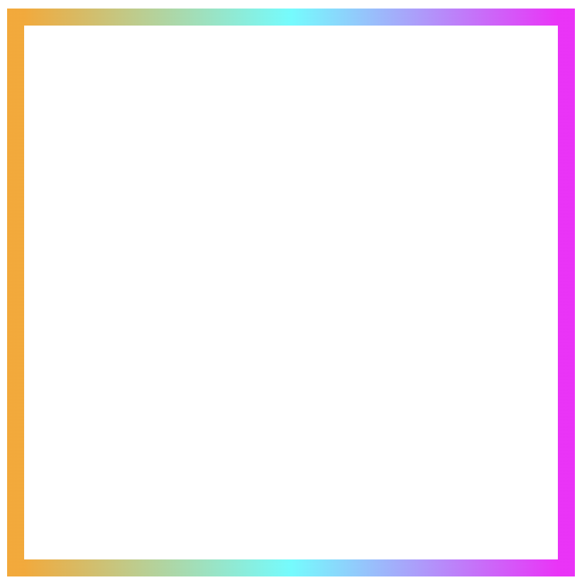
    Flipping the colors: The reverse linear-gradient

    Colorful linear gradients that flow from top to bottom or the reverse way are like creating amazing color bands that wrap around the box.

    .box {
      ...
      border: 5px solid transparent;
      border-image: linear-gradient(to top, magenta, cyan, orange);
      border-image-slice: 1;
    }
    CSS
    Border effect with magenta, cyan and orange made combining the linear-gradient technique and the border-image-slice: 1 CSS property

    Smooth side-to-side color flow with linear-gradient

    Colors travel from one side to the other, giving the border’s box a bright, balanced look.

    Firstly, from left to right

    .box {
      ...
      border: 5px solid transparent;
      border-image: linear-gradient(to right, magenta, cyan, orange);
      border-image-slice: 1;
    }
    CSS
    Border effect with magenta, cyan and orange made combining the linear-gradient technique and the border-image-slice: 1 CSS property

    Then, from right to left

    .box {
      ...
      border: 5px solid transparent;
      border-image: linear-gradient(to left, magenta, cyan, orange);
      border-image-slice: 1;
    }
    CSS
    Border effect with magenta, cyan and orange made combining the linear-gradient technique and the border-image-slice: 1 CSS property

    Playing with diagonal directions

    A diagonal direction gives the sense of a wavy, moving effect. Plus, changing the angle, you can create a more dynamic look.

    .box {
      ...
      border: 5px solid transparent;
      border-image: linear-gradient(45deg, magenta, cyan, orange);
      border-image-slice: 1;
    }
    CSS
    Diagonal border effect with magenta, cyan and orange made combining the linear-gradient technique and the border-image-slice: 1 CSS property

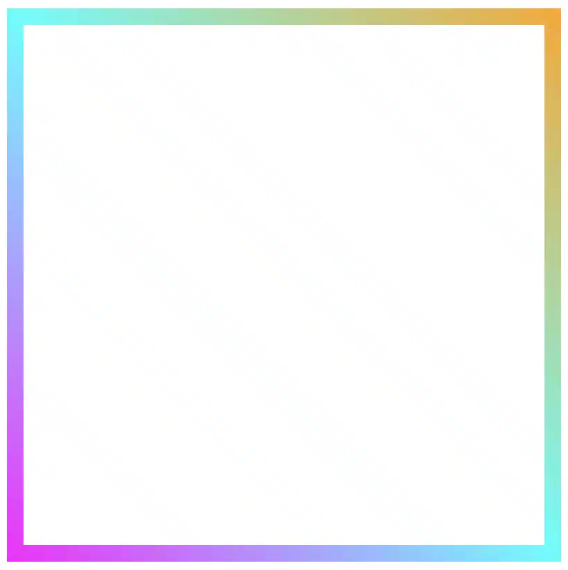
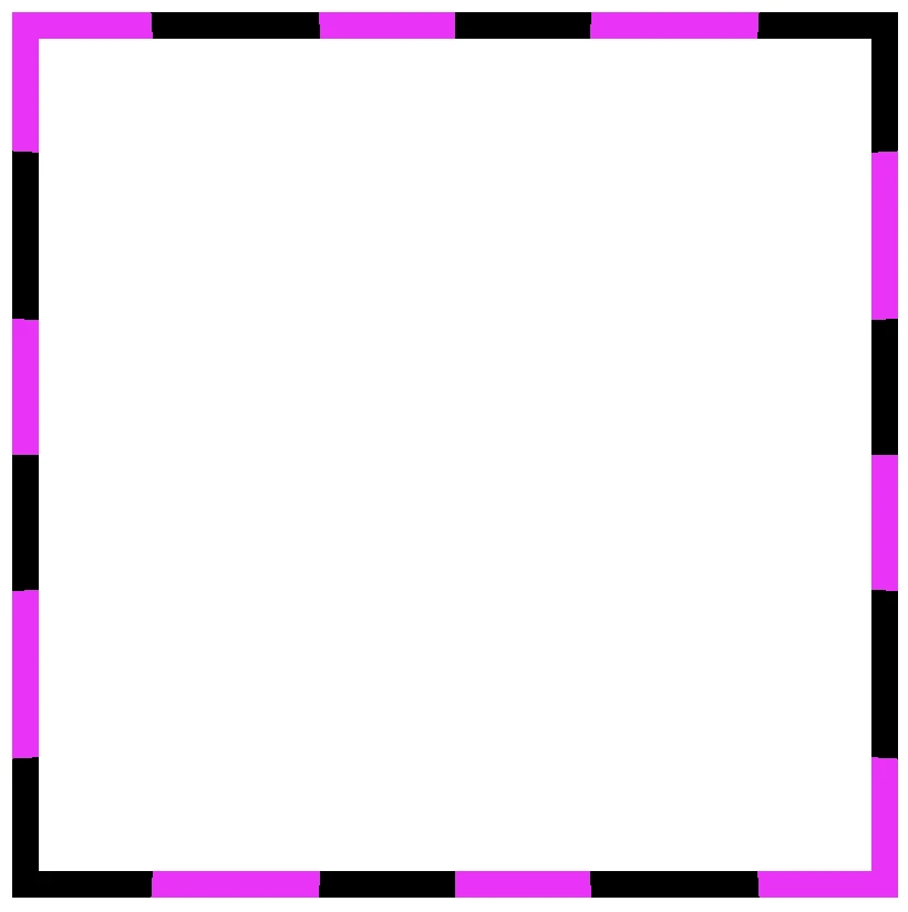
    Color loops: The repeating linear-gradient technique

    With repeating gradients, you can build patterns that literally look like an impressive dancing effect or all these amazing neon light effects. How cool is that!? 😎

    .box {
      ...
      border: 5px solid transparent;
      border-image: linear-gradient(45deg, magenta, cyan, orange, magenta, cyan, orange, magenta, cyan, orange, magenta, cyan, orange, magenta, cyan, orange, magenta, cyan, orange, magenta, cyan, orange, magenta, cyan, orange, magenta, cyan, orange, magenta, cyan, orange, magenta, cyan, orange);
      border-image-slice: 1;
    }
    CSS
    Repeating border effect with magenta, cyan and orange made combining the linear-gradient technique and the border-image-slice: 1 CSS property

    Moreover, we are free to experiment with the other two (radial-gradient and conic-gradient) CSS gradients as well. So, let’s dive into some more examples and discover how different gradient ideas come to life.

    Border effects with different border-image-slice values

    Radial gradient for spinning border effects

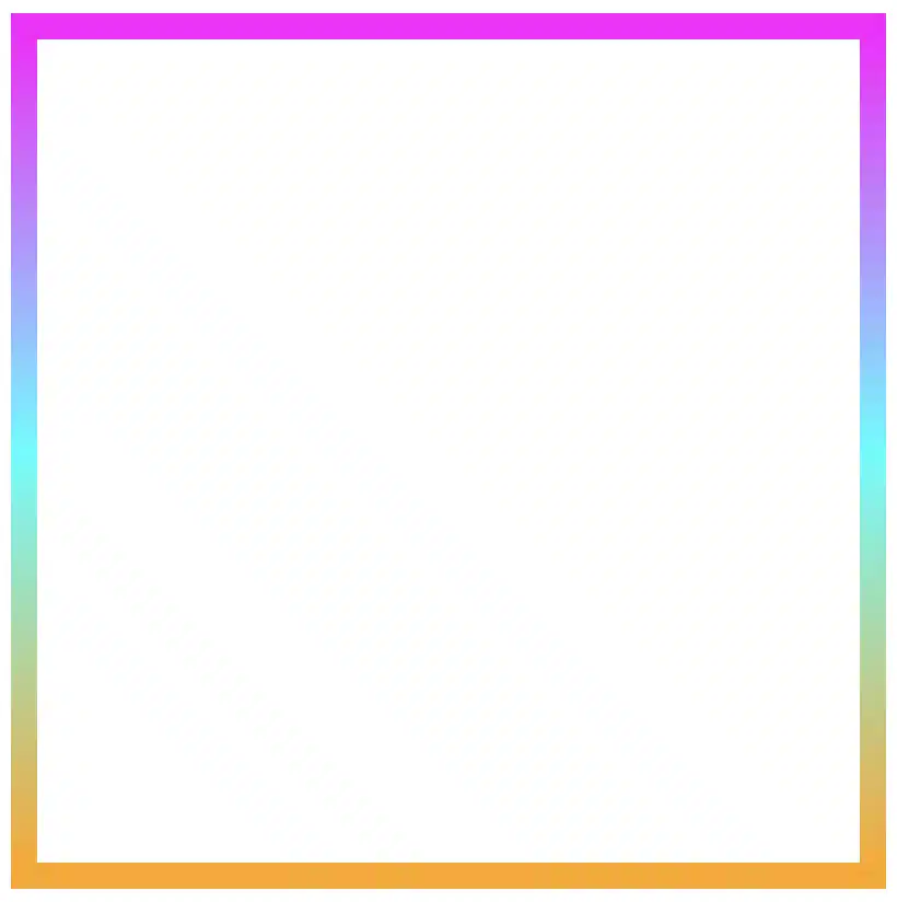
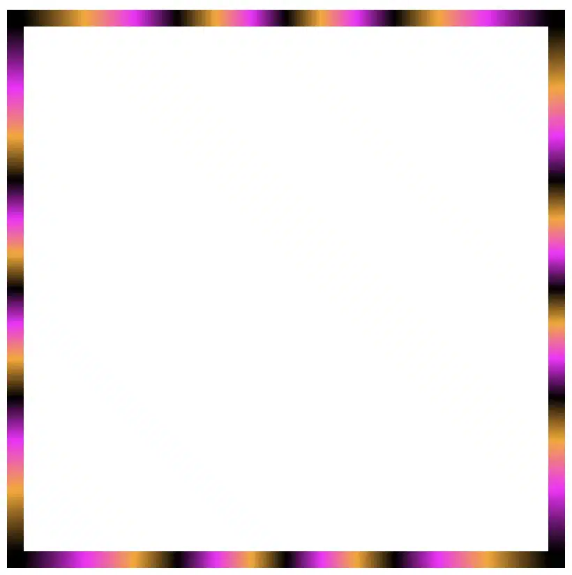
    Now, let’s see what would happen if we use the same gradient, in this case, the radial-gradient, with many different values on border-image-slice.
    For these examples, I used cyan, pink and violet. 🎨 ✨

    In the first example, we maintain the value 1 while in the second, we replace it with a value of 50.
    The border-image-slice: 1; applies the entire gradient, spreading the colors smoothly around the border. With this transition, the gradient stays wide and soft.

    .box {
      ...
      border: 5px solid transparent;
      border-image: radial-gradient(cyan, pink, violet, cyan, pink, violet, cyan, pink, violet, cyan, pink, violet, cyan, pink, violet, cyan, pink, violet, cyan, pink, violet, cyan, pink, violet, cyan, pink, violet, cyan, pink, violet, cyan, pink, violet);
      border-image-slice: 1;
    }
    CSS
    Border effect with cyan, pink and violet made combining the radial-gradient technique and the border-image-slice: 1 CSS property


    The border-image-slice: 50; applies a small piece of the gradient. Since it’s using only a part of the gradient’s color range, the colors repeat more often and look like stripes that are spinning around.

    .box {
      ...
      border: 5px solid transparent;
      border-image: radial-gradient(cyan, pink, violet, cyan, pink, violet, cyan, pink, violet, cyan, pink, violet, cyan, pink, violet, cyan, pink, violet, cyan, pink, violet, cyan, pink, violet, cyan, pink, violet, cyan, pink, violet, cyan, pink, violet);
      border-image-slice: 50;
    }
    CSS
    Border effect with repeating stripes from cyan, pink and violet made combining the radial-gradient technique and the border-image-slice: 50 CSS property

    To sum up, increasing the slice value tells the browser to take a smaller “slice” of the gradient and reuse it around the border. As a result, with a smaller slice, we have more repetition and eventually stronger striping.

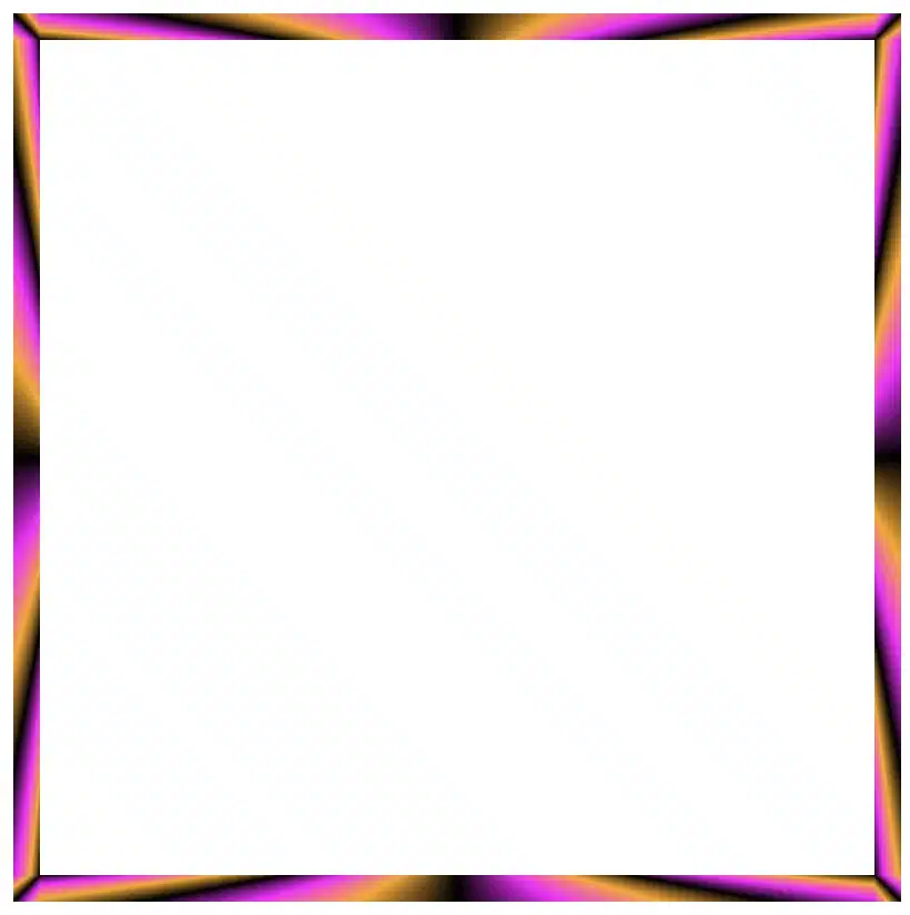
    Conic gradient for more complex border effect

    Next, let’s see what would happen if we use the same gradient, in this case, the conic-gradient, but different values on border-image-slice.
    For these examples, I changed the colors and used black, orange, magenta, and black again. 🎨 ✨

    🔖 A small detail to keep in mind is that starting and ending with the same color (in this case, black) helps to keep the transitions soft and seamless.

    .box {
      ...
      border: 5px solid transparent;
      border-image: conic-gradient(black, orange, magenta, black);
      border-image-slice: 1;
    }
    CSS
    Border effect with black, orange and magenta made combining the conic-gradient technique and the border-image-slice: 1 CSS property

    Conic-gradient with repeating pattern

    In this case, with a 1 value it uses almost the entire conic gradient around the border. The colors flow smoothly and evenly, creating a soft circular blend with gentle transitions.

    .box {
      ...
      border: 5px solid transparent;
      border-image: conic-gradient(black, orange, magenta, black, orange, magenta, black, orange, magenta, black, orange, magenta, black, orange, magenta, black, orange, magenta, black, orange, magenta, black, orange, magenta, black, orange, magenta, black, orange, magenta,black, orange, magenta, black, orange, magenta, black, orange, magenta, black, orange, magenta, black, orange, magenta, black, orange, magenta, black);
      /* all around the same value */
      border-image-slice: 1;
    }
    CSS
    Repeating border effect with black, orange and magenta made combining the conic-gradient technique and the border-image-slice: 1 CSS property

    On the other hand, with a value 30 it takes a smaller portion of the gradient and stretches it around the border. The border starts showing clearer color sections with mild curves and slight breaks at the corners.

    .box {
      ...
      border: 5px solid transparent;
      border-image: conic-gradient(black, orange, magenta, black, orange, magenta, black, orange, magenta, black, orange, magenta, black, orange, magenta, black, orange, magenta, black, orange, magenta, black, orange, magenta, black, orange, magenta, black, orange, magenta,black, orange, magenta, black, orange, magenta, black, orange, magenta, black, orange, magenta, black, orange, magenta, black, orange, magenta, black);
      /* all around the same value (30) */
      border-image-slice: 30;
    }
    CSS
    Border effect with black, orange and magenta made combining the conic-gradient technique and the border-image-slice: 30 CSS property

    Finally, with a value of 60 it uses a very small wedge of the conic gradient and repeats it. As a result, the border shows strong, repeating color bands or striped details, especially near the corners.

    .box {
      ...
      border: 5px solid transparent;
      border-image: conic-gradient(black, orange, magenta, black, orange, magenta, black, orange, magenta, black, orange, magenta, black, orange, magenta, black, orange, magenta, black, orange, magenta, black, orange, magenta, black, orange, magenta, black, orange, magenta,black, orange, magenta, black, orange, magenta, black, orange, magenta, black, orange, magenta, black, orange, magenta, black, orange, magenta, black);
      /* all around the same value (60) */
      border-image-slice: 60;
    }
    CSS
    Border effect with black, orange and magenta made combining the conic-gradient technique and the border-image-slice: 60 CSS property

    In this case, we use two values: 1 60. The result is a creative mix of two effects. The first value (1) applies to the top and bottom borders. Due to this we have a smooth and gentle look with wide color transitions. The second value (60) applies to both the left and right borders. Because of that, the effect is a tighter and more striped pattern as the gradient slice we use is smaller and repeated more often.

    .box {
      ...
      border: 5px solid transparent;
      border-image: conic-gradient(black, orange, magenta, black, orange, magenta, black, orange, magenta, black, orange, magenta, black, orange, magenta, black, orange, magenta, black, orange, magenta, black, orange, magenta, black, orange, magenta, black, orange, magenta,black, orange, magenta, black, orange, magenta, black, orange, magenta, black, orange, magenta, black, orange, magenta, black, orange, magenta, black);
      /* top & bottom - left & right */
      border-image-slice: 1 60;
    }
    CSS
    Border effect with black, orange and magenta made combining the conic-gradient technique and the border-image-slice: 1 60 CSS property

    Our final example takes four values: 1 60 60 1. This setup makes our border appear acymatric, calm, and energetic at the same time. More analytically, the first value (1) is for the top border and uses almost the entire gradient. The second and the third values (60 60) are for the right and bottom borders and use a smaller slice (tighter pattern). While the last value (1) is for the left border and uses almost the entire gradient again. Due to these values, we have smooth and continuous top and right borders, while the bottom and left are striped.

    .box {
      ...
      border: 5px solid transparent;
      border-image: conic-gradient(black, orange, magenta, black, orange, magenta, black, orange, magenta, black, orange, magenta, black, orange, magenta, black, orange, magenta, black, orange, magenta, black, orange, magenta, black, orange, magenta, black, orange, magenta,black, orange, magenta, black, orange, magenta, black, orange, magenta, black, orange, magenta, black, orange, magenta, black, orange, magenta, black);
      /* top - right - bottom - left */
      border-image-slice: 1 60 60 1;
    }
    CSS
    Border effect with black, orange and magenta made combining the conic-gradient technique and the border-image-slice: 1 60 60 1 CSS property

    Conic-gradient with color stops

    Furthermore, we can control the color stops by using percentages, allowing us to decide exactly where the colors start and end each time.

    .box {
      ...
      border: 5px solid transparent;
      border-image: conic-gradient(black 75%, orange 75%, magenta 80%, black 85%,  black 90%, magenta 95%, orange 100%);
      border-image-slice: 1;
    }
    CSS
    Border effect with black, orange and magenta made combining the conic-gradient technique and the border-image-slice: 1 CSS property
    .box {
      ...
      border: 5px solid transparent;
      border-image: conic-gradient(black 0%, black 5%, magenta 5%, magenta 10%, black 10%, black 15%, magenta 15%, magenta 20%, black 20%, black 25%, magenta 25%, magenta 30%, black 30%, black 35%, magenta 35%, magenta 40%, black 40%, black 45%, magenta 45%, magenta 50%, black 50%, black 55%, magenta 55%, magenta 60%, black 60%, black 65%, magenta 65%, magenta 70%, black 70%, black 75%, magenta 75%, magenta 80%, black 80%, black 85%, magenta 85%, magenta 90%, black 90%, black 95%, magenta 95%, magenta 100%);
      border-image-slice: 1;
    }
    CSS
    Border effect with black and magenta stripes made combining the conic-gradient technique and the border-image-slice: 1 CSS property

    The results we observe when utilizing these all these specific values above on the border-image-slice CSS property concerns only a box of 150 pixels in width and height. It is critical to adjust the values if you have different dimensions.

    Take into consideration that gradients with the 1 value look better in square shapes, as the color flow fits perfectly within equal sides.

    Experimenting with gradient borders opens the door to an endless palette of styles — from soft pastel outlines that frame content elegantly to bold, vibrant strokes that command attention. The key lies in balance: using color transitions and subtle motion to enhance, not overpower, the user experience. Whether you’re styling buttons, containers, or entire sections, CSS gradient borders are a reminder that even the smallest design detail can carry a playful spark — proof that borders don’t just separate elements, they can also bring them to life.

  • How To Be Creative With Different CSS Border Styles

    How To Be Creative With Different CSS Border Styles

    Hello everybody! 😀 In this post, we’ll work with the amazing CSS border property, which is basically the line that surrounds our objects. Borders are an independent property and do not affect the content within. You can think of borders as beautiful frames that enclose HTML elements. ✨ 🖼 Let’ dive into the details of CSS border styles.

    When working with borders in CSS, we have four key properties to consider:

    • border-width
    • border-style
    • border-color
    • border-radius

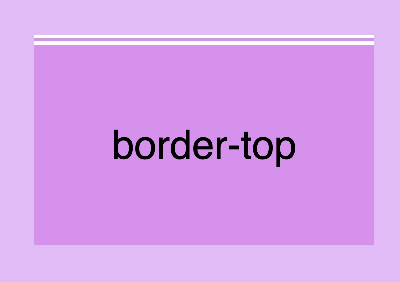
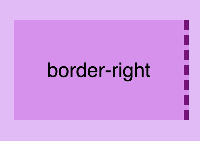
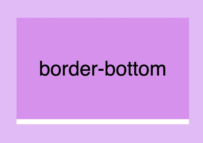
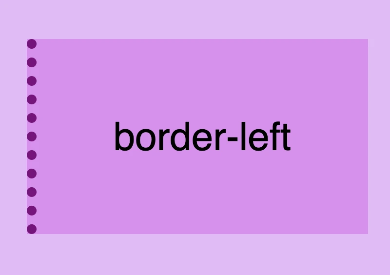
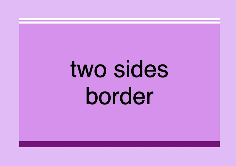
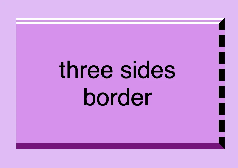
    Furthermore, we have the option to handle each side individually by using properties like border-top, border-right, border-bottom and border-left. We can either modify all four sides at once or selectively apply changes to different sides.

    Below, there are some basic examples of borders so that you can have a quick glimpse of the possibilities offered by this CSS property. Afterward, we will go deeper and explore every case more analytically.

    CSS border styles: This is an image that shows a box with border box none.
    CSS border styles: This is an image that shows a box with 4 sides border, 10px width, dotted style and color black.
    CSS border styles: This is an image that shows a box with 1 side border, 10px width, dashed style and color purple.
    CSS border styles: This is an image that shows a box with 2 sides border, 8px width, double style top but solid style bottom and color white.
    CSS border styles: This is an image that shows a box with a 3 sides mixed styled and mixed color border with 5px width and border-radius 50px.
    CSS border styles: This is an image that shows a 4 sides border with 10px width, solid style, color blue and border-radius 25%.

    CSS border style – The playful property

    We can now move forward and focus on the first thing we need to know about borders is the border-style CSS property. There are many styles available, but for today, we will concentrate on the most common ones.

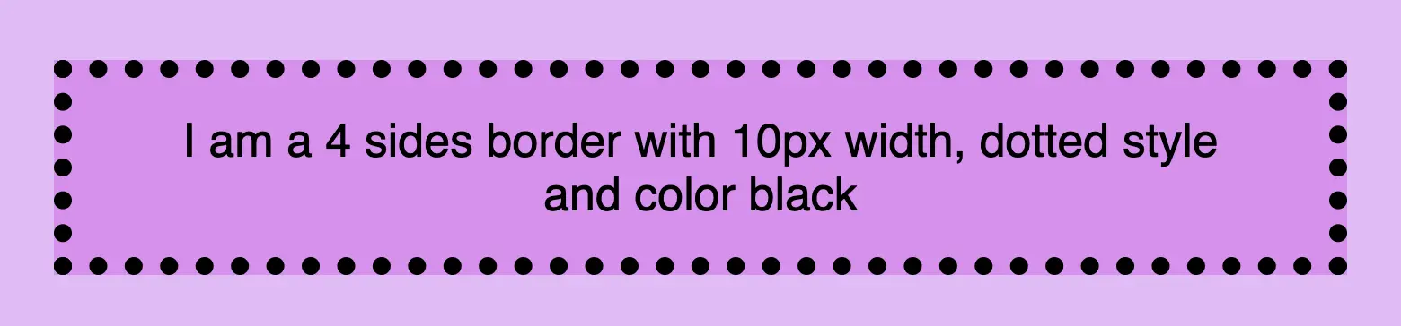
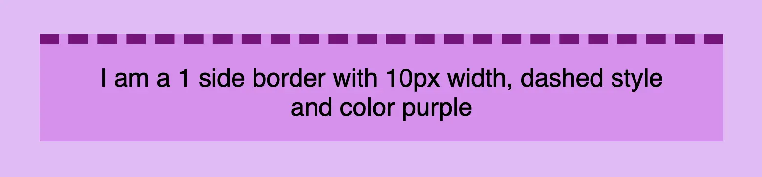
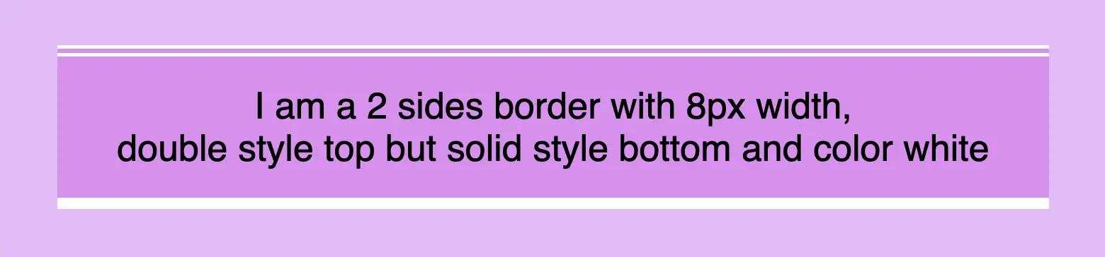
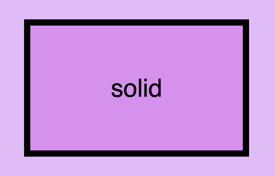
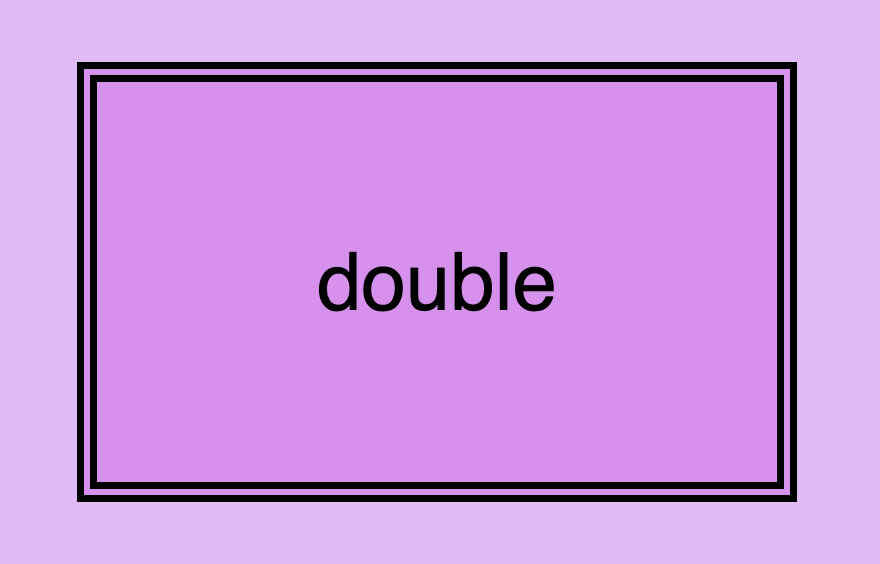
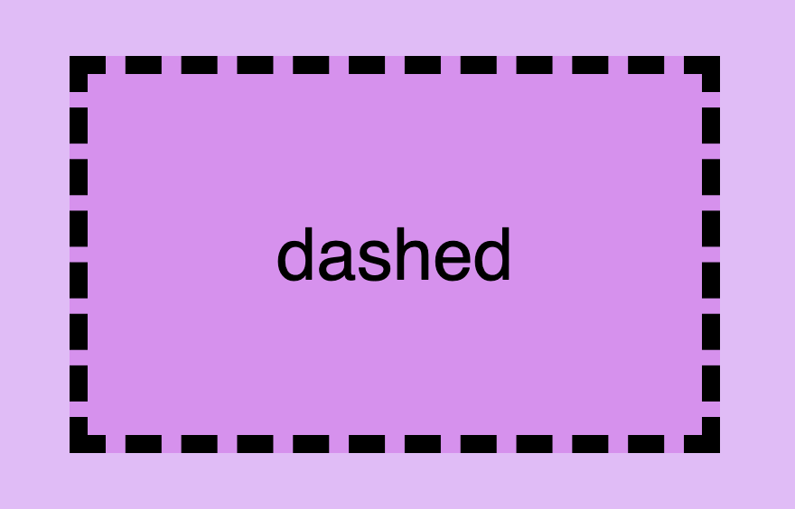
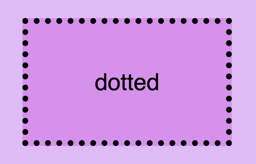
    The first and most usual is the solid type which is just a simple line. Then we have the double which is as you’d expect a double line border. Another style is the dashed one in which, the line is made up of dashes. It’s nice to have clear and descriptive names right? Finally, the dotted style is the one in which the border line consists of dots.

    Below, you will find examples showcasing the styles we’ve just mentioned alongside their respective CSS code:

    border-style: solid;
    CSS
    CSS border style: This is an image that shows a box with border style solid.
    CSS border style: This is an image that shows a box with border style double.
    border-style: double;
    CSS
    border-style: dashed;
    CSS
    CSS border style: This is an image that shows a box with border style dashed.
    CSS border style: This is an image that shows a box with border style dotted.
    border-style: dotted;
    CSS

    CSS border width – Focusing on precision

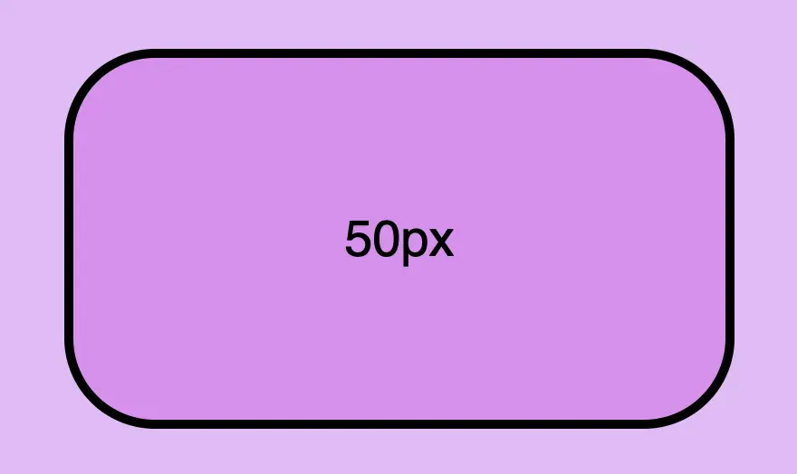
    Now that you’ve seen the basic border stylings, it’s time to check out the border’s width property. By default, borders have 1px width. To change that, we must modify the border-width property according to our needs.

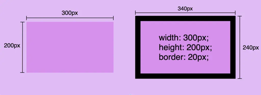
    Before we continue, it’s important to give you some insights on an important property that directly affects border behaviors and is called box-sizing. Box sizing’s value is set, by default, to content-box . Because of that borders occupy additional space around the objects they surround.

    In simple words, if I have a box with 300px width and 200px height and I want to add a 20px border to all sides, then I will end up having a bordered box with 340px width and 240px height. Let’s see how I came up with this result:

    width:300px (box’s width) + 40px (20px border-left + 20px border-right) = 340px;

    height:200px (box’s height) + 40px (20px border-top + 20px border-bottom) = 240px;

    border-width: 20px;
    CSS

    🕵️‍♀️ By exploring the box-sizing CSS property, we can include borders within the box’s dimensions. If you’re interested in learning more about it check out my post. You will find detailed instructions and explanations on each box sizing method.

    CSS border color – For vivid results

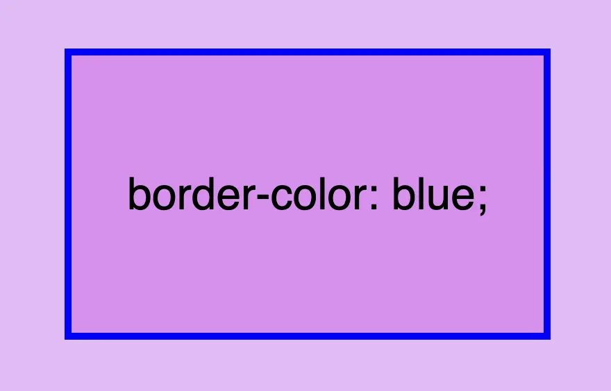
    The next step is to understand how border color works. By default, borders are always rendered in black. This means that if we don’t specify a color our borders will automatically display in black.

    By default, borders are always rendered in black

    However, if we want a different color we have the freedom to choose any color we desire and simply assign it to the border-color property. Let’s see that in action:

    border-color: blue;
    CSS

    Border colors can be described using various different value types. For instance, you can specify the color blue by using :

    • The word blue
    • The corresponding hex code #00F
    • The RGB value rgb(0, 0, 255)
    • The HSL value hsl(240, 100%, 50%)

    A color 🌈 guide is also available to help expand your knowledge of colors.

    Border shorthand for simplified stylings

    border: border-width border-style border-color

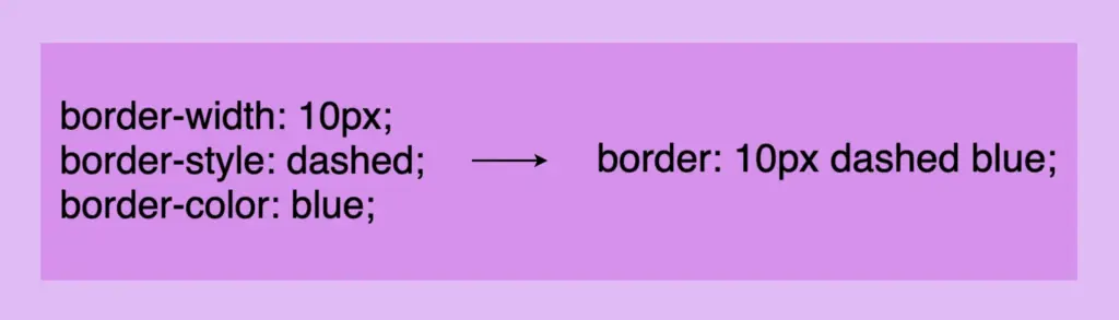
    There is a cool method for writing all the above border properties that prove to be highly useful. By choosing this approach, you can set multiple values simultaneously. This technique is a super efficient way to define all border properties in a quick and easy manner. It’s a total time and space saver! 😃

    Instead of listing each property separately, you just add each property side by side in a single line:

    Border-style css: This image shows that border-width, border-style and border-color can be declared only with the word border.
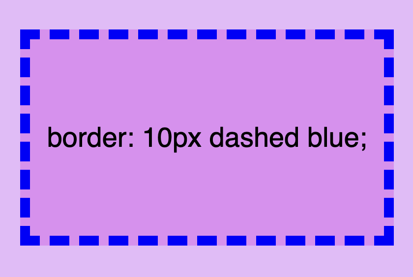
    border: 10px dashed blue;
    CSS
    Border-style css: This image shows a box with a 10px dashed blue 4 sides border.

    Cool right? 😎 ✨ Keep in mind that the order of the property doesn’t matter! We usually start with pixels and then add style and color, but it’s up to you the final decision!

    CSS Border Styles for unique results


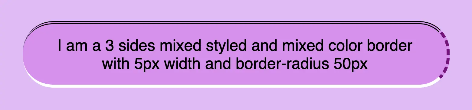
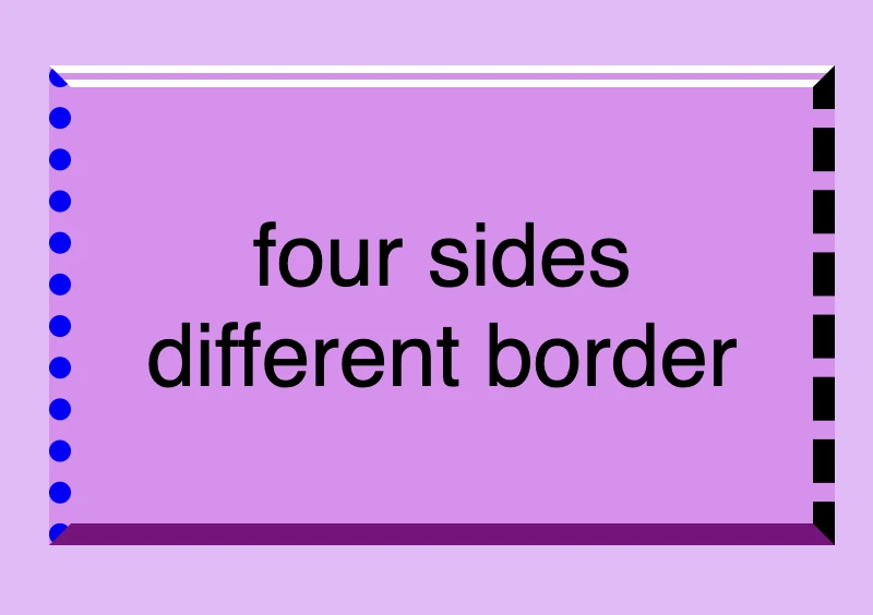
    Additionally, we have the flexibility to selectively choose specific sides when defining our border styles. This allows us to create borders combined with different styling. In the following example, you can check out some of these combinations. But still, you are free to make your own! 😀

    One side border

    border-top: 10px double white;
    CSS
    Border styles css: This image shows a box with a 10px double white border-top.
    Border styles css: This image shows a box with a 10px dashed purple border-right.
    border-right: 10px dashed purple;
    CSS
    border-bottom: 10px solid white;
    CSS
    Border styles css: This image shows a box with a 10px solid white border-bottom.
    Border styles css: This image shows a box with a 10px dotted purple border-left.
    border-left: 10px dotted purple;
    CSS

    Multiple sides border

      border-top: 10px double white;
      border-right: none;
      border-bottom: 10px solid purple;
      border-left: none;
    CSS
    Border styles css: This image shows a box with a 10px double white border-top and a 10px solid purple border-bottom. Border-left and border-right have value none.
    Border styles css: This image shows a box with a 10px double white border-top, a 10px solid purple border-bottom and a 10px dashed black border-right. Border-left has value none.
      border-top: 10px double white;
      border-right: 10px dashed black;
      border-bottom: 10px solid purple;
      border-left: none;
    CSS
      border-top: 10px double white;
      border-right: 10px dashed black;
      border-bottom: 10px solid purple;
      border-left: 10px dotted blue;
    CSS
    Border styles css: This image shows a box with a 10px double white border-top, a 10px solid purple border-bottom, a 10px dashed black border-right and a 10px dotted blue border-left.
    Border styles css: This image shows a box with a 10px solid purple border applied to all 4 sides.
      border-top: 10px solid purple;
      border-right: 10px solid purple;
      border-bottom: 10px solid purple;
      border-left: 10px solid purple;
      /* OR */
      border: 10px solid purple;
    CSS

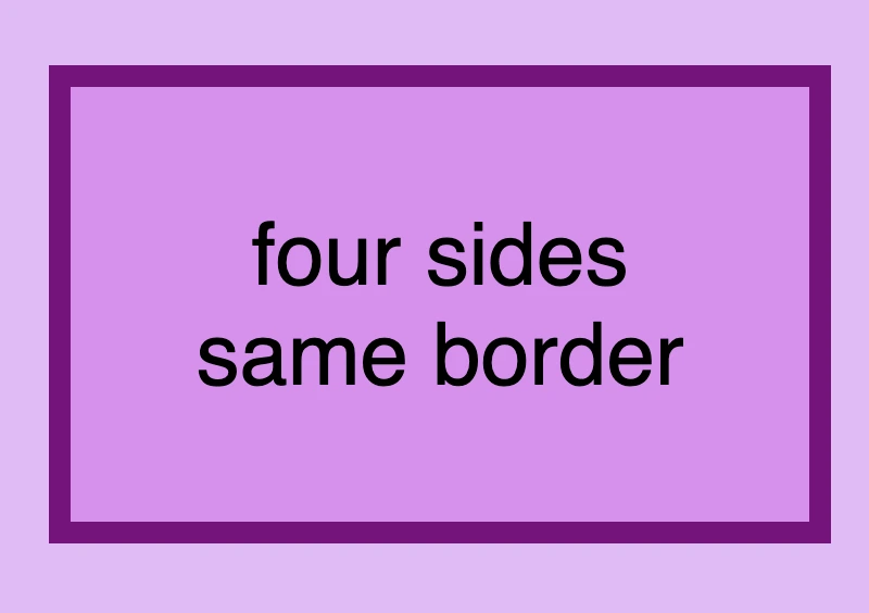
    🔖 Keep in mind when working with the CSS border property that it is considered a good practice to set equal border widths for all sides. Being consistent helps by bringing a sense of balance and distraction-free results.
    Furthermore, try to avoid mismatched styles and colors. Matching styles and colors lead to a smooth and cohesive look that’s easy on the eyes. Not to mention, it keeps your code cleaner 🎉 and easier to manage. 😀

    DO’S

      border-top: 10px solid white;
      border-right: 10px dashed purple;
      border-bottom: 10px solid white;
      border-left: 10px dashed purple;
    CSS
    This image shows a box with a 10px solid white border top and bottom, while border right and left have 10px dashed purple. Also this image has a message inside it that says: 'DO'S"

    DON’TS

    This image shows a box with a 30px double red border-top, a 5px dashed green border-right, a 20px solid orande border-bottom,  and a 15px dotted blue border-left. Also this image has a message inside it that says: 'DON'TS"
    border-top: 30px double red;
    border-right: 5px dashed green;
    border-bottom: 20px solid orange;
    border-left: 15px dotted blue;
    CSS

    Create curved corners using border-radius

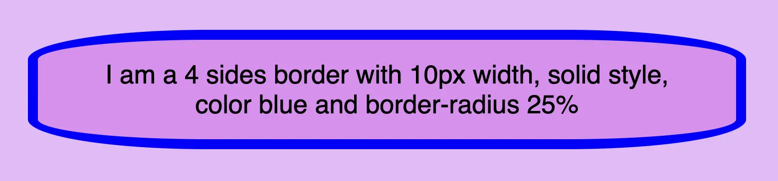
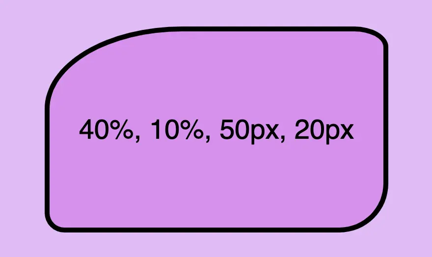
    Last but not least we have the border-radius CSS property, which enables us to give our elements rounded corners. We can opt for uniform rounding or we can apply different degrees of rounding to each corner. In addition to that, it’s useful to know that when we are working with different radius per corner, we can also combine px with %.

    When we are setting different border-radius per corner, we are free to combine px with %.

    Same corners

    border-radius: 50%;
    CSS
    This image shows a box with border-radius: 50% 25%; Top-left and bottom-right corners have radius 50% while top-right and bottom-left corners have radius 25%.
    This image shows a box with border-radius: 40% 20px 30%; Top-left corner have radius 40%, top-right and bottom-left corners have radius 20px while bottom-right corners have radius 30%.
    border-radius: 50px;
    CSS

    Different corners

    /* top-left & bottom-right | top-right & bottom-left */
    border-radius: 50% 25%;
    CSS
    This image shows a box with border-radius: 50% 25%; Top-left and bottom-right corners have radius 50% while top-right and bottom-left corners have radius 25%.
    This image shows a box with border-radius: 40% 20px 30%; Top-left corner have radius 40%, top-right and bottom-left corners have radius 20px while bottom-right corners have radius 30%.
    /* top-left | top-right & bottom-left | bottom-right */
    border-radius: 40% 20px 30%;
    CSS
    /* top-left | top-right | bottom-right | bottom-left */
    border-radius: 40% 10% 50px 20px;
    CSS
    This image shows a box with border-radius: 40% 10% 50px 20px. Top-left corner has radius 40%, top-right corner has radius 10%, bottom-right corner has radius 50px and bottom-left corner has radius 20px.