Tag: CSS gradients

Learn how to use CSS gradients, including linear, radial, and conic types. Explore simple tips, examples, and creative ways to style backgrounds, text, and UI elements with smooth color transitions.

  • Create Playful Border Effects Combining CSS Gradients With The Border-image-slice CSS Property

    Create Playful Border Effects Combining CSS Gradients With The Border-image-slice CSS Property

    Borders have long been one of the simplest tools in web design. Yet, that’s no reason to look boring. Combining the border-image-slice property with the power of CSS gradients, we can turn simple static lines into 🎨 colorful, eye-catching details that make your designs stand out. Besides, a playful border effect adds fun and energy to a page, helping shapes and sections feel more alive. No images needed, just blending colors with clean CSS.
    In other words, it’s a small touch that can make your design feel fresh and creative, adding personality and vibrance. 🌈 ✨

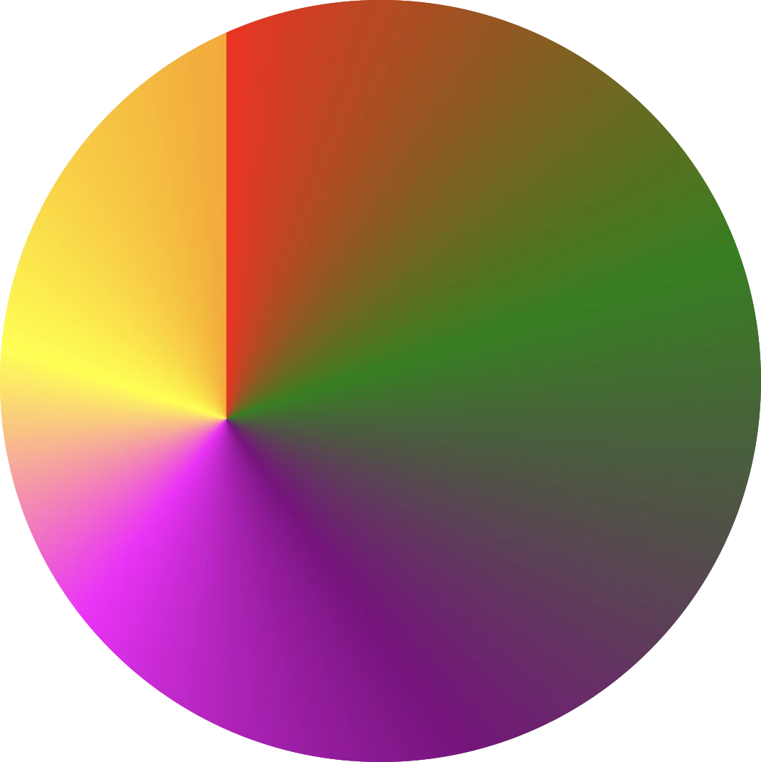
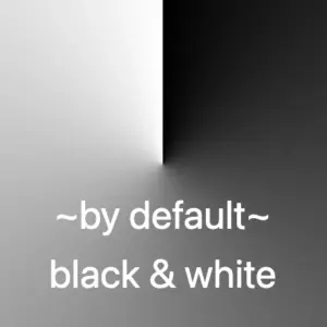
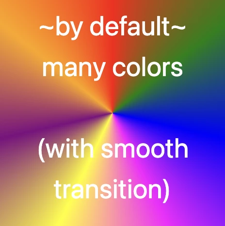
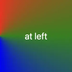
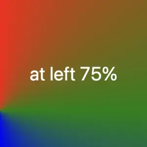
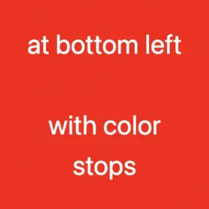
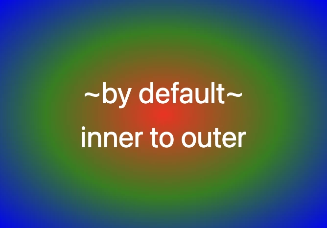
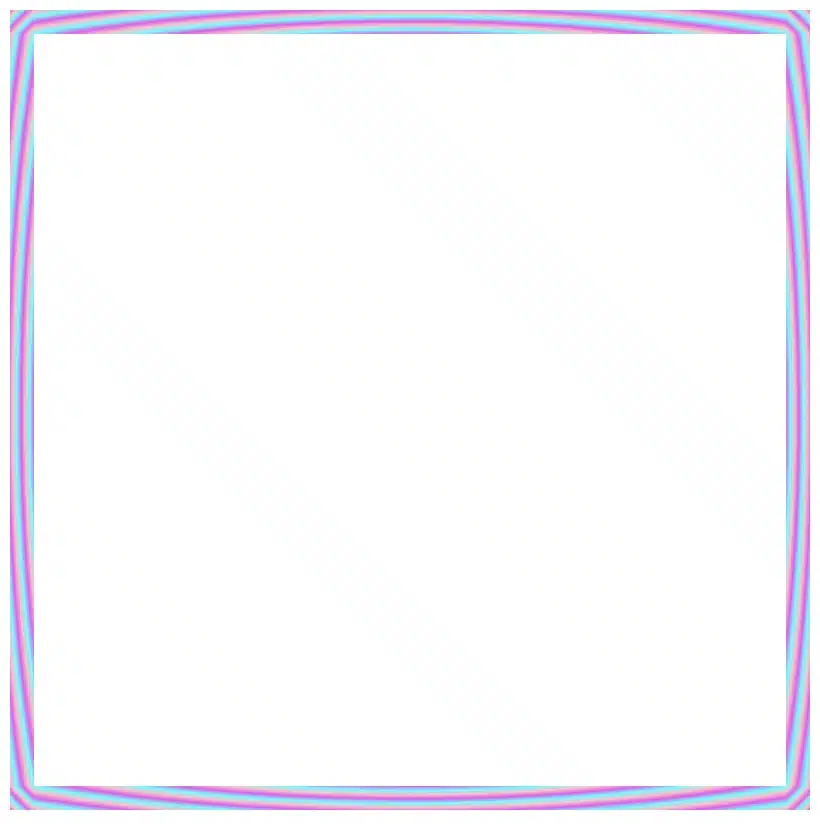
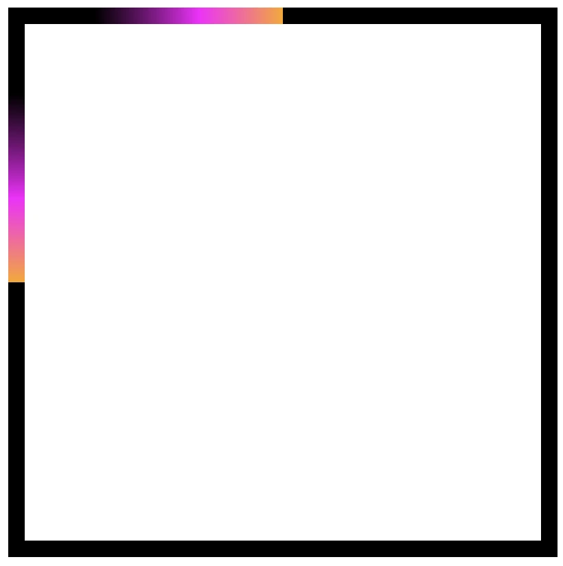
    Border effect explanation setting linear-gradient

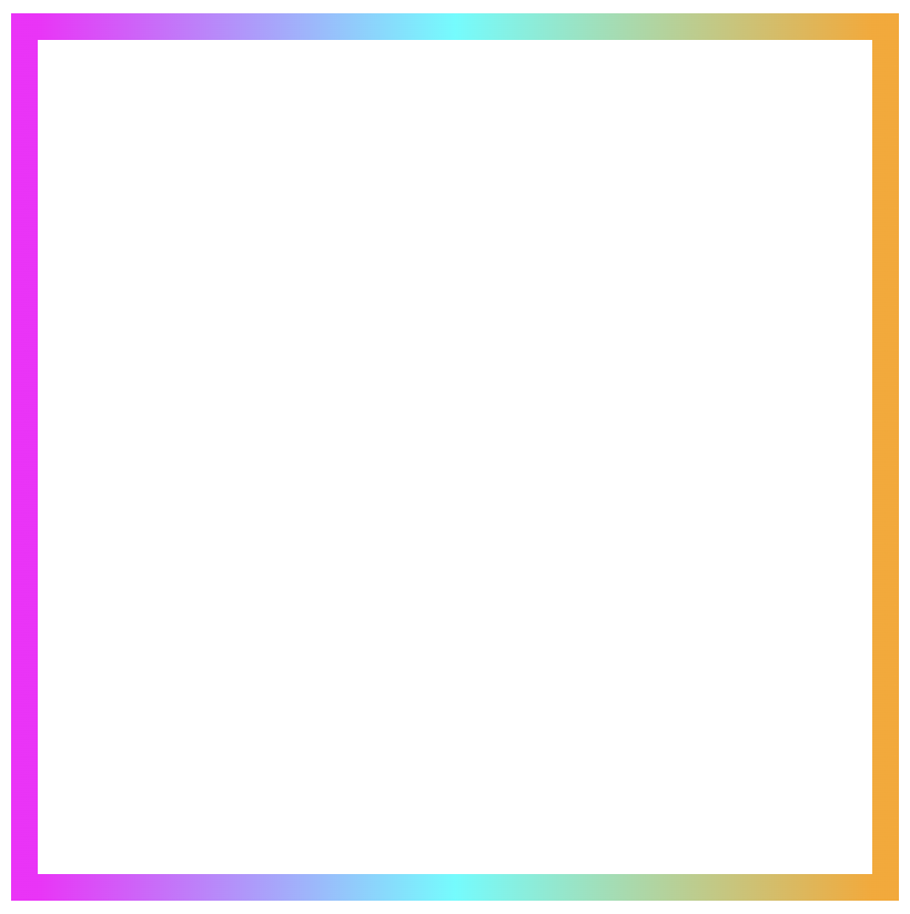
    We’ll begin by creating a box with a 150px width and height that temporarily has a solid 5px black border. This is the box we’ll use to experiment with different gradient border effects and make it pop! 🥳

    <div class="box"></div>
    HTML
    .box {
      width: 150px;
      height: 150px;
      border: 5px solid;
    }
    CSS
    A white box with 5 pixels solid black border

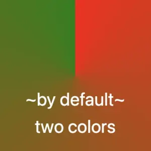
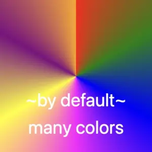
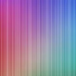
    With our box in place, we can make things more interesting by replacing the simple black border with a color 🍭 splash of CSS gradients.

    • First, we need to add the transparent value to the border.
    • Next, we continue with the gradient. I decided to start with the linear-gradient and use three colors (magenta, cyan, orange). Feel free to use as many colors as you want.
    • In the final step, we set border-image-slice to 1. In that way, the browser uses the whole gradient evenly on all sides of the border.

    The browser doesn’t know how to spread the gradient across the border area. Without the border-image-slice property, the gradient won’t appear at all. It is essential to add it as it will activate and display the gradient border.

    .box {
      ...
      border: 5px solid transparent;
      border-image: linear-gradient(magenta, cyan, orange);
      border-image-slice: 1;
    }
    CSS
    Border effect with magenta, cyan and orange made combining the linear-gradient technique and the border-image-slice: 1 CSS property

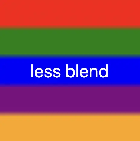
    It’s good to know that the border-image-slice property can take up to four values, each one responsible for how to cut (slice) the gradient we use as a border.

    More analytically:

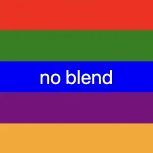
    border-image-slice: 1; simply put the whole gradient eventually on all sides

    border-image-slice: 20; it cuts 20 (px or percentages, depending on what you use) from each edge to make the border

    border-image-slice: 20 30; the same as above but the first value is for top and bottom, the second for left and right

    border-image-slice: 20 30 10; the first value is for top, the second for left and right and the third for bottom

    border-image-slice: 20 30 10 5; finally, the first value is for top, the second for right, the third for bottom and the fourth for left

    🔖 When we use a gradient, we usually just write 1 because a gradient isn’t a picture with pixels or edges to slice. It smoothly fills the space, so there’s nothing to “cut”. The value 1 simply tells the browser to use the whole gradient for the border.

    More border effect ideas with linear-gradient technique and border-image-slice: 1

    Below, I included a few more examples to help you see how changing the gradient can completely transform the look of a border, making the concept clearer and easier to follow. 😃

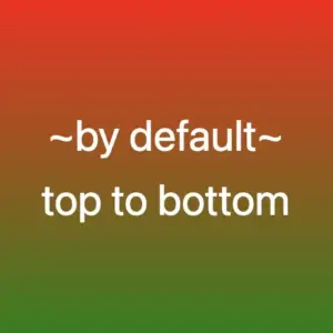
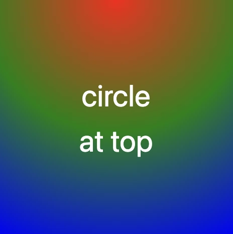
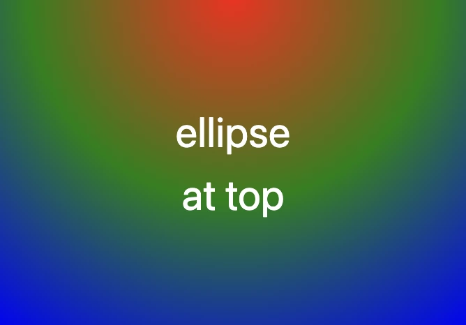
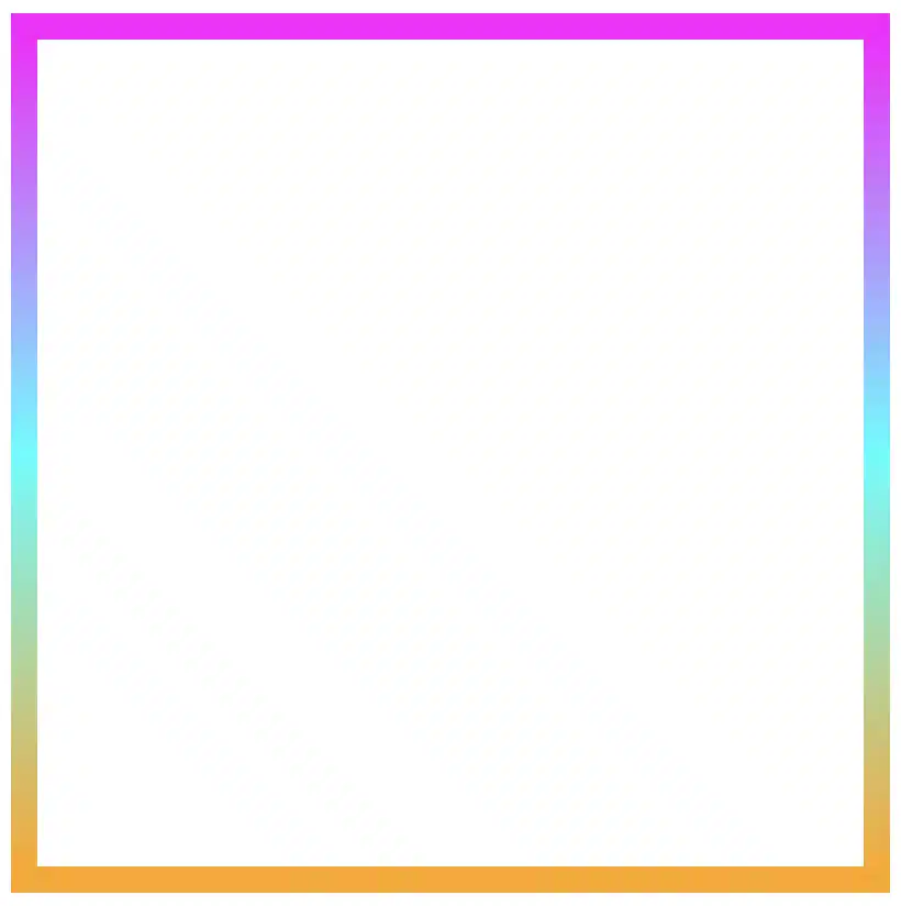
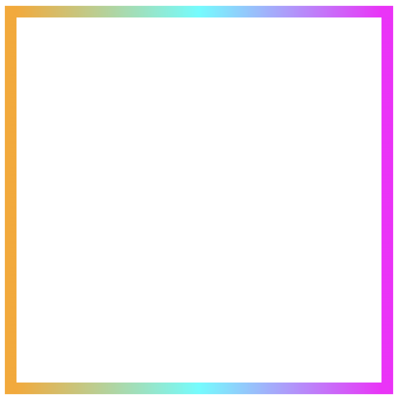
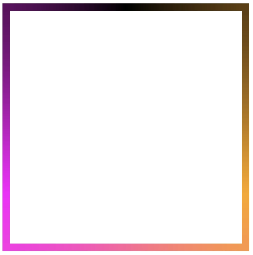
    Flipping the colors: The reverse linear-gradient

    Colorful linear gradients that flow from top to bottom or the reverse way are like creating amazing color bands that wrap around the box.

    .box {
      ...
      border: 5px solid transparent;
      border-image: linear-gradient(to top, magenta, cyan, orange);
      border-image-slice: 1;
    }
    CSS
    Border effect with magenta, cyan and orange made combining the linear-gradient technique and the border-image-slice: 1 CSS property

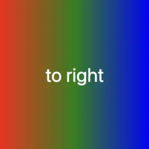
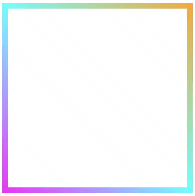
    Smooth side-to-side color flow with linear-gradient

    Colors travel from one side to the other, giving the border’s box a bright, balanced look.

    Firstly, from left to right

    .box {
      ...
      border: 5px solid transparent;
      border-image: linear-gradient(to right, magenta, cyan, orange);
      border-image-slice: 1;
    }
    CSS
    Border effect with magenta, cyan and orange made combining the linear-gradient technique and the border-image-slice: 1 CSS property

    Then, from right to left

    .box {
      ...
      border: 5px solid transparent;
      border-image: linear-gradient(to left, magenta, cyan, orange);
      border-image-slice: 1;
    }
    CSS
    Border effect with magenta, cyan and orange made combining the linear-gradient technique and the border-image-slice: 1 CSS property

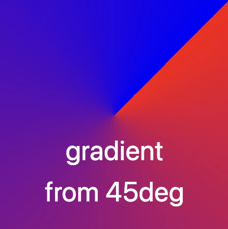
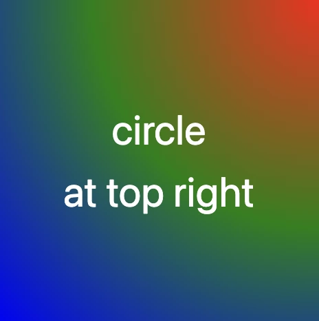
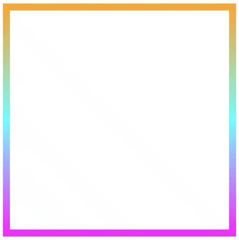
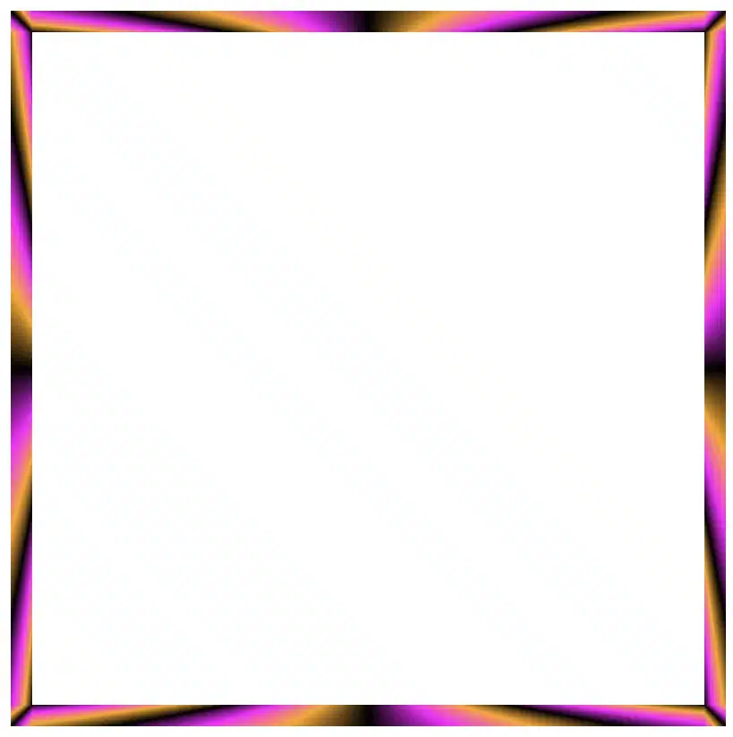
    Playing with diagonal directions

    A diagonal direction gives the sense of a wavy, moving effect. Plus, changing the angle, you can create a more dynamic look.

    .box {
      ...
      border: 5px solid transparent;
      border-image: linear-gradient(45deg, magenta, cyan, orange);
      border-image-slice: 1;
    }
    CSS
    Diagonal border effect with magenta, cyan and orange made combining the linear-gradient technique and the border-image-slice: 1 CSS property

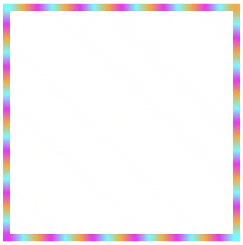
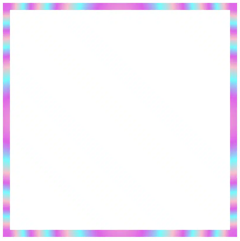
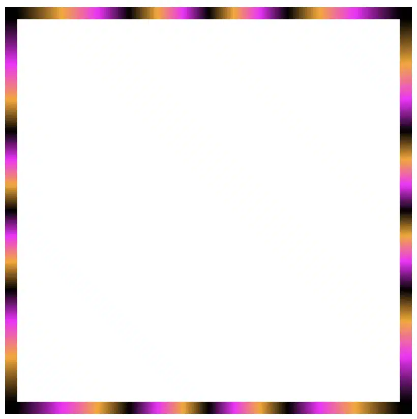
    Color loops: The repeating linear-gradient technique

    With repeating gradients, you can build patterns that literally look like an impressive dancing effect or all these amazing neon light effects. How cool is that!? 😎

    .box {
      ...
      border: 5px solid transparent;
      border-image: linear-gradient(45deg, magenta, cyan, orange, magenta, cyan, orange, magenta, cyan, orange, magenta, cyan, orange, magenta, cyan, orange, magenta, cyan, orange, magenta, cyan, orange, magenta, cyan, orange, magenta, cyan, orange, magenta, cyan, orange, magenta, cyan, orange);
      border-image-slice: 1;
    }
    CSS
    Repeating border effect with magenta, cyan and orange made combining the linear-gradient technique and the border-image-slice: 1 CSS property

    Moreover, we are free to experiment with the other two (radial-gradient and conic-gradient) CSS gradients as well. So, let’s dive into some more examples and discover how different gradient ideas come to life.

    Border effects with different border-image-slice values

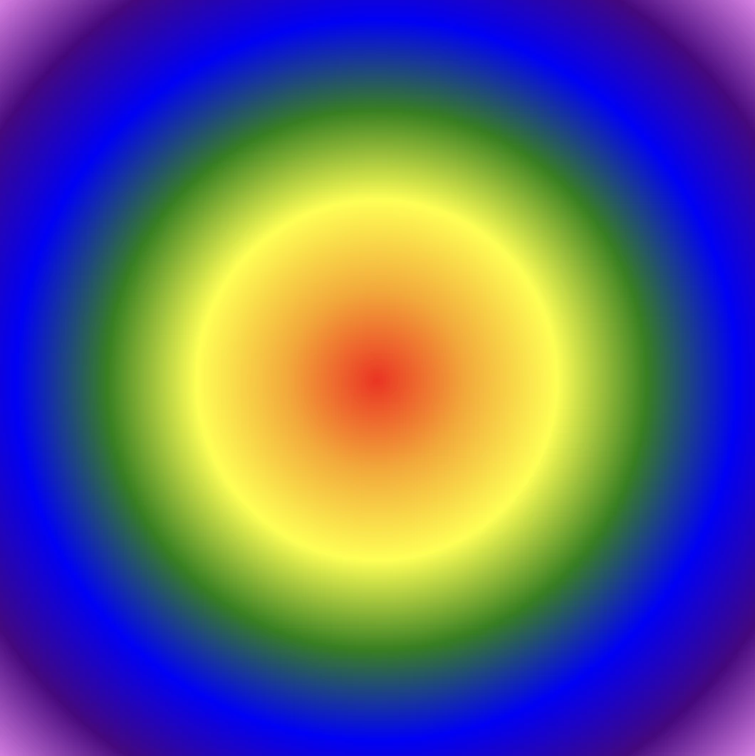
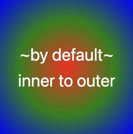
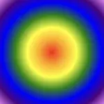
    Radial gradient for spinning border effects

    Now, let’s see what would happen if we use the same gradient, in this case, the radial-gradient, with many different values on border-image-slice.
    For these examples, I used cyan, pink and violet. 🎨 ✨

    In the first example, we maintain the value 1 while in the second, we replace it with a value of 50.
    The border-image-slice: 1; applies the entire gradient, spreading the colors smoothly around the border. With this transition, the gradient stays wide and soft.

    .box {
      ...
      border: 5px solid transparent;
      border-image: radial-gradient(cyan, pink, violet, cyan, pink, violet, cyan, pink, violet, cyan, pink, violet, cyan, pink, violet, cyan, pink, violet, cyan, pink, violet, cyan, pink, violet, cyan, pink, violet, cyan, pink, violet, cyan, pink, violet);
      border-image-slice: 1;
    }
    CSS
    Border effect with cyan, pink and violet made combining the radial-gradient technique and the border-image-slice: 1 CSS property


    The border-image-slice: 50; applies a small piece of the gradient. Since it’s using only a part of the gradient’s color range, the colors repeat more often and look like stripes that are spinning around.

    .box {
      ...
      border: 5px solid transparent;
      border-image: radial-gradient(cyan, pink, violet, cyan, pink, violet, cyan, pink, violet, cyan, pink, violet, cyan, pink, violet, cyan, pink, violet, cyan, pink, violet, cyan, pink, violet, cyan, pink, violet, cyan, pink, violet, cyan, pink, violet);
      border-image-slice: 50;
    }
    CSS
    Border effect with repeating stripes from cyan, pink and violet made combining the radial-gradient technique and the border-image-slice: 50 CSS property

    To sum up, increasing the slice value tells the browser to take a smaller “slice” of the gradient and reuse it around the border. As a result, with a smaller slice, we have more repetition and eventually stronger striping.

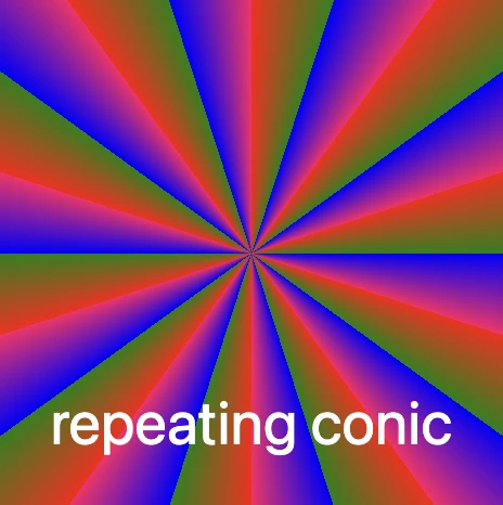
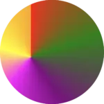
    Conic gradient for more complex border effect

    Next, let’s see what would happen if we use the same gradient, in this case, the conic-gradient, but different values on border-image-slice.
    For these examples, I changed the colors and used black, orange, magenta, and black again. 🎨 ✨

    🔖 A small detail to keep in mind is that starting and ending with the same color (in this case, black) helps to keep the transitions soft and seamless.

    .box {
      ...
      border: 5px solid transparent;
      border-image: conic-gradient(black, orange, magenta, black);
      border-image-slice: 1;
    }
    CSS
    Border effect with black, orange and magenta made combining the conic-gradient technique and the border-image-slice: 1 CSS property

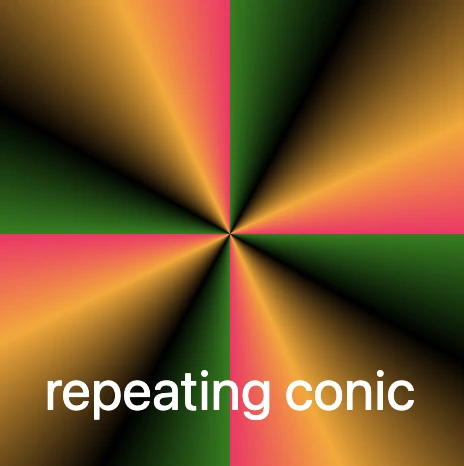
    Conic-gradient with repeating pattern

    In this case, with a 1 value it uses almost the entire conic gradient around the border. The colors flow smoothly and evenly, creating a soft circular blend with gentle transitions.

    .box {
      ...
      border: 5px solid transparent;
      border-image: conic-gradient(black, orange, magenta, black, orange, magenta, black, orange, magenta, black, orange, magenta, black, orange, magenta, black, orange, magenta, black, orange, magenta, black, orange, magenta, black, orange, magenta, black, orange, magenta,black, orange, magenta, black, orange, magenta, black, orange, magenta, black, orange, magenta, black, orange, magenta, black, orange, magenta, black);
      /* all around the same value */
      border-image-slice: 1;
    }
    CSS
    Repeating border effect with black, orange and magenta made combining the conic-gradient technique and the border-image-slice: 1 CSS property

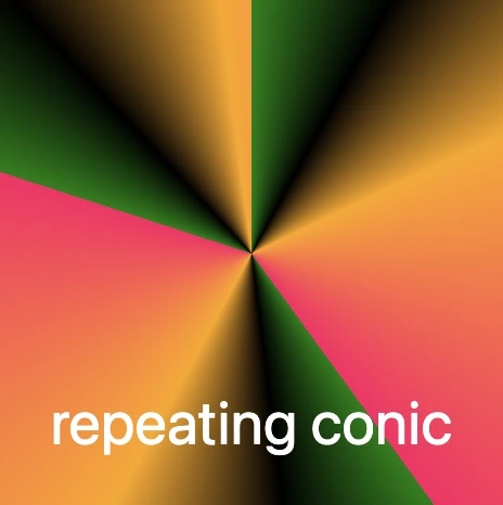
    On the other hand, with a value 30 it takes a smaller portion of the gradient and stretches it around the border. The border starts showing clearer color sections with mild curves and slight breaks at the corners.

    .box {
      ...
      border: 5px solid transparent;
      border-image: conic-gradient(black, orange, magenta, black, orange, magenta, black, orange, magenta, black, orange, magenta, black, orange, magenta, black, orange, magenta, black, orange, magenta, black, orange, magenta, black, orange, magenta, black, orange, magenta,black, orange, magenta, black, orange, magenta, black, orange, magenta, black, orange, magenta, black, orange, magenta, black, orange, magenta, black);
      /* all around the same value (30) */
      border-image-slice: 30;
    }
    CSS
    Border effect with black, orange and magenta made combining the conic-gradient technique and the border-image-slice: 30 CSS property

    Finally, with a value of 60 it uses a very small wedge of the conic gradient and repeats it. As a result, the border shows strong, repeating color bands or striped details, especially near the corners.

    .box {
      ...
      border: 5px solid transparent;
      border-image: conic-gradient(black, orange, magenta, black, orange, magenta, black, orange, magenta, black, orange, magenta, black, orange, magenta, black, orange, magenta, black, orange, magenta, black, orange, magenta, black, orange, magenta, black, orange, magenta,black, orange, magenta, black, orange, magenta, black, orange, magenta, black, orange, magenta, black, orange, magenta, black, orange, magenta, black);
      /* all around the same value (60) */
      border-image-slice: 60;
    }
    CSS
    Border effect with black, orange and magenta made combining the conic-gradient technique and the border-image-slice: 60 CSS property

    In this case, we use two values: 1 60. The result is a creative mix of two effects. The first value (1) applies to the top and bottom borders. Due to this we have a smooth and gentle look with wide color transitions. The second value (60) applies to both the left and right borders. Because of that, the effect is a tighter and more striped pattern as the gradient slice we use is smaller and repeated more often.

    .box {
      ...
      border: 5px solid transparent;
      border-image: conic-gradient(black, orange, magenta, black, orange, magenta, black, orange, magenta, black, orange, magenta, black, orange, magenta, black, orange, magenta, black, orange, magenta, black, orange, magenta, black, orange, magenta, black, orange, magenta,black, orange, magenta, black, orange, magenta, black, orange, magenta, black, orange, magenta, black, orange, magenta, black, orange, magenta, black);
      /* top & bottom - left & right */
      border-image-slice: 1 60;
    }
    CSS
    Border effect with black, orange and magenta made combining the conic-gradient technique and the border-image-slice: 1 60 CSS property

    Our final example takes four values: 1 60 60 1. This setup makes our border appear acymatric, calm, and energetic at the same time. More analytically, the first value (1) is for the top border and uses almost the entire gradient. The second and the third values (60 60) are for the right and bottom borders and use a smaller slice (tighter pattern). While the last value (1) is for the left border and uses almost the entire gradient again. Due to these values, we have smooth and continuous top and right borders, while the bottom and left are striped.

    .box {
      ...
      border: 5px solid transparent;
      border-image: conic-gradient(black, orange, magenta, black, orange, magenta, black, orange, magenta, black, orange, magenta, black, orange, magenta, black, orange, magenta, black, orange, magenta, black, orange, magenta, black, orange, magenta, black, orange, magenta,black, orange, magenta, black, orange, magenta, black, orange, magenta, black, orange, magenta, black, orange, magenta, black, orange, magenta, black);
      /* top - right - bottom - left */
      border-image-slice: 1 60 60 1;
    }
    CSS
    Border effect with black, orange and magenta made combining the conic-gradient technique and the border-image-slice: 1 60 60 1 CSS property

    Conic-gradient with color stops

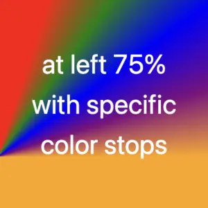
    Furthermore, we can control the color stops by using percentages, allowing us to decide exactly where the colors start and end each time.

    .box {
      ...
      border: 5px solid transparent;
      border-image: conic-gradient(black 75%, orange 75%, magenta 80%, black 85%,  black 90%, magenta 95%, orange 100%);
      border-image-slice: 1;
    }
    CSS
    Border effect with black, orange and magenta made combining the conic-gradient technique and the border-image-slice: 1 CSS property
    .box {
      ...
      border: 5px solid transparent;
      border-image: conic-gradient(black 0%, black 5%, magenta 5%, magenta 10%, black 10%, black 15%, magenta 15%, magenta 20%, black 20%, black 25%, magenta 25%, magenta 30%, black 30%, black 35%, magenta 35%, magenta 40%, black 40%, black 45%, magenta 45%, magenta 50%, black 50%, black 55%, magenta 55%, magenta 60%, black 60%, black 65%, magenta 65%, magenta 70%, black 70%, black 75%, magenta 75%, magenta 80%, black 80%, black 85%, magenta 85%, magenta 90%, black 90%, black 95%, magenta 95%, magenta 100%);
      border-image-slice: 1;
    }
    CSS
    Border effect with black and magenta stripes made combining the conic-gradient technique and the border-image-slice: 1 CSS property

    The results we observe when utilizing these all these specific values above on the border-image-slice CSS property concerns only a box of 150 pixels in width and height. It is critical to adjust the values if you have different dimensions.

    Take into consideration that gradients with the 1 value look better in square shapes, as the color flow fits perfectly within equal sides.

    Experimenting with gradient borders opens the door to an endless palette of styles — from soft pastel outlines that frame content elegantly to bold, vibrant strokes that command attention. The key lies in balance: using color transitions and subtle motion to enhance, not overpower, the user experience. Whether you’re styling buttons, containers, or entire sections, CSS gradient borders are a reminder that even the smallest design detail can carry a playful spark — proof that borders don’t just separate elements, they can also bring them to life.

  • CSS Conic Gradient Made Easy

    CSS Conic Gradient Made Easy

    Hello! 😃 CSS conic gradient techniques are a fantastic way to add colorful, creative flair to your designs. Today, we’re diving into the enchanting world of conic-gradient in CSS — a type of gradient where colors transition in a circular or conical pattern around a central point (either the default center or one you define within the element).

    This powerful technique allows you to blend and combine colors in unique ways, creating artistic and visually striking effects. Plus, it’s perfect for building things like pie charts for presentations — no extra libraries needed!

    In addition to conic-gradient CSS also offers linear-gradient and radial-gradient techniques. 🌈✨ They all have a starting and an ending point, giving us the flexibility to control the direction and flow of the gradient. It is essential to blend at least two colors, but we can blend even more, creating smooth transitions or distinct shifts between them based on our needs.

    Ready to unlock 🗝 the art and practical uses of conical gradients? Let’s jump into this creative adventure! 💻

    What is a conic gradient?

    A CSS conic gradient is a styling technique used in CSS to create a color transition that radiates from a central point in a circular or conical pattern. It allows you to specify different color stops and angles, leading to a visually pleasing gradient effect for backgrounds or other elements on a webpage.

    There are many variations and creative ways to use conic gradients — and we’ll be exploring them in the next sections!

    Understanding the default direction of a CSS conic gradient

    So, let’s begin with the default direction, which is clockwise. To create a conic gradient, we need at least two colors. Below, I’ve prepared some examples to show exactly what I mean.

    /* blend two colors */
    
    .conic-two-colors {
      background-image: conic-gradient(red, green);
    }
    
    CSS
    Default CSS conic gradient with two colors, red and green
    /* blend many colors */
    
    .conic-multiple-colors {
      background-image: conic-gradient(red, green, blue, magenta, yellow, purple, orange);
    }
    
    CSS
    Default conic gradient with many colors.
    /* blend black and white */
    
    .conic-black-white {
      background-image: conic-gradient(black, white);
    }
    
    CSS
    Default conic gradient with only black and white.

    🔖 Keep in mind that if we want to achieve a seamless transition between the last and first color, we have two ways to achieve this:

    • First, we can choose intermediate colors between the starting and ending colors. For example, in our case, we can pick colors from #FF4C00 (orange) to #FF6E00 (a reddish shade), creating a smooth blend from orange to red.
    • The second option, which is simpler, involves repeating the same color at both ends. In this example, we’ll use red as the repeated color.

    Here’s a simple code snippet to help illustrate this.

    /* using specific colors when blending */
    .conic-smooth-option-a {
      background-image: conic-gradient(red, green, blue, magenta, yellow, purple, orange, #FF4C00, #FF6E00);
    }
    
    /* using the same color at both ends */
    .conic-smooth-option-b {
      background-image: conic-gradient(red, green, blue, magenta, yellow, purple, orange, red);
    }
    
    CSS

    Positioning the center of a CSS conic gradient

    Move the center to the sides

    In CSS, conic gradients provide the flexibility to reposition the gradient’s center anywhere within the container. This enables precise alignment with a specific side, whether or not you use percentage values (%) or define specific color stops.

    In the following examples, we’ll focus on positioning the gradient center along different sides of the container.

    /* Gradient starting from the left */
    
    .conic-left-point {
      background-image: conic-gradient(at left, red, green, blue, purple, orange);
    }
    
    CSS
    Conic gradient with many colors. The center is at the left side of the square.
    /* Starting point at 75% from the left */
    
    .conic-using-percentage {
      background-image: conic-gradient(at left 75%, red, green, blue, purple, orange);
    }
    
    CSS
    Conic gradient with many colors. The center is at the 75% of the left side of the square.
    /* Gradient starting at 75% left with defined color stops */
    
    .conic-specific-stops {
      background-image: conic-gradient(at left 75%, red 5%, green 10%, blue 15%, purple 20%, orange 25%);
    }
    
    CSS
    Conic gradient with many colors and specific color stops. The center is at the 75% of the left side of the square.

    Move the center to the corners

    Building on the previous section, we can also move the gradient’s center to the corners of the container. Conic gradients in CSS allow this kind of precise positioning, with or without using color stops, giving you even more layout control.

    Without color stops

    The following code snippet shows a gradient that starts from the center point of our element with red color, transitions to green, then blue, followed by purple, ending with orange, creating a smooth, circular gradient effect.

    .conic-default {
      background-image: conic-gradient(red, green, blue, purple, orange);
    }
    CSS

    Below we can see how the previous gradient can break into different pieces the position we choose for the gradient’s center.

    The CSS code snippet .conic-corner-bottom-right starts at the bottom right corner of our element and smoothly transitions through red, green, blue, purple, and orange creating a visually appealing color blend.

    .conic-bottom-right-corner {
      background-image: conic-gradient(at bottom right, red, green, blue, purple, orange);
    }
    CSS
    CSS Conic-gradient where the center is at the bottom right corner.

    The reason you’re only seeing the purple and orange colors is due to the angle of the gradient in relation to the element.

    I followed the same steps with .conic-bottom-left-corner, and as the angle changes, the red and green colors become visible. The same goes for .conic-top-right-corner, where we can now see shades of blue and purple. Finally, by setting the center to the top left using .conic-top-left-corner, green and blue come into view. How cool is that! 🥳

    .conic-bottom-left-corner {
      background-image: conic-gradient(at bottom left, red, green, blue, purple, orange);
    }
    CSS
    CSS Conic-gradient where the center is at the bottom left corner.
    .conic-top-right-corner {
      background-image: conic-gradient(at top right, red, green, blue, purple, orange);
    }
    CSS
    Conic-gradient where the center is at the top right corner.
    .conic-top-left-corner {
      background-image: conic-gradient(at top left, red, green, blue, purple, orange);
    }
    CSS
    Conic-gradient where the center is at the top left corner.

    Imagine that changing the center position and adjusting the angle is like zooming in on the gradient — revealing each quarter of the circle more closely, one at a time. 🔍 It’s like examining the gradient through a magnifying glass as you explore each corner!

    With color stops

    Let’s take a look at the following example, where color stops are used to better control how and where each color appears within the conic gradient.

    Color stops let you define specific points along the gradient circle where a color should begin or end. This gives you greater precision over the flow of colors, rather than relying on an even, automatic blend. For example:

    .conic-color-stops {
      background-image: conic-gradient(red 75%, green 80%, blue 90%, purple 95%, orange 100%);
    }
    CSS
    CSS conic-gradient with color stops — red to 75%, then green, blue, purple, and orange up to 100%, creating sharp transitions in a circular layout.

    In this case, red takes up the majority of the gradient — up to 75% — and the remaining colors (green, blue, purple, and orange) appear in quicker succession toward the end.

    We can also combine color stops with center positioning to control not only when colors appear but also where they start. For instance:

    .conic-bottom-right-stops {
      background-image: conic-gradient(at bottom right, red 75%, green 80%, blue 90%, purple 95%, orange 100%);
    }
    CSS
    Conic-gradient with many colors and specific color stops. The center is at the bottom right corner.
    .conic-bottom-left-stops {
      background-image: conic-gradient(at bottom left, red 75%, green 80%, blue 90%, purple 95%, orange 100%);
    }
    CSS
    Conic-gradient with many colors and specific color stops. The center is at the bottom left corner.

    These examples show how positioning the gradient center at different corners—while using color stops—can dramatically affect which parts of the gradient are visible. You’ll notice that the dominant red still takes the lead, but the visibility of the other colors shifts depending on the corner you choose.

    Moving the center inside the element

    We continue with a really powerful feature of conic gradients: the ability to position the center anywhere inside the element. This opens up even more creative possibilities — and of course, you’re free to use color stops with these custom center positions as well.

    Below, I’ve prepared two examples.

    In the first one, the gradient starts from a point located 30% across and 55% down the element. It then smoothly transitions through different colors: red, green, purple, magenta, yellow, and orange. Imagine a color wheel starting from red and going around in order, stopping at each of these colors along the way.

    .conic-center-30-55 {
      background-image: conic-gradient(at 30% 55%, 
      red, green, purple, magenta, yellow, orange);
    }
    CSS
    Conic-gradient with many colors where the center is at 30% across and 55% down.

    In the second one, the gradient starts from a point 30% across and 55% down the element — but this time, it uses color stops to control exactly where each color appears.

    Then it transitions through different color stops: red 15%, green 30%, purple 45%, magenta 60%, yellow 90%, and finally orange at 100%. You can use my example or you are free to create your own. I chose these values based on what felt right to me—but feel free to experiment and create your own version. It’s totally up to you

    .conic-center-30-55-stops {
      background-image: conic-gradient(at 30% 55%, 
      red 15%, green 30%, purple 45%, magenta 60%, yellow 90%, orange 100%);
    }
    CSS
    Conic-gradient with many colors and specific color stops. The center is at 30% across and 55% down.

    Changing the starting angle of a CSS conic gradient

    Let’s move forward and explore another option we have another option available with conic gradients, as we are free to start the gradient from different points.

    In our example the gradient starts at 45 degrees to the right, moving from red to blue. This means the colors change smoothly in a circular motion, like a slice of pie with red at the starting edge and blue at the finishing point.

    .conic-angle-45 {
      background-image: conic-gradient(from 45deg, red, blue);
    }
    CSS

    CSS conic gradient without blending

    Another option is to use a non-blend gradient technique. In the following code snippet, the gradient starts with the color red at the top of the circle and makes sharp, sudden transitions to the next colors — green, blue, purple, and finally orange. Each color occupies a distinct 20% slice of the circle, creating a step-like, segmented pattern with no smooth blending between sections. It’s like a colorful pie chart made of equal parts..

    .conic-no-blending {
      background-image: conic-gradient(
      red 0%, red 20%, 
      green 20%, green 40%, 
      blue 40%, blue 60%, 
      purple 60%, purple 80%, 
      orange 60%, orange 100%
      );
    }
    CSS

    Creating repeating CSS conic gradients

    The repeating-conic-gradient is a function that is used to repeat the conic gradient. Below are two examples that show just how flexible and creative conic gradients can be.

    1. Repeating every 10%: The gradient originates from the center of the element. It begins with red at the center, then transitions to green at 5%, and to blue shortly after. At 10%, it shifts to a specific pinkish-red color defined by the hex code #ff1064. These color transitions repeat every 10% of the circle, creating a series of concentric slices that cycle outward in a continuous, colorful loop.

    .conic-repeat-10 {
      background-image: repeating-conic-gradient(red, green 5%, blue 5%, #ff1064 10%);
    }
    CSS

    2. Repeating every 25%: In this example, the gradient is centered within the element and begins with green at the starting point. As it radiates outward, it shifts to black at 8%, then to orange at 18%, and finally to a vibrant pinkish-red at 25% (using the hex code #ff1064). These defined color stops repeat every 25% of the circle, creating a looping, segmented pattern that spirals out from the center in consistent, colorful sections.

    .conic-repeat-25 {
      background-image: repeating-conic-gradient(green, black 8%, orange 18%, #ff1064 25%)
    }
    CSS

    What to avoid when creating CSS conic gradients

    Always bear in mind that, to create a harmonious and uniform repeating conic gradient, it’s important to maintain consistent spacing and carefully planned distances between color stops.

    In the image below, we can observe that green, black, and orange are each repeated three times, while the color #ff1064 (a shade of pinkish-red) appears only twice. This happens because the total space occupied by all the defined color stops—green, black, orange, and #ff1064—adds up to 40% of the conic gradient.

    This setup ensures that the entire pattern repeats in a balanced way: the specified colors take up 40% of the gradient, and the remaining 60% of the circle is evenly distributed across the repeated pattern. The result is a visually pleasing and consistent circular repetition.

    The following code snippet defines the color stops and their positions for this repeating conic gradient:

    .conic-avoid-repeating {
      background-image: repeating-conic-gradient(green, black 8%, orange 18%, #ff1064 40%);
    }
    CSS

    Here’s what each part means:

    • green: This is the starting color of the gradient. It begins right at the 0% mark.
    • black 8%: The next color in the gradient is black, and it starts at 8%.
    • orange 18%: Orange follows next, starting at 18% of the circle.
    • #ff1064 40%: Finally, the last color in the gradient is a shade of pinkish-red specified by the hexadecimal color code #ff1064, and it starts at 40% of the circle’s circumference.

    After that, the pattern repeats, starting again from green and continuing through the same sequence.

    Creating amazing pie charts with CSS conic gradient

    The CSS conic function is used to create conic gradient backgrounds. A conic gradient creates a circular gradient, much like a pie chart, with or without different color stops defining different sections of the circle.

    And here’s the fun part: we’re completely free to shape our gradients into perfect circles using CSS! Just apply a border-radius of 50%, and you can create stunning pie-style visuals. 😃

    .pie-chart {
      background-image: conic-gradient(
      red 0%, red 12%, 
      orange 12%, orange 30%, 
      yellow 30%, yellow 48%, 
      green 48%, green 65%, 
      blue 65%, blue 82%, 
      purple 82%, purple 100%
      );
    }
    
    .circle {
      width: 240px;
      height: 240px;
      border-radius: 50%;
    }
    CSS

    Breakdown of the color segments:

    • red 0%, red 12% This pair defines a red segment that starts at 0% and ends at 12% of the circle. This represents the first segment of the conic gradient.
    • orange 12%, orange 30%: Starts right after red and continues to 30%, forming the orange slice.
    • yellow 30%, yellow 48%, green 48%, green 65%, and blue 65%, blue 82% each define their own slices.
    • The last segment, purple 82%, purple 100%, defines the purple segment that starts at 82% and goes all the way to 100% of the circle. This represents the last segment of the conic gradient.

    Each pair of color stops defines a slice of the CSS conic gradient, making it easy to visualize proportions — just like a pie chart!

  • CSS Linear Gradient Techniques: Create Colorful Line Drawings

    CSS Linear Gradient Techniques: Create Colorful Line Drawings

    Hey there! 😃 Exploring CSS linear gradient techniques is a fantastic approach to fashion vibrant, colorful mixtures. Gradients give us the flexibility to choose any desired direction, defined by their starting and ending points. Mixing a minimum of two colors is fundamental, yet the potential for blending expands further, enabling us to achieve seamless transitions or pronounced shifts based on our design requirements.

    Today, let’s dive into the exciting world of CSS linear gradient techniques. 🌈✨ Picture a smooth transition of colors in a straight line, adding a sleek and dynamic touch to your web design. With linear gradients, you can smoothly transition between colors. You have the power to guide the eye seamlessly from one color to another. Whether it’s a subtle shift or a striking contrast, mastering linear gradients empowers you to enhance the visual appeal of your web projects.

    Ready to discover 🔍 the art and versatility behind linear gradients? Let’s get started! 💻

    Definition of a radial gradient

    A linear gradient is a visual effect that allows us to smoothly shift between colors in a straight line inside any shape we want. It’s like blending multiple colors together in a straight line pattern, allowing us to create colorful and visually appealing backgrounds or effects for elements on our website.

    A linear gradient is a visual effect that allows us to smoothly shift between colors in a straight line inside any shape we want

    The default CSS linear gradient

    We will begin our exploration with the default linear gradient, characterized by its top-to-bottom direction. The following code snippet and image provide a clear representation.

    .linear-default {
      background-image: linear-gradient(red, green);
    }
    
    /* we are free to use "deg" too */
    .linear-default {
      background-image: linear-gradient(180deg, red, green);
    }
    CSS

    From side to side

    We can adjust the direction of our gradients whenever we need to. To help you understand this better, take a look at the example below, where we changed the default direction to to right.

    We are also free to choose any direction we want to top , to right , to bottom (the default direction), to left.

    .linear-to-top {
      background-image: linear-gradient(to right, red, green, blue);
    }
    CSS

    From corner to corner

    At any point, we also have the flexibility to alter the orientation of our gradients along the diagonal path. To illustrate this concept, consider the following example with the to bottom right direction.

    Here colors would spread from the top-left corner to the bottom-right corner. We can combine any corner with its adjacent sides, to top left, to top right, to bottom left, and to bottom right.

    .linear-to-corner {
      background-image: linear-gradient(to bottom right, red, green, blue);
    }
    CSS

    CSS Linear gradient using percentages %

    With less blend

    If we want to create a linear gradient with less blending (colors have more distinct limits this way) and maintain the same space for each color, we can use equal specific stops in the gradient by adding % percentages.

    .linear-less-blend {
      background-image: linear-gradient(
        red 0%, red 18%,
        green 22%, green 38%,
        blue 42%, blue 58%,
        purple 62%, purple 78%,
        orange 82%, orange 100%
      );
    }
    CSS

    🕵️‍♂️ In this example, I’ve divided the space into 5 segments, but I left a 4% blend among each space in order to create a smooth but small transition.

    The percentages between the color stops determine how smooth the transition between colors is.

    • Red (0% – 18%): defines a red color stop that starts at 0% and ends at 18% of the gradient.
    • Between 18% and 22%, there is no specific color stop defined. This gap represents a transition zone where the gradient transitions smoothly from red to green.
    • Green 22%, green 38%): defines a green color stop that starts at 22% and ends at 38% of the gradient.
    • Between 38% and 42%, there is no specific color stop defined. This gap represents a transition zone where the gradient transitions smoothly from green to blue.
    • Blue (42% – 58%): defines a blue color stop that starts at 42% and ends at 58% of the gradient.
    • Between 58% and 62%, there is no specific color stop defined. This gap represents a transition zone where the gradient transitions smoothly from blue to purple.
    • Purple (62% – 78%): defines a purple color stop that starts at 62% and ends at 78% of the gradient.
    • Between 78% and 82%, there is no specific color stop defined. This gap represents a transition zone where the gradient transitions smoothly from purple to orange.
    • Orange (82% – 100%): defines an orange color stop that starts at 82% and ends at 100% of the gradient.
    A colorful css linear gradient technique. Setting the background-image: linear-gradient( red 0%, red 18%, green 22%, green 38%, blue 42%, blue 58%, purple 62%, purple 78%, orange 82%, orange 100% );

    Without blend

    Finally, it is really useful to know that we are able to create non-smooth transitions. In the following example, we will see a gradient with distinct color stops at specific percentage intervals, resulting in a distinct color transition from red to orange. Each color stop abruptly changes to the next color at the defined percentage points.

    .linear-no-blend {
      background-image: linear-gradient(
        red 0%, red 20%, 
        green 20%, green 40%, 
        blue 40%, blue 60%, 
        purple 60%, purple 80%, 
        orange 80%, orange 100%
      );
    }
    CSS

    🕵️‍♂️ In this example, I’ve divided the space into 5 equal segments without blending among each other. So, we create multiple color stops without transitions.

    • Red (0% – 20%): defines a red color stop that starts at 0% and ends at 20% of the gradient.
    • Green (20% – 40%): defines a green color stop that starts at 20% and ends at 40% of the gradient.
    • Blue (40% – 60%): defines a blue color stop that starts at 40% and ends at 60% of the gradient.
    • Purple (60% – 80%): defines a purple color stop that starts at 60% and ends at 80% of the gradient.
    • Orange (80% – 100%): defines an orange color stop that starts at 80% and ends at 100%
  • CSS Radial Gradient: How To Make Colorful Infinite Loops

    CSS Radial Gradient: How To Make Colorful Infinite Loops

    Greetings! 😃 Utilizing CSS radial gradient techniques is a remarkable approach for vibrant, colorful combinations. Gradients give us the liberty to choose any desired direction, defined by a clear starting and ending point. Using a minimum of two colors is essential, but we are free to blend even more based on our needs. This lets us achieve progressions or variations based on our specific requirements.

    In today’s post, we will analyze the captivating world of CSS radial gradient techniques. 🌈✨ Imagine colors coming out from a central point, spreading outwards in a circular fashion—an effect 🌀 that can truly elevate your design.

    Radial gradients offer a versatile approach to blending colors, creating central points or smooth transitions. By mastering radial gradients, you unlock the potential to infuse depth and excitement into your web design.

    Excited to learn more about this captivating technique? Let’s dive 🤿 right in! 💻

    Definition of a radial gradient

    A radial gradient is a visual effect in which colors blend outward from a central point, creating a smooth transition from one color to another in a circular or elliptical pattern. Circular ones spread colors outward from the center, evenly, making a symmetrical look. Elliptical ones also start from the center but stretch the colors toward the edges, creating an oval appearance.

    A radial gradient is a visual effect in which colors blend outward from a central point, creating a smooth transition from one color to another in a circular or elliptical pattern

    The default CSS radial gradient

    We’ll start by exploring the default orientation for the radial gradient which starts in the center of our elements and spreads outward. To better understand, look at the following piece of code and the pictures that go with it.

    The first picture shows a circle, while the second one depicts an ellipse.

    .radial-default {
      background-image: radial-gradient(red, green, blue);
    }
    
    /* circle default */
    .box-square {
      width: 240px;
      height: 240px;
    }
    
    /* elliptical default */
    .box-rectangle {
      width: 340px;
      height: 240px;
    }
    CSS

    Center at sides

    We can change the center of our element by setting circle at left , circle at top , circle at bottom and circle at right. To understand this better we’ve prepared an example. As before, the left picture relates to the circle, whereas the second one refers to the ellipse.

    .radial-at-side {
      background-image: radial-gradient(circle at top, red, green, blue);
    }
    
    /* circle default */
    .box-square {
      width: 240px;
      height: 240px;
    }
    
    /* elliptical default */
    .box-rectangle {
      width: 340px;
      height: 240px;
    }
    CSS

    Center at corners

    Also, the diagonal direction of our circle can change if we combine any corner with its adjacent sides.

    .radial-at-corner {
      background-image: radial-gradient(circle at top right, red, green, blue);
    }
    
    /* circle default */
    .box-square {
      width: 240px;
      height: 240px;
    }
    
    /* elliptical default */
    .box-rectangle {
      width: 340px;
      height: 240px;
    }
    CSS

    CSS Radial gradient using %

    With less blend

    We are also up to play with the blend we want to create. In the following example, the gradient blends between various colors in a circular pattern, it begins with red at the center, transitioning to green, then blue, purple, and finally orange at the outer edge.

    .radial-less-blend {
      background-image: radial-gradient(
        red 0%, red 20%, 
        green 30%, green 50%, 
        blue 60%, blue 100%
      );
    }
    
    /* circle default */
    .box-square {
      width: 240px;
      height: 240px;
    }
    
    /* elliptical default */
    .box-rectangle {
      width: 340px;
      height: 240px;
    }
    CSS

    🕵️‍♂️ In this example, I’ve divided the space into 3 sections. I left a 10% blend in each space in order to create a smooth small transition. The percentages between the color stops, determine how smoothly the transition between colors happens.

    • Red (0%-20%): The gradient starts at the center (0%) with the red color.
    • Red to Green (20%-30%): Within this radial range, there is a subtle transition from red to green, creating a visually appealing blend.
    • Green (30%-50%): the gradient takes a solid green color.
    • Green to Blue (50%-60%): Between this radial distance, there’s a gentle transition from green to blue.
    • Blue (60%-100%): Finally, the gradient concludes with a blue hue, providing a vibrant and visually striking finish.

    Without blend

    We also have the option to make non-blend gradients. As you can see below, the gradient consists of multiple color stops, transitioning from red to orange in a radial pattern, like colorful rings. Each color is assigned to specific percentage intervals, creating a visually appealing gradient effect.

    .radial-no-blend {
      background-image: radial-gradient(
        red 0%, red 33%, 
        green 33%, green 66%, 
        blue 66%, blue 100%
      );
    }
    
    /* circle default */
    .box-square {
      width: 240px;
      height: 240px;
    }
    
    /* elliptical default */
    .box-rectangle {
      width: 340px;
      height: 240px;
    }
    CSS

    🕵️‍♂️ In this example, I’ve divided the space into 3 sections. There is no blending among them. We can see a shape like a target, 🎯 that creates clear bands of sharp colors.

    • Red: Starts at 0% and ends at 33%.
    • Green: Starts at 33% and ends at 66%.
    • Blue: Starts at 66% and ends at 100%.