Tag: css reflection

  • How To Make CSS Reflection – The Easy Way

    How To Make CSS Reflection – The Easy Way

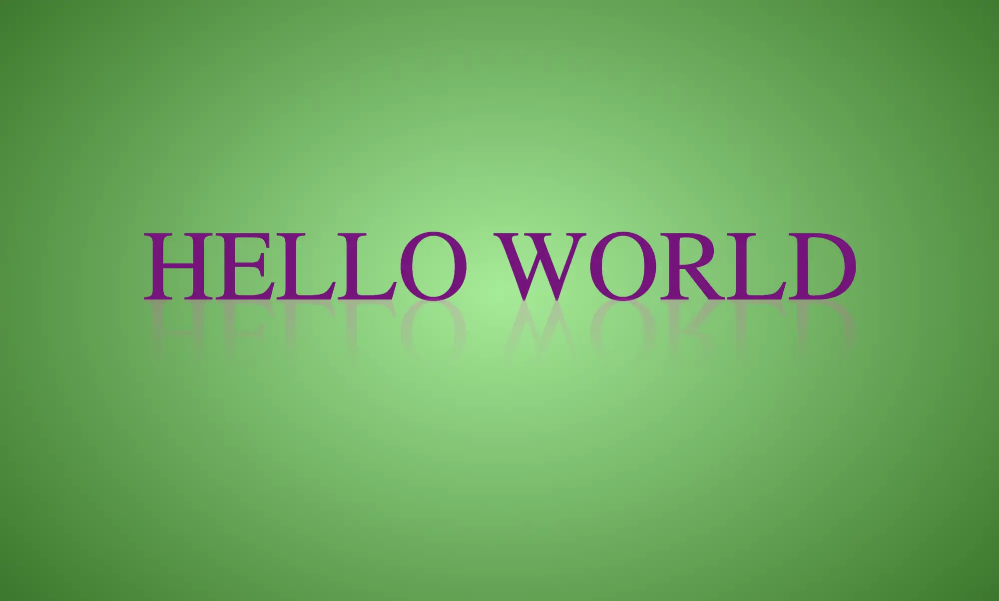
    Hello there! Today, we will explore a simple yet valuable topic. How do you create a CSS reflection using only one property? Let’s unlock the amazing –webkit-box-reflect property and effortlessly craft repeatable elements with minimal 😉 code! 🥳

    Simple CSS Reflection

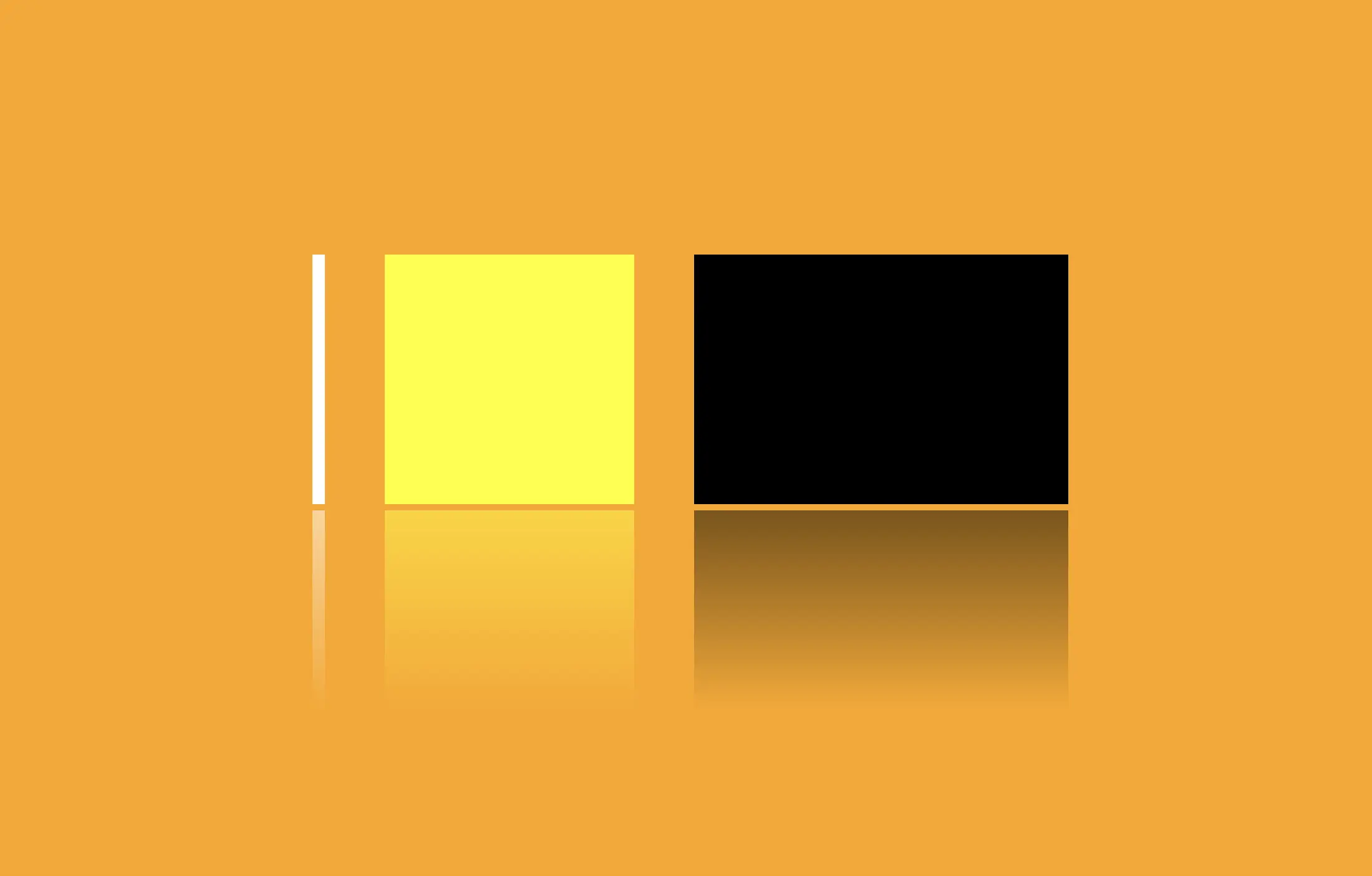
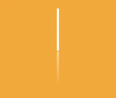
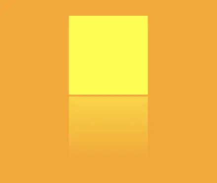
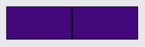
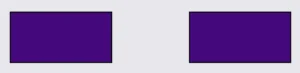
    We will start by creating two identical boxes. We set 200 pixels width and 100 pixels height and also add a solid black 2 pixel border. Continuing, we give our boxes an indigo background-color.

    <div class="box box--adjacent"></div>
    <div class="box box--spaced"></div>
    HTML

    Next, we proceed with our -webkit-box-reflect where we create the reflection of each box, ensuring that their direction remains the same (right direction). However, the second reflection is located 150 pixels from the original box. That way, we can explore both direction and distance.

    .box {
      width: 200px;
      height: 100px;
      border: 2px solid black;
      background-color: indigo;
      &--adjacent {
        -webkit-box-reflect: right;
      }
      &--spaced {
        -webkit-box-reflect: right 150px;
      }
    }
    SCSS

    In the images provided, we can see two boxes along with their corresponding reflections. In the first image, the box’s reflection is located exactly on the right-hand side, adjacent to the original box, while in the second image, the box also has a reflection on the right-hand side but is positioned 150 pixels away from the original box.

    CSS reflection. An image showing a box reflection on the right-hand side of the origin box.
    -webkit-box-reflect: right
    CSS reflection. An image showing a box reflection on the right-hand side positioned 150 pixels away from the original box.
    -webkit-box-reflect: right 150px

    CSS Reflection With Fade-Out Effect

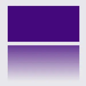
    It is essential to know that we can use the -webkit-box-reflect CSS property to create a reflection effect that accurately mirrors the original element’s appearance and style. We can further improve this effect and make it seem more authentic by using the linear-gradient CSS property, which gives us the impression of a gradual fade-out. This technique is pretty cool! 😎

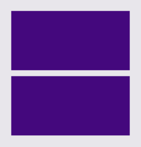
    We will start with our HTML code snippet, creating again two boxes with identical characteristics. We set 200 pixels width and 100 pixels height. Next, we give both boxes an indigo background-color.

    <div class="box box--top"></div>
    <div class="box box--bottom"></div>
    HTML

    Next, we proceed with our -webkit-box-reflect where we create the reflections of each box, ensuring that they have the same direction (below). However, the second reflection has a linear-gradient that creates a fade-out effect from top to bottom.

    .box {
      width: 200px;
      height: 100px;
      background-color: indigo;
      &--simple-reflection {
        -webkit-box-reflect: below 10px;
      }
      &--fade-out-reflection {
        -webkit-box-reflect: below 10px
        linear-gradient(
          rgba(0,0,0,0.0), 
          rgba(0,0,0,0.2),
          rgba(0,0,0,0.4),
          rgba(0,0,0,0.6),
          rgba(0,0,0,0.8)
        );
      }
    }
    SCSS

    When adjusting the reflection vertically, we need to use above and below instead of top and bottom.

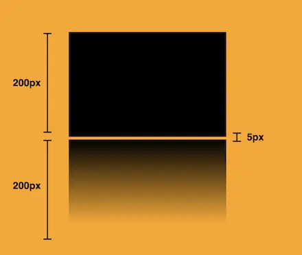
    Below, you can observe two boxes along with their related reflections. In the first image, the box’s reflection is located 10 pixels above the original box. In the second image, the reflection stands again 10 pixels above the origin box, but this time has the fade-out effect. It looks nice, doesn’t it?

    CSS reflection. An image showing a box reflection 10 pixels below the original box.
    -webkit-box-reflect: below 10px
    CSS reflection. An image showing a box reflection positioned 10 pixels below the original box. It has a linear-gradient(
      rgba(0,0,0,0.0), 
        rgba(0,0,0,0.2),
        rgba(0,0,0,0.4),
        rgba(0,0,0,0.6),
        rgba(0,0,0,0.8)) that creates the fade-out effect.
    -webkit-box-reflect: below 10px linear-gradient(rgba(…))

    If you are interested in diving deeper, there is an amazing post about CSS text reflection that you might enjoy reading!

  • How To Make A CSS Text Reflection Effect

    How To Make A CSS Text Reflection Effect

    Hi there! 😃 In this post, we’ll learn bit by bit how to create a CSS text reflection effect. When we say reflection, we’re referring to a mirror-like effect that looks like the text reflects on a surface, much like the way we see our reflection in a mirror.

    This is a simple yet amazing way to enhance the appearance of your text. Let’s analyze our effect so that you can easily follow along.

    HTML structure

    We will begin with our HTML structure. As you can see below, I prepared a div with the class .reflection-text , this is where our effect will take place.

    <div class="reflection-text">HELLO WORLD</div>
    CSS

    CSS foundation

    Let’s move forward with the CSS basic structure. We start with defining the background. It’s worth noting that using radial-gradient can make our effect more impressive. 😃

    body {
      background: radial-gradient(lightgreen, darkgreen);
      height: 100vh;
    }
    CSS

    Below, we can see the background we just created.

    In web development, we use the flex method in order to center our text. Then we will enhance its appearance, by making some adjustments. We will set the font-size to 100 pixels, select the “Roboto” font-family, and choose white as the text color.

    body {
      ...
      display: flex;
      align-items: center;
      justify-content: center;
    }
    
    .reflection-text {
      font-size: 100px;
      font-family: 'Roboto', sans-serif;
      color: white;
    }
    CSS

    This is what is rendered on the screen for now. A perfectly centered, 🎯 white text.

    Adding the CSS structure for the reflection effect

    Creating a reflection can be achieved by using pseudoelements like :before and :after. To ensure this works properly, we need to include position: relative in our .reflection-text class.

    .reflection-text {
      ...
      position: relative;
    }
    CSS

    Now, we are ready to proceed and create our reflection by adding the :before pseudoelement with all the necessary properties, as shown in the following code snippet.

    .reflection-text:before {
      content: "HELLO WORLD";
      position: absolute;
      top: 65px;
      transform: rotate(180deg) scaleX(-1);
      background: linear-gradient(
        to bottom, 
        rgba(255, 255, 255, 0) 20%, 
        rgba(255, 255, 255, 0.5) 60%, 
        rgba(255, 255, 255, 2) 100%
      );
      background-clip: text;
      color: transparent;
      opacity: 0.3;
    }
    CSS

    Breaking down the process

    🟢 To begin, we add the text “HELLO WORLD” to create another text element with the same content. This new text will serve as our reflection. Then, we set position: absolute so that we can move our reflected text below the original text. We use the top property to move the reflected text 65 pixels from the top, but you can always move the reflection in any direction you prefer. It is important to position the text and its reflection closely together for a more realistic reflection effect. 😉

    🟢 We move forward and use the transform CSS property to rotate the text by 180 degrees

    and then flip it horizontally using scaleX(-1). Now we have the perfect reflection! Let’s continue and make it more realistic.

    🟢 In the next step, we will adjust the color of our reflected text. To achieve this, we will utilize the linear-gradient CSS property and specify the direction as downwards. This will create white gradients, with the top appearing more intense and gradually fading towards the bottom of the text.

    🟢 It is commonly known that gradients cannot be directly applied to texts. Don’t worry! 🤔 We already have the solution to this problem. For now, let’s give a quick explanation. To create a clipped linear background pattern for text, first, we add the -webkit-background-clip: text property, and at the same time, we set the color to transparent, and our text automatically turns to transparent. In that way, our text takes the background: linear-gradient as its real color.

    🟢 For a more transparent text, we can adjust the opacity. The lower the opacity, the more transparent our text becomes. So, here we are! Our reflection is ready! 🥳

    Exploring different colors

    🔖 It is always an option to use black or any other color in our work. Below, I’ve included examples of texts with black, purple, and green colors. It’s important to remember that the key factor is to set the correct gradients at the linear-gradient property. That way, we can create respective shades. Therefore, please give extra attention to that! 😊

    Black text

    .reflection-text {
      position: relative;
      font-size: 100px;
      font-family: 'Roboto', sans-serif;
      color: black; /* default color */
    }
    CSS
    .reflection-text:before {
      content: "HELLO WORLD";
      position: absolute;
      top: 65px;
      transform: rotate(180deg) scaleX(-1);
      background: linear-gradient(to bottom, 
      rgba(0, 0, 0, 0) 20%, 
      rgba(0, 0, 0, 0.5) 60%, 
      rgba(0, 0, 0, 2) 100%);
      background-clip: text;
      color: transparent;
      opacity: 0.3;
    }
    CSS

    Purple Text

    .reflection-text {
      position: relative;
      font-size: 100px;
      font-family: 'Roboto', sans-serif;
      color: purple;
    }
    CSS
    .reflection-text:before {
      content: "HELLO WORLD";
      position: absolute;
      top: 65px;
      transform: rotate(180deg) scaleX(-1);
      background: linear-gradient(to bottom, 
      rgba(255, 55, 205, 0) 20%, 
      rgba(255, 55, 205, 0.5) 60%, 
      rgba(255, 55, 205, 2) 100%);
      background-clip: text;
      color: transparent;
      opacity: 0.3;
    }
    CSS

    Green Text

    .reflection-text {
      position: relative;
      font-size: 100px;
      font-family: 'Roboto', sans-serif;
      color: green;
    }
    CSS
    .reflection-text2:before {
      content:"HELLO WORLD";
      position: absolute;
      top: 65px;
      transform: rotate(180deg) scaleX(-1);
      background: linear-gradient(to bottom, 
      rgba(20, 150, 20, 0) 20%, 
      rgba(20, 150, 20) 60%, 
      rgba(20, 150, 20, 2) 100%);
      background-clip: text;
      color: transparent;
      opacity: 0.3;
    }
    CSS
  • How To Make A CSS Reflection Effect

    How To Make A CSS Reflection Effect

    Hello everyone! 😃 Today, we will learn how to create a cool CSS reflection effect. Through step-by-step instructions, we will understand how to manipulate linear-gradient and opacity CSS properties to create a stunning mirror-like effect. Below, I’ll include’ll give you all the information you need. Let’s get started.

    HTML structure

    Our HTML structure starts with an empty div element, with the class .reflection where our effect will take place.

    <div class="reflection"></div>
    HTML

    CSS foundation

    Let’s continue with the CSS basic structure. We will start by setting the background-color to orange.

    body {
      background-color: orange;
    }
    CSS

    Creating the element

    In the following step, we will define the element. I opt for a color black rectangle with 300 pixels width and 200 pixels height.We will also be adding the flex method to the body to center our element.

    body {
      ...
      display: flex;
      align-items: center;
      justify-content: center;
    }
    
    .reflection {
      width: 300px;
      height: 200px;
      background-color: black;
    }
    CSS

    This is what is rendered on the screen for now. A perfectly centered black rectangle! 

    Adding the CSS structure for the reflection effect

    A CSS reflection effect can be accomplished using pseudoelements like before and after.First, we need to add position: relative in our .reflection class to get prepared for our pseudoelement’s positioning.

    .reflection {
      ...
      position: relative;
    }
    CSS

    Then we are ready to create our reflection utilizing the before pseudoelement.

    .reflection:before {
      position: absolute;
      content: "";
      width: 100%;
      height: 100%;
      background: linear-gradient(
        to bottom, 
        rgba(0, 0, 0, 5), 
        rgba(0, 0, 0, 0) 80%
      );
    }
    CSS

    We initiate by setting the the position as absolute. Setting the content to an empty string (“”) and then its width and height to 100%, will make our pseudoelement appear and inherit its parent’s dimensions (width 300px and height 200px).  

    Next, we add a background: linear-gradient that goes downwards, by specifying its direction, from top to bottom. This way, we create black gradients that are more intense at the top and gradually fade toward the bottom to achieve our desired effect.

    So far, we have created the CSS reflection effect below our original rectangle. However, we need to take one more step for our effect to be visible. We add the top CSS property and set it to 205 pixels. This will move our reflection 5 pixels down from the origin rectangle.

    .reflection:before {
      ...
      top: 205px;
      opacity: 0.5;
    }
    CSS

    Additionally, we set the opacity to achieve a smoother and more natural-looking effect. You might be thinking that the same result could be accomplished by adjusting the linear-gradient property and you are right. It’s just that using the opacity this way requires much less effort and produces similar results.

    .reflection:before {
      ...
      opacity: 0.5;
    }
    CSS


    Voila! Here is our amazing reflection! 🥳

    Exploring different reflection colors

    🔖 Feel free to use any color you prefer, but it’s important to create a linear-gradient that gives the perspective shades. Here are examples of white and yellow reflections. I am keeping the orange background to facilitate easier comparison.

    White reflection

    .reflection {
      width: 10px;
      height: 200px;
      background-color: white;
    }
    
    .reflection:before {
      content: "";
      position: absolute;
      width: 100%;
      height: 100%;
      top: 205px;
      background: linear-gradient(to bottom, 
      rgba(255, 255, 255, 5), 
      rgba(255, 255, 255, 0) 80%);
      opacity: 0.5;
    }
    CSS

    Yellow reflection

    .reflection {
      width: 200px;
      height: 200px;
      background-color: yellow;
    }
    
    .reflection:before {
      content: "";
      position: absolute;
      width: 100%;
      height: 100%;
      top: 205px;
      background: linear-gradient(to bottom, 
      rgba(255, 255, 0, 5), 
      rgba(255, 255, 0, 0) 80%);
      opacity: 0.5;
    }
    CSS

    Choosing the perfect colors with their appropriate shades can truly transform your work. Be bold in your choices and let your creativity shine. Remember, there are endless possibilities and your creativity knows no bounds. 🎉 ✨