Tag: CSS shadow

  • The CSS Text Shadow Property – Enhance Your Content

    The CSS Text Shadow Property – Enhance Your Content

    Hello everybody! In the land of web design, the CSS text shadow property is like adding magic to your text. It helps you create elegant headings that command attention and, many times, make text easier to read. The text-shadow empowers designers to pass beyond the limits of ordinary with just a few lines of simple yet powerful code.

    However, it’s essential to use it wisely, overdoing it can sometimes cause confusion and reading can end up difficult. Therefore, we must keep in mind that beyond styling, readability is also important. Always aim to strike a balance between appearance and clarity so our text is accessible to everyone.

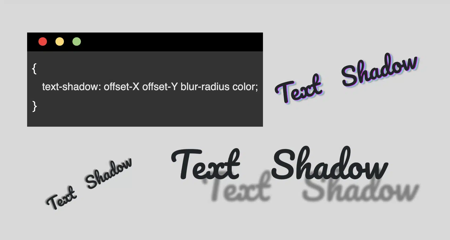
    Text shadow structure

    First things first! We’ll begin with the structure and break down its components:

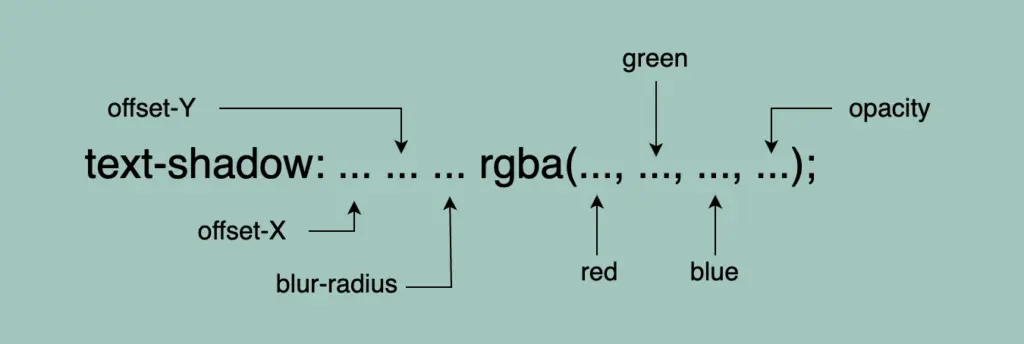
    • Offset-X and Offset-Y: They determine the horizontal and vertical distances of the shadow. When we use positive values, the shadow moves to the down and right. When we use negative values, the shadow moves to the top and left.
    • Blur-radius: It specifies the extent of blurring for the shadow. A higher value creates a spread, while a lower value sharpens the shadow.
    • Color: Here, we set the color of the shadow. All color methods are accessible (color names, hexadecimal codes, rgba and hsla values).

    If we don’t want to use a specific color, our shadow defaults to black.

    Below, I have prepared some examples to make this amazing tool more understandable. I’ll use the charming “Pacifico” font with the text “Text Shadow” to showcase its capabilities. So, let the game begin!! 😃

    Text shadow with positive values

    In our first example, we use positive values and create a gray shadow 5 pixels to the bottom and right of our text. It has a blur radius of 5 pixels, giving it a softened appearance.

    .text-shadow {
      text-shadow: 5px 5px 5px gray;
    }
    A shadow of 5px 5px 5px gray

    Text shadow with negative values

    Next, we create a gray shadow 5 pixels to the top and left of our text, using negative values. It has a blur radius of 5 pixels.

    .text-shadow {
      text-shadow: -5px -5px 5px gray;
    }
    A shadow of -5px -5px 5px gray

    Text shadow with colors

    Nothing better than playing with colors!! 🌈 In that case, we add two vibrant colors: magenta and cyan, then finish our shadow with color gray. Cool hug!? 😎
    As shown in the following code snippet, to create a repeating shadow with different colors, we must increase the pixels along both the X-axis and the Y-axis each time we add a new color.

    .text-shadow3 {
      text-shadow: 2px 2px 2px magenta, 4px 4px 2px cyan, 6px 6px 5px gray;
    }
    A shadow of 2px 2px 2px magenta, 4px 4px 2px cyan, 6px 6px 5px gray

    Text shadow with high blur-radius

    â›” In this example, we increase the blur, and we are able to notice that it is very, very important to keep blur-radius at low values, otherwise, our text appears a bit confusing with poor readability.

    .text-shadow4 {
      text-shadow: 5px 5px 20px gray;
    }
    Ashadow of 5px 5px 20px gray

    Text shadow with high values

    Finally, let’s get creative. By increasing the values at both the X-axis and Y-axis, we can widen the gap between the text and its shadow, achieving a more strongly marked visual effect.

    .text-shadow {
      text-shadow: 70px 50px 5px gray;
    }
    A shadow of 70px 50px 5px gray

    Whether a shadow type is “good” depends on your design goals. For bold, eye-catching text that stands on the page, this approach can be very effective. If you’re going for a more subtle or minimalistic design, you might opt for smaller offsets and blurs. It’s all about finding the balance that fits your overall design concept!

    Utilizing the text shadow, you are not only creating a stylish effect, but you are also crafting an experience that users will remember. So, get playful when using it. Experiment! Let your creativity shine through! ✨ 🎉

  • How inset Works in box-shadow (Made Simple)

    How inset Works in box-shadow (Made Simple)

    Shadows are a simple yet powerful way to add depth and dimension. In programming, the box shadow CSS property creates a sense of layering by simulating light or darkness on HTML elements. The inset box-shadow, which we will analyze in this post, creates a shadow inside the element, giving it a “pressed” or “embossed” effect that adds even more visual interest to your design.

    📌 Always remember that inset shadows are drawn inside the box, hence they can reduce the space inside the element.

    For better clarity, let’s begin by breaking down the box-shadow property as each value controls and affects a specific part of how the shadow appears.

    box-shadow: /* offset-X, offset-Y, blur-radius, spread-radius, color;
    CSS

    🔸 position
      • offset-X: moves the shadow horizontally
      • offset-Y: moves the shadow vertically

    🔸 blur-radius
     • It softens the edges of the shadow

    🔸 spread-radius
      • It makes the shadow bigger

    🔸 color
      • It defines the color and the transparency rgba() of a shadow

    Setting up the layout

    We begin by establishing the basic HTML and CSS structure. Our shadow will be housed within a gray ⬜ box, but for now, we need to adjust the body element so it can properly center and display our box.

    <div class="box"></div>
    HTML
    body {
      background-color: #e0e0e0; /* Light Gray */
      display: flex;
      align-items: center;
      justify-content: center;
      margin: 0;
    }
    CSS

    Creating the box

    Now it’s time to create a rounded box with a light gray background color to gently contrast with the body. This subtle color difference helps us clearly see the shadow effect in action.

    .box {
      width: 200px;
      height: 200px;
      border-radius: 10px;
      background-color: #ece9e9; /* Very Light Gray */
    }
    CSS
    A gray box on a dark gray background.

    Creating inner shadows using box-shadow

    We finalize our work with the shadow effect. Let’s break down our code to make it clear:

    inset -5px -5px 10px rgba(255, 255, 255, 0.8)
    ➤ It positions the shadow at the bottom-right, with a softly blurred, which makes the edges smooth rather than sharp. Also, the shadow is white and mostly visible.

    inset 5px 5px 10px rgba(50, 50, 50, 0.2)
    ➤ It positions the shadow at the top-left, we have again a softly blurred effect, and the shadow now is dark gray and very soft.

    .box {
      ...
      box-shadow: inset -5px -5px 10px 0 rgba(255, 255, 255, 0.8),
        inset 5px 5px 10px 0 rgba(50, 50, 50, 0.2);
    }
    CSS
    A gray box with inset dark shadow at the top left sides and light shadow at the bottom right sides

    If you use spread-radius with inset shadows, it can make the shadow spread too much, making it look too big or messy. By leaving it out, the shadow stays close to the edges, keeping the effect clean and focused.

    Working with different shades of gray adds a touch of elegance and also elevates your work. Additionally, it maintains a clean and modern design. 🚀 ✨ So, what’s your take? Do you agree with me, or do you see it in a whole different way? 😄