😃 In this post, we are beyond excited to show you how to create a breathtaking water drop effect that stands on top of a text using only the power of CSS.
We will confidently guide you through every single step of the process, from the initial design phase to the final finishing touches.
In addition, we will share expert tips on how to masterfully experiment with CSS properties to achieve the perfect shape and reflection effects. So, let’s jump right in and create something fantastic together!
Setting up the HTML structure for the water drop effect
We begin with the HTML structure. We need to create an element with the class name .wrapper. This element will have two child elements. The first child element will be dedicated to the text, so we give a suitable class name, such as .text. Similarly, we should name the second child element with a class name that reflects its purpose, such as .drop.
<div class="wrapper">
  <div class="text">drop</div>
  <div class="drop"></div>
</div>Our top priority right now is to work on the second child element, which is our amazing drop. 💦 🤓 Once we’re done with that, we’ll move on to the text.
Styling the water drop effect with CSS
We move forward with the CSS structure. To create a flexible layout for our project, we set the flex property on the element with the class .wrapper. This will allow us to easily adjust the size and position of its child elements.
Additionally, we added the position: relative property to the wrapper to establish a reference point for any absolutely positioned child elements later on in the project. By doing this, we have prepared the necessary space and layout for easier and more precise positioning of elements.
.wrapper {
display: flex;
align-items: center;
justify-content: center;
position: relative;
}How to create a realistic water drop effect in CSS
Firstly, we must select a color for the body, setting the background-color. Keep in mind that the same color must be used for the drop. Therefore, it is crucial to choose the color carefully. 🌈
Then, we need to establish the dimensions and borders. Thus, we will set the width and height and then adjust the border-radius property to create a slightly rounded shape.
Next, we maintain the body’s background-color by adjusting the transparency of the drop. In that way, our drop inherits the color of the body.
Additionally, we add the box-shadow property which is the most crucial part as it is responsible for creating a realistic-looking drop that appears three-dimensional. Without it, the element may appear flat and lacking in depth. 😉 So, don’t be afraid to experiment with different shadow settings until you find the right combination that works for you. It’s truly amazing how much of a difference a small tweak-change can make!
body {
background-color: #5fc8e8; /* a light shade of blue */
}
.wrapper {
...
}
.drop {
width: 210px;
height: 220px;
background-color: transparent;
border-radius: 45% 50% 45% 55%;
box-shadow: -2px -2px 10px 5px #0f9dc4, /* all around */
5px 5px 10px #0796c1, /* top & right */
inset 15px 15px 30px #0796c1, /* inset top & right */
inset -29px -20px 50px #f2f4f7; /* inset left & bottom */
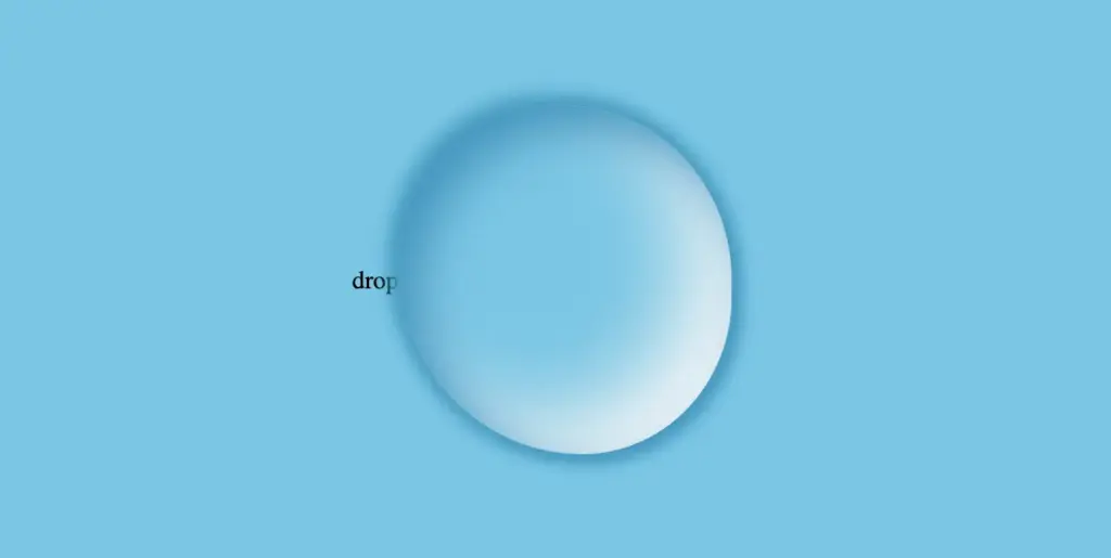
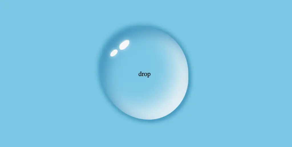
}This is what is rendered on the screen. For now, we continue to ignore the text and focus on our almost-ready 🙃 amazing drop!


Adding shine to the water drop
By utilizing the CSS properties :before and :after, we can create two new pseudo-elements without the need for additional HTML markup. This technique can be used to create a glancing effect. Both pseudo-elements have the same properties but with different values, which helps to differentiate them from each other and create a unique look.
We can effortlessly position those glances within the drop element by using the CSS property position: absolute.
Then, we specify their dimensions and the color by setting the width, height and background-color.
Next, we modify the shadows and their shape by setting the box-shadow and border-radius .
After that, we use the top and left properties to position them. Finally, to make them look even more realistic, we can add some rotation by using the transform: rotate() property.
.drop {
...
position: absolute;
}
.drop:before {
position: absolute;
content: "";
width: 14%;
height: 7%;
background-color: #f5f5f5;
box-shadow: 0 0 10px #f5f5f5;
border-radius: 60% 45% 50% 60%/60% 45% 60% 50%;
top: 15%;
left: 20%;
transform: rotate(140deg);
}
.drop:after {
position: absolute;
content: "";
width: 10%;
height: 5%;
background-color: #fff;
box-shadow: 0 0 10px #fff;
border-radius: 50% 45% 45% 60%/50% 50% 40% 55%;
top: 25%;
left: 10%;
transform: rotate(-45deg);
}After adding these glances, we can see our final drop. 💦 ✨ It’s pretty cool, isn’t it?
Adjusting text appearance beneath the water drop effect
We are moving forward by adjusting our text and making it more visually appealing. I have selected the “Lobster” font-family with a font size of 140 pixels, a warm dark orange, and a black 2px text-shadow.
In case we wish to use another font-family than the usual ones, we need to insert it into our CSS. We do so by setting the @import url(...). Ensure this statement is placed at the beginning of your CSS code snippet, just like I did. Check below. 👇
@import url('https://fonts.googleapis.com/css?family=Lobster');
.text {
font-family: "Lobster", sans-serif;
font-size: 140px;
color: #e85a5a; /* a shade of warm dark orange */
text-shadow: 2px 2px 2px black;
}Take a closer look now. The text appears so different behind the water drop. It’s quite impressive, don’t you think? 😎
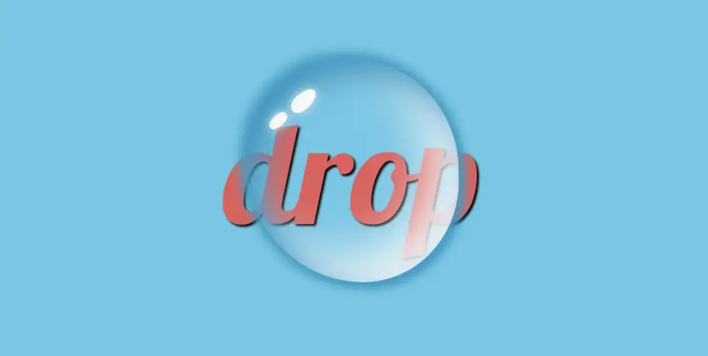
One last step, and we are ready! We are free to place our text wherever we want by setting the position: absolute , top and left CSS properties in order to move it.
We also have full control over the placement of our text. This can be achieved by confidently adjusting the CSS properties position: absolute , top and left.
.text {
...
position: absolute;
top: -45px;
left: -35px;
}The final step is complete! Congratulations! 🥳 You have the option to either keep the original design or create your own. Please remember that the most important thing is to combine the appropriate colors 🌈 and shadows; this is necessary for our drop to look realistic.


Full CSS water drop effect code (copy & paste ready)
Below is the full code referenced in this blog post. Feel free to copy and use it in your own projects. If you have any questions or encounter any issues, don’t hesitate to reach out for assistance. You can easily copy the desired code snippet by clicking on the copy icon, located in the top-right corner of each snippet.
<div class="wrapper">
  <div class="text">drop</div>
  <div class="drop"></div>
</div>@import url('https://fonts.googleapis.com/css?family=Lobster');
* {
margin: 0;
padding: 0;
box-sizing: border-box;
}
html,
body {
height: 100vh;
}
body {
background-color: #5fc8e8;
display: flex;
align-items: center;
justify-content: center;
}
.wrapper {
  display: flex;
  align-items: center;
  justify-content: center;
  position: relative;
}
.text {
position: absolute;
font-family: "Lobster", sans-serif;
font-size: 140px;
color: #e85a5a;
text-shadow: 2px 2px 2px black;
top: -45px;
left: -35px;
}
.drop {
width: 210px;
height: 220px;
background-color: transparent;
border-radius: 45% 50% 45% 55%;
box-shadow: -2px -2px 10px 5px #0f9dc4, /* all around */
5px 5px 10px #0796c1, /* top & right */
inset 15px 15px 30px #0796c1, /* inset top & right */
inset -29px -20px 50px #f2f4f7; /* inset left & bottom */
position: absolute;
}
.drop:before {
position: absolute;
content: "";
width: 14%;
height: 7%;
background-color: #f5f5f5;
box-shadow: 0 0 10px #f5f5f5;
border-radius: 60% 45% 50% 60%/60% 45% 60% 50%;
top: 15%;
left: 20%;
transform: rotate(140deg);
}
.drop:after {
position: absolute;
content: "";
width: 10%;
height: 5%;
background-color: #fff;
box-shadow: 0 0 10px #fff;
border-radius: 50% 45% 45% 60%/50% 50% 40% 55%;
top: 25%;
left: 10%;
transform: rotate(-45deg);
}