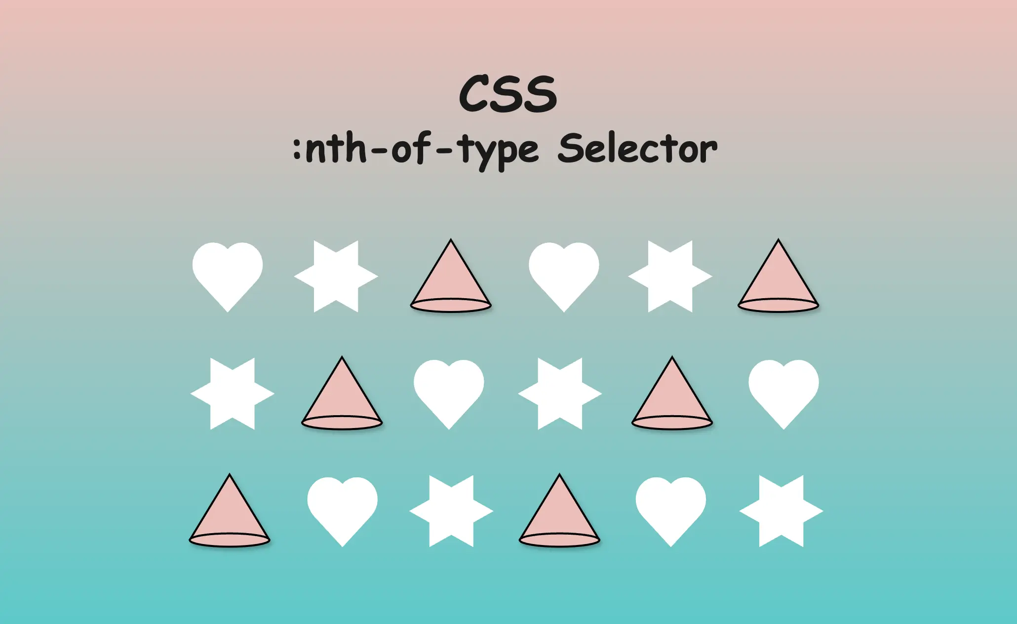
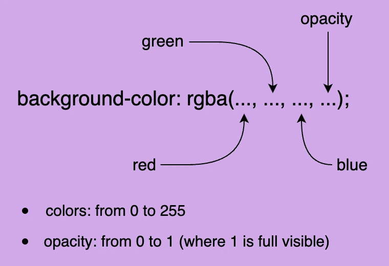
Hello there! Today, we’ll explore how the CSSnth-of-type() selector works. This powerful CSS selector allows us to targetevery nth childHTML elementof a specific type within its parent container.
Below, I prepared some examples to analyze this amazing pseudo-class thoroughly.
Basic HTML structure
We begin with the HTML structure. We create an <article> HTML element. It contains two headings (<h1> , <h2>) elements. Also, we include some <p> and <div> HTML elements. The example may seem slightly complicated, but it is the right way to understand just how useful 🛠 tool this selector can be. 😃 For now, we’ll maintain the default styling with a white background and black text.
🔖 Please note that this HTML code snippet will be used across all examples.
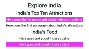
<article><h1>Explore India</h1><h2>India's Top Ten Attractions</h2><p>Here goes the 1st paragraph about India's attractions</p><p>Here goes the 2nd paragraph about India's attractions</p><h2>India's Food</h2><div>Here goes text about India's cusine</div><div>Here goes text about India's cusine</div></article>
HTML
Below, we can see what is rendered on the screen 💻 for now. It’s just a simple article in a newspaper 🗞 or on the internet. At least as articles were once upon a time 😂 just text, no images, and no special styling. Don’t worry; it works well for us!
Targeting a specific HTML element
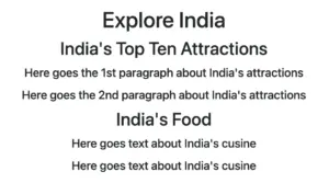
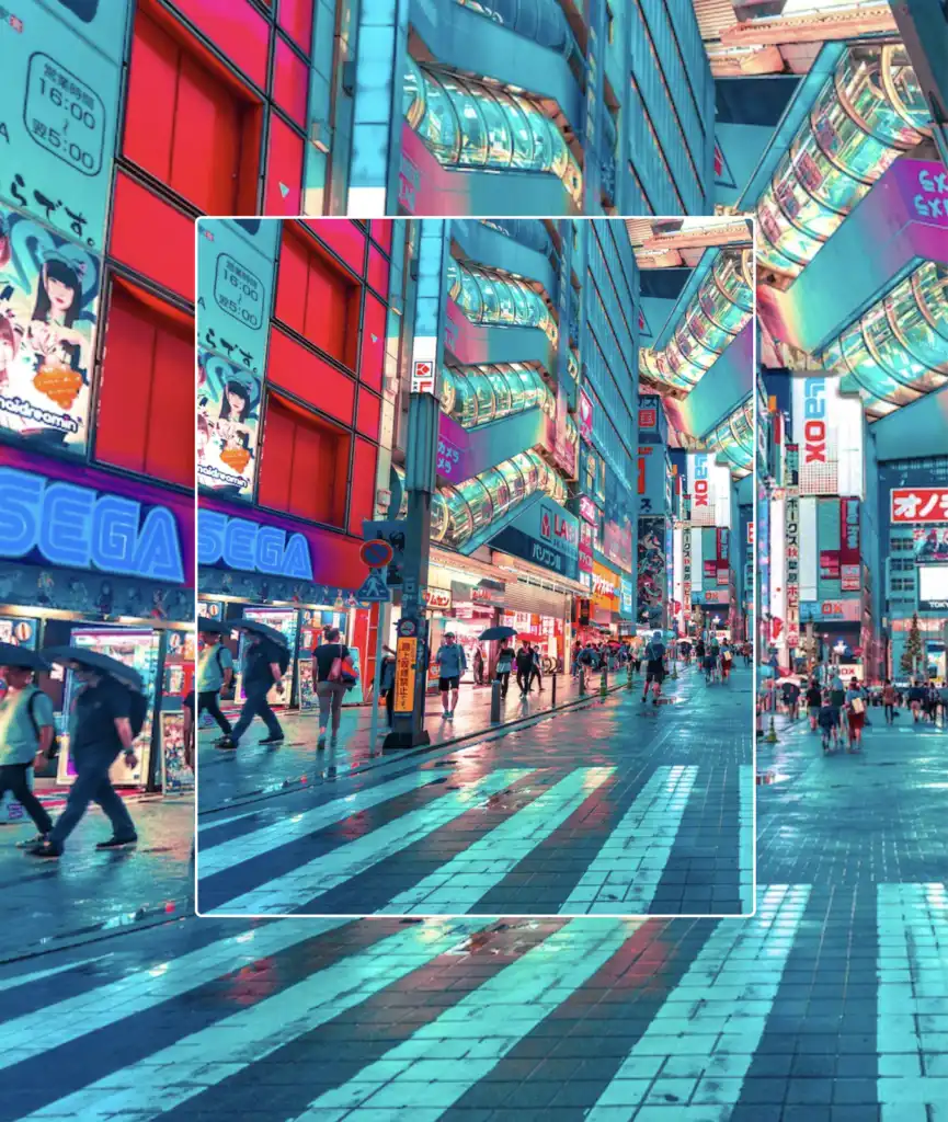
Now let’s explore how this selector works. We start by using the nth-of-type() selector, preceded by h2, and placing the number 1 inside the parentheses (). This targets the very first<h2> element within our <article> parent.
In the following image, we can see the result of the applied nth-of-type selector.
Targeting all elements of a specific type
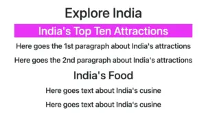
We continue and dive a bit deeper! We place h2 before our nth-of-type() selector, but this time, we add the n inside the parentheses(). By doing so, we target all<h2> elements within our parent element.
The n in nth-of-type(n) enables the selector to match elements at any position among siblings. This means you can apply styles to all matching elements without specifying an exact position, ensuring that every instance is included.. 😎
Additionally, we have the option to use the nth-of-type() selector to target more than one different type of HTML elements. In our case, we set the p:nth-of-type(1) to target the first <p> element and also the div:nth-of-type(2) to target the second <div> element.
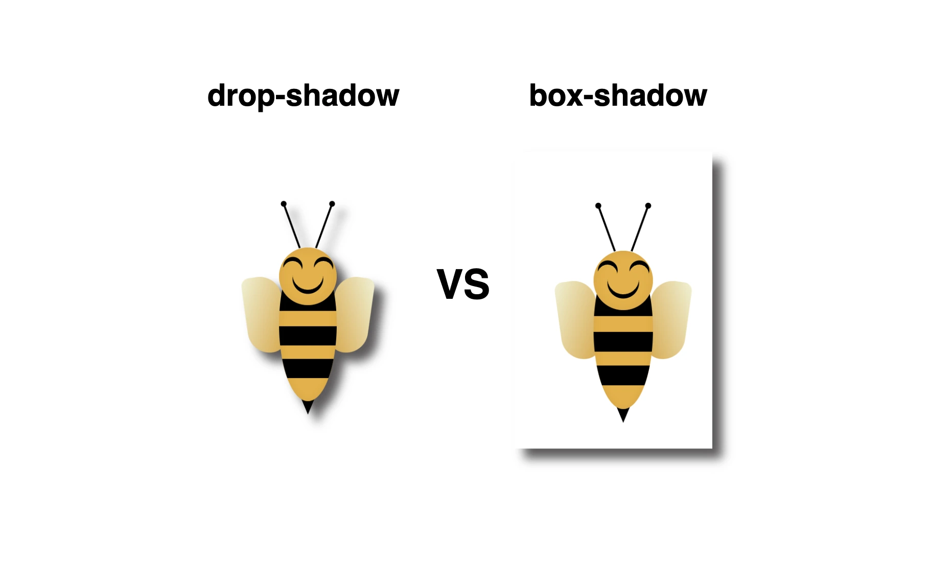
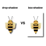
Greetings 😃 In today’s session, we’re about to explore 🔎 the fascinating world of the CSS shadow properties. Get ready to unlock 🗝 the secret between CSS drop-shadow and box-shadow properties!
I created a beautiful, playful bee 🐝 to make our example understandable and funny! You can check out my “bee code” at the end of my post and see how I created it. You are welcome to use it wherever suits you!
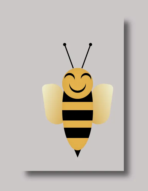
CSS box-shadow
Now, let’s focus on our shadows! In the following example, we see the effect of the box-shadow property. Our shadow is applied to the two sides of our box (bee-wrapper). The code I provided creates a gray shadow with the following characteristics:
offset-X: adds 10 pixels to the right of the element.
offset-Y: adds 10 pixels below the element.
blur-radius: A blurry shadow with a radius of 10 pixels. (You are free to use a higher blur radius for a softer, more diffuse shadow, or you might opt for a lower blur radius to create a sharper, crisper shadow).
spread-radius: The shadow doesn’t expand or contract beyond the blur radius as I set it to zero. (I chose not to add spread, but it’s totally up to you if you want to add it. 🔖 Keep in mind that the spread-radius parameter determines whether the shadow expands or reduces in size. A positive value will enlarge the shadow, whereas a negative value will shrink it).
color: The color of the shadow is a shade of gray (#5b5959).
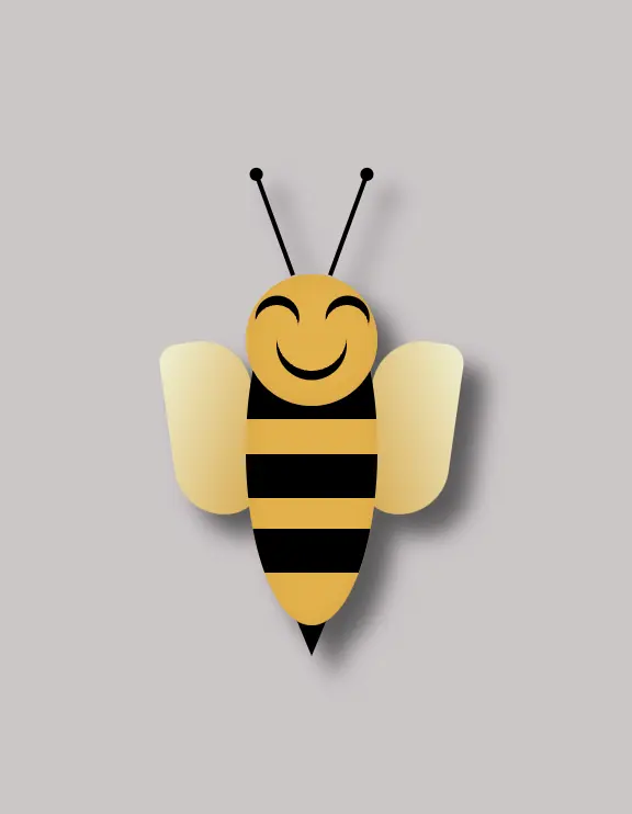
CSS drop-shadow
In this case, on the other hand, we can see that by setting the filter: drop-shadow() property the shadow applies smoothly to all parts of our content inside the box (bee-wrapper). Cool 🥳 ha! So, let’s see our code in more detail and how the shadow will now be rendered on the screen through our lovely bee!
filter: The filter property in CSS applies various graphical effects, including blurs, color adjustments, and, in this instance, shadows, to an element.
offset-X: This specifies the horizontal offset of the shadow from the element. It’s 10 pixels to the right, creating a shadow on the right side of the element.
offset-Y: This specifies the vertical offset of the shadow from the element. It’s 10 pixels below the element, creating a shadow below it.
blur-radius: A moderately blurry shadow with a radius of 5 pixels. (A higher value would create a more diffused and softer shadow, while a lower one would create a sharper shadow).
color: The shadow’s color is a shade of gray (#5b5959).
🔖 It is worth mentioning that spread-radius property does not appear here.
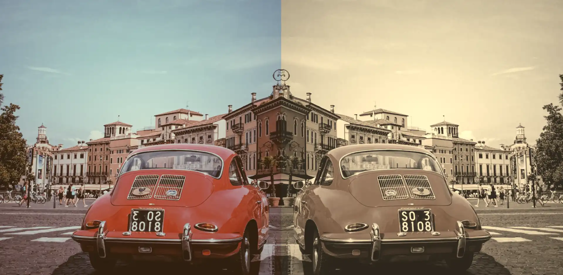
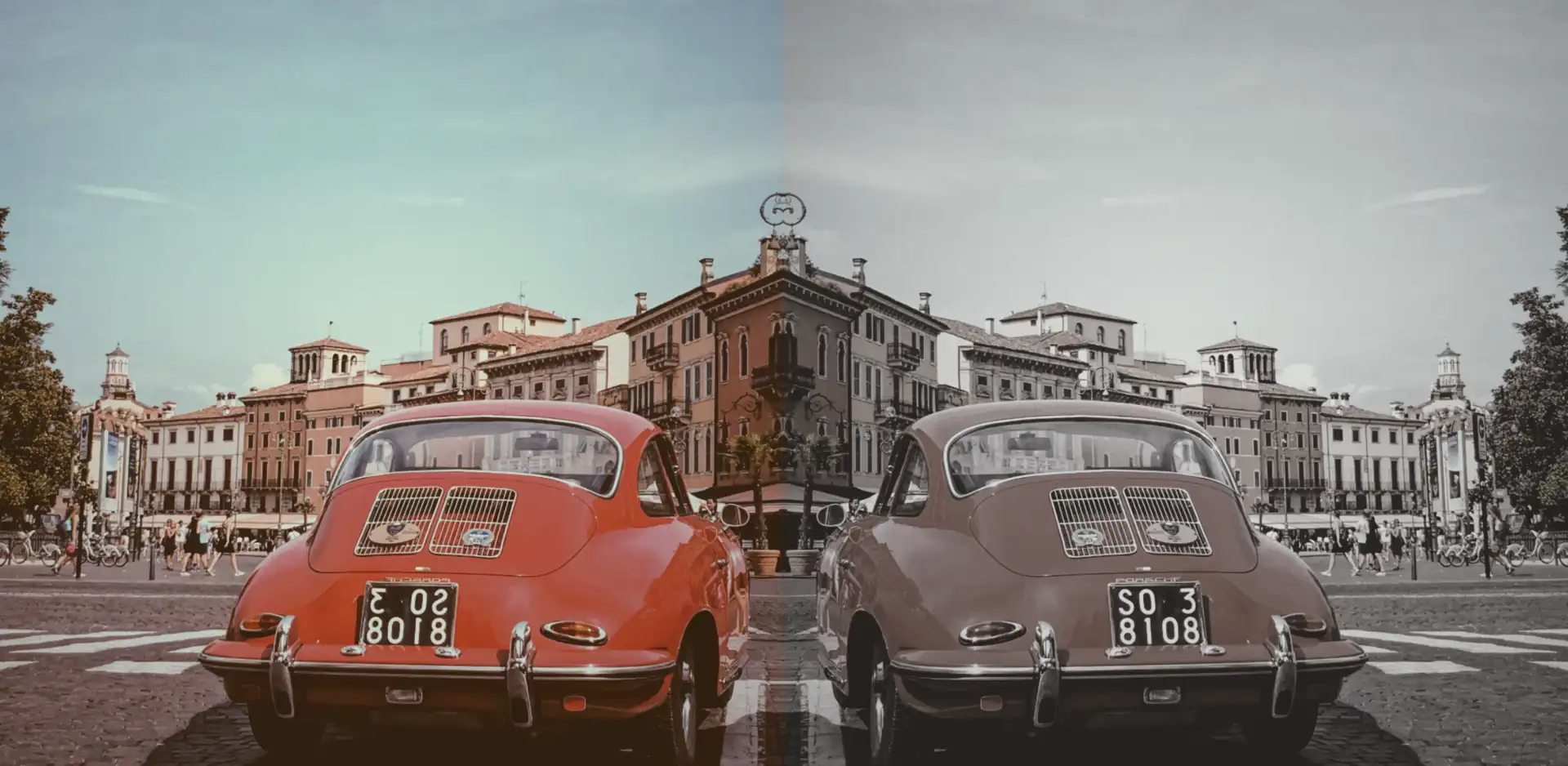
In the world of web design, adding a touch of nostalgia or a vintage vibe to images can significantly enhance a website’s aesthetic. One timeless technique to achieve this effect is the CSS sepia filter.
Originating from sepia ink, which has been used for centuries, this filter gives photos a warm, brownish tone reminiscent of old photographs, lending a sense of history and charm to the visuals.
An image with 0% sepia maintains its original, true colors, while at 100% sepia, the image is entirely transformed into a warm, brownish tone as an aged photograph. As you increase the percentage, you intensify the sepia effect.
Join me 😃 into the magic of the filter: sepia(%) CSS property and explore how it can be seamlessly integrated into your web design toolbox.
History of the sepia ink
🧐 Did you know that sepia ink is a brownish-black ink made from the ink sac of the common cuttlefish, Sepia? 🐙 They belong to the class Cephalopoda, which also includes squid, octopuses, and nautiluses.
Historically, it has been used for writing and drawing, and it was particularly popular in the past for writing manuscripts and creating artwork.
The ink took its name from the sepia cuttlefish, which was the source of the ink. The ink was widely used in antiquity and during the Renaissance*, and it has a characteristic warm, brownish hue which is why the CSS filter that replicates this effect is referred to as the “sepia” filter.
(* The Renaissance was a period in European history that spanned roughly from the 14th century to the 17th century. It was characterized by a significant cultural, artistic, and intellectual rebirth after the Middle Ages. The term “Renaissance” is derived from the French word meaning “rebirth”).
Use the CSS sepia filter to an image
Below I craft an example as an easy way to explain this amazing CSS property to you! 😃 So, let’s proceed.
We will start with our HTML and CSS code snippets.
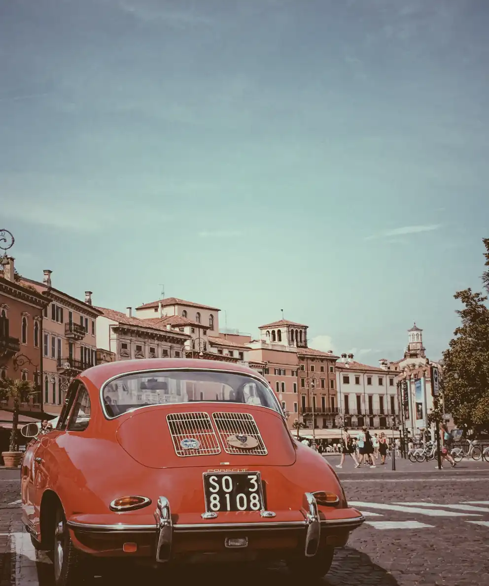
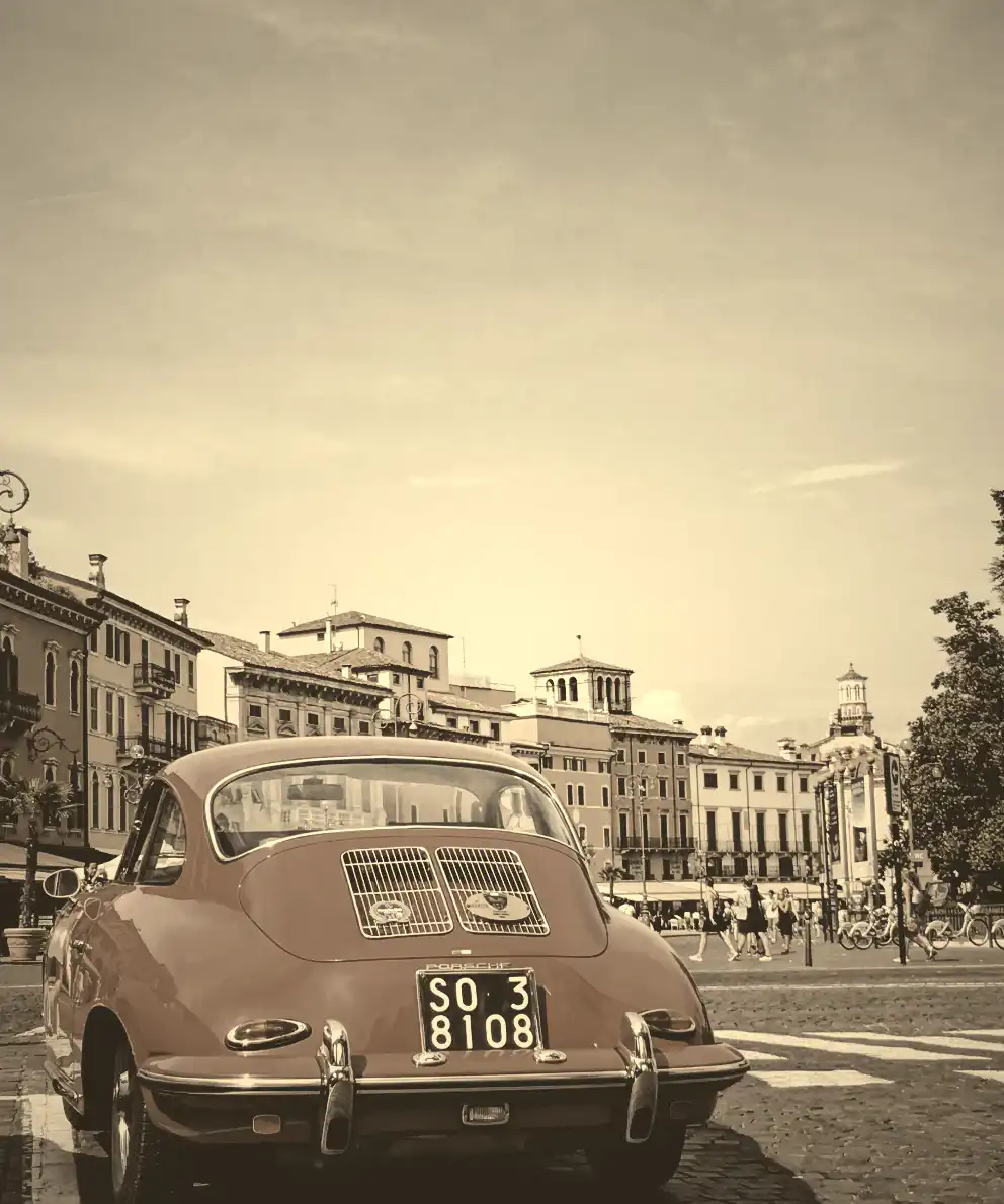
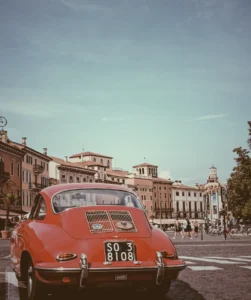
The HTML snippet contains two <img> elements. The first one has the .original-image class, indicating a standard image. The second one has also the .original-image and additionally the .with-sepia, implying it’s a styled image using the sepia filter, giving it a warm, brownish tone.
The .original-image class is shared by both image elements, setting a background image, ensuring it doesn’t repeat and covering the specified width and height (400px by 500px).
The .with-sepia class applied only to the second image, introduces a sepia filter of 80%, giving a warm, brownish tone.
Enrich filter CSS sepia property with grayscale value
In addition, we can add the filter: grayscale(%) CSS property. Together, these filters can create a unique and visually captivating presentation, capturing the essence of both the past and the present in a single frame.
Transforming your images into stunning black-and-white tones with depth and texture has become easier than ever with the powerful grayscale filter. Adding a touch of gray to your images creates a modern vibe and turns them into art. To achieve this effect, we use the CSS filter: grayscale(%) property.
The grayscale filter allows you to adjust the percentage of gray. When you increase the percentage, you boost the effect. An image with 0% grayscale maintains its authentic colors, while at 100% grayscale, the image is entirely transformed into a cold, grayish tone.
Join me 😃 in the magic of the grayscale filter, explore how it can be merged harmoniously, and enhance your techniques.
Monochrome – Grayscale method
The grayscale method, or in other words, monochrome photography method, captures and displays different levels of light but not different colors. It includes all forms of black-and-white photography, which produces images with shades of gray ranging from black to white.
It originated in 1820 when Nicephore Niepce, a French inventor and photographer, created the first photograph. In today’s world, monochrome photography is mainly used for applications other than photographs.
Applying the grayscale filter to an image
Below, I’ve prepared an example to help clarify this property for you! 😃 So, let’s move forward.
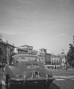
The HTML snippet includes three img elements. The first one has the .original-image class, indicating a standard image. The second and the third also have the .original-image plus the .with-grayscale class, meaning it’s a styled image using the grayscale filter, giving it a cold, grayish tone.
The .original-image class is applied to all image elements, setting a background image, ensuring no repetition, and covering the specified dimensions of 400px width and 500px height.
The .with-grayscale class applied only to the second and third images, introduces a grayscale filter. In the second case, it is set at 50%, displaying our image with some grayish tones, while in the third case, it is set at 100%, decolorizing our image and declaring a completely gray tone.
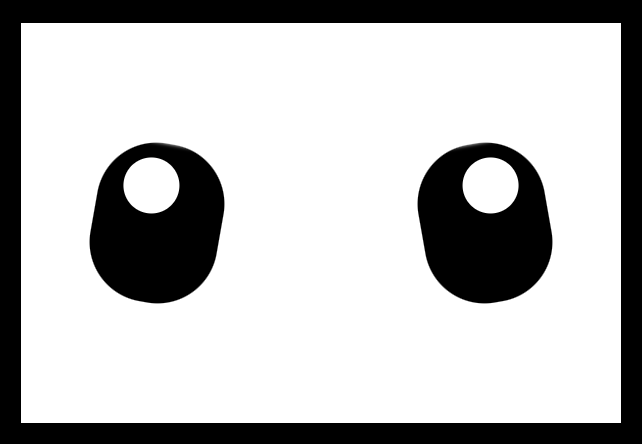
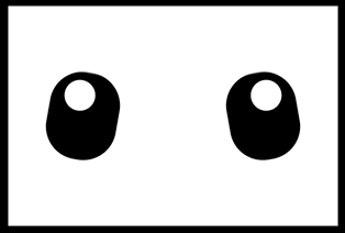
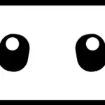
Hey there! In this post, I will show you how to create a pair of blinking eyes effect using only CSS (SCSS), complete with a smooth blinking animation to bring the eyes to life.A cow’s pair of eyes! Yes, yes, you read it right! We are dealing with a hidden 🐮 cow! Below, you can see our new 🐄 friend, with flesh and bones.
We are dealing with a hidden 🐮 cow!
HTML Structure
Firstly, let’s build our blinking eyes’ initial structure using only HTML:
Secondly, we continue by enhancing our HTML with CSS, starting from the body. We use flexbox as we want to place our face container in the center of our screen.
body {height: 100vh; // gives us the full screen-size heightbackground-color: black;display: flex;align-items: center;justify-content: center;}
CSS
CSS Face Structure
Next, we add our face container styling in order to be ready for our eyes’ positioning. We set background-color: white; just for contrast since our eyes will be black. Afterward, we use display: grid; and place-items: center; because we want our container’s children, our eyes, to get centered.
Afterward, we continue by creating our beautiful cow’s 👀 eyes.
.face { ....eye {position: absolute;width: 64px;height: 80px;background-color: black;border-radius: 30px;overflow: hidden;&:before { // iriscontent: "";position: absolute;width: 28px;height: 28px;background-color: white;border-radius: 50%; } // end of before &--left { // position of left eyeleft: 200px;transform: rotate(-10deg);&:before { // position of left iristop: 8px;right: 12px; } }&--right { // position of right eyeright: 200px;transform: rotate(10deg);&:before { // position of right iristop: 8px;left: 12px; } } } // end of eye } // end of face
SCSS
Adding the blinking animation
Now is the right time, drum 🥁 roll, to add our blinking animation 😉 .
.face { ....eye { ...&:after { // eyelid content: "";position: absolute;/* takes the same width as the eye (width: 64px;) in order to cover the whole eye when blinking */width: 100%;/* we need 0 initial height - as our starting point before the animation runs */height: 0%;background-color: white;border-radius: 30px;box-shadow: 1px-2px2px2pxwhite;/* here we add our "blink" animation since this is the html part (:after - blinking) we want to make animate. We want the animation to repeat every 4 seconds forever. */animation: blink4sinfiniteease-in; } // end of after } // end of eye} // end of face/* we name our animation "blink". We set different height percentagesas a way to set our eye lids STAY IN DIFFERENT PART each time */@keyframesblink {0% {height: 0%; }30% {height: 0%; }33% {height: 100%; }40% {height: 0%; }70% {height: 0%; }75% {height: 100%; }78% {height: 0%; }81% {height: 100%; }84% {height: 0%; }100% {height: 0%; }}
SCSS
Hint 💡 Moreover, you should apply box shadow (check code above) to make the blinking eyelid overflow the eyes’ borders. This way during the blinking animation it will cover the whole eye and make it more realistic!
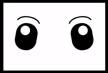
Finally, we add the 🤨 eyebrows to complete the gaze.
.face { ....eye { ... } /* end of eye */.eyebrow {position: absolute;width: 70px;height: 20px;border: solid4pxblack;border-color: blacktransparenttransparenttransparent;border-radius: 50%/20px20px00;top: 40px;&--left {left: 40px;transform: rotate(10deg); }&--right {right: 40px;transform: rotate(-10deg); } } /* end of eyebrow */} /* end of face */
SCSS
Complete code solution
Below is the full CSS code referenced in this blog post. Feel free to copy and use it in your projects.
body {height: 100vh; // gives us the full screen-size heightbackground-color: black;display: flex;align-items: center;justify-content: center;}.face {position: relative;width: 300px;height: 200px;background-color: white;display: grid;place-items: center;.eye {position: absolute;width: 64px;height: 80px;background-color: black;border-radius: 30px;overflow: hidden;&:before { // iriscontent: "";position: absolute;width: 28px;height: 28px;background-color: white;border-radius: 50%; } // end of before &:after { // eyelid content: "";position: absolute;/* takes the same width as the eye (width: 64px;) in order to cover the whole eye when blinking */width: 100%;/* we need 0 initial height - as our starting point before the animation runs */height: 0%;background-color: white;border-radius: 30px;box-shadow: 1px-2px2px2pxwhite;/* here we add our "blink" animation since this is the html part (:after - blinking) we want to make animate. We want the animation to repeat every 4 seconds forever. */animation: blink4sinfiniteease-in; } // end of after&--left { // position of left eyeleft: 200px;transform: rotate(-10deg);&:before { // position of left iristop: 8px;right: 12px; } }&--right { // position of right eyeright: 200px;transform: rotate(10deg);&:before { // position of right iristop: 8px;left: 12px; } } } // end of eye .eyebrow {position: absolute;width: 70px;height: 20px;border: solid4pxblack;border-color: blacktransparenttransparenttransparent;border-radius: 50%/20px20px00;top: 40px;&--left {left: 40px;transform: rotate(10deg); }&--right {right: 40px;transform: rotate(-10deg); } } /* end of eyebrow */} // end of face@keyframesblink {0% {height: 0%; }30% {height: 0%; }33% {height: 100%; }40% {height: 0%; }70% {height: 0%; }75% {height: 100%; }78% {height: 0%; }81% {height: 100%; }84% {height: 0%; }100% {height: 0%; }}
Hello there! 😃 In CSS, we have a really helpful property called backdrop-filter. It’s like a special filter that applies grayish shades to the backgrounds. A useful tool when we want to focus on a part of the webpage without changing the actual element itself. Mm… 🤔 that is a little bit tricky! Isn’t it? Let’s grab a cup of coffee ☕ and move forward! We will clarify everything in this post about using a grayscale backdrop filter. 👩💻
How the backdrop filter works
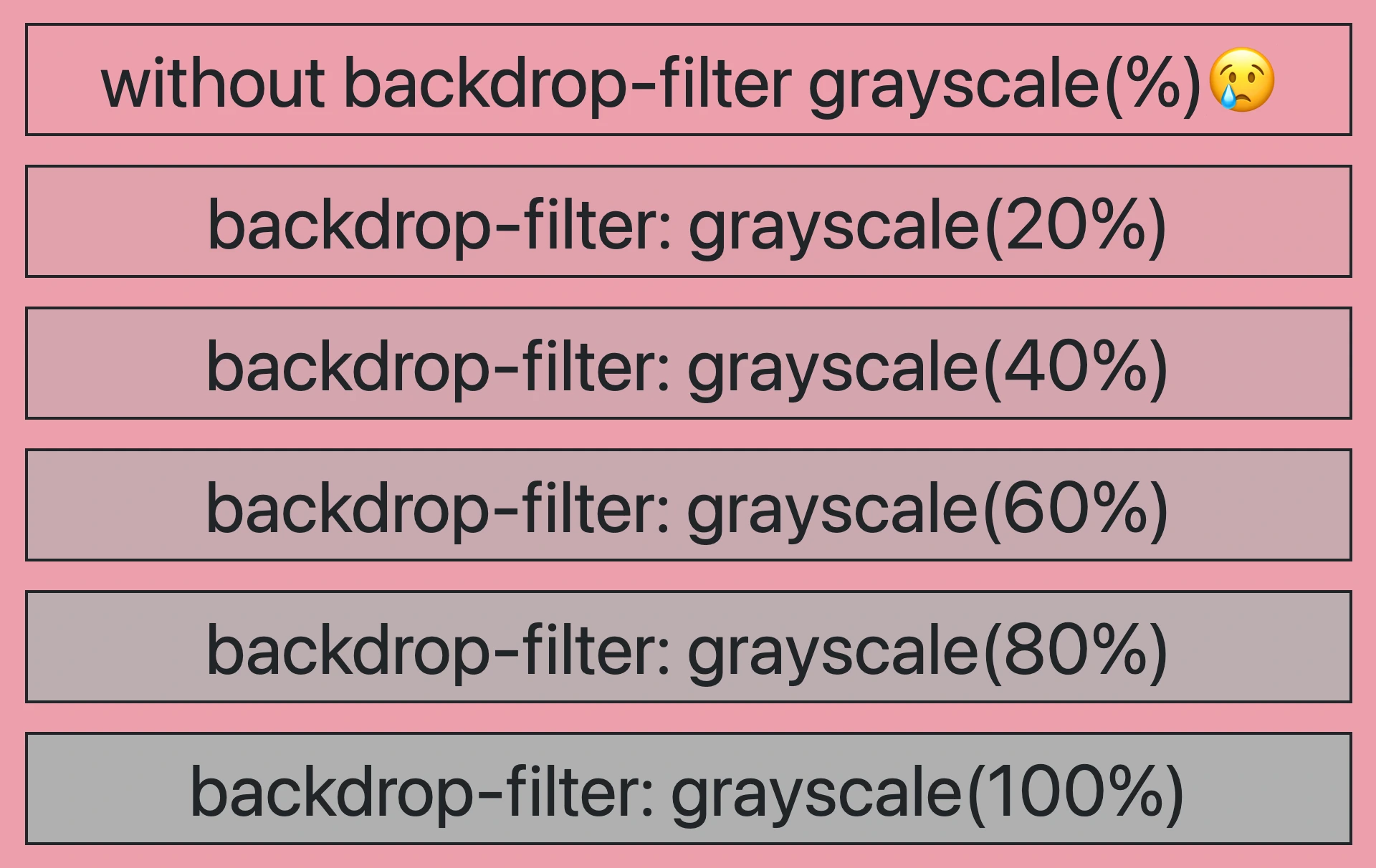
So, how does this property really work? We will begin by setting the backdrop-filter property to grayscale(percentage), where the percentage determines the intensity of the grayscale effect, ranging from 0% to 100%. A value of 100% turns the color into a complete grayscale color, while a value of 0% will keep the element’s original color shades without any grayscale effect.
This CSS property is not quite noticeable on black or white backgrounds because it adds shades of gray, and black is already the darkest shade while white is the lightest one. In simpler words, black and white will not get converted to grayscale because it already belongs to the darkest side of grayscale.
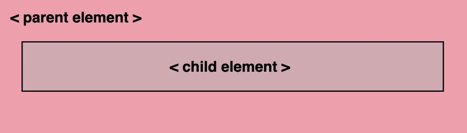
For the filter to work properly, as a first step, we need to set the background-color property of the parent element. Afterward, we add the backdrop filter to the child elements we want to apply the grayscale effect. The backdrop filter will only affect the child element’s background color but not its content, text, images, etc.
As a result, the parent element maintains its original background color, while the child element’s background is desaturated, creating a monochromatic, grayscale effect.
Create a grayscale backdrop filter effect
This HTML and CSS code above creates a <section> element (father) with a <p> element (child) inside. The section has a background color in a shade of pinkish peach, defined by the hex color code #f99bab. Initially, the paragraph inherits the same background color.
<section><p>...</p></section
HTML
/* PARENT ELEMENT */section {background-color: #f99bab; // a shade of pinkish peach}/* CHILD ELEMENT */p {backdrop-filter: grayscale(50%);}
CSS
We continue with the <p> element styled by a backdrop-filter with a grayscale value of 50%. This effect visually desaturates the paragraph’s background (the paragraph inherits its background from its parent, the section). This means that the colors where the backdrop filter is applied (the area behind the element) will be desaturated to 50%. As a result, a grayscale effect will be applied where the colors are halfway between their original color and grayscale while leaving the content unaffected.
In simple terms, by setting this code, we create a parent element with a shade of pinkish peach-colored background, and its child element has a somewhat muted, desaturated appearance while at the same time retaining some of the original pink color.
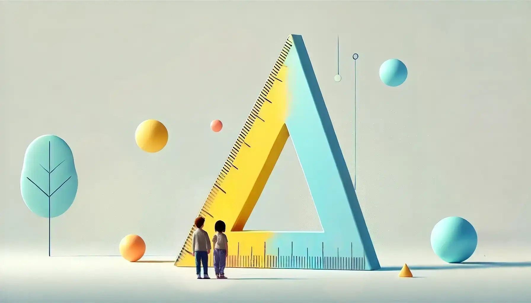
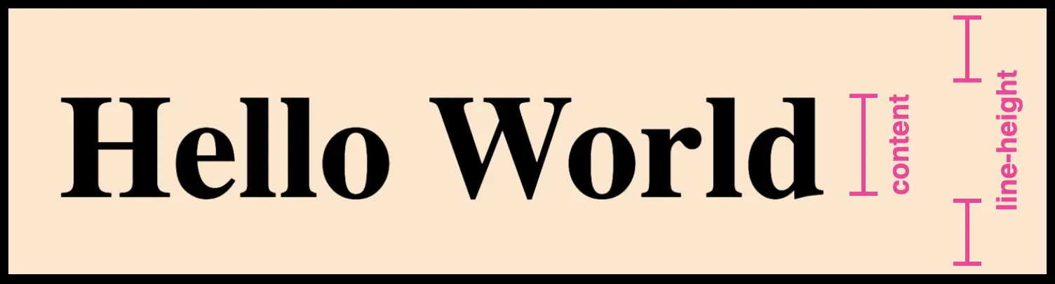
Hello there! 😃 Today, we’ll explore how we can calculate the CSS line height property, which defines the height of a line on a webpage. Each line contains the main content (text) as well as the space above and below the content ↕ (line-height). While the default value for desktop browsers is 1.2, we should keep in mind that it can vary depending on the font family. We can also set a custom line-height according to our preferences.
⛔ Please note that the system does not accept negative values. The default value will be automatically used if a negative value is entered.
Below, I have drafted a plan that might help you understand things better. Check it out:
Below is an example to explain this CSS property more analytically.
HTML structure for CSS line height
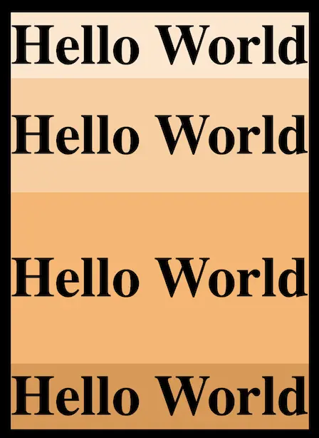
We create an HTML document with four headings <h1> . All headings have the same content (text) but different classes, each with unique characteristics concerning the line-height.
We will move forward with our CSS code and add the necessary characteristics. The first heading has a class with line-height: normal, the second one has a class with line-height: 200px, the third one has a class with line-height: 300px, and the fourth has a class with line-height: -300px (⛔ negative value).
I am using different background-color for each class to easily distinguish them and notice the results clearly. 😉
In the image that follows, we can see the differences between the four headings regarding their line-height ↕.
Utilizing the line-height CSS property can significantly improve text clarity and visual appeal, creating a comfortable reading experience for users. ✨ 😃
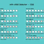
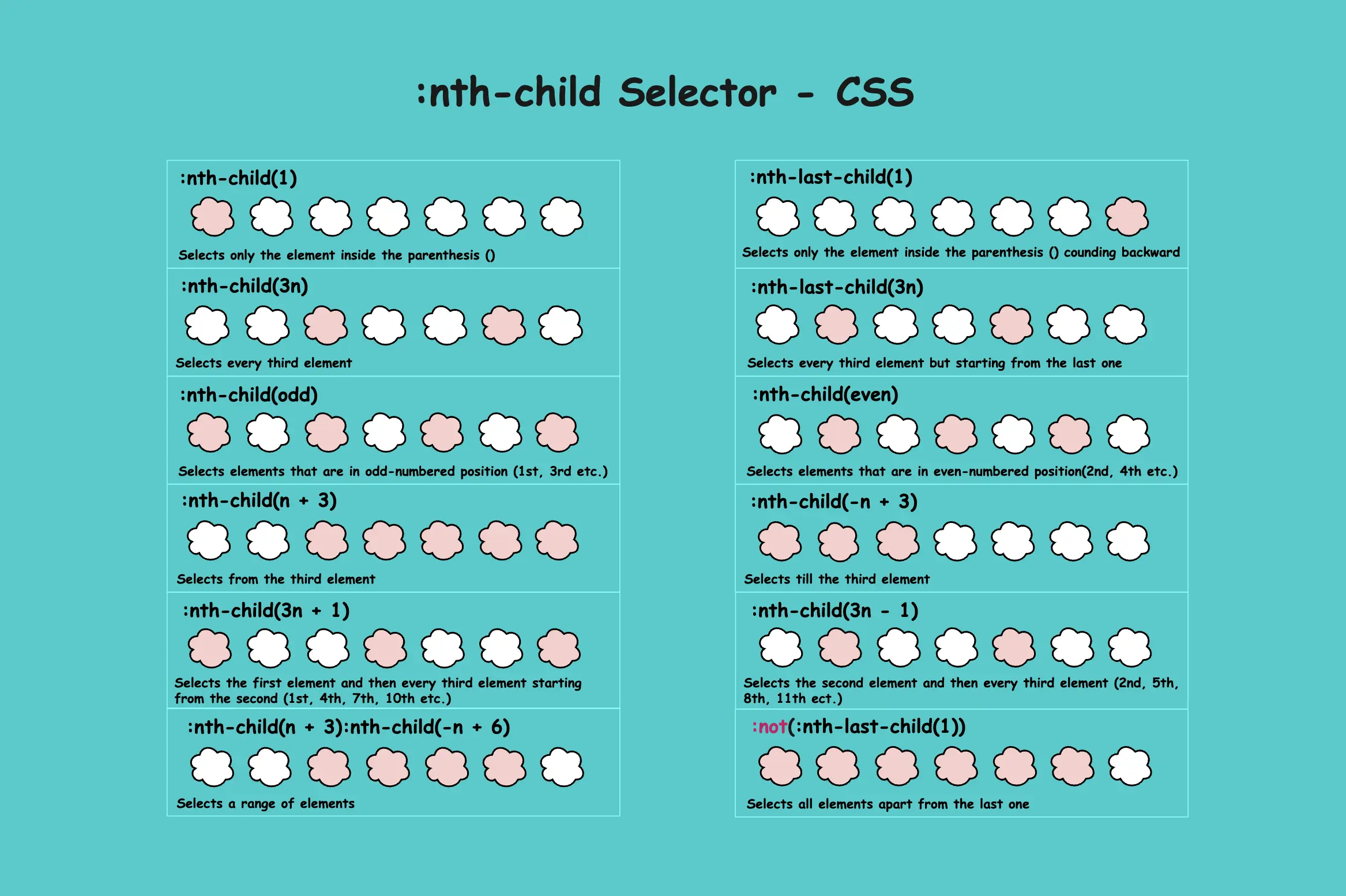
The CSS nth child selector is an extremely useful tool for targeting and styling the nth element within a group of similar HTML elements on a webpage. It’s really handy for organizing your code and helps you pick elements based on their position in a sequence. It’s also part of a larger group of selectors.
You can apply specific styles like color or size to just that nth item or to combinations with the nth item in a list or group, making it different from all the others.
The “nth” is a mathematical term that refers to any position in a list or sequence, such as the first, second, third, and so on. A sequence is a set of numbers or elements that follow a particular pattern or rule.
Below are examples of utilizing this selector. Let’s proceed and explore its uses in more detail. 🧐
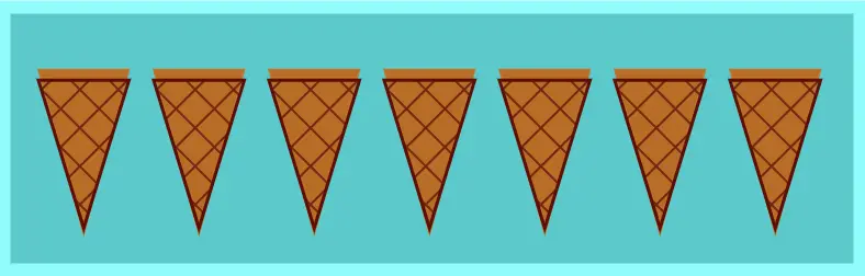
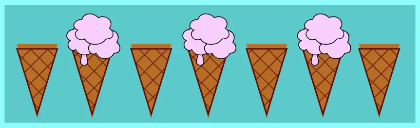
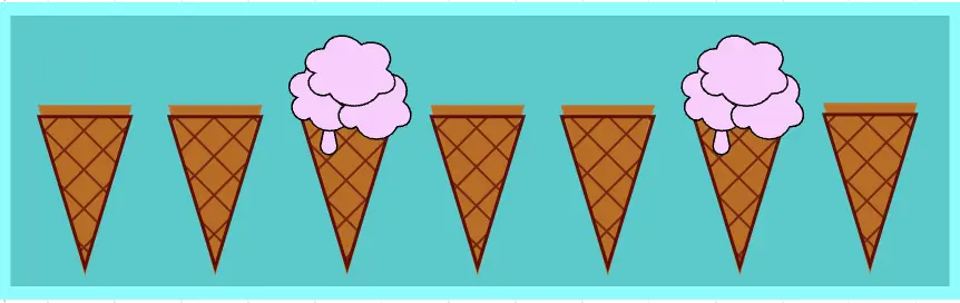
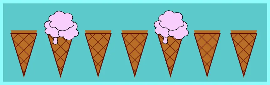
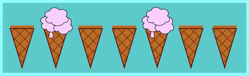
We will use the same HTML code snippet for all instances. We have seven child elements inside our body element. Each one represents an ice cream cone. Yes! You read correctly! An ice cream cone! Let’s make our learning a bit fun! The empty cones remain unaffected, while the cones that have ice cream strawberry 🍓 flavor 🍦 on top are styled based on thenth-child()selector.
Let’s imagine that what you see below would be rendered on the screen if each div child element was actually a cone.
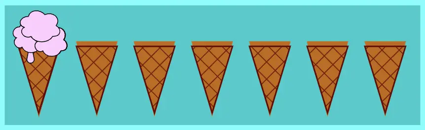
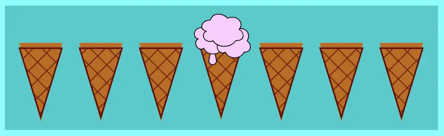
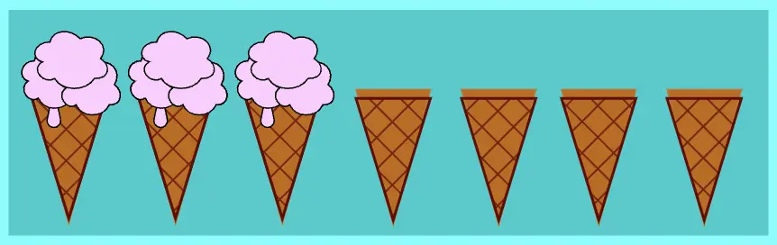
Styling the first element with nth-child(1)
The nth-child(1) selector targets and styles only the first element. So, in our case, we add ice cream strawberry 🍓 flavor 🍦 only to the top of the first cone. All the other cones remain unaffected.
div:nth-child(1) {background-color: pink;}
CSS
* If we want to target the third child, use:nth-child(3), and similarly for other positions.
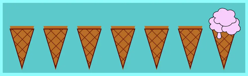
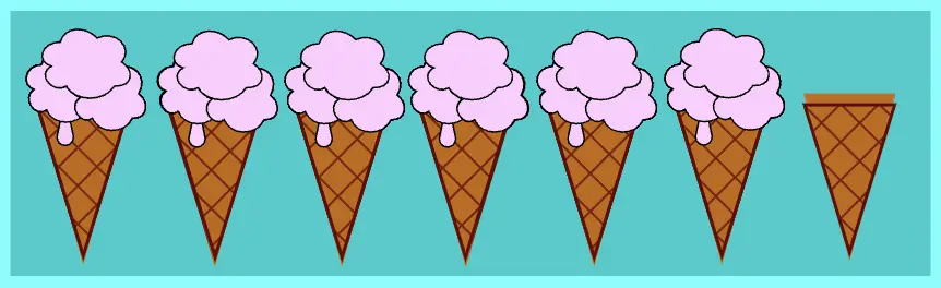
Styling only the last element with nth-last-child(1)
The nth-last-child(1) selector targets and styles only the last element as it counts backward. That’s why we added the word last in our selector. So that it will pick the first (1) element from the endof the list.
div:nth-last-child(1) {background-color: pink;}
CSS
* If we want to pick the fourth child from the end, we set the:nth-last-child(4), etc.
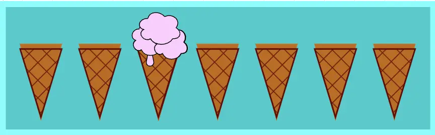
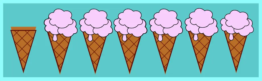
Select all elements apart from the last one
Combing the nth-last-child selector with the not pseudoclass, we can target and style all elements apart from the last one. That’s why, in this example, we added the word :not and then the word last in our selector, indicating we wanted all but not the last one(1). 🤔
*If we want to pick all elements apart from the first one we can erase thelastword and set the:not(:nth-child(1))etc.
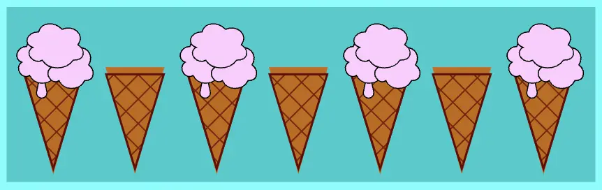
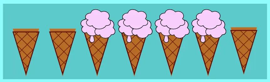
Target every odd child element
Using the word “odd” in our nth-child selector we can target and style every other element, specifically the 1st, 3rd, 5th, 7th and so on
*Odd numbers are those that, when divided by 2, always leave a remainder of 1.
div:nth-child(odd) {background-color: pink;}
CSS
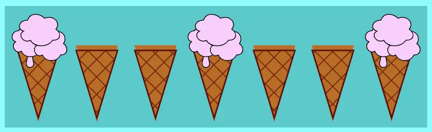
Target every even child element
Just as we did for odd elements, we can also target even elements by using the keyword “even” in our nth-child selector. This allows us to style every second element, specifically the 2nd, 4th, 6th, and so on
*Even numbers are those that can be divided by 2 and leave no remainder.
The nth-child() selector offers great flexibility, allowing us to create combinations that target multiple child elements simultaneously.
Selecting elements based on multiplying by the nth-child()
By using nth-child(3n) we target every third element. In this example, the 3rd element is the first one selected. From there, we move three steps forward forward to the next target, which is the 6th element.
The n in 3n starts at 0 and increases incrementally with each integer (0, 1, 2, 3…). By multiplying n by 3 we target elements at positions that are multiples of 3 (0, 3, 6, 9…).
div:nth-child(3n) {background-color: pink;}
CSS
Select elements based on multiplies with the nth-child(), counting backward
When using the nth-last-child(3n)selector we target every third element, but this time, it starts counting from the end. In our case, we have seven elements. Starting counting from the 7th one, the 5th element is the first we pick. Then we continue by taking three steps backward to the second choice, which is the 2nd element.
The n in 3n starts at 0 and increases incrementally with each integer (0, 1, 2, 3…). The number 3 we assign to n shows multiplies of it, but we also have the last word in our selector, which indicates we start counting from the last child towards the first one.
div:nth-last-child(3n) {background-color: pink;}
CSS
Pick elements that appear after a specific point
This one seems more complicated. 😰 Let’s analyze it a bit more! 🧐
When using the nth-child(n + 3) selector, we are targeting the third element and all subsequent elements. If we use n + 5, it would start counting from the fifth element onward, including the fifth element itself, and continue until the end.
The (n) starts at 0 and increases incrementally with each integer (0, 1, 2, 3…). The (+ 3) means that the selector starts matching from the 3rd element onward.
Here’s how n works under the hood:
n=0 selects the 3rd element (0 + 3 = 3). n=1 selects the 4th element (1 + 3 = 4). n=2 selects the 5th element (2 + 3 = 5). n=3 selects the 6th element (3 + 3 = 6). n=4 selects the 7th element (4 + 3 = 7).
div:nth-child(n + 3) {background-color: pink;}
CSS
Select elements that appear up to a specific point
Using nth-child(-n+3), the selector targets elements up to a specific point, setting a limit to which element will stop. In our case, it picks and styles all the elements up to and including the third element.
The (n) represents 0. The (-n) by itselft is not used in CSS selectors because it does not correspond to any valid child positions. However when combined with a positive number (e.g. :nth-child(-n + 3)), it allows to select the child elements up to and including the specified position, such as the 3rd child. The (+ 3) part of the selector means that the selector matches elements up to and including the 3rd element..
Here’s how n works in practice:
n=0 selects the 3rd element (-0 + 3 = 3). n=1 selects the 2nd element (-1 + 3 = 2). n=2 selects the 1st element (-2 + 3 = 1). n=3 selects no child element (-3 + 3 = 0). 😮
div:nth-child(-n + 3) {background-color: pink;}
CSS
:nth-child(n + X) targets every element from the Xth onward, ensuring the Xth element is also included. WHILE :nth-child(-n + X) targets every element up to and including the Xth element.
Pick a range of elements
If we combine the previous two types of the nth-child selector, we can pick and style a portion of elements. In our example, all elements between the 3rd and the 6th element. Both the start (3rd element) and the end (6th element) are included.
The :nth-child(n + 3) selector targets all children starting from the third element onward.
The :nth-child(-n + 6) selector targets all children up to the sixth element.
Select the first element and then every third element
The n starts at 0 and increases by 1 with each step, representing all integer values (0, 1, 2, 3, …)
Using the expression (n + 1) we determine which elements we want to pick.
By applying the multiplier 3n, we instruct CSS to target every third element in the sequence.
Combining all those charectistics we get:
When n is 0, 3n + 1 => 3 * 0 + 1 = 1, so it selects the 1st child. When n is 1, 3n + 1 => 3 * 1 + 1 = 4, so it selects the 4th child. When n is 2, 3n + 1 => 3 * 2 + 1 = 7, so it selects the 7th child, etc.
div:nth-child(3n + 1) {background-color: pink;}
CSS
Choose the first element and then every third element, counting backward
Same as before, but this time, we start picking elements from the end, as indicated by the word last in our selector.
The n starts at 0 and increases by 1 with each step, representing all integer values (0, 1, 2, 3, …)
Using the expression (n + 1) we determine which elements we want to pick.
By applying the multiplier 3n, we instruct CSS to target every third element in the sequence.
Let’s see how that works:
When n is 0, 3n + 1 => 3 * 0 + 1 = 1, so it selects the 1st child from the end which is the 7th child. When n is 1, 3n + 1 => 3 * 1 + 1 = 4, so it selects the 4th child. When n is 2, 3n + 1 => 3 * 2 + 1 = 7, so it selects the 7th child from the end which is the 1th child.
Choose the second element and then every third element
The same logic applies as in the previous example, except that in this case, we are using subtraction with the selector 3n-1
The n starts at 0 and increases by 1 with each step, representing all integer values (0, 1, 2, 3, …)
Using the expression (n - 1) we determine which elements we want to pick.
By applying the multiplier 3n, we instruct CSS to target every third element in the sequence.
Now that we know what each part does, let’s dive in and see how CSS works when using this selector:
When n is 0 then 3n - 1 => 3 * 0 - 1 = -1, so it selects no child. (I know 🥱) When n is 1 then 3n - 1 => 3 * 1 - 1 = 2, so it selects the 2nd child. When n is 2 then 3n - 1 => 3 * 2 - 1 = 5, so it selects the 5th child, etc.
div:nth-child(3n - 1) {background-color: pink;}
CSS
Using + or - in the selector may sometimes result in the same outcome. In our example, doing 3n+2 or 3n-1, ends up targeting the second element and then every third element onward. However, it’s important to understand that the underlying logic is different.
Select the second element and then every third element, counting backward
Same as before, but this time, we start picking from the end since we have the word last in our selector.
The n starts at 0 and increases by 1 with each step, representing all integer values (0, 1, 2, 3, …)
Using the expression (n - 1) we determine which elements we want to pick.
By applying the multiplier 3n, we instruct CSS to target every third element in the sequence.
Let’s dive in and see whats happening:
When n is 0 then 3n - 1 => 3 * 0 - 1 = -1, so it selects no child. When n is 1 then 3n - 1 => 3 * 1 - 1 = 2, so it selects the 2nd child from the end. When n is 2 then 3n - 1 => 3 * 2 - 1 = 5, so it selects the 5th child from the end, etc.
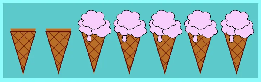
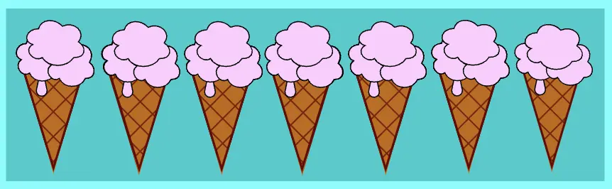
Although the nth-child() selector is made in order to target specific positions or patterns among children, we can also use it to match all child elements at once by assigning the n inside the parenthesis ().
The n lets the selector match elements at any position inside the parent element. This flexibility allows us to pick elements and apply styles without specifying an exact position. As a result, we can target all possible positions. 😎 Additionally, we have all our cones full of delicious strawberry 🍓 flavor 🍦 ice cream! So, this is by far the sweetest choice!
div:nth-child(n) {background-color: pink;}
CSS
I hope you enjoyed our little trip to the “ice cream CSS nth child” land!! 🎉 🎉 Keep going till next time!! 🍓 🍦 ✨
Hello everybody 😃 Today, we will discover the art of the powerful CSS blur effect. Get ready to meet the amazing backdrop-filter CSS property. We’ll dive 🤿 into the world of adding visual elegance and depth to our web design, and we will learn to create captivating and stunning web elements. Let’s get started!
Adding basic HTML structure
Let’s get started with the HTML setup. We create a parent div named custom-container for the background and a child div named blurry-container where we will apply the CSS blur effect. Follow along for the step-by-step process.
We move forward with the CSS structure by preparing the background. I opted for a striking and colorful background image as it is more impressive and gives prominence to our effect, setting background-image. I also add background-repeat which determines how the background image is shown, and background-size which sets the size of the image, in our case we want to fill the entire display. Completing it with height: 100vh for full-screen coverage.
The next step is to create a “place” where we can accommodate our blur, I believe a box would serve this need. To begin, I create one by setting the appropriate width and height along with its border and border-radius. I utilized borders to ensure my box remains visible. Whether to keep them or not is entirely up to you. The design can still look great in both cases. Feel free to choose whichever option suits your preference or the project’s requirements. 😃
We create the blur effect using the pseudo-element :before. To manage this, we have to set position:relative to the parent element and position: absolute to the child. The child element needs the content CSS property to be assigned an empty string value in order to be displayed. Despite the recent code adjustments, you won’t notice any visible changes on the screen just yet. 😭
.custom-container { ...position: relative;.blurry-container { ...&:before {position: absolute;content: ""; } /* end of before */ } /* end of blurry-container */} /* end of custom-container */
SCSS
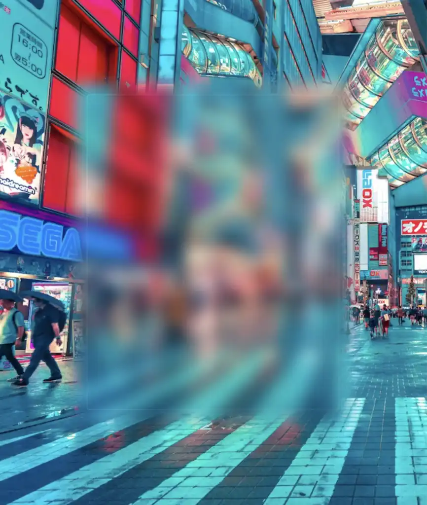
Let’s proceed with our effect. 🥁 We do so by adding the backdrop-filter CSS property to :before pseudoelement. Increasing the pixel value intensifies the blur effect by creating a stronger visual impact. I’ve applied a 12px blur effect, but you have the flexibility to adjust it according to your preferences. If you desire a clearer look, feel free to reduce ⬇ the pixels. Alternatively, for a stronger fade effect, you can increase ⬆ the pixel value.
Remember that the blur effect can sometimes get out of control on a web page because of how it’s applied to an element. When you use the blur effect, it makes the element bigger, like it’s expanded, depending on how much blur you want. So, the more blur you add, the larger the element becomes. Because of that, the element might grow so big that it spills out of its box or crashes into nearby elements. 😟
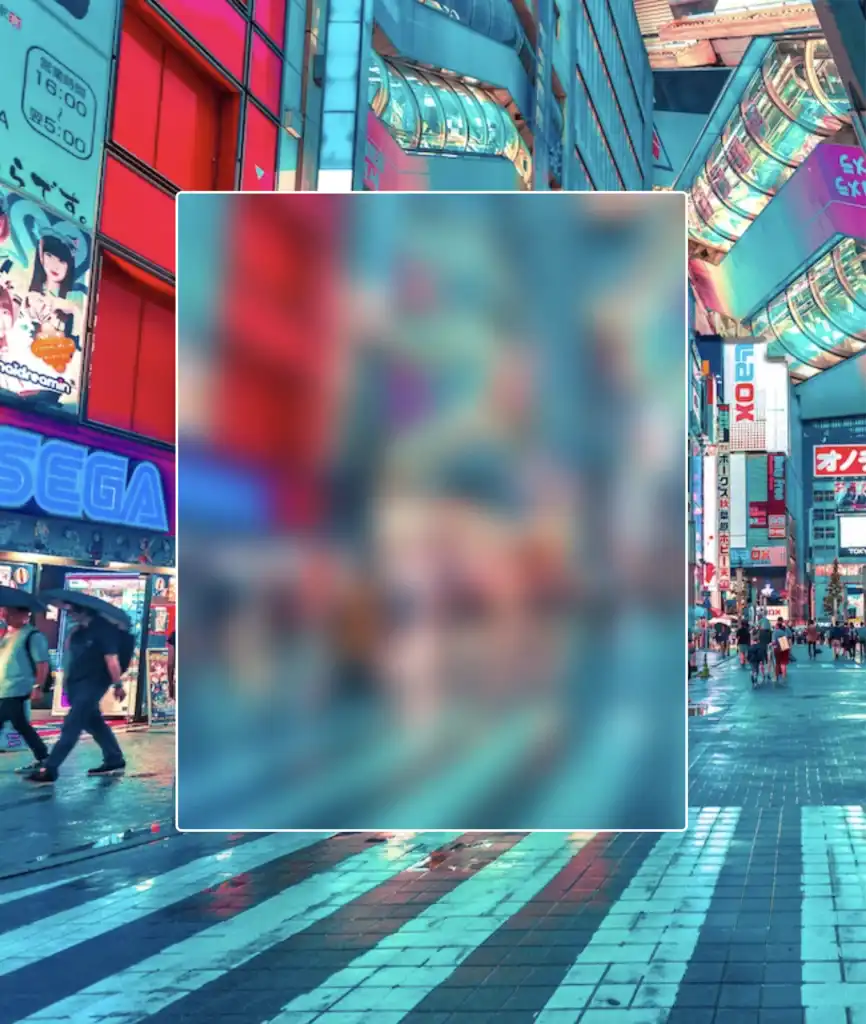
Observe how the blur CSS property overflows in the current setup above. To correct that, apply the overflow: hidden CSS property to the PARENT element custom-container. With this modification, you can control the blur effect and prevent it from causing a mess on your web page.
.custom-container { ...overflow: hidden;}
SCSS
… and boom 🥳 here it is! Our blur effect displayed flawlessly, as intended!
Complete code solution
Below is the full code referenced in this blog post. Feel free to copy and use it in your own projects. If you have any questions or encounter any issues, don’t hesitate to reach out for assistance. You can easily copy the desired code snippet by clicking on the copy icon, located in the top-right corner of each snippet.
<sectionclass="custom-container"><divclass="blurry-container"><divclass="title">Hello World</div></div><!-- end of blurry-container --></section><!-- end of customer-container -->
Below, I include the code for my post’s cover. I also added a title to see how we add text over the blur effect. 😎
<sectionclass="custom-container"><divclass="blurry-container"><divclass="title">Hello World</div></div><!-- end of blurry-container --></section><!-- end of customer-container -->
Hey there! 😃 In today’s technology-driven world, it’s super important to learn how to create an awesome transparent button. A well-designed button not only adds to the product’s aesthetic appeal but also enhances the user experience. Therefore, it’s essential to create buttons that are both visually appealing and functionally efficient.
Let’s work together, utilizing only HTML and CSS, to design the perfect button that stands out and enhances your app’s user-friendliness.
HTML basic structure
First, we prepare our HTML code snippet. We need to create a parent element with the class .wrapper that acts as the base of the button. Next, we add a child element within the parent element that will serve as the clickable part of the button. This child element has the class .custom-button . Doing so will help us create an interactive button that users can click on, to perform an action. How amazing is this! 😎
Let’s continue by using our CSS magic and making our button look cool! For this post, I am writing CSS using Sass syntax. If you would like to convert it to vanilla CSS and don’t already know how, I’d suggest you use an online Sass —CSS converter.
Create the base for the transparent button
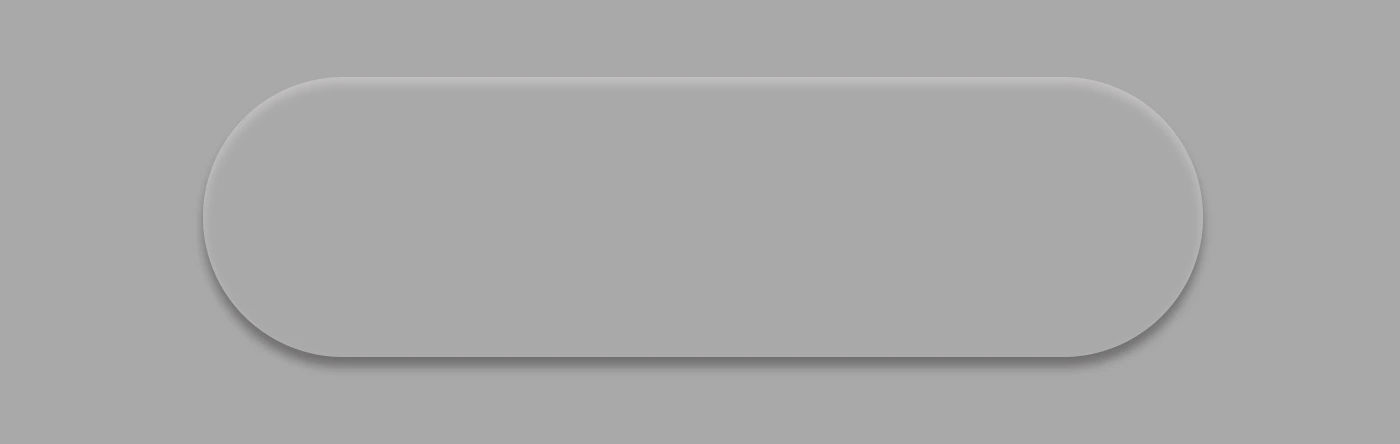
First of all, we set the background-color of the body to dark grey and also add some extra positioning properties in order for our button to be centered. We will be using the same color for our button, by applying the background: transparent CSS property, along with some width and height of our choice in the .wrapper class.
We are also applying a border-radius of 80 pixels and a box-shadow with carefully selected shades of grey. It is important to select the appropriate shades to ensure the desired outcome. 😉
For our example, we are placing the clickable part of the button in the center of the base. For that reason, we are using the flex method.
Take a look at the image below to see what’s currently rendered on screen.
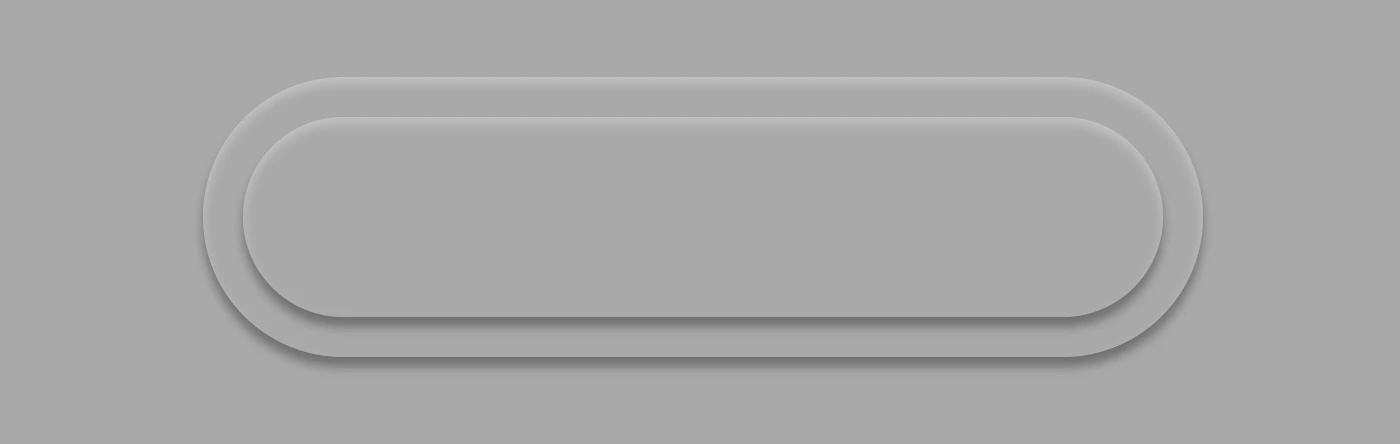
Create the clickable part of the transparent button
We proceed with the clickable area of our button. After applying some basic dimensions, we need to make sure the background is set to transparent as we did before, with the base part of the button. After that, we adjust the border-radius and box-shadow to inherit, so that these attributes would be identical to the base. To remove any natively applied border styling we use border: none.
Below, you see what’s on the screen now, with the clickable (top) part of our button added.
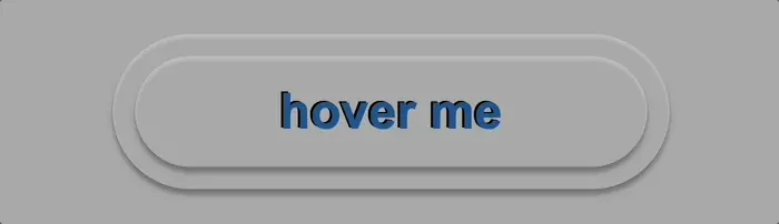
Add the button text
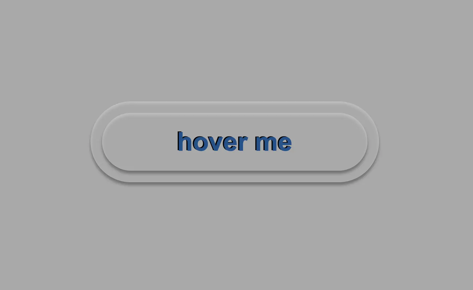
To begin, we use the flex method to center the button’s text appropriately. Then we add the text using the :before CSS pseudoselector, adding “hover me” as the content. I used a bold, 45-pixel blue text with a black shadow effect. For enhanced readability, I opted for the Arial font-family as it is really legible. 🆒 ✨
.custom-button { ...font-family: 'Arial';font-size: 45px;color: #12528e; /* a shade of blue */font-weight: bold;display: flex;align-items: center;justify-content: center;&:before {position: absolute;content: "hover me";text-shadow: -2px-1pxblack; }}
SCSS
In the following image, we can see what’s displayed on the screen now.
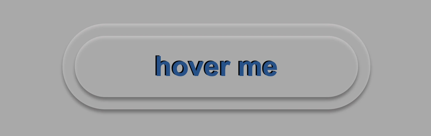
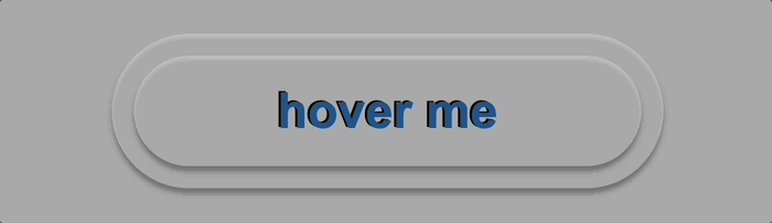
Now, is the appropriate time to implement the hover effect. We can achieve this by adding the :hover CSS pseudo-classwith the cursor set to pointer. After that, we will use :before again to modify the text content to display “click me”.
Below, we can observe 🔎 the hover effect in action. Moving the cursor over the button, immediately transforms from arrow ⬆ into pointer 👆(hand), and the text content changes. The hover effect is a widely used design technique that adds interactivity and visual interest to a webpage.
Apply the active effect of the transparent button
Now, we can add the :active state to the button to finish our work. Once we click on the button, the active state will be triggered. To make it look more realistic and impressive, we adjust the box-shadow CSS property.
Additionally, we will modify the text content using the :before CSS property and change it to be inspiring and display the text “Good Job!” in indigo color with white text-shadow.
.custom-button { ...&:active {box-shadow: 0px-1px3px#969393, /* top side */inset0px5px3px#b7b5b5, /* inset top side */inset1px0px3px#969393, /* inset left side */inset-1px0px3px#969393, /* inset right side */inset0px-4px3px#969393; /* inset bottom side */&:before {content: "Good Job!";color: indigo;text-shadow: -2px-1pxwhite; } }}
SCSS
At this moment, you can witness 🧐 the active effect in action. Take a moment to observe and analyze how the effect is taking place and what impact it has. This will help you gain a better understanding of the process and its outcomes, which can be useful for future reference and decision-making. 😇 So, good luck with your work!
Complete code solution
Below is the full code referenced in this blog post. Feel free to copy and use it in your own projects. If you have any questions or encounter any issues, don’t hesitate to reach out for assistance. You can easily copy the desired code snippet by clicking on the copy icon, located in the top-right corner of each snippet.
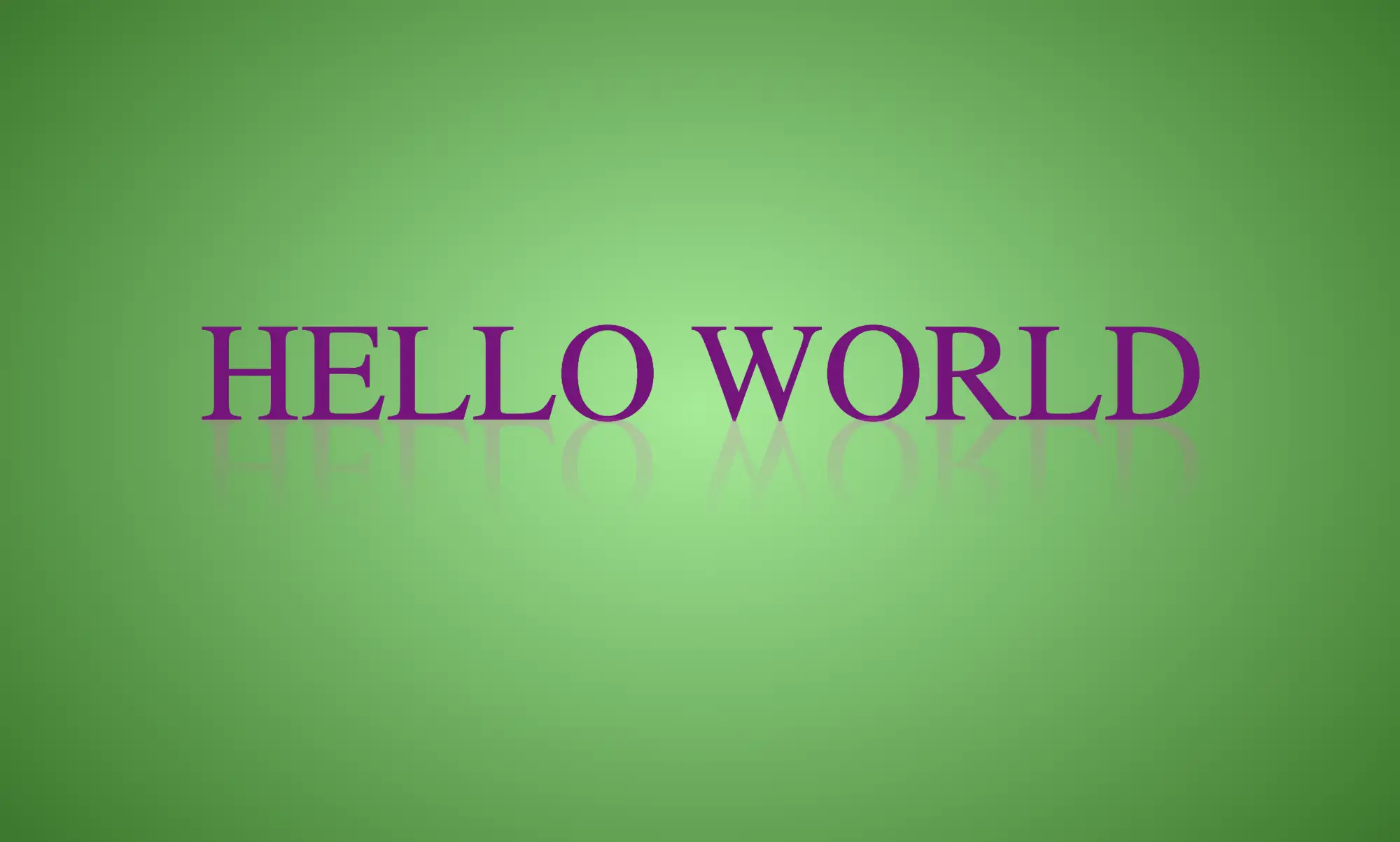
Hi there! 😃 In this post, we’ll learn bit by bit how to create a CSS text reflection effect. When we say reflection, we’re referring to a mirror-like effect that looks like the text reflects on a surface, much like the way we see our reflection in a mirror.
This is a simple yet amazing way to enhance the appearance of your text. Let’s analyze our effect so that you can easily follow along.
HTML structure
We will begin with our HTML structure. As you can see below, I prepared a div with the class .reflection-text , this is where our effect will take place.
<div class="reflection-text">HELLO WORLD</div>
CSS
CSS foundation
Let’s move forward with the CSS basic structure. We start with defining the background. It’s worth noting that using radial-gradient can make our effect more impressive. 😃
body {background: radial-gradient(lightgreen, darkgreen);height: 100vh;}
CSS
Below, we can see the background we just created.
In web development, we use the flex method in order to center our text. Then we will enhance its appearance, by making some adjustments. We will set the font-size to 100 pixels, select the “Roboto” font-family, and choose white as the text color.
Adding the CSS structure for the reflection effect
Creating a reflection can be achieved by using pseudoelements like :before and :after. To ensure this works properly, we need to include position: relative in our .reflection-text class.
.reflection-text { ...position: relative;}
CSS
Now, we are ready to proceed and create our reflection by adding the :before pseudoelement with all the necessary properties, as shown in the following code snippet.
🟢 To begin, we add the text “HELLO WORLD” to create another text element with the same content. This new text will serve as our reflection. Then, we set position: absolute so that we can move our reflected text below the original text. We use the top property to move the reflected text 65 pixels from the top, but you can always move the reflection in any direction you prefer. It is important to position the text and its reflection closely together for a more realistic reflection effect. 😉
🟢 We move forward and use the transform CSS property to rotate the text by 180 degrees
and then flip it horizontally using scaleX(-1). Now we have the perfect reflection! Let’s continue and make it more realistic.
🟢 In the next step, we will adjust the color of our reflected text. To achieve this, we will utilize the linear-gradient CSS property and specify the direction as downwards. This will create white gradients, with the top appearing more intense and gradually fading towards the bottom of the text.
🟢 It is commonly known that gradients cannot be directly applied to texts. Don’t worry! 🤔 We already have the solution to this problem. For now, let’s give a quick explanation. To create a clipped linear background pattern for text, first, we add the -webkit-background-clip: text property, and at the same time, we set the color to transparent, and our text automatically turns to transparent. In that way, our text takes the background: linear-gradient as its real color.
🟢 For a more transparent text, we can adjust the opacity. The lower the opacity, the more transparent our text becomes. So, here we are! Our reflection is ready! 🥳
🔖 It is always an option to use black or any other color in our work. Below, I’ve included examples of texts with black, purple, and green colors. It’s important to remember that the key factor is to set the correct gradients at the linear-gradient property. That way, we can create respective shades. Therefore, please give extra attention to that! 😊
Hey there! 😃 Exploring CSS linear gradient techniques is a fantastic approach to fashion vibrant, colorful mixtures. Gradients give us the flexibility to choose any desired direction, defined by their starting and ending points. Mixing a minimum of two colors is fundamental, yet the potential for blending expands further, enabling us to achieve seamless transitions or pronounced shifts based on our design requirements.
Today, let’s dive into the exciting world of CSS linear gradient techniques. 🌈✨ Picture a smooth transition of colors in a straight line, adding a sleek and dynamic touch to your web design. With linear gradients, you can smoothly transition between colors. You have the power to guide the eye seamlessly from one color to another. Whether it’s a subtle shift or a striking contrast, mastering linear gradients empowers you to enhance the visual appeal of your web projects.
Ready to discover 🔍 the art and versatility behind linear gradients? Let’s get started! 💻
Definition of a radial gradient
A linear gradient is a visual effect that allows us to smoothly shift between colors in a straight line inside any shape we want. It’s like blending multiple colors together in a straight line pattern, allowing us to create colorful and visually appealing backgrounds or effects for elements on our website.
A linear gradient is a visual effect that allows us to smoothly shift between colors in a straight line inside any shape we want
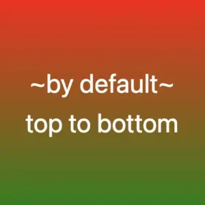
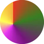
The default CSS linear gradient
We will begin our exploration with the default linear gradient, characterized by its top-to-bottom direction. The following code snippet and image provide a clear representation.
.linear-default {background-image: linear-gradient(red, green);}/* we are free to use "deg" too */.linear-default {background-image: linear-gradient(180deg, red, green);}
CSS
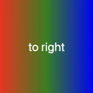
From side to side
We can adjust the direction of our gradients whenever we need to. To help you understand this better, take a look at the example below, where we changed the default direction to to right.
We are also free to choose any direction we want to top , to right , to bottom (the default direction), to left.
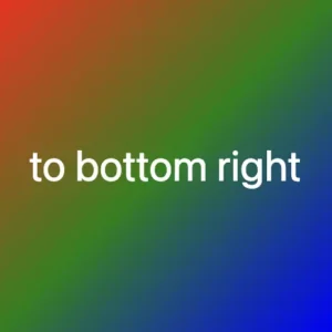
At any point, we also have the flexibility to alter the orientation of our gradients along the diagonal path. To illustrate this concept, consider the following example with the to bottom right direction.
Here colors would spread from the top-left corner to the bottom-right corner. We can combine any corner with its adjacent sides, to top left, to top right, to bottom left, and to bottom right.
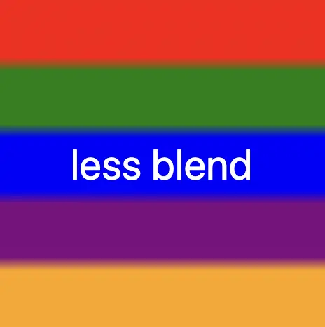
If we want to create a linear gradient with less blending (colors have more distinct limits this way) and maintain the same space for each color, we can use equal specific stops in the gradient by adding % percentages.
🕵️♂️ In this example, I’ve divided the space into 5 segments, but I left a 4% blend among each space in order to create a smooth but small transition.
The percentages between the color stops determine how smooth the transition between colors is.
Red (0% – 18%): defines a red color stop that starts at 0% and ends at 18% of the gradient.
Between 18% and 22%, there is no specific color stop defined. This gap represents a transition zone where the gradient transitions smoothly from red to green.
Green 22%, green 38%): defines a green color stop that starts at 22% and ends at 38% of the gradient.
Between 38% and 42%, there is no specific color stop defined. This gap represents a transition zone where the gradient transitions smoothly from green to blue.
Blue (42% – 58%): defines a blue color stop that starts at 42% and ends at 58% of the gradient.
Between 58% and 62%, there is no specific color stop defined. This gap represents a transition zone where the gradient transitions smoothly from blue to purple.
Purple (62% – 78%): defines a purple color stop that starts at 62% and ends at 78% of the gradient.
Between 78% and 82%, there is no specific color stop defined. This gap represents a transition zone where the gradient transitions smoothly from purple to orange.
Orange (82% – 100%): defines an orange color stop that starts at 82% and ends at 100% of the gradient.
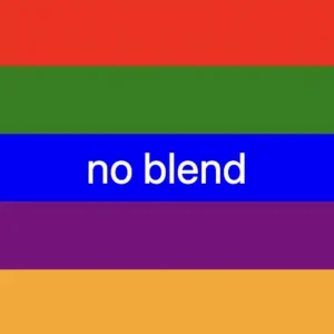
Without blend
Finally, it is really useful to know that we are able to create non-smooth transitions. In the following example, we will see a gradient with distinct color stops at specific percentage intervals, resulting in a distinct color transition from red to orange. Each color stop abruptly changes to the next color at the defined percentage points.
🕵️♂️ In this example, I’ve divided the space into 5 equal segments without blending among each other. So, we create multiple color stops without transitions.
Red (0% – 20%): defines a red color stop that starts at 0% and ends at 20% of the gradient.
Green (20% – 40%): defines a green color stop that starts at 20% and ends at 40% of the gradient.
Blue (40% – 60%): defines a blue color stop that starts at 40% and ends at 60% of the gradient.
Purple (60% – 80%): defines a purple color stop that starts at 60% and ends at 80% of the gradient.
Orange (80% – 100%): defines an orange color stop that starts at 80% and ends at 100%
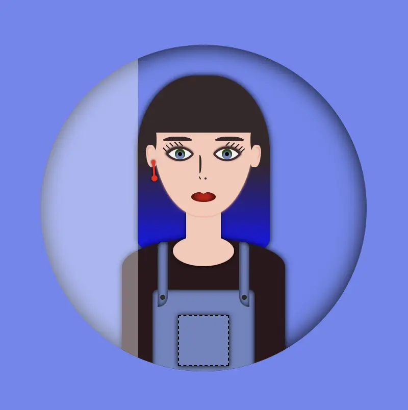
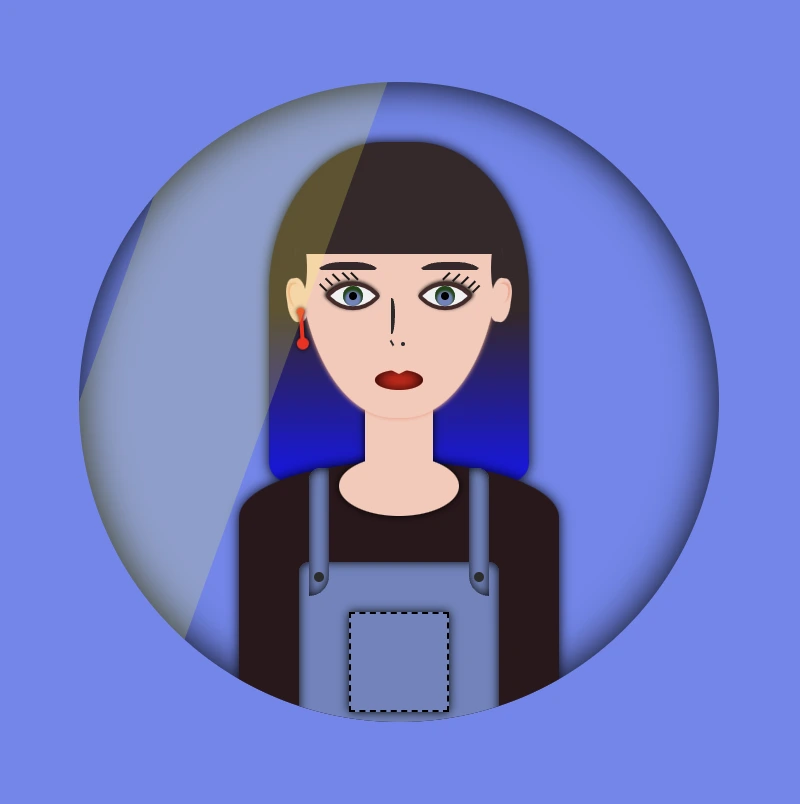
Welcome to this post! Today, I will share with you how to create a fascinating CSS shine effect animation. To make it more interesting and attractive, I have already prepared an avatar (using only HTML and CSS) and added the animation to it. If you’re curious about how I made the avatar, you can find the complete avatar code at the end of this post. Please feel free to enclose it in your animation if you wish. Remember, the most important thing is to have fun and let your creativity shine. 😉 ✨
For the moment, let’s focus on making this astonishing animation!
HTML structure
To begin, we need to create the base for our project by adding the HTML structure. We’ll start by creating our avatar-container , which will serve for our manipulations. I will carefully guide you through the following steps to achieve the desired results. Once we have a good structure in place, we can build upon it our CSS shine effect.
<divclass="avatar-container"> ... Here goes my avatar</div><!-- end of avatar-container -->
HTML
CSS basic structure
Moving forward, let’s focus on organizing our project’s visual appeal by adding the CSS structure. Our first step will be to center the avatar-container on the screen, therefore, we can take advantage of the display: flex property of the body element. This will help us align it along the horizontal and vertical axes, creating a perfectly centered layout. With this basic structure in place, we can then proceed to add styles and create everything we have in mind. 😊
In order to place the avatar inside the container, it is essential to set it position: relative. Then we can place the components we want to include for our avatar, just by adding position: absolute to them.
.avatar-container {position: relative;min-width: 320px;height: 320px;background-color: transparent;box-shadow: inset0020px;border-radius: 50%;} /* end of avatar-container */
SCSS
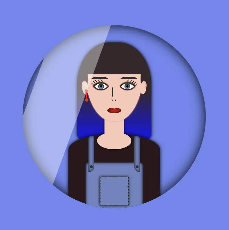
CSS Shine Effect
All the necessary preparations have been completed. Let’s now move forward and make the shine 🥳 effect.
Create the shine
Firstly, we use :before pseudo-element which allows styling specific parts of an element without adding extra content to HTML. It behaves as a child of the chosen CSS element. In our case, avatar-container takes extra data only by using :before CSS property.
Next, we set width: 30% and height: 100% as this is a proper space in our example.
We also set background-color: rgba(255, 255, 255, 0.4) as it is the most suitable for the CSS shine effect.
We continue with z-index which overlaps the stack order of an HTML element. In simple words, it manages which HTML element should appear on top of others. The higher the stack order, the higher the element will be placed at the top of the stacking order. A really useful CSS property that is responsible for layering. To achieve the desired effect over my avatar, I have specified a z-index: 4 as my avatar has multiple layers. Without multiple layers applied to it (in simple words without the avatar), z-index CSS property is not necessary. It’s good practice when we use z-index to count close numbers. We can set positive and negative integer values.
.avatar-container {position: relative;width: 320px;height: 320px;background-color: transparent;box-shadow: inset0020px;border-radius: 50%;overflow: hidden;&:before {position: absolute;content: "";width: 30%;height: 100%;background-color: rgba(255, 255, 255, 0.4);transform: skewX(-20deg);left: -120px;z-index: 3; } /* end of before */ } /* end of avatar-container */
SCSS
The image below displays a preview of the code mentioned above.
Transform the CSS shine effect
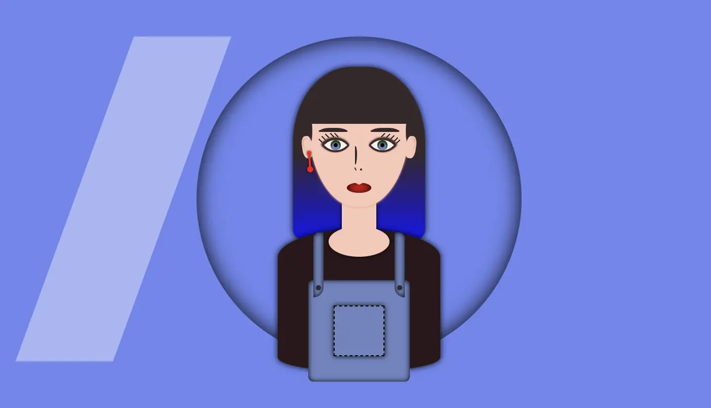
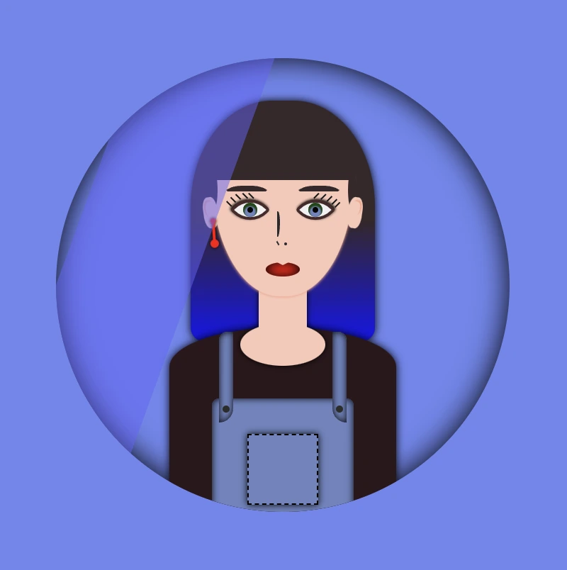
Afterward is necessary to add overflow: hidden to avatar-container, as we want to hide the content that flows over our container’s bounds.
We continue with transform: skew as a way to add inclination to our shine.
Finally left: -120px keeps our effect in the appropriate place, -120px left out of the avatar-container , in order to be invisible. As we previously used, overflow: hidden anything outside of the avatar-container is not visible, that’s why in this pick, below, we can’t see our effect. It’s still there though! 😄
HINT
💡 Well, maybe at this point it might be a good idea to temporarily disable the CSS property overflow: hidden and observe the current position of the effect. By doing so, one can see if the effect is working as intended and make any necessary adjustments. The effect is now positioned -120 pixels to the left, as this is the starting point from where the effect will begin to move.
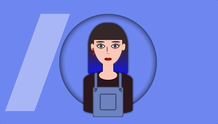
Create an animation for the CSS shine effect
To finalize my work, firstly, I’m adding the animation CSS property animation: <animation-name> <animation-duration> <animation-iteration-count> which is responsible for the way our animation behaves.
Secondly, I add CSS @keyframes which is used to control the style of the animation at different points in time. In this post, we want our shine to move rightwards, starting from -120px left to 350px left and then turning back to -120px left again.
By combining these 2 properties we end up having the desired animation result, that is, moving our shine every 5 seconds, forever (infinite), from -120px to 350px and back.
🚫 It is required to connect these two properties. We do so by giving a name to the @keyframes and putting the same name on the animation property. In our case, this name is “shine”.
.avatar-container { ...&:before { ...animation: shine 5sinfinite; } /* end of before */} /* end of avatar-container *//* My animation */@keyframesshine {0% {left: -120px; }50% {left: 350px; }0% {left: -120px; }}
SCSS
💡 If you want to see the whole move of the CSS shine effect you can once again disable the CSS property overflow: hidden to avatar-container and observe the effect. Isn’t it great? 😄
🔖 Please be informed that you have the flexibility to modify the background-color: rgba(..., ..., ..., ...) CSS property at any point to adjust both the color and opacity of your shine effect. In this context, I have chosen to generate a grey shine, as this shade is widely recognized and utilized.
Container’s color -> background-color: #c4c0c0 (grey)
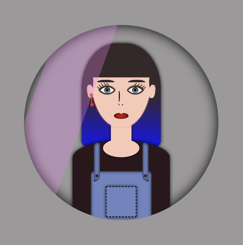
Complete avatar code
Below, I include my HTML and CSS avatar code.
<divclass="avatar-container"><divclass="hair-long"></div><divclass="face"><divclass="ear ear--left"><divclass="earing earing--left"></div></div><divclass="ear ear--right"></div><divclass="hair-front"></div><divclass="eyebrow eyebrow--left"></div><divclass="eyebrow eyebrow--right"></div><divclass="eye eye--left"><divclass="eyelash eyelash--left"></div><divclass="eyelash eyelash--left1"></div><divclass="eyelash eyelash--left2"></div><divclass="eyelash eyelash--left3"></div><divclass="eyelash eyelash--left4"></div></div><!-- end of left eye --><divclass="eye eye--right"><divclass="eyelash eyelash--right"></div><divclass="eyelash eyelash--right1"></div><divclass="eyelash eyelash--right2"></div><divclass="eyelash eyelash--right3"></div><divclass="eyelash eyelash--right4"></div></div><!-- end of right eye --><divclass="nose"></div><divclass="lips"></div></div><!-- end of face --><divclass="body-avatar"><divclass="neck"></div><divclass="t-shirt"></div><divclass="dungarees"><divclass="pocket"></div><divclass="strap strap--left"><divclass="button button--left"></div></div><divclass="strap strap--right"><divclass="button button--right"></div></div></div><!-- end of dungarees --></div><!-- end of body --></div><!-- end of avatar-container -->
Hello everybody! In this post, we will analyze the CSS first child selector, one of the most useful selectors in CSS. We utilize the CSS first-child selector when we want to target and manipulate only the first element among a variety of elements of the same type. Note that when we refer to types of elements, we mean HTML tags like paragraphs (<p>), headings (<h1>, <h2> …), lists (<li>), and so on.
We often apply the CSS first child selector to list items (<li>), but it can be used with any type of element. Below, I have prepared some examples to help you understand how to use the CSS first child selector depending on your needs.
Alternatively, we can use the CSS nth child selector like this :nth-child(1) for the same purpose, but it’s more generic as it allows the selection of any child based on its position.
In addition to providing all the necessary CSS syntax for each first child case we describe, we have also included Sass syntax under each code snippet if you are using a Sass pre-processor.
CSS first child selector: List element
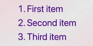
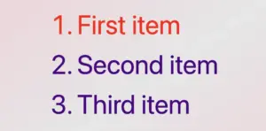
In the following example, the HTML structure consists of an ordered list (<ol>) with three list items (<li>), all colored indigo.
Then, we add the CSS rule, which selects only the first item and applies a red color to it.
/* Applies indigo color to all list items */li {color: indigo; }/* Applies red color only to the first list item */li:first-child {color: red; }/* OR */li:nth-child(1) {color: red;}
CSS
🔖 When we work with Sass, our code will be structured as follows:
li {color: indigo;&:first-child {color: red; }}/* OR */li {color: indigo;&:nth-child(1) {color: red; }}
SCSS
When using the :first-child selector in CSS, it targets the very first element within its parent. When we add a new item to the beginning of the list, this new item becomes the first child of the list, and the previous first item now becomes the second one. This change causes the :first-child selector to now target the newly added item instead.
CSS first child selector: Non-list element
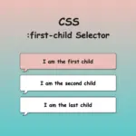
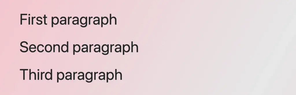
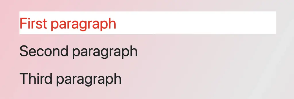
In the example below, we set the first child selector for paragraphs. The HTML structure consists of a <div> containing three paragraph (<p>) elements. By default, all HTML elements have black text color, so paragraphs will appear in black.
By applying the CSS first child selector, it selects the first <p> element and apply the text color red to a white background. As a result, the first paragraph appears in red with a white background, while the subsequent paragraphs maintain their default styling.
/* Applies red color and background white to the first paragraph*/p:first-child {color: red;background-color: white;}/* OR */p:nth-child(1) {color: red;background: white;}
CSS
🔖 When working with Sass, our code will be structured as follows:
p {&:first-child {color: red;background: white; }}/* OR */p {&:nth-child(1) {color: red;background: white; }}
First child CSS selector applied across multiple parent containers
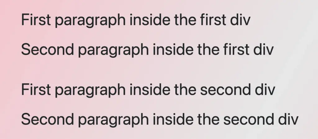
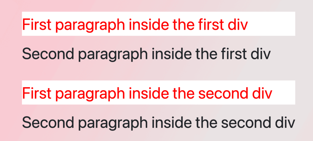
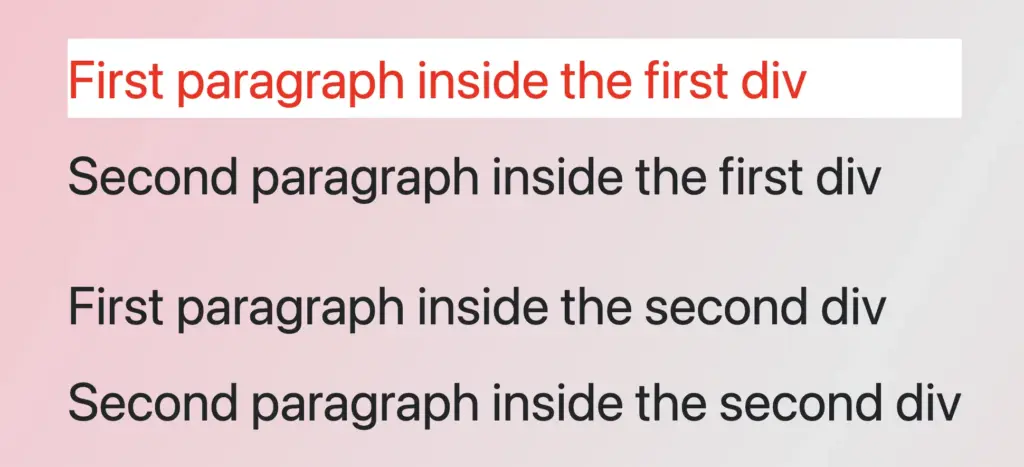
In this example, we can see a different approach, as most times, we have multiple HTML elements to manipulate within a document. In our case, we have two div elements, each containing two paragraph (<p>) elements colored black.
<div><p>First paragraph inside the first div</p><p>Second paragraph inside the first div</p></div><div><p>First paragraph inside the second div</p><p>Second paragraph inside the second div</p></div>
HTML
The CSS rule div p:first-childselects the first <p> element within any <div> and applies the specified styles to it. As a result, the first paragraph within each <div> will display in red with a white background, while the remaining paragraphs will retain their default styles. This demonstrates how the :first-child selector can be used to style the first element within a number of parent containers. 😉
/* Applies red color and white background to the first paragraph inside each div*/divp:first-child {color: red;background-color: white;}/* OR */divp:nth-child(1) {color: red;background-color: white;}
CSS
🔖 When using Sass, our code will look like this:
div {p:first-child {color: red;background-color: white; }}/* OR */div {p:nth-child(1) {color: red;background-color: white; }}
SCSS
First child CSS selector targeting the first element of the first parent
In the following example, we have two div elements, each containing two paragraph (<p>) elements colored black.
<div><p>First paragraph in the first div</p><p>Second paragraph in the first div</p></div><div><p>First paragraph in the second div</p><p>Second paragraph in the second div</p></div>
HTML
the CSS rule div:first-child p:first-childselects only the first paragraph (<p>) within the firstdiv and applies the specified styles to it. Thus, the first paragraph in the first div will be displayed in red with a white background, while the second paragraph will remain in its default black color.
The second div, remains unaffected by the styles applied to the first div, showcasing how to apply specific styles selectively. 😉 This approach is really helpful for applying specific styles to elements in complex layouts.
/* Applies red color and white background to the first paragraph of the first div*/div:first-childp:first-child {color: red;background-color: white;}/* OR */div:nth-child(1) p:nth-child(1) {color: red;background-color: white;}
CSS
🔖 When we work with Sass, we will write our code as follows:
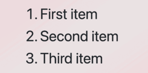
In our last example, we have the opposite case. How not to select the CSS first child. The HTML structure consists of an ordered list <ol> containing three list <li> elements.
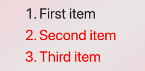
The CSS rule ol li:not(:first-child) selects all <li> elements within the ol apart from the first one and applies the specified styles to them. Because of that, all list items apart from the first one will be displayed in red, while the first list item will retain its default color, black.
/* Applies red color to all paragraphs except for the first one*/olli:not(:first-child) {color: red;}/* OR */olli:not(:nth-child(1)) {color: red;}
CSS
🔖 When we work with Sass, we will write our code as follows:
ol {li:not(:first-child) {color: red; }}/* OR */ol {li:not(:nth-child(1)) {color: red; }}
Hello! In this post, I will show you how to create a visually appealing CSS 2d card with flipping animation that activates when you hover over it. To enhance the design, I have added an avatar and integrated the animation with it. If you are interested in how I created the avatar, you can check out the complete avatar code at the end of this post. You are free to use it in your animation or customize it to your liking. Enjoy! 😉
For now, let’s move forward and create this incredible animation!
CSS Flipping card animation on hover
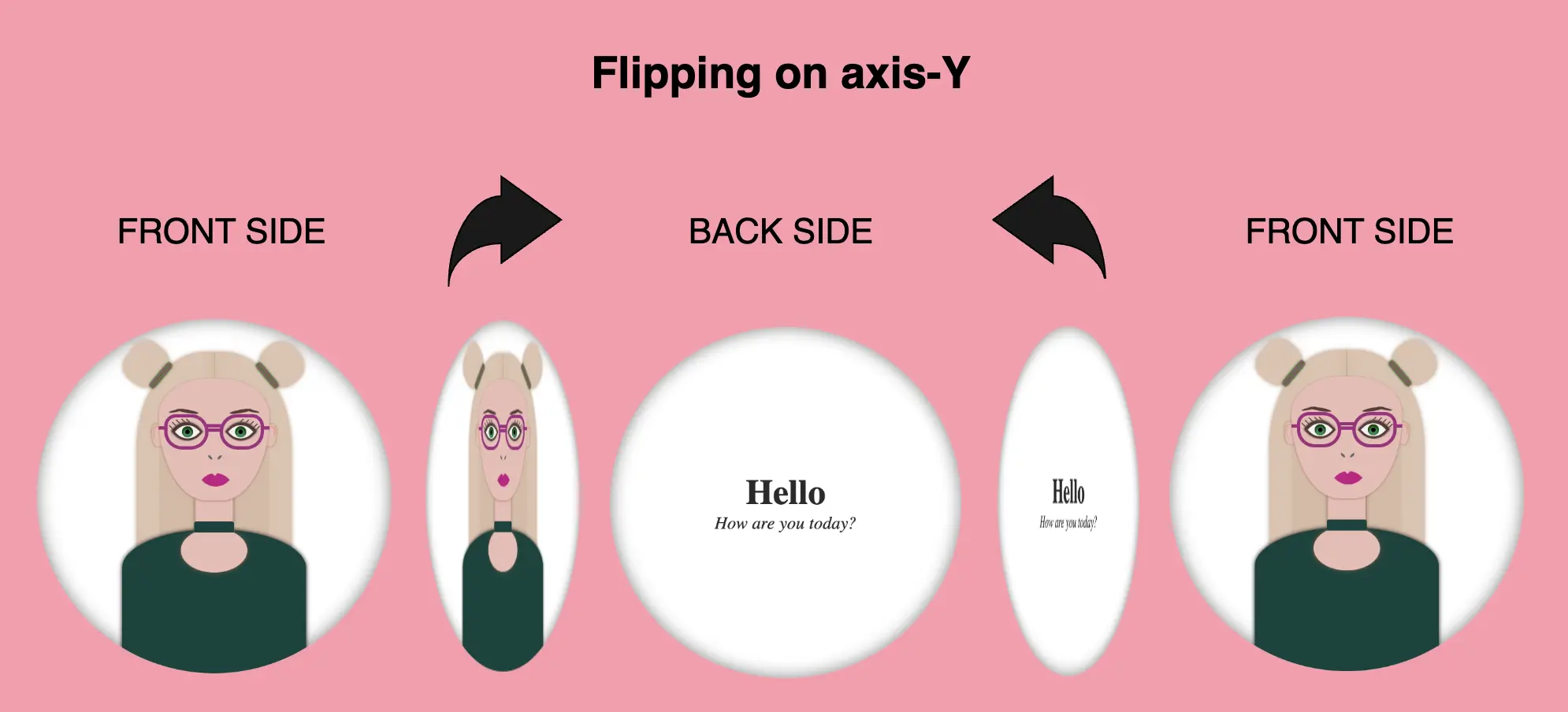
The following HTML and SCSS (Sass) code makes a card flip around. Using the X-axis and Y-axis which are two lines that intersect, helps us determine the position of a point in a two-dimensional area.
Let’s analyze our code one step at a time:
HTML structure
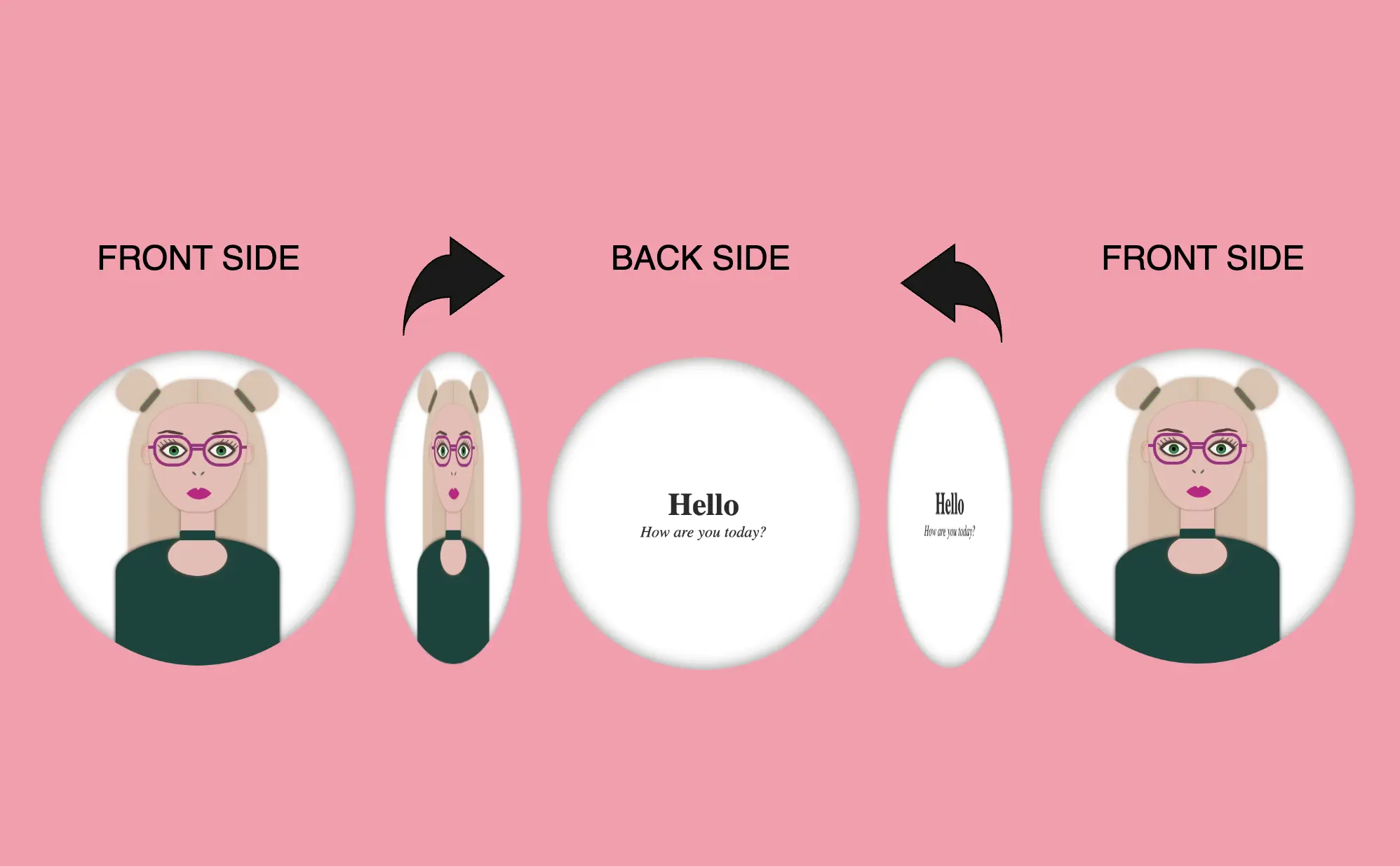
We will begin with the HTML structure. We create a parent container called .flip-wrapper. This container acts as the parent element for our animation. Inside it, we have a child element with the .flip-card class, this is where our animation happens. Next, we divide the child element into two parts: the front side and the back side. On the front side, we’ll add the .avatar-container and place the avatar inside while on the back side, we’ll add the .text-container class and add some text.
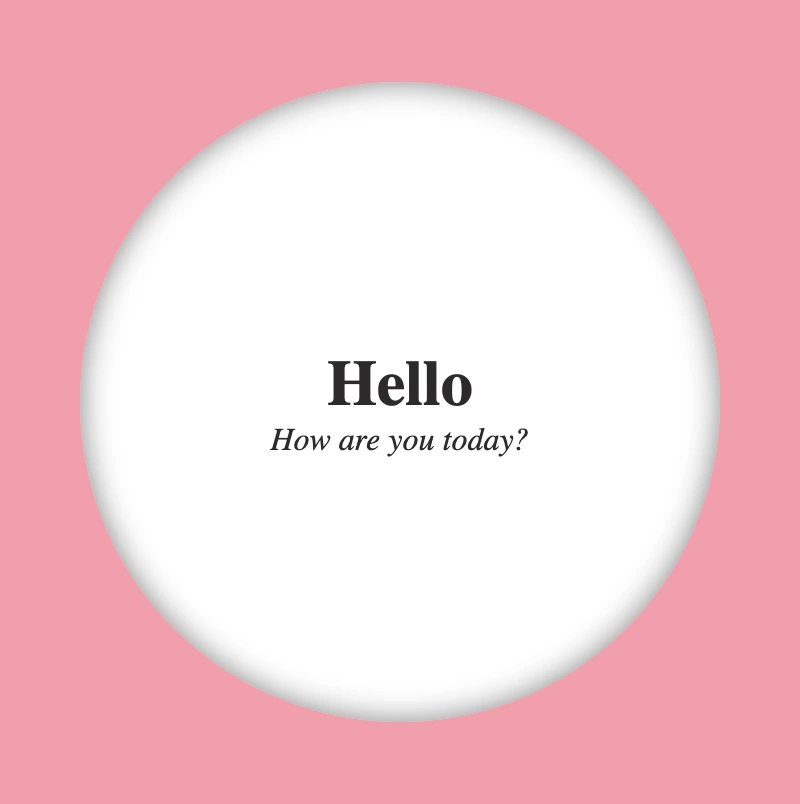
<divclass="flip-wrapper"><divclass="flip-card"><divclass="avatar-container"></div><divclass="text-container"><h1>Hello</h1><div><i>How are you today?</i></div></div></div></div>
HTML
CSS Basic structure
In our CSS code snippet, first of all, we set the background of our whole page to pink. 🐷🐷
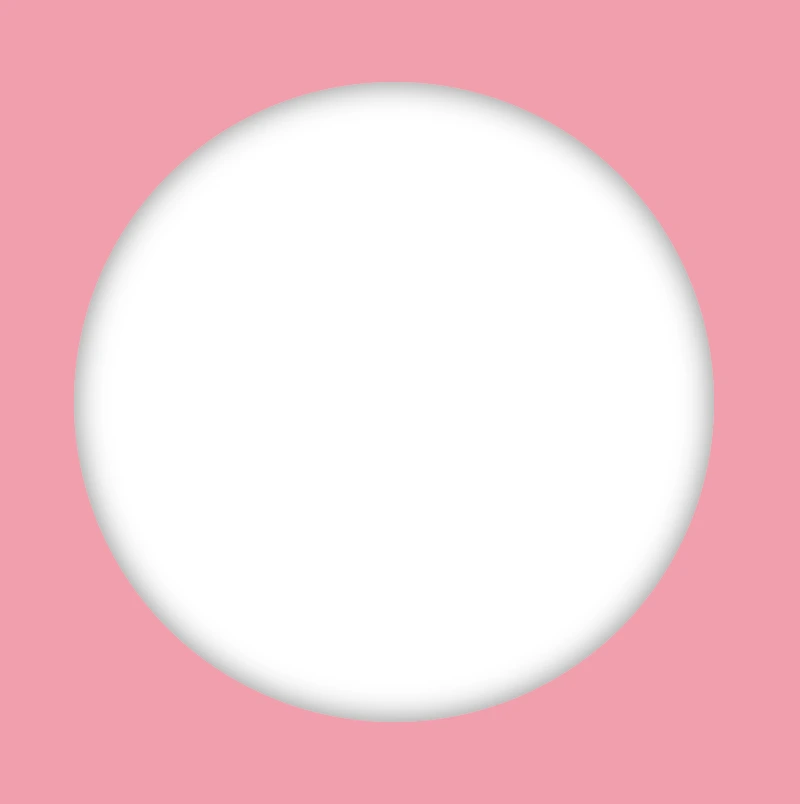
Moving on to the .flip-wrapper container, we specify its dimensions, giving it a fixed width and height of 300 pixels. To make a circular appearance, we apply a border-radius of 50%. If you desire, you can maintain the square ⬜ shape. I chose this rounded ⚪ design because it makes it easier for us to observe the effect we’re aiming for. 😉
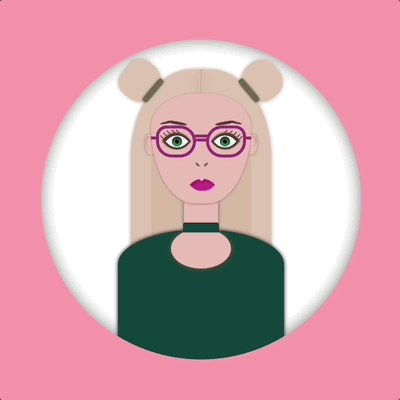
Next, we focus on the .flip-card element. We set the position: relative property and then its witdh and height to 100% to ensure it covers the entire available space. We also add a white background-color and a subtle gray shadow effect. To maintain the circular theme, we apply a border-radius of 50% to this container too.
Finally, we set the position: absolute property in both .avatar-container and .text-container classes. In that way we will be ready to place the content we want on both, the front and the back, sides of our card.
This is what’s rendered on our screen at the moment.
Adding the hover effect
In order for our effect to function as intended we have to work with both the parent and the child element. We begin with the parent element, where we apply the :hover effect and change the cursor to a pointer (you can pick any cursor style you prefer).
.flip-wrapper { ...&:hover {cursor: pointer; }}
SCSS
Preparing the front side of my flipping card
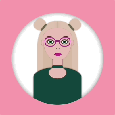
I added an avatar on the front side of my flipping card. You can add whatever you want (some text, maybe, or an emoticon ✏️) or you can leave it empty, though it is not really useful for observing the flipping.
.avatar-container { ...}
SCSS
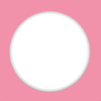
In the following image, we can see how the front side of our flipping card would be. Nice! Isn’t it? 😃
Preparing the back side of my flipping card
Here we prepare our text’s style. We keep the default black color and we centered our text based on the display: flex method.
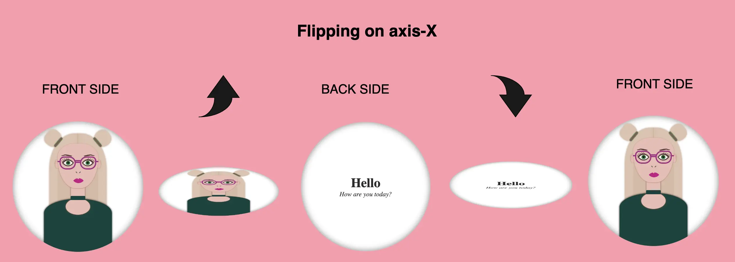
We are free to create flipping animations on both axis X and Y. Below, I prepared two examples. The first one is for axis-Y while the second one is for axis-X. Let’s break it down and see them analytically. 🧐
Flipping animation on axis-Y
In order to achieve our goal we have to combine the following CSS properties.
transform: rotateY(180deg) We begin by setting the transform property, which is responsible for the flipping, inside the hover effect. It is also necessary to add it to the class that represents the back side of our card, in our case the .text-container class, otherwise, our text won’t be rendered on the screen when we hover over the card.
transition: transform 6s & transform-style: preserve-3d We continue by combining these two properties inside the .flip-card class. The first one shows us the exact, time in seconds (s), our effect will take place while the second one makes the children of an element appear as if they are positioned in a 3D space. So this property gives us the impression that the descendants (children) of our element are located within a three-dimensional space.
backface-visibility: hidden We finalize our work with the backface-visibility property that defines whether or not the back side of an element should be visible when facing the user. The back face of an element is a mirror image of the front face being displayed.
Boom! 🎉 This is our wonderful flipping 2d card animation for the X-axis!!
Complete avatar code
Below, I include my HTML and CSS avatar code.
<divclass="avatar-container"><divclass="hair-back"></div><divclass="hair hair--left"></div><divclass="hair hair--right"></div><divclass="hair-clip hair-clip--left"></div><divclass="hair-clip hair-clip--right"></div><divclass="ear ear--left"></div><divclass="ear ear--right"></div><divclass="face"><divclass="eyebrow1 eyebrow1--left"></div><divclass="eyebrow1 eyebrow1--right"></div><divclass="eyebrow2 eyebrow2--left"></div><divclass="eyebrow2 eyebrow2--right"></div><divclass="eye-glasses eye-glasses-left"></div><divclass="eye-glasses eye-glasses-right"></div><divclass="eye eye--left"><divclass="eyelash eyelash--left"></div><divclass="eyelash eyelash--left1"></div><divclass="eyelash eyelash--left2"></div><divclass="eyelash eyelash--left3"></div><divclass="eyelash eyelash--left4"></div></div><!-- end of left eye --><divclass="eye eye--right"><divclass="eyelash eyelash--right"></div><divclass="eyelash eyelash--right1"></div><divclass="eyelash eyelash--right2"></div><divclass="eyelash eyelash--right3"></div><divclass="eyelash eyelash--right4"></div></div><!-- end of right eye --><divclass="nose"></div><divclass="lips"></div></div><!-- end of face --><divclass="neck"></div><divclass="t-shirt"></div><divclass="neckless"></div></div><!-- end of avatar-container -->