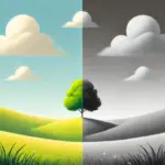
Hello everybody! 😃 In the vibrant world of web design, the CSS grayscale filter stands as a powerful tool for transforming the visual appearance of images and elements on a webpage. The CSS filter: grayscale(%) works like a magic wand. 🪄 It takes colorful images or elements and converts them into grayscale shades. This effect is great for creating different aesthetics, whether you’re aiming for a vintage charm or a sleek, modern look. The CSS grayscale filter can be applied to various elements, including images, SVGs, emojis, font icons, and even HTML elements.
Let’s explore what makes this filter so enchanting! 🧙♀️
Grayscale on HTML elements
First of all, it’s important to note that the CSS grayscale filter may not be noticeable on black and white elements. Since grayscale shifts colors toward shades of gray, and black is already the darkest shade, while white stays the lightest one. Secondly, always keep in mind that the filter: grayscale(100%) can make text completely dark, which may not be ideal when placed on black or very dark backgrounds.
Using the CSS grayscale filter on fonts
We will begin by applying grayscale to fonts. In the following example, I used blue text, instead of the default black to emphasize the contrast and make the transition to shades of gray more noticeable.
This reinforces an important point we discussed earlier—this effect stands out most when applied to bright, colored elements rather than dark, black, or near-black ones. 😉
<h1>The grayscale filter</h1>h1 {
color: blue;
filter: grayscale(50%);
}With the HTML code, we define an <h1> heading element, then CSS sets its text color to blue and applies a grayscale filter to it. Initially, we use 50% intensity, creating a visual effect where the blue text is converted to grayscale while still retaining a subtle hint of its original blue color.
To clarify, there is another example where we use the filter at 90%, resulting in the title appearing in different shades of gray. This time, it’s very close to being completely dark gray—almost black, we could say.


Grayscale on background color
In this case, instead of setting the text color, we will set the background-color. Now, take a look at the orange. In the first image, we see a bright orange, while in the second, the color appears slightly darker (grayish) due to the filter: grayscale(40%) property.
<h1>The grayscale filter</h1>h1 {
background-color: orange;
filter: grayscale(40%);
}

Grayscale on other HTML elements
We can also apply the grayscale filter to various HTML elements, such as <span>, <li>, and more. Below, I’ve provided two examples for clarity: the first applies the filter to the content of two <span> elements, while the second applies it to the bullets of an <li>.
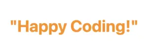
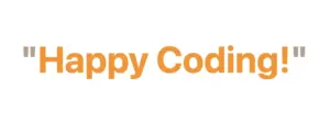
Example using a span
<div class="grayscale-elements">
  <span>"</span> Happy Coding! <span>"</span>
</div>.grayscale-elements {
color: orange;
}
.grayscale-elements span {
filter: grayscale(80%);
}In the HTML snippet, we create a <div> element with the class .grayscale-elements. Inside this <div>, we add two <span> elements, each containing a double quote to frame the text “Happy Coding!” These <span> elements allow us to style the quotes differently from the rest of the text.
In the associated CSS code, .grayscale-elements is targeting elements with this class. The text color of the elements with this class is set to orange. Additionally, the CSS rules target the <span> elements inside and apply an 80% grayscale filter to them, rendering the quotes in shades of gray while retaining the orange color for the rest of the content.
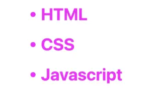
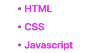
Example using a ul
<ul>
  <li>HTML</li>
  <li>CSS</li>
  <li>Javascript</li>
</ul>ul {
list-style: none; /* remove the default bullets */
}
li {
color: magenta; /* change lists default (black) color */
}
li:before {
content: "•"; /* add new bullets and now can be manipulatated */
margin-right: 10px; /* add distance between the bullet and the text */
filter: grayscale(50%); /* one of our examples */
}
In the HTML snippet, we create an unordered list (<ul>) containing three list items (<li>).
In the associated CSS, we target the <ul> element and remove the default bullets using list-style: none. Then, we style the list items (<li>), setting their text color to magenta.
The :before pseudo-element is used to add custom bullets before each list item. In this case, the bullet is a solid circle (•) created using the content property. The margin-right property adds spacing between the bullet and the text.
Additionally, a grayscale effect is applied to the bullets using filter: grayscale(50%), reducing their original color intensity by 50%. This results in bullets appearing in varying shades of gray while still retaining some color.
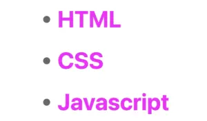
For an even more pronounced effect, I also applied a 90% grayscale filter (filter: grayscale(90%)), making the bullets appear even closer to a true gray. 😃
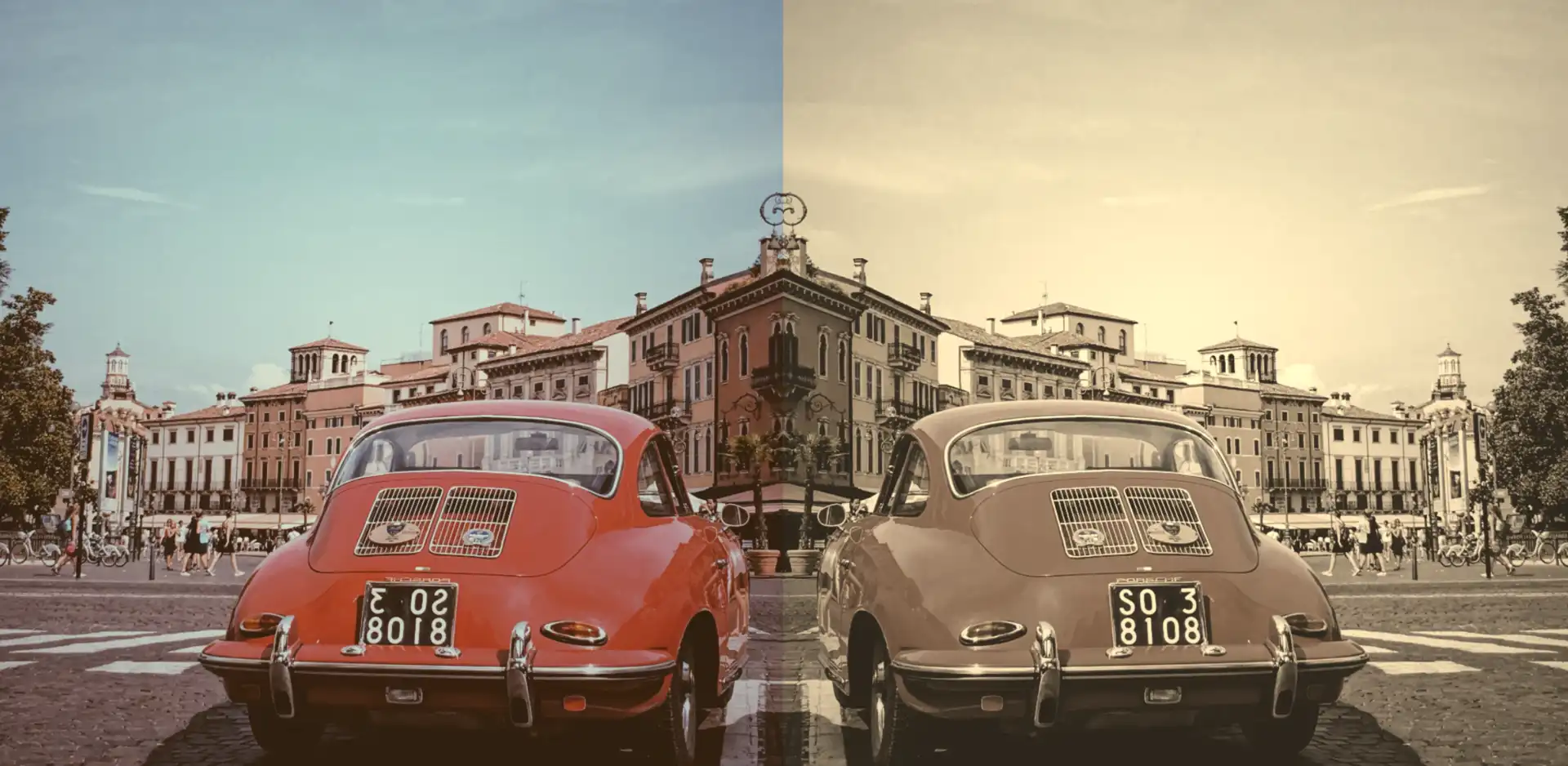
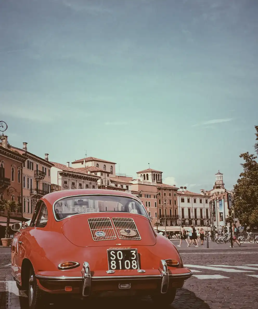
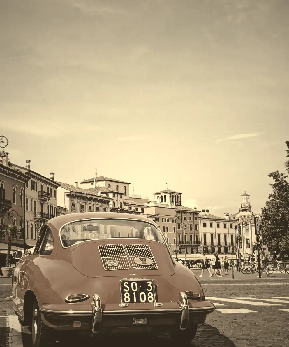
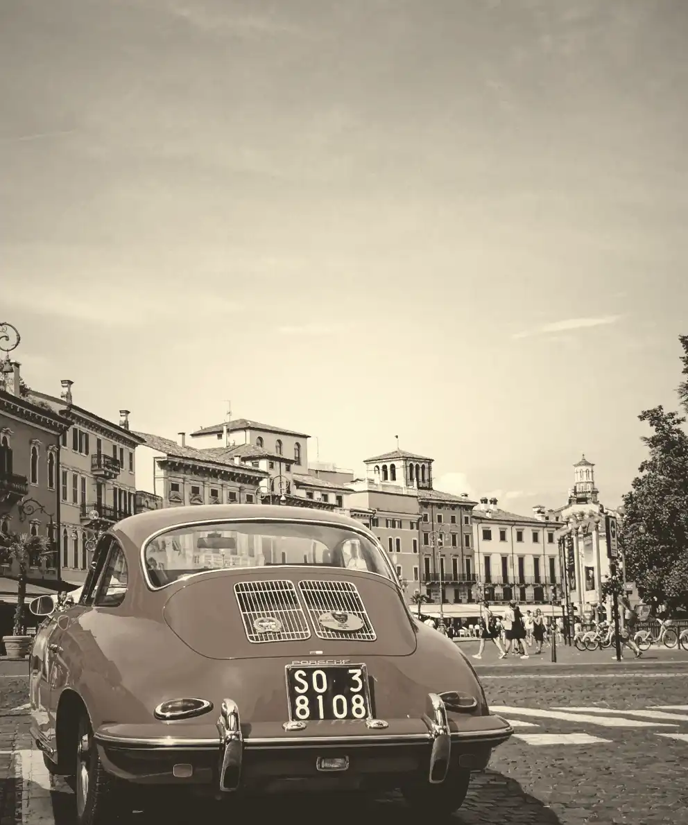
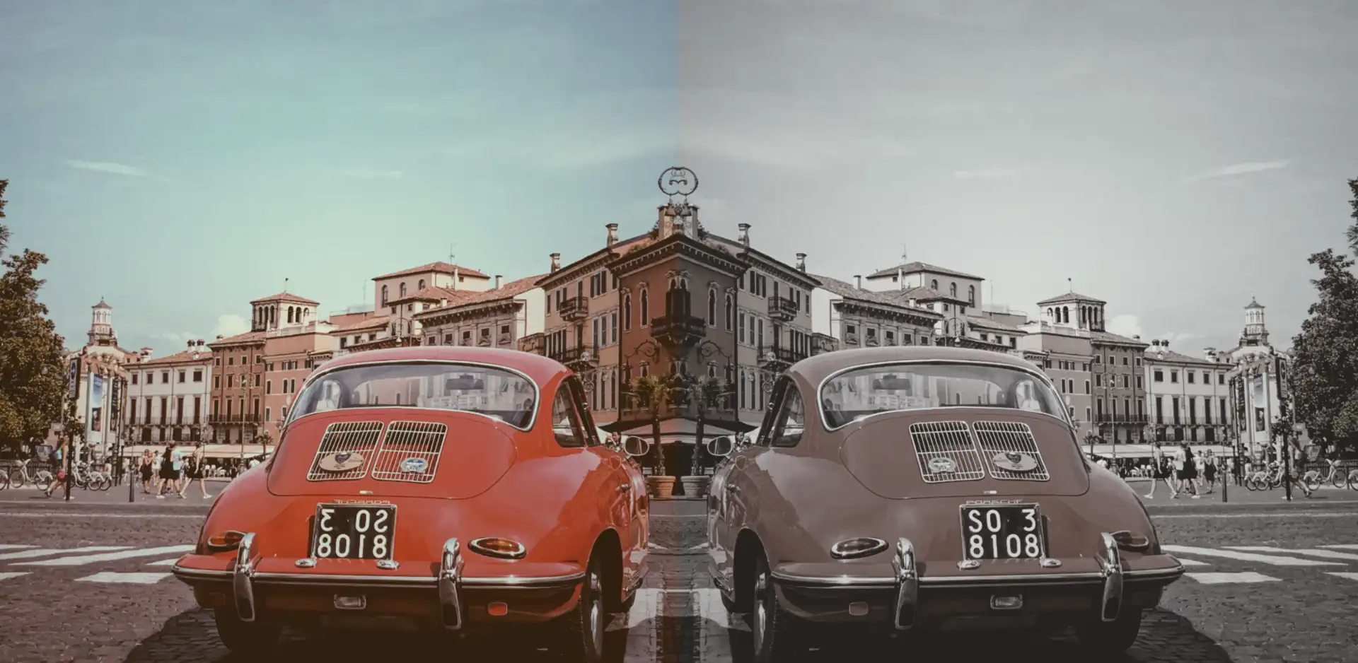
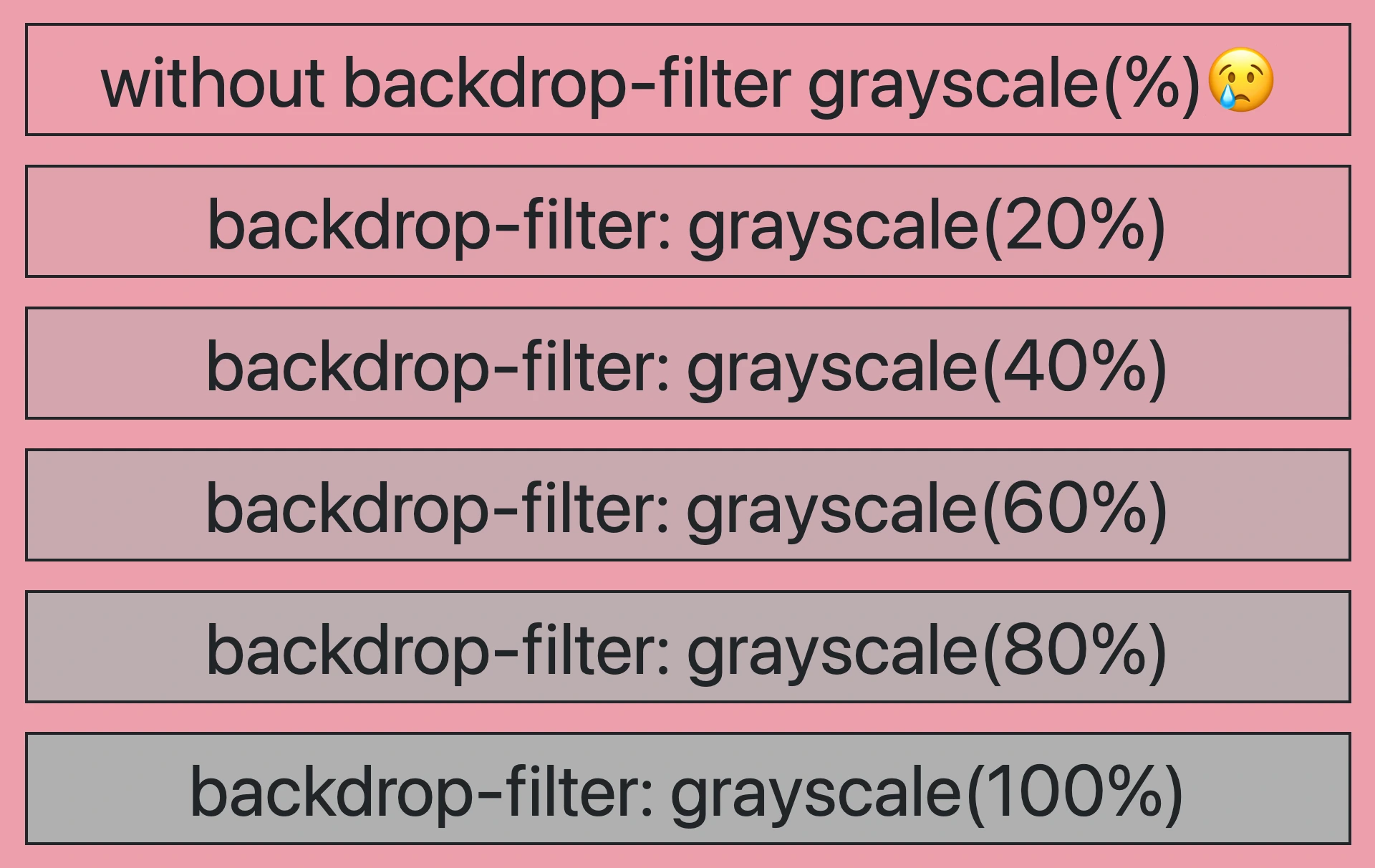
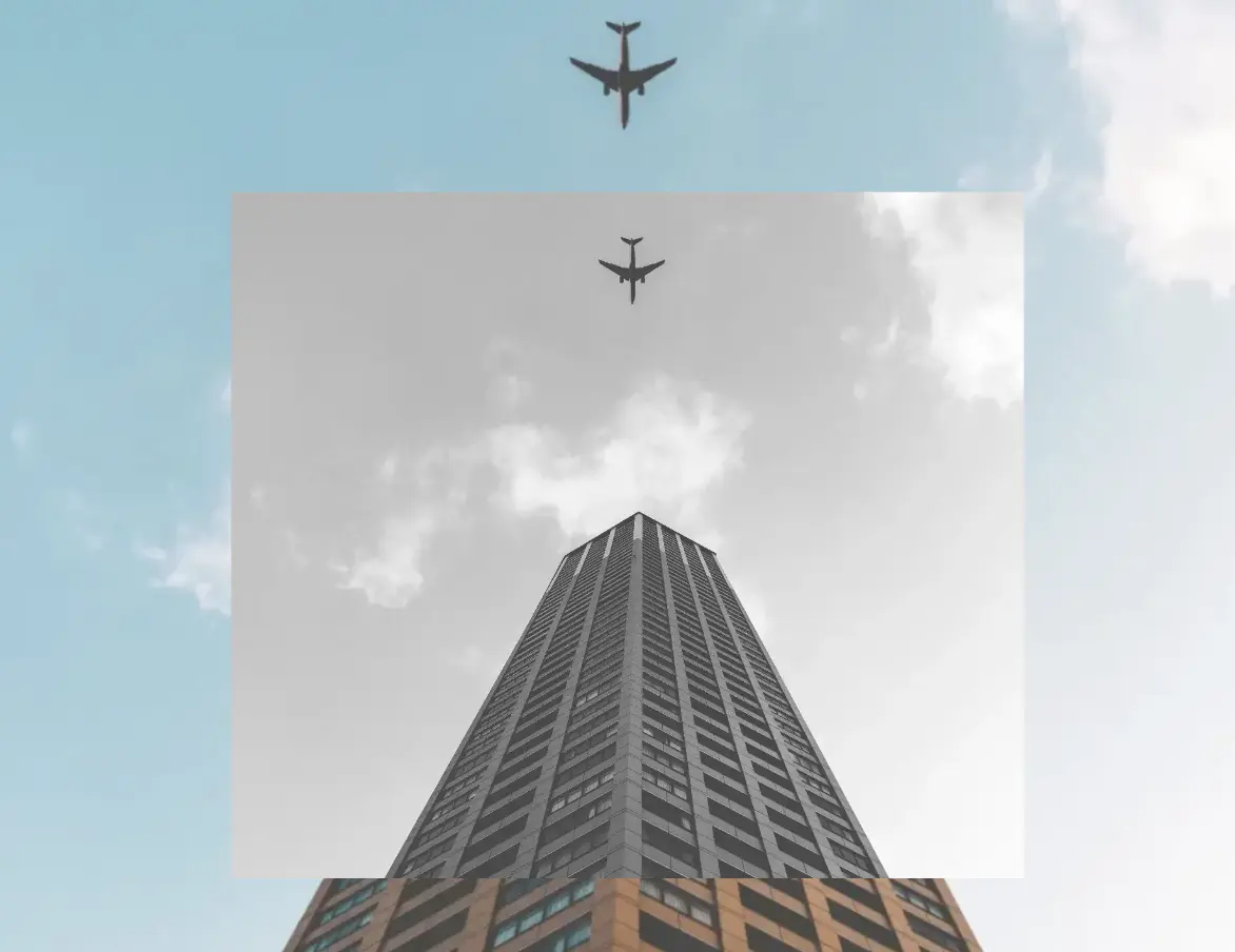
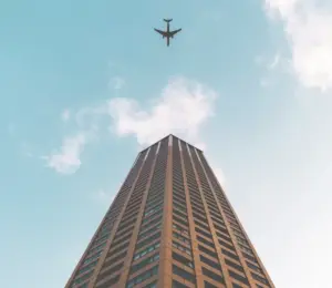
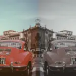
CSS Grayscale on images
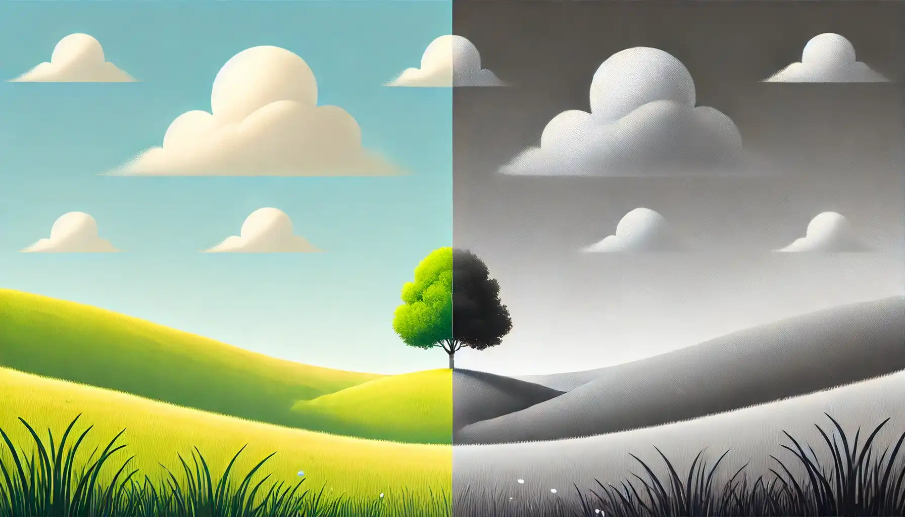
Another way to take advantage of this CSS property is by applying the filter: grayscale to images, transforming their colors into shades of gray. This is particularly useful for making pictures look old-fashioned or monochromatic when they create a black and white effect.
<div class="grayscale-image"><div>.grayscale-image {
background-image: url(<your-image>);
background-repeat: no-repeat;
background-size: cover;
width: 300px;
height: 400px;
filter: grayscale(70%);
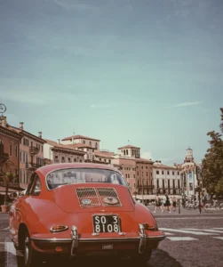
}The given code creates an HTML div element with the class .grayscale-image.
This class is styled using CSS to display a grayscale image. The background of the div is set to an image from the provided URL using the background-image property. The image is styled to not repeat (background-repeat: no-repeat) and to cover the entire area (background-size: cover). Its dimensions are set to width of 300 pixels and height of 400 pixels. Finally, a grayscale filter is applied to the image using the filter property, with a 70% level of grayscale.


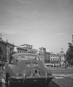
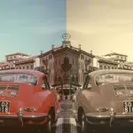
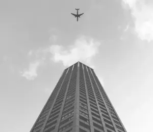
I did something similar for the following image but set the grayscale to 100%, which transformed the image entirely into shades of gray. Impressive, isn’t it? 🙃


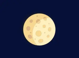
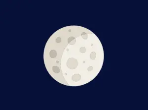
CSS Grayscale on SVG
The grayscale filter can be applied to SVG elements too, making them appear in varying shades of gray. This is often used to achieve a specific artistic or design effect. For instance, we applied this filter to an SVG of a moon, which was originally yellow, transforming it into a soft gray and adding a unique visual dimension. Awesome, right?
svg {
  filter: grayscale(80%);
}In our CSS code, we apply a filter with a specified grayscale percentage of 80%. This effect transforms the originally yellow image into varying shades of gray while preserving a subtle hint of its original color.
🔖 Remember that directly targeting the <svg> element may cause conflicts 🌩 ⚡ if multiple SVGs exist in the document.
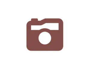
CSS Grayscale in Font Awesome
Another way to use this CSS trick is with Font Awesome icons. In the example below, we will see how to do it the correct way. Since Font Awesome icons start off as black, it’s important to apply color before adding the grayscale effect.
<i class="fa-solid fa-camera-retro"></i>
.fa-camera-retro {
  color: red;
  filter: grayscale(70%);
}

/* OR - if you want a more generic rule */

i {
  color: red;
  filter: grayscale(70%);
}In this HTM snippet, we have an <i> element with the class .fa-solid .fa-camera-retro from the Font Awesome library.
The corresponding CSS styles .fa-camera-retro, setting the icon’s color to red and applying a 70% grayscale effect. Additionally, we can also target the <i> element directly for a more generic customization.
🔖 Remember, if you use the Font Awesome .fa-solid class for multiple icons or style them via <i>, all instances will inherit the same appearance, affecting every <i> element in the document.

CSS Grayscale on emoticons using pseudo-elements
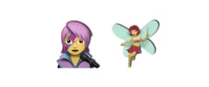
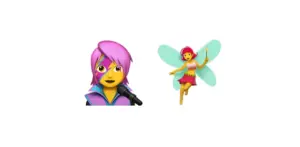
Next, we move on to the beloved emoticons (like 🤗, 😇, etc.). It’s a cool way to make them look a bit different! Below I crafted an example to give a clearer explanation. I chose two of my favorite emoticons 👩🎤 🧚♀️. Feel free to choose your personal favorite and enjoy the experience!! Always remember that the more vivid the colors, the stronger and more noticeable the effect will be! Good luck! 🌟 🥳
<div class="grayscale-emoticons"></div>.grayscale-emoticons:before {
content: "👩🎤 🧚♀️";
filter: grayscale(40%);
font-size: '50px';
}The HTML snippet creates a div element with the class .grayscale-emoticons.
The linked CSS code, .grayscale-emoticons uses the :before pseudo-element to insert content. The inserted content consists of two emojis: “👩🎤” and “🧚♀️.” Additionally, a grayscale filter of 40% is applied, giving the emojis a subtle grayscale effect, displaying them in varying shades of gray while retaining some of their original colors.
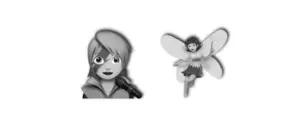
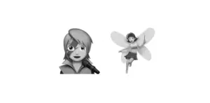
I also included another example with a 100% grayscale filter, which completely removes all colors, rendering the emojis entirely in grayscale.

Using shades of gray adds a nice touch, but if you want to go the extra mile 🏃♀️, try adding shadows to elements for a more realistic look. Building on our previous example, I’ve incorporated the fantastic drop-shadow CSS property to achieve this. Pretty cool, right! 😃
.grayscale-emoticons:before {
content: "👩🎤 🧚♀️";
filter: grayscale(40%) drop-shadow(2px -1px 1px #1d1e22);
font-size: 100px;
}