Another efficient and user-friendly CSS method to cut down ✂ and “play” 🤹♀️ with existing HTML elements. In contrast to most clip-path methods that use coordinate pairs(X, Y) to define points (that act as the corners of the shape) inset() manipulate the sides of the element. How so? Let’s discover it together!
The clip-path: inset() is a way to restrict the visible area of an element by “pushing in” its sides from the element’s bounding box. This function doesn’t create a new shape as every element’s box is rectangular (and it can be a square if the width and height match), it just “trims” the existing one. The result is always a four-sided shape with right angles, which can be either a rectangle or, in special cases, a square.
Now, let’s proceed with a more detailed analysis and try out this amazing tool. For better understanding, I have prepared some practical examples for you. This is our “working area” for today! 👷♀️ 🏗 👷♂️

Clip-path: inset() function explained
First things first. What does this mean? Well.. We need a rectangular or a square shape in order to work with clip-path: inset() CSS property.
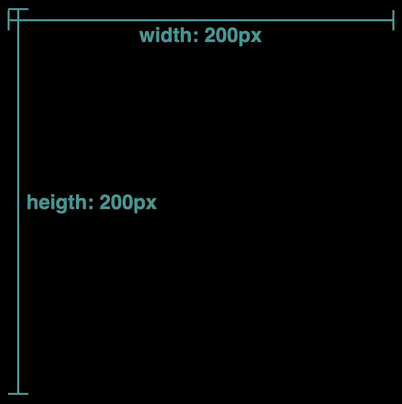
The following code snippet and image illustrate how we create a simple black square with 200px width and 200px height.
/* square */
.square-shape {
  width: 200px;
  height: 200px;
  background-color: black;
  }
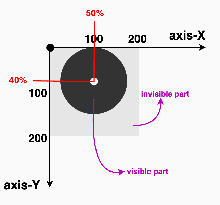
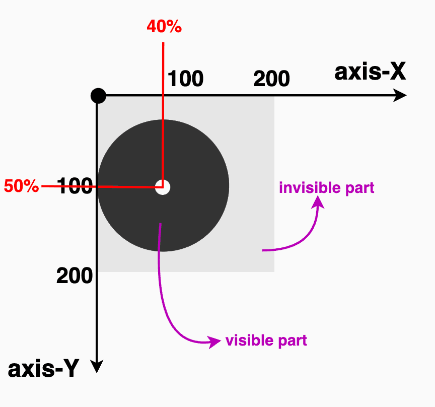
Inset accepts up to four values, each controlling how far the sides are pushed inward.
So, how about analyzing the different cases based on these values, and then proceeding with examples?
- One value: it applies to all four sides
- Two values: the first one is for top & bottom, while the second is for left & right
- Three values: the first one is for top, the second for left & right and the third for bottom
- Four values: the first one is for top, the second for left, the third for bottom and finally the fourth value is for the right side (clockwise).
We can now proceed with our examples. The code snippets and images that follow display these four cases.
First case – One value
.square-shape {
  ...
  clip-path: inset(50px);
  }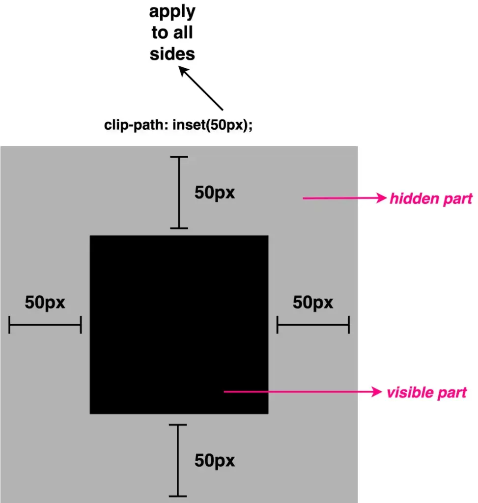
NOTE: ⬜ The gray color is used only for clarity, to distinguish the initial square from the clipped one. In practice, this part would be cut out (hidden).
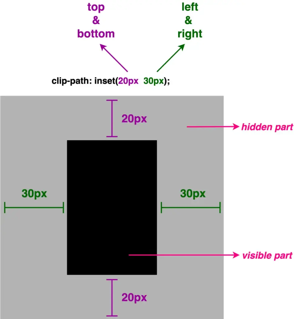
Second case – Two values
.square-shape {
  ...
  clip-path: inset(20px 30px);
  }
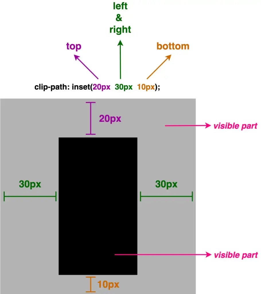
Third case – Three values
.square-shape {
  ...
  clip-path: inset(20px 30px 10px);
  }
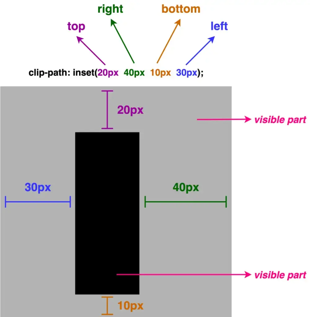
Fourth case – Four values
.square-shape {
  ...
  clip-path: inset(20px 40px 10px 30px);
  }
Making your elements smooth with rounded corners
Apart from cropping, inset() allows you to round the corners of the clipped shape as well. This is achieved by adding the optional round keyword, followed by a radius value, which functions similarly to the border-radius CSS property.
By utilizing it, we can transform the sharp corners into rounded ones.
As previously with the inset(), round takes up to four values, too.
- One value: it applies to all corners the same value
- Two values: they applied diagonal, the first one is for top-left & bottom-right corners, while the second is for top-right & bottom-left corners
- Three values: the first one is for the top-left corner, the second goes diagonally and is applied to both the top-right & bottom-left corners, and the third for the bottom-right corner
- Four values: the first one is for the top-left corner, the second for the top-right, the third for the bottom-right, and finally the fourth value is for the bottom-left corner (clockwise).
We move forward with our examples. The following code snippets and images display these four cases.
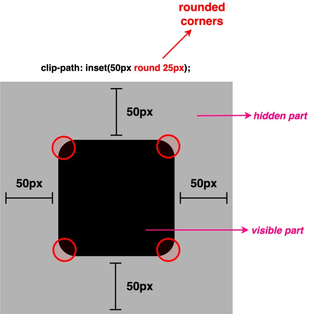
First case – One value
.square-shape {
  ...
  clip-path: inset(50px round 25px);
  }
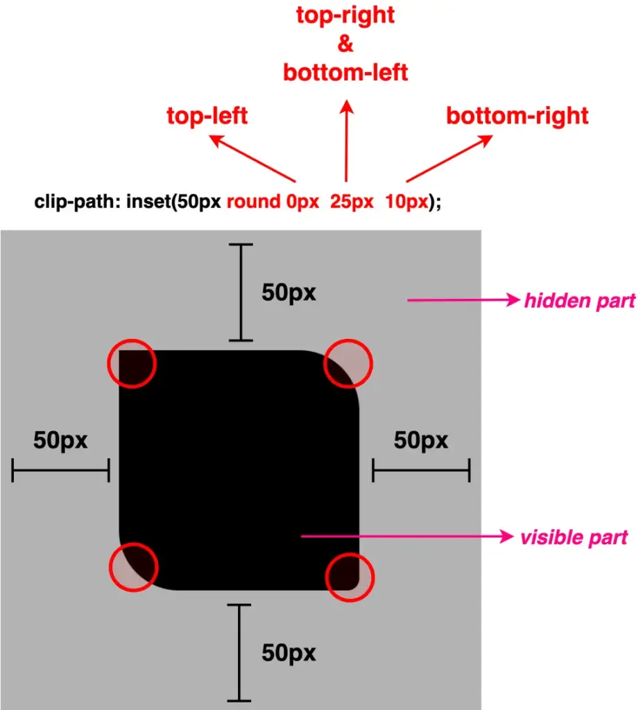
Second case – Two values
.square-shape {
  ...
  clip-path: inset(50px round 0px 25px);
  }
Third case – Three values
.square-shape {
  ...
  clip-path: inset(50px round 0px 25px 10px);
  }
Fourth case – Four values
.square-shape {
  ...
  clip-path: inset(50px round 0px 25px 10px 20px);
  }
Apart from pixels, all values can also be written in percentages. The two units, px and %, can even be combined.
The following examples, along with their code snippets and images, illustrate these cases.
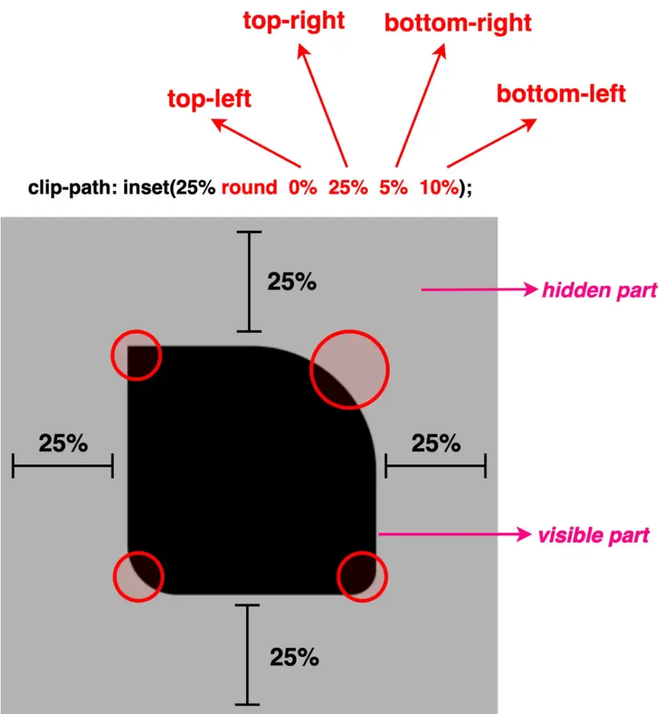
Using percentages as values
.square-shape {
  ...
  clip-path: inset(25% round 0% 25% 5% 10%);
  }
Combine percentages with pixels
.square-shape {
  ...
  clip-path: inset(25% round 10px 30% 5% 60px);
  }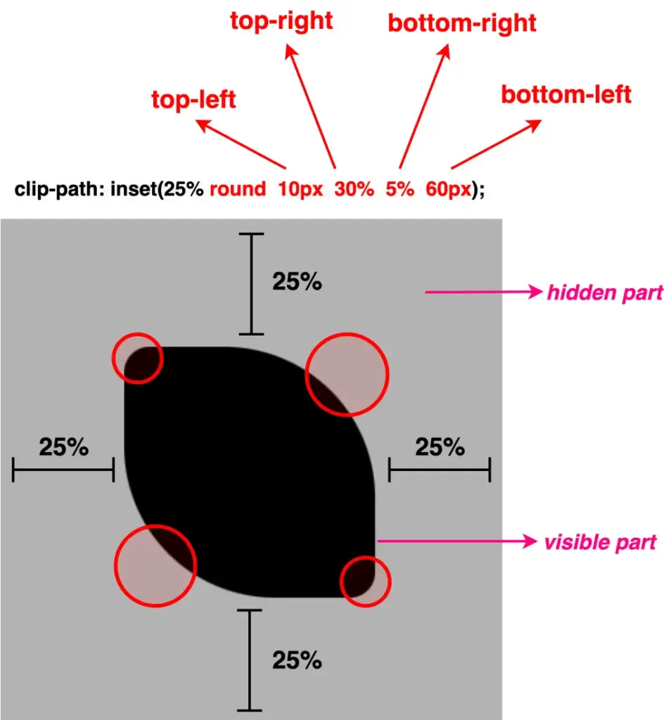
Well, something like a 🍋 lemon is here!! Cool, hug!?
Clip-path inset function – manipulating images
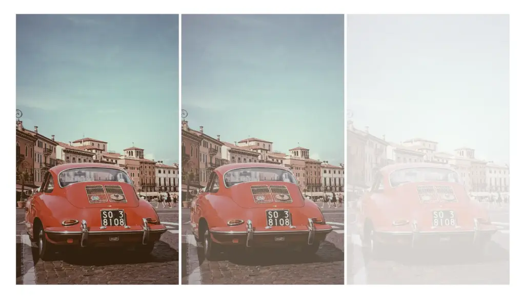
Images can also be clipped, revealing only part of them, by simply utilizing the clip-path: inset() CSS property.
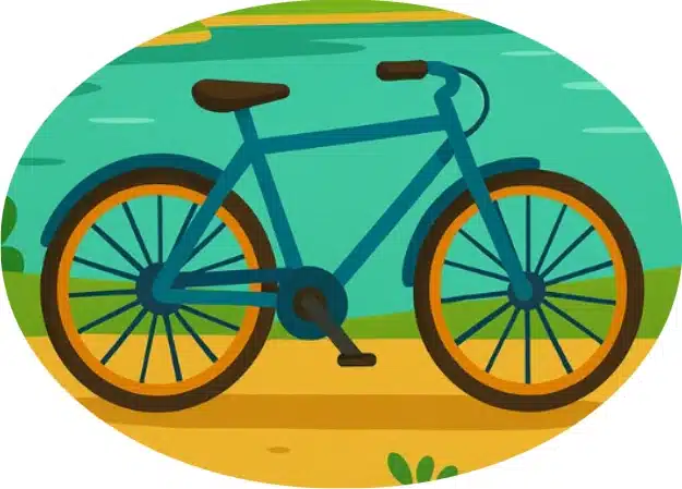
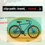
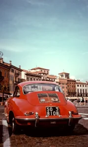
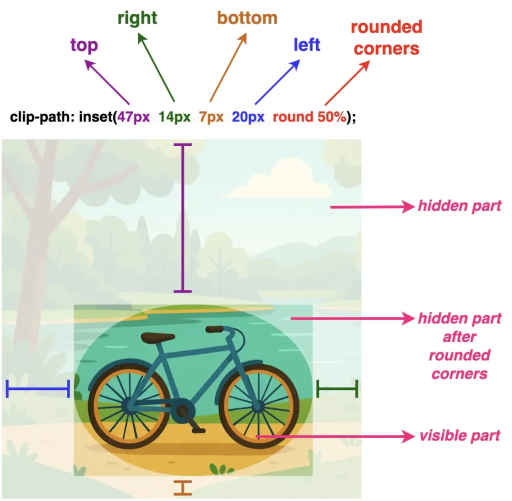
Below, we have an image of a bicycle 🚴♀️ out in nature. 🏞 Let’s say that we want to isolate the bicycle and display it within a rounded shape, pretty much like a frame. ✨

Depending on our prefrences, we cut away the unnecessary parts. First, our initial square image turns into a rectangle. After that, we add the round with a value of 50% which gives the remaining part a smooth, nicely rounded shape.
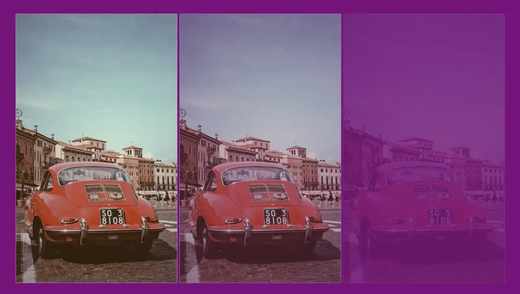
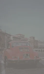
NOTE: To make things more straightforward, I’ve prepared an image with colored code and overlays 🎨 ✂ showing which values correspond to the parts we cut away.
.image {
...
clip-path: inset(47px 14px 7px 20px round 50%);
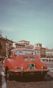
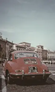
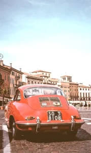
}Now we see just the bicycle kept in view, while everything else is clipped out. Exactly the effect we want to achieve.
Voila!! There we have it! Our final updated image!! 🥳 Ready to be styled even more with all those amazing CSS properties!