Learn how to use CSS linear-gradients to create smooth color transitions, background effects, and visually engaging web designs with practical examples.
Have you ever wanted to add cool effects to your website? With the CSS overlay effect, you can easily create stylish overlays to make your content stand out! Let’s see how it works!
What are overlay effects?
A CSS overlay effect is a powerful technique for placing an extra layer on top of your web content, typically an image or a background, to enhance its appearance or improve readability.
This effect allows you to create various visual enhancements, such as darkening an image or adding a color tint.
You can achieve overlays using the CSS background-color and background-image properties, enabling you to apply stunning visual effects to images. With these properties, you can easily modify the look and feel of your content, making it more engaging and visually appealing.
Let’s dive into an example to see how the CSS overlay effect works.
Basic HTML and CSS setup for a CSS overlay effect
First, we need to create an HTML element to hold our image and assign it a class. This class will contain all the necessary CSS rules to achieve the desired overlay effect.
<divclass="overlay-container"></div>
HTML
Next, we write the CSS for our class, setting a background image without repetition. This ensures the image fits nicely within a 400x600px box. With this setup, we can easily apply overlay effects or make further adjustments as needed.
A common technique for creating overlay effects is pseudoelements (:before and :after). To get this effect working, we have to prepare our class by setting position: relative. Then, we apply position: absolute to the :before pseudo-element. This ensures that :before is positioned relative to its parent — the overlay container.
We also use the content: "" declaration to make sure the pseudo-element is generated. In this case, the content remains empty since we want the image to be visible underneath.
Additionally, we set width: 100%; and height: 100%; to ensure the :before pseudo-element covers the entire area of its parent container, completely overlaying the image.
Overlay effects come in various types, each adding a unique touch to our images. The CSS property that helps us to create this effect is background-image.
Below, I’ve created different variations for you to explore. 👩💻 Enjoy!
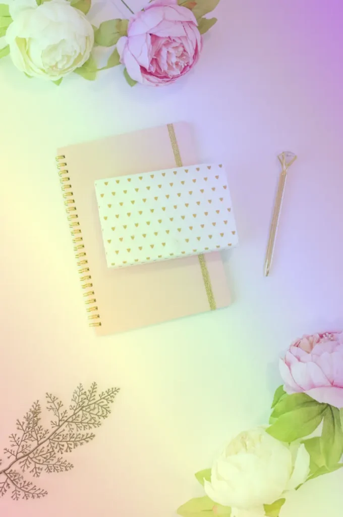
Using a linear gradient for the overlay effect
In the following CSS code snippet, you can see that the background-image property is set to linear gradient(...), creating a multi-color overlay effect with different transparency levels. This produces a smooth gradient overlay from top to bottom with shades of teal, yellow, and purple that make the perfect match for our image.
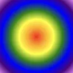
We continue with a more creative approach. Here, radial gradient(...) creates a unique overlay effect using a circular pattern. It transitions from shades of light gray to dark gray, adding a subtle yet eye-catching touch to the image.
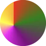
Another vibrant and playful effect is the rainbow gradient. Often used for decorative purposes, this effect adds bright, joyful colors to the image, creating a fun and lively vibe. 🌈✨
When you apply this gradient as a background, it creates a smooth transition of colors from purple to red, mimicking the colors of a rainbow (ROYGBIV). The use of semi-transparent alpha values gives a soft blending effect between the colors, creating a visually appealing and harmonious overlay.
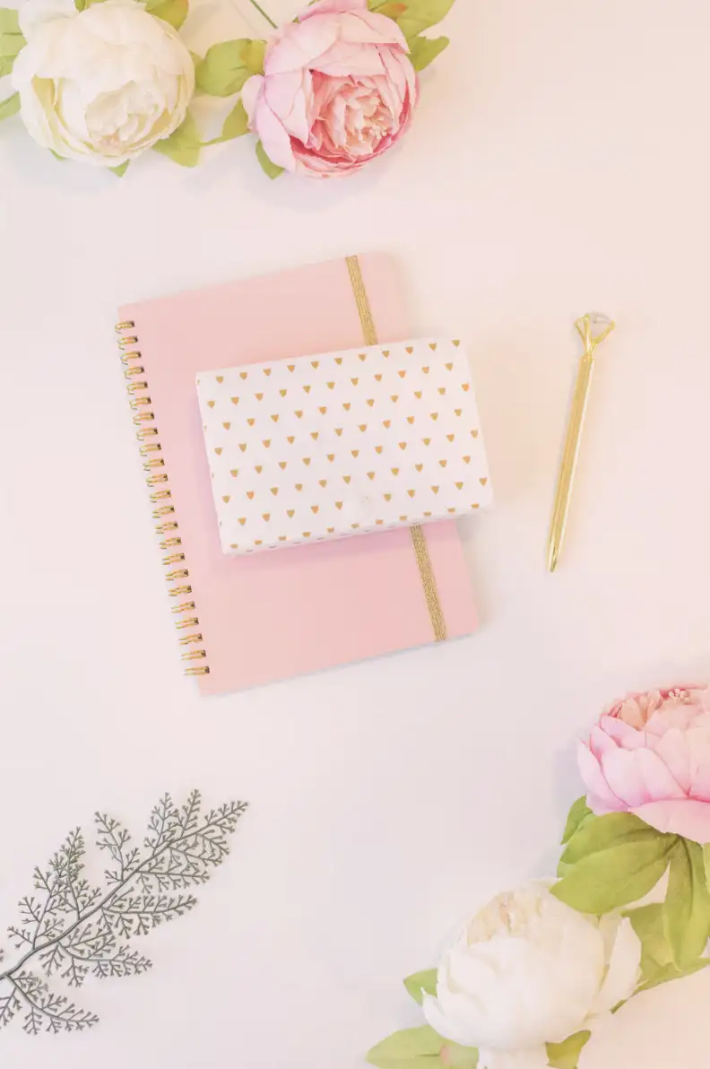
In this example, I kept the second image to make the outcome clearer. I’ve given it a softer, more romantic feel, where the pale pink color with the slight see-through effect adds a charming and gentle mood.
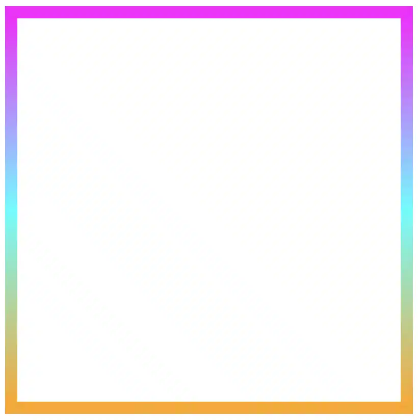
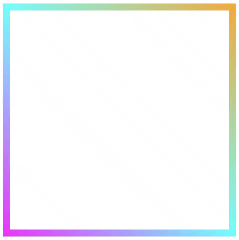
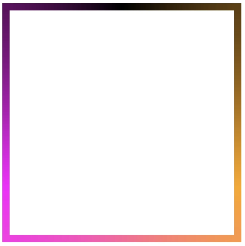
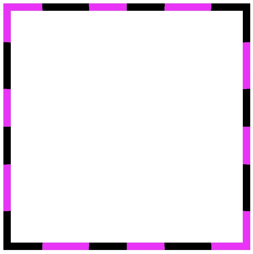
Borders have long been one of the simplest tools in web design. Yet, that’s no reason to look boring. Combining the border-image-slice property with the power of CSS gradients, we can turn simple static lines into 🎨 colorful, eye-catching details that make your designs stand out. Besides, a playful border effect adds fun and energy to a page, helping shapes and sections feel more alive. No images needed, just blending colors with clean CSS. In other words, it’s a small touch that can make your design feel fresh and creative, adding personality and vibrance. 🌈 ✨
Border effect explanation setting linear-gradient
We’ll begin by creating a box with a 150px width and height that temporarily has a solid 5px black border. This is the box we’ll use to experiment with different gradient border effects and make it pop! 🥳
With our box in place, we can make things more interesting by replacing the simple black border with a color 🍭 splash of CSS gradients.
First, we need to add the transparent value to the border.
Next, we continue with the gradient. I decided to start with the linear-gradient and use three colors (magenta, cyan, orange). Feel free to use as many colors as you want.
In the final step, we set border-image-slice to 1. In that way, the browser uses the whole gradient evenly on all sides of the border.
The browser doesn’t know how to spread the gradient across the border area. Without the border-image-slice property, the gradient won’t appear at all. It is essential to add it as it will activate and display the gradient border.
It’s good to know that the border-image-slice property can take up to four values, each one responsible for how to cut (slice) the gradient we use as a border.
More analytically:
border-image-slice: 1; simply put the whole gradient eventually on all sides
border-image-slice: 20; it cuts 20 (px or percentages, depending on what you use) from each edge to make the border
border-image-slice: 20 30; the same as above but the first value is for top and bottom, the second for left and right
border-image-slice: 20 30 10; the first value is for top, the second for left and right and the third for bottom
border-image-slice: 20 30 10 5; finally, the first value is for top, the second for right, the third for bottom and the fourth for left
🔖 When we use a gradient, we usually just write 1 because a gradient isn’t a picture with pixels or edges to slice. It smoothly fills the space, so there’s nothing to “cut”. The value 1 simply tells the browser to use the whole gradient for the border.
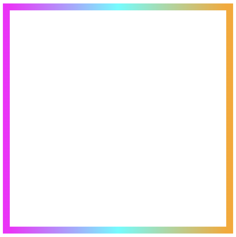
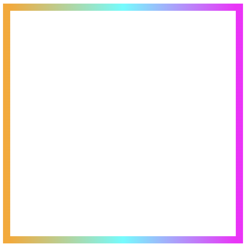
More border effect ideas with linear-gradient technique and border-image-slice: 1
Below, I included a few more examples to help you see how changing the gradient can completely transform the look of a border, making the concept clearer and easier to follow. 😃
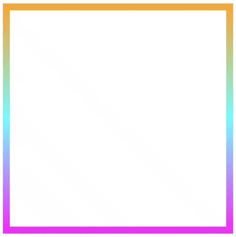
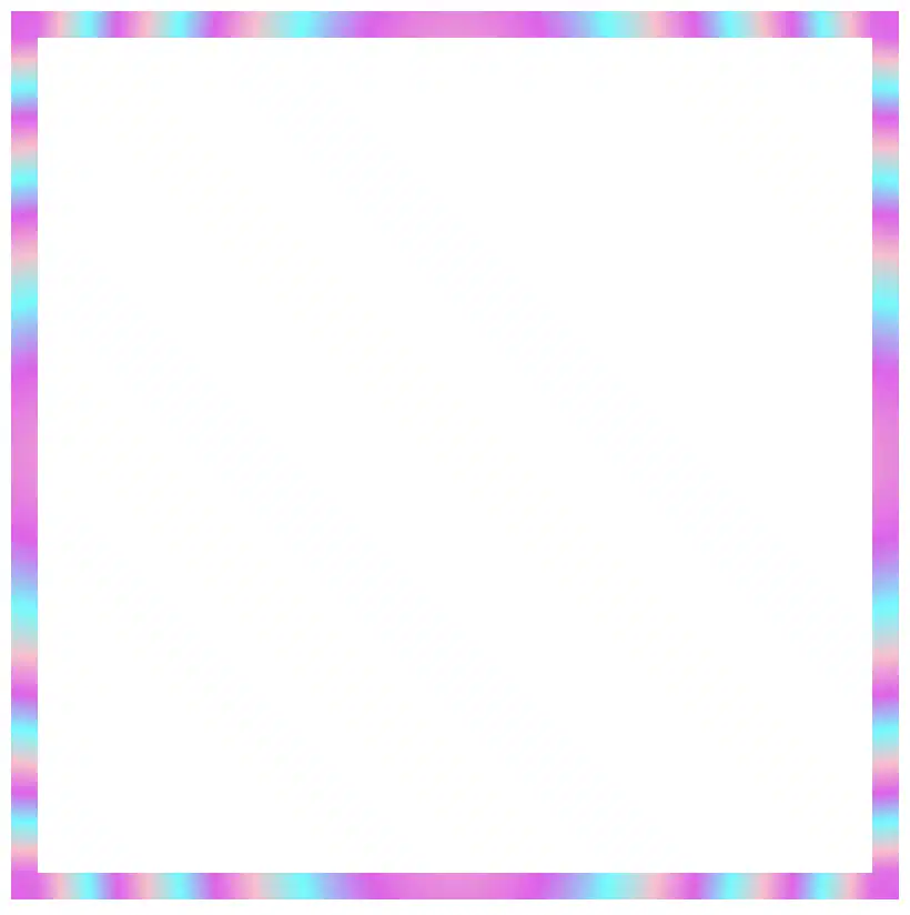
Flipping the colors: The reverse linear-gradient
Colorful linear gradients that flow from top to bottom or the reverse way are like creating amazing color bands that wrap around the box.
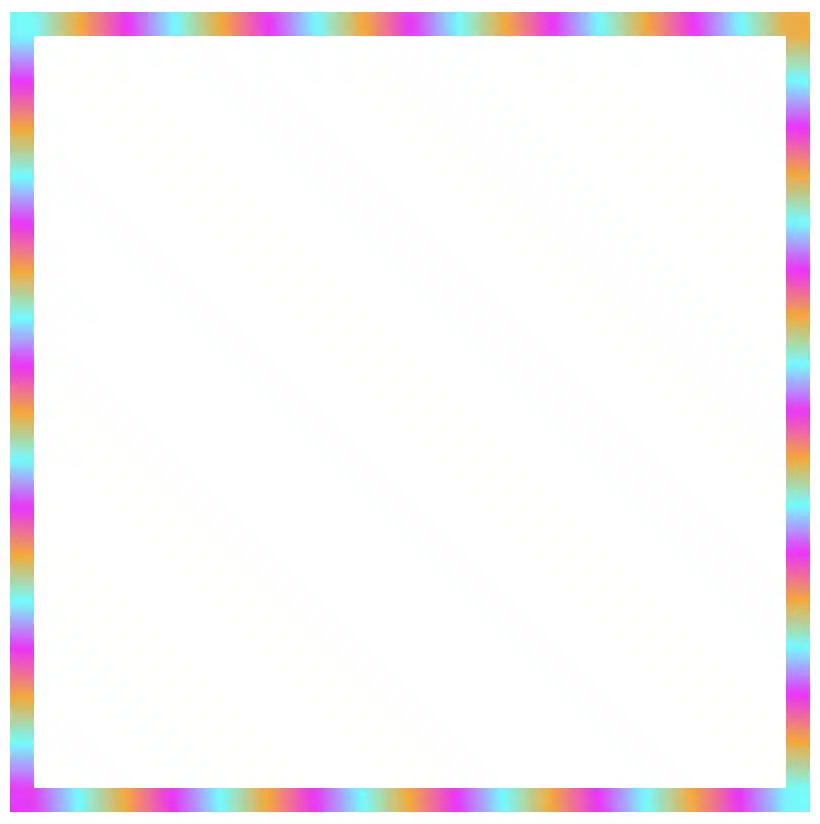
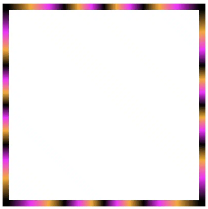
Color loops: The repeating linear-gradient technique
With repeating gradients, you can build patterns that literally look like an impressive dancing effect or all these amazing neon light effects. How cool is that!? 😎
Moreover, we are free to experiment with the other two (radial-gradient and conic-gradient) CSS gradients as well. So, let’s dive into some more examples and discover how different gradient ideas come to life.
Border effects with different border-image-slice values
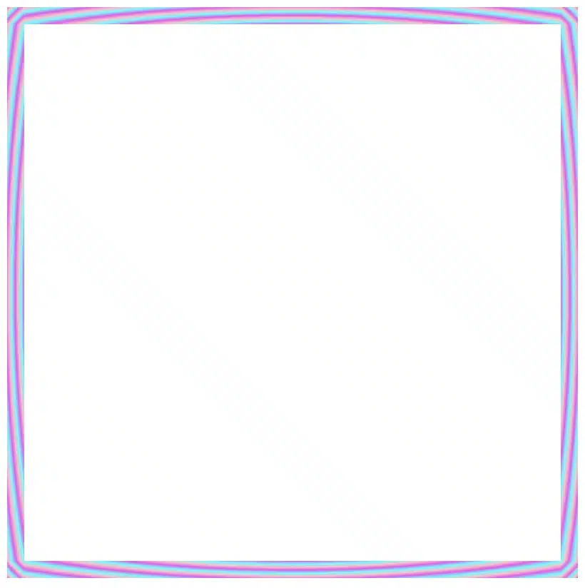
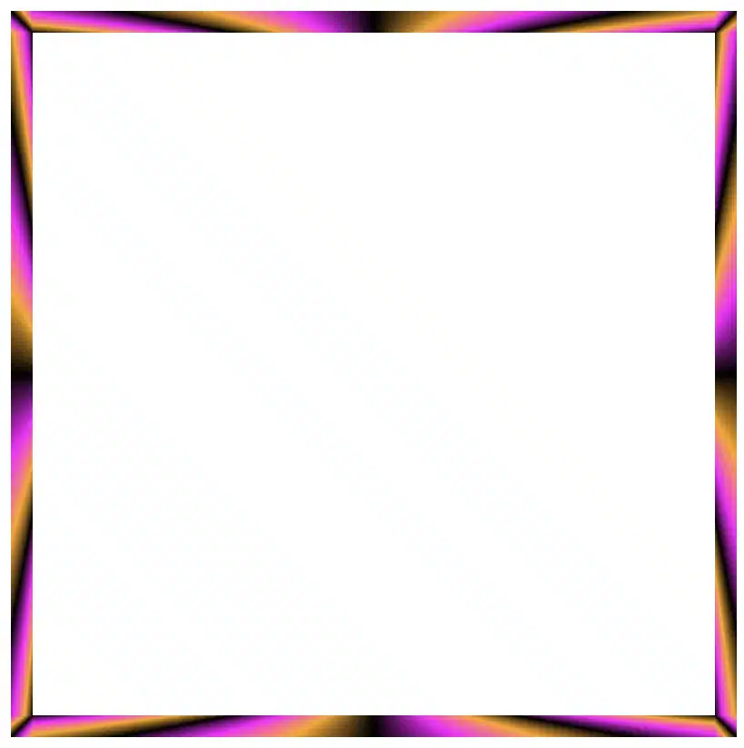
Radial gradient for spinning border effects
Now, let’s see what would happen if we use the same gradient, in this case, the radial-gradient, with many different values on border-image-slice. For these examples, I used cyan, pink and violet. 🎨 ✨
In the first example, we maintain the value 1 while in the second, we replace it with a value of 50. The border-image-slice: 1; applies the entire gradient, spreading the colors smoothly around the border. With this transition, the gradient stays wide and soft.
The border-image-slice: 50; applies a small piece of the gradient. Since it’s using only a part of the gradient’s color range, the colors repeat more often and look like stripes that are spinning around.
To sum up, increasing the slice value tells the browser to take a smaller “slice” of the gradient and reuse it around the border. As a result, with a smaller slice, we have more repetition and eventually stronger striping.
Conic gradient for more complex border effect
Next, let’s see what would happen if we use the same gradient, in this case, the conic-gradient, but different values on border-image-slice. For these examples, I changed the colors and used black, orange, magenta, and black again. 🎨 ✨
🔖 A small detail to keep in mind is that starting and ending with the same color (in this case, black) helps to keep the transitions soft and seamless.
In this case, with a 1 value it uses almost the entire conic gradient around the border. The colors flow smoothly and evenly, creating a soft circular blend with gentle transitions.
On the other hand, with a value 30 it takes a smaller portion of the gradient and stretches it around the border. The border starts showing clearer color sections with mild curves and slight breaks at the corners.
Finally, with a value of 60 it uses a very small wedge of the conic gradient and repeats it. As a result, the border shows strong, repeating color bands or striped details, especially near the corners.
In this case, we use two values: 1 60. The result is a creative mix of two effects. The first value (1) applies to the top and bottom borders. Due to this we have a smooth and gentle look with wide color transitions. The second value (60) applies to both the left and right borders. Because of that, the effect is a tighter and more striped pattern as the gradient slice we use is smaller and repeated more often.
Our final example takes four values: 1 60 60 1. This setup makes our border appear acymatric, calm, and energetic at the same time. More analytically, the first value (1) is for the top border and uses almost the entire gradient. The second and the third values (60 60) are for the right and bottom borders and use a smaller slice (tighter pattern). While the last value (1) is for the left border and uses almost the entire gradient again. Due to these values, we have smooth and continuous top and right borders, while the bottom and left are striped.
The results we observe when utilizing these all these specific values above on the border-image-slice CSS property concerns only a box of 150 pixels in width and height. It is critical to adjust the values if you have different dimensions.
Take into consideration that gradients with the 1 value look better in square shapes, as the color flow fits perfectly within equal sides.
Experimenting with gradient borders opens the door to an endless palette of styles — from soft pastel outlines that frame content elegantly to bold, vibrant strokes that command attention. The key lies in balance: using color transitions and subtle motion to enhance, not overpower, the user experience. Whether you’re styling buttons, containers, or entire sections, CSS gradient borders are a reminder that even the smallest design detail can carry a playful spark — proof that borders don’t just separate elements, they can also bring them to life.
Hey there! 😃 In today’s technology-obsessed world, it’s absolutely crucial to master the art of creating an amazing circular clickable button. A well-crafted button not only enhances the presentation but also elevates the user experience. Maximizing user attention is vital, and buttons are, most of the time, the key to achieving this goal. By utilizing the right tools and techniques, we can create a visually stunning and functionally efficient button that not only looks great but also delivers an unforgettable user experience. 🆙
Let’s collaborate to create a standout button that supports user-friendliness.
HTML Basic Structure
To start building our button, we need to organize our HTML code snippet. The first step is to create a parent element that will act as the base of our button. We give this element the class name .button-base. Next, we need to add a child element within this parent element to serve as the clickable part of the button. We give this child element the class name .clicable-part. It’s important to nest these two elements within a button HTML element as it’s more semantic, better for accessibility, and behaves correctly in forms and interactive contexts by default. Additionally, we need to create the shadow effect for our button, so we add one more HTML element with the class name .button-shadow.
We move forward with CSS and make our button fresh and stylish! For this post, I am writing CSS using Sass syntax. If you would like to convert it to vanilla CSS and don’t already know how, I’d suggest you use an online Sass — CSS converter.
Prepare the body for the clickable button
Firstly, we apply a color (#f5f5f5 – dark gray) to the body by setting the background-color. Additionally, we want to center our button. For that reason, we are using the flex method.
body {background-color: #f5f5f5;display: flex;align-items: center;justify-content: center;}
SCSS
Create the base of the clickable button
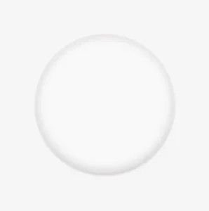
To create the base of our button, we start by making a square with a width and height of 200 pixels. Then, we make it rounded by adding a border-radius of 50%. We use a pale white color (#f9f9f9) for the button’s background-color. To give it a more stylish look, we add some shadows using the box-shadow property.
Finally, we add the flex method to prepare the space to position the clickable part of the button in the center of the base.
📍 As seen in the code snippet below, we need to include border: none and background-color: transparent properties in the button element to ensure it will display only the styles we define. These properties remove the browser’s default styles that typically come with. As a result, it provides us with a clean starting point, so the button appears exactly as we’ve styled it, with no unexpected borders or colors.
In the image below, you can see the base of the button we just created.
Create the clickable part of the button
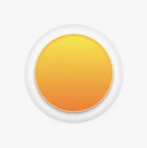
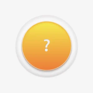
To create the clickable part of our button, we first set the height and width to 80%. Then, we apply a border-radius: inherit to make it appear rounded and follow the shape of the base. For the background of the button, we use a linear-gradient that adds depth as it gives a bright orange color at the top that gradually becomes darker as it goes down. To add a more stylish look, we include shadows using the box-shadow property.
To add content at the top of the clickable part of a button, we can use a :before pseudoelement. Inside the pseudoelement, we can insert the desired symbol or text using the content property. For instance, in our case, a question mark emoticon (?) has been used, but you can use any symbol or text you prefer. It’s important to note that the flex method in the .clickable-part class is essential, as it centers the mark correctly.
The image below displays the content we added on the top of the clickable part of the button.
Add the hover effect on the top of the clickable button
To add a hover effect, we set the :hover CSS property. For the cursor, I prefer using the value pointer (👆), but feel free to choose any other style from the plethora of options available here. Finally, I apply the filter: brightness and increase it to 110%. This makes our button appear brighter whenever the mouse hovers over it. ✨
The gif below demonstrates how the hover effect (👆) appears.
Activate the clickable part of the button
To make your button fully functional, you need to activate its clickable part. We can achieve this by adding the :active property. Next, we give it a background with a linear-gradient that creates a sense of depth by providing a bright magenta color at the top that gradually becomes darker as it goes down. To make it more visually appealing, we include shadows using the box-shadow property.
The following gif displays the activated clickable area.
Update the button’s content when it is activated
To enhance the user experience, we can dynamically update the content displayed on the button when it’s clicked. This may be accomplished by adding a :before pseudoelement and inserting the desired content into the content property. In our case, we will display a white heart (🤍) when the button is clicked.
With just a single click, this button comes to life and reveals its beautiful new content in the following gif (🤍) – it’s an absolute must-see!! 😎
Add the shadow effect to the clickable button
The last thing we have to do is add the shadow effect. We create a rectangle with 140 pixels width and 15 pixels height. Next, we give it a rounded shape by setting the border-radius property to 50%. To create a background that looks like it becomes lighter as it goes toward outer space, we use the radial-gradient technique and make the center darker. To make the whole thing look smoother, we add shadows with the box-shadow property.
Finally, we utilize the position: absolute combined with the top, left, and transform properties to move it below the button and center it.
.shadow {width: 140px;height: 15px;border-radius: 50%;background: radial-gradient(#a7aaaa, #b2b7b710%, #eaeded);box-shadow: -5px0px10px5px#eaeded, /* shadow right side */5px0px10px5px#eaeded, /* shadow left side */inset-5px0px5px#eaeded, /* inset shadow right side */inset5px0px5px#eaeded; /* inset shadow left side */position: absolute;top: 520px;left: 50%;transform: translate(-50%);}
SCSS
The button’s captivating shadow effect is truly impressive and adds to the overall appeal. Hope you find it enjoyable and engaging. Thank you for your attention. 🥳
Below is the full code referenced in this blog post. Feel free to copy and use it in your own projects. If you have any questions or encounter any issues, don’t hesitate to reach out for assistance. You can easily copy the desired code snippet by clicking on the copy icon, located in the top-right corner of each snippet.
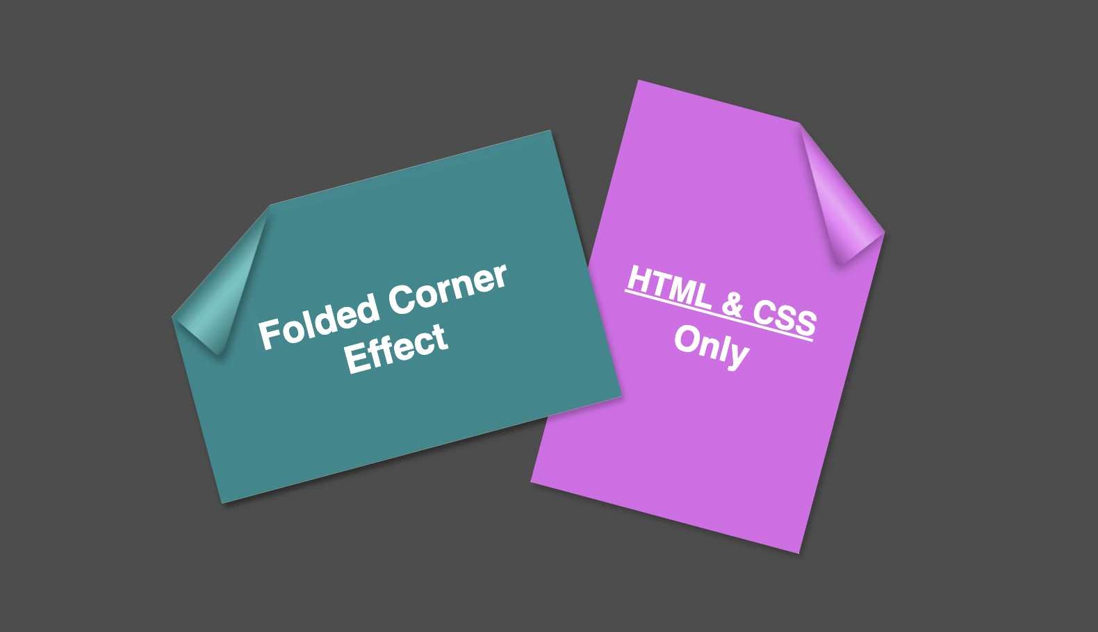
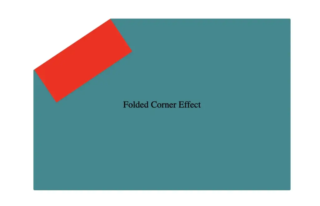
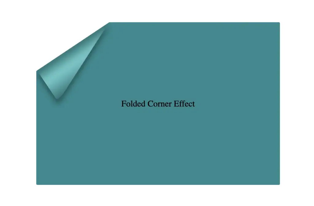
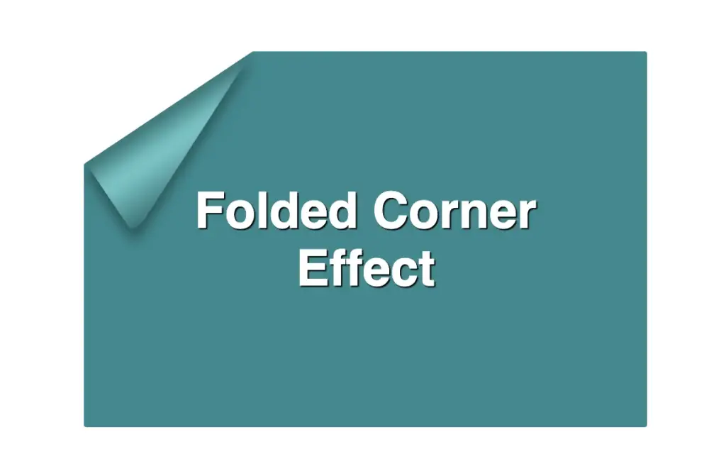
Hello everybody! I’m excited to share a cool folded corner effect I created using just HTML and CSS. This eye-catching design adds a dynamic flair, creating a realistic illusion that enhances your webpage’s visual appeal —no images, extra scripts, or complex code required. How awesome is that? 😎
Elements with clip-path do not take shadows directly. Instead, they must be nested within a container to inherit its shadows.
Creating the folded corner effect using pseudo-element
We’ll start by using the :before pseudo-element combined with the clip-path property to create the folded corner effect. The main element, which contains the pseudo-element, is styled with a filter property to apply a shadow. This shadow is then inherited by the pseudo-element, allowing the folded corner to display a subtle, realistic shadow as well. This technique keeps the design lightweight and visually appealing.
Basic HTML structure for the folded corner effect
The HTML code snippet creates a card layout. We have a parent element with the class .card, housing two child elements: the first with the class .title for the card’s title, and the second with the class .folded-corner to apply the folded corner effect via CSS.
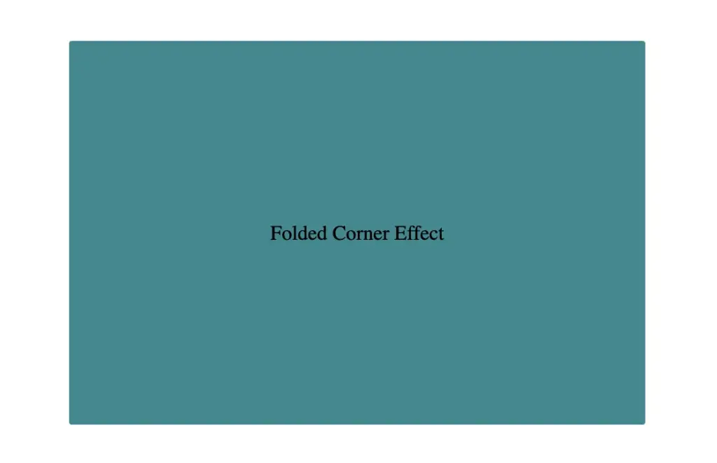
Starting with the CSS, we define a horizontal rectangle by setting the width to 450px and the height to 300px, along with a subtle 2px border-radius for slightly rounded corners. The background color is set to #228a90, a rich teal with greenish-blue tones that gives the card a fresh, modern look.
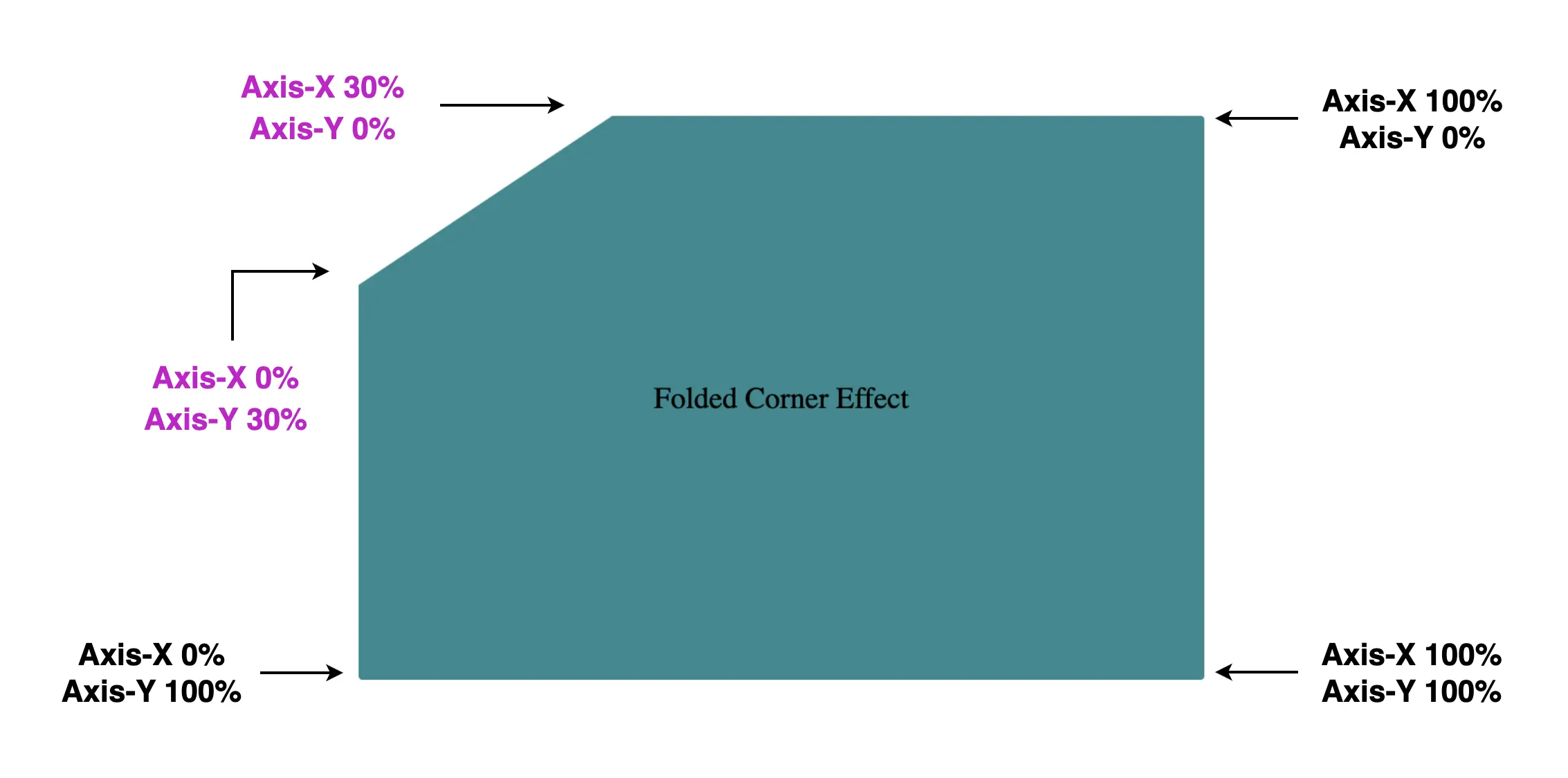
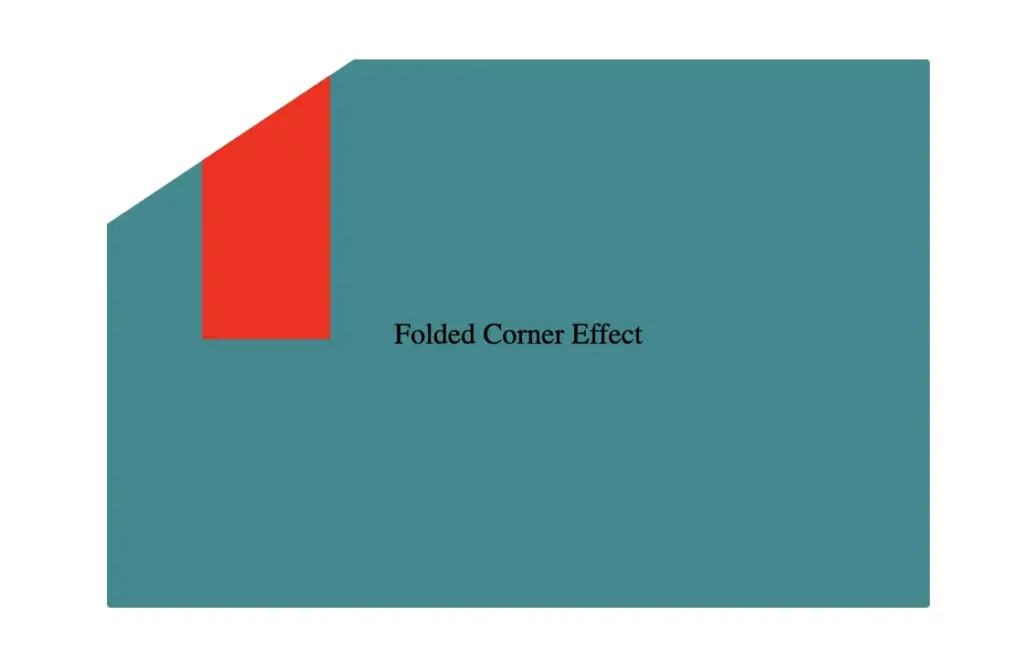
Then we use the clip-path property to shape the desired paper corner for the folded effect. I chose the top-left corner, but you can select any one you prefer by adjusting the corresponding points in the clip-path: polygon() function.
Think of the corners in this order: top-left, top-right, bottom-right, bottom-left (clockwise).
Remember to split each selected corner into two coordinates to get the right look (watch those 👇 magenta measurements! 😉) Take into account that the top-left corner has both Axis-X and Axis-Y on 0%.
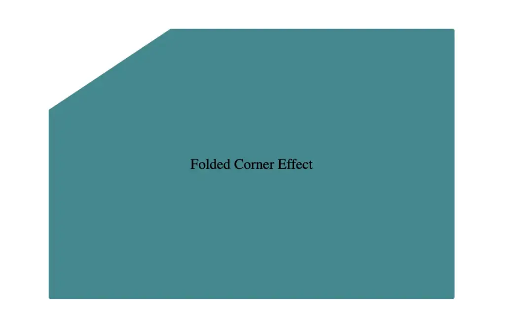
Finally, adding position:relative does not change something in our effect but prepares us for future positioning adjustments. As for centering our elements using flexbox—it’s purely for aesthetic purposes, helping keep everything visually balanced and neat. Below, we can see what is rendered on the screen for now. Pretty cool, right!? 😃
CSS structure: how to create the folded corner effect
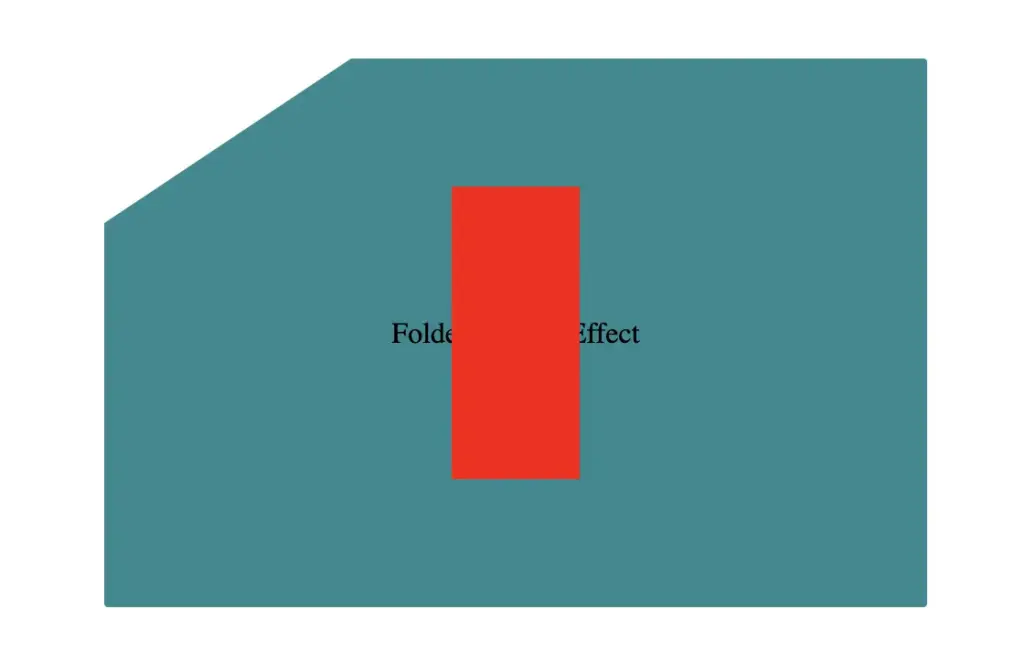
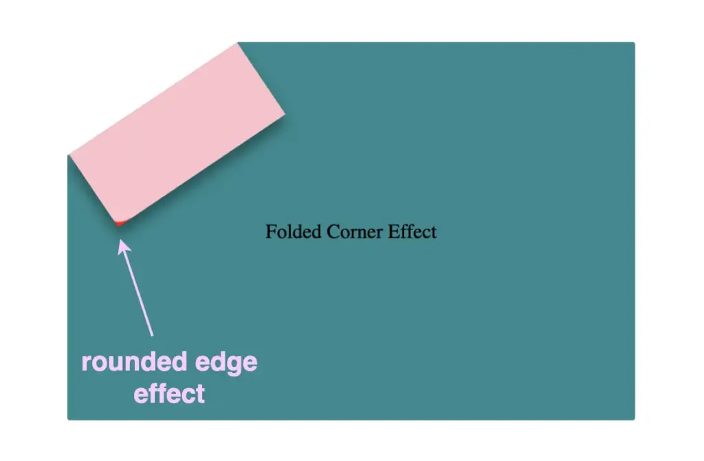
To continue building our effect, we’ll use the folder-corner child element to create a second rectangle within the parent card element. This element will act as the folded piece of paper. We’ll give it a width of 70px and a height of 160px.
For now, we’ll use a red background color to help us visualize its position and behavior more clearly—this will be updated to its final color later. We’ll also apply position: absolute to enable precise positioning.
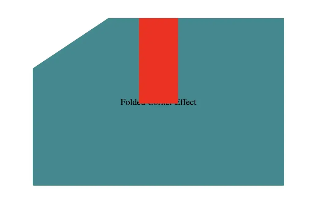
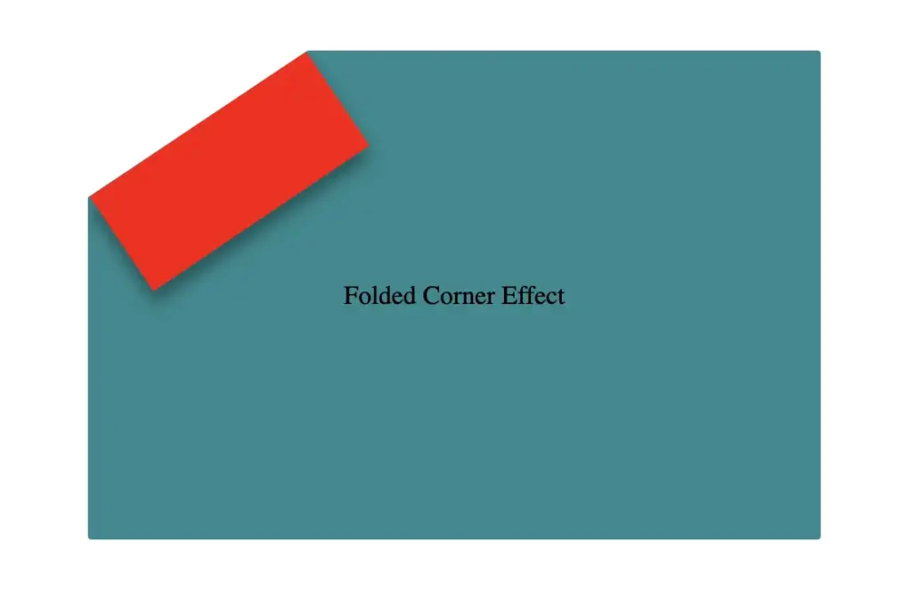
Next, we continue with positioning. We use the top and left properties to move the .folded-corner element closer to the clipped corner, then apply the transform property to rotate it into place.
Finally, adding the filter property is essential for completing our effect. As mentioned earlier, applying a shadow directly to an element with a clip-path isn’t possible — so the solution is to create an additional element that can hold the shadow.
To do this, we’ll add a :before pseudo-element with the same dimensions as our folded corner. This allows us to recreate the folded shape and apply the shadow to it — adding depth and realism to the folded corner effect. 😎
Next, we move forward by using the beforepseudo-element with the content property and set its position to absolute for precise placement within the parent. We want this pseudo-element to have the exact dimensions as the parent, so we set both its width and height to 100%, something that allows it to inherit the parent’s size.
For now, we apply a pink background to help visualize the structure. Finally, we add a border-radius of 10% to the bottom corner, which softens the edge and creates a smoother, more realistic folded appearance.
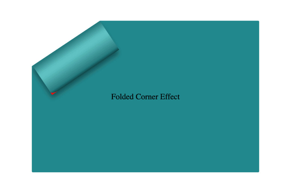
Next, we replace the pink background with a smooth linear gradient. We choose colors similar to the main hue but make them darker towards the edges and lighter in the center. This gradient effect enhances the appearance by making the center appear brighter and polish. ✨
To complete the shape, we apply the clip-path: polygon(0% -2%, 0% 100%, 100% 100%) property. This is essential for transforming the before pseudo-element —which starts as a rectangle, just like its parent—into a triangle.
In simple words, this clipping path reshapes the element into the desired triangular form. 🥳
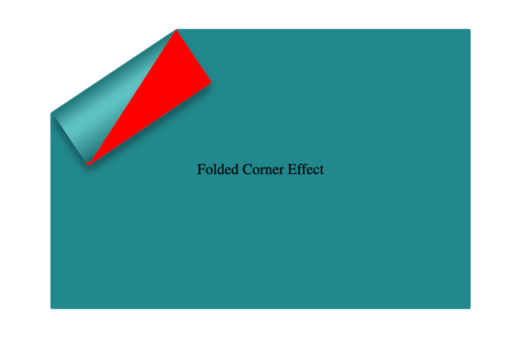
The last step is to turn back to the parent element with the class .folded-corner and “remove” the red rectangle from view by simply replacing the red background-color with a transparent value. As we can see, the :before pseudoelement inherits its parent shadow effect while the parent becomes invisible.
We can enhance the title to have a more eye-cathing result. Applying a white background-color, increasing the font-size, and adding a subtle black text-shadow will make the title stand out beautifully, elevating the overall design. 📄 ✨
If you have any questions or run into any issues, don’t hesitate to reach out in the comments below — I’m happy to help. You can easily copy any code snippet by clicking the copy icon in the top-right corner of each block.
Summary
We started by creating the paper and cutting its corner. Then, we set the clip-path property to define the shape and positioned the folded-corner element precisely over the clipped area. After that, we enhanced the styling with background gradients that match the paper’s tone, and wrapped up by polishing the effect for a clean, realistic look. 📄 ✨
Wishing you the best of luck in all your creative endeavors! 😃
Hello there! Today, we will explore a simple yet valuable topic. How do you create a CSS reflection using only one property? Let’s unlock the amazing –webkit-box-reflect property and effortlessly craft repeatable elements with minimal 😉 code! 🥳
Simple CSS Reflection
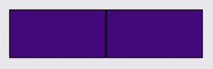
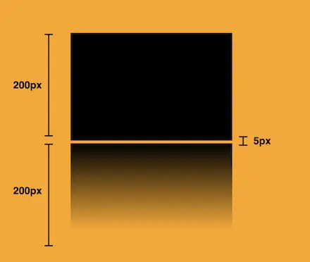
We will start by creating two identical boxes. We set 200 pixels width and 100 pixels height and also add a solid black 2 pixel border. Continuing, we give our boxes an indigo background-color.
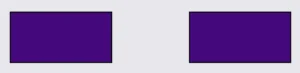
Next, we proceed with our -webkit-box-reflect where we create the reflection of each box, ensuring that their direction remains the same (right direction). However, the second reflection is located 150 pixels from the original box. That way, we can explore both direction and distance.
In the images provided, we can see two boxes along with their corresponding reflections. In the first image, the box’s reflection is located exactly on the right-hand side, adjacent to the original box, while in the second image, the box also has a reflection on the right-hand side but is positioned 150 pixels away from the original box.
-webkit-box-reflect: right
-webkit-box-reflect: right 150px
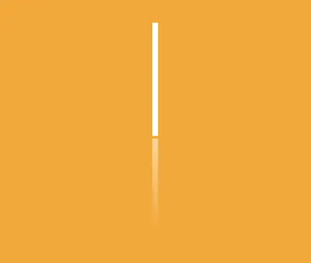
CSS Reflection With Fade-Out Effect
It is essential to know that we can use the -webkit-box-reflect CSS property to create a reflection effect that accurately mirrors the original element’s appearance and style. We can further improve this effect and make it seem more authentic by using the linear-gradient CSS property, which gives us the impression of a gradual fade-out. This technique is pretty cool! 😎
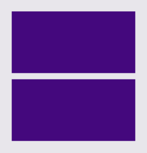
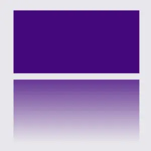
We will start with our HTML code snippet, creating again two boxes with identical characteristics. We set 200 pixels width and 100 pixels height. Next, we give both boxes an indigo background-color.
Next, we proceed with our -webkit-box-reflect where we create the reflections of each box, ensuring that they have the same direction (below). However, the second reflection has a linear-gradient that creates a fade-out effect from top to bottom.
When adjusting the reflection vertically, we need to use above and below instead of top and bottom.
Below, you can observe two boxes along with their related reflections. In the first image, the box’s reflection is located 10 pixels above the original box. In the second image, the reflection stands again 10 pixels above the origin box, but this time has the fade-out effect. It looks nice, doesn’t it?
Hi there! 😃 In this post, we’ll learn bit by bit how to create a CSS text reflection effect. When we say reflection, we’re referring to a mirror-like effect that looks like the text reflects on a surface, much like the way we see our reflection in a mirror.
This is a simple yet amazing way to enhance the appearance of your text. Let’s analyze our effect so that you can easily follow along.
HTML structure
We will begin with our HTML structure. As you can see below, I prepared a div with the class .reflection-text , this is where our effect will take place.
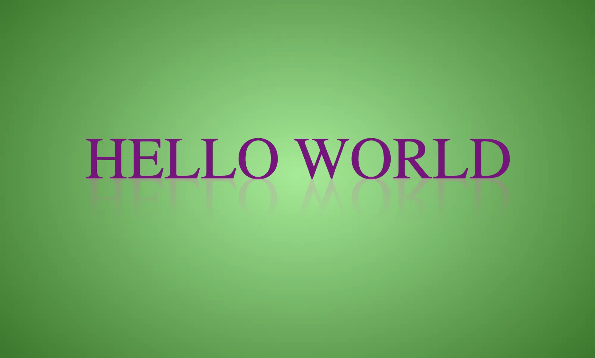
<div class="reflection-text">HELLO WORLD</div>
CSS
CSS foundation
Let’s move forward with the CSS basic structure. We start with defining the background. It’s worth noting that using radial-gradient can make our effect more impressive. 😃
body {background: radial-gradient(lightgreen, darkgreen);height: 100vh;}
CSS
Below, we can see the background we just created.
In web development, we use the flex method in order to center our text. Then we will enhance its appearance, by making some adjustments. We will set the font-size to 100 pixels, select the “Roboto” font-family, and choose white as the text color.
Adding the CSS structure for the reflection effect
Creating a reflection can be achieved by using pseudoelements like :before and :after. To ensure this works properly, we need to include position: relative in our .reflection-text class.
.reflection-text { ...position: relative;}
CSS
Now, we are ready to proceed and create our reflection by adding the :before pseudoelement with all the necessary properties, as shown in the following code snippet.
🟢 To begin, we add the text “HELLO WORLD” to create another text element with the same content. This new text will serve as our reflection. Then, we set position: absolute so that we can move our reflected text below the original text. We use the top property to move the reflected text 65 pixels from the top, but you can always move the reflection in any direction you prefer. It is important to position the text and its reflection closely together for a more realistic reflection effect. 😉
🟢 We move forward and use the transform CSS property to rotate the text by 180 degrees
and then flip it horizontally using scaleX(-1). Now we have the perfect reflection! Let’s continue and make it more realistic.
🟢 In the next step, we will adjust the color of our reflected text. To achieve this, we will utilize the linear-gradient CSS property and specify the direction as downwards. This will create white gradients, with the top appearing more intense and gradually fading towards the bottom of the text.
🟢 It is commonly known that gradients cannot be directly applied to texts. Don’t worry! 🤔 We already have the solution to this problem. For now, let’s give a quick explanation. To create a clipped linear background pattern for text, first, we add the -webkit-background-clip: text property, and at the same time, we set the color to transparent, and our text automatically turns to transparent. In that way, our text takes the background: linear-gradient as its real color.
🟢 For a more transparent text, we can adjust the opacity. The lower the opacity, the more transparent our text becomes. So, here we are! Our reflection is ready! 🥳
🔖 It is always an option to use black or any other color in our work. Below, I’ve included examples of texts with black, purple, and green colors. It’s important to remember that the key factor is to set the correct gradients at the linear-gradient property. That way, we can create respective shades. Therefore, please give extra attention to that! 😊
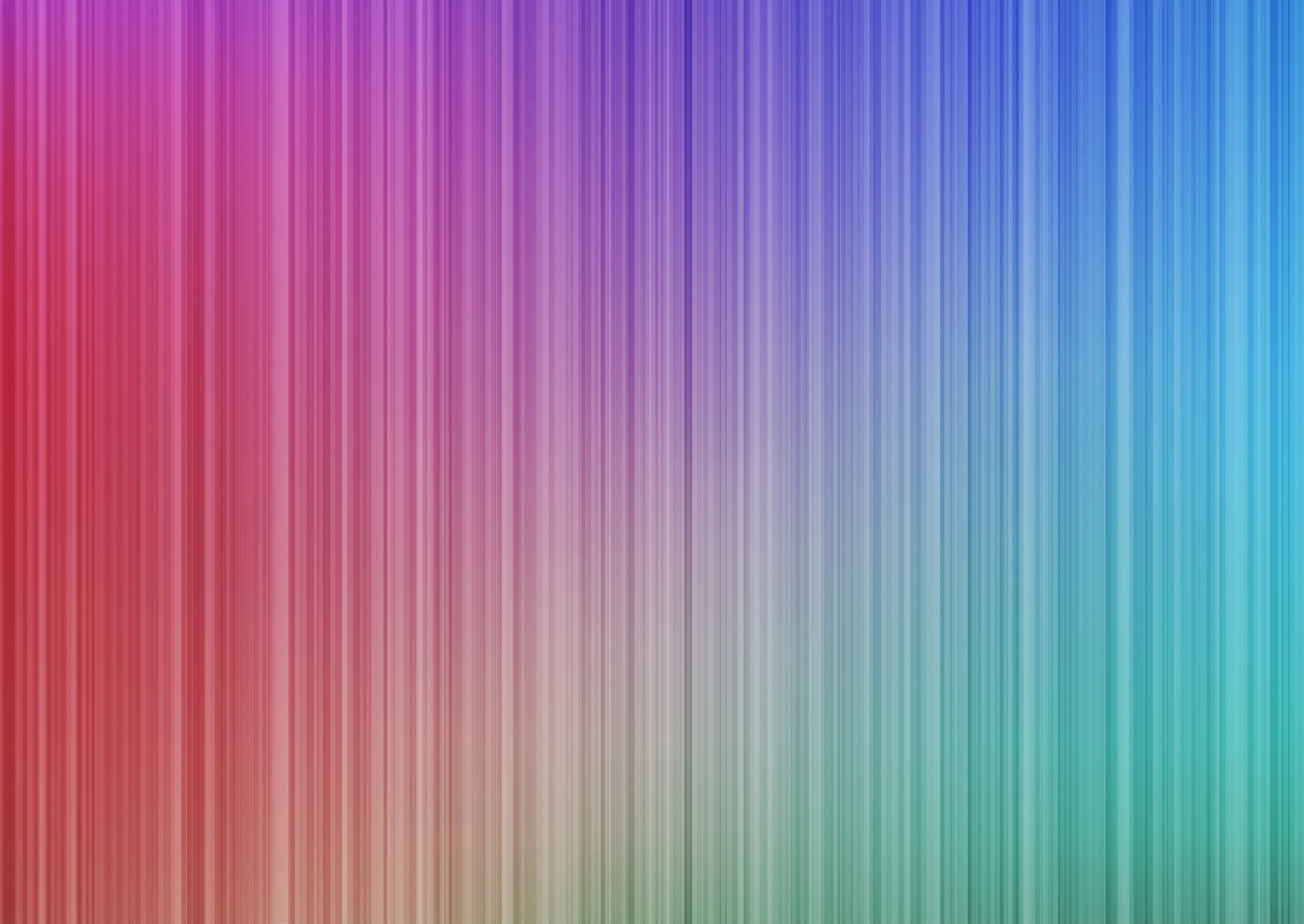
Hey there! 😃 Exploring CSS linear gradient techniques is a fantastic approach to fashion vibrant, colorful mixtures. Gradients give us the flexibility to choose any desired direction, defined by their starting and ending points. Mixing a minimum of two colors is fundamental, yet the potential for blending expands further, enabling us to achieve seamless transitions or pronounced shifts based on our design requirements.
Today, let’s dive into the exciting world of CSS linear gradient techniques. 🌈✨ Picture a smooth transition of colors in a straight line, adding a sleek and dynamic touch to your web design. With linear gradients, you can smoothly transition between colors. You have the power to guide the eye seamlessly from one color to another. Whether it’s a subtle shift or a striking contrast, mastering linear gradients empowers you to enhance the visual appeal of your web projects.
Ready to discover 🔍 the art and versatility behind linear gradients? Let’s get started! 💻
Definition of a radial gradient
A linear gradient is a visual effect that allows us to smoothly shift between colors in a straight line inside any shape we want. It’s like blending multiple colors together in a straight line pattern, allowing us to create colorful and visually appealing backgrounds or effects for elements on our website.
A linear gradient is a visual effect that allows us to smoothly shift between colors in a straight line inside any shape we want
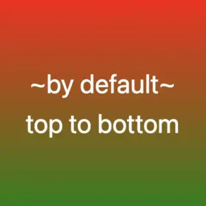
The default CSS linear gradient
We will begin our exploration with the default linear gradient, characterized by its top-to-bottom direction. The following code snippet and image provide a clear representation.
.linear-default {background-image: linear-gradient(red, green);}/* we are free to use "deg" too */.linear-default {background-image: linear-gradient(180deg, red, green);}
CSS
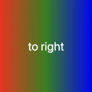
From side to side
We can adjust the direction of our gradients whenever we need to. To help you understand this better, take a look at the example below, where we changed the default direction to to right.
We are also free to choose any direction we want to top , to right , to bottom (the default direction), to left.
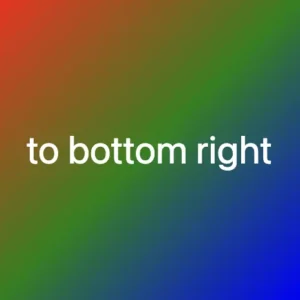
At any point, we also have the flexibility to alter the orientation of our gradients along the diagonal path. To illustrate this concept, consider the following example with the to bottom right direction.
Here colors would spread from the top-left corner to the bottom-right corner. We can combine any corner with its adjacent sides, to top left, to top right, to bottom left, and to bottom right.
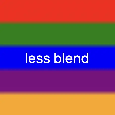
If we want to create a linear gradient with less blending (colors have more distinct limits this way) and maintain the same space for each color, we can use equal specific stops in the gradient by adding % percentages.
🕵️♂️ In this example, I’ve divided the space into 5 segments, but I left a 4% blend among each space in order to create a smooth but small transition.
The percentages between the color stops determine how smooth the transition between colors is.
Red (0% – 18%): defines a red color stop that starts at 0% and ends at 18% of the gradient.
Between 18% and 22%, there is no specific color stop defined. This gap represents a transition zone where the gradient transitions smoothly from red to green.
Green 22%, green 38%): defines a green color stop that starts at 22% and ends at 38% of the gradient.
Between 38% and 42%, there is no specific color stop defined. This gap represents a transition zone where the gradient transitions smoothly from green to blue.
Blue (42% – 58%): defines a blue color stop that starts at 42% and ends at 58% of the gradient.
Between 58% and 62%, there is no specific color stop defined. This gap represents a transition zone where the gradient transitions smoothly from blue to purple.
Purple (62% – 78%): defines a purple color stop that starts at 62% and ends at 78% of the gradient.
Between 78% and 82%, there is no specific color stop defined. This gap represents a transition zone where the gradient transitions smoothly from purple to orange.
Orange (82% – 100%): defines an orange color stop that starts at 82% and ends at 100% of the gradient.
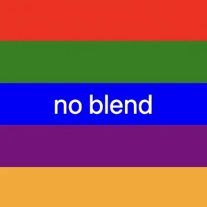
Without blend
Finally, it is really useful to know that we are able to create non-smooth transitions. In the following example, we will see a gradient with distinct color stops at specific percentage intervals, resulting in a distinct color transition from red to orange. Each color stop abruptly changes to the next color at the defined percentage points.
🕵️♂️ In this example, I’ve divided the space into 5 equal segments without blending among each other. So, we create multiple color stops without transitions.
Red (0% – 20%): defines a red color stop that starts at 0% and ends at 20% of the gradient.
Green (20% – 40%): defines a green color stop that starts at 20% and ends at 40% of the gradient.
Blue (40% – 60%): defines a blue color stop that starts at 40% and ends at 60% of the gradient.
Purple (60% – 80%): defines a purple color stop that starts at 60% and ends at 80% of the gradient.
Orange (80% – 100%): defines an orange color stop that starts at 80% and ends at 100%
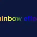
Imagine infusing your web typography (fonts) with the vibrant hues of a dazzling 🌈✨ rainbow! Cascading Style Sheets (CSS) empower designers and developers to bring this captivating vision to life. A colorful font like the CSS rainbow effect is more than just a spectrum of colors; it’s a creative and dynamic way to enhance your website’s visual appeal and make a lasting impression on your visitors.
Today, with this post, 😃 we’ll dive into the exciting world of creating a rainbow effect, unlocking the magic of colors and typography to elevate your web design. Enjoy! 💻
Prepare basic HTML and CSS structure
We begin with our HTML and CSS structure. We create an HTML <div> element that has a class called rainbow-effect. Then, we set some rules in CSS that are applied to our HTML element. So, let’s move forward and analyze our CSS code snippet.
body {background-color: #050c20; /* deep blue */}.rainbow-effect {text-align: center;color: white;font-size: 180px;font-weight: bold;font-family: 'Roboto', sans-serif;}
CSS
First of all, we set the background color of our body to be a deep blue. Then, we proceed with our text. We create a center aligned, white180px text with bold and highly legible fonts, as we specifically seek a font with excellent readability.
Once set, we can then proceed with our tweaks in order to infuse the text with the enchanting hues of a rainbow. The following image shows what is rendered on the screen for the time being. 😃
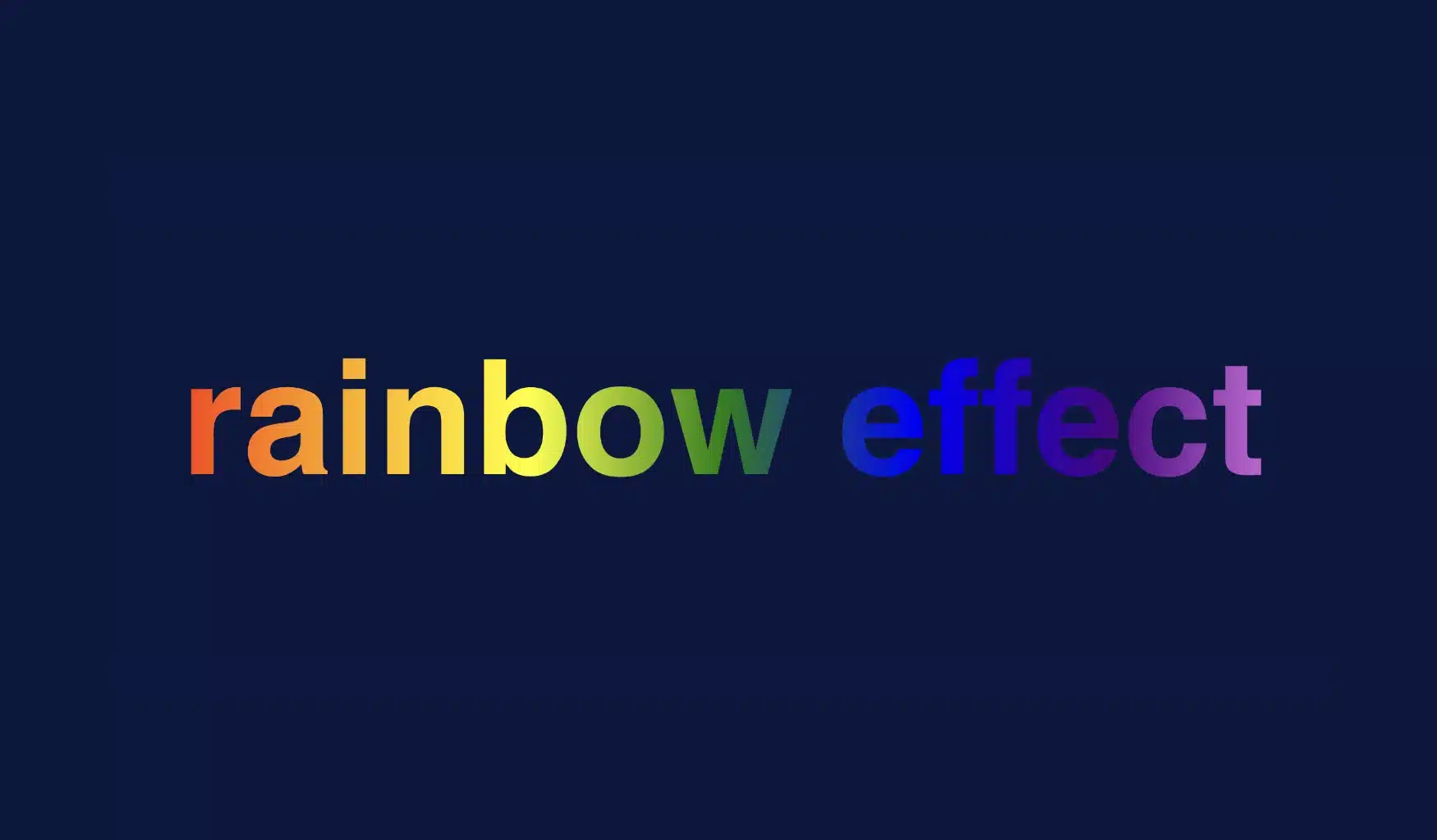
background-image: linear-gradient The first thing we need to know is that by using the background-image CSS property we are able to create a background with more than one color.
We do so by setting the linear-gradient value, and we are free to choose any color and any direction we want for our text. In our case, we use the to right direction and the gradient starts with the color red on the left and smoothly transitions through orange, yellow, green, blue, indigo, and violet as it moves from left to right. So, it gives a colorful, horizontal stripe-like background.
You are always free to choose any direction of the linear-gradient you like! 👍
background-clip: text We continue our work with the background-clip property which is used to define how the background should be clipped or masked. In our case, it’s set to text, which tells the browser to apply the background gradient only to the text inside our div.
What? Nothing happened yet? Why? Using this property, the colorful background is applied to the text, but the effect is not visible yet because it is necessary to proceed to our next step 🧐 ⬇ in order to achieve the final and desired results. So, let’s move on!
color: transparent Finally, adding the color property to transparent renders the text itself invisible, allowing the colorful background to show through the text. And there it is! 🥳
So, in summary, putting it all together, when you use this code, you’ll have a text with a colorful gradient background (rainbow colors) that appears within the text. The text itself is invisible, creating a striking and colorful text effect. 🎉
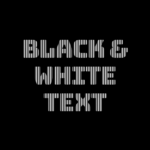
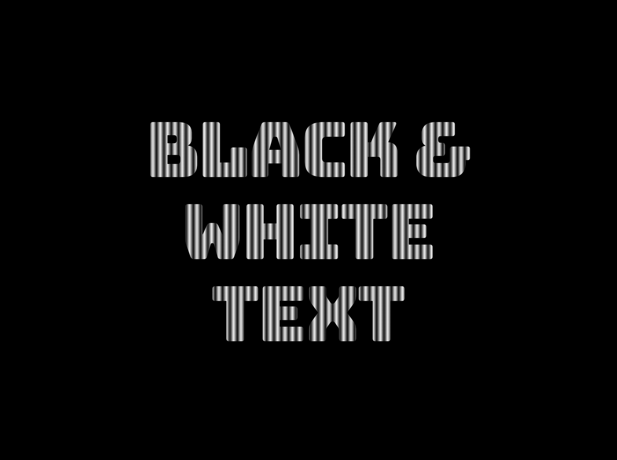
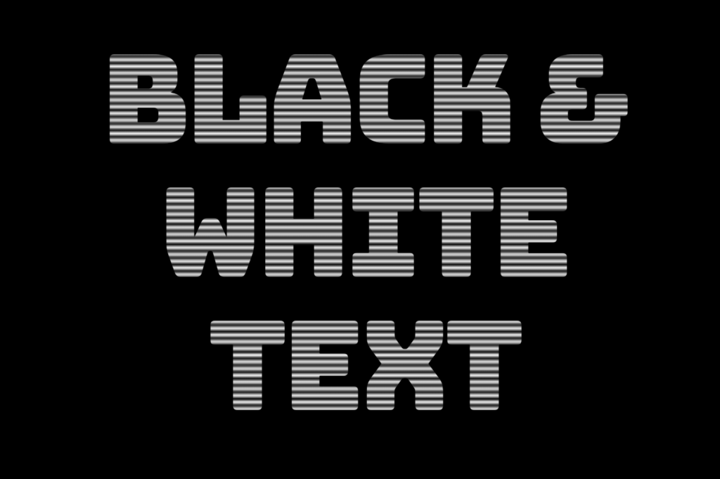
Welcome to a world where ⚫ black and ⚪ white aren’t just colors. In this post, 😃 we’ll explore the exciting world of creating black and white CSS stripes. It is a really cool effect to level up your text by adding stripes, making it even more fascinating and appealing.
We will be learning about this effect by using an example to make it crystal clear. Let’s check it out! 👩💻
Create basic HTML and CSS structure
We will begin with our HTML and CSS structure. Our HTML code includes a <div> element that has a class named .stripes-effect for identification and styling purposes. Following that, we add some CSS rules to apply specific styles to our HTML element with this class.
<body><divclass="stripes-effect">black & white text with shadow</div></body
HTML
body {background-color: black;}.stripes-effect {font-family: 'Bungee', sans-serif;text-align: center;color: white;}
CSS
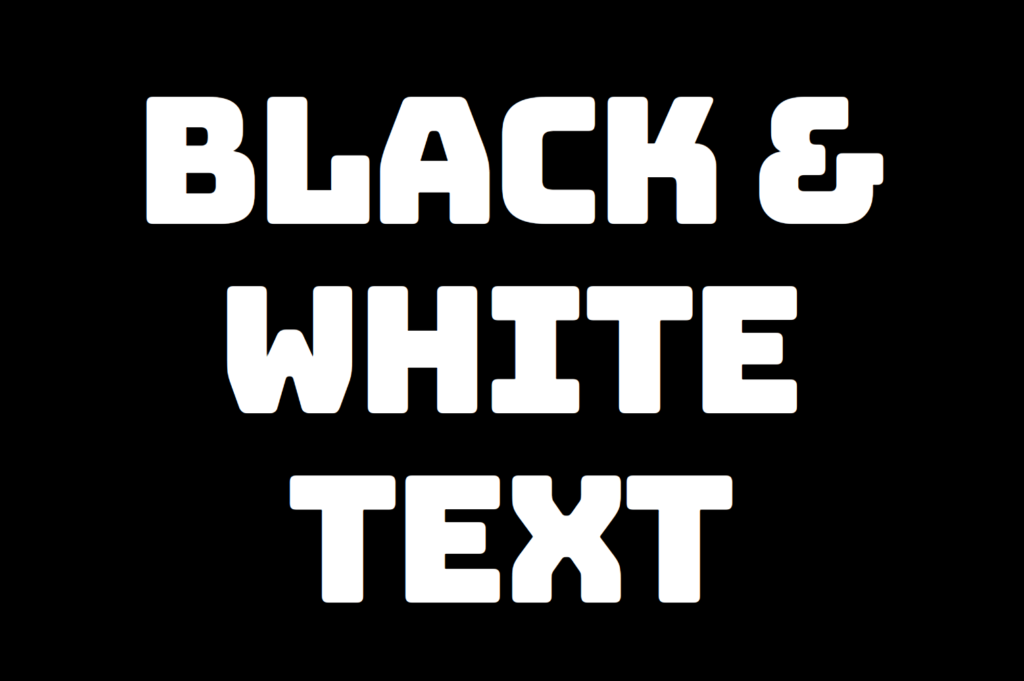
By doing so, our heading is ready for applying our CSS stripes effect and should now look like this
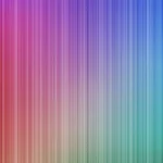
Adding black and white vertical stripes
Now that we have added our basic structure, we’ll create our stripe effect gradually, step by step, until it’s perfected. Let’s add the following styling
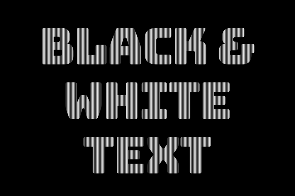
.stripes-effect { ...background-image: linear-gradient(to right, white, black, ...);/* clips the background pattern */background-clip: text;/* makes text invisible */color: transparent;}
CSS
In our already existing .stripes-effect class, we have the following rules:
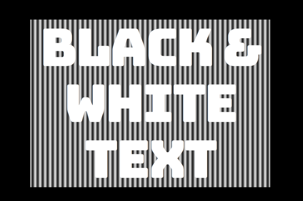
background-image: linear-gradient(to right, white, black, ...) ➡ We begin by setting this CSS property that creates a background pattern using a gradient of alternating black and white stripes from left to right. The default direction is from top to bottom.
Don’t worry if our black-and-white text is hard to read; 🕯 😂 it is a temporary phase just to serve our purpose for now. We will move forward and see! So let’s proceed immediately! ⏳
background-clip: text ➡ By adding this property, it clips the background pattern to the shape of the text, making the text appear as if it’s filled with black and white stripes. If we just add this property and leave our CSS settings without any other change, our effect will not show properly.
If we want this to see our effect it is necessary to proceed with the following step (color: transparent ⬇).
color: transparent ➡ It’s time to make the text transparent, enabling the background pattern we created in the previous step to be visible!
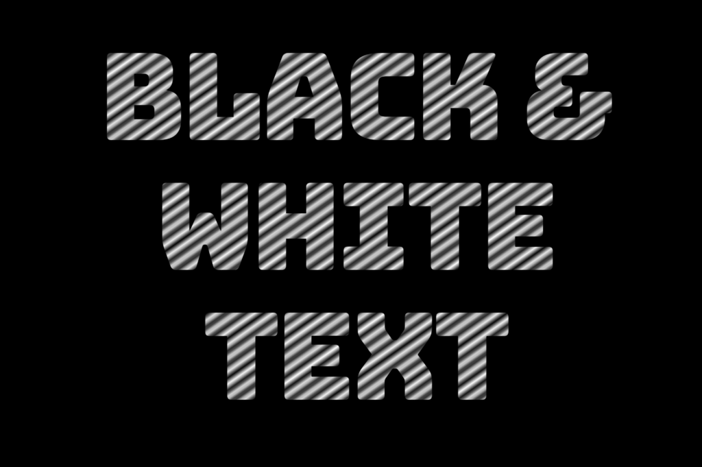
The Zebra effect is not limited to vertical stripes (linear-gradient) for your texts; you can explore more options and create any effect you want. Below, you will find some variations to give you the inspiration you need.
Hello everyone! 😃 Today, we will learn how to create a cool CSS reflection effect. Through step-by-step instructions, we will understand how to manipulate linear-gradient and opacity CSS properties to create a stunning mirror-like effect. Below, I’ll include’ll give you all the information you need. Let’s get started.
HTML structure
Our HTML structure starts with an empty div element, with the class .reflection where our effect will take place.
<divclass="reflection"></div>
HTML
CSS foundation
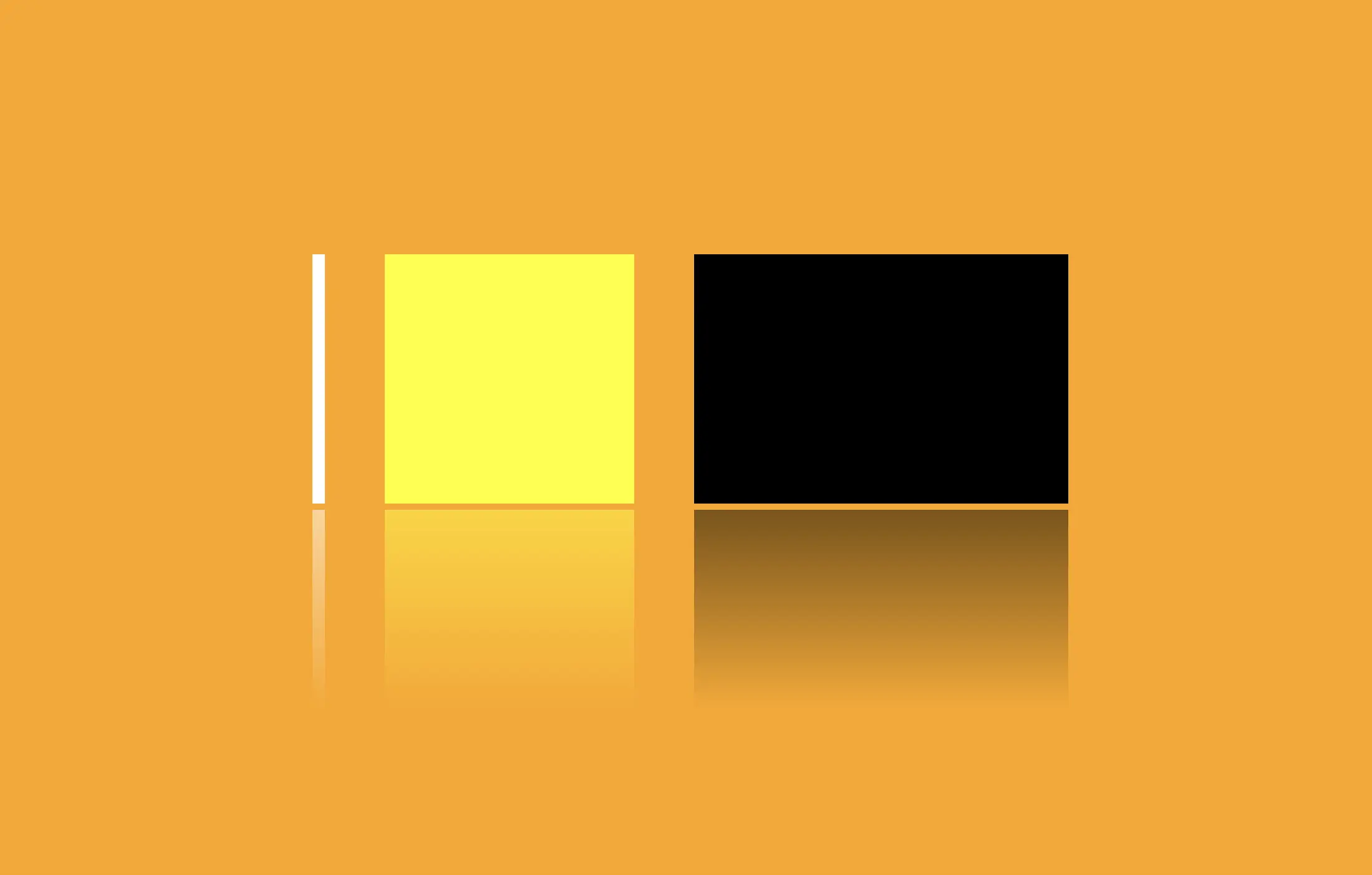
Let’s continue with the CSS basic structure. We will start by setting the background-color to orange.
body {background-color: orange;}
CSS
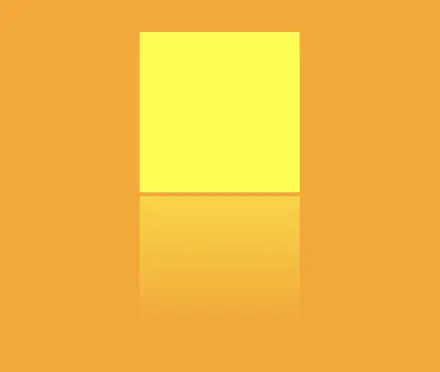
Creating the element
In the following step, we will define the element. I opt for a color black rectangle with 300 pixels width and 200 pixels height.We will also be adding the flex method to the body to center our element.
body { ...display: flex;align-items: center;justify-content: center;}.reflection {width: 300px;height: 200px;background-color: black;}
CSS
This is what is rendered on the screen for now. A perfectly centered black rectangle!
Adding the CSS structure for the reflection effect
A CSS reflection effect can be accomplished using pseudoelements like before and after.First, we need to add position: relative in our .reflection class to get prepared for our pseudoelement’s positioning.
.reflection { ...position: relative;}
CSS
Then we are ready to create our reflection utilizing the before pseudoelement.
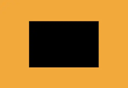
We initiate by setting the the position as absolute. Setting the content to an empty string (“”) and then its width and height to 100%, will make our pseudoelement appear and inherit its parent’s dimensions (width 300px and height 200px).
Next, we add a background: linear-gradient that goes downwards, by specifying its direction, from top to bottom. This way, we create black gradients that are more intense at the top and gradually fade toward the bottom to achieve our desired effect.
So far, we have created the CSS reflection effect below our original rectangle. However, we need to take one more step for our effect to be visible. We add the top CSS property and set it to 205 pixels. This will move our reflection 5 pixels down from the origin rectangle.
.reflection:before { ...top: 205px;opacity: 0.5;}
CSS
Additionally, we set the opacity to achieve a smoother and more natural-looking effect. You might be thinking that the same result could be accomplished by adjusting the linear-gradient property and you are right. It’s just that using the opacity this way requires much less effort and produces similar results.
🔖 Feel free to use any color you prefer, but it’s important to create a linear-gradient that gives the perspective shades. Here are examples of white and yellow reflections. I am keeping the orange background to facilitate easier comparison.
Choosing the perfect colors with their appropriate shades can truly transform your work. Be bold in your choices and let your creativity shine. Remember, there are endless possibilities and your creativity knows no bounds. 🎉 ✨
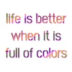
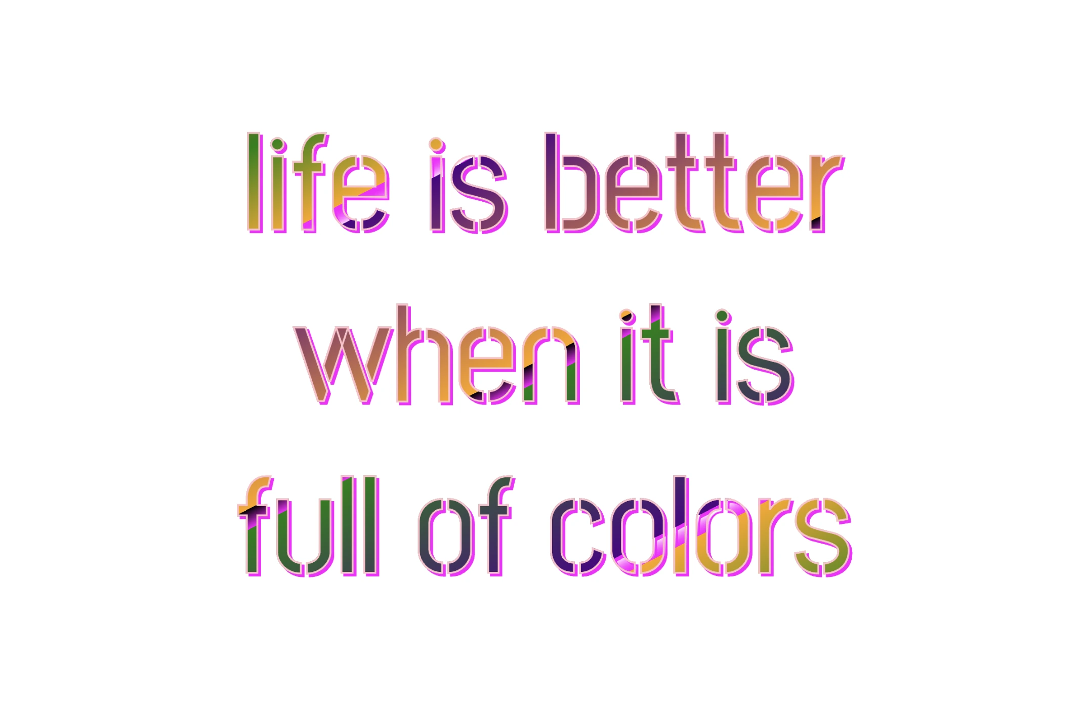
Hello, everybody 😃 Get ready to add a vibrant twist to your web designs with my latest post on fonts. In this post, we’ll explore the fascinating world of typography, sharing clever ways to add a burst of colors, outlines, shadows, and CSS colorful text. Whether we are looking to level up designs or experiment with CSS, this post provides the inspiration and know-how to make texts truly stand out on your screen. Stay tuned for an amazing journey into the art of CSS typography! 🌈✨
We already know the color CSS property. When setting the text color, we’re setting the color of the text itself. In contrast, setting the background-color sets the background color behind the text. But what if we want a more challenging font? Can we do that? Absolutely!
Below, I prepared an example as a way to make it more understandable. Enjoy! 💻
Preparing our HTML and CSS structure
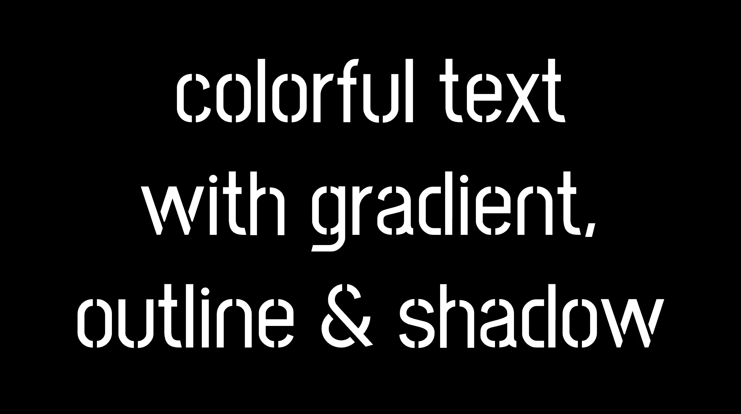
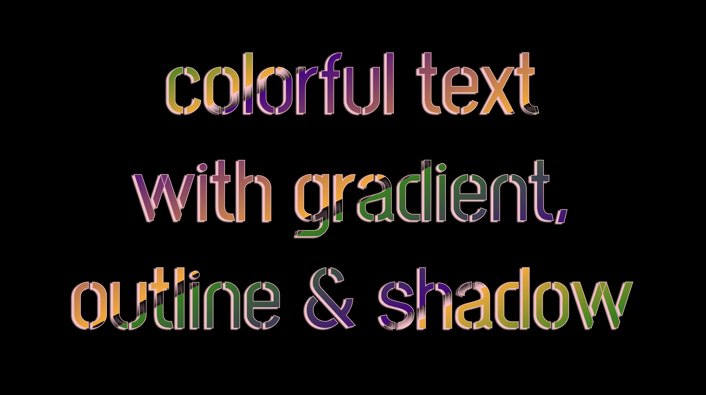
The following code creates a colorful text with gradient, outline, and shadow. We will start with our HTML structure. Our body has background-color: black. Inside, we make an HTML div element that serves as a container for our text and has a class attribute named font-effects.
<body><divclass="font-effects"> colorful text with gradient, outline & shadow is so impressive</div></body>
HTML
Next, let’s proceed with our CSS structure. The font-effects class contains the rules applied to the HTML element mentioned earlier. We’ll provide a thorough examination of these rules as we progress through this post. For now, it’s important to note that our text has color white, our body has background-color black, and we’ve also integrated (@import url(...)) a font-family of Google Fonts.
Ensure this statement is placed at the beginning of your CSS code snippet, just like I did (check line 2).
/* insert google fonts */@importurl('https://fonts.googleapis.com/css2?family=Stick No Bills');body {background-color: black;}.font-combinations {width: 1100px;font-size: 150px;color: white;font-family: 'Stick No Bills', sans-serif;text-align: center;}
CSS
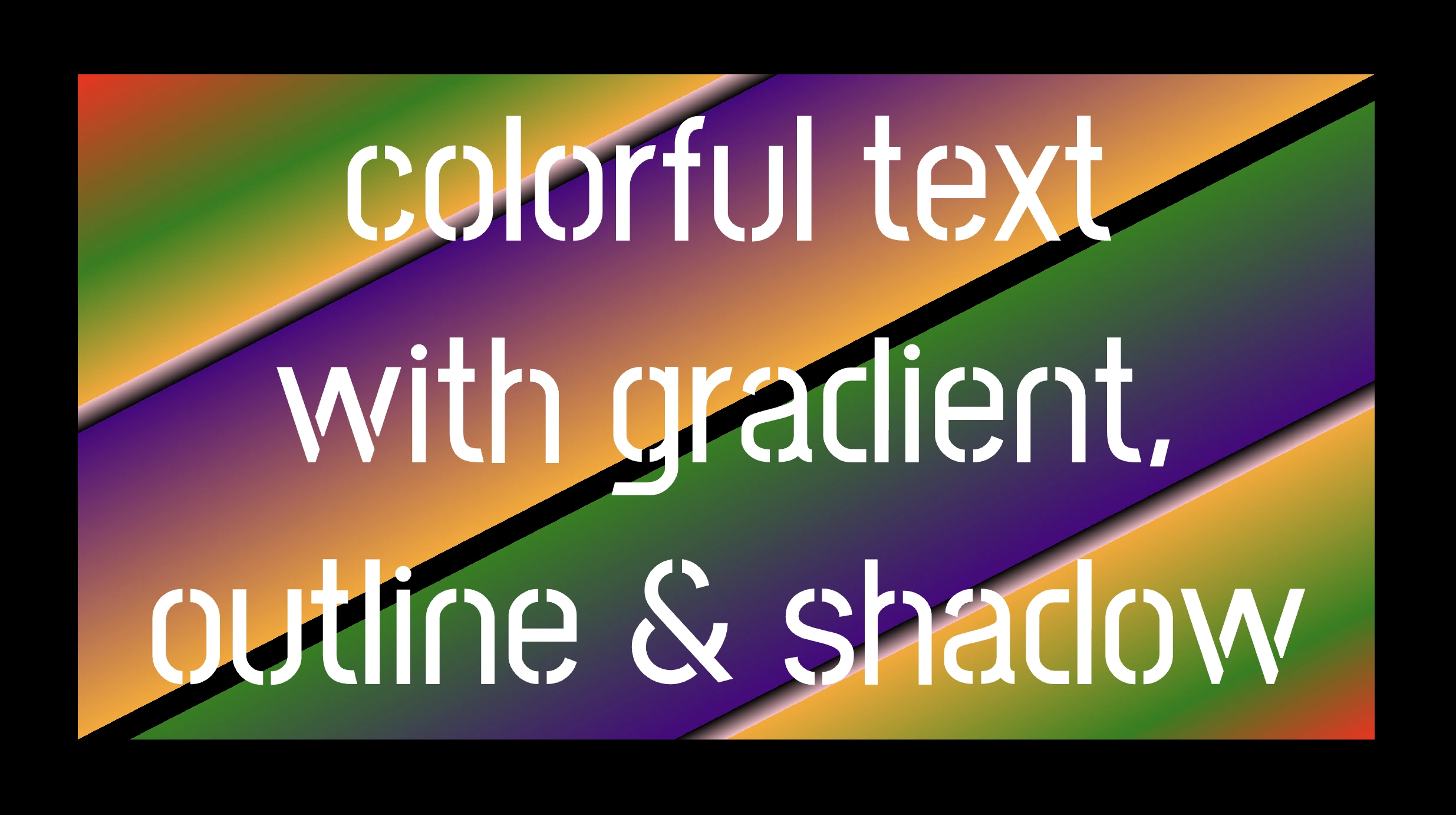
The following image shows what is rendered on the screen now.
Inside the .font-effects style rules, we include the following instructions to create these amazing fonts:
.font-combinations { .../* adding colors */background-image: linear-gradient( to rightbottom, red0, green15%, orange25%, pink25%,transparent27%, indigo27%, orange50%, black50%,transparent52%, green52%, indigo73%,transparent73%, pink75%, orange75%, green90%,red100% );/* Makes the text shape match the background */-webkit-background-clip: text;color: transparent;/* adding outline to text */-webkit-text-stroke-width: 1px;-webkit-text-stroke-color: pink;/* adding shadow to text */filter: drop-shadow(-2px2px2pxrgba(250, 190, 210, 0.8));}
CSS
Adding the linear gradient effect
background-image: linear-gradient(...) ➡ This CSS rule creates a background gradient using the linear-gradient function. The gradient begins with red, transitions to green, and then shifts to orange. It then transitions to pink, becomes transparent, then indigo, returns orange becomes transparent once more, shifts to green, then indigo, then transparent again, returns to pink, then orange for the third time, then green, and finally returns red again.
Remember that this gradient will be used as the background for our text. Isn’t this awesome? 😎
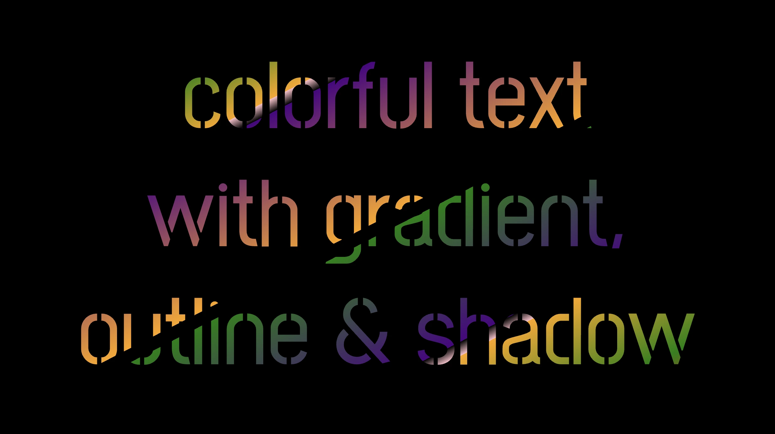
-webkit-background-clip: text ➡ We continue with this CSS rule that tells the browser to clip the background gradient to the shape of the text. We are not ready yet to see the colorful background as text. 😕 We just prepared the space (fonts). Don’t worry we will proceed with our work and see the amazing result! 😉
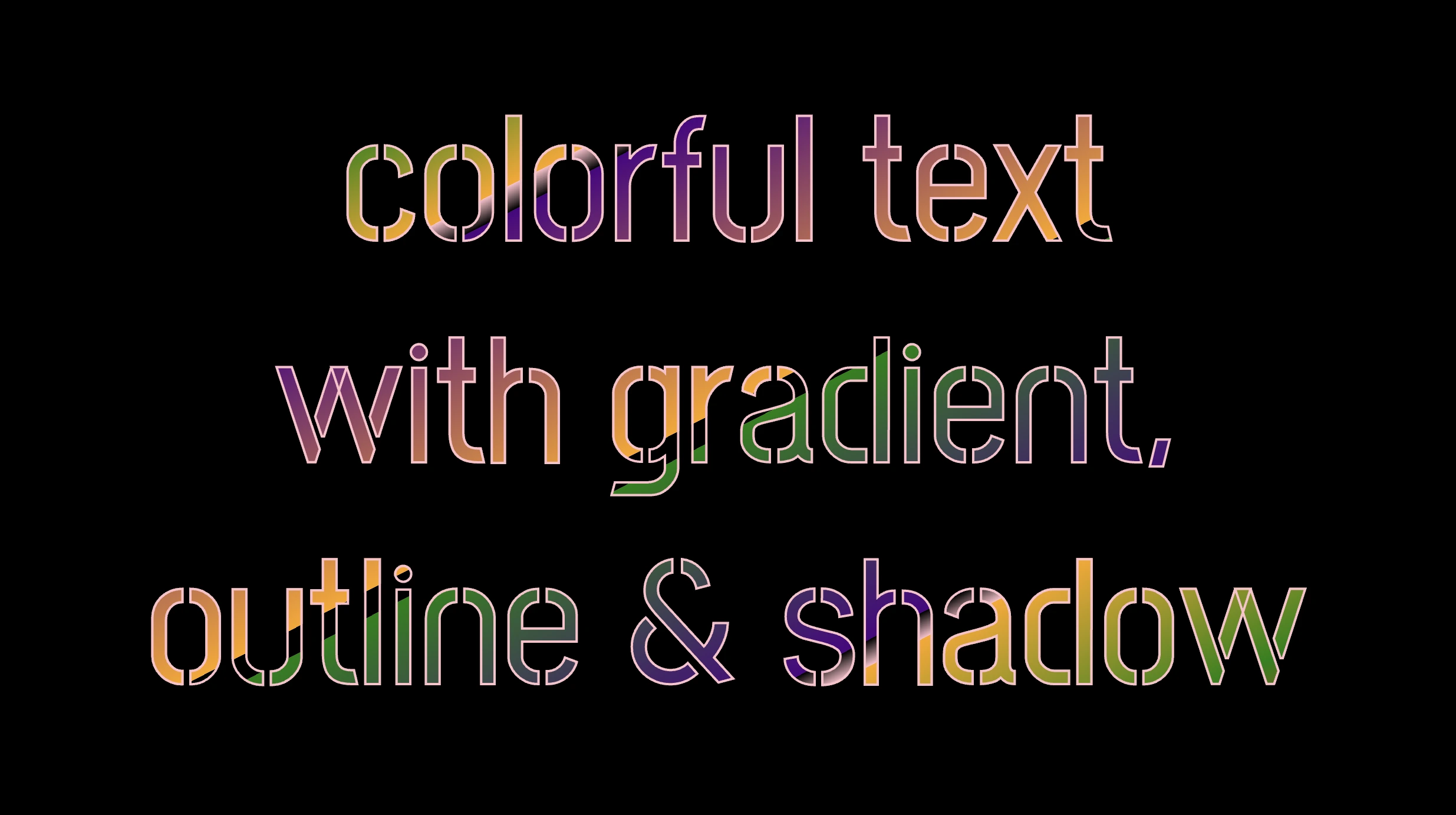
color: transparent ➡ This CSS rule makes the actual text content transparent. This allows the colorful gradient to show through the text 🥳, and there it 🥁 is!
Adding the outline effect
-webkit-text-stroke: 2px red ➡ Then we add a pink outline or stroke with a width of 2 pixels. This makes the text more visible against the background gradient.
🔖 We are free to write it more analytically setting the following two CSS properties -webkit-text-stroke-width and -webkit-text-stroke-color. It’s up to you!
Applying the shadow effect
filter: drop-shadow(-2px 2px 2px rgb(250, 190, 210, 0.8)) ➡ To finalize our work we add a shadow to the entire section, with an offset of -2 pixels to the left, 2 pixels down, a blur radius of 2 pixels, and a subtle pink shadow rgba(10, 10, 10, 0.8). This deep shadow adds a subtle but noticeable darkening effect to our text.
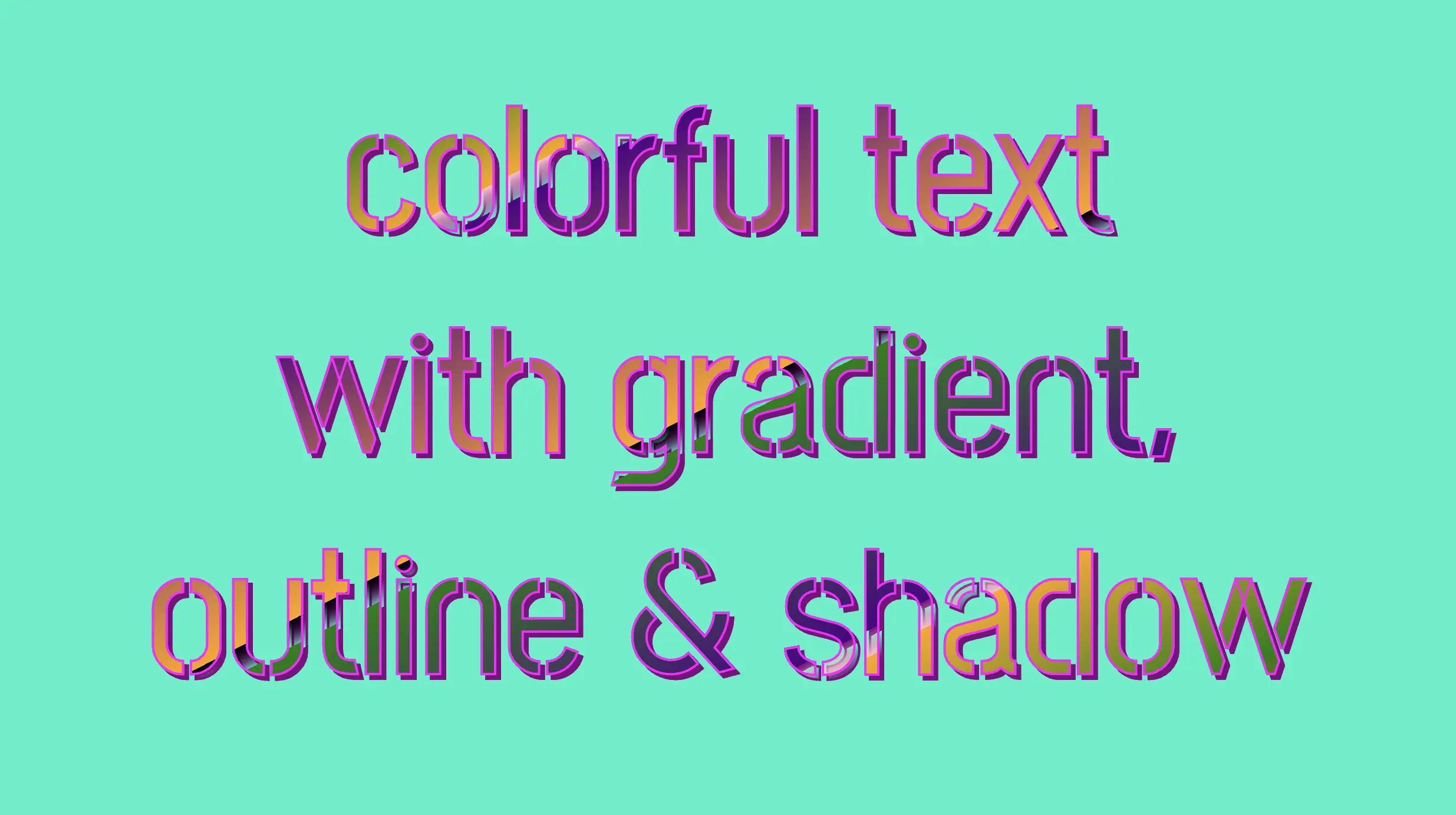
To infuse our text with a touch of fantasy and vibrance 🎉 ✨, we can use a brighter color for the outline and change the shadow to match. For example, we could create a vivid or dark background as a way to create contrast and then swap out the pink outline and shadow for a more vibrant magenta. In the picture below, you can see how these small changes make a big difference, giving a more colorful and bright result.