Welcome to a practical guide on using the CSS filter to modify how your images 📸 look. In this post, we’ll work on how to adjust the opacity and saturate (color intensity) CSS filters. These two methods will help us handle how images are rendered on our website, particularly concerning their colors and transparency.
Let’s get into the world of CSS 👩💻 and customize the images to suit our needs.
CSS filter: opacity
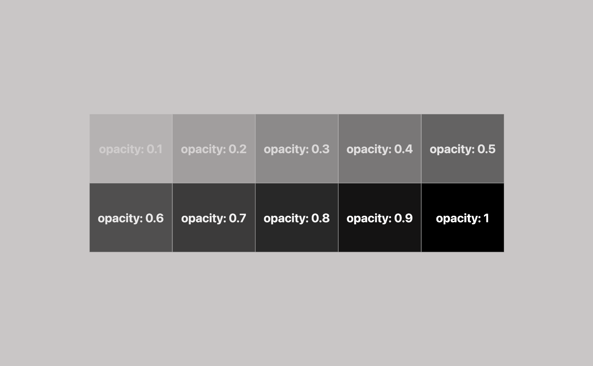
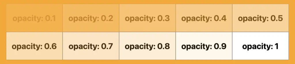
The CSS property filter: opacity() helps you control how colorful an image appears against its background. You can set it anywhere between 0% and 100%. At 0%, the image turns grayscale, losing all its colors and showing only the background color. If you set it to 100%, the image displays its true, unaltered colors. Values in between change how colorful the image appears.
🔖 For setting CSS opacity, you can use either a percentage of 0% and 100% or a decimal value between 0 and 1, both options ending up in the same outcome. 🫧😃
Example
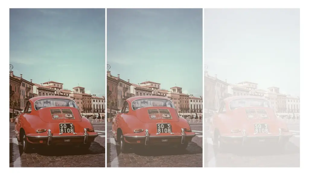
Starting with the HTML code which includes three <img> elements. All images share the same .image class. Additionally, the second image includes one more class the .opacity-image2 while the third image includes the .opacity-image3 class.
<body>
  <img class="image"/>
  <img class="image opacity-image2"/>
  <img class="image opacity-image3"/>
</body>In the CSS code the .image class introduces a non-repeated image that covers the entire background area of the element. Its dimensions are 300 pixels in width and 500 pixels in height.
We move forward with the other two classes. The .opacity-image2 class targets the second image and applies a visual effect controlling transparency. An opacity of 80% means the element will be slightly transparent, allowing some background to show through.
The .opacity-image3 class is meant for the third image, ensuring the same visual change happens there too. In this case, an opacity of 20% means the element will be mostly transparent, allowing more background to show through.
.image {
background-image: url(https://images.unsplash.com/photo-1501829385782-9841539fa6bf?ixlib=rb-4.0.3&ixid=M3wxMjA3fDB8MHxwaG90by1wYWdlfHx8fGVufDB8fHx8fA%3D%3D&auto=format&fit=crop&w=3024&q=80);
background-repeat: no-repeat;
background-size: cover;
width: 300px;
height: 500px;
}
.opacity-image2 {
filter: opacity(80%);
}
.opacity-image3 {
filter: opacity(20%);
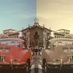
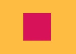
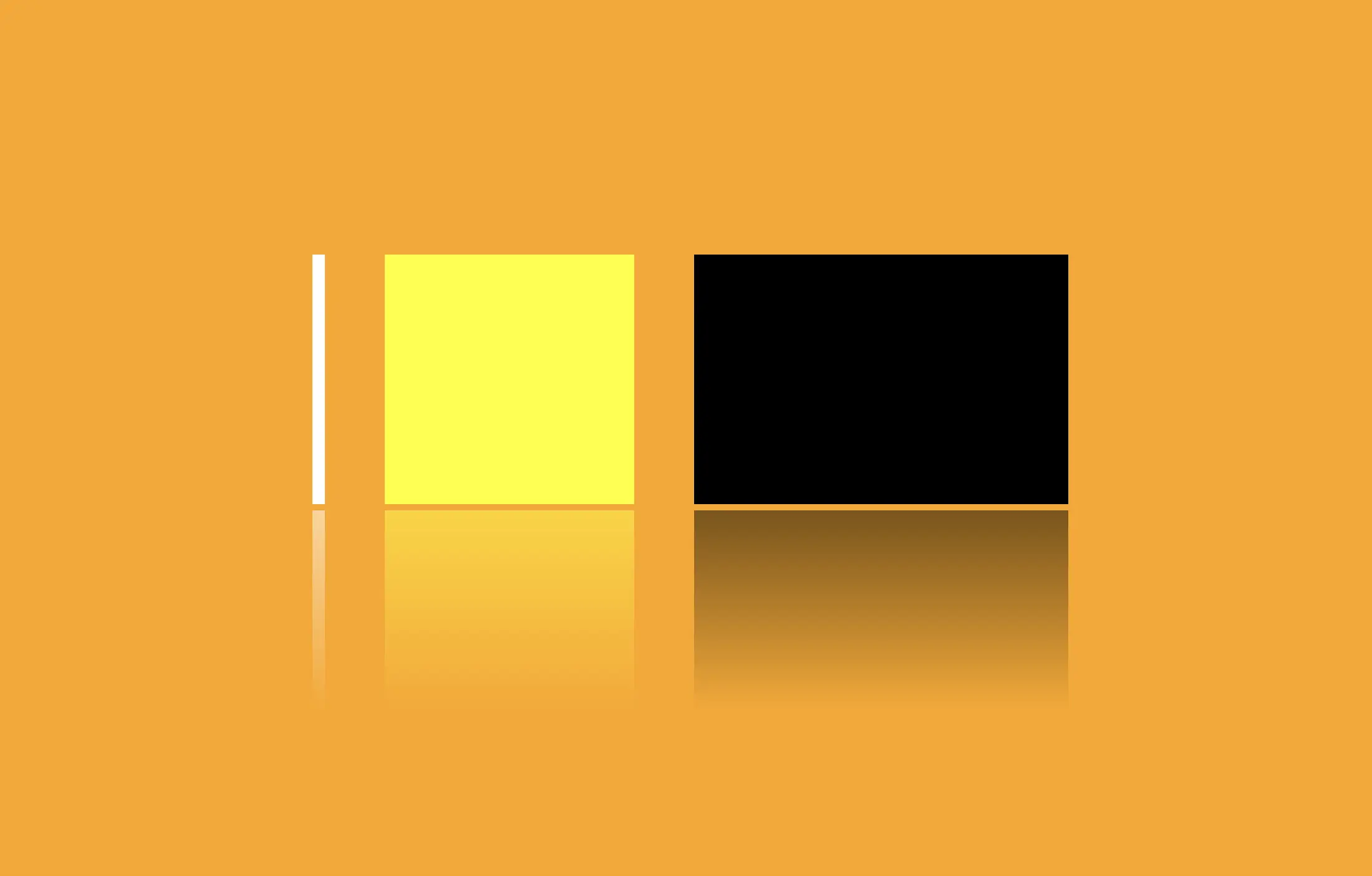
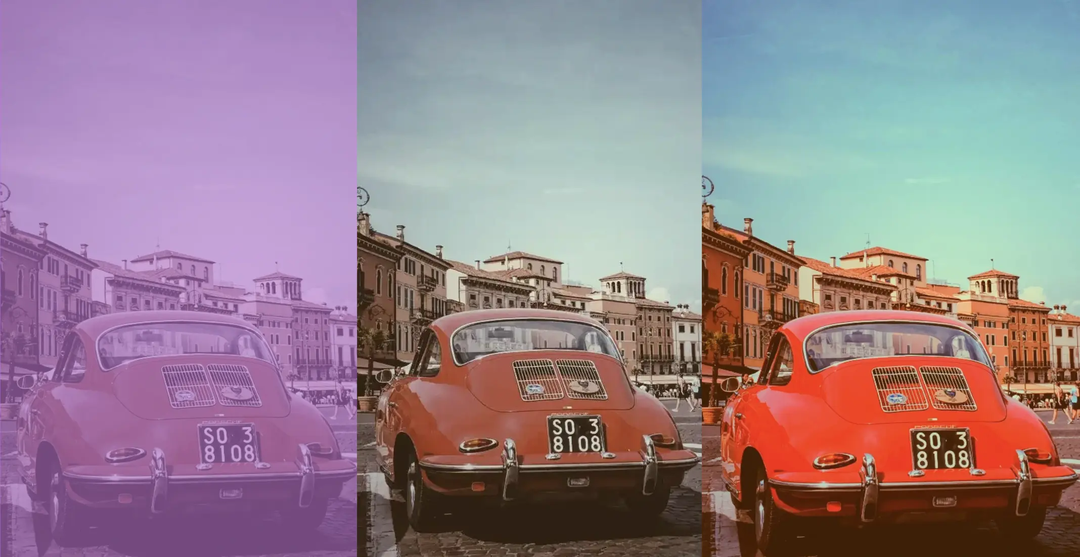
}* In this case, the background is black, so our effect turns to dark shades.
* In this case, the background is white, so our effect turns to bright shades.
* In this case, the background is purple (a random color for this specific example, as you can pick any color you prefer), so our effect will blend the original element’s colors and the purple background color, influenced by the 80% opacity.
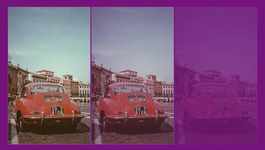
Original photo by Jonatan Hernandez on Unsplash – opacity(80%) – opacity(20%)
CSS filter: saturate
Saturation is about how bright and vivid colors are in a picture. The CSS property filter: saturate() helps you adjust this. The values vary from 0% to 100%. If you choose 0%, the colors disappear and become black and white (grayscale). With a value of 100%, it stays as colorful as it was.
Keep in mind that going over 100% makes colors appear highly vibrant. Specifying a saturation of 200% is technically allowed, but that’s not the usual way.
🔖 To specify a percentage for saturation, you can use values like 10% or 0.1, they mean the same thing. It’s up to you. 🫧😃
Example
Starting with the HTML code which includes three <img> elements. All images share the same .image class. Additionally, the second image includes one more class the .saturate-image2 while the third image includes the .saturate-image3 class.
<img class="image"/>
<img class="image saturate-image2"/>
<img class="image saturate-image3"/>
In the CSS code, the .image class introduces a non-repeated image that covers the entire background area of the element. Its dimensions are 300 pixels in width and 500 pixels in height.
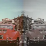
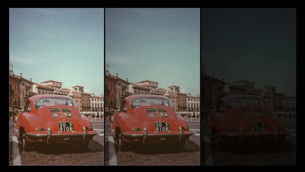
We continue with the other two classes. The .saturate-image2 class targets the second image and applies a visual effect controlling saturation. A saturation of 200% will be doubled compared to the original colors of the image, resulting in a sharp visual effect.
The .saturate-image3 class focuses on the third image and applies the same visual effect. In this case, a saturation of 20% means the image will have its colors slightly desaturated, resulting in a toned-down appearance compared to the original colors. The saturation level will be reduced to one-fifth of the original, giving a less intense color effect.
.image {
  background-image: url(https://images.unsplash.com/photo-1501829385782-9841539fa6bf?ixlib=rb-4.0.3&ixid=M3wxMjA3fDB8MHxwaG90by1wYWdlfHx8fGVufDB8fHx8fA%3D%3D&auto=format&fit=crop&w=3024&q=80);
  background-repeat: no-repeat;
  background-size: cover;
  width: 300px;
  height: 500px;
}

.saturate-image2 {
  filter: saturate(200%);
}

.saturate-image3 {
  filter: saturate(20%);
}The results are shown in the images below.