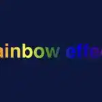
Hello, everybody 😃 Get ready to add a vibrant twist to your web designs with my latest post on fonts. In this post, we’ll explore the fascinating world of typography, sharing clever ways to add a burst of colors, outlines, shadows, and CSS colorful text. Whether we are looking to level up designs or experiment with CSS, this post provides the inspiration and know-how to make texts truly stand out on your screen. Stay tuned for an amazing journey into the art of CSS typography! 🌈✨
We already know the color CSS property. When setting the text color, we’re setting the color of the text itself. In contrast, setting the background-color sets the background color behind the text. But what if we want a more challenging font? Can we do that? Absolutely!
Below, I prepared an example as a way to make it more understandable. Enjoy! 💻
Preparing our HTML and CSS structure
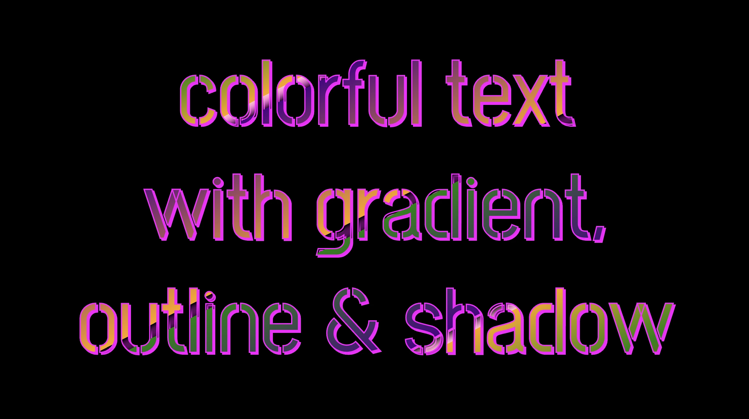
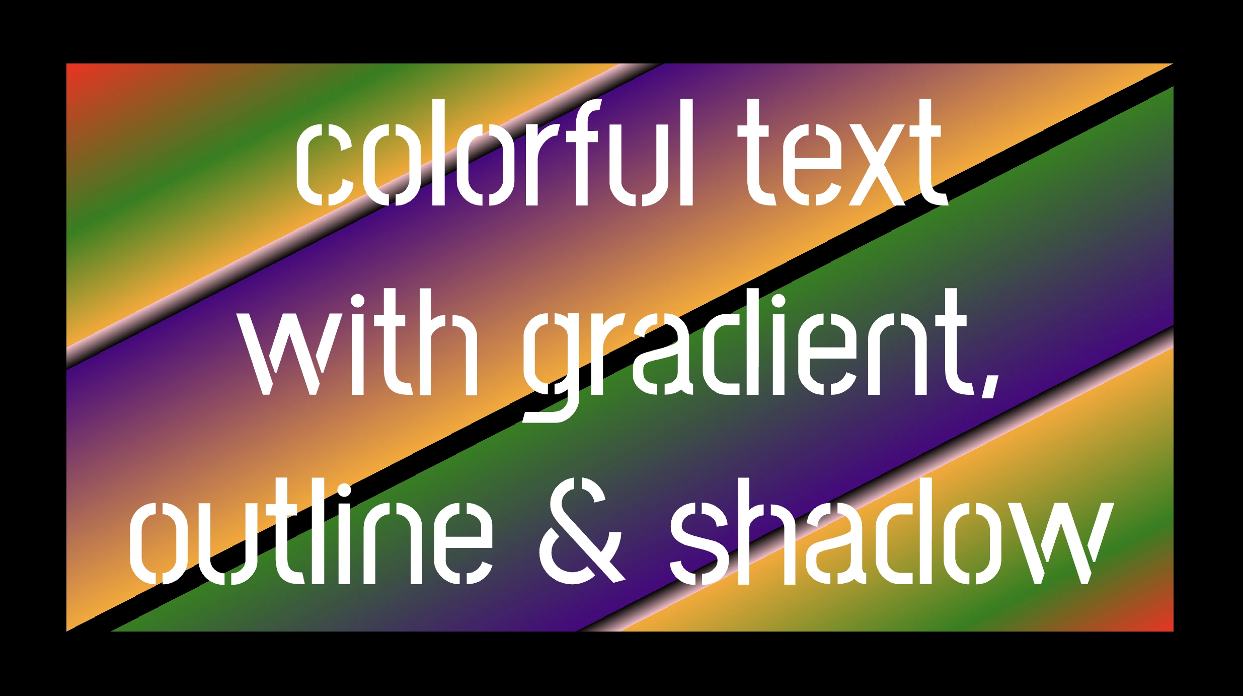
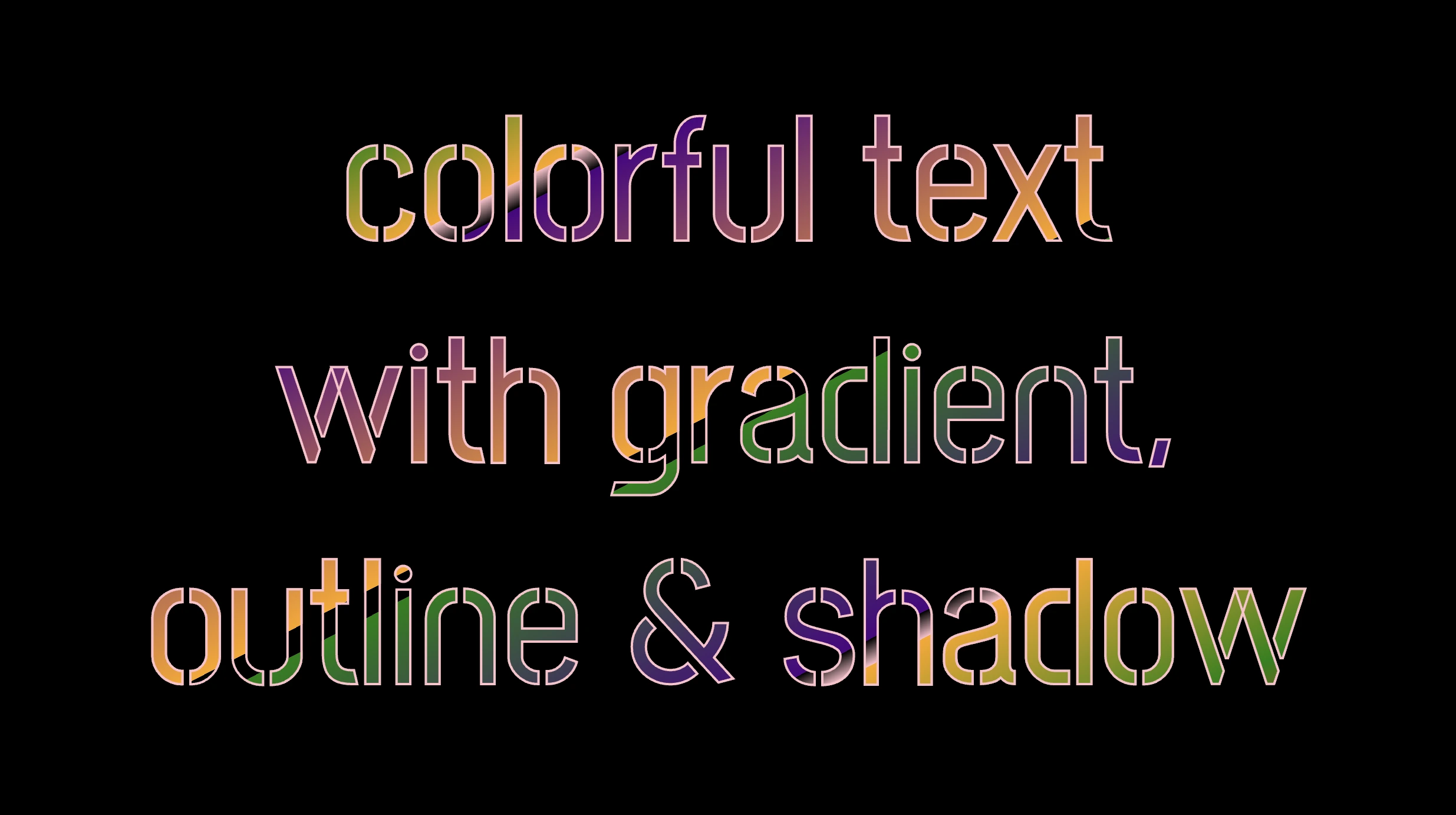
The following code creates a colorful text with gradient, outline, and shadow. We will start with our HTML structure. Our body has background-color: black. Inside, we make an HTML div element that serves as a container for our text and has a class attribute named font-effects.
<body>
  <div class="font-effects">
    colorful text with gradient, outline & shadow is so impressive
  </div>
</body>Next, let’s proceed with our CSS structure. The font-effects class contains the rules applied to the HTML element mentioned earlier. We’ll provide a thorough examination of these rules as we progress through this post. For now, it’s important to note that our text has color white, our body has background-color black, and we’ve also integrated (@import url(...)) a font-family of Google Fonts.
Ensure this statement is placed at the beginning of your CSS code snippet, just like I did (check line 2).
/* insert google fonts */
@import url(
  'https://fonts.googleapis.com/css2?family=Stick No Bills'
);

body {
  background-color: black;
}

.font-combinations {
  width: 1100px;
  font-size: 150px;
  color: white;
  font-family: 'Stick No Bills', sans-serif;
  text-align: center;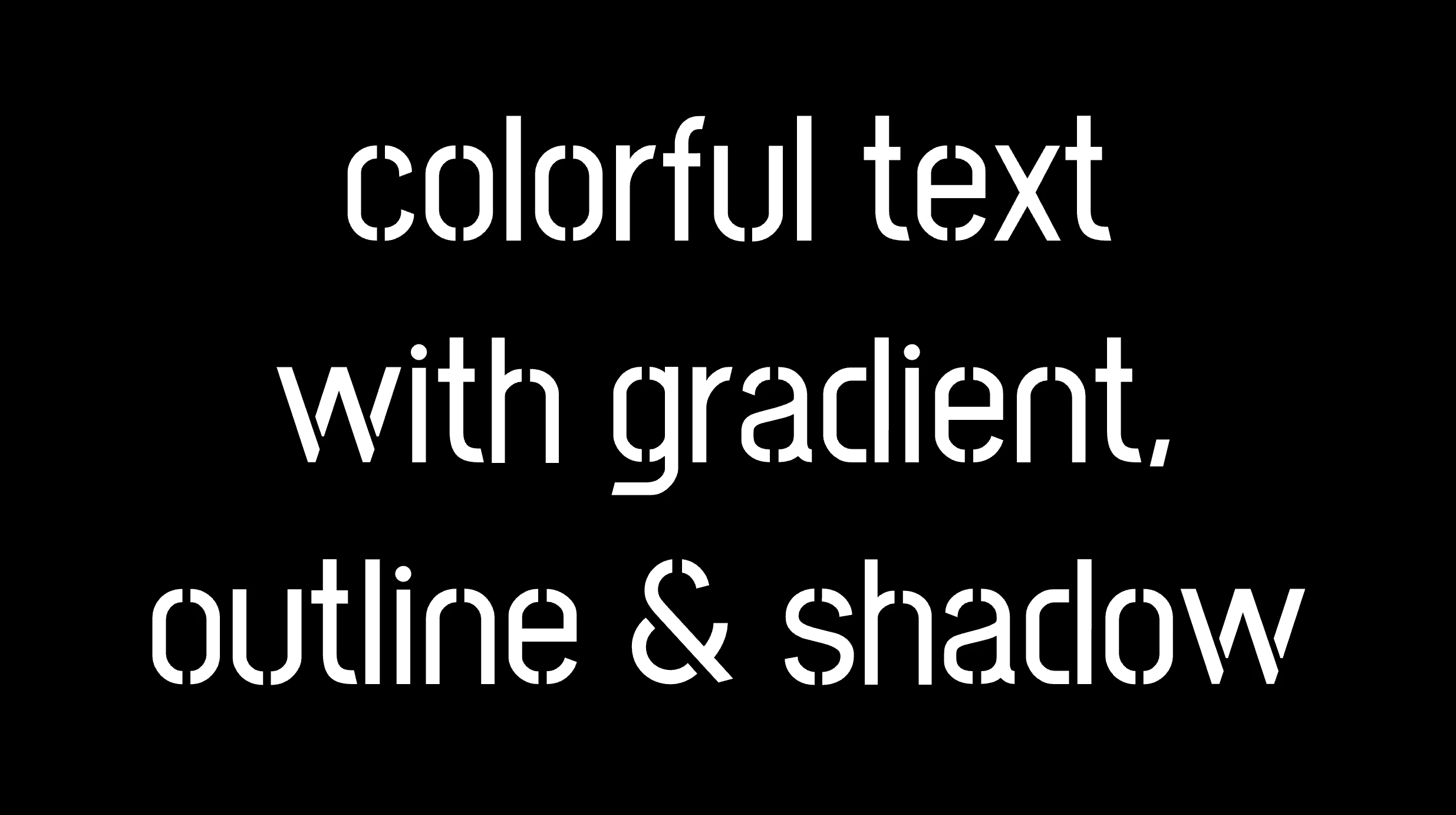
}The following image shows what is rendered on the screen now.


Explaining the CSS colorful text effect
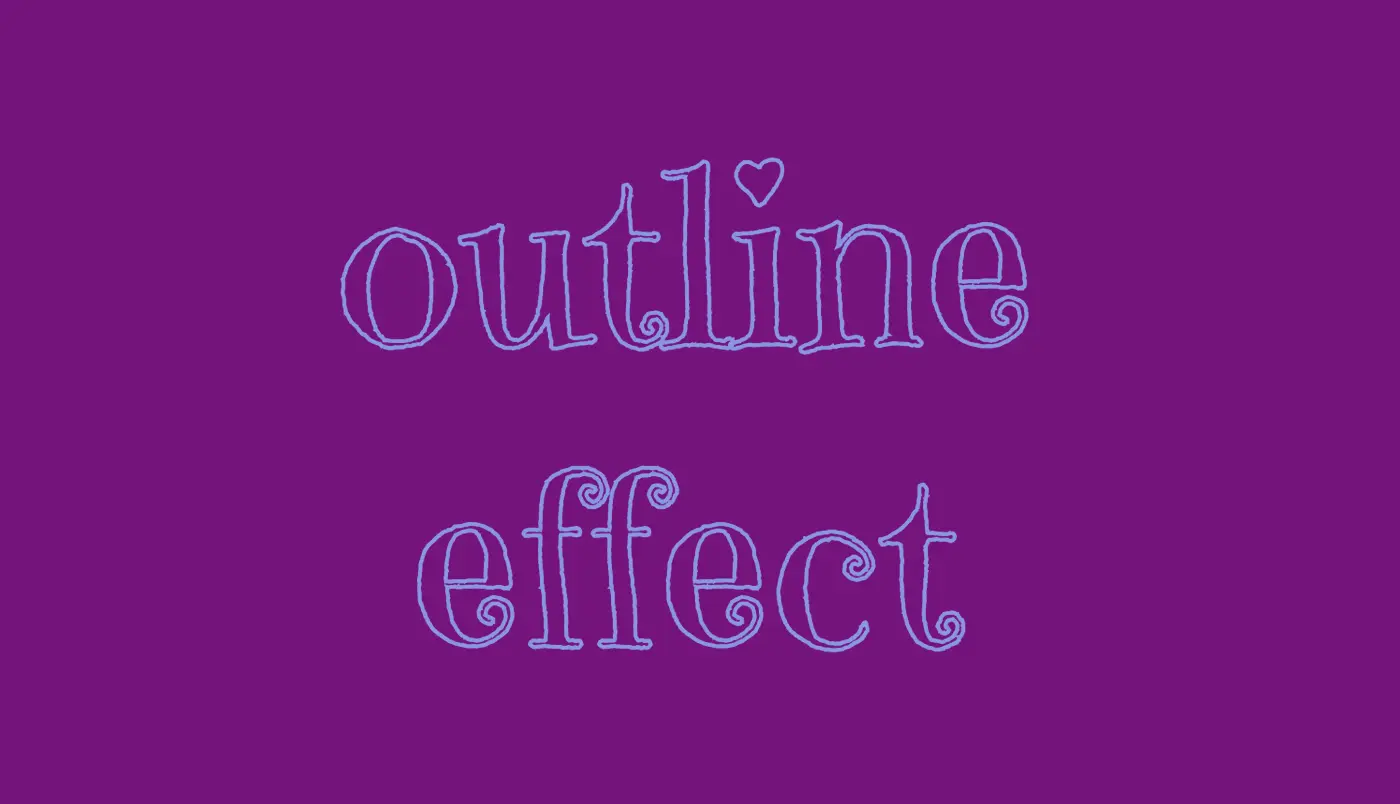
Inside the .font-effects style rules, we include the following instructions to create these amazing fonts:
.font-combinations {
  ...
  /* adding colors */
  background-image: linear-gradient(
    to right bottom, red 0, green 15%, orange 25%, pink 25%,
    transparent 27%, indigo 27%, orange 50%, black 50%,
    transparent 52%, green 52%, indigo 73%,
    transparent 73%, pink 75%, orange 75%, green 90%,
    red 100%
  );
  /* Makes the text shape match the background */
  -webkit-background-clip: text;
  color: transparent;
    /* adding outline to text */
  -webkit-text-stroke-width: 1px;
  -webkit-text-stroke-color: pink;
  /* adding shadow to text */
  filter: drop-shadow(-2px 2px 2px rgba(250, 190, 210, 0.8));
}Adding the linear gradient effect
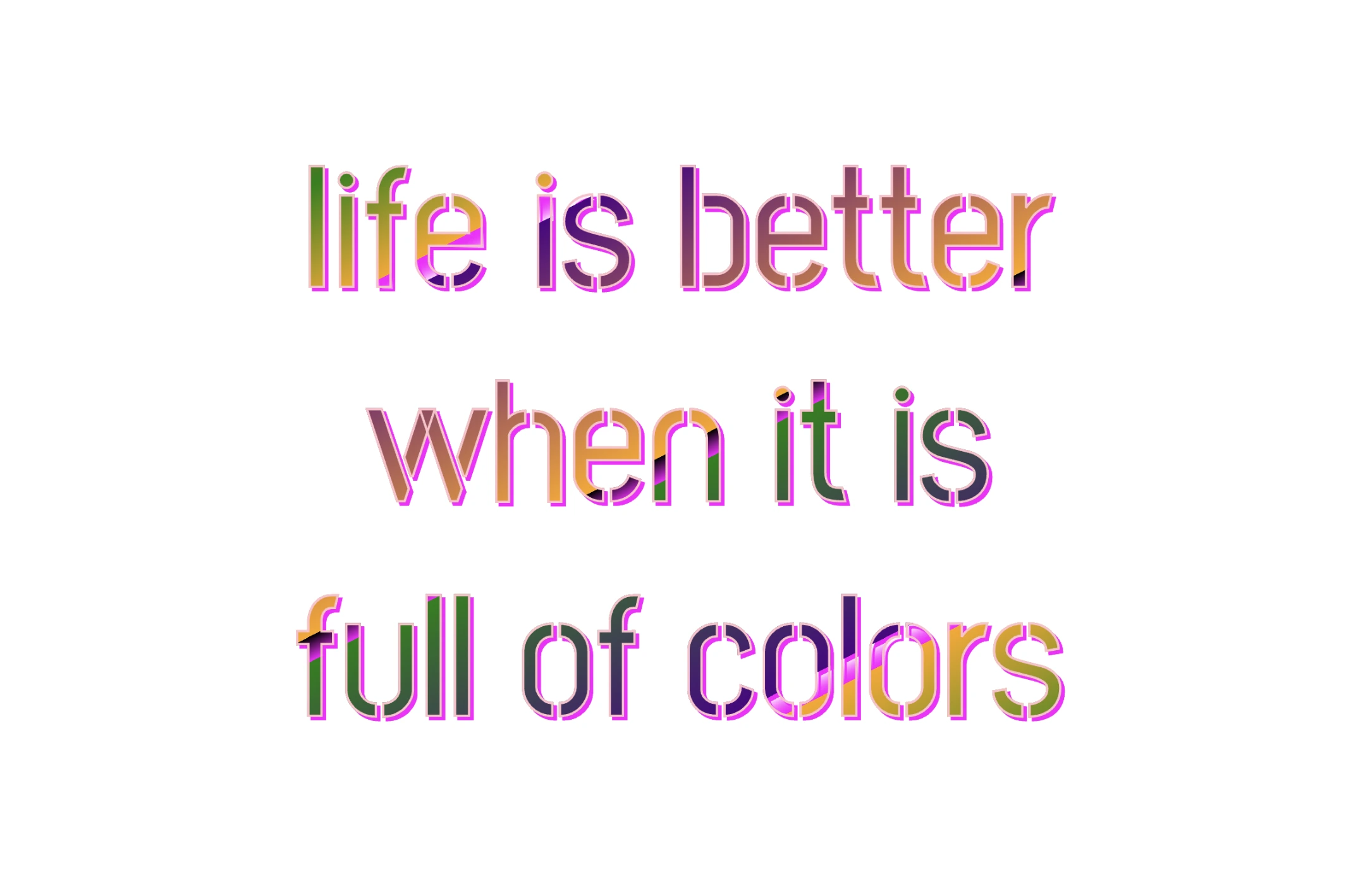
background-image: linear-gradient(...) ➡ This CSS rule creates a background gradient using the linear-gradient function. The gradient begins with red, transitions to green, and then shifts to orange. It then transitions to pink, becomes transparent, then indigo, returns orange becomes transparent once more, shifts to green, then indigo, then transparent again, returns to pink, then orange for the third time, then green, and finally returns red again.
Remember that this gradient will be used as the background for our text. Isn’t this awesome? 😎
-webkit-background-clip: text ➡ We continue with this CSS rule that tells the browser to clip the background gradient to the shape of the text. We are not ready yet to see the colorful background as text. 😕 We just prepared the space (fonts). Don’t worry we will proceed with our work and see the amazing result! 😉
color: transparent ➡ This CSS rule makes the actual text content transparent. This allows the colorful gradient to show through the text 🥳, and there it 🥁 is!
Adding the outline effect
-webkit-text-stroke: 2px red ➡ Then we add a pink outline or stroke with a width of 2 pixels. This makes the text more visible against the background gradient.
🔖 We are free to write it more analytically setting the following two CSS properties -webkit-text-stroke-width and -webkit-text-stroke-color. It’s up to you!
Applying the shadow effect
filter: drop-shadow(-2px 2px 2px rgb(250, 190, 210, 0.8)) ➡ To finalize our work we add a shadow to the entire section, with an offset of -2 pixels to the left, 2 pixels down, a blur radius of 2 pixels, and a subtle pink shadow rgba(10, 10, 10, 0.8). This deep shadow adds a subtle but noticeable darkening effect to our text.
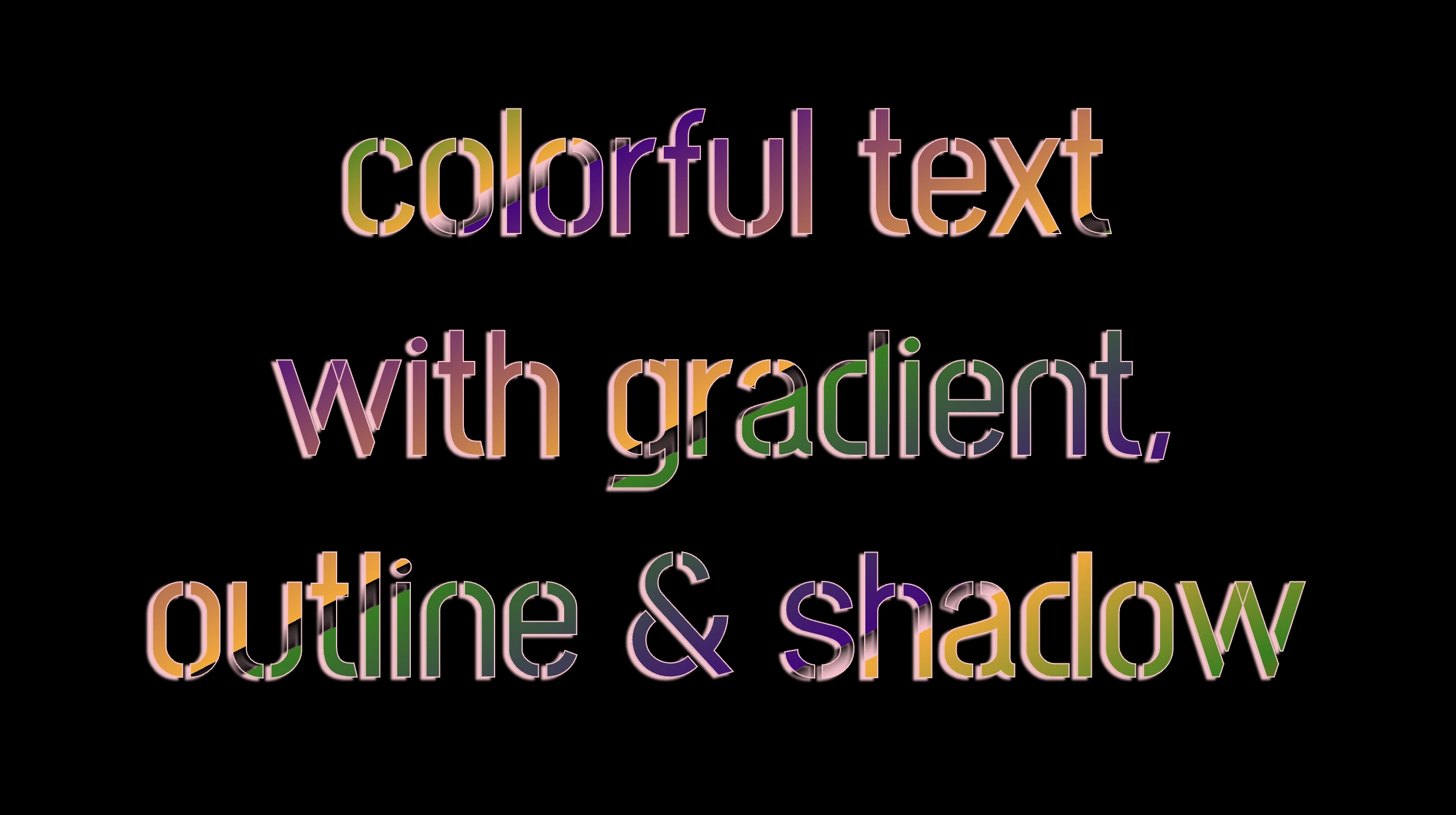
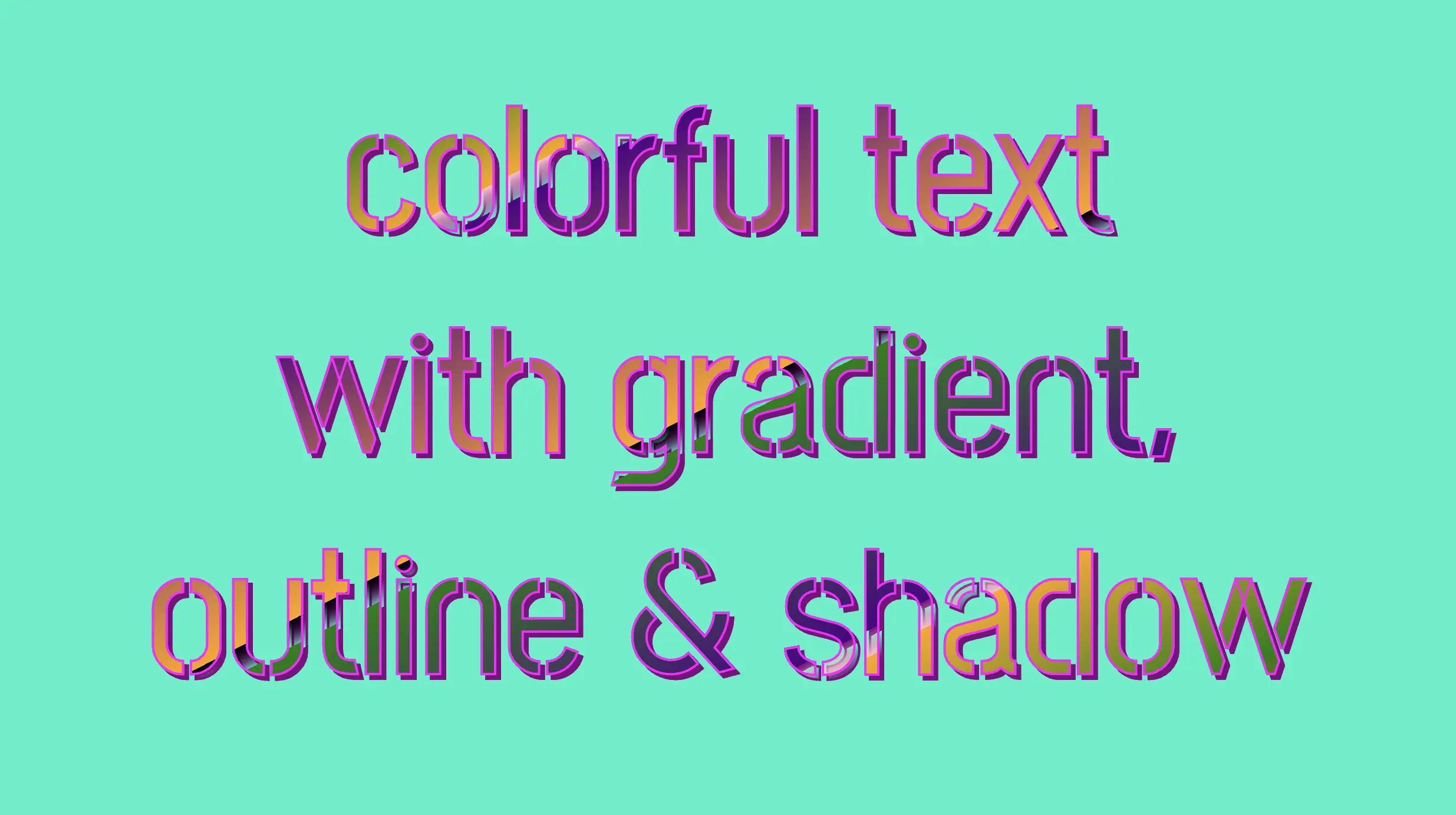
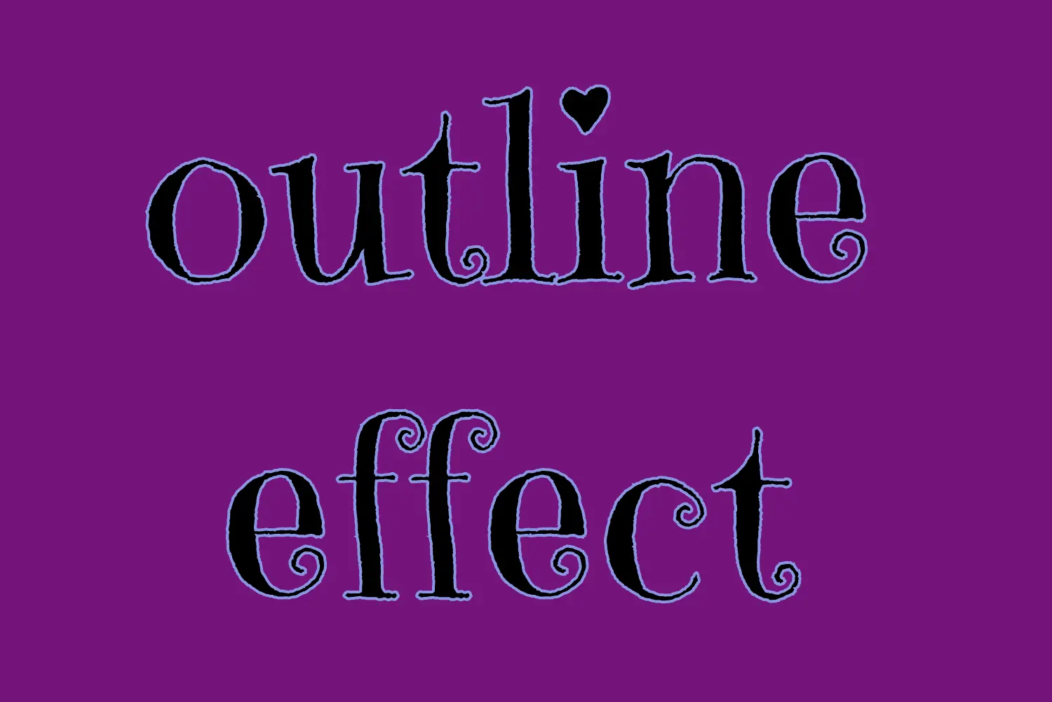
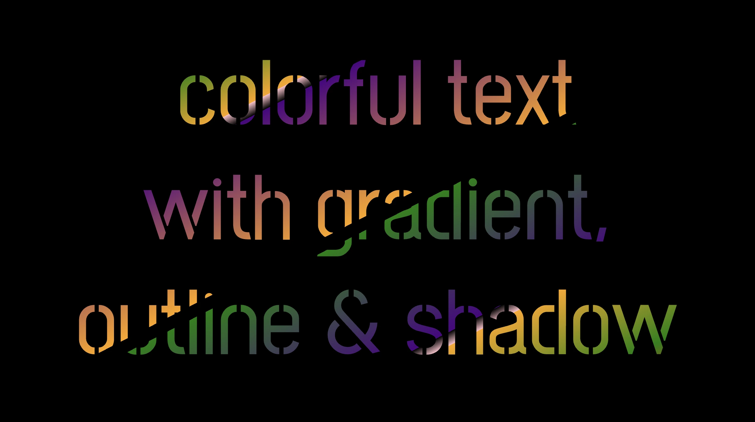
To infuse our text with a touch of fantasy and vibrance 🎉 ✨, we can use a brighter color for the outline and change the shadow to match. For example, we could create a vivid or dark background as a way to create contrast and then swap out the pink outline and shadow for a more vibrant magenta. In the picture below, you can see how these small changes make a big difference, giving a more colorful and bright result.