Welcome to this article, where I will guide you through some simple steps of creating a stunning CSS infinite flipping card animation. With my easy-to-follow instructions, you’ll be able to design a beautiful and eye-catching card in no time. Don’t miss this opportunity to elevate your website and impress your audience! 😉
Let’s proceed and direct our attention towards creating this distinctive animation!
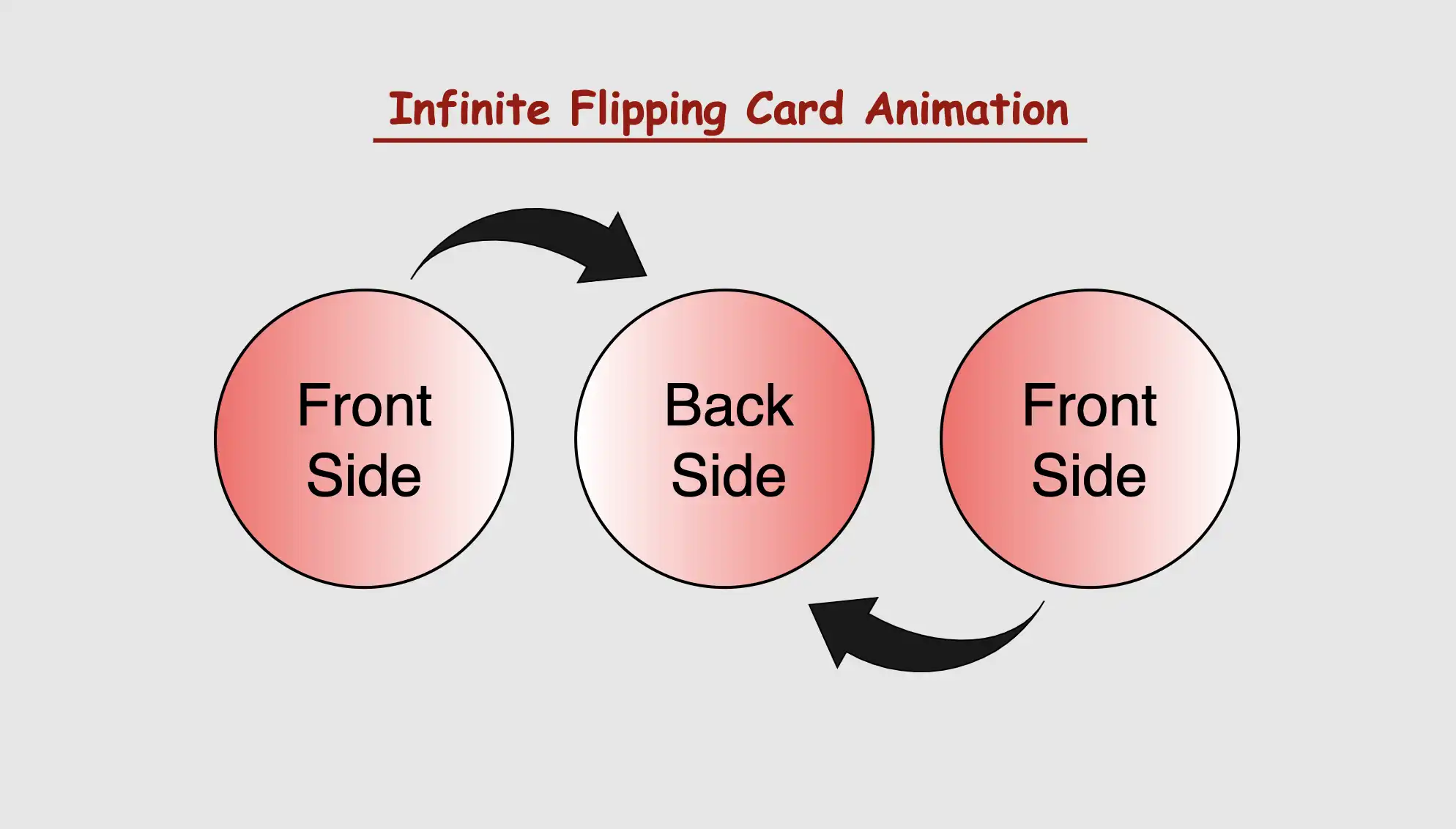
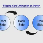
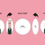
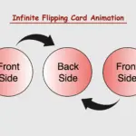
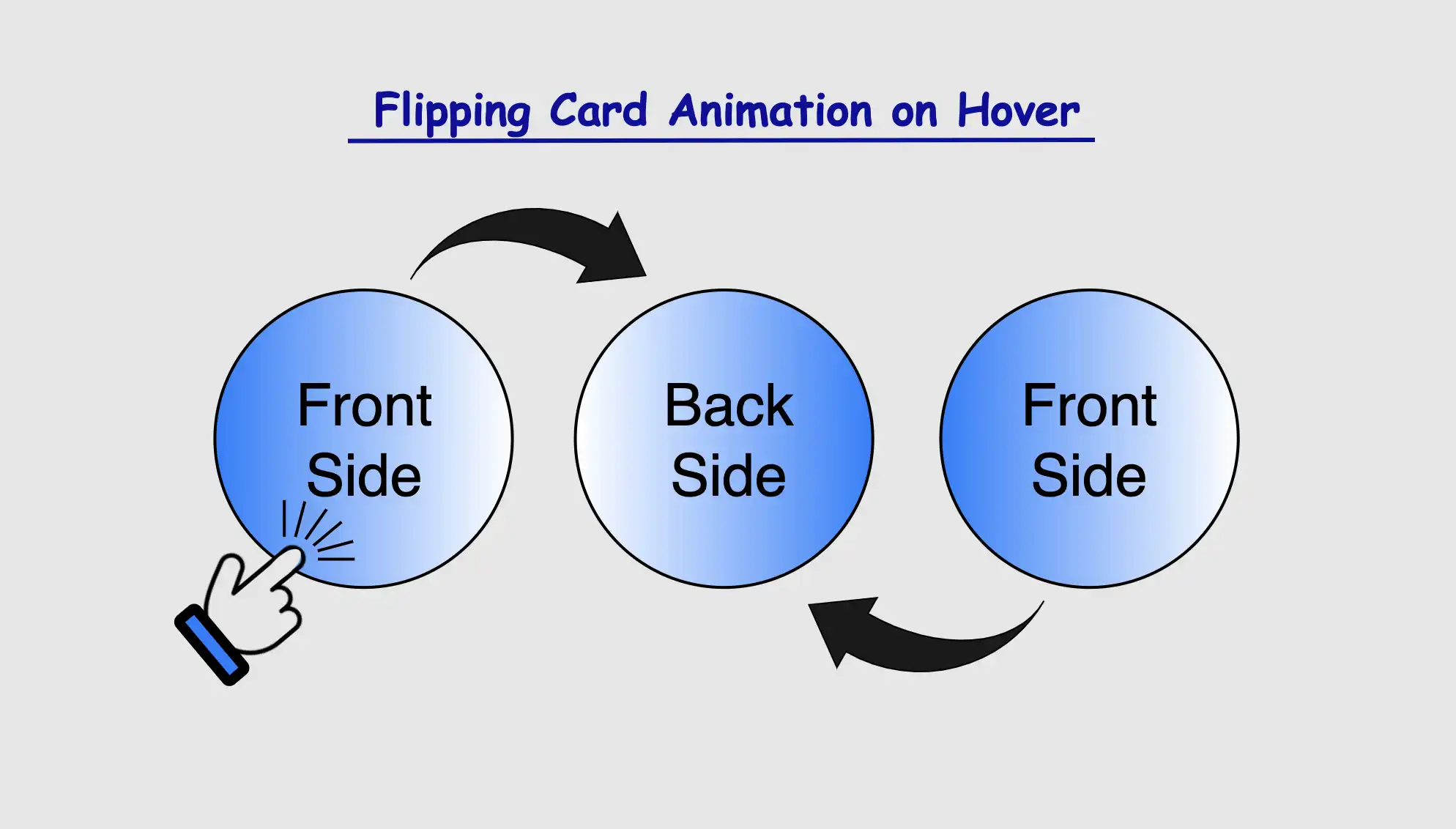
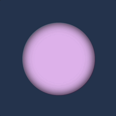
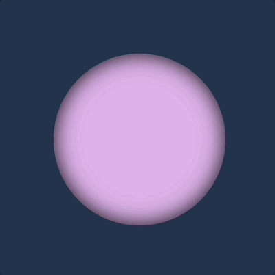
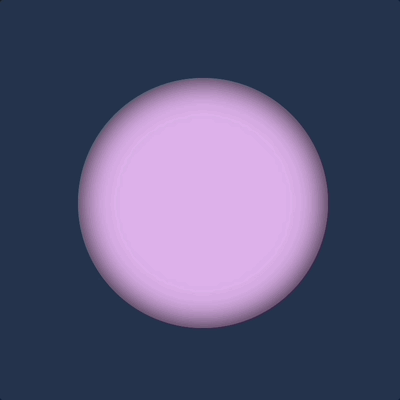
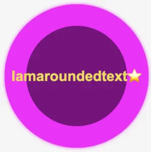
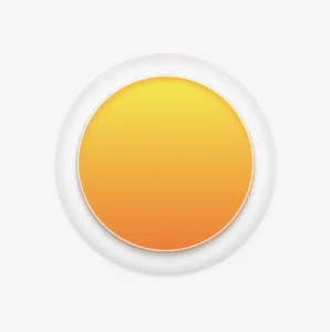
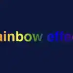
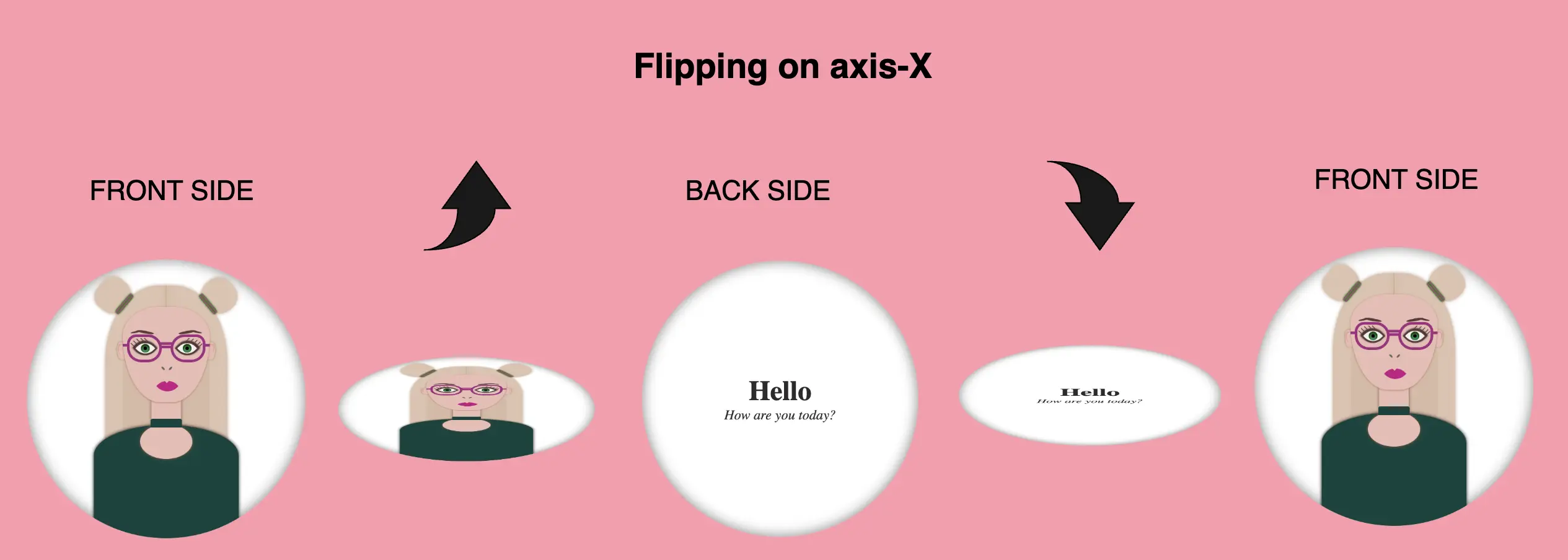
CSS Infinite flipping card effect animation
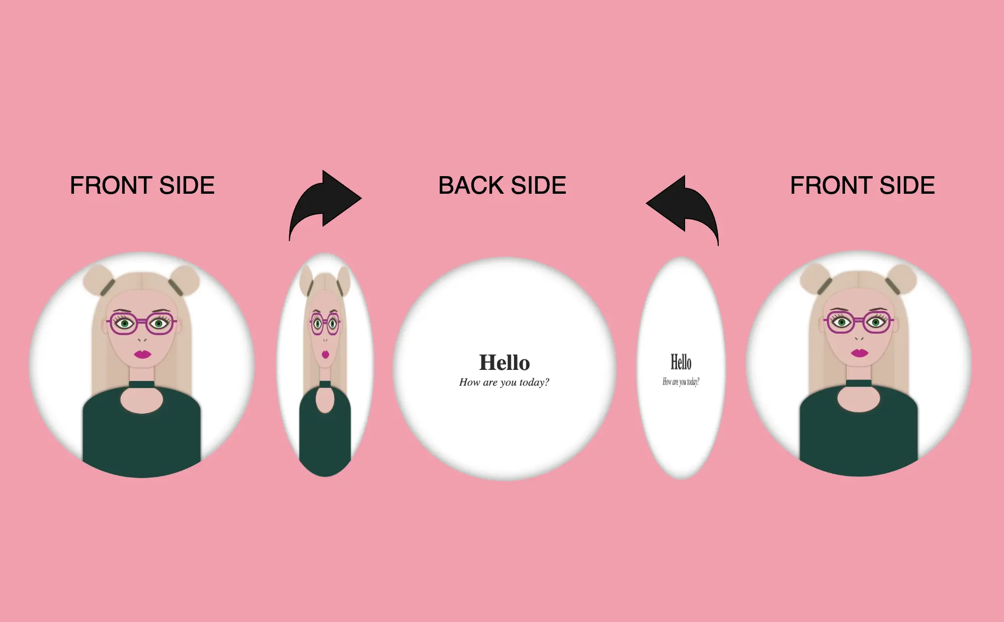
The supplied HTML and SCSS (Sass) code generates a flip card that exhibits movement along both the Y and X axes. The X-axis and Y-axis represent two intersecting lines, defining the coordinates of a point in a two-dimensional space.
Now, let’s analyze the code one step at a time:
HTML structure
Let’s start by examining the HTML structure. We begin by creating a container element with the class flip-wrapper. This container acts as the main hub for our animation. Inside this container, we have a special area with the class flip-card. So, now we have a parent element and a child element. The parent element is where we will build the animation while the child element is the one that determines the appearance of our animation.
<div class="flip-wrapper">
  <div class="flip-card"></div>
</div>CSS Basic Structure
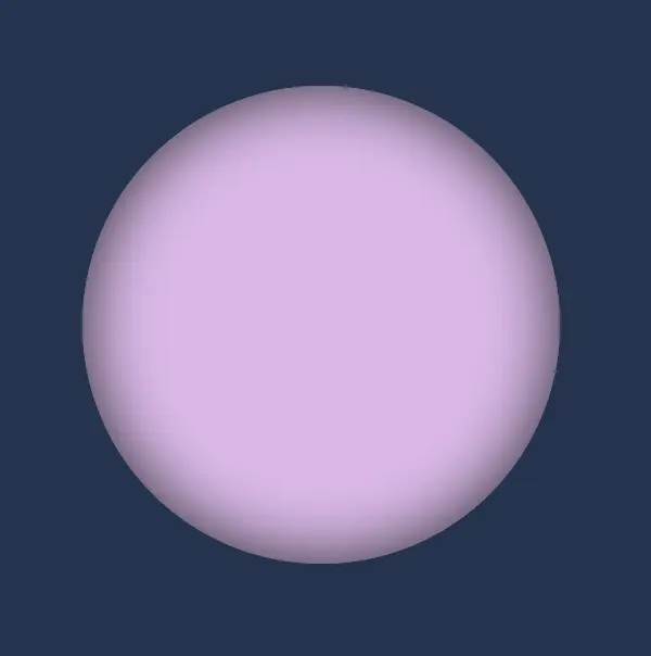
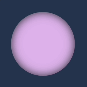
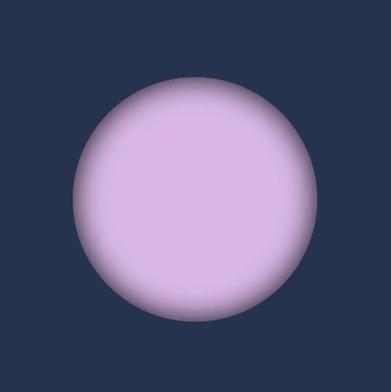
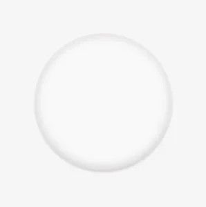
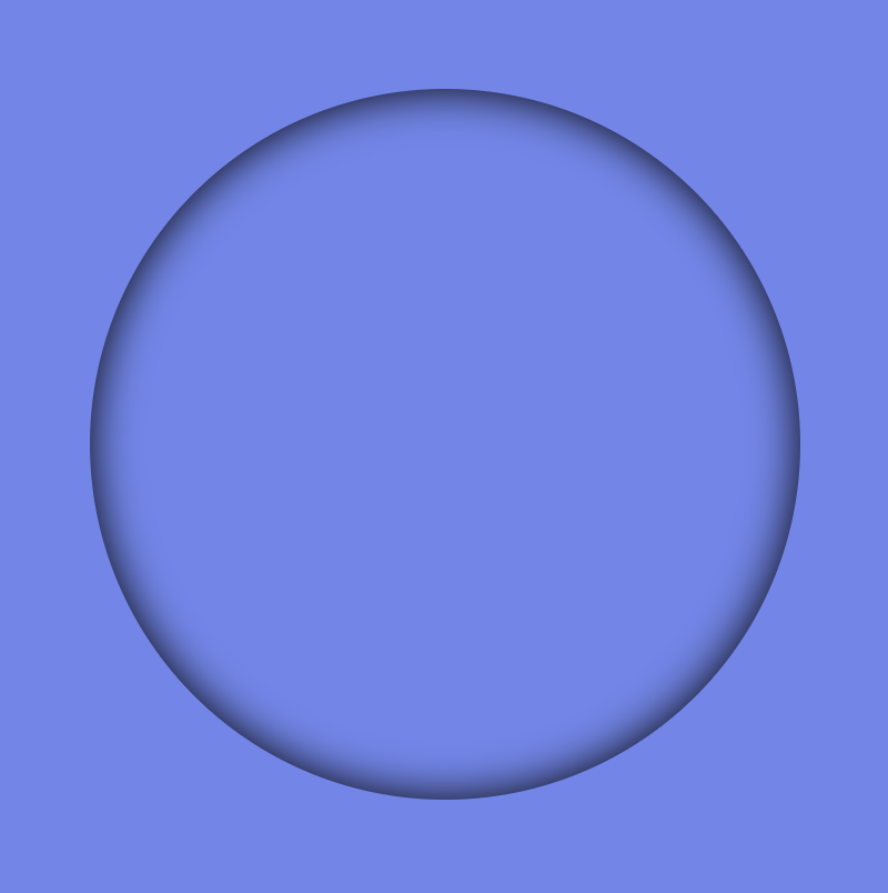
In our CSS code example, we start by making the whole page’s background-color a shade of gray (#c3c8c3).
Then, for the container called .flip-wrapper we decide its size by giving it a fixed width and height of 300 pixels. We also make it look circular or rounded by using the border-radius property. It’s important to mention that you can keep it square ⬛ if you prefer, but I went with the rounded look ⚫ because it helps us see clearly the effect.
Moving on to the .flip-card element, we set its width and height to 100% as a way to cover the entire available space. We make it look nicer by giving it a linear-gradient background using white and black colors. A subtle gray shadow effect is also a nice touch, giving a sense of depth. To keep the circular style consistent, we add the inherit value to border-radius property.
body {
  background-color: #213450; /* dark blue */
}

.flip-wrapper {
  width: 300px;
  height: 300px;
  border-radius: 50%;
  .flip-card {
    width: 100%;
    height: 100%;
    background-color: #e1b6ea; /* lavender */
    box-shadow: inset 0 0 30px;
    border-radius: inherit;
  }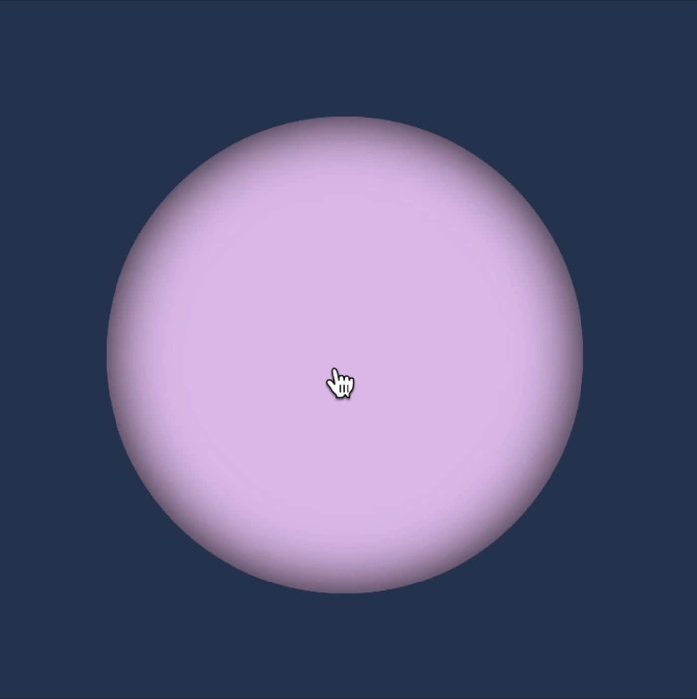
}This is what’s currently visible on our screen.
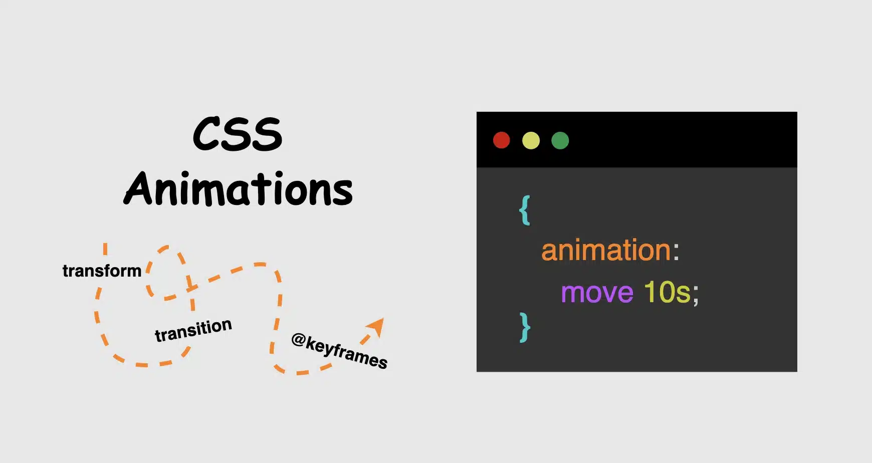
Creating the CSS flipping card effect animation
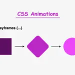
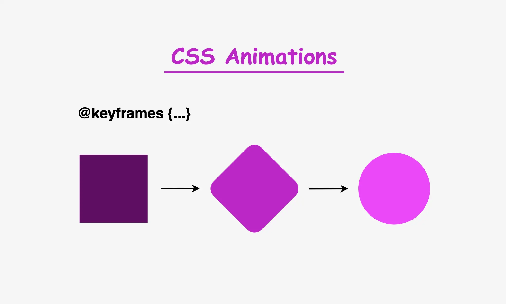
To achieve this captivating effect, we must employ the following two CSS properties: animation and @keyframes. Let’s dive deeper into their analytical exploration.
To create an infinite flipping card animation it is essential to connect the animation and @keyframes CSS properties. Otherwise, it won’t work.
Setting the animation CSS property
In this section of the code, we’re applying the CSS animation property to the element we want to make the animation, in our case to the .flip-wrapper class. The purpose of this property is to associate the animation with the element, as we mentioned above.
- First of all, we need a name for our animation. Here the animation is named
rotation. This name acts as a reference point, allowing us to reuse and target this specific animation throughout our stylesheet. - Then we have to give it a duration. Our example has a duration of 8 seconds
8s. This duration defines how long the animation takes to complete one cycle, indicating that the entire animation, from start to finish, will span over 8 seconds. - Additionally, it’s set to repeat infinitely. This means that once the animation completes, it restarts immediately and runs continuously without a break. This creates a continuous animation effect (loop 🌪 😂).
In summary, we are using the animation property to apply an animation named ‘rotation’ to the .flip-wrapper class, making it last for 8 seconds and repeat indefinitely, resulting in an uninterrupted, continuous animation for an element.
.flip-wrapper {
  ...
  animation: rotation 8s infinite;
  .flip-card {
    ...
  }
}Ways to add the @keyframes
In the @keyframes rotation section, we define the animation behavior. It specifies a transformation that involves rotating an element around its X-axis and Y-axis. Here’s a breakdown of its key components:
@keyframes: This is the rule used to define the keyframes for the animation. Keyframes specify how the animation should change over time, in this case, from the starting state (from) to the ending state (to).rotation: This is the name given to the animation, and it will be used to reference the animation when applying it to elements using theanimationproperty.fromandto: These define the initial and final states of the animation. In thefromstate, the element has a rotation of 0 degrees around the X-axis, meaning it starts with no rotation. In thetostate, the element is rotated 360 degrees, completing one full rotation, around the X-axis and/or Y-axis.transform: Thetransformproperty is used to apply a specific transformation to the element. In rotation animations, (the specific transformation applied can vary, such as rotating, scaling, or skewing the element.) it enables the element to change its orientation.
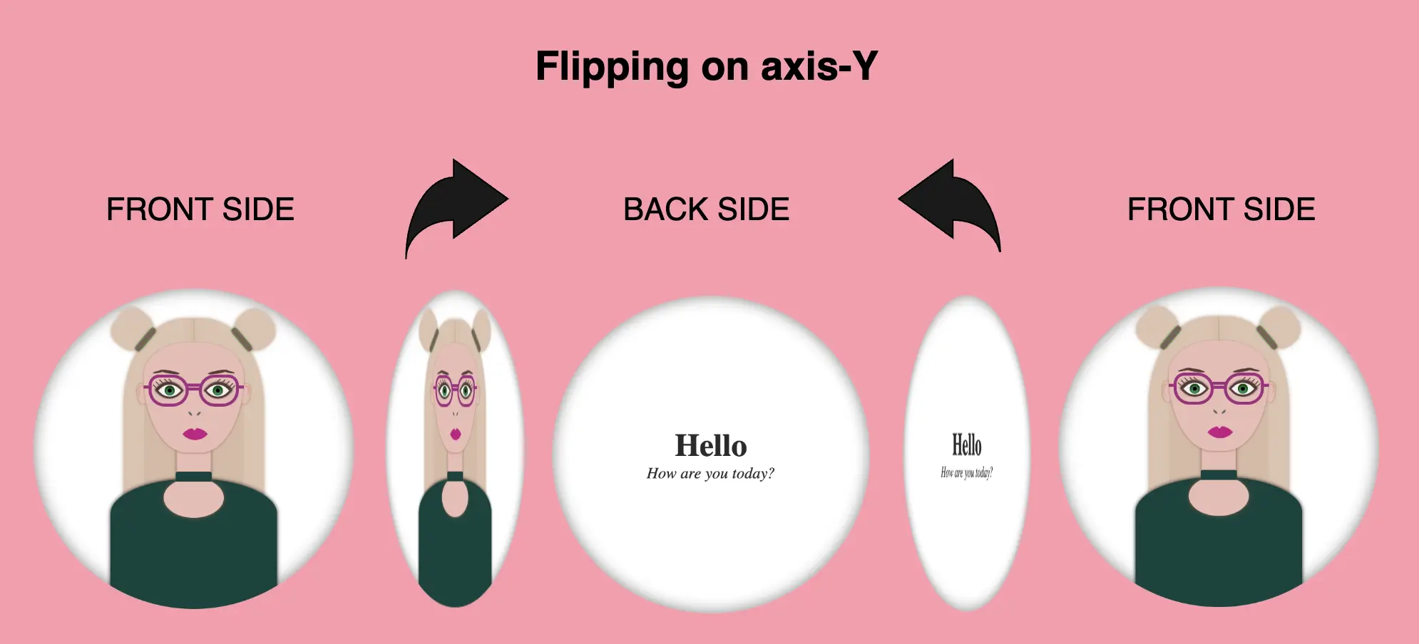
transform: rotateY()
In the following CSS animation, named rotation , our animation starts from a rotation of 0 degrees (from) and smoothly transitions to a 360-degree rotation (to) around the Y-axis.
/* ANIMATION */
@keyframes rotation {
  from {
    transform: rotateY(0deg);
  }
  to {
    transform: rotateY(360deg);
  }
}
transform: rotateX()
This CSS animation, named rotation rotates the element around its X-axis. It starts (from) with no rotation (0 degrees) and smoothly completes (to) a full 360-degree rotation.
/* ANIMATION */
@keyframes rotation {
  from {
    transform: rotateX(0deg);
  }
  to {
    transform: rotateX(360deg);
  }
}
We have the capability to create rotations along both the Y and X axis at the same time.
transform: rotateX() rotateY()
In this CSS animation named rotation the element is rotated in both the X and Y axes. It starts (from) with no rotation (0 degrees in both axes) and gradually complete (to) a full 360-degree rotation in both the X and Y axes. This animation can create a complex spinning effect that involves rotations in multiple directions. Cool huh!! 😎
/* ANIMATION */
@keyframes rotation {
  from {
    transform: rotateX(0deg) rotateY(0deg);
  }
  to {
    transform: rotateX(360deg) rotateY(360deg);
  }
}
What to avoid when making a CSS flipping card effect animation
As a reminder, it’s important to ensure that our animation transitions smoothly. To achieve a complete rotation, we must rotate (from) 0 degrees (to) 360 degrees. In the provided animation code, the @keyframes specifies a rotation of (160 deg) for both the X and Y axes, resulting in a card flip effect. However, this setup does not create a smooth transition beyond the 180-degree point. The card abruptly returns to its initial position, giving it a characteristic stop-and-return appearance. To achieve a more natural and realistic flipping effect, we need to ensure a complete 360-degree rotation or a half 180-degree rotation.
/* ANIMATION */
@keyframes rotation {
  from {
    transform: rotateX(0deg) rotateY(0deg);
  }
  to {
    transform: rotateX(160deg) rotateY(160deg);
  }
}
🌼 Hope you found my post interesting and helpful.
Thanks for being here! 🌼


