CSS in motion! Another perfect title for this post, as CSS is no longer just a language to style static pages, but also to elevate them with animations. CSS entered a new era and has grown into a clever tool that brings digital interfaces to life through movement. It began to shine, showing its full potential and ultimately becoming part of the experience, not just the look.
CSS properties for movement
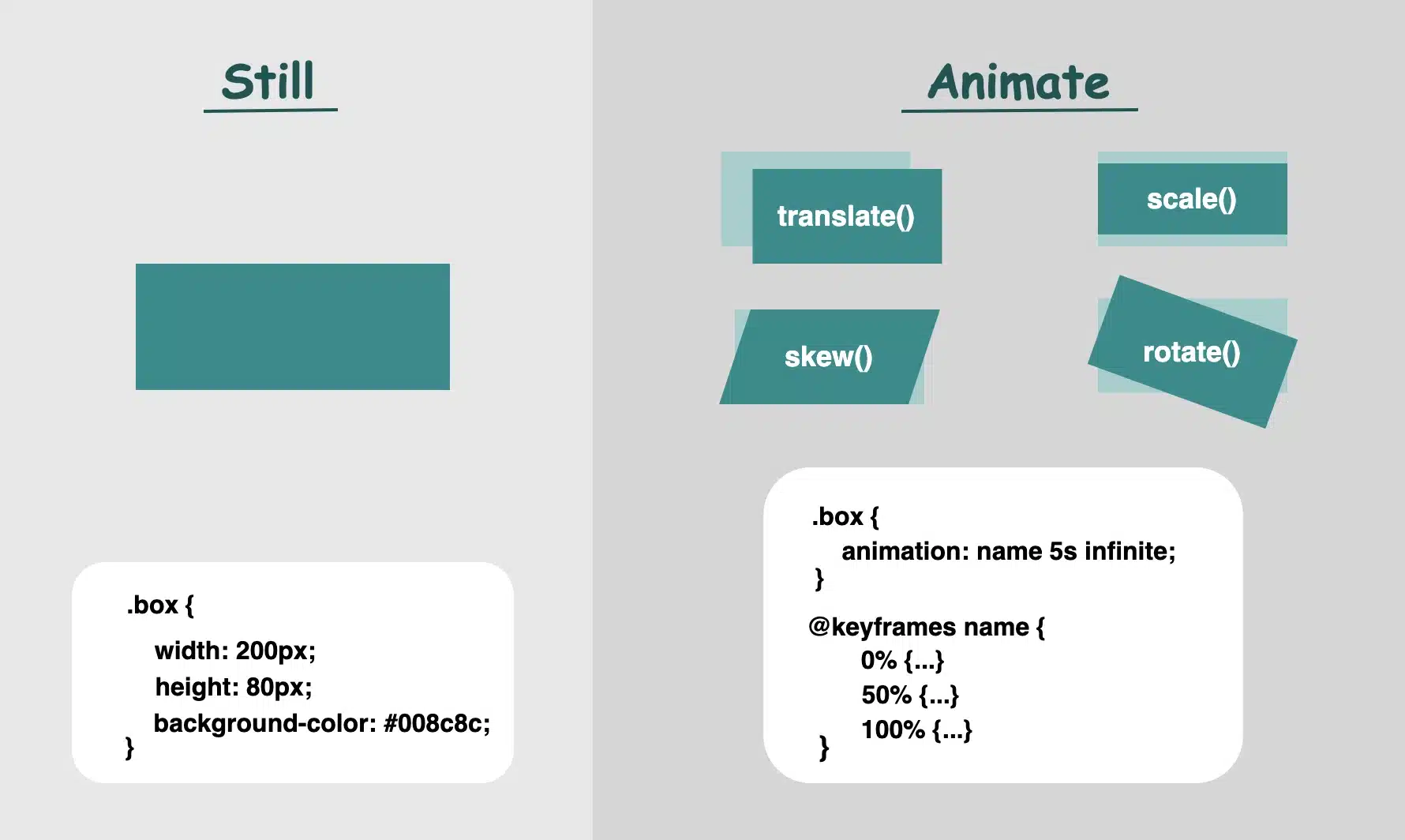
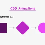
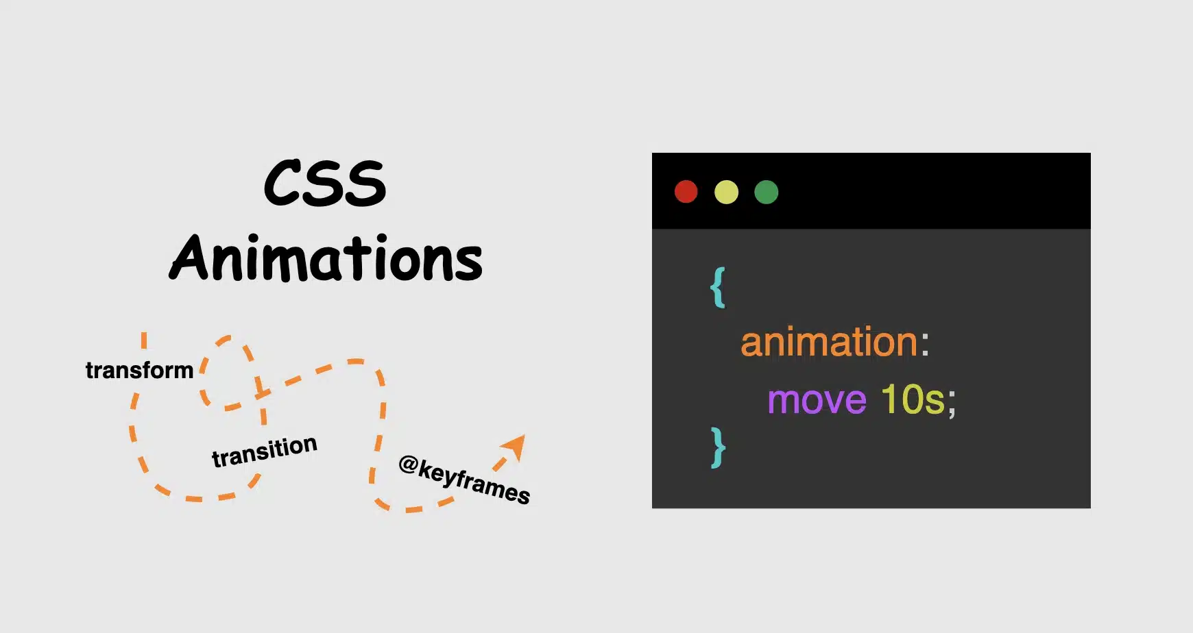
Now, time to focus on where CSS credits its upgrade. Utilizing the following properties: transform, transition, animation and @keyframes, elements can scale, slide, fade, spin and move through time all without a single line of JavaScript. Today, we’ll focus on understanding how these properties create such amazing visual feedback. We’ll take a step back from the code and examine these features from a more theoretical perspective: what they mean, how they influence behavior, and why they play such a crucial role in modern design. So, let’s zoom in! 🧐
Transform CSS property
It applies 2D or 3D transformations 🛠 to an element. It can change the size, rotation, position, and shape. Values:
scale(): Resize elements – making them smaller or bigger depending on our preferences (use unitless numbers).
skew(): Slant elements (use deg, which stands for degrees).
translate(): Move elements (use length units like: %, px, rem, etc.).
rotate(): Spin elements (use deg, like skew).
📌 Depending on our needs and preferences, we are free to make combinations with the above values.
perspective(): Creates a 3D effect, giving the elements a sense of depth.
matrix(): Creates 2D transformations. It provides a streamlined approach for applying scaling, skewing, translation, and rotation through a unified matrix. (a mathematical representation – transform: matrix(a, b, c, d, e,f) – that combines the first three transformations into a single matrix. If you want to include rotation as well, you would replace a, b, c, and d with the appropriate cosine and sine values for the desired rotation angle, while keeping e and f for translation.)
It animates changes in property values over time ⏳ and smoothens the transition between two stages (e.g. on hover, focus) Values:
transition-property: What property will animate (e.g. transform, opacity)
transition-duration: How much time does the transition take to complete (e.g. 0.4s, s stands for seconds, we are free to use ms too, for milliseconds)
transition-timing-function: Define the speed curve (ease, linear, ease-in, ease-out, ease-in-out)
transition-delay: The time you wait before an animation starts (s and ms, similar to animation-duration). Its default value is 0s, which means the transition will start instantly.
Define intermediate states of an animation 📽 series. Breaks the animation into episodes 🎬, like “first episode, look like this,” “second episode, change to this,” “third episode, change to that,” and “final episode, finish like that.” Each episode represents a point in the timeline where the property-value changes (opacity, rotation, color, etc.). Values:
From / To : Timeline positions
Percentages % : Timeline positions
📌 Each one represents a property-value pair that defines the appearance at a specific moment
It runs 🎞 a full animation based on the @keyframes you have defined. Unlike the transition we mentioned above, which moves from one point to another, animations can have many points ⏱ and follow more complex timing rules. Values:
name: the identifier of the @keyframes rule
duration: for how long it moves
time-function: how the speed flows
ease: it gives a smooth motion, starts slow, continues faster, and ends slow again (which is the default value)
linear: it has the same speed all the way
ease-in: it starts slow, then it speeds up
ease-out: it starts fast, then it slows down (Suitable for hover effects 😎)
ease-in-out: starts slow, in the middle spreads up, then slows down again
delay: if the animations begin immediately or with a delay
a value of 0s (seconds) indicates it starts as soon as it’s applied (which is the default value)
a positive value that it will start after a set amount of time (e.g. 2s, which means it will start 2 seconds later)
a negative value that starts straightforward but acts like it has already begun (e.g. -2s the animation won’t wait — it’ll jump in as if it had already been playing for 2 seconds. This can be very helpful if you want animations to be already in motion when the page loads. 😎)
iteration-count: how many times to repeat (infinite, 1, 2, ech)
direction: in which direction the animation moves
normal ➡ the animation moves forward (which is the default value)
reverse ⬅ the animation moves backward
alternate ➡ ⬅ first forward, then backward
alternate-reverse ➡ ⬅ ➡ first forward, then backward, then again forward
fill-mode: shows how the element should look like before the animation starts or after it ends. You have the option to freeze the first or last frame so it doesn’t snap back (➡ forwards, ⬅ backwards). The default value is none, which means it does not apply any styles to the elements.
play-state: control if the animation is running or paused, like play ▶ or pause ⏸ buttons (running, paused)
📌 For an animation to actually play, we need to utilize only the: animation-name, animation-duration and the @keyframe. All the other CSS properties are optional.
When creating content for the web, even the smallest detail can significantly alter how something appears. The experience of bringing elements to life is amazing! It doesn’t need to be dramatic or complex. A simple yet well-structured and strategically placed change at the right moment can make everything more connected, useful and realistic.
🌼 Hope you found my post interesting and helpful. Thanks for being here! 🌼
Greetings! Today, I’m excited to walk you through the steps of crafting an amazing CSS flipping card animation that will activate when the user hovers over it. By following my detailed guidance, you’ll learn how to create a stunning animated card that will grab the attention of your viewers and enhance the overall appearance of your website. So, don’t miss out! 😉
Let’s focus on making this unique animation!
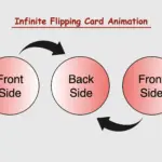
CSS Flipping card animation on hover
The provided HTML and SCSS (Sass) code creates a flip card that moves along the Y and X axis. The X-axis and Y-axis are two lines that cross each other. They’re used to define the location of a point in a two-dimensional space.
Let’s break down the code step by step:
HTML structure
To start, let’s focus on the HTML structure. We begin by creating a parent container with the class flip-wrapper. This container serves as the parent for our captivating animation. Inside this wrapper, we have a child element with the .flip-card class. This particular element is where our animation will take place.
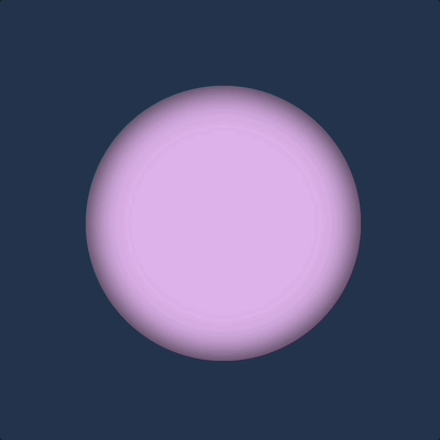
In our CSS code snippet, we start by setting the background-color of the entire page to a deep shade of dark blue (#213450).
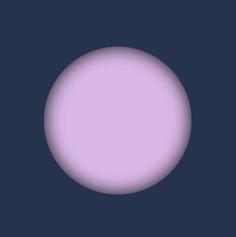
Moving on to the .flip-wrapper container, we specify its dimensions, giving it a fixed width and height of 300 pixels. To create a circular or rounded appearance, we apply border-radius. It’s worth noting that, if desired, you can leave the dimensions as is to maintain a square 🟪 shape. I chose this rounded 🟣 design because it makes it easier for us to observe the effect we’re aiming for. 😉
Next, we focus on the .flip-card element. We set its witdh and height to 100% to ensure it covers the entire available space. We also enhance its visual appeal with a soothing pastel purple (lavender) background-color and a subtle gray shadow effect. To maintain the circular theme, we add the inherit value to border-radius property.
body {background-color: #213450; /* dark blue */}.flip-wrapper {width: 300px;height: 300px;border-radius: 50%;.flip-card {width: 100%;height: 100%;background-color: #e1b6ea; /* lavender */box-shadow: inset0030px;border-radius: inherit; }}
SCSS
This is what’s visible on our screen at the moment.
For our effect to function as intended we have to work with both the parent and the child element. We begin with the parent element where we apply the :hover effect and change the cursor to a pointer 👆. You can check out all cursor style and pick the one that suits you best. 🤗
.flip-wrapper { ...&:hover {cursor: pointer; }}
SCSS
Next, we’ll move on to our child element. Here, we set the transform CSS property to rotateY and specify the degree (deg) of rotation we desire.
Afterward, we’ll define the transition CSS property. We can use it in two ways. We add it to the :hover or we can add it directly to the .flip-card class. In the first case, the effect works only when you hover in. In the second case, the effect works when you hover in, but when you hover out it turns back to its original position. Then we set the transform value and specify the duration in seconds (s). In our case, I’ve chosen 8 seconds to make the effect slow and easily observable. 😉
Hi there! You’re aware that the web 🕸 wasn’t always like it is today? Websites were like digital 📰 posters – just text and images. A page loads, and no changes occur. Static design had the reins. No movement, no glow! 🤹♀️ ✨ Everything remained visually frozen. 🧊 🥶 CSS was only a tool to decorate that static content and make some improvements, such as selecting a font, changing colors, adding a border or a margin.
As time went on, browsers improved, and users began to expect more. That’s when CSS started to shine and show the way from static pages to fluid experiences! With features like transition, transform, animation, and keyframes, the focus shifted from how things looked to how they can pulse and move in time. Dynamic design is finally here! CSS became a language capable of transforming static HTML elements into dynamic 🧨 ones.
Motion matters. It allows users to feel when something changes and witness how elements react. It’s a way of communication, 🔊 not just decoration. With only CSS, designers can craft these interactions. Creating animations that ‘rotate‘, ‘skew‘, scale‘ or ‘shift‘ position suggests ongoing system activity. A sliding menu, like a ‘hamburger icon‘, reveals categories, indicating that navigation continues beyond the current view. A spinning icon, after a user clicks ‘Submit’ or ‘Save’ on a button, signals that a process is loading. A button that gently fades in and out on hover – labeled ‘Sign Up‘ – asks for interaction. A fading alert, such as ‘Connection lost‘ or ‘Download has failed, retrying‘, quietly suggests that the message is temporary. Even a ‘scale-up‘ focusing on an image can reveal that it is active. CSS became a must to represent progress and maintain users’ attention.
Of course, as with everything, setting boundaries is essential. Many times action can cause confusion and make users feel distracted or, even worse, rushed. Not every interface needs to include movement. Sometimes, picking stillness is the best choice. Valuable designs recognise when to pause!
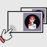
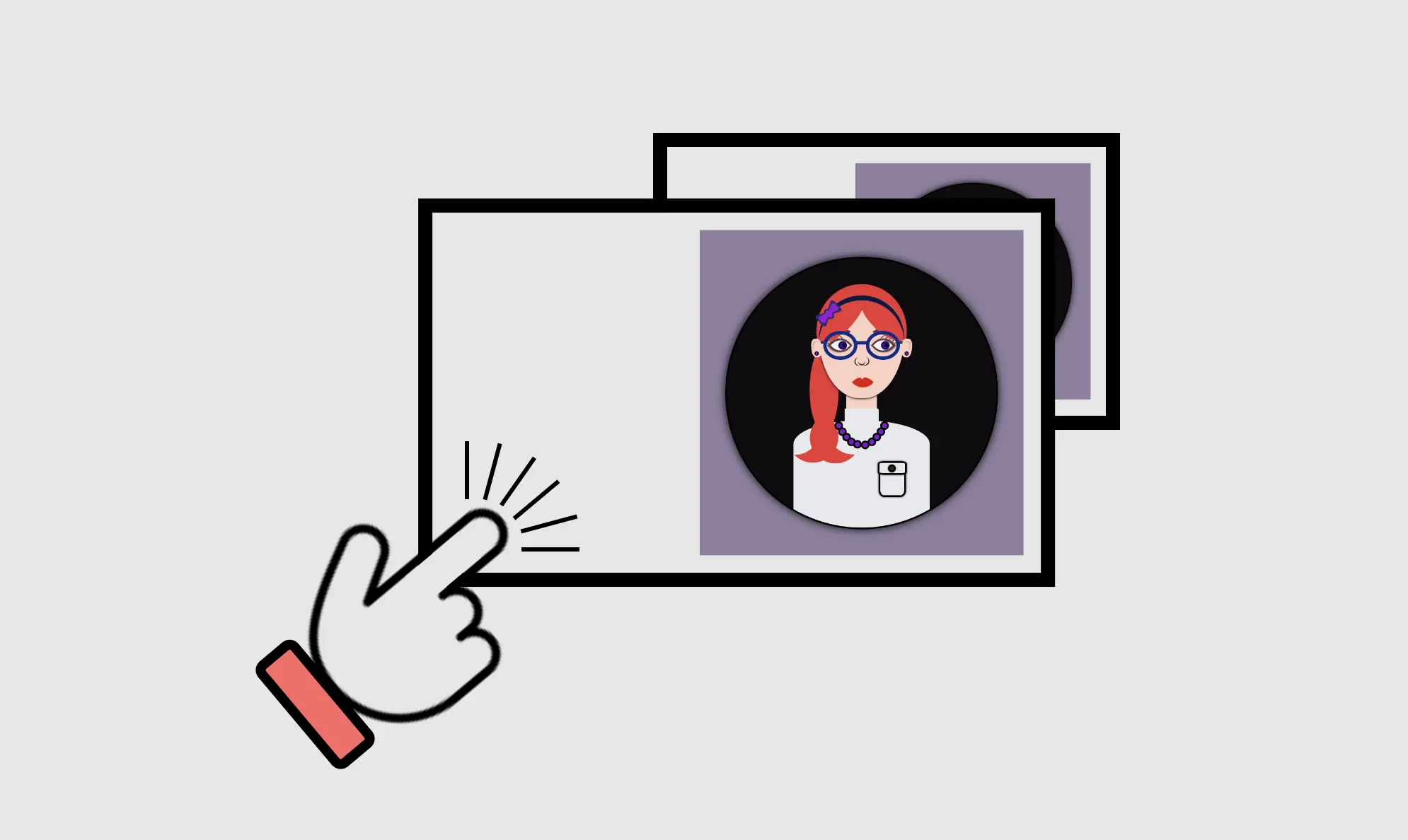
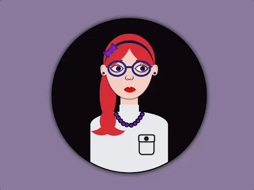
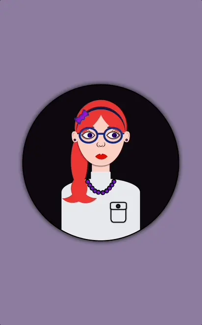
Hello! In this post, I will show you how to create a visually appealing CSS 2d card with flipping animation that activates when you hover over it. To enhance the design, I have added an avatar and integrated the animation with it. If you are interested in how I created the avatar, you can check out the complete avatar code at the end of this post. You are free to use it in your animation or customize it to your liking. Enjoy! 😉
For now, let’s move forward and create this incredible animation!
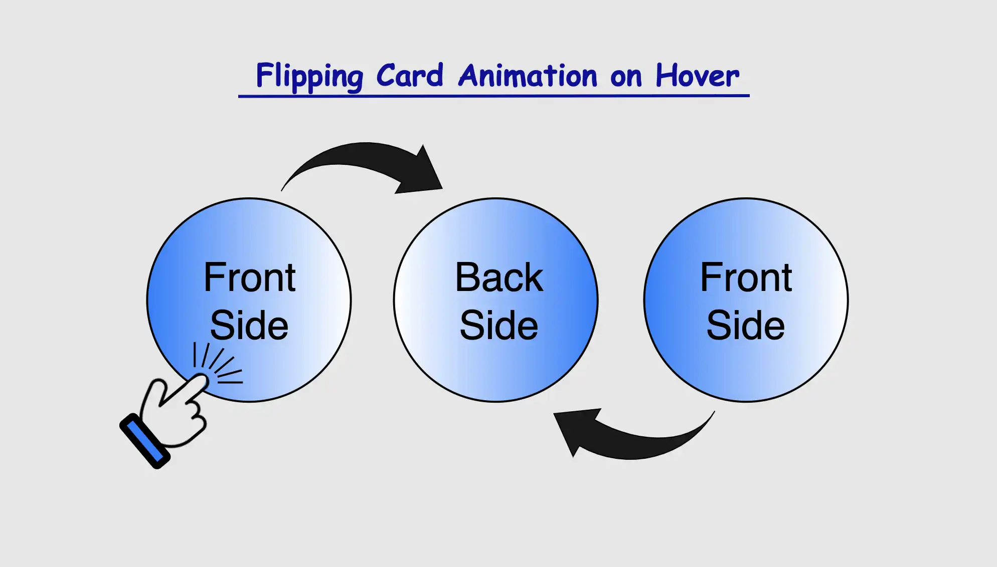
CSS Flipping card animation on hover
The following HTML and SCSS (Sass) code makes a card flip around. Using the X-axis and Y-axis which are two lines that intersect, helps us determine the position of a point in a two-dimensional area.
Let’s analyze our code one step at a time:
HTML structure
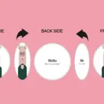
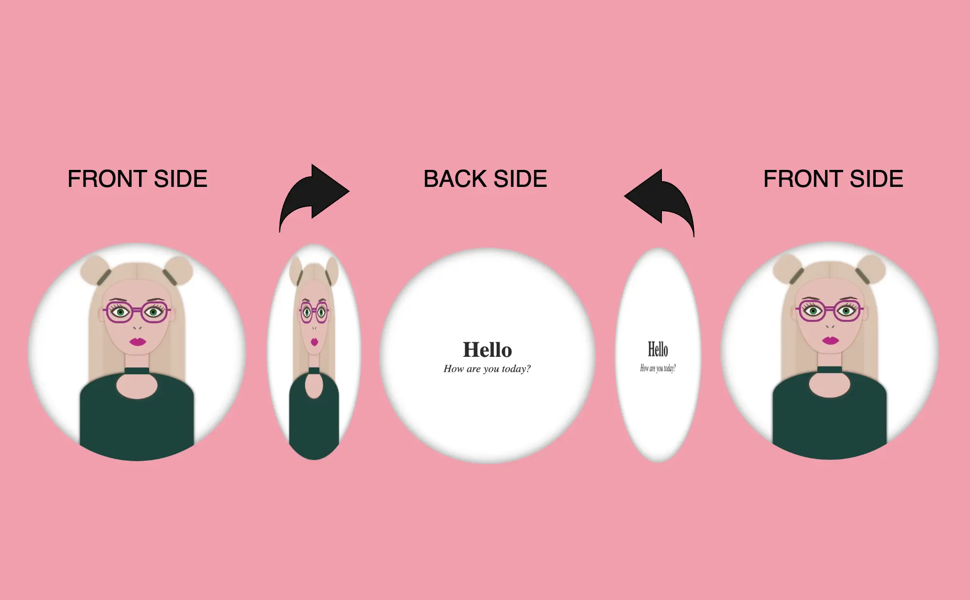
We will begin with the HTML structure. We create a parent container called .flip-wrapper. This container acts as the parent element for our animation. Inside it, we have a child element with the .flip-card class, this is where our animation happens. Next, we divide the child element into two parts: the front side and the back side. On the front side, we’ll add the .avatar-container and place the avatar inside while on the back side, we’ll add the .text-container class and add some text.
<divclass="flip-wrapper"><divclass="flip-card"><divclass="avatar-container"></div><divclass="text-container"><h1>Hello</h1><div><i>How are you today?</i></div></div></div></div>
HTML
CSS Basic structure
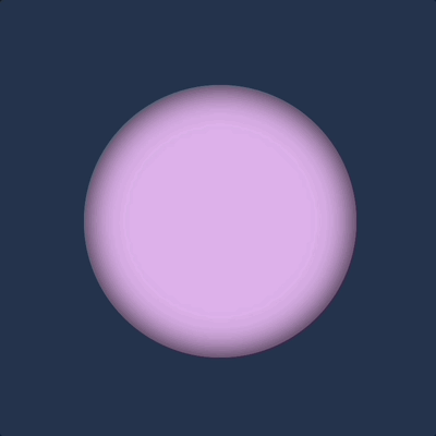
In our CSS code snippet, first of all, we set the background of our whole page to pink. 🐷🐷
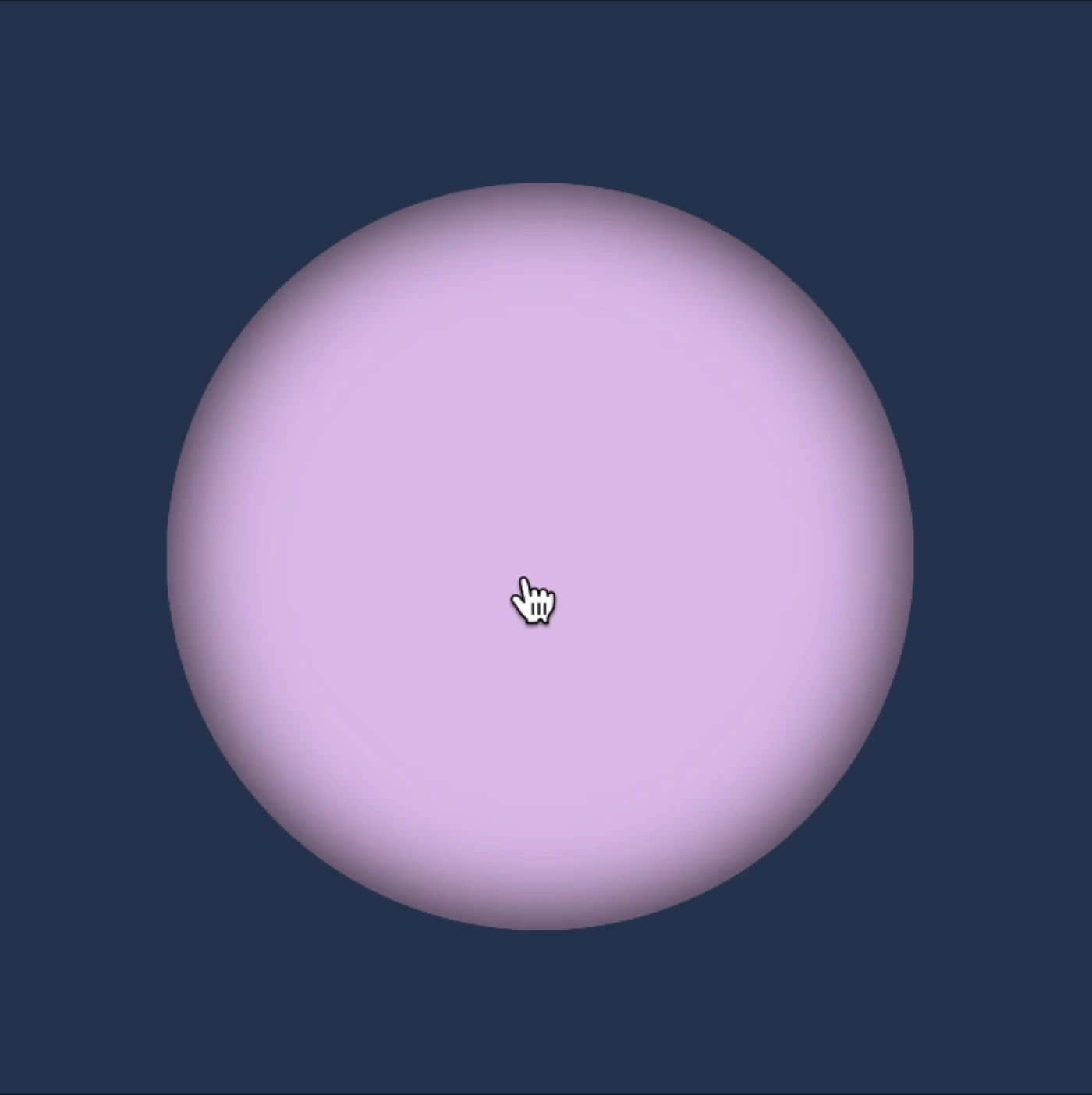
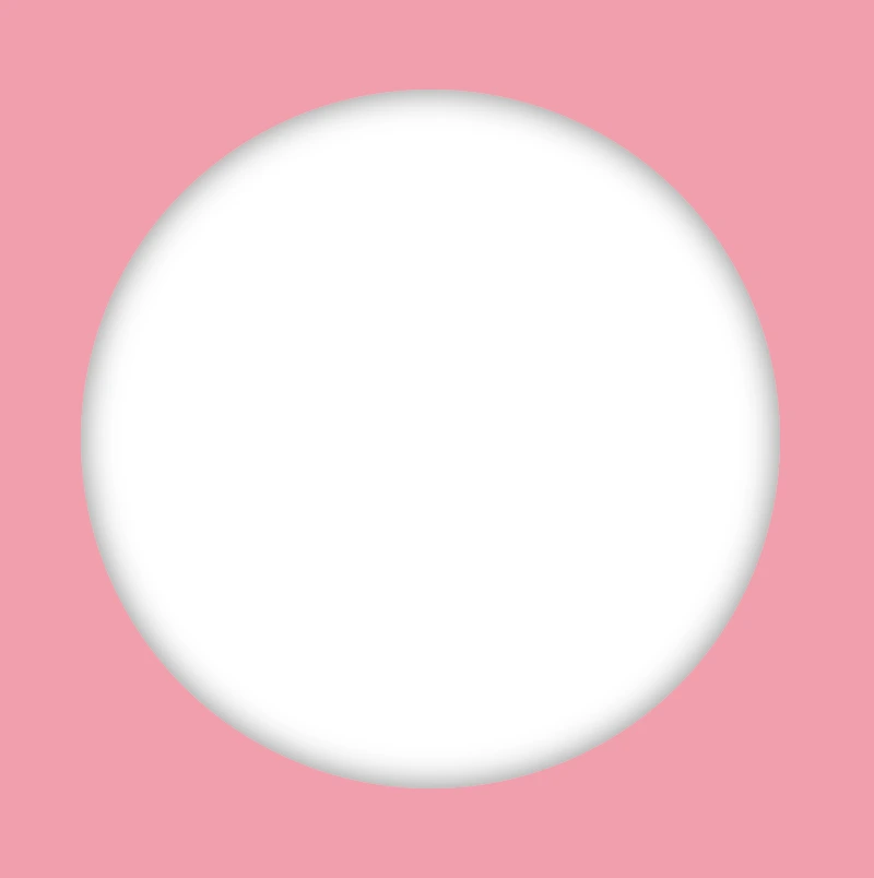
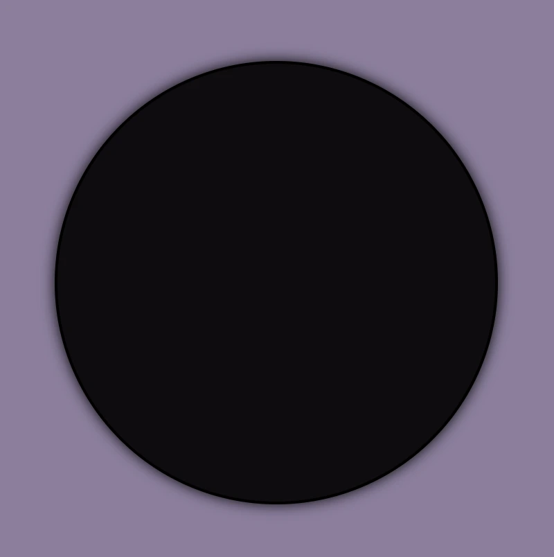
Moving on to the .flip-wrapper container, we specify its dimensions, giving it a fixed width and height of 300 pixels. To make a circular appearance, we apply a border-radius of 50%. If you desire, you can maintain the square ⬜ shape. I chose this rounded ⚪ design because it makes it easier for us to observe the effect we’re aiming for. 😉
Next, we focus on the .flip-card element. We set the position: relative property and then its witdh and height to 100% to ensure it covers the entire available space. We also add a white background-color and a subtle gray shadow effect. To maintain the circular theme, we apply a border-radius of 50% to this container too.
Finally, we set the position: absolute property in both .avatar-container and .text-container classes. In that way we will be ready to place the content we want on both, the front and the back, sides of our card.
This is what’s rendered on our screen at the moment.
Adding the hover effect
In order for our effect to function as intended we have to work with both the parent and the child element. We begin with the parent element, where we apply the :hover effect and change the cursor to a pointer (you can pick any cursor style you prefer).
.flip-wrapper { ...&:hover {cursor: pointer; }}
SCSS
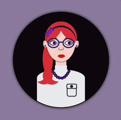
Preparing the front side of my flipping card
I added an avatar on the front side of my flipping card. You can add whatever you want (some text, maybe, or an emoticon ✏️) or you can leave it empty, though it is not really useful for observing the flipping.
.avatar-container { ...}
SCSS
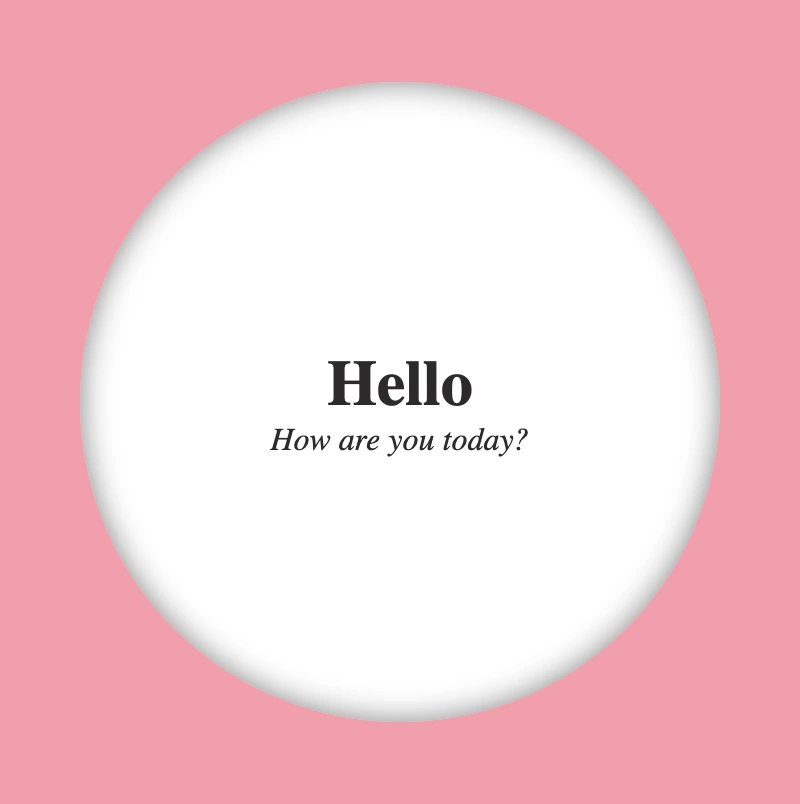
In the following image, we can see how the front side of our flipping card would be. Nice! Isn’t it? 😃
Preparing the back side of my flipping card
Here we prepare our text’s style. We keep the default black color and we centered our text based on the display: flex method.
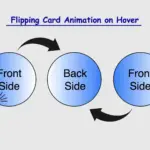
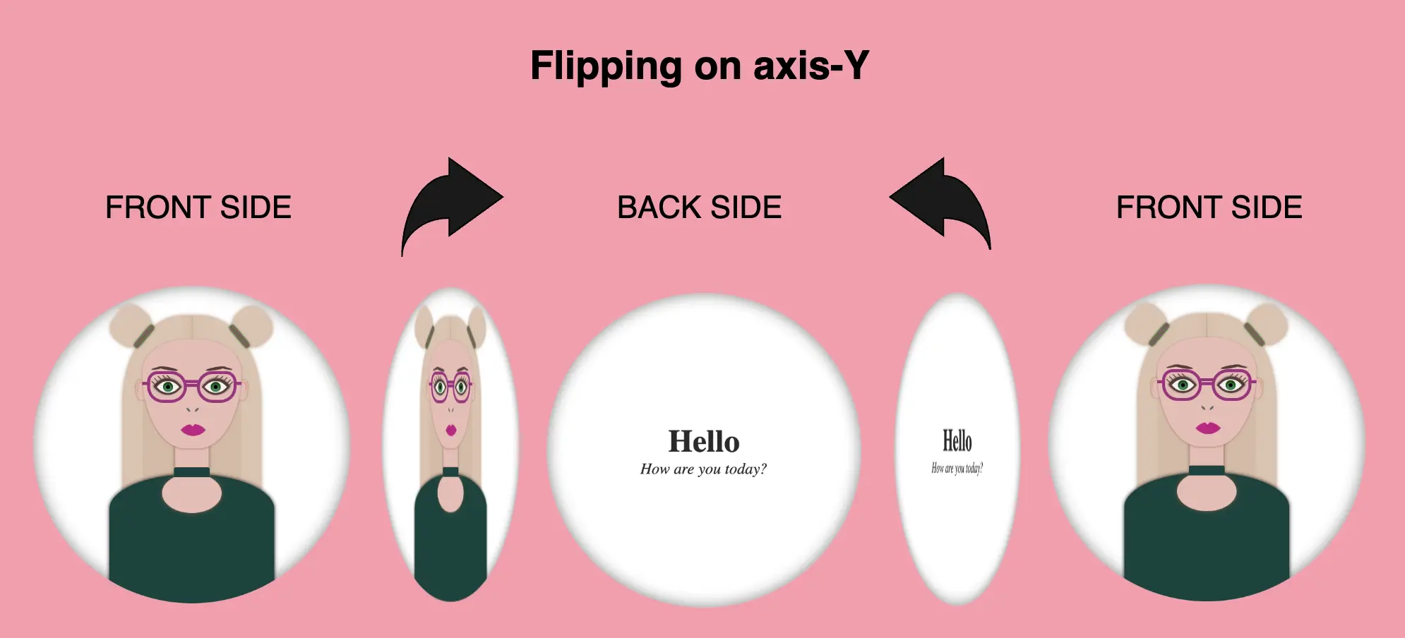
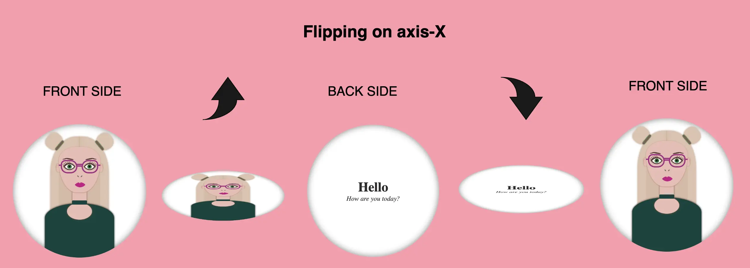
We are free to create flipping animations on both axis X and Y. Below, I prepared two examples. The first one is for axis-Y while the second one is for axis-X. Let’s break it down and see them analytically. 🧐
Flipping animation on axis-Y
In order to achieve our goal we have to combine the following CSS properties.
transform: rotateY(180deg) We begin by setting the transform property, which is responsible for the flipping, inside the hover effect. It is also necessary to add it to the class that represents the back side of our card, in our case the .text-container class, otherwise, our text won’t be rendered on the screen when we hover over the card.
transition: transform 6s & transform-style: preserve-3d We continue by combining these two properties inside the .flip-card class. The first one shows us the exact, time in seconds (s), our effect will take place while the second one makes the children of an element appear as if they are positioned in a 3D space. So this property gives us the impression that the descendants (children) of our element are located within a three-dimensional space.
backface-visibility: hidden We finalize our work with the backface-visibility property that defines whether or not the back side of an element should be visible when facing the user. The back face of an element is a mirror image of the front face being displayed.
Boom! 🎉 This is our wonderful flipping 2d card animation for the X-axis!!
Complete avatar code
Below, I include my HTML and CSS avatar code.
<divclass="avatar-container"><divclass="hair-back"></div><divclass="hair hair--left"></div><divclass="hair hair--right"></div><divclass="hair-clip hair-clip--left"></div><divclass="hair-clip hair-clip--right"></div><divclass="ear ear--left"></div><divclass="ear ear--right"></div><divclass="face"><divclass="eyebrow1 eyebrow1--left"></div><divclass="eyebrow1 eyebrow1--right"></div><divclass="eyebrow2 eyebrow2--left"></div><divclass="eyebrow2 eyebrow2--right"></div><divclass="eye-glasses eye-glasses-left"></div><divclass="eye-glasses eye-glasses-right"></div><divclass="eye eye--left"><divclass="eyelash eyelash--left"></div><divclass="eyelash eyelash--left1"></div><divclass="eyelash eyelash--left2"></div><divclass="eyelash eyelash--left3"></div><divclass="eyelash eyelash--left4"></div></div><!-- end of left eye --><divclass="eye eye--right"><divclass="eyelash eyelash--right"></div><divclass="eyelash eyelash--right1"></div><divclass="eyelash eyelash--right2"></div><divclass="eyelash eyelash--right3"></div><divclass="eyelash eyelash--right4"></div></div><!-- end of right eye --><divclass="nose"></div><divclass="lips"></div></div><!-- end of face --><divclass="neck"></div><divclass="t-shirt"></div><divclass="neckless"></div></div><!-- end of avatar-container -->
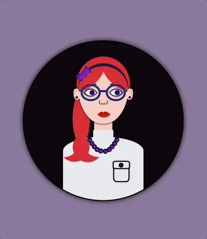
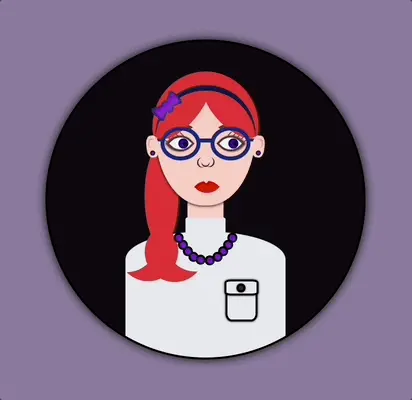
Hey there! Today, I’m gonna teach you how to use CSS transform scale on hover by using the transform: scale property. I’ve already created an avatar in order to make our animation more understandable and fun! 😄 If you’re curious about how I made the avatar, you will find the complete avatar code at the end of my post. You are encouraged to incorporate it into your animation as well 😉 The choice is yours!
Meanwhile, let’s just dive 🤿 into creating these amazing scale animations!
Meanwhile, let’s just dive into creating these amazing scale animations!
HTML structure
In order to create the scale transformations, first of all, it is necessary to make a container, which I named scale-content. This is the ‘place’ where we will do our CSS manipulations. After that, we move forward with a second container, the avatar-container. I named it that way as I intend to position the avatar inside it. As a matter of choice, 😊 you are able to add the avatar, too. Otherwise, you can continue only with the box. Once we prepare those two containers we are ready to move on.
<divclass="scale-content"><divclass="avatar-container"> ... Here goes my avatar</div><!-- end of avatar-container --></div><!-- end of scale-content -->
HTML
CSS basic styling
Next, we do the appropriate settings in order to center our container to the body, using the display: flex CSS property. We have also added the colors, setting body-color and container-color.
We begin with position: relative CSS property to the parent container and position: absolute to the child container in order to achieve the desired positioning of elements. Next, we specify the width and height of both containers according to our desired dimensions. We also use the CSS properties we want in order to create our avatar-container with the willing characteristics.
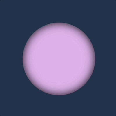
.scale-content {position: relative;width: 320px;height: 320px;.avatar-container {position: absolute;width: 100%;height: 100%;background-color: $container-color;border: 2pxsolidblack;box-shadow: 0010px;border-radius: 50%;overflow: hidden; } /* end of avatar-container */} /* end of scale-content */
SCSS
Great! Now, take a break and look at the container we made using our earlier code. Feel free to go with it, or you may come up with your own! 😊
Our containers are ready!! We can continue by doing our manipulations and creating scale transformations.
We apply the transition: transform CSS property to the parent element, which enables us to achieve smooth changes in property values within a specified duration. As you can see below, I set 4s, and as a result, our transition lasts 4 seconds.
Next, we set the CSS transform: scale(X, Y) property on the child element in order to resize, increase, or decrease the size of an element in the axes. We have the capability to simultaneously resize both axes with the same or different values or selectively resize either the X-axis or the Y-axis.
💡 Below there are some examples of scale transformations as a way to understand it better 😃
transform: scale(X, Y) with the same value on both axes
Resizes (increases) with the same value, the size of an element in both axes.
.scale-content { ...transition: transform 4s; &:hover { cursor: pointer;transform: scale(1.2); }.avatar-container { ... } /* end of avatar-container */} /* end of scale-content */
CSS
Resizes (decreases) with the same value, the size of an element in both axes.
.scale-content { ...transition: transform 4s; &:hover { cursor: pointer;transform: scale(0.5); }.avatar-container { ... } /* end of avatar-container */} /* end of scale-content */
CSS
transform: scale(X, Y) with different values on both axes
Resizes (increase the width and decrease the height), with different values, the size of an element in both axes.
.scale-content { ...transition: transform 4s; &:hover { cursor: pointer;transform: scale(1.4, 0.4); }.avatar-container { ... } /* end of avatar-container */} /* end of scale-content */
CSS
Resizes (decrease the width and increase the height), with different values, the size of an element in both axes.
.scale-content { ...transition: transform 4s; &:hover { cursor: pointer;transform: scale(0.4, 1.4); }.avatar-container { ... } /* end of avatar-container */} /* end of scale-content */
CSS
transform: scale(X) increase or decrease width
Resizes (increases) the width of an element (X-axis).
.scale-content { ...transition: transform 4s; &:hover { cursor: pointer;transform: scaleX(2); }.avatar-container { ... } /* end of avatar-container */} /* end of scale-content */
CSS
Resizes (decreases) the width of an element (X-axis).
.scale-content { ...transition: transform 4s; &:hover { cursor: pointer;transform: scaleX(0.2); }.avatar-container { ... } /* end of avatar-container */} /* end of scale-content */
CSS
transform: scale(Y) increase or decrease height
Resizes (increases) the height of an element (Y-axis).
.scale-content { ...transition: transform 4s; &:hover { cursor: pointer;transform: scaleY(2); }.avatar-container { ... } /* end of avatar-container */} /* end of scale-content */
CSS
Resizes (decreases) the height of an element (Y-axis).
.scale-content { ...transition: transform 4s; &:hover { cursor: pointer;transform: scaleY(0.5); }.avatar-container { ... } /* end of avatar-container */} /* end of scale-content */


