Tag: transparent

Practical CSS tips for working with transparency — opacity, RGBA, overlays, and layering elements cleanly without breaking readability.

  • Make a Unique Folded Corner Effect Utilizing the clip-path CSS Property

    Make a Unique Folded Corner Effect Utilizing the clip-path CSS Property

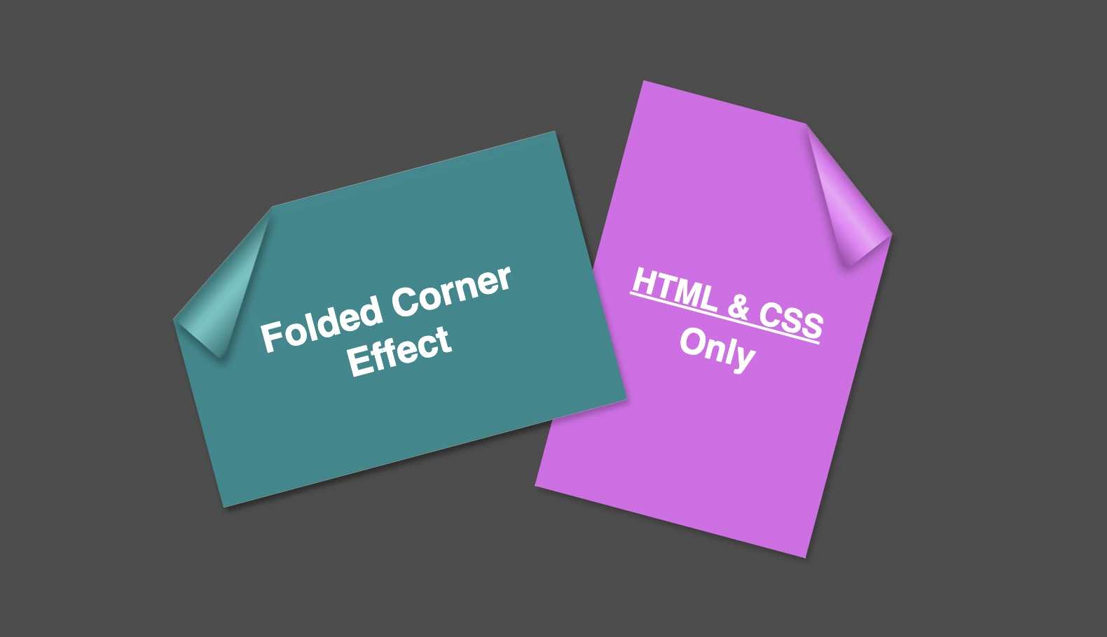
    Hello everybody! I’m excited to share a cool folded corner effect I created using just HTML and CSS. This eye-catching design adds a dynamic flair, creating a realistic illusion that enhances your webpage’s visual appeal —no images, extra scripts, or complex code required. How awesome is that? 😎

    Elements with clip-path do not take shadows directly. Instead, they must be nested within a container to inherit its shadows.

    Creating the folded corner effect using pseudo-element

    We’ll start by using the :before pseudo-element combined with the clip-path property to create the folded corner effect. The main element, which contains the pseudo-element, is styled with a filter property to apply a shadow. This shadow is then inherited by the pseudo-element, allowing the folded corner to display a subtle, realistic shadow as well. This technique keeps the design lightweight and visually appealing.

    Basic HTML structure for the folded corner effect

    The HTML code snippet creates a card layout. We have a parent element with the class .card, housing two child elements: the first with the class .title for the card’s title, and the second with the class .folded-corner to apply the folded corner effect via CSS.

    <div class="card">
      <div class="title">Folded Corner Effect</div>
      <div class="folded-corner"></div>
    </div>
    HTML

    CSS structure: creating the paper and cut corner

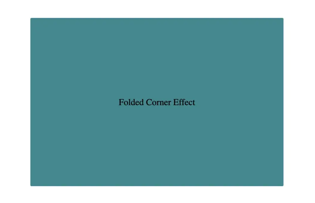
    Starting with the CSS, we define a horizontal rectangle by setting the width to 450px and the height to 300px, along with a subtle 2px border-radius for slightly rounded corners. The background color is set to #228a90, a rich teal with greenish-blue tones that gives the card a fresh, modern look.

    .card {
      width: 450px;
      height: 300px;
      border-radius: 2px;
      background-color: #228a90;
        
      display: flex;
      align-items: center;
      justify-content: center;
    }
    CSS
    Initial paper design before applying folded corner effect

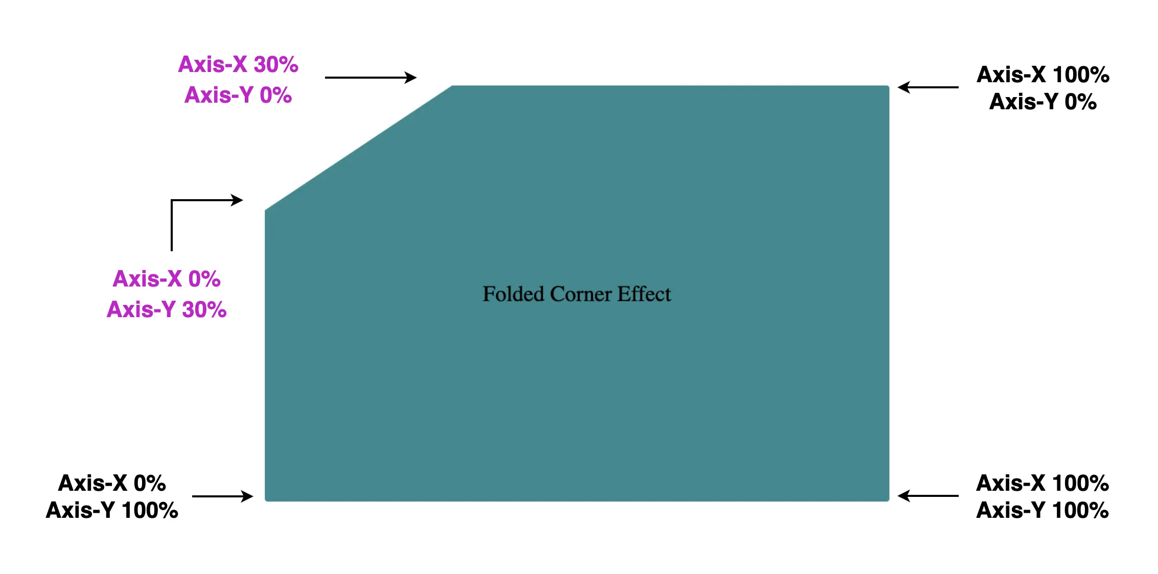
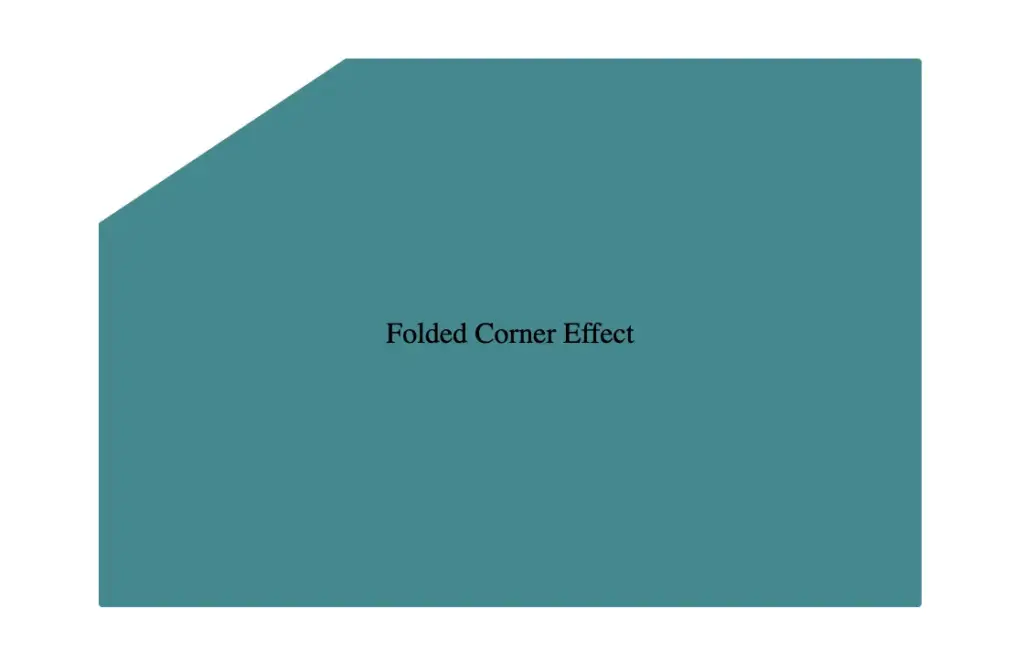
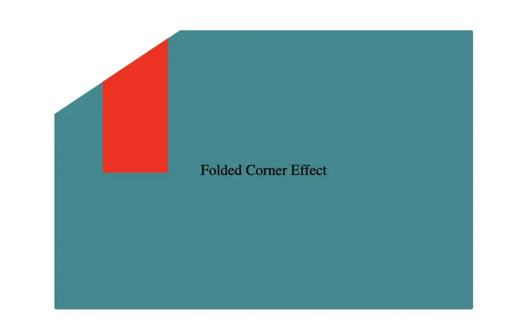
    Then we use the clip-path property to shape the desired paper corner for the folded effect. I chose the top-left corner, but you can select any one you prefer by adjusting the corresponding points in the clip-path: polygon() function.

    .card {
      width: 450px;
      height: 300px;
      border-radius: 2px;
      background-color: #228a90;
      
      clip-path: polygon(0% 30%, 30% 0%, 100% 0%, 100% 100%, 0% 100%);
      position: relative;
    }
    CSS

    Think of the corners in this order: top-left, top-right, bottom-right, bottom-left (clockwise).

    Remember to split each selected corner into two coordinates to get the right look (watch those 👇 magenta measurements! 😉)
    Take into account that the top-left corner has both Axis-X and Axis-Y on 0%.

    Axis coordinates of card showing top-left corner cut, preparing the folded corner effect

    Finally, adding position:relative does not change something in our effect but prepares us for future positioning adjustments. As for centering our elements using flexbox—it’s purely for aesthetic purposes, helping keep everything visually balanced and neat.
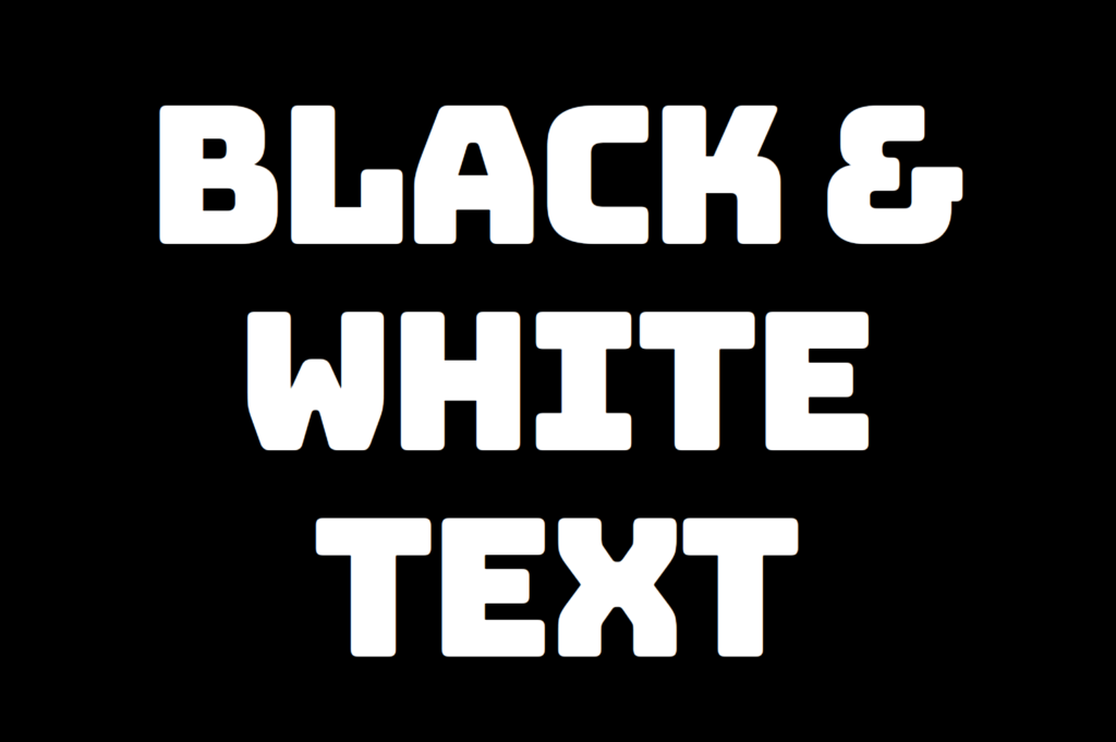
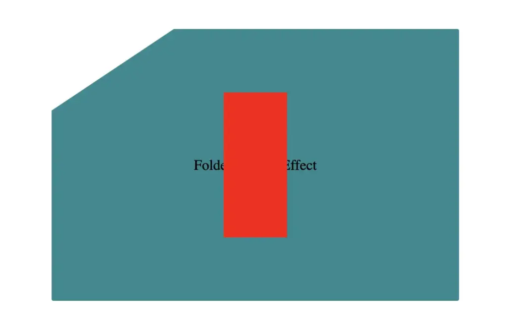
    Below, we can see what is rendered on the screen for now. Pretty cool, right!? 😃

    Progress so far: paper with cut corner created using HTML and CSS folded corner effect

    CSS structure: how to create the folded corner effect

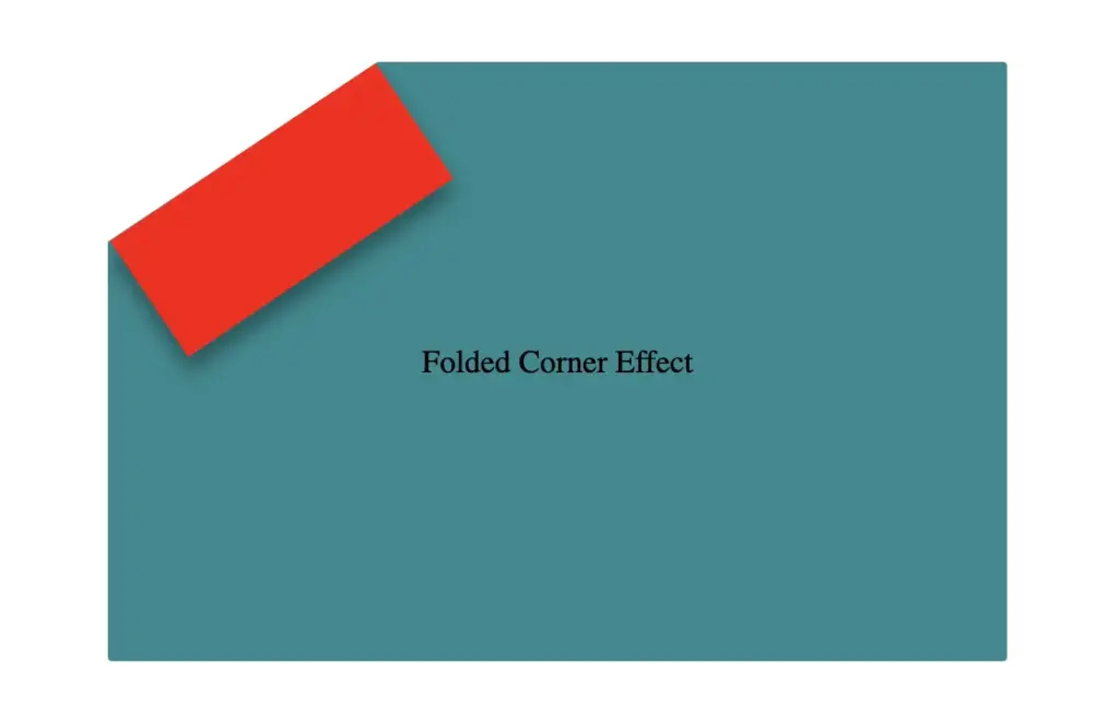
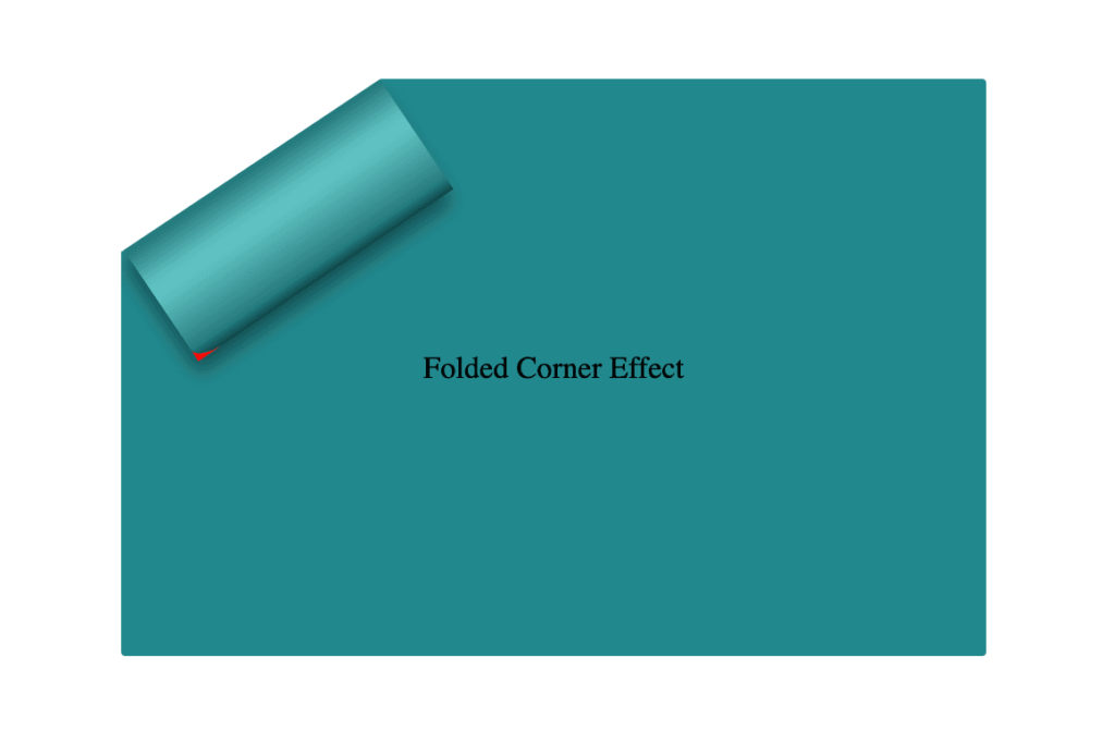
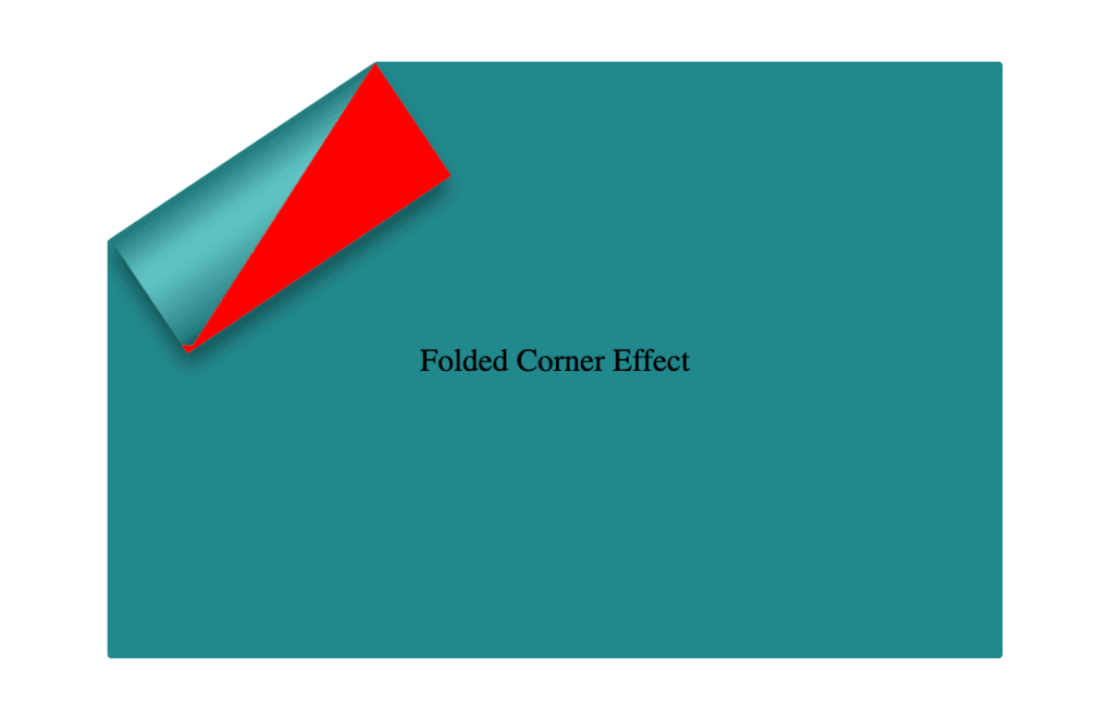
    To continue building our effect, we’ll use the folder-corner child element to create a second rectangle within the parent card element. This element will act as the folded piece of paper. We’ll give it a width of 70px and a height of 160px.

    .card .folded-corner {
      width: 70px;
      height: 160px;
      background-color: red;
      position: absolute;
    }
    CSS

    For now, we’ll use a red background color to help us visualize its position and behavior more clearly—this will be updated to its final color later. We’ll also apply position: absolute to enable precise positioning.

    Initial red-colored container element for folded corner effect

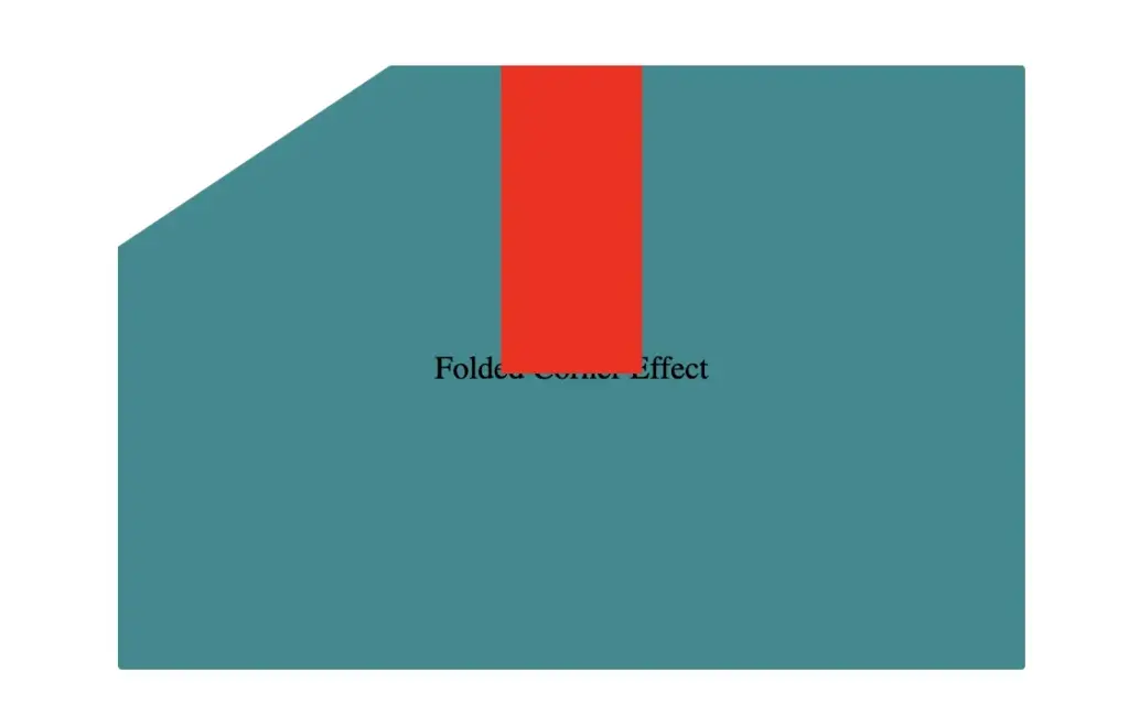
    Next, we continue with positioning. We use the top and left properties to move the .folded-corner element closer to the clipped corner, then apply the transform property to rotate it into place.

    .card .folded-corner {
      ...
      top: -7px;
      left: 52px;
      transform: rotate(56deg);
    }
    CSS
    Positioning folded-corner element at top -7px in folded corner effect layout
    top: -7px;
    Positioning folded-corner element at left 52px to align with cut corner
    left: 52px;
    Rotating folded-corner element by 52 degrees using CSS transform property
    transform: rotate(56deg);

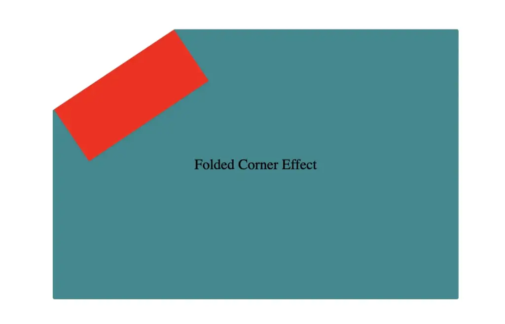
    Finally, adding the filter property is essential for completing our effect. As mentioned earlier, applying a shadow directly to an element with a clip-path isn’t possible — so the solution is to create an additional element that can hold the shadow.

    To do this, we’ll add a :before pseudo-element with the same dimensions as our folded corner. This allows us to recreate the folded shape and apply the shadow to it — adding depth and realism to the folded corner effect. 😎

    .card .folded-corner {
      ...
      top: -7px;
      left: 52px;
      transform: rotate(56deg);
      filter: drop-shadow(6px 4px 5px rgba(0, 0, 0, 0.4));
    }
    CSS
    Initial red-colored container element for folded corner effect
    filter: drop-shadow(6px 4px 5px rgba(0, 0, 0, 0.4));

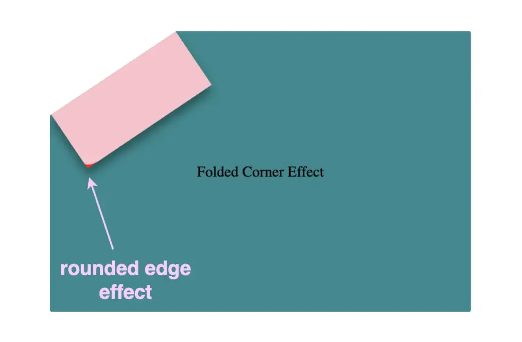
    Next, we move forward by using the before pseudo-element with the content property and set its position to absolute for precise placement within the parent.
    We want this pseudo-element to have the exact dimensions as the parent, so we set both its width and height to 100%, something that allows it to inherit the parent’s size.

    .card .folded-corner:before {
      content: "";
      position: absolute;
      width: 100%;
      height: 100%;
      background: pink;
      border-radius: 0 0 10% 0;
    }
    CSS

    For now, we apply a pink background to help visualize the structure. Finally, we add a border-radius of 10% to the bottom corner, which softens the edge and creates a smoother, more realistic folded appearance.

    Adding the before pseudoelement

    Next, we replace the pink background with a smooth linear gradient. We choose colors similar to the main hue but make them darker towards the edges and lighter in the center. This gradient effect enhances the appearance by making the center appear brighter and polish. ✨

    .card .folded-corner:before {
      ...
      background: linear-gradient(to right, #277c7f 5%, #5abcbc 30%, #63c5c6 40%, #5abcbc 50%, #277c7f 90%, #0d4749);
    }
    CSS
    Adding linear- gradient at the before pseudoelement

    To complete the shape, we apply the clip-path: polygon(0% -2%, 0% 100%, 100% 100%) property. This is essential for transforming the before pseudo-element —which starts as a rectangle, just like its parent—into a triangle.

    In simple words, this clipping path reshapes the element into the desired triangular form. 🥳

    .card .folded-corner:before {
      ...
      clip-path: polygon(0% -2%, 0% 100%, 100% 100%);
    }
    CSS
    Adding clip-path to the before pseudoelement

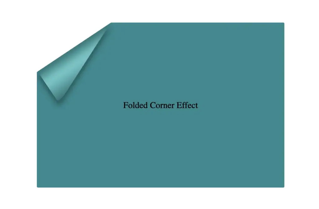
    The last step is to turn back to the parent element with the class .folded-corner and “remove” the red rectangle from view by simply replacing the red background-color with a transparent value.
    As we can see, the :before pseudoelement inherits its parent shadow effect while the parent becomes invisible.

    .card .folded-corner {
      width: 70px;
      height: 160px;
      background-color: transparent;
      position: absolute;
      top: -7px;
      left: 52px;
      transform: rotate(56deg);
      filter: drop-shadow(6px 4px 5px rgba(0, 0, 0, 0.4));
    }
    CSS
    Finalize the folded corner effect

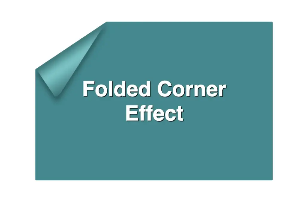
    We can enhance the title to have a more eye-cathing result. Applying a white background-color, increasing the font-size, and adding a subtle black text-shadow will make the title stand out beautifully, elevating the overall design. 📄 ✨

    .card .title {
      font-family: sans-serif;
      font-size: 40px;
      font-weight: bold;
      text-align: center;
      padding: 0 50px;
      color: white;
      text-shadow: 1px 1px 1px black;
    }
    CSS
    Stylling paper's title

    Complete code example

    <div class="card">
      <div class="title">Folded Corner Effect</div>
      <div class="folded-corner"></div>
    </div>
    HTML
    .card {
      width: 450px;
      height: 300px;
      border-radius: 2px;
      background-color: #228a90;
      clip-path: polygon(0% 30%, 30% 0%, 100% 0%, 100% 100%, 0% 100%);
      position: relative;
      display: flex;
      align-items: center;
      justify-content: center;
    }
    
    .card .folded-corner {
      width: 70px;
      height: 160px;
      background-color: transparent;
      position: absolute;
      top: -7px;
      left: 52px;
      transform: rotate(56deg);
      filter: drop-shadow(6px 4px 5px rgba(0, 0, 0, 0.4));
    }
    
    .card .folded-corner:before {
      content: "";
      position: absolute;
      width: 100%;
      height: 100%;
      border-radius: 0 0 10% 0;
      background: linear-gradient(to right, #277c7f 5%, #5abcbc 30%, #63c5c6 40%, #5abcbc 50%, #277c7f 90%, #0d4749);
      clip-path: polygon(0% -2%, 0% 100%, 100% 100%);
    }
    
    .card .title {
      font-family: sans-serif;
      font-size: 40px;
      font-weight: bold;
      text-align: center;
      padding: 0 50px;
      color: white;
      text-shadow: 1px 1px 1px black;
    }
    CSS
    Expand

    If you have any questions or run into any issues, don’t hesitate to reach out in the comments below — I’m happy to help. You can easily copy any code snippet by clicking the copy icon in the top-right corner of each block.

    Summary

    We started by creating the paper and cutting its corner. Then, we set the clip-path property to define the shape and positioned the folded-corner element precisely over the clipped area. After that, we enhanced the styling with background gradients that match the paper’s tone, and wrapped up by polishing the effect for a clean, realistic look. 📄 ✨

    Wishing you the best of luck in all your creative endeavors! 😃

  • How To Make A CSS Text Reflection Effect

    How To Make A CSS Text Reflection Effect

    Hi there! 😃 In this post, we’ll learn bit by bit how to create a CSS text reflection effect. When we say reflection, we’re referring to a mirror-like effect that looks like the text reflects on a surface, much like the way we see our reflection in a mirror.

    This is a simple yet amazing way to enhance the appearance of your text. Let’s analyze our effect so that you can easily follow along.

    HTML structure

    We will begin with our HTML structure. As you can see below, I prepared a div with the class .reflection-text , this is where our effect will take place.

    <div class="reflection-text">HELLO WORLD</div>
    CSS

    CSS foundation

    Let’s move forward with the CSS basic structure. We start with defining the background. It’s worth noting that using radial-gradient can make our effect more impressive. 😃

    body {
      background: radial-gradient(lightgreen, darkgreen);
      height: 100vh;
    }
    CSS

    Below, we can see the background we just created.

    In web development, we use the flex method in order to center our text. Then we will enhance its appearance, by making some adjustments. We will set the font-size to 100 pixels, select the “Roboto” font-family, and choose white as the text color.

    body {
      ...
      display: flex;
      align-items: center;
      justify-content: center;
    }
    
    .reflection-text {
      font-size: 100px;
      font-family: 'Roboto', sans-serif;
      color: white;
    }
    CSS

    This is what is rendered on the screen for now. A perfectly centered, 🎯 white text.

    Adding the CSS structure for the reflection effect

    Creating a reflection can be achieved by using pseudoelements like :before and :after. To ensure this works properly, we need to include position: relative in our .reflection-text class.

    .reflection-text {
      ...
      position: relative;
    }
    CSS

    Now, we are ready to proceed and create our reflection by adding the :before pseudoelement with all the necessary properties, as shown in the following code snippet.

    .reflection-text:before {
      content: "HELLO WORLD";
      position: absolute;
      top: 65px;
      transform: rotate(180deg) scaleX(-1);
      background: linear-gradient(
        to bottom, 
        rgba(255, 255, 255, 0) 20%, 
        rgba(255, 255, 255, 0.5) 60%, 
        rgba(255, 255, 255, 2) 100%
      );
      background-clip: text;
      color: transparent;
      opacity: 0.3;
    }
    CSS

    Breaking down the process

    🟢 To begin, we add the text “HELLO WORLD” to create another text element with the same content. This new text will serve as our reflection. Then, we set position: absolute so that we can move our reflected text below the original text. We use the top property to move the reflected text 65 pixels from the top, but you can always move the reflection in any direction you prefer. It is important to position the text and its reflection closely together for a more realistic reflection effect. 😉

    🟢 We move forward and use the transform CSS property to rotate the text by 180 degrees

    and then flip it horizontally using scaleX(-1). Now we have the perfect reflection! Let’s continue and make it more realistic.

    🟢 In the next step, we will adjust the color of our reflected text. To achieve this, we will utilize the linear-gradient CSS property and specify the direction as downwards. This will create white gradients, with the top appearing more intense and gradually fading towards the bottom of the text.

    🟢 It is commonly known that gradients cannot be directly applied to texts. Don’t worry! 🤔 We already have the solution to this problem. For now, let’s give a quick explanation. To create a clipped linear background pattern for text, first, we add the -webkit-background-clip: text property, and at the same time, we set the color to transparent, and our text automatically turns to transparent. In that way, our text takes the background: linear-gradient as its real color.

    🟢 For a more transparent text, we can adjust the opacity. The lower the opacity, the more transparent our text becomes. So, here we are! Our reflection is ready! 🥳

    Exploring different colors

    🔖 It is always an option to use black or any other color in our work. Below, I’ve included examples of texts with black, purple, and green colors. It’s important to remember that the key factor is to set the correct gradients at the linear-gradient property. That way, we can create respective shades. Therefore, please give extra attention to that! 😊

    Black text

    .reflection-text {
      position: relative;
      font-size: 100px;
      font-family: 'Roboto', sans-serif;
      color: black; /* default color */
    }
    CSS
    .reflection-text:before {
      content: "HELLO WORLD";
      position: absolute;
      top: 65px;
      transform: rotate(180deg) scaleX(-1);
      background: linear-gradient(to bottom, 
      rgba(0, 0, 0, 0) 20%, 
      rgba(0, 0, 0, 0.5) 60%, 
      rgba(0, 0, 0, 2) 100%);
      background-clip: text;
      color: transparent;
      opacity: 0.3;
    }
    CSS

    Purple Text

    .reflection-text {
      position: relative;
      font-size: 100px;
      font-family: 'Roboto', sans-serif;
      color: purple;
    }
    CSS
    .reflection-text:before {
      content: "HELLO WORLD";
      position: absolute;
      top: 65px;
      transform: rotate(180deg) scaleX(-1);
      background: linear-gradient(to bottom, 
      rgba(255, 55, 205, 0) 20%, 
      rgba(255, 55, 205, 0.5) 60%, 
      rgba(255, 55, 205, 2) 100%);
      background-clip: text;
      color: transparent;
      opacity: 0.3;
    }
    CSS

    Green Text

    .reflection-text {
      position: relative;
      font-size: 100px;
      font-family: 'Roboto', sans-serif;
      color: green;
    }
    CSS
    .reflection-text2:before {
      content:"HELLO WORLD";
      position: absolute;
      top: 65px;
      transform: rotate(180deg) scaleX(-1);
      background: linear-gradient(to bottom, 
      rgba(20, 150, 20, 0) 20%, 
      rgba(20, 150, 20) 60%, 
      rgba(20, 150, 20, 2) 100%);
      background-clip: text;
      color: transparent;
      opacity: 0.3;
    }
    CSS
  • Transform Your Text: Black and White CSS Stripes Made Easy

    Transform Your Text: Black and White CSS Stripes Made Easy

    Welcome to a world where ⚫ black and ⚪ white aren’t just colors. In this post, 😃 we’ll explore the exciting world of creating black and white CSS stripes. It is a really cool effect to level up your text by adding stripes, making it even more fascinating and appealing.

    We will be learning about this effect by using an example to make it crystal clear. Let’s check it out! 👩‍💻

    Create basic HTML and CSS structure

    We will begin with our HTML and CSS structure. Our HTML code includes a <div> element that has a class named .stripes-effect for identification and styling purposes. Following that, we add some CSS rules to apply specific styles to our HTML element with this class.

    <body>
      <div class="stripes-effect">black & white text with shadow</div>
    </body
    HTML
    body {
      background-color: black;
    }
    
    .stripes-effect {
      font-family: 'Bungee', sans-serif;
      text-align: center;
      color:  white;
    }
    CSS

    By doing so, our heading is ready for applying our CSS stripes effect and should now look like this

    This image shows a white text with a black background

    Adding black and white vertical stripes

    Now that we have added our basic structure, we’ll create our stripe effect gradually, step by step, until it’s perfected. Let’s add the following styling

    .stripes-effect {
      ...
      background-image: linear-gradient(to right, white, black, ...);
      /* clips the background pattern */
      background-clip: text;
      /* makes text invisible */
      color: transparent;
    }
    CSS

    In our already existing .stripes-effect class, we have the following rules:

    background-image: linear-gradient(to right, white, black, ...) ➡ We begin by setting this CSS property that creates a background pattern using a gradient of alternating black and white stripes from left to right. The default direction is from top to bottom.

    This image shows a white text with black and white background that comes from the CSS property background-image: linear-gradient(to right, white, black, ...) CSS property.

    Don’t worry if our black-and-white text is hard to read; 🕯 😂 it is a temporary phase just to serve our purpose for now. We will move forward and see! So let’s proceed immediately! ⏳

    background-clip: text ➡ By adding this property, it clips the background pattern to the shape of the text, making the text appear as if it’s filled with black and white stripes. If we just add this property and leave our CSS settings without any other change, our effect will not show properly.

    This image shows that the browser clips the background when we set the -webkit-background-clip: text CSS property.

    If we want this to see our effect it is necessary to proceed with the following step (color: transparent ⬇).

    color: transparent ➡ It’s time to make the text transparent, enabling the background pattern we created in the previous step to be visible!

    This image shows the color: transparent CSS property. We now see our text having a black and white - css zebra effect.

    Black and white CSS stripes variations

    The Zebra effect is not limited to vertical stripes (linear-gradient) for your texts; you can explore more options and create any effect you want. Below, you will find some variations to give you the inspiration you need.

    Horizontal striped text

    .stripes-effect {
      ...
      background-image: linear-gradient(white, black, ...);
    }
    CSS
    This image shows the CSS stripes effect but with horizontal lines direction.

    Diagonal striped text

    .stripes-effect {
      ...
      background-image: linear-gradient(to bottom right white, black, ...);
    }
    CSS
    This image shows the black and white CSS stripes effect but with diagonal lines direction.
  • CSS Colorful Text – Crafting Vibrant Effects

    CSS Colorful Text – Crafting Vibrant Effects

    Hello, everybody 😃 Get ready to add a vibrant twist to your web designs with my latest post on fonts. In this post, we’ll explore the fascinating world of typography, sharing clever ways to add a burst of colors, outlines, shadows, and CSS colorful text. Whether we are looking to level up designs or experiment with CSS, this post provides the inspiration and know-how to make texts truly stand out on your screen. Stay tuned for an amazing journey into the art of CSS typography! 🌈✨

    We already know the color CSS property. When setting the text color, we’re setting the color of the text itself. In contrast, setting the background-color sets the background color behind the text. But what if we want a more challenging font? Can we do that? Absolutely!

    Below, I prepared an example as a way to make it more understandable. Enjoy! 💻

    Preparing our HTML and CSS structure

    The following code creates a colorful text with gradient, outline, and shadow. We will start with our HTML structure. Our body has background-color: black. Inside, we make an HTML div element that serves as a container for our text and has a class attribute named font-effects.

    <body>
      <div class="font-effects">
        colorful text with gradient, outline & shadow is so impressive
      </div>
    </body>
    HTML

    Next, let’s proceed with our CSS structure. The font-effects class contains the rules applied to the HTML element mentioned earlier. We’ll provide a thorough examination of these rules as we progress through this post. For now, it’s important to note that our text has color white, our body has background-color black, and we’ve also integrated (@import url(...)) a font-family of Google Fonts.

    Ensure this statement is placed at the beginning of your CSS code snippet, just like I did (check line 2).

    /* insert google fonts */
    @import url(
      'https://fonts.googleapis.com/css2?family=Stick No Bills'
    );
    
    body {
      background-color: black;
    }
    
    .font-combinations {
      width: 1100px;
      font-size: 150px;
      color: white;
      font-family: 'Stick No Bills', sans-serif;
      text-align: center;
    }
    CSS

    The following image shows what is rendered on the screen now.

    Explaining the CSS colorful text effect

    Inside the .font-effects style rules, we include the following instructions to create these amazing fonts:

    .font-combinations {
      ...
      /* adding colors */
      background-image: linear-gradient(
        to right bottom, red 0, green 15%, orange 25%, pink 25%,
        transparent 27%, indigo 27%, orange 50%, black 50%,
        transparent 52%, green 52%, indigo 73%,
        transparent 73%, pink 75%, orange 75%, green 90%,
        red 100%
      );
      /* Makes the text shape match the background */
      -webkit-background-clip: text;
      color: transparent;
        /* adding outline to text */
      -webkit-text-stroke-width: 1px;
      -webkit-text-stroke-color: pink;
      /* adding shadow to text */
      filter: drop-shadow(-2px 2px 2px rgba(250, 190, 210, 0.8));
    }
    CSS

    Adding the linear gradient effect

    background-image: linear-gradient(...) ➡ This CSS rule creates a background gradient using the linear-gradient function. The gradient begins with red, transitions to green, and then shifts to orange. It then transitions to pink, becomes transparent, then indigo, returns orange becomes transparent once more, shifts to green, then indigo, then transparent again, returns to pink, then orange for the third time, then green, and finally returns red again.

    Remember that this gradient will be used as the background for our text. Isn’t this awesome? 😎

    -webkit-background-clip: text ➡ We continue with this CSS rule that tells the browser to clip the background gradient to the shape of the text. We are not ready yet to see the colorful background as text. 😕 We just prepared the space (fonts). Don’t worry we will proceed with our work and see the amazing result! 😉

    color: transparent ➡ This CSS rule makes the actual text content transparent. This allows the colorful gradient to show through the text 🥳, and there it 🥁 is!

    Adding the outline effect

    -webkit-text-stroke: 2px red ➡ Then we add a pink outline or stroke with a width of 2 pixels. This makes the text more visible against the background gradient.

    🔖 We are free to write it more analytically setting the following two CSS properties -webkit-text-stroke-width and -webkit-text-stroke-color. It’s up to you!

    Applying the shadow effect

    filter: drop-shadow(-2px 2px 2px rgb(250, 190, 210, 0.8)) ➡ To finalize our work we add a shadow to the entire section, with an offset of -2 pixels to the left, 2 pixels down, a blur radius of 2 pixels, and a subtle pink shadow rgba(10, 10, 10, 0.8). This deep shadow adds a subtle but noticeable darkening effect to our text.

    To infuse our text with a touch of fantasy and vibrance 🎉 ✨, we can use a brighter color for the outline and change the shadow to match. For example, we could create a vivid or dark background as a way to create contrast and then swap out the pink outline and shadow for a more vibrant magenta. In the picture below, you can see how these small changes make a big difference, giving a more colorful and bright result.

  • CSS Text Outline: How To Make Amazing Outlined Texts

    CSS Text Outline: How To Make Amazing Outlined Texts

    Hello, there 😃 Let’s step into a digital world where CSS brings forth the captivating CSS text outline effect. It’s a simple yet powerful technique that adds structure and clarity to texts and elements.

    Let’s dive into how CSS outlines 🖋 can make a significant difference in the visual appeal of your website. 💻 🫧

    Create basic HTML and CSS structure

    As a first step, we need some basic HTML structure to apply our CSS stylings.

    <body>
      <div class="outline-effect">outline effect</div>
    </body>
    HTML
    /* insert google fonts */
    @import url(
      'https://fonts.googleapis.com/css2?family=Emilys+Candy&display=swap'
    );
    
    body {
      background-color: purple;
    }
    
    .outline-effect {
      width: 650px;
      font-size: 180px;
      text-align: center;
      font-family: 'Emilys Candy', cursive;
    }
    CSS

    Let’s see what we have done so far. I have chosen a vibrant purple color for our background while keeping the text in the default black color. Our text is set to 180px, perfectly aligned to the center.

    To give a playful and lively vibe to our design, I’ve chosen the “Emily Candy” font-family which adds a delightful touch. If you also intend to use this font family, importing it into your CSS file is essential. Ensure the @import statement is placed at the beginning of your CSS code snippet, just like I did (check above lines 2-4).

    In the image below, you can see the current rendering on the screen up to this point.

    Apply the CSS text outline effect

    .outline-effect {
      ...
      text-stroke: 2px #8695e9; // medium blue shade
      color: transparent;
    }
    CSS

    The first thing we have to do is set the text-stoke property which represents a specific style line. Here, in our example, the text should have a light to medium blue color (#8695e9) outline with 2 pixels wide. Remember that as we increase the pixels, the outline becomes wider.

    🔖 It’s useful to know that we can split the text-stroke property in two: text-stroke-width and text-stroke-color.

    /* 1st choice */
      text-stroke: 2px #8695e9;
    
    /* 2nd choice */
      text-stroke-width: 2px;
      text-stroke-color:  #8695e9;
    CSS

    (Personally, I opt for the shortened form, saving time and extra lines of code, but the choice is yours. 🙂)

    Finally, by adding color: transparent we complete our effect by allowing the background to show through.

    To sum up, this code styles a piece of text with a see-through center and a visible 2px blue outline. It’s simple yet impressive 🎈 ✨